10,000 search results
(0.031 seconds)
- Malabar by Linotype,
$29.99 Malabar is a type family for extensive text. Its design was developed with a nod toward newspapers. Malabar's characters are seriffed and of the Old Style genre. A strong diagonal axis is apparent within the curves. Sturdy serifs help strengthen the line of text in small point sizes, as well as define the overall feeling of the face. Malabar's x-height is very high, a deliberate choice that makes the most important parts of lowercase letters visibly larger in tiny settings. The height of the capital letters is also rather diminutive, allowing for better character fit, as well as eliminating a bit of clumsiness in German, which often includes quite a few uppercase letters. Diacritical marks and additional alphabetic forms required by many Western, Central, and Eastern European languages are naturally a part of the character set, including those needed in the Baltic states, for Romanian, and for Turkish. Malabar's accents are bold and direct, sitting well with their base glyphs. The family includes three weights, each with a companion Italic. Malabar Regular is equipped with small caps, and both it and Malabar Italic include oldstyle figures. All members of the family have both proportional and tabular-width lining figures, as well as special variants of certain punctuation marks vertically adjusted for all-caps text setting. Malabar is informed both by contemporary ideas of typeface design (sheared terminals, the wider-drawn s) as well as by 16th-century masters. Malabar Heavy and Heavy Italic are very loud; their blackness almost shouts out from the page. The Regular's wedge serifs become more slab-ish in nature as the letters' weight increases. Malabar Heavy and Heavy Italic are best relegated to headline use only. Malabar Bold and Bold Italic may be used for text emphasis, a job for which the Heavy is to dark. Malabar received a Certificate of Excellence in Type Design at the Type Directors Club of New York TDC2 competition in 2009.
 - Trivette by Greater Albion Typefounders,
$12.00 Trivette is an ‘All Capitals’ calligraphic display face, where all upright strokes are rendered as curves and where everything approaching the vertical are rendered in threes. That’s probably as clear as mud, but the results combine charm and legibility with a decorative period air. Recommended for poster work where a sense of dignified fun is important.
 - Shameless by Positype,
$79.00 I will spare you the long-winded description this time and all of the motivations and witty innuendoes. Quite frankly, I forgot about creating this typeface and it sat on my hard drive for almost a year. Luckily, my daughter Isobel saw the initial drawings one day and ask me about those pretty letters and I remembered… yep, that happened. That said, time made this a better typeface… with fresh eyes and time, much was redrawn, retooled and expanded to something I truly enjoy playing with. Shameless makes extensive use of Contextual alternates to create a proper ebb and flow from letter to letter. Interestingly, there are only a handful of ligatures… instead many special combinations are accounted for solely by relying on Contextual Alts. Mix in Stylistic Alts, Swashes, responsive Titling Alts, numerous Style Sets, etc and you can have a lot of fun. I created 2 versions. A ‘Standard’ version that has 2200+ characters and a ‘Deluxe’ version that has 2400+ characters and an interesting caveat… I plan on expanding the Deluxe version any time I have an idea to add to the typeface… and as such, buyers will receive all of those updates at no charge (with updates going directly to the distributors). You get what you pay for… no insane discounts. Oh, and if you are wondering… Shameless is based on my handwriting using Kuretake Zig CocoIro pens. I love these pens.
 - Carle by Kaer,
$19.00 Carle is a display font family with regular and colored styles. 3D style letters are based on impossible isometric shapes. Perfect for childish labels, illusion company, birthday posters etc. What you will get: Colored, regular and shadow styles Uppercase only (lowercase glyphs are same) Numbers and symbols Please feel free to request to add characters you need: kaer.pro@gmail.com You can use color fonts in PS since CC 2017, AI since CC 2018, ID since CC 2019, QuarkXPress since 2018, Pixelmator, Sketch, Affinity Designer Since macOS 10.14 Mojave, Paint.NET Windows only. Please note that the Canva do not support color fonts!
 - Perlmutter by Vic Fieger,
$25.99Perlmutter is a Hebrew and Yiddish font designed for the purpose of legibility at great distance. Included are niqqud, letters with dagesh, punctuation, sheqel sign, and aleph-lamed ligature. - Graffick Top by Graffiti Fonts,
$12.99Halfway between graffiti & typeography you find styles like Graffick™. These fonts are derived directly from hand written letters made mechanically perfect to behave more like common digital fonts. - Graffick Wide by Graffiti Fonts,
$12.99Halfway between graffiti & typeography you find styles like Graffick™. These fonts are derived directly from hand written letters made mechanically perfect to behave more like common digital fonts. - Retail Merchant JNL by Jeff Levine,
$29.00Retail Merchant JNL is strictly for making prices. The 0-9 keys have large numbers, the shift position of the same keys have smaller, centered numbers, and the alphabet keys have a variety of smaller numbers with underscores in single digits, pairs of numerals and even a few complete prices such as "$1.00". Thrown in for good measure are companion words... "at", "for, "each", "lb." and "dozen"... - Veneribe by Greater Albion Typefounders,
$10.95 Veneribe -the Venerable face- is an experiment in what many today might call 'grunge', though we at Greater Albion would probably prefer to talk of rustic (or if we're feeling really old-fashioned rustick) charm. It's a derivative of our Clementhorpe family, and aims to combine a battered antique look with the charm of that decorative Roman family. Regular and oblique forms are offered.
 - Ornate Deco by Jeff Levine,
$29.00 Ornate Deco JNL is a thick-and-thin Art Deco serif typeface with diamond shapes inside the thicker parts of the characters. It is based on an alphabet example found in the 1949 French lettering book “Album de Lettres Arti”, and is available in both regular and oblique versions.
 - Fancy Deco JNL by Jeff Levine,
$29.00 This decorative, scalloped thick-and-thin Art Deco type design is one of the many inspirations found within the pages of the 1934 French lettering book “L'Art du Tracé Rationnel de la Lettre”. Now in digital format, Fancy Deco JNL is available in both regular and oblique versions.
 - Areno by BoxTube Labs,
$24.00 Areno was our first ever font family, released in 2017. We’ve learned a lot since then and made the decision to redraw it from scratch with improved letterforms, better readability and added language support. Most adjustments are very subtle, but some glyphs have gotten a complete makeover. We've also added lowercase letters to the family. Areno is a strong and bold sports block font. These fonts are perfect for sports logos, branding, posters, apparel design, magazine headlines, labels and so much more. Areno now features a full Adobe Latin 1 Character Set with support for most Western European languages including Afrikaants, Basque, Breton, Catalan, Danish, Dutch, English, Finnish, French, Gaelic, German, Icelandic, Indonesian, Irish, Italian, Norwegian, Portuguese, Sami, Spanish, Swahili and Swedish.
 - St Croce Pro by Storm Type Foundry,
$29.00 Our eye is able to join missing parts of worn letters back into undisturbed shapes. We tend to see things better than they really are. Thanks to this ability we ignore faults of those close to us as we can’t accept the fact that every once in a while we convene with an impaired entity. Typography is merely a man’s invention, hence imperfection and transience, albeit overlooked, are its key features. This typeface is based on worn-out letterings on tombstones in the St. Croce basilica in Florence. For hundreds of years, microscopic particles of marble are being taken away on the soles of visitors: the embossed figures become fossilised white clouds, fragments of inscriptions are nearing the limits of legibility. First missing are thin joins and serifs, then the main strokes finally slowly diminish into nothingness over time. Unlike an archaeologist, for whom even completely featureless stele is valuable, the typographer must capture the proper moment of wear, when the type is not too “new” but also not too much decimated. Such typeface is usable for catalogue jackets, invitations and posters. Calligraphy is a natural human trait. To write is to create characters of reasonable beauty and content, according to the nature of the writer. A natural characteristic of architecture is to create an aesthetic message very similar to the alphabet. A doric column, the gabled roof, the circle of the well plan: these are the basic shapes from which all text typeface is derived.
 - Saturday Brunch by Rachel White Art,
$18.00 Saturday Brunch is a smooth script. It fits into tight and tall places, has big loops, and lots of attitude. Saturday Brunch has a set of alternate lowercase letters with no tails (which are coded to work with tricky letters like x and z who don't play well with tails), a bunch of double letter ligatures, and a few fun alternates, like t's with long swooping crossbars, and 3 alternate ampersands so you can pick the perfect style for your project.
 - Mexico by Struvictory.art,
$16.00 We want to introduce Mexico Font Family. The letters of the display font are decorated with floral ornaments based on Mexican landscapes. The typeface is presented in two styles: decorative and blank, сombine them to get your unique design. Mexico font is suitable for lettering posters and cards, tourist brochures, photo overlays, book covers and article titles. The font also works great for printing clothes, products branding and packaging. Also use individual letters and symbols to create logos and monograms.
 - Nerves of Steel BB by Blambot,
$9.00 Here's a deluxe comic book dialogue font with a vintage feel! Nerves of Steel BB comes with Regular, Italic, Bold, and Bold Italic. Contextual Alternates and Auto-ligatures enable six versions of every letter, and three versions of each number, the exclamation point and question mark. Barred-I correction is included as well as bouncy baselines when three or more duplicate letters are typed. To top it off, you get glyphs included for manga letterers, and a large European set of characters!
 - Joufflou NF by Nick's Fonts,
$10.00REALLY fat faces seem to be popular these days, so here's my take on one. The strokes have been expanded to the brink of illegibility, but the letters remain distinguishable, especially in context. Also included are alternate versions of the letter A—suitable for use as first and last letters in a word— in the ASII circumflex and ASCII tilde positions. This font contains the complete Latin language character set (Unicode 1252) plus support for Central European (Unicode 1250) languages as well. - Luminum JNL by Jeff Levine,
$29.00In hardware stores across the country are display racks with letters and numbers silk-screened onto self-adhesive aluminum "parallelograms". These handy and durable items have graced countless mailboxes, office doors, hallway signs and automobiles for years. My fellow font designing buddy [Harold Lohner] suggested that I make a font based on this form of lettering as a counterpart to my Mailbox Letters JNL (also based on self-adhesive signage product)... and now his suggestion takes shape as a digital font... Luminum JNL. - Faikinlan by IRF Lab Studio,
$11.00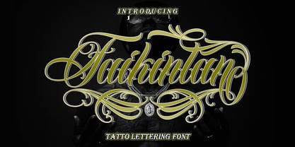 Introducing Faikinlan Tattoo Lettering Font with more details, clean, and more complex. Faikinlan includes uppercase and lowercase letters, numerals, a large range of punctuation, ligatures and multilingual language. All lowercase letters include ending swashes and alternative font. Faikinlan swash In order to use the beautiful swashes, you need a program that supports OpenType features such as Adobe Illustrator CS, Adobe Photoshop CC, Adobe Indesign and Corel Draw. Please contact us if you have any question, we are happy to help you! Thank you !
 - Masheen by Ingrimayne Type,
$10.00 This typeface was inspired by the popular typeface Machine but is not intended to be a copy of that font. It uses straight lines with circles converted to octagons. The Masheen family offers a variety of overlay possibilities to produced multicolored lettering. MasheenConvicted and MasheenFlag can be layered over MasheenBold to produce letters with two colors. The two overlay styles can be placed over MasheenCollege to produce bi or tricolored lettering. Examples are given in one of the font posters.
 - Trinculo by Scriptorium,
$12.00Trinculo is a cursive font which combines traditional letter forms with ridiculously ornate embellishments and flourishes. It's rather like what an 18th century clerk might have done with his lettering if he was bored to distraction with writing the same old letters again and again. The upper case characters are more complex with simpler versions of the same characters in the lower case. Trinculo is a lot of fun, though if you use it too much it may become overwhelming. - Hyptis by TripleHely,
$16.00 “Hi! I’m Hyptis – the script font based on brush handwriting. I was drawn with a soft, wet brush and digitally cleaned with care, but some of my characters keep their natural texture. If you are looking for a font for logos, postcards, product packaging, quotes, text overlays – or anything else – I am a good choice!” Hyptis has two types of embedded auto-replacement: lowercase letters without connecting strokes (for a case of the last character of the word), and ligatures (for a case of two letters that do not pair well together). These features work well in many apps (even simple ones like Notepad/TextEdit), and if you need to customize their application – you could use programs that support OpenType features (for example, Adobe apps or CorelDraw). All these additional glyphs are PUA-encoded, so if your software does not support OpenType — you could access them through Character Map (Windows) or Font Book (Mac). Hyptis also has wide multilingual support: Western-, Central- and Eastern-European, Baltic, Turkish, Latin-type Africans, and Asian (94 languages in total). And finally, Hyptis comes with a bonus font, Hyptis Swashes, that includes a set of 26 swashes – linear, round or oval. To type it you could simply use small letters from ‘a’ to ’z’.
 - Bird Script by Lián Types,
$24.95 Characterized by quickness, lightness, and ease of movement, Bird Script is a font which challenges many aspects of type-design: every single stroke, comes directly from the author’s hand and tries to reflect not only the tool used, but also his feelings at the moment of writing. Bird Script is a font filled up with the energic gestures of what it’s called gestural calligraphy, a not very explored field in typography, where hardly ever a letter comes the same way two times: When manipulating the pen, the letterer seeks for the beauty of the differences and the grace of a confident execution. Originally done with a flat speedball pen nib nº5 and retouched with pencil for the bolder elements, it turned into a very pleasant to the eyes font which dances between the formal rules of typography and the artistic look of calligraphy. Bird Script Pro and Bird Script Light Pro come with many ligatures, alternates and ornaments. Into the standard ligatures we find lots of pairs of two and three ligated letters so when they are activated the font seems alive. However if none of them are activated, the font gives a really particular text pattern, specially in smaller sizes. Get Bird Script, add rhythm to your work.
 - Roxborough CF by Connary Fagen,
$35.00 Roxborough CF is a dramatic serif, influenced by calligraphy and hand lettering. Built around a distinctive single-storey 'a' and full of rich detail, Roxborough pairs well with its expressive italics, lending an artful touch to text across print and digital. Roxborough CF pairs nicely with simple, bold headline typefaces, like Greycliff CF and Articulat CF. All typefaces from Connary Fagen include free updates, including new features, and free technical support.
 - Humble Craftman by Invasi Studio,
$17.00 Humble Craftman is a super versatile font that pairs script and sans typefaces. Each letter features a swashy touch, making Drippy more remarkable in the industry. This script font blends classic historical ambiance with pop modern retro vibes. Be the best version of your vision statement, and stand out from the crowd. A perfect pair for your logotype, branding project, label design, sign painting, and a very wide of advertising needs.
 - Neo Sans Cyrillic by Monotype,
$103.99The branding agency's client wanted an ultra modern"" typeface that was ""futuristic without being gimmicky or ephemeral,"" according to the design brief. Designer Sebastian Lester took on this intriguing custom font assignment, but soon, a bureaucratic decision cancelled the project. ""I was left with a sketchbook full of ideas and thought it would be a shame not to see what came of them,"" says Lester. He decided to finish the design on his own. Lester's research confirmed that the principal ingredient of an ""ultra modern"" typeface was simplicity of character structure: a carefully drawn, monoline form, open letter shapes and smooth, strong curves. To conceive a typeface that crossed the line from modern to futuristic, Lester decided to amplify these qualities. About a year after Lester's initial conceptual work, two highly functional and versatile typefaces emerged. These are Neo Sans and Neo Tech, designs Lester describes as ""legible without being neutral, nuanced without being fussy, and expressive without being distracting."" Both the Neo Sans and the more-minimalist Neo Tech families are available in six weights, ranging from Light to Ultra. Each has a companion italic, and Neo Tech offers a suite of alternate characters. While engineered to look modern as tomorrow, Neo Sans and Neo Tech display the functional and aesthetic excellence that earns them a place in the list of classic designs from the Monotype typeface library. - Neo Sans Paneuropean by Monotype,
$114.99The branding agency's client wanted an ultra modern"" typeface that was ""futuristic without being gimmicky or ephemeral,"" according to the design brief. Designer Sebastian Lester took on this intriguing custom font assignment, but soon, a bureaucratic decision cancelled the project. ""I was left with a sketchbook full of ideas and thought it would be a shame not to see what came of them,"" says Lester. He decided to finish the design on his own. Lester's research confirmed that the principal ingredient of an ""ultra modern"" typeface was simplicity of character structure: a carefully drawn, monoline form, open letter shapes and smooth, strong curves. To conceive a typeface that crossed the line from modern to futuristic, Lester decided to amplify these qualities. About a year after Lester's initial conceptual work, two highly functional and versatile typefaces emerged. These are Neo Sans and Neo Tech, designs Lester describes as ""legible without being neutral, nuanced without being fussy, and expressive without being distracting."" Both the Neo Sans and the more-minimalist Neo Tech families are available in six weights, ranging from Light to Ultra. Each has a companion italic, and Neo Tech offers a suite of alternate characters. While engineered to look modern as tomorrow, Neo Sans and Neo Tech display the functional and aesthetic excellence that earns them a place in the list of classic designs from the Monotype typeface library. - ZsaZsa Galore by Chank,
$39.95Chank created Zsazsa Galore as a fresh alternative to Mister Frisky, another jerky, hypercaffeinated interpretation of the traditional roman alphabet. The difference this time is that the new font has no descenders. Every letter comes to rest hard on the baseline. It sits there firmly rooted with branches wiggling around in the air. It was released as the Chank Font of the Month in October 1999 and it was named after Zsa Zsa Gabor because she is beautiful. - HoTom by Linotype,
$29.99Linotype Ho Tom is part of the Take Type Library, which features winners of Linotype’s International Digital Type Design Contest from 1994 to 1997. Designed by Thomas Hoffman, this font’s historical roots are easily traced to the slab serif style. Ho Tom was originally intended as a lettering system for a project in the center of the old East Berlin. This explains the stable, angular characters and the consistent rectangular base forms, which also makes Ho Tom a very legible font, suitable for longer texts. - Peanut Jam by PizzaDude.dk,
$18.00 Peanuts are a good source of healthful fats, protein and fiber - and besides that, I looove peanuts! Every once in a while, I have to name a font peanut-something. But I only do that with fonts that have that organic and handmade look and feeling ... and in this case, this font looked perfect to have the honour! :) Peanut Jam is super handmade and has 4 different versions of each lowercase letter and besides that, the font has multilingual support! Go get that peanut butter feeling! :)
 - Balega by Linotype,
$29.99 Balega is stencil-like display font, created by German designer Jürgen Weltin in 2002. Balega's letters are very bold, and have a slight italic slant. While some of the uppercase forms appear somewhat sharp, the lowercase is definitively round and friendly. Text set in Balega has a very forward moving motion, as the slant makes all of the letters seem to be lunging toward the right. This gives the typeface a very dynamic feel. Because the counterforms in and between the letters are very narrow, we recommend using Balega in posters and other larger displays, where its design may be truly appreciated. Balega is part of the Take Type 5 collection, from Linotype GmbH."
 - Sassa Mixed by Celebrity Fontz,
$24.99Uninhibited by typographic demands, this artistic font freely expresses individual creativity. The use of line in conjunction with deceptively simple patterns of squares or dots and the occasional solid infilling gives the letters a lively vigor lacking in many modern designs. The joins between the letters' uprights and curves and the balance between thin and thick strokes are executed with impressive simplicity. The alphabet letters were inspired by Swiss art from 1939. The numbers were patterned after a design cut in stone dating back to the year 1692, while the punctuation and mathematical characters are a simple and modern typeface that is both pleasing to the eye and a whimsical contrast to the other characters. - Love Duets by Ingrimayne Type,
$9.00 LoveDuets is a family of two novelty fonts that have letters on hearts. There are at least five other font families on myfonts that have have letters on hearts but LoveDuets differs from them because it uses the OpenType feature of Contextual Alternatives (calt) to put two letters on each heart, one on the left side and a second on the right side. The two styles in the family can be used in layers to increase color possibilities. The brace characters have empty half hearts that can be used to replace spaces or to complete hearts at ends of lines. LoveDuets can be used when hearts are appropriate such as for Valentines Day, anniversaries, and weddings.
 - Puggu by Aah Yes,
$9.95Puggu is ideal for headlines or posters where slightly unusual or unrefined type is required, though paragraphs of text are quite readable. The font includes 57 ligatures of fairly common letter combinations (such as at, ee, ss, tt, Ar, RD,) with alternative letter-shapes used, to give some random variations and avoid having too many repeat letters looking identical. (The full list is included with the zip-file.) And there's a wide range of accented characters giving compatability with many European languages. The zip contains OTF and TTF versions - only install one version of a font on the same machine, either the OTF or TTF, but not both as that could cause various conflicts and erratic behaviour. - DT Squished Stuff by Dragon Tongue Foundry,
$15.00 DT Squished Stuff is a font made for fun. This uneven simple blocky sans-serif font has wonky letters that adapt automatically and change shape to fit against their neighbours. Use with contextual ligatures turned on to allow Squished Stuff to operate correctly. If a particular letter decides to do something that you don’t want it to, turn ‘contextual ligatures’ off for that letter. But do remember to turn it back on afterwards. This font lives and breathes when ‘contextual ligatures’ are turned on. Also, there are easter eggs and quirky surprises hidden inside. Watch it squish and move to fit together. This is a wacky, crazy, fun, mad, party, toonified font. Enjoy
 - Kropotkin Std by sugargliderz,
$30.00 This typeface design was influenced by the British Rail corporate type introduced in an old lettering instruction book published in Japan. Of course, the only clue to this typeface is the lettering instruction book at hand. Therefore, this typeface is based on the British Rail corporate type introduced in an old lettering instruction book published in Japan, and I have expanded the design variations. I started with the Bold design first. Then I designed Light, Regular, and Black in that order. Light and Regular are intended to be used as the text type, while Bold and Black are intended to be used as the base for logotypes, headlines, and other eye-catchers.
 - Candy Design by Typophobia,
$20.00 Candy Design is a display font containing 265 glyphs. It was designed during a stay in Tanzania, Zanzibar in 2022. The main idea was to combine a sans-serif modernist, grotesque typeface with the addition of delicate Arabic accents. Its main assumption of use is posters, product design and branding. Unusual, dynamic and unpredictable accents that are found in practically every letter give the character of a very custom font, also completely not intended for typesetting, which, contrary to the features mentioned above, remains legible. Usually all letters are of the same size - however, as we used to when designing, hide small flavors in the whole sequence of numbers / letters and characters.
 - Tendria by Linotype,
$29.99Patricia Pothin-Roesch's Tendria typeface bases its letterforms on the logo for the French “Tendriade” mark. Clearly inspired by writing and hand lettering, Patricia Pothin-Roesch began her work on Tendria in Adobe Illustrator. After a few letters, she went back to designing the old-fashioned way: drawing by hand on layers of tracing paper. Tendria is a sturdy upright script face with a warm, childlike feeling. Its letters are like the typefaces often used in primary schools; the counterforms are large and open. The name Tendria is reminiscent of the French word for tender, “tendre.” Designers who set Tendria lovingly will reap rewards; this is an excellent addition to a display heading toolkit. - Decorate The Tree by Ingrimayne Type,
$9.00 DecorateTheTree is a festive novelty font family containing two styles designed to be used in layers. Each style has letters on Christmas-tree lights. The regular style has clear bulbs and the bold style has filled bulbs. Some characters are on standing bulbs and others on hanging bulbs and these two sets are made to alternate with the OpenType contextual alternatives (calt) feature. To use only one set of bulbs, this feature must be turned off and character spacing adjusted, though why anyone would want to use only one set is a mystery. These fonts are monospaced. They are useful to display a holiday message not just in words but in the lettering itself. (The characters on the bulbs are derived from the font SansduskiMono.)
 - 99 Names of ALLAH Compact by Islamic Calligraphy75,
$12.00 We have transformed the “99 names of ALLAH” into a font. That means each key on your keyboard represents 1 of the 99 names of ALLAH Aaza Wajal. The fonts work with both the English and Arabic Keyboards. We call this Calligraphy "Compact" because as you can see everything is very close and decorative symbols are at a maximum. The first "alef" has neither a "hamzit wasel" nor a "fatha", this indicates to skip that first alef so instead of saying "AR-RAHMAAN" you say "R-RAHMAAN". (in the zip file you will find a pdf file explaining the differences in the "harakat", pronunciation and spelling according to the Holy Quran). The calligraphy is anything but traditional & we have used all the decorative letters except for the "Ye". In other calligraphy you don't usually find the decorative letters: "Dal, Ra & Ye" but we like them and we use them, the important thing is that they don't change the pronunciation or the meaning. Decorative letters used in this calligraphy: "Mim, Aain, Sin, HHe, He, Kaf, Alef, Ta, Dal, Ra & Saad". Purpose & use: - Writers: Highlight the names in your texts in beautiful Islamic calligraphy. - Editors: Use with kinetic typography templates (AE) & editing software. - Designers: The very small details in the names does not affect the quality. Rest assured it is flawless. The MOST IMPORTANT THING about this list is that all the names are 100% ERROR FREE, and you can USE THEM WITH YOUR EYES CLOSED. All the “Tachkilat” are 100% ERROR FREE, all the "Spelling" is 100% ERROR FREE, and they all have been written in accordance with the Holy Quran. No names are missing and no names are duplicated. The list is complete "99 names +1". The +1 is the name “ALLAH” 'Aza wajal. Another important thing is how we use the decorative letters. In every font you will see small decorative letters, these letters are used only in accordance with their respective letters to indicate pronunciation & we don't include them randomly. That means "mim" on top or below the letter "mim", "sin" on top or below the letter "sin", and so on and so forth. Included: Pdf file telling you which key is associated with which name. In that same file we have included the transliteration and explication of all 99 names. Pdf file explaining the differences in the harakat and pronunciation according to the Holy Quran. Here is a link to all the extra files you will need: https://drive.google.com/drive/folders/1Xj2Q8hhmfKD7stY6RILhKPiPfePpI9U4?usp=sharing