10,000 search results
(0.028 seconds)
- Zenoa by Brenners Template,
$19.00 Zenoa Display Serif Font Family - They are sharp and sensitive, but connected-oriented. That's why they're designed by incorporating hook glyphs into an elegant serif style. Somewhat high contrast between vertical and horizontal, they reveal the strong individuality of each glyph, so you can create creative layouts. The meticulous design stands out so that readability and individuality can be expressed in harmony. And, these are the special excellences of this font family: Stylish Alternates and Ligatures where calligraphic subtlety is artistically connected. These OpenType features are decorative pleasures of using this font family more functionally. Please check first if the app you are using supports these features. They are easy to use in Adobe apps such as Photoshop and Illustrator. Alternates : A, B, C, D, E, F, G, H, J, K, L, M, N, P, Q, R, S, T, U, V, W, X, Y. Standard Ligatures : ff, fi, fl Discretionary ligatures : Am, Ba, Ca, Ch, De, En, Fr, Ge, Ha, In, Lo, Mi, No, Pa, Ro, Sa, Th, Va, Wo, Yo, an, bi, ck, de, ee, gn, ha,ie, lo, mo, no, oo, pr, ro, ss, st, te, um, ve, we, yo. Supported Languages: Western Europe, Central/Eastern Europe, Baltic, Turkish, Romanian
 - Lopsickles by Ingrimayne Type,
$7.00 Lopsickles is a family in which the letters are based on lopsided, distorted ellipses. The family has four sets of letters that are combined in six different ways, yielding six fonts. Four of these fonts (styles AB, Ad, Bc, and cd) use the OpenType feature Contextual Alternatives (calt) to alternate letter sets so that top-heavy characters alternate with bottom-heavy characters. The spacing in these fonts is designed for alternating characters and will result in overlap if the characters do not alternate. The other two styles (Ac and Bd) are spaced normally. Style Ac contains the two character sets that are top heavy and style Bd has the two character sets that are bottom heavy. The Ac and Bd fonts have italics and backslanted styles that may be useful to suggest speed. Each of these ten fonts has an inset style designed to be used in a layer above the base font. This layering can be used to give the effect of hollow letters or to add a colored interior. Lopsickles joins several other alternating-characters families in the IngrimayneType library including Snuggels, CloseTogether, and Caltic, but is visually very different from them. It is a strange, unusual family that will get noticed.
 - Faith And Glory by Set Sail Studios,
$12.00 Thanks for checking out Faith and Glory! These 2 hand-painted brush fonts are designed to perfectly combine with one another and allow you to create beautiful rustic typography with a personal touch. Ideal for; Logos, printed quotes, invitations, image overlays, greeting cards, product packaging, text headers, & whatever else your imagination holds! Faith and Glory One Is a script font which includes upper & lowercase characters, punctuation, numerals, and multilingual support. Alternates are available for several lower case characters, these are accessible by turning on 'Stylistic Alternates', or via any software with a Glyphs panel. Faith and Glory Two is a condensed brushed font containing uppercase only characters, punctuation, numerals, and multilingual support are also included. Alternates are available for key characters, you can access these simply by switching between upper & lower case glyphs within the 2 fonts (e.g. typing 'A' and 'a' will give you 2 alternate characters).
 - Loft by Monotype,
$40.99Loft is a typeface family of extremes: from the extra compressed Hairline to the extra wide Mammoth. Paris-based designer Julien Janiszewski’s aim was to create a type family based on a strict hierarchy — a suite that would provide graphic designers with a tool to create systematic solutions. Its design was inspired by 19th-century wood type as well as the sign saying “DÉFENSE D'AFFICHER” (Post No Bills) that is ubiquitous in France. Loft comes in seven weights with matching italics. Interestingly, counter widths remain the same across all weights. As weights increase, the characters extend by building stroke thickness outside the counter. Loft is space-efficient in lighter weights while making an increasingly stronger statement as the designs become heavier. The Loft typeface family is distinctive, versatile, and always intriguing. - Organetto by Latinotype,
$25.00 Organetto is a typeface, inspired by the lettering found on Art Deco posters, whose design embraces latest digital font technology. This versatile font contains multiple widths which make it an ideal solution to fit every design need. In addition to its functional geometric style and different widths, Organetto also includes alternate characters that provide even more design options. All these features make the font a great choice for graphic designers and art directors, logos, wordmarks, short text, etc. Organetto is a sans-serif typeface with modern proportions and straight-edge terminals. It comes in 7 weights, ranging from Hair to Ultrabold, and 7 widths (from Ultra Condensed to Expanded) and contains a set of 397 characters that support 180 different languages. Organetto also includes OpenType features- 3 sets of alternates, catchwords and titling.
 - BerlinSmallCaps - Unknown license

- Motel Xenia by Fenotype,
$19.95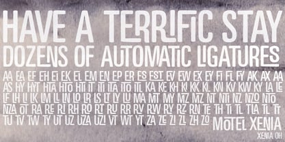 Motel Xenia is an OpenType font with dozens of automatic ligature pairs.
 - Stolzl Display by Inhouse Type,
$33.78 Stolzl Display is an original font family designed for headlines, titles and subtitles. Based on the combination of contrasting shapes, the harmony of form and rhythm is fundamental to the design. Inspired by Bauhaus, Stolzl represents, not just the significant influence of this “crucible of modernism”, but aims at capturing its original idealism, commitment to creativity and experiment driven philosophy. Details include six weights, Cyrillic, 480 characters, alternative glyphs, manually edited kerning and Opentype features. Named after Gunta Stölzl, the Bauhaus’s only female master, Stolzl Display is the first subfamily of the Stolzl font collection to be released this year.
 - Rogue Korner by Sohel Studio,
$16.00 Rogue Korner is a retro display serif font that exudes a classic charm and bold character. With its design inspired by retro styles, this font brings an elegant touch and evokes a sense of the past. Each letter is meticulously crafted with careful attention to detail and proportion, resulting in a visually appealing and unique appearance. Rogue Korner is perfect for projects that require a vintage feel, such as posters, logos, packaging, and promotional materials that aim to capture a nostalgic and sophisticated atmosphere. This font will add a special touch to your designs and captivate viewers with its retro allure and distinctiveness.
 - Janora Outline by RagamKata,
$14.00 Janora is a retro display serif font that exudes a classic charm and bold character. With its design inspired by retro styles, this font brings an elegant touch and evokes a sense of the past. Each letter is meticulously crafted with careful attention to detail and proportion, resulting in a visually appealing and unique appearance. Janora is perfect for projects that require a vintage feel, such as posters, logos, packaging, and promotional materials that aim to capture a nostalgic and sophisticated atmosphere. This font will add a special touch to your designs and captivate viewers with its retro allure and distinctiveness.
 - Beautiful Scarlet by Tropical Sunlight Co.,
$16.00 The font is called "Beautiful Scarlet", it is font duo with fashionable themes. The font comes with two pairing typefaces (script and serif). Script font contains 2 set alternates and some ligatures. The Beautiful Scarlet matches apply in some designs such as the logotype, quotes, wedding invitation, business card, packaging, branding, and more custom design. Beautiful Scarlet includes : - Uppercase, lowercase, numeral, symbol and punctuation, alternates (ss01-ss02), ligature in script font - All-caps, numeral, symbol and punctuation in serif font - Multilingual - PUA Encoded - File format in .otf If you have any questions, please contact : tropicalsunlight.co@gmail.com
 - Archimoto V01 by Owl king project,
$37.00 Archimoto V.01 Responded to the design of working drawing techniques in the world of architecture and letters on old stuff photography lens bodies, archimoto is designed with a more modern form, a little touch of detail in the corner area is so smooth that it aims to provide comfort to the eyes, by bringing 20 sizes including italic archimoto can be used more freely and can be adjusted more extensive exploration of its use. archimoto can be used as headlines and body text, the level of readability that looks comfortable makes the arrangement of letters more beautiful.
 - NS Yorkest Poster by Novi Souldado,
$25.00 Experience the around-the-world traveling vibes from the past with Yorkest Poster. It was inspired by the vintage retro national travel arts and printings from the 60s and 70s eras back in the day. Comes along with 2 styles (Serif and Script) that would never go wrong to be paired. A pack of Stylistic Alternates features to give a personal touch to your design, and also Swashes to cover your visual needs to be stronger in every appearance. Perfectly fit for logo design, headliner, signage, poster, postcard, title, postage stamp, and a lot of other printing works and stuff.
 - Moreli Display by Jinan Studio,
$19.00 Moreli Display is a wonderful typeface designed to bring a spirit of psychedelia to your projects. With mixable uppercase and lowercase glyph, ligatures, alternates, and outlines version, offers unmatched versatility for psychedelic theme design projects, apparel, branding, promotional materials, stickers, quotes, and social media posts. Let your creativity flow and embark on a captivating and transformative visual journey. Features A set of uppercase and lowercase glyphs Number, symbol, and punctuation Multilingual Support Alternates, ligatures, and swashes Outline Version Type j_1 until j_20 to features swash, ligatures will automatically replace the standard letter pairs whenever available, when using any OpenType capable software.
 - Rosegold House by Tropical Sunlight Co.,
$16.00 The font is called "Rosegold House", it is font duo with modern themes. The font comes with two pairing typefaces (script and serif). Script font contains 3 set alternates and some ligatures. And the serif font contains 1 set alternates and some ligatures. The Rosegold House matches apply in some designs such as the logotype, quotes, wedding invitation, business card, packaging, branding, and more custom design. Rosegold House includes : - Uppercase, lowercase, numeral, symbol and punctuation in script font - All-caps, numeral, symbol and punctuation in serif font - Alternates - Ligatures - Multilingual - PUA Encoded If you have any questions, please contact : tropicalsunlight.co@gmail.com
 - EmBauhaus by Emboss,
$25.00 EmBauhaus is a display typeface, geometric in style, inspired by the face named after the world changing Bauhaus School. To aid readability I rethought the original typeface and closed all of the voids cut out of the strokes. We also modified the upper case to make it a more traditional design. An example of this is the upper case L, where a 90 degree angle was added. This typeface was designed to be used judiciously in a layout, to draw focus to words and headlines, using stark angles, radii and geometry to create visual rhythm and gestalt.
 - TT Tangerine by Tropical Type,
$29.00 TT Tangerine made in 2017 has been a global hit. It's been used by the biggest performing artist in the world, luxury brands, designer packaging and more. Due to its popularity an italic style was added in Feb 2023. From the designer: I wanted to make a retro font with that 70's good vibes feel but i didn't want to just copy letters from that era. I decided to make new unique letters that had that groovy 70s feel. The bold curves pay homage to the big hair and bell-bottoms of the golden era.
 - Black Radiant by Sohel Studio,
$14.00 Black Radiant is a retro display serif font that exudes a classic charm and bold character. With its design inspired by retro styles, this font brings an elegant touch and evokes a sense of the past. Each letter is meticulously crafted with careful attention to detail and proportion, resulting in a visually appealing and unique appearance. Black Radiant is perfect for projects that require a vintage feel, such as posters, logos, packaging, and promotional materials that aim to capture a nostalgic and sophisticated atmosphere. This font will add a special touch to your designs and captivate viewers with its retro allure and distinctiveness.
 - Janice by Canada Type,
$24.95 Janice is a revival and expansion of a 1960s Mecanorma film type called Putty Bold. It’s thick, flowing, happy and oozes psychedelia. Unlike many art nouveau/hippy faces of the era, this font comes with a lowercase that expands its functionality to quite a few applications, like design aimed at kids and young adults. It’s also one of those fonts that feel right at home being warped, scaled and manually squeezed for packaging and poster design. Janice comes with over 400 glyphs. It contains a few stylistic alternates and support for the majority of Latin languages.
 - Monotype Old Style by Monotype,
$29.99 Monotype Old Style is a nineteenth century update of Caslon Old Face with characteristics of the moderns built in. Monotype Old Style was recut by Monotype in 1901 from a Stephenson Blake & Company version. The design originated at the Miller and Richard foundry in 1860. In some respects it can be seen as transitional between old style and modern, but the spirit of the old styles predominates. By the turn of the century it had become a successful rival to the moderns. The Monotype Old Style font family is an attractive design which gives a light, airy feel to text.
 - Solingen by Mysterylab,
$14.00 Solingen is an elegant display serif font well suited to logo design applications. The capital letter set features many unique double-letter pairings which serve as inspirational design features when creating posh, delicate, and luxurious logos. Suggested uses for Solingen might include high-end branding for boutique apparel, accessories, jewelry, or cosmetics; unique wedding invitation headlines; packaging for personal care items, and much more. In many applications, the ligatures feature is turned on by default as Standard Ligature alternates, but these can generally be easily overridden in the Glyphs panel when you prefer to use the standard characters instead.
 - Maron King by Storictype,
$19.00 Introducing new display typeface its called Maron King Inspired by victorian style with classic style .OpenType features some characters that allows you to mix and match pairs of letters to fit in your designs. It’s an all caps typeface, with strong and sleek letters. offering an infinite opportunity to customise and create logos, headlines, titling, product packaging, labeling, logo, classic shop, badges, movie title, t-shirt, posters, label, greetingcard, letterhead, book cover, etc. To access the alternate glyphs, you need a program that supports OpenType Features : Character Set A-Z Numerals & Punctuations (OpenType Standard) Ligatures Accents (Multilingual characters) Thanks and enjoy designing
 - Rummy Tall by Bunny Dojo,
$23.00 Rummy, the stout, scrappy font inspired by sports branding and 1940s film, has grown up and is ready to take on new responsibilities. The result: Rummy Tall. Still powerful, precise, and packed with personality, Rummy Tall's added height brings with it even more versatile charm. Track Rummy Tall tightly for a sturdy foundation, or give Rummy Tall some breathing room for an unexpected air of nobility. Reach new heights!
 - Elisabetha by Unitype Studio,
$29.00 Introducing the "Elizabeth Font" – an exquisite typographical masterpiece that gracefully bridges the realms of modernity and classic elegance. With each letter crafted as if by the stroke of a calligrapher's quill, this font exudes an air of refined sophistication that captivates the eye and enchants the mind. This font comes with a lot of language support, this font is perfect for you. Thanks for purchase and I hope you enjoy it!
 - Makeads by Sryga,
$22.00 Makeads, a typeface exuding subtle authority, brings a touch of seriousness to the creative palette. Rooted in the foundations of Bauhaus aesthetics, this font effortlessly balances boldness and sophistication. The supertight kerning and unique texture contrast strike an air of balance between formal and casual, making it an ideal choice for projects that demand a touch of gravitas. Makeads is the silent powerhouse that commands attention without raising its voice.
 - Luengo by Hashtag Type,
$25.00 Luengo is a modern geometric sans serif font family. Rounded corners give a natural and overall home-felt feel with an accessible air and an elegant touch. Luengo is for display purpose, but it also looks great in longer copy, making this family of 5 weights perfect for a range of uses such as brand identities, packaging and editorial. Luengo offers ligatures and alternatives with manual kerning and spacing.
 - Rosie Brown by Letterhend,
$17.00 Rosie Brown is a pair of font that brings the modern and casual feel in the same time. The pretty high contrast serif combined with the natural hand writing script are the perfect match for you who needs a typeface for headline, logotype, apparel, invitation, branding, packaging, advertising etc. Features : 2 fonts (serif and script font) uppercase & lowercase numbers and punctuation multilingual alternates & ligatures PUA encoded We highly recommend using a program that supports OpenType features and Glyphs panels like many of Adobe apps and Corel Draw, so you can see and access all Glyph variations.
 - Signage by Fontador,
$36.00 Signage is not made up of grid-based dots. They are optical corrected and there is always the same distance between the dots, with the aim to create more harmonic letterforms. The dots also vary gradually in size to reflect the thickening and thinning of strokes, giving the letterforms a sophisticated overall look. Signage comes up with 3 weights and 3 italics and is perfectly suited for logos, brands, magazines and special for signage systems and mobile devices. The language support includes Western, Central and Eastern European character sets, as well as Baltic and Turkish languages.
 - Sign Painter by Vintage Voyage Design Supply,
$10.00 The Sign Painter – a layered type system with a lot of decor stuff. Inspired by Victorian era signs of IX and XX century. Traditional sans with moonlike script are cool pair to give you really vintage touch, especially with Decoration, which one you find inside. Simple layered system give you easy way to get really cool result. You will get many variations of your inscription with layered system (PDF "How To Use" instruction inside). The Sign Painter script has stylistic alternate with swashes for each letter (Initial, Middle and Final) so you can have swashes for any length of your inscription.
 - Hallie Thompson by Letterhend,
$17.00 Hallie Thompson is a pair of font that brings the modern and elegant feel in the same time. The serif combined with the natural hand writing script with signature style are the perfect match for you who needs a typeface for headline, logotype, apparel, invitation, branding, packaging, advertising etc. Features : 2 fonts (serif and script font) uppercase & lowercase numbers and punctuation multilingual alternates & ligatures PUA encoded We highly recommend using a program that supports OpenType features and Glyphs panels like many of Adobe apps and Corel Draw, so you can see and access all Glyph variations.
 - Florian by Fenotype,
$35.00 Florian is an elegant Roman Display typeface with three weights. It’s great for branding, packaging or as in headlines. Florian is a classic high contrast serif with contemporary features. Florian has a clear sense of fashion and style. Florian is equipped with 150 OpenType alternates including Swash, Stylistic and Titling Alternates. Florian also has interlocking ligatures set in Discretionary Ligatures. These ligatures contain pairs in Uppercase + Uppercase and Uppercase + Lowercase. All Alternates are PUA encoded and can also be accessed from Glyph Palette or Character Map. Try combining Discretionary Ligatures with other Alternates in Caps to create striking word forms.
 - Breuer Text by TypeTrust,
$30.00 Breuer Text is a simple geometric sans with relaxed curves and slightly condensed proportions suitable for moderate lengths of body copy. The italics are optically adjusted obliques with a selection of augmented lowercase glyphs for a warmer read. Breuer Text offers the distinct aura of technical precision in a personable tone, ideal for instructional copy or safety warnings. Its basic structure and conservative letterforms maintain a level voice without turning robotic or sterile. Pair with the two-font Breuer Headline family for a simple and complete editorial type system. Breuer Text includes Small Caps, Old Style Figures and Tabular Figures.
 - Glitter Girl by Comicraft,
$19.00 Glitter Girl is a naive but romantic and flirty face with fragments of tinsel in its hair. Here's a font with a fresh attitude dressed in frilly flowing flower child fabrics sparkling with sequins. If you're looking for a light feminine aesthetic to grace your chic fashionista blog or livejournal, give it a little Glitter Girl Gossip, a safe text with long legs that will treat your thoughts with a twinkle and a touch of magic. These chic, cozy, clean, warm and fuzzy fonts are BFF -- Best Fonts for Facebook statements you want to share with your social network!
 - Fast Food by Breauhare,
$35.00 Fast Food is a font based on the former (and now revived) logo of a hamburger chain. It has that look of the 1970s & 1980s, yet also has a futuristic, alienesque, sci-fi look about it. It can be used for projects aimed at consumers waxing nostalgic for their good old days, or for movie posters or books about the great final frontier, and much more. There’s an alternate uppercase E & F, both of which are really stylin'! You may even develop such an appetite that you'll want to supersize your order! Digitized by John Bomparte.
 - Evita by ITC,
$29.99Gérard Mariscalchi is a self-made designer. Born in Southern France of a Spanish mother and an Italian father, he has worked as a mechanic, salesman, pilot, college teacher – even a poet (with poetry being the worst-paying of these professions, he reports.) “Throughout all this, the backbone of my career has always been design,” Mariscalchi says. “I’ve been drawing since I was five, but it wasn’t until I was twenty-four that I learned that my hobby could also help me earn a living.” It was about this same time that Mariscalchi fell in love with type. He studied the designs of masters like Excoffon, Usherwood and Frutiger, as well as the work of calligraphers and type designers such as Plantin, Cochin and Dürer. With such an eclectic background, it’s no surprise that Mariscalchi’s typeface designs are inspired by many sources. Baylac and Evita reflect the style of the art nouveau and art deco periods, while Marnie was created as an homage to the great Lithuanian calligrapher Villu Toots. However, the touch of French elegance and distinction Mariscalchi brings to his work is all his own. Baylac Who says thirteen is an unlucky number? Three capitals and ten lowercase letters from a poster by L. Baylac, a relatively obscure Art Nouveau designer, served as the foundation for this typeface. The finished design has lush curves that give the face drama without diminishing its versatility. On the practical side, Baylac’s condensed proportions make it perfect for those situations where there’s a lot to say and not much room in which to say it Evita Mariscalchi based the design of Evita on hand lettering he found in a restaurant menu, and considers this typeface one of his most difficult design challenges. “The main problem was to render the big weight difference between the thin and the thick strokes without creating printing problems at small point sizes,” he says. Unlike most scripts, Evita is upright, with the design characteristics of a serif typeface. Mariscalchi named the face for a close friend. The end result is a charming design that is light, airy, and slightly sassy. Marnie Based on Art Nouveau calligraphic lettering, Marnie is elegant, inviting, and absolutely charming. Mariscalchi paid special attention to letter shapes and proportions to guarantee high levels of character legibility. He also kept weight transition in character strokes to modest levels, enabling the face to be used at relatively small sizes – an unusual asset for a formal script. Marnie’s capital letters are expansive designs with flowing swash strokes that wrap affectionately around adjoining lowercase letters. The design easily captures the spontaneous qualities of hand-rendered brush lettering. - Baylac by ITC,
$29.99Gérard Mariscalchi is a self-made designer. Born in Southern France of a Spanish mother and an Italian father, he has worked as a mechanic, salesman, pilot, college teacher – even a poet (with poetry being the worst-paying of these professions, he reports.) “Throughout all this, the backbone of my career has always been design,” Mariscalchi says. “I’ve been drawing since I was five, but it wasn’t until I was twenty-four that I learned that my hobby could also help me earn a living.” It was about this same time that Mariscalchi fell in love with type. He studied the designs of masters like Excoffon, Usherwood and Frutiger, as well as the work of calligraphers and type designers such as Plantin, Cochin and Dürer. With such an eclectic background, it’s no surprise that Mariscalchi’s typeface designs are inspired by many sources. Baylac and Evita reflect the style of the art nouveau and art deco periods, while Marnie was created as an homage to the great Lithuanian calligrapher Villu Toots. However, the touch of French elegance and distinction Mariscalchi brings to his work is all his own. Baylac Who says thirteen is an unlucky number? Three capitals and ten lowercase letters from a poster by L. Baylac, a relatively obscure Art Nouveau designer, served as the foundation for this typeface. The finished design has lush curves that give the face drama without diminishing its versatility. On the practical side, Baylac’s condensed proportions make it perfect for those situations where there’s a lot to say and not much room in which to say it Evita Mariscalchi based the design of Evita on hand lettering he found in a restaurant menu, and considers this typeface one of his most difficult design challenges. “The main problem was to render the big weight difference between the thin and the thick strokes without creating printing problems at small point sizes,” he says. Unlike most scripts, Evita is upright, with the design characteristics of a serif typeface. Mariscalchi named the face for a close friend. The end result is a charming design that is light, airy, and slightly sassy. Marnie Based on Art Nouveau calligraphic lettering, Marnie is elegant, inviting, and absolutely charming. Mariscalchi paid special attention to letter shapes and proportions to guarantee high levels of character legibility. He also kept weight transition in character strokes to modest levels, enabling the face to be used at relatively small sizes – an unusual asset for a formal script. Marnie’s capital letters are expansive designs with flowing swash strokes that wrap affectionately around adjoining lowercase letters. The design easily captures the spontaneous qualities of hand-rendered brush lettering. - Marnie by ITC,
$29.99Gérard Mariscalchi is a self-made designer. Born in Southern France of a Spanish mother and an Italian father, he has worked as a mechanic, salesman, pilot, college teacher – even a poet (with poetry being the worst-paying of these professions, he reports.) “Throughout all this, the backbone of my career has always been design,” Mariscalchi says. “I’ve been drawing since I was five, but it wasn’t until I was twenty-four that I learned that my hobby could also help me earn a living.” It was about this same time that Mariscalchi fell in love with type. He studied the designs of masters like Excoffon, Usherwood and Frutiger, as well as the work of calligraphers and type designers such as Plantin, Cochin and Dürer. With such an eclectic background, it’s no surprise that Mariscalchi’s typeface designs are inspired by many sources. Baylac and Evita reflect the style of the art nouveau and art deco periods, while Marnie was created as an homage to the great Lithuanian calligrapher Villu Toots. However, the touch of French elegance and distinction Mariscalchi brings to his work is all his own. Baylac Who says thirteen is an unlucky number? Three capitals and ten lowercase letters from a poster by L. Baylac, a relatively obscure Art Nouveau designer, served as the foundation for this typeface. The finished design has lush curves that give the face drama without diminishing its versatility. On the practical side, Baylac’s condensed proportions make it perfect for those situations where there’s a lot to say and not much room in which to say it Evita Mariscalchi based the design of Evita on hand lettering he found in a restaurant menu, and considers this typeface one of his most difficult design challenges. “The main problem was to render the big weight difference between the thin and the thick strokes without creating printing problems at small point sizes,” he says. Unlike most scripts, Evita is upright, with the design characteristics of a serif typeface. Mariscalchi named the face for a close friend. The end result is a charming design that is light, airy, and slightly sassy. Marnie Based on Art Nouveau calligraphic lettering, Marnie is elegant, inviting, and absolutely charming. Mariscalchi paid special attention to letter shapes and proportions to guarantee high levels of character legibility. He also kept weight transition in character strokes to modest levels, enabling the face to be used at relatively small sizes – an unusual asset for a formal script. Marnie’s capital letters are expansive designs with flowing swash strokes that wrap affectionately around adjoining lowercase letters. The design easily captures the spontaneous qualities of hand-rendered brush lettering. - Don Sans by SIAS,
$29.90 Don Sans is a sturdy display sans which evokes the invironment of old-day industrialism, steamers, locomotives and other machinery; dusty back-yard workshops and the glamorous air of backstage life. It has been inspired by various letterings crafted by former graphic workmen who would have had an idea of simple letter construction but did not really wanted to bother with detail sophistication. Hence the result is somewhat quaint and imperfect … if that is something you are willing to enjoy. The unique charme of this typeface lies in its lack of perfection. And yet it embodies a peculiar straight-forward strength and sobriety, a visual stubbornness which is certainly not over-used! Utilize Don-Sans for stationary and ads, for crisp title settings and smart identity graphics; for menus and leaflets, business cards, cutting-edge campaign eye-catchers … whatever your imagination makes of it! Don Sans is a multilingual typeface, it supports every Euro-Latin language.
 - Rainy Candy by Illushvara,
$14.00 Hello, We are so excited to announce our new fonts "Rainy Candy" is unique display font. Use it to make your ideas even more realistic like a kids, sweet packaging, merchandise and create spectacular the Christmas designs! Features : Uppercase and lowercase Numbers Symbols Multilingual Accent What you get : Rainy Candy. OTF If you have any question, don’t hesitate to contact me. Happy Designing !!! Thank You, Bayu Suwirya
 - Magnies by Arterfak Project,
$22.00 Feel the sweetness with Magnies, a minimalist serif font with clean stencil looks. The feminine letterforms which are perfect for logotype, fashion, and display. Magnies was designed with a high contrast of the strokes and cut the thinner line to get the optical effect but still keep the legibility. Great choice with over 100+ alternates characters, that you can create many variations for your design.
