10,000 search results
(0.037 seconds)
- Norden Round by Asgeir Pedersen,
$23.99 The name Norden means “the Nordic”, as in the geographical area or its countries. Inspired by the simplicity of Nordic and Scandinavian design, the Norden fonts give you clarity of expression, beyond the usual geometric look and feel of traditional sans-serifs. Open and spacious, the shapes of the glyphs play both with and against each other. Round and soft versus square and solid, a basic curve versus a straight line, creating a detached yet distinct style of expression, from light-as-air Hairline to dark and Bold. Norden comes in three variants: Standard, Round and Display.
 - La Patio by Nasir Udin,
$16.00 Say hello to La Patio Script, a monoline script font with fun vibes to spread happiness. A perfect choice to give a holiday vibe to any products, merchandise, restaurant or cafe. La Patio comes with several alternates and swashes for you to play with. Also the underline & border features help you to give a special character to your design. It's especially created for restaurant signs with outdoor/open air concept. That's why it's called La Patio. Beside that, it's also perfect for poster, business cards, magazines, blog, book, neon signage, badges, and many more happy things!
 - Romany by Ascender,
$50.99 The Romany™ typeface family is a delightful typographic confectionary that will bring affability and charm to both print and interactive design projects. Be it an online game, digital app, hardcopy packaging, or larger than life poster, Romany will deliver. When first designed by A.R. Bosco for American Type Founders in 1934, Romany was a single weight design. Relatively popular as hand-set type, Romany was not made into digital fonts – until now. The septuagenarian design was updated, reimagined and enlarged into a small family by Terrance Weinzierl.
 - Romantic Couple by Bluestudio,
$15.00 Romantic Couple is the perfect collection of fonts for any design project that requires a light and charming feel. Use it to turn any design project into a true standout! Romantic Couple includes Multilingual support - spread your message globally AÀÁÂÃÄÅCÇDÐEÈÉÌÍÎÏIÌÍÎÏNÑOØÒÓÔÕÖUÙÜÚÛWYÝŸÆßÞþ Encoded PUA Characters Fonts are fully accessible without additional design software. Happy designing...! Thanks.
 - Roasting by Bluestudio,
$20.00 Newest product Roasting brush script font. Roasting is suitable for all your design project needs such as: logo design, branding, covers, posters, magazines, wedding invitations, greeting cards, quotes and more. What includes: Alternate, Ligature Multilingual support - spread your message globally AÀÁÂÃÄÅCÇDÐEÈÉÌÍÎÏIÌÍÎÏNÑOØÒÓÔÕÖUÙÜÚÛWYÝŸÆßÞþ Encoded PUA Characters Fonts are fully accessible without additional design software. Happy designing...! Thanks.
 - Rocker stage by Jehansyah,
$9.00 This font is very beautiful if we combine it into a design that wants to appear bold, bold and unique, there are several alternatives that you can use to make this font as support for your design project.
 - Bullhead by Gassstype,
$28.00 Here comes a New font, Bullhead is a handwritten brush that is written casually and quickly. these strong Letters are made with brushes on Procreate. Bullhead is perfect for homeware designs, branding projects, Logo design, Quotes product packaging.
 - Adhipati by Midvel,
$20.00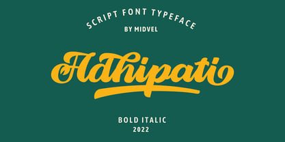 This modern script font based from brush lettering with unique flow that make outstanding. Adhipati come with 139 alternate glyphs and 10 swash glyphs. Active opentype features and try Stylistic set, ligature, swash to custom your design, with PUA included. This fonts are perfect to design such us logotype, quote, apparel design, Poster design, greeting card, invitation design and other design that you need.
 - Mantika Sans Paneuropean by Linotype,
$67.99With its well-defined characters that are readily legible even in the small font sizes, Mantika Sans by Jürgen Weltin is ideal for typesetting. The elaborately designed and highly individual set of italics enhances the attractiveness of the font.Jürgen Weltin developed the Mantika™ Sans sans serif font using older designs for an serif font as his inspiration. Nothing more than the merest suggestion of the original serifs has survived. Bevelled line endings and the slight variation in thickness of verticals, in particular, provide Mantika Sans with a very dynamic character that evokes manuscript. Short ascenders and descenders give the font a compact appearance that is also underscored by its condensed proportions. Weltin has achieved his aim of producing a typeface with excellent legibility even in small sizes not just by means of the x-height, which is tall in comparison with the capital letters, but also by using clearly defined and well differentiated designs for critical letters, such as i", "I" and "l". Lower case "i", for example, has a serif while the "l" has a curved base.In addition to uppercase numerals, Mantika Sans also has lowercase or old style numerals that have been designed so that they can be used in both tabular and proportional settings. The uppercase numerals are slightly shorter than the uppercase letters, ensuring that the latter can be sympathetically incorporated within continuous text.The Mantika Sans italics are very unusual. They are inclined at only 4.5° (the usual angle for italics is 10 - 12°) and so appear to be almost upright. In addition, they also have quite distinctive forms. The overall effect calls attention to their curvilinear, manuscript character, enhances contrasts and further emphasizes the terminals. Weltin explains: "Within the variety of forms of the italics there are many contrasting terminal elements that create dynamism. The result is a diversity of interaction between the rounded and angular forms". Mantika Sans Italic thus has all the features of a display typeface, but can also be happily used on its own to set longer text passages. Mantika Sans is available in two weights; Regular and Bold, both of which have corresponding italics sets. Mantika Sans has been designed so that the widths of the four related cuts are identical, meaning that a change of font within a single layout will have no effect on justification. In addition, the members of the Mantika Informal font family, designed by Jürgen Weltin in 2010, also have the same thickness. Other font families having weights with equal thickness can be found in the "Linotype Office Alliance series".The Mantika Sans character sets are paneuropean. There are characters for setting texts in Eastern European languages, Greek and Cyrillic. There is also a range of special symbols, including right-angled brackets, subscript and superscript lower case letters, together with numerals, arrows and many different bullet points.As a vibrant and highly legible text font, Mantika Sans has a broad spectrum of potential applications. Its unusual italics are not just perfect for use in display text. The fact that it has only four cuts means that Mantika Sans is particularly suitable for office use or for the setting of business reports. Its excellent legibility even in the small font sizes also makes it ideal as a text for electronic reading devices; this also applies to Mantika Informal.At the 3rd International Eastern Type Design Competition Granshan 2010, Mantika Sans was awarded in the category Greek text typefaces." - Mantika Sans by Linotype,
$50.99 With its well-defined characters that are readily legible even in the small font sizes, Mantika Sans by Jürgen Weltin is ideal for typesetting. The elaborately designed and highly individual set of italics enhances the attractiveness of the font.Jürgen Weltin developed the Mantika™ Sans sans serif font using older designs for an serif font as his inspiration. Nothing more than the merest suggestion of the original serifs has survived. Bevelled line endings and the slight variation in thickness of verticals, in particular, provide Mantika Sans with a very dynamic character that evokes manuscript. Short ascenders and descenders give the font a compact appearance that is also underscored by its condensed proportions. Weltin has achieved his aim of producing a typeface with excellent legibility even in small sizes not just by means of the x-height, which is tall in comparison with the capital letters, but also by using clearly defined and well differentiated designs for critical letters, such as i", "I" and "l". Lower case "i", for example, has a serif while the "l" has a curved base.In addition to uppercase numerals, Mantika Sans also has lowercase or old style numerals that have been designed so that they can be used in both tabular and proportional settings. The uppercase numerals are slightly shorter than the uppercase letters, ensuring that the latter can be sympathetically incorporated within continuous text.The Mantika Sans italics are very unusual. They are inclined at only 4.5° (the usual angle for italics is 10 - 12°) and so appear to be almost upright. In addition, they also have quite distinctive forms. The overall effect calls attention to their curvilinear, manuscript character, enhances contrasts and further emphasizes the terminals. Weltin explains: "Within the variety of forms of the italics there are many contrasting terminal elements that create dynamism. The result is a diversity of interaction between the rounded and angular forms". Mantika Sans Italic thus has all the features of a display typeface, but can also be happily used on its own to set longer text passages. Mantika Sans is available in two weights; Regular and Bold, both of which have corresponding italics sets. Mantika Sans has been designed so that the widths of the four related cuts are identical, meaning that a change of font within a single layout will have no effect on justification. In addition, the members of the Mantika Informal font family, designed by Jürgen Weltin in 2010, also have the same thickness. Other font families having weights with equal thickness can be found in the "Linotype Office Alliance series".The Mantika Sans character sets are paneuropean. There are characters for setting texts in Eastern European languages, Greek and Cyrillic. There is also a range of special symbols, including right-angled brackets, subscript and superscript lower case letters, together with numerals, arrows and many different bullet points.As a vibrant and highly legible text font, Mantika Sans has a broad spectrum of potential applications. Its unusual italics are not just perfect for use in display text. The fact that it has only four cuts means that Mantika Sans is particularly suitable for office use or for the setting of business reports. Its excellent legibility even in the small font sizes also makes it ideal as a text for electronic reading devices; this also applies to Mantika Informal.At the 3rd International Eastern Type Design Competition Granshan 2010, Mantika Sans was awarded in the category Greek text typefaces."
 - Phanter Black by Sipanji21,
$21.00 "Phanter Black" is a display font with a modern, space, and futuristic theme. This font reflects elements of technology, strength, and a futuristic aesthetic often associated with modern design. The space theme adds an element of exploration and the unknown in the universe to your design. "Phanter Black" is well-suited for various design projects that aim to emphasize these aspects, including space-related designs, advanced technology, advertisements for futuristic products, and more. With "Phanter Black," you can create designs that convey durability, strength, and a bold vision of the future, while infusing a futuristic touch into your projects.
 - Iron Metals by Sipanji21,
$20.00 "Iron Metal" is a display font with a modern, space, and futuristic theme. This font reflects elements of technology, strength, and resilience often associated with modern and futuristic designs. The use of a space theme can also add elements of exploration and the wonders of the universe to your design. "Iron Metal" is highly suitable for design projects that aim to emphasize these aspects, including space-themed designs, cutting-edge technology, advertisements for futuristic products, and much more. With "Iron Metal," you can create designs that convey durability, strength, and a challenging vision of the future.
 - Spring Fashion JNL by Jeff Levine,
$29.00Spring Fashion JNL was modeled after an example of hand lettering from an old book displayed on an online auction. Rendered in lower case only with basic punctuation, this type design was made specifically for headlines. Its light, airy personality adds charm to simple ad copy or titles. - Arco Dot by Okaycat,
$29.95 The Arco Dot font features an exciting texture of dots in matching complimentary styles, making cool designs easy! Arco Dot features extended characters, and contains West European diacritics & ligatures. Highly suitable for international environments & publications. Arco Dot pairs well with Arco Web and Arco Crayon from Okaycat fonts.
 - ITC Leawood by ITC,
$29.99 ITC Leawood was begun by designer Les Usherwood and finished by his talented staff at Typsettra in Toronto, Canada, after his untimely death. A similar calligraphic series to ITC Usherwood, following alternative options, the typeface features small, well-defined serifs which aid legibility and allow for close spacing.
 - Black Dolphin by Mr. Typeman,
$14.00 Introducing the new and tasteful Black Dolphin Multilingual Font Duo. Black Dolphin is a stunning pair of luxury signature script and a hand-drawn brush font, designed to contrast and complement each other with elegant beauty and contemporary style, making it an excellent fit for projects of all types.
 - Rabenk by Sealoung,
$20.00 Rabenk is a fun quirky look serif. With a modern look, it looks perfect when paired with conventional serif/sans serifs. It can be used for mastheads, posters, business identities and just about anything. Use this font to beautify your designs and make your work look more beautiful.
 - Umoya by Scholtz Fonts,
$19.00 Umoya is a modern and fluid African font. Its name means 'spirit' in the Zulu language and it is also the word used for 'air'. It is best used for an ethereal, magical look with tribal undertones. The font is fully professional: carefully letterspaced and kerned.
 - Milky Line by Sakha Design,
$12.00 Milky Line is a modern and elegant display font! Each letter is thoughtfully crafted with clean lines and stylish details, resulting in a sophisticated and refined look. Perfect for creating eye-catching headlines, titles, and branding materials that exude an air of professionalism and high-end quality.
 - JulianaJoy by Lebbad Design,
$24.95 JulianaJoy is a condensed elegant sharp serif typeface for headline display and text use. Several alternate characters are included with this original font design.
 - Fleuron Labels by Wiescher Design,
$39.50Fleurons are embellishments and here is my seventh set. This time I give you all kind of different labels. Your labeled designer Gert Wiescher - Hello Headline by DearType,
$29.00 Hello Headline is a bold and friendly typeface designed specifically (believe it or not) for headlines. All of the letters are chunky and rounded, which is probably the reason why they are visible from afar. And I mean, really, really afar. The overall feel of the typeface is meant to be very casual and affable, so it is great for businesses that are fun, outgoing and sincere.
 - ParaCaps by Paragraph,
$12.00 This decorative, headline or logotype geometric font consists entirely of uppercase letters. The glyphs of uppercase are rounder than their lowercase counterparts, allowing playful interaction within words, contrasting round and square shapes. The font is an extension of the Paragraph fonts family, however the capitals of ParaCap and lower case glyphs of Paragraph are not designed to be used together. That said, you are welcome to try :)
 - Hoofer by Scholtz Fonts,
$15.00 Light and flexible, slightly retro, casual and readable, Hoofer combines 28 brush script, mono line script and sans-serif styles with ornaments into one Mega-Family. The different styles of the Hoofer Mega-family have been chosen to work together and to harmonize in a pleasing way. The Hoofer Mega-Family of fonts can be divided into three sub-families: Hoofer BRUSH subfamily: An eclectic group of five fonts. These are mainly joined scripts. Hoofer LINE subfamily: Seven mono-line scripts with joined letters in a number of weights, widths and styles. Hoofer SANS subfamily: Sixteen casual, Sans-Serif fonts. They are very readable and in a variety of weights & styles The mood of the Hoofer mega-family is light and flexible, slightly retro, casual and readable. It combines script and many sans-serif styles with ornaments into one Mega-Family. The different styles of the Hoofer Mega-family have been chosen to work together and to harmonize in a pleasing way. The Brush Sub-Family is designed for titling, packaging and display purposes, The Line Sub-Family can also be used for titling, packaging and display, however, it is less “showy”, and conveys an air of informality. The Sans Sub-Family is designed to shine as sub-heads and as body text. The wide range of Hoofline styles gives you, the designer, great flexibility in creating just the mood or impression that you want. Most of the fonts can use one or more OpenType Features. These can be accessed in a number of ways. The reason for this is that the major software producers provide different (and often conflicting) ways of accessing OpenType Features. In some cases such software manufacturers provide NO way of accessing certain OpenType Features. We have tried to remedy this by providing a highly flexible family of fonts. OPENTYPE (these OpenType features are only available in the “otf” fonts and not in the “ttf” fonts.) OpenType features that Hoofer makes use of are: Swashes (Word-Begin and Word-End Features); Alternate Numerals; and True Small Caps. ORNAMENTS In addition the Hoofer family has a font containing 94 ornaments. ALTERNATE NUMERALS You can access two sets of figures (numbers) in Hoofer Sans fonts. Both sets are tabular and lining but they differ in the height (but not the width) of the figures. The height of the alternate figures has been chosen so that they are compatible with the small caps. However, these alternate figures are available in ALL Hoofer Sans fonts, whether they feature small cap fonts or not. Hoofer has all the features usually included in a fully professional font. Language support includes all European character sets, Greek symbols and all punctuation. Opentype features include automatic replacement of some characters and discretionary replacement of stylistic alternatives.
 - Fox Chicken by Fox7,
$12.00 Fox Chicken Font is a lively and playful display font that is perfect for adding a touch of fun and cheer to any design project. Designed with a focus on creativity and originality, this font features bold and expressive characters that are guaranteed to make your designs stand out.
 - The Wave by Bluestudio,
$15.00 Introducing our latest product The Wave. The Wave fits all the needs of design projects for clothing, t-shirts, branding, quotes, covers, magazine, posters, books and others. What's included? Multilingual support - spread your message globally AÀÁÂÃÄÅCÇDÐEÈÉÌÍÎÏIÌÍÎÏNÑOØÒÓÔÕÖUÙÜÚÛWYÝŸÆßÞþ Encoded PUA CharactersFonts are fully accessible without additional design software . Happy designing!
 - M Ying Hei HK by Monotype HK,
$523.99 M Ying Hei™ is designed by type designer Kenneth Kwok and Robin Hui. Unnecessary details have been eliminated to pursue a minimal form. The structure of characters are well balanced, neat and dignified. Different components of a character are cooperating perfectly in an appropriate proportion. Thickness of strokes are modified according to the number of strokes, thus achieving an even texture throughout the paragraphs. Therefore a perfect choice for prints, user interface and signages. M Ying Hei™ is equipped with 7 weights, which is sufficient for various occasions like matching with different Latin typefaces and handling complex information hierarchy.
 - Day And Collins Logotypes by Jeremia Adatte,
$20.00 Please Note: as this is a picture-only font, there are no latin alpha/numeric glyphs. Each wood type manufacturer had their own selection of original Logotypes or Catchwords designs. These are taken right from the original source material, an extremely rare 1910 catalog of an English wood type maker called Day & Collins in London. As the name says it, these words are intended to attract attention, to spice up posters, packaging or advertisement designs. I made these available for the digital age, leaving the original texture of printed wood type at the highest detail possible.
 - Etoxina by FSdesign-Salmina,
$39.00 Etoxina is designed especially for the burgeoning market of starships and other space cruisers. Etoxina has been developed with the contribution of experts in navigation through space and time. The fonts are ideal for internal and external use (including zero-g and occasional bursts of cosmic rays), and with their simplified forms are expected to survive well in non-linear galaxies. With their unusual diagonal half-pixels the fonts are striking as abstract designs at astronomical sizes, where small text may be placed within the black holes formed inside the letters. On explicit suggestion of Mr. Spock true capital letters have been added.
 - Itoxina by FSdesign-Salmina,
$39.00 Itoxina is designed especially for the burgeoning market of starships and other space cruisers. Itoxina has been developed with the contribution of experts in navigation through space and time. The fonts are ideal for internal and external use (including zero-g and occasional bursts of cosmic rays), and with their simplified forms are expected to survive well in non-linear galaxies. With their unusual diagonal half-pixels the fonts are striking as abstract designs at astronomical sizes, where small text may be placed within the black holes formed inside the letters. On explicit suggestion of Mr. Spock true capital letters have been added.
 - Qukiha by Twinletter,
$15.00 Looking for the perfect font for your next gothic project? Do not look elsewhere than QUKIHA! A great place to look for fonts for your most recent logo, label, badge, music video, or movie is the QUKIHA Blackletter font. You can select the ideal word for your project by choosing from the beautiful and harmonious shapes available in the QUKIHA font. The capital letters are impressive, and the letters are slick and fashionable. QUKIHA Blackletter is a necessity if you’re designing labels, posters, or other things. They are also of a professional caliber, making them ideal for any design task.
 - M Ying Hei PRC by Monotype HK,
$523.99 M Ying Hei™ is designed by type designer Kenneth Kwok and Robin Hui. Unnecessary details have been eliminated to pursue a minimal form. The structure of characters are well balanced, neat and dignified. Different components of a character are cooperating perfectly in an appropriate proportion. Thickness of strokes are modified according to the number of strokes, thus achieving an even texture throughout the paragraphs. Therefore a perfect choice for prints, user interface and signages. M Ying Hei™ is equipped with 7 weights, which is sufficient for various occasions like matching with different Latin typefaces and handling complex information hierarchy.
 - M Young Hei PRC by Monotype HK,
$523.99 M Ying Hei™ is designed by type designer Kenneth Kwok and Robin Hui. Unnecessary details have been eliminated to pursue a minimal form. The structure of characters are well balanced, neat and dignified. Different components of a character are cooperating perfectly in an appropriate proportion. Thickness of strokes are modified according to the number of strokes, thus achieving an even texture throughout the paragraphs. Therefore a perfect choice for prints, user interface and signages. M Ying Hei™ is equipped with 7 weights, which is sufficient for various occasions like matching with different Latin typefaces and handling complex information hierarchy.
 - Fd Forever Young by Fortunes Co,
$12.00 Forever Young is A disco 70s retro font is a typeface that captures the bold, flashy, and vibrant style of the disco era, which was popular in the 1970s. These fonts are characterized by their unique design elements that reflect the disco culture. with funky shapes Disco fonts often feature unconventional and geometric shapes, such as curves, swirls, and exaggerated serifs. Retro fonts are widely used in various design projects, branding, posters, and packaging to create a sense of nostalgia or capture the essence of a particular era. They are versatile and can be customized to fit a wide range of creative applications.
 - Linotype Not Painted by Linotype,
$29.99Linotype Not Painted is part of the Take Type Library, chosen from the contestants of Linotype’s International Digital Type Design Contests of 1994 and 1997. This fun font from German designer Robert Bucan grabs attention immediately. The forms are made up of multiple layers. The upper case’ alphabet forms, numerals and punctuation are two different styles of the same character, one over the other, and the lower case’ letters are composed of the lower case and upper case of the same letter superimposed. Linotype Not Painted is particularly good as a headline font in larger point sizes. - Armature Neue Sans by fontBoy,
$15.00 Armature Neue Sans is an extension of the original Armature Neue family released in 2010. Like Armature Neue, Armature Neue Sans consists of six weights with accompanying italics. Armature is one result of my interest in typefaces that are constructed, rather than drawn. Although it is basically a monoline design, there are subtle details throughout that compensate for a monoline’s evenness. As with all fontBoy fonts, there are dingbats hidden away in the dark recesses of the keyboard. When I first started designing this face in 1992, I called it Dino - I thought I would name all my fonts after famous pets, so the dingbats for Armature are dinosaurs. To access the alternate characters (closed counter B and R, and others) use Stylistic Set 1 or the glyphs palette in your OpenType-enabled application. Designed by Bob Aufuldish with editing and production by Psy/Ops.
 - Romans Lovers by Alit Design,
$12.00 Introducing Roman Lover Elegant typeface + Bonus Boho Illustrations The Roman Lover Serif typeface is an elegantly themed font that has a dynamic serif style. The details of the shape of the "Roman Lover Serif Elegant typeface" are very smooth and flow to create unique and beautiful curves. Elegant Serif typefaces such as “Roman Lover Serif Elegant typeface” are very easy to apply to any design, especially those with an elegant and smooth concept, besides that this font is very easy to use both in design and non-design programs because everything changes and glyphs are supported by Unicode (PUA). The Roman Lover Serif Elegant typeface contains 573 glyphs with many unique and interesting alternative options. Plus, there's a cool serif font family for header and description text from Thin to Heavy. In the poster preview all the letters are in the Roman Lover Serif Elegant typeface.
 - Diane Script by GroupType,
$27.00 In 1995, FontHaus came upon a rare opportunity to create a revival of Aries, a little known and previously unavailable typeface by the legendary Eric Gill. Discovering a lost typeface by one of the major designers of the 20th Century, was the discovery of a buried treasure, and being the first type company to release it was an honor. Thirteen years later, FontHaus came across another little known typeface treasure: Diane. Designed by the legendary French designer Roger Excoffon in 1956, this remarkable script has never been faithfully recreated until now. In close collaboration with Mark Simonson, FontHaus and Mr. Simonson painstakingly researched rare type books, publications, European metal type services, and period showings from the United States, England, Germany and from the University of Groningen in the Netherlands. Finding full specimens of the font turned out to be quite a challenge. In most cases, only the caps and lowercase were shown. Furthermore, the more we researched Diane, many curious facts came to light. The caps in earlier specimens of Diane are completely different from specimens published later, suggesting that the face was redesigned at some point, perhaps in the mid-1960s. So we are left with two different sets of caps. The original had very elaborate, swirly strokes, very characteristic of Excoffon¹s gestural designs for posters and logos. Later on, these appear to have been replaced by a set of simpler, more traditional script caps. The original caps are criticized in one source Mark found (Practical Handbook on Display Typefaces, 1959) as being "exquisite" but "not highly legible". Perhaps this is what led to the simpler caps being introduced. Nevertheless, FontHaus's release includes not only both sets of caps, but a range of alternates and a number of new characters not originally available such as the Euro, and a magnificent alternate Ampersand to name a few.
 - Avenir Next Cyrillic by Linotype,
$49.00 The original Avenir typeface was designed by Adrian Frutiger in 1988, after years of having an interest in sans serif typefaces. The word Avenir means “future” in French and hints that the typeface owes some of its interpretation to Futura. But unlike Futura, Avenir is not purely geometric; it has vertical strokes that are thicker than the horizontals, an “o” that is not a perfect circle, and shortened ascenders. These nuances aid in legibility and give Avenir a harmonious and sensible appearance for both texts and headlines. In 2012, Akira Kobayashi worked alongside Avenir’s esteemed creator Adrian Frutiger to bring Avenir Next to life, as a new take on the classic Avenir. The goal of the project was to take a beautifully designed sans and update it so that its technical standards surpass the status quo, leaving us with a truly superior sans family. Since then, Monotype expanded the typeface to accommodate more languages. Akira’s deep familiarity with existing iterations of the Frutiger designs, along with his understanding of the design philosophy of the man himself, made him uniquely suited to lead the creation of different language fonts. Avenir Next World family, the most recent release from Monotype, is an expansive family of fonts that offers support for more than 150 languages and scripts that include Latin, Cyrillic, Greek, Hebrew, Arabic, Georgian, Armenian and Thai. Avenir Next World contains 10 weights, from UltraLight to Heavy. The respective 10 Italic styles do not support Arabic, Georgian and Thai, since Italic styles are unfamiliar in these scripts/languages. Separate Non-Latin products to support just the Arabic, Cyrillic, Georgian, Hebrew and Thai script are also available for those who do not need the full language support.
 - Avenir Next World by Linotype,
$149.00 The original Avenir typeface was designed by Adrian Frutiger in 1988, after years of having an interest in sans serif typefaces. The word Avenir means “future” in French and hints that the typeface owes some of its interpretation to Futura. But unlike Futura, Avenir is not purely geometric; it has vertical strokes that are thicker than the horizontals, an “o” that is not a perfect circle, and shortened ascenders. These nuances aid in legibility and give Avenir a harmonious and sensible appearance for both texts and headlines. In 2012, Akira Kobayashi worked alongside Avenir’s esteemed creator Adrian Frutiger to bring Avenir Next to life, as a new take on the classic Avenir. The goal of the project was to take a beautifully designed sans and update it so that its technical standards surpass the status quo, leaving us with a truly superior sans family. Since then, Monotype expanded the typeface to accommodate more languages. Akira’s deep familiarity with existing iterations of the Frutiger designs, along with his understanding of the design philosophy of the man himself, made him uniquely suited to lead the creation of different language fonts. Avenir Next World family, the most recent release from Monotype, is an expansive family of fonts that offers support for more than 150 languages and scripts that include Latin, Cyrillic, Greek, Hebrew, Arabic, Georgian, Armenian and Thai. Avenir Next World contains 10 weights, from UltraLight to Heavy. The respective 10 Italic styles do not support Arabic, Georgian and Thai, since Italic styles are unfamiliar in these scripts/languages. Separate Non-Latin products to support just the Arabic, Cyrillic, Georgian, Hebrew and Thai script are also available for those who do not need the full language support.