10,000 search results
(0.105 seconds)
- BD Gitalona by Balibilly Design,
$22.00 We introduce our high-complex typeface. A wide range of serifs for text and display titles are divided into one prominent sub-family and four display sub-families. Comes shifted from serif to sans serif to fulfilling the completeness of this font family that we named BD Gitalona. In addition to these massive things, this font family is filled with an explorative and experimental decorative version that we present separately. Figure out the decorative version BD Gitalona Moxa to make the aesthetic appeal of this whole typeface! Inspiration The world of entertainment moves non-stop. One by one, figures appeared and left. We expect to create something to entertain previous trends with packaging more relevant to the present. More specifically, we admire and are inspired by some of the world's leading and top singers with a segmented nature. We imagine so many figures that can affect every viewer. However, each artist or singer has a segment because almost all of them have characteristics. The Design The basic design of this typeface begins with a transitional serif shape with sharp, shapeless corners. Then in the middle of the invention, there was an opportunity to explore it further from the readability side by adding an optical variable that can adjust the serif thickness when used together between large, medium to paragraph text sizes for editorials. The shift from serif to sans-serif with the contrast initiated by the shift of the serif family form as a different variable also makes this font richer in terms of the features it contains. Parts are expected to add to the user satisfaction with the complexity of this font. The Features BD Gitalona consists of one sub-family intended for body text with nine weights from Thin(100) to Black(900) and four other display sub-families such as Display serif, Flick, Harmony Sans and Contrast Sans. Each consists of four weights Thin(100), Regular Weight(400), Bold(700), and Black(900). And again, there are also retailed separately; the BD Gitalona Variable font, which is designed to accommodate all Subfamily in 1 font file, and BD Gitalona Moxa, an experimental typeface. A total of 700+ glyphs in each style. Advanced OpenType features functionally and aesthetically, such as Case-sensitive forms, small caps, standard and discretionary ligatures, stylistic alternates, ordinals, fractions, numerator, denominator, superscript, subscript, circled number, slashed zero, old-style figure, tabular and lining figure. Supports multi-languages including Western Europe, Central Europe, Southeast Europe, South America, and Oceania.
 - Mrs Eaves XL Serif by Emigre,
$59.00 Originally designed in 1996, Mrs Eaves was Zuzana Licko’s first attempt at the design of a traditional typeface. It was styled after Baskerville, the famous transitional serif typeface designed in 1757 by John Baskerville in Birmingham, England. Mrs Eaves was named after Baskerville’s live in housekeeper, Sarah Eaves, whom he later married. One of Baskerville’s intents was to develop typefaces that pushed the contrast between thick and thin strokes, partially to show off the new printing and paper making techniques of his time. As a result his types were often criticized for being too perfect, stark, and difficult to read. Licko noticed that subsequent interpretations and revivals of Baskerville had continued along the same path of perfection, using as a model the qualities of the lead type itself, not the printed specimens. Upon studying books printed by Baskerville at the Bancroft Library in Berkeley, Licko decided to base her design on the printed samples which were heavier and had more character due to the imprint of lead type into paper and the resulting ink spread. She reduced the contrast while retaining the overall openness and lightness of Baskerville by giving the lower case characters a wider proportion. She then reduced the x-height relative to the cap height to avoid increasing the set width. There is something unique about Mrs Eaves and it’s difficult to define. Its individual characters are at times awkward looking—the W being narrow, the L uncommonly wide, the flare of the strokes leading into the serifs unusually pronounced. Taken individually, at first sight some of the characters don’t seem to fit together. The spacing is generally too loose for large bodies of text, it sort of rambles along. Yet when used in the right circumstance it imparts a very particular feel that sets it clearly apart from many likeminded types. It has an undefined quality that resonates with people. This paradox (imperfect yet pleasing) is perhaps best illustrated by design critic and historian Robin Kinross who has pointed out the limitation of the “loose” spacing that Licko employed, among other things, yet simultaneously designated the Mrs Eaves type specimen with an honorable mention in the 1999 American Center for Design competition. Proof, perhaps, that type is best judged in the context of its usage. Even with all its shortcomings, Mrs Eaves has outsold all Emigre fonts by twofold. On MyFonts, one of the largest on-line type sellers, Mrs Eaves has been among the 20 best selling types for years, listed among such classics as Helvetica, Univers, Bodoni and Franklin Gothic. Due to its commercial and popular success it has come to define the Emigre type foundry. While Licko initially set out to design a traditional text face, we never specified how Mrs Eaves could be best used. Typefaces will find their own way. But if there’s one particular common usage that stands out, it must be literary—Mrs Eaves loves to adorn book covers and relishes short blurbs on the flaps and backs of dust covers. Trips to bookstores are always a treat for us as we find our Mrs Eaves staring out at us from dozens of book covers in the most elegant compositions, each time surprising us with her many talents. And Mrs Eaves feels just as comfortable in a wide variety of other locales such as CD covers (Radiohead’s Hail to the Thief being our favorite), restaurant menus, logos, and poetry books, where it gives elegant presence to short texts. One area where Mrs Eaves seems less comfortable is in the setting of long texts, particularly in environments such as the interiors of books, magazines, and newspapers. It seems to handle long texts well only if there is ample space. A good example is the book /CD/DVD release The Band: A Musical History published by Capitol Records. Here, Mrs Eaves was given appropriate set width and generous line spacing. In such cases its wide proportions provide a luxurious feel which invites reading. Economy of space was not one of the goals behind the original Mrs Eaves design. With the introduction of Mrs Eaves XL, Licko addresses this issue. Since Mrs Eaves is one of our most popular typefaces, it’s not surprising that over the years we've received many suggestions for additions to the family. The predominant top three wishes are: greater space economy; the addition of a bold italic style; and the desire to pair it with a sans design. The XL series answers these requests with a comprehensive set of new fonts including a narrow, and a companion series of Mrs Eaves Sans styles to be released soon. The main distinguishing features of Mrs Eaves XL are its larger x-height with shorter ascenders and descenders and overall tighter spacing. These additional fonts expand the Mrs Eaves family for a larger variety of uses, specifically those requiring space economy. The larger x-height also allows a smaller point size to be used while maintaining readability. Mrs Eaves XL also has a narrow counterpart to the regular, with a set width of about 92 percent which fulfills even more compact uses. At first, this may not seem particularly narrow, but the goal was to provide an alternative to the regular that would work well as a compact text face while maintaining the full characteristics of the regular, rather than an extreme narrow which would be more suitable for headline use. Four years in the making, we're excited to finally let Mrs Eaves XL find its way into the world and see where and how it will pop up next.
 - Canne - Unknown license

- Slide - Unknown license

- LDJ Squirrel Tracks by Illustration Ink,
$3.00If squirrels could write, chances are they would love to use this perky new font from Jillustration. - Embossed by Gerald Gallo,
$20.00 Embossed is a family of fonts whose characters are composed of squares that appear to be embossed.
 - Monoron Sans by Fontron,
$30.00MonoronSans is the first family of fonts produced by Fontron. The weights are lighter than conventional fonts. - Banjo by Funk King,
$5.00 Banjo and Woodcut Banjo are whimsical fonts with a hand-crafted feel. Woodcut is the “underlined” version.
 - Angulatte by Gerald Gallo,
$20.00 Angulatte is a sans serif font made up of characters that are drawn with only straight lines.
 - Began by Atlantic Fonts,
$26.00 Began is square and round, athletic and unapologetic. It may be just what you are looking for.
 - Fat Face No. 20 by Solotype,
$19.95This is almost a necessity if you are doing reproductions of mid-19th century posters and playbills. - PMN Caecilia eText by Monotype,
$29.99PMN Caecilia™ is the premiere work of the Dutch designer Peter Matthias Noordzij. He made the first sketches for this slab serif design in 1983 during his third year of study in The Hague, and the full font family was released by Linotype in 1990. The PMN prefix represents the designer's initials, and Caecilia is his wife's name. This font has subtle variations of stroke thickness, a tall x-height, open counters, and vivacious true italics. Noordzij combined classical ductus with his own contemporary expression to create a friendly and versatile slab serif family. With numerous weights from light to heavy, and styles including small caps, Old style figures, and Central European characters, PMN Caecilia has all the elements necessary for rich typographic expression. eText fonts - the optimum of on-screen text quality With our new eText fonts that have been optimised for on-screen use, you can ensure that your texts remain readily legible when displayed on smartphones, tablets or e-readers. The poor resolution of many digital display systems represents a major challenge when it comes to presenting text. It is necessary to make considerable compromises, particularly in the case of text in smaller point sizes, in order to adapt characters designed in detail using vector graphics to the relatively crude pixel grid. So-called 'font hinting' can help with this process. This, for example, provides the system with information on which lines are to be displayed in a particular thickness, i.e. using a specific number of pixels. As font hinting is a largely manual and thus very complex technique, many typefaces come with only the most necessary information. What is unimportant for a text printed in high resolution can result in a poor quality image when the same text is displayed on a screen, so that reading it rapidly becomes a demanding activity. Specially optimised eText fonts can help overcome this problem. An extremely refined and elaborate font hinting system makes sure that these fonts are optimally displayed on screens. Monotype has not only adopted font hinting for this purpose but has also thoroughly reworked the fonts to hone them for display in low resolution environments. For example, the open counters present in the letters C, c, e, S, s, g etc. have been slightly expanded so that these retain their character even in small point sizes. Also with a view to enhancing appearance in smaller point sizes, line thickness has been discreetly increased and x-height carefully adjusted. Kerning has also been modified. Don't leave the on-screen appearance of your creations to chance. Play it safe and use eText fonts to achieve perfect results on modern display devices. Many typefaces, including many popular classics, are already available as eText fonts and new ones are continually being published. The eText font you can purchase here are available for use as Desktop Fonts or Web Fonts. Should they be used in Mobile Devices such as smartphones, tablets or eReaders, please contact our OEM specialists at sales-eu@monotype.com. - JP MultiColour by jpFonts,
$29.90 Multicolored Fonts Many years ago, when Xerox Corporation still had its own font department, I came to Los Angeles in 1985 to train the IKARUS program. One day Bill Kienzel, head of the Xerox font department at the time, said we should go to the Hollywood Hills together; he knew people there who were experimenting with multicolored fonts. After a little wandering through the winding streets of the many hills, we reached a somewhat overgrown, simple family house standing under trees. A group of very inspired designers were waiting for us there. They immediately showed us the works they created using photomechanical tricks. They were fascinating. The American colors and the whole look seemed noble and enchanting. The problem was that this process was very difficult to implement and required a lot of effort on individual letters. They dreamed of a colored font that could be used for normal typesetting. We thought back and forth about how to save the individually colored letters in a common font, but soon gave up because we didn't see a technical option. So this idea and the memory of the time in Hollywood lay dormant in the back of my mind for many years, until at the beginning of this year 2023 I received an order to produce an outline typeface and the story came back to me. Suddenly I knew how to solve the problem from back then: if only the areas that should have the same color in all letters were saved in their own separate fonts, they could be colored independently of each other and later placed on top of each other. I implemented this in the 5 fonts that are now available with the 3 variants “Outside”, “Middle” and “Inside”. Together with the background, 4 colors can be combined with each other. This method works in text programs such as Word or InDesign. In Photoshop or Illustrator, the individual surfaces can also be colored by converting them into paths if the additional “Complete” variants (which contain all 3 contours) are used. There is also a “Basic” variant that can be used to achieve special effects such as overlay, bleed, etc. The first 5 fonts in this series are all based on the principle of contouring. Anyone who claims that you don't need any special fonts because they can be created automatically from any font using common programs is wrong or is only telling only half the truth. Anyone who has ever dealt with this knows that many individual adjustments to the design are necessary after contouring. This has happened in the 5 fonts that are now available and have very different styles. The dream from back then has come true. The user can set any text, long or short, in multiple colors, freely design the color scheme and apply all the usual typographic settings. Volker Schnebel, November 2023
 - Barokah by Alifinart Studio,
$14.00 Do you want to create a design with a luxurious and casual style? Barokah Serif Font is the best choice. This is a modern display font has a lot of ligature for uppercase and lowercase. This serif font are perfect for luxury projects and will keep your creativity flowing. Typeface Story In 2021, we released Barokah Script and at that time a lot of people loved it. However, we feel that Barokah Script should be combined with a serif font with a luxurious and casual style, so that it will become a popular for everyone. That's why, today—after 1 year—we are releasing Barokah Serif, as the best match for Barokah Script. Why Barokah Serif Font? Barokah Serif is a font with a myriad of ligatures, both uppercase and lowercase. In this font, there are Stylistic Alternates for each capital letter with an authentic and elegant design. In the lowercase letters you will find an amazing variety of ligatures and in a luxurious style. This will make each of your designs look elegant and classy. For ease of use, we divide it into two; Standard and Discretionary Ligatures. Features: - Uppercase and lowercase letters - Numbers and punctuation - Lots of ligatures for uppercase and lowercase - Stylistic Alternates for each capital letter - True type hinting - Multilingual Standard and Discretionary Ligatures Standard and Discretionary Ligatures are available for the following letter combinations: LA LI LU LE LO LL RA RI RU RE RO KA KI KU KE KO XA XI XU XE XO ZA ZI ZU ZE ZO RS AS MS KS HS EV EW DO OC OG DG OO OQ TT NN WWW SS Th fi ff ffi fj ffj ft fl ffl fb ffb fh ffh fk ffk ſi ſſ ſſi ſl ſſl ſt ct st tt an ah am ap ar ab en eh em ep er eb cn ch cm cp cr cb un uh um up u rub gi gj ti tti tj ss ri rj www Language Supports Afrikaans, Albanian, Asu, Basque, Bemba, Bena, Breton, Catalan, Chiga, Colognian, Cornish, Croatian, Czech, Danish, Dutch, Embu, English, Esperanto, Estonian, Faroese, Filipino, Finnish, French, Friulian, Galician, German, Gusii, Hungarian, Indonesian, Irish, Italian, Kabuverdianu, Kalaallisut, Kalenjin, Kamba, Kikuyu, Kinyarwanda, Latvian, Lithuanian, Lower Sorbian, Luo, Luxembourgish, Luyia, Machame, Makhuwa-Meetto, Makonde, Malagasy, Maltese, Manx, Meru, Morisyen, North Ndebele, Norwegian Bokmål, Norwegian Nynorsk, Nyankole, Oromo, Polish, Portuguese, Quechua, Romanian, Romansh, Rombo, Rundi, Rwa, Samburu, Sango, Sangu, Scottish Gaelic, Sena, Serbian, Shambala, Shona, Slovak, Soga, Somali, Spanish, Swahili, Swedish, Swiss German, Taita, Teso, Turkish, Upper Sorbian, Uzbek (Latin), Volapük, Vunjo, Walser, Zulu Suggested Uses Perfect for branding projects, logo or logotype, promotion, book cover, invitation, letterhead, website, and more. Conclusion Barokah Serif is a luxurious authentic font and a must-have in your font collection. Get the Barokah Serif Font now… ----------------------------------- Alifinart Studio alifinart@gmail.com Instagram | Behance
 - Ettlora by Jadatype,
$14.00 Ettlora is a script font with a natural line vibe. gives the impression of a signature, elegant, and beautiful. suitable to be paired with logomarks, branding, invitation cards, greetings cards, events, weddings, and others. Contains standard English fonts and some support for multilingual. can be installed in applications such as adobe family, affinity, Ms.Word, or similar applications.
 - Atipla ND by Nicolas Deslé,
$20.00 Atipla ND is a contemporary sans serif typeface. It works best at large sizes, with softened ink traps pair legibility with aesthetic, while its strict horizontal and vertical terminals give it a rigid yet friendly appearance. The typeface contains a stylistic set, case sensitive forms, symbols and arrows, and the font covers all Latin Extended-A languages.
 - Rozza by Serebryakov,
$49.00 Rozza is a single weight stencil cursive fat face font for extremal display use. Looking at this font the story of beauty and the beast comes to mind. That is how I would describe it. On the one hand prickly and dangerous, and on the other - pulsating beauty and passion. Try to combine Rozza together with Displace — great pair!
 - SavoryPaste by insigne,
$14.95SavoryPaste is a grungy sans serif from insigne. SavoryPaste includes 64 discretionary ligatures of the most common letter pairs for a more natural look without distracting repeating characters. The typeface family also includes OpenType small caps, old style figures and alternates without filled counters. The SavoryPaste family also includes a completely interchangeable and more restrained alternate. - Autogate by Letterhend,
$14.00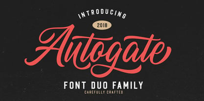 Autogate Font Duo is a pair of script and sans fonts that perfectly work together. The classic feel is really great for you who needs a typeface for logotypes, apparel, invitations, branding, packaging, advertising, and more. This typeface comes in uppercase, lowercase, punctuations, symbols & numerals, 09 stylistic set alternate, ligatures, has multi-lingual support and is already PUA encoded.
 - Academica Sans by Storm Type Foundry,
$53.00 Academica Sans was drawn with the aim of following the artistic features of Josef Týfa's fonts. It has the same proportions as the famous Academica, so both fonts can be successfully combined. It is suitable for all types of literature from scientific to poetry, but also for corporate identity and websites. It has a calm and timeless character.
 - Honey Waffles by Allouse Studio,
$16.00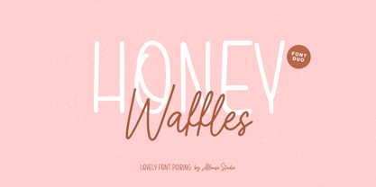 Proudly Presenting, Honey Waffles is a Lovely Font Pairing. Honey Waffles is perfect for any titles, logo, product packaging, branding project, megazine, social media, wedding, or just used to express words above the background. Honey Waffles also come with Multi-Lingual Support. Enjoy the font, feel free to comment or feedback, send me PM or email. Thank You!
 - Film Reel JNL by Jeff Levine,
$29.00 In a World War II training film from the U.S. Signal Corps, the opening title card saying “First Aid” was hand lettered in an extra bold, Art Deco inline style. Those two words (with seven available letters) used as a work model has inspired Film Reel JNL, which is available in both regular and oblique versions.
 - Differentura by ABSTRKT,
$50.00This typeface was developed for the Different Ground exhibition identity (and that explains the name of the font). The aim was to make an absolutely geometric, constructed font. Sometimes even too geometric and too much into it's own rules. But at the same time to make it look very humane, sometimes imperfect and weird, but alive and not soulless. - Cyclic Sans by ArtyType,
$25.00 Cyclic Sans is a legible and highly distinctive type family in four weights, running from Light to Heavy. A stoic sans, imbued with strength and charm, the fonts can be paired with their Cyclic Serif counterparts to stunning effect. Cyclic Sans is a stylish modern face and a versatile all-rounder, ideal for both text and headline use.
 - Royal Kevino by Hanzel Space,
$25.00 This modern serif typeface features serifs. Perfect for gorgeous logos & titles, Royal Kevino will pair beautifully with many fonts and work well with whatever project you're working on. That's it! If you have any questions at all , feel free to pop me a private message , I'm always more than happy to help you along :) Happy creating! Hanzel Studio
 - Organic Space by Melissa Lapadula,
$19.95Organic Space is about preserving what natural goodness there is left in the world, with its use of curves and space usage. It represents the selection of consumers, which choose organic products instead of the alternative genetically modified version. This typeface aims to be organic and unique. This font can function as headings, subheadings and body text. - ArchiType Rounded by Archiness,
$15.00 ArchiType Rounded is not just the rounded version of the ArchiType font. The aim was to get a slightly different balance between the squareness and the roundness of the original font. Now with rounded endings, resulting in a smoother appearance. Every glyph is redesigned, around 70 glyphs have been added and kerning has been vastly improved.
 - 90 Flinders Street by Melissa Lapadula,
$10.95This typeface has been influenced by the Melbourne city landscape. One building in particular reflects this typeface, this building is located at 90 Flinders Street, Melbourne, Australia. This font is also influenced by computer age fonts such as Bubbledot and Digital. This typeface aims to be bold, angular, dynamic and original. Its primary function is heading use. - Avignon by Larin Type Co,
$15.00 Avignon script - a new casual font. This font is light, airy and elegant, perfect for wedding invitation, ideal for branding, blog and to decorate any project. Also with their help, you can create a logo or beautiful frame for your home. Or just use for your small business, notebook, stationery, marketing, magazines and more. Enjoy using!
 - IA Airship Captain by Invisible Art Studio,
$14.99 IA Airship Captain is a good readable comic book dialogue font made with a marker with wavy lines, giving it uniqueness and recognition. The family includes Regular, Italic, Bold, and Bold Italic. And contains a large number of kerning pairs. Added extended Latin, extended Cyrillic and contextual autoreplacing crossbar "I" in words like I, I'm, etc.
 - Splashdown by Comicraft,
$29.00 Surf's Up! Head on down to the Barrier Reef with your favorite board, your latest pair of Oakleys and join us where the waves break. Zip up your wetsuit and be prepared to Wipe Out! On the other hand, if you'd rather not get wet, simply install this font and experience similar results. Splashdown is totally tubular, dude!
 - Demonic Rhapsody by Hun Liszt,
$50.00 Demonic Rhapsody is a unique typeface inspired by Codex Gigas, featuring Gothic, handwritten glyphs. Perfect for adding mystique to projects such as book covers, album artwork, or unique branding. It's part of the Demonic Rhapsody NFT project, symbolizing marginalized voices. A narrative tool, it pairs well with minimalist typefaces for contrast or textured fonts for an immersive experience.
 - Sweet Patterson by Just Font You,
$16.00 Sweet Patterson, a beautiful and lovely modern calligraphy script font with perfectly imperfect written by the hand. Perfectly fit for branding, logo, wedding things, greeting cards, fashion, anytime you need to pour some love. Included Uppercase, Lowercase, Numbers & Punctuations, Multilanguage Support, Stylistic Alternates for every lowercase letters, and some nice ligatures to aim the handwriting feels.
 - Futura by Linotype,
$42.99 First presented by the Bauer Type Foundry in 1928, Futura is commonly considered the major typeface development to come out of the Constructivist orientation of the Bauhaus movement in Germany. Paul Renner (type designer, painter, author and teacher) sketched the original drawings and based them loosely on the simple forms of circle, triangle and square. The design office at Bauer assisted him in turning these geometric forms into a sturdy, functioning type family, and over time, Renner made changes to make the Futura fonts even more legible. Futura’s long ascenders and descenders benefit from generous line spacing. The range of weights and styles make it a versatile family. Futura is timelessly modern; in 1928 it was striking, tasteful, radical — and today it continues to be a popular typographic choice to express strength, elegance, and conceptual clarity. NEW: the new Futura W1G versions features a Pan-European character set for international communications. The W1G character set supports almost all the popular languages/writing systems in western, eastern, and central Europe based on the Latin alphabet including Vietnamese, and also several based on Cyrillic and Greek alphabets Futura® font field guide including best practices, font pairings and alternatives.
 - Bernyck by Eurotypo,
$24.00 Bernyck is a vintage fonts inspired by bold advertisers hand lettering styles, popular in the late 1940s through the early 1950s. It has the same charm as his brother “Cinefile”, but, this time, connected and with more alternates. The Bernyck family is integrated by Bernyck and Bernyck Extrude to interact together. To this we add a beautiful set of 131 ornaments, Bernyck Ornaments and of course, Bernyck Ornaments Extrude. The Open Type features include a full international character compliment, standard and contextual alternates, swatches, stylistic sets, initial forms, standard and discretionary ligatures. All this makes the text lively and bouncy, without the monotony of obviously repeated letterforms. A total of 634 glyphs to offer you many more options for your designs! Bernyck, like all our fonts, was carefully designed, controlled and tested in both aspects: readability and technical aspects. We take care of the kerning pairs, hinting and the precise programming of the Open Type functions; as well as the final touch of each glyph. Bernyck adapts well to titles, packages, invitations, greeting cards, magazines and book covers, children's material, fashion, logos and, posters and wherever you need a fun and sympathetic display font.
 - Bingana by LetterStock,
$18.00 Bingana This pair was inspired by kids movie poster design that i saw on some gallery, It was crafted by hand specially to add natural handmade feeling in its brand identity than i make it clean with pentool. We improve with handmade to make a playful feel, this font is bold so it can look strong if you use it for branding or even title for your poster design with playful decorative style. Opentype features Bingana font has 175 character set included Bingana Font is very good looking in playful decorative logotype, labels, t-shirt prints, product packaging, invitations, advertising and others. This fonts works with folowing languages: Afrikaans, Albanian, Asu, Basque, Bemba, Bena, Chiga, Cornish, Danish, English, Estonian, Filipino, Finnish, French, Friulian, Galician, German, Gusii, Indonesian, Irish, Italian, Kabuverdianu, Kalenjin, Kinyarwanda, Low German, Luo, Luxembourgish, Luyia, Machame, Makhuwa-Meetto, Makonde, Malagasy, Malay, Manx, Morisyen, North Ndebele, Norwegian Bokmål, Norwegian Nynorsk, Nyankole, Oromo, Portuguese, Romansh, Rombo, Rundi, Rwa, Samburu, Sango, Sangu, Scottish Gaelic, Sena, Shambala, Shona, Soga, Somali, Spanish, Swahili, Swedish, Swiss German, Taita, Teso, Vunjo, Zulu Thank you for using this font. LS
 - Casandra Lie by IbraCreative,
$17.00 Casandra Lie – A Chic Monoline Script Font Casandra Lie, a name like a whispered secret, perfectly embodies the essence of this chic monoline script font. Imagine the delicate stroke of a fine penmanship teacher gliding across paper, leaving behind an effortless trail of ink that dances and twirls with understated elegance. Every letter whispers tales of romance and intrigue, their slender forms adorned with graceful swashes and subtle flourishes that hint at a hidden passion. Think vintage Parisian boudoirs illuminated by candlelight, secret love letters penned under twilight skies, and the airy charm of handwritten invitations to soirees under the stars. Casandra Lie is not merely a font; it’s an invitation to a world of whispered dreams and unspoken promises, etched in ink as delicate as a spider’s web, yet strong enough to capture the beating heart of a story waiting to be told. Casandra Lie is perfect for branding projects, logo, wedding designs, social media posts, advertisements, product packaging, product designs, label, photography, watermark, invitation, stationery, game, fashion and any projects. Fonts include multilingual support for; Afrikaans, Albanian, Czech, Danish, Dutch, English, Estonian, Finnish, French, German, Hungarian, Italian, Latvian, Lithuanian, Norwegian, Polish, Portuguese, Slovak, Slovenian, Spanish, Swedish.
 - Auriga by Typehill Studio,
$14.00 Preview Text The quick brown fox jumps over the lazy dog Auriga Example 1 of Font More information about this Font Auriga is a calligraphy script font that comes with beautiful alternative characters. a mixture of copper calligraphy with handleting style. Designed to bring style elegance. Auriga attracts such a subtle, clean, feminine, sensual, glamorous, simple and very readable typeface. The classic style is perfect to apply in various formal forms such as invitations, labels, menus, Logos, fashion, make up, stationery, letterpress, romantic novels, magazines, books, greeting / wedding cards, packaging, labels. Auriga has 671 glyphs. including multiple language support. With OpenType features with stylish alternatives, ligatures and characters, allowing you to mix and match pairs of letters to fit your design, as well as a touch of ornament to make this font look elegant. To install fonts follow these simple steps: .Open the zip folder you downloaded. .Double-click on the font as if you were opening an application. .Now the font installation window will open. .Click Install and wait for it to finish. .You have now installed the font. .Be sure to restart your application (and if that doesn't work restart your computer).
 - Mack Dutch by LetterStock,
$25.00 MackDutch MackDucth font pair was inspired by old magazine that i saw at barbershop. It was crafted by hand specially to add natural handmade feeling in its brand identity than i make it clean with pentool. We add some rough to make it retro feel, this font is bold so it can look strong if you use it for branding or even title for your retro poster design. Opentype features MackDucth font is a great retro rough font that will looks good in logotype, labels, t-shirt prints, product packaging, invitations, advertising and others. If you looking for retro rough font style, this font is a great choice for you to make your design awesome and flawless. This fonts works with folowing languages: Afrikaans, Albanian, Asu, Basque, Bemba, Bena, Chiga, Cornish, Danish, English, Estonian, Filipino, Finnish, French, Friulian, Galician, German, Gusii, Indonesian, Irish, Italian, Kabuverdianu, Kalenjin, Kinyarwanda, Low German, Luo, Luxembourgish, Luyia, Machame, Makhuwa-Meetto, Makonde, Malagasy, Malay, Manx, Morisyen, North Ndebele, Norwegian Bokmål, Norwegian Nynorsk, Nyankole, Oromo, Portuguese, Romansh, Rombo, Rundi, Rwa, Samburu, Sango, Sangu, Scottish Gaelic, Sena, Shambala, Shona, Soga, Somali, Spanish, Swahili, Swedish, Swiss German, Taita, Teso, Vunjo, Zulu Thank you for using this font. LS
 - Karim by Linotype,
$187.99Karim is a traditional-style Arabic text face, designed in response to a demand for a traditional text face adapted to setting Quranic commentaries. Within the constraints of the standard character set and typesetting program, Karim’s design aims to recall the style and fluency of manuscript Naskh without, however, reproducing the idiosyncrasies of any particular calligrapher. The line weight chosen is heavier than usual for a traditional light face in order to benefit the reproduction of small size Tafsir text. A tall kaf, deep descenders and slightly inclined alifs and lams all help to suggest the cursiveness of manuscript. The type-style that emerges is characterized by restraint and clarity; qualities suited to Karim’s original purpose, and ones that recommend it for wider use. Karim ships includes Latin glyphs from Janson Text Roman, allowing the single font to set text in both most Western European and Arabic languages. Karim’s code pages incorporate Basic Latin and the Arabic character set, which supports Arabic, Persian, and Urdu. The font includes tabular and proportional Arabic, Persian, and Urdu numerals, as well as a set of tabular European (Latin) numerals.

