10,000 search results
(0.306 seconds)
- Ranch Land JNL by Jeff Levine,
$29.00 Ranch Land JNL is based on a classic French Clarendon wood type, many of which were popular in the 1800s and are now associated with either Western motifs or circus events.
 - Schwarz by Miguel Ibarra Design,
$20.00 Schwarz is a Black Letter typeface inspired by all that is black. Jagged edges and sharp diagonals make Schwarz a head banging font. Some stylistic alternates and ligatures are also available.
 - Medium Roman by Monotype,
$29.99Medium Roman is an engravers, all-capitals font for invitations and stationery. Particular characteristics of the Medium Roman font are the tail on Q and the spurs on J and U. - Tannarin BT by Bitstream,
$50.99Futuristic and spacey, Tannarin is a modular, cap-only typeface. Many letters are constructed of repeated components with the added twist of the round characters being shorter than the square characters. - Octin Vintage by Typodermic,
$11.95 Introducing Octin Vintage, the typeface that combines toughness and style in a delicately textured design. With its versatile 2 styles—sans and serif—and 3 weights—regular, bold, and black—Octin Vintage is the perfect choice for any project that requires a bold, eye-catching headline. Whether you’re creating designs for police, sports, prison, construction, school, or military themes, Octin Vintage delivers the rugged, vintage look that will help your designs stand out. Its timeless appeal is sure to capture the attention of your audience and leave a lasting impression. And it’s not just about looks—Octin Vintage is designed for versatility and ease of use, making it an ideal choice for both experienced designers and beginners. With its finely crafted letterforms and subtle textures, Octin Vintage adds a touch of sophistication and style to any design. So if you’re looking for a typeface that combines toughness, style, and versatility, look no further than Octin Vintage. Try it out today and discover the difference that this delicately textured design can make in your next project Check out the rest of the Octin families: Octin Sports, Octin College, Octin Prison, Octin Stencil & Octin Spraypaint. Most Latin-based European writing systems are supported, including the following languages. Afaan Oromo, Afar, Afrikaans, Albanian, Alsatian, Aromanian, Aymara, Bashkir (Latin), Basque, Belarusian (Latin), Bemba, Bikol, Bosnian, Breton, Cape Verdean, Creole, Catalan, Cebuano, Chamorro, Chavacano, Chichewa, Crimean Tatar (Latin), Croatian, Czech, Danish, Dawan, Dholuo, Dutch, English, Estonian, Faroese, Fijian, Filipino, Finnish, French, Frisian, Friulian, Gagauz (Latin), Galician, Ganda, Genoese, German, Greenlandic, Guadeloupean Creole, Haitian Creole, Hawaiian, Hiligaynon, Hungarian, Icelandic, Ilocano, Indonesian, Irish, Italian, Jamaican, Kaqchikel, Karakalpak (Latin), Kashubian, Kikongo, Kinyarwanda, Kirundi, Kurdish (Latin), Latvian, Lithuanian, Lombard, Low Saxon, Luxembourgish, Maasai, Makhuwa, Malay, Maltese, Māori, Moldovan, Montenegrin, Ndebele, Neapolitan, Norwegian, Novial, Occitan, Ossetian (Latin), Papiamento, Piedmontese, Polish, Portuguese, Quechua, Rarotongan, Romanian, Romansh, Sami, Sango, Saramaccan, Sardinian, Scottish Gaelic, Serbian (Latin), Shona, Sicilian, Silesian, Slovak, Slovenian, Somali, Sorbian, Sotho, Spanish, Swahili, Swazi, Swedish, Tagalog, Tahitian, Tetum, Tongan, Tshiluba, Tsonga, Tswana, Tumbuka, Turkish, Turkmen (Latin), Tuvaluan, Uzbek (Latin), Venetian, Vepsian, Võro, Walloon, Waray-Waray, Wayuu, Welsh, Wolof, Xhosa, Yapese, Zapotec Zulu and Zuni.
 - Sofachrome by Typodermic,
$11.95 Introducing Sofachrome—the epitome of the modern, the pinnacle of the sleek, and the embodiment of high-tech design. Its extended futuristic letterforms will take your project to the next level, while its streamlined, industrial contours will give your work a feeling of durability and strength. This typeface is not just any ordinary typeface. It has been specifically designed to evoke a sense of futuristic innovation, with its bold thick and thin stroke contrast that provides a striking impact. Its sleek and polished finish will leave an unforgettable impression on anyone who lays their eyes on it, making it perfect for designs that demand a high-speed and technical efficiency. With five sleek weights and italics, Sofachrome is versatile enough to use in a variety of projects. Whether you’re creating a high-tech ad campaign, designing a futuristic poster or even creating an eye-catching logo, this typeface will help you achieve the desired impact. Sofachrome is not just a font, it’s a statement—a statement of quality, precision, and sophistication. So why settle for anything less when you can elevate your designs to the next level with Sofachrome? Choose Sofachrome for your next design project and see the future of design unfold before your very eyes. Most Latin-based European writing systems are supported, including the following languages. Afaan Oromo, Afar, Afrikaans, Albanian, Alsatian, Aromanian, Aymara, Bashkir (Latin), Basque, Belarusian (Latin), Bemba, Bikol, Bosnian, Breton, Cape Verdean, Creole, Catalan, Cebuano, Chamorro, Chavacano, Chichewa, Crimean Tatar (Latin), Croatian, Czech, Danish, Dawan, Dholuo, Dutch, English, Estonian, Faroese, Fijian, Filipino, Finnish, French, Frisian, Friulian, Gagauz (Latin), Galician, Ganda, Genoese, German, Greenlandic, Guadeloupean Creole, Haitian Creole, Hawaiian, Hiligaynon, Hungarian, Icelandic, Ilocano, Indonesian, Irish, Italian, Jamaican, Kaqchikel, Karakalpak (Latin), Kashubian, Kikongo, Kinyarwanda, Kirundi, Kurdish (Latin), Latvian, Lithuanian, Lombard, Low Saxon, Luxembourgish, Maasai, Makhuwa, Malay, Maltese, Māori, Moldovan, Montenegrin, Ndebele, Neapolitan, Norwegian, Novial, Occitan, Ossetian (Latin), Papiamento, Piedmontese, Polish, Portuguese, Quechua, Rarotongan, Romanian, Romansh, Sami, Sango, Saramaccan, Sardinian, Scottish Gaelic, Serbian (Latin), Shona, Sicilian, Silesian, Slovak, Slovenian, Somali, Sorbian, Sotho, Spanish, Swahili, Swazi, Swedish, Tagalog, Tahitian, Tetum, Tongan, Tshiluba, Tsonga, Tswana, Tumbuka, Turkish, Turkmen (Latin), Tuvaluan, Uzbek (Latin), Venetian, Vepsian, Võro, Walloon, Waray-Waray, Wayuu, Welsh, Wolof, Xhosa, Yapese, Zapotec Zulu and Zuni.
 - Ugocranis by Typodermic,
$11.95 Ugocranis is not your ordinary typeface. Its compact and angular design evokes a sense of strength and durability, reminiscent of the brutalist architecture that dominated the twentieth century. The inspiration for Ugocranis comes from the bold and imposing concrete structures that characterized the brutalist movement. Just like those buildings, Ugocranis makes a statement with its strong letterforms, capturing the raw and unapologetic essence of the era. This typeface is perfect for headlines that demand attention. It commands the viewer’s gaze with its distinct and bold design, making it ideal for projects that require a strong and forceful visual presence. Ugocranis is not afraid to stand out, just like the buildings that inspired it. The beauty of Ugocranis lies in its simplicity. Its uncomplicated design allows it to be versatile, fitting into a variety of different design themes while still maintaining its strong, brutalist influence. Whether it’s used in graphic design, web design, or even in architecture itself, Ugocranis will make a bold and unforgettable statement. In a world where everything seems to be getting more complicated, Ugocranis is a refreshing reminder that sometimes less is more. Its straightforward and unadorned design captures the essence of brutalism, reminding us of a time when architecture was about strength, simplicity, and functionality. Most Latin-based European writing systems are supported, including the following languages. Afaan Oromo, Afar, Afrikaans, Albanian, Alsatian, Aromanian, Aymara, Bashkir (Latin), Basque, Belarusian (Latin), Bemba, Bikol, Bosnian, Breton, Cape Verdean, Creole, Catalan, Cebuano, Chamorro, Chavacano, Chichewa, Crimean Tatar (Latin), Croatian, Czech, Danish, Dawan, Dholuo, Dutch, English, Estonian, Faroese, Fijian, Filipino, Finnish, French, Frisian, Friulian, Gagauz (Latin), Galician, Ganda, Genoese, German, Greenlandic, Guadeloupean Creole, Haitian Creole, Hawaiian, Hiligaynon, Hungarian, Icelandic, Ilocano, Indonesian, Irish, Italian, Jamaican, Kaqchikel, Karakalpak (Latin), Kashubian, Kikongo, Kinyarwanda, Kirundi, Kurdish (Latin), Latvian, Lithuanian, Lombard, Low Saxon, Luxembourgish, Maasai, Makhuwa, Malay, Maltese, Māori, Moldovan, Montenegrin, Ndebele, Neapolitan, Norwegian, Novial, Occitan, Ossetian (Latin), Papiamento, Piedmontese, Polish, Portuguese, Quechua, Rarotongan, Romanian, Romansh, Sami, Sango, Saramaccan, Sardinian, Scottish Gaelic, Serbian (Latin), Shona, Sicilian, Silesian, Slovak, Slovenian, Somali, Sorbian, Sotho, Spanish, Swahili, Swazi, Swedish, Tagalog, Tahitian, Tetum, Tongan, Tshiluba, Tsonga, Tswana, Tumbuka, Turkish, Turkmen (Latin), Tuvaluan, Uzbek (Latin), Venetian, Vepsian, Võro, Walloon, Waray-Waray, Wayuu, Welsh, Wolof, Xhosa, Yapese, Zapotec Zulu and Zuni.
 - Quire Sans by Monotype,
$155.99 My goal was to make a design that might fit in anywhere,” says Jim Ford about his Quire Sans™ typeface. “I wanted it to be highly functional and sexy at the same time.” With one foot comfortably in the realm of oldstyle design and traditional book typography, and the other in evolving electronic media, the Quire Sans family does, indeed, fit in just about anywhere. As for sexy, someone once quotably wrote, “A great figure or physique is nice, but it's self-confidence that makes someone really sexy.” Yes, Quire Sans is sexy, performing confidently in virtually any setting. 2014-06-26 00:00:00.000 57.9900 F43063-S193385 42831 Neue Frutiger World Monotype https://www.myfonts.com/collections/neue-frutiger-world-font-monotype-imaging https://cdn.myfonts.net/cdn-cgi/image/width=417,height=208,fit=contain,format=auto/images/pim/10000/279026_ed8c8093fe1ac59ebe9e3ee1d9262c8e.png Neue Frutiger World is designed for global use with an impressive range of 10 weights, from Ultra Light to Extra Black, with matching italics. It embodies the same warmth and clarity as Adrian Frutiger’s original design, but allows brands to maintain their visual identity, and communicate with a consistent tone of voice, regardless of the language. Neue Frutiger World supports more than 150 languages and scripts including Latin, Greek, Cyrillic, Georgian, Armenian, Hebrew, Arabic, Thai and Vietnamese. “Before Neue Frutiger World it was not an easy task for western brands to find families in Arabic, Hebrew, Thai and Vietnamese which match with their Latin,” says Monotype type director Akira Kobayashi, who led the Neue Frutiger World project. “They may find a type with closer expression, but there was no guarantee if the bold version in the non-Latin family matches the bold in their Latin. Neue Frutiger World offers a better solution.” In addition to Neue Frutiger World’s linguistic versatility, it works hard across environments – suited to branding and corporate identity, advertising, signage, wayfinding, print, and digital environments. The Neue Frutiger World fonts can be paired with Monotype’s CJK fonts: M XiangHe Hei (Chinese), Tazugane Gothic (Japanese), Tazugane Info (Japanese), and Seol Sans (Korean). These were all designed to address brands’ needs to expand into Asian cultures and solve for global typographic challenges.
 - Blackboard Ultra - 100% free

- Palmera Outline by RagamKata,
$14.00 Palmera is a geometric slab serif font. Simple and sharp-looking, this typeface will truly inspire you to create spectacular designs that will impress everyone. Palmera font is perfect for your up coming projects. Such as logo branding, editorial design, fashion, adventure apparel, stationery design, sport design, blog design, modern advertising design, card invitation, badge, art quote, home decor, book/cover title, special events and any more.
 - LP Cervo by URW Type Foundry,
$35.99 LP Cervo is a typeface designed by German type designer Peter Langpeter. LP has been running his own design studio since 1995, working as a typeface and logo designer, as a calligrapher, cartographer and illustrator. During this time LP created a large number of excellent new typeface designs. With its styles Grotesk, Lapidar, Semiserif and Serif the LP Cervo is well suited for various design possibilities
 - Derick Skone by Dumadi,
$20.00 Derick Skone is a brush font created with a brush application. This design font is perfect for meeting the needs of designers in perfecting their projects. Derrick Skone is suitable for magazine design, poster design, event title design, sport event titles, movie poster titles, t-shirt designs, game titles, youtube cover titles, and more. Maximize your business with the right fonts. best regards, Toni Dzulham - Dumadistyle 2020
 - Defused - Personal use only

- Guaruja Grotesk by Tipogra Fio,
$- Guaruja Grotesk is the first Tipogra Fio family for headlines & body copy. The grotesque form factor is much inspired in the Modernism movement from the mid of 20th Century but the Italic weight is a great cursive contrast aside the Roman ones so you can make very brutalist layouts or craft humanist projects, without losing the communication between all the family. Do not be afraid to type words with uppercase I and lowercase L because this last one has its own personality so do others glyphs like Italic lowercase G, Y and K and the straight corners in the Roman uppercase A, K, V, W, X, Y and Z. The same curves and corners are transferred to the numbers, symbols and so on. If your text is in a latin alphabet even though has lots of diacritcs, Guaruja may get it done! If you’re making a mathematical equation, it also can make it. If there’s a signaling project with lots of destinations, trust the arrows to help with together with the whole family.
 - Sparrowhawk Script by Max.co Studio,
$14.00 Sparrowhawk Script is retro signage font, bold and clean. There are so many variations on each character. Include Opentype stylistic alternates. You are able to create so many different typographical layouts easily and quickly. Make sure you use OpenType savvy program and simply open Glyph Palette to access all of the glyphs. This font is suitable for t-shirts, signage, logos, headlines, branding, packaging, etc. Sparrowhawk Script features 460+ glyphs and alternate characters. including initial and terminal letters, alternates, ornament, swash, ligatures and multiple language support. To enable the OpenType Stylistic alternates, you need a program that supports OpenType features such as Adobe Illustrator CS, Adobe Indesign & CorelDraw X6-X7, Microsoft Word 2010 or later versions. How to access all alternative characters using Adobe Illustrator: http://youtu.be/iptSFA7feQ0 Sparrowhawk Script is coded with PUA Unicode, which allows full access to all the extra characters without having special designing software. Mac users can use Font Book , and Windows users can use Character Map to view and copy any of the extra characters to paste into your favourite text editor/app. How to access all alternative characters, using Windows Character Map with Photoshop: https://www.youtube.com/watch?v=Go9vacoYmBw If you need help or advice, please contact me by e-mail "maximal.fonts@gmail.com"
 - Atyp BL by Suitcase Type Foundry,
$39.00 The sources of inspiration for the Atyp typeface are spread out widely both stylistically and chronologically. The basic proportions of the uppercase refer to the elementary geometric constructions of the Bauhaus. The subtle details in the drawing of the characters and the microscopic adjustments, which evoke the illusion of uniformity and mechanical purity, pay homage to the rationalism of the typefaces popular in the International Style. The increased contrast of the joints of the bowls and shoulders in the Display weight, which in certain diagonal curves transition into almost deconstructive permutations. For a change these take delight in doing things on purpose, teasing readability and breaking the rules of the new millennium's typography. Atyp was created by adapting a typeface originally made for a commercial television station. The potential of the neutral grotesque, proven by its excellent readability on screens, gave the impetus for its preparation into an extremely wide character set. Coherence across all eight key masters lays the groundwork ideally for using the variable font format. The key benefits of this technology are a significant reduction in data consumption in the case of web fonts, as well as an unlimited access to the full range of styles, which in turn is a significant benefit in the area of responsive design.
 - Mon Nicolette by Sudtipos,
$49.00 This is a digital revival by Cristóbal Henestrosa based on an experimental typeface named Charter, designed – yet never fully accomplished – by the prominent William Addison Dwiggins. It is an upright italic, unconnected script typeface, whose main features are a pronounced contrast, condensed forms and exaggerated ascenders. While Dwiggins worked on this project from 1937 to 1955, he only completed the lowercase and a few other characters. However, it was used to set a specimen in 1942 and a short novel in 1946. The sources that Cristóbal used for Mon Nicolette were the original sketches by WAD as well as printing trails kept at the Boston Public Library, and a copy of the 1946 edition of The Song-Story of Aucassin and Nicolette. This gorgeous typeface can be used successfully in headlines, subheads and short passages of text from 12 points onwards, in applications such as fashion magazines, soft news, advertising, poetry, albums, and book covers. This project started ten years ago, while Cristóbal was studying the Type@Cooper Extended Program at New York City. A previous version was selected to be part of the Biennial Tipos Latinos 2018, and now Mon Nicolette is finally ready for commercial distribution with Sudtipos… and we are very proud of it! Festina lente.
 - Blau by Wilton Foundry,
$19.00 Designed with a hand-chiseled feel, Blau’s sculpted characters add a refined personality to a wide range of brand, corporate, product and service applications. Highlighting the sculpted theme, inkwell treatment variations are prevalent throughout Blau, with several key glyphs that are stenciled for increased legibility. This sturdy, typographic workhorse shines when a slightly unorthodox typographic approach is required — a prime choice for distinctive and dynamic logotype use. The Blau family is available in Light, Light Italic, Regular, Italic, Bold and Bold Italic. The name Blau was chosen to celebrate the color Blue (or Blau in German, Blaauw in Dutch, Bleu French, Blå in Norwegian, Swedish & Danish, Blua in Esperanto, Blár in Icelandic) Blue is nature’s color for water, sky, mountains and glaciers. Blue is embraced as the color of heaven and authority, denim jeans and corporate logos. Surveys in the US and Europe show that blue is the color most commonly associated with harmony, faithfulness, confidence, distance, infinity, the imagination, and cold. In US and European public opinion polls, it is the most popular color, chosen by both men and women as their favorite color. Another very popular Wilton Foundry font in the “blue” family is “Cyan” and “Cyan Neue”.
 - Cyan Sans by Wilton Foundry,
$29.00The design of Cyan was inspired by features found in classic Roman and styles like Trajan and Bodebeck. The characters stay true to the same features as the capitals, resulting in an unusually distinctive style. The Capitals version contains Roman numerals. Cyan's weight is similar to Trajan's but the horizontal strokes are slightly bolder resulting in better legibility for small sizes, especially for lowercase characters. Cyan Sans evolved out of the hugely successful Cyan Serif family. Cyan Sans retains the same geometric Roman proportions with open centers in B,P,R b, d, p . This helps create a thick and thin stroke illusion since the actual strokes don't vary much. There are many subtle details in Cyan Sans that become more interesting in larger sizes. The beauty of Cyan Sans is that it has no features that "jar" the eye. The result is a very pleasing and distinctive sans that scales well. Cyan Sans is a robust font that will exceed expectations in areas never explored before. The name is inspired by the Greek word cyan, meaning "blue". Blue as a primary color that has many hues and uses. Cyan the font, we hope will be seen in a similar light. Obviously Cyan Sans is a perfect companion to the Cyan Serif family. - Oktah by Groteskly Yours,
$15.00 Oktah is a geometric grotesk that comes both as a variable font and 22 static fonts: 11 uprights and 11 matching italics, which make it a great tool for those seeking a versatile font with a strong character and high legibility. Throw in a very pleasing look, elegant curves and a wide range of weights, and you'd get what Oktah aspires to be: a perfect typographic tool for every need.In Oktah, elegant geometric curves meet bold strokes and wide apertures. Round letters are nearly circular, but, to boost readability, slight changes were introduced for optical compensation. Oktah is also equipped with amazing OpenType features: case sensitive punctuation, ligatures, fractions, superscript and subscript figures, two kinds of circular figures, stylistic & contextual alternatives and much more! Oktah supports all major European languages, as well as Vietnamese and some dozens of foreign languages that you may encounter in your designs. We've got all that covered. The glyph count for each of the styles is 800+ characters. Two styles (Extra Light and Bold Italic) are free to try and experiment with. If you need wide language support and more extensive OpenType features, consider taking a look at Oktah Neue, a bigger version of the classic Oktah.
 - Vena Amoris by Delve Fonts,
$49.00 New Orleans, June 25, 1895 My dear Edmond, I found upon my return home to dinner yesterday, your letter informing me of your affection for Annie and asking that we confide her future happiness to your keeping... This excerpt was taken from a letter written by designer Kathryn Podorsky’s great-great-grandfather, Lucien Doize, in response to Edmond’s request to marry his daughter, Annie. The letter was not only beautiful contextually, but exquisitely penned and epitomized the delightful charm of the New Orleans people of the time. Vena Amoris, or “Vein of Love” refers to a phrase coined by Henry Swinburne in his A Treatise of Espousal published in 1686. Vena Amoris also refers to the fourth finger on the left hand which was traditionally believed to contain a vein running directly to the heart, hence “the ring finger.” As a digital font, Vena Amoris boasts an extensive Latin-based character set that supports 51 languages. Also included are stylistic and contextual alternates, ligatures, swash variants, oldstyle figures, and roman numerals and calligraphic words that will undoubtedly bring a dynamic quality to any setting. All of those extras are driven by cleverly applied OpenType features allowing you to add harmony and calligraphic beauty to your layout.
 - Berryfield by Missy Meyer,
$12.00 Berryfield started as an experiment: making a font entirely out of geometric shapes. It started with a couple of circles and a couple of rectangles, and was constructed entirely from those parts, and parts made from those parts! For the uppercase, I took style inspiration from the heavy serif classics. But when it came time to create the lowercase set, I took a sharp turn and looked to fun unicase fonts, creating uppercase-height lowercase letters, in addition to uppercase alternates. When I finished Berryfield Regular, I liked it so much I made a lighter version (almost like a typewriter font), and a heavier version, to give you even more variety! Each font in the family contains over 520 characters, including over 300 extended Latin characters for language support. There are also a number of alternate letters to choose from, as well as superscript ordinals (ST, ND, RD, and TH), all of which are PUA-encoded for easy access no matter what design program you're using. Berryfield was a ton of fun to make, and I hope you have a ton of fun using it! It's smooth and easy for both print and crafting; the uppercase alone is straightforward enough for a magazine headline, but combining in the lowercase makes it quirky and fun.
 - FS Meridian Variable by Fontsmith,
$199.99Timeless imperfection FS Meridian is a rhythmic geometric grotesque which takes inspiration from the precise yet imperfect nature of time. There are 24 hours in a day. 60 minutes in an hour. 60 seconds in a minute. Well, almost. The Earth’s orbit isn’t a perfect circle – and nor is the Earth itself. Each day varies a few dozen seconds and up to 16 minutes each year. Look closer and time is more flexible than we think. Geometry with a twist From a geometric base, FS Meridian’s rounded forms veer and extend, creating unexpected humanistic shapes – while the straight terminals remain reliably rigid. This combination of forms gives this grotesque sans serif a pleasingly dynamic rhythm, every time it’s read. Added quirks The unconventional character of rigid terminals and ink traps are balanced with emphasized extended forms to develop visual differentiation. Designed by Kristina Jandová, the complete family has been carefully crafted with distinguishing marks. Take a look at the cap ‘Q’ which comes with three alternative options. Deliciously loopy FS Meridian has a wide geometric, mono-liner appearance with humanistic elements. Quirky individual touches like the loopy expressive pound sign help the typeface to stand out. Available in five weights, FS Meridian is both timeless and timely, a distinctive font for all screens and surfaces. - Evoque Text by Monotype,
$40.00 Evoque Text is a humanist serif type family specifically designed for a comfortable reading experience. This has been achieved by optically adjusting the regular weights from my original Evoque family (released November 2021). You will notice a significantly reduced x-height and longer ascenders and descenders, complemented by adjustments to weight and spacing. This makes Evoque Text a perfect choice for any long passages of text. All OpenType features have been retained from Evoque. A plethora of swash alternates and discretionary ligatures enhance Evoque Text, giving you the opportunity to embellish your typography. Simply activate Stylistic Sets to start adding these flourishes to your text. Other useful features include Small Caps at the click of a button, and Old Style Figures are an option to the default proportional figure style. There are 14 fonts altogether over 7 weights in roman and italic, you can also avail of two variable fonts which allow you to fine tune the weight to your exact liking. Evoque Text has an extensive character set (900+ glyphs) that covers every Latin European language. Key features: 7 weights in both roman and italic 80 Alternates 26 Ligatures Small Caps Variable fonts included with full family Full European character set (Latin only) 900+ glyphs per font.
 - Haboro Slab Soft by insigne,
$32.99 Haboro Slab Soft is a scion of the Haboro hyperfamily. This concept powers through with its well built, accommodating nature. Haboro Slab Soft’s serifs are rounded, giving it a softer look. The Haboro hyperfamily is a comprehensive design suite that provides solutions for many projects. The iconic angled wedge makes this family ideal for apparel, packaging, apps, corporate identities and advertising campaigns. Subfamilies in the hyperfamily include the original Haboro, a Didone face, Haboro Sans, Serif, Soft, and Slab. The Haboro hyperfamily is known for its ability to make your copy appear clear and simple. The Haboro typeface is built on a common underlying model. It has the same cap height, the same x-height, and the same basic character shape. This unification of shape and proportion results in a complementary set of typefaces. Haboro Slab Soft’s wide variety of ligatures and OpenType alternatives give your message the clarity it deserves. The Haboro Slab Soft family includes seven weights, from Thin to ExBold, three widths, and matching italics. There are over 550 glyphs per style and support for over 70 Latin-based languages. Haboro Slab Soft includes features such as small caps, ligatures, fractions, and alternatives. Haboro Slab Soft is there when you need to present information in a clear and friendly fashion.
 - Palmer Lake by Jen Wagner Co.,
$13.00 Features: Palmer Lake Print: Uppercase letters, numbers, & extended punctuation Palmer Lake Script: Lowercase letters, numbers, & extended punctuation Non-English support for the international designer Same stroke thickness with each font, so you don't need to make any time-consuming adjustments to get it looking right! Palmer Lake Print (uppercase font) letters are the same height as the Script lowercase letters, so making quotes is super easy! This is such a fun new duo, perfect for creating quotes, logos, or just adding a hand-written touch to any project! While other fonts usually take some size adjusting to look just right, Palmer Lake duo has the same stroke thickness for both fonts, so you can set each font to the same size and you're done! Plus, the uppercase letters of the Print font are the same height as the lowercase letters of the Script font (see the samples), so lining them up with one another is a breeze! Each font also has alternates for each letter, so when you type uppercase or lowercase for each font, the letters will change slightly. For example, tying in all caps with the Script font will connect each letter, whereas typing all lowercase will disconnect each letter. Test it out for yourself in the box above!
 - FS Meridian by Fontsmith,
$80.00 Timeless imperfection FS Meridian is a rhythmic geometric grotesque which takes inspiration from the precise yet imperfect nature of time. There are 24 hours in a day. 60 minutes in an hour. 60 seconds in a minute. Well, almost. The Earth’s orbit isn’t a perfect circle – and nor is the Earth itself. Each day varies a few dozen seconds and up to 16 minutes each year. Look closer and time is more flexible than we think. Geometry with a twist From a geometric base, FS Meridian’s rounded forms veer and extend, creating unexpected humanistic shapes – while the straight terminals remain reliably rigid. This combination of forms gives this grotesque sans serif a pleasingly dynamic rhythm, every time it’s read. Added quirks The unconventional character of rigid terminals and ink traps are balanced with emphasized extended forms to develop visual differentiation. Designed by Kristina Jandová, the complete family has been carefully crafted with distinguishing marks. Take a look at the cap ‘Q’ which comes with three alternative options. Deliciously loopy FS Meridian has a wide geometric, mono-liner appearance with humanistic elements. Quirky individual touches like the loopy expressive pound sign help the typeface to stand out. Available in five weights, FS Meridian is both timeless and timely, a distinctive font for all screens and surfaces.
 - TX Signal Signifier by Typebox,
$39.00Eight designers present a set of icons that indicate the fun and fantastic world of signage. Each collaborator's solution represents a completely different interpretations on signage vernacular. Akira Kobayashi's "Subsumption", obscured by foliage, offers a perspective that signs on Japanese roads can be vague and beautiful. M.A.D.'s "People Signs" is a graphical association of people signage with a variety of well known situation symbols. Cynthia Jacquette's "Honest Arrows" are a series of arrows that attempts to honestly tell you how to get from point A to Point B in a big, confusing city. Mike Kohnke's "Road Kill" and the "Bump & Bruise" highlight how signs make for perfect targets when unloading a round of buckshot, and the licking a contruction barrier often endures. Joachim Muller-Lance's "Traffic Blends" places faces on things! Hey, didn't you give your first car a nickname? Cars are alive, you know - they guzzle and smoke all day. Jean-Benoît Lévy's "Inner-State" was inspired while reading the California driver handbook to pass a driver's test. Kevin Roberson's "Tail Lighting" reminds us to drive carefully and not to forget to signal. Diana Stoen's "Drivers Out There" shows us "driver personality archetypes", including the lil'ol lady that everyone tries to avoid. - Kaat by ChrisNuijen.com,
$29.00 Kaat is a new type (2013). It was designed by Chris Nuijen and named after his daughter Kaat. It represents the period in which everyone has their face behind the latest mobile phone screen or interactive games console. "Kaat"is slick, modern and progressive, to reflect our busy immediate life style, whilst providing the essentials in a period where people can be judged on television. Kaat is here to stay and to evolve. Everyone wants to try to be that little bit different, but essentially we are all the same, with the same inherent needs, just like babies or children. We need to be fed, watered, nurtured and loved, the only difference is in today's world you can do all that from behind a screen. "Kaat" bridges that gap, transcending the basic needs of type, with the sophistication and fast paced sharpness of today, everyone wants to be different but we all stay the same, this is a reflection in the thickness and shape of each glyph. The font represents how we are molded and cast differently in yet we still stay the same, because we need the repetition! Everything needs to be done quicker, simpler and cheaper. We eat we sleep we communicate.
 - Kamber by Studio Buchanan,
$24.00 Kamber is a playful and approachable, neo-grotesque sans-serif with a handful of humanist flourishes. Subtle convex terminals and a curved structure create it's friendly personality and bouncy rhythm. If you're looking for a warm typeface that's affable without straying into cliché, then Kamber is your new best friend – like the labrador of typefaces. Kamber's balanced yet quirky nature makes for a fun and interesting display face, without compromising on legibility at smaller sizes. The lowercase letters have an elevated x-height, sitting at around 70% of the cap height – this means running copy remains clear and readable. Available in 8 weights, each with a corresponding italic, Kamber is a widely functional typeface that can hold it's own, regardless of the use case. It includes all the usual open type features for further adaptation and variation, including small caps, ligatures, stylistic alternates and more. The primary numerals are lining figures, but tabular figures, old style figures, and a combination of both are also included. If you're looking for something to stand out from the sea of overly geometric faces and soulless helvetica variants, then Kamber is ready and waiting. Perfect for editorial design, branding or anywhere you use text – Kamber is the typeface that smiles.
 - Bathur by 4RM Font,
$21.00 Inspired by Brutalism Design, this font is designed with attention to the value of authenticity and harmonious beauty. made with a wider size which will add value to the authenticity of this font. suitable for use in graphic designs such as posters, stickers, especially Retro-themed designs and Brutalism designs
 - Godzie Olstd by Olexstudio,
$19.00 GODZIE Olstd Handwritten Brush Font will look gorgeous on all your designs, poster design, book design, branding materials, logo's, and all project design other. WHAT'S INCLUDED GODZIE Olstd Handwritten Brush Font contains standard characters, All Chacacter is Uppercase, numbers, punctuation, Alternates, ligatures and international glyphs. Happy designed.! thanks, regard olexstudio
 - Anther Brush by Akifatype,
$14.00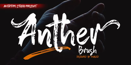 Anther Brush is a textured brush font, a contemporary approach to design, naturally handmade. It also has alternatives and ligatures that make your design more attractive. Suitable for use in designs such as clothing, invitations, book tittles, stationery designs, quotes, branding, logos, greeting cards, t-shirts, packaging designs, posters and more.
 - Agave Azul by Fat Hamster,
$25.00 Agave Azul - Hand made old typewriter font Agave Azul Artisan font is perfect for tequila & mezcal label and packaging design, social media quotes, logo & branding design, apparel design, whiskey, beer label and packaging design, heading, scrapbooking, calendars, book covers. Don't forget to use bonus logos, marks and labels for your designs.
 - Marborn by OCSstudio,
$14.00 Marborn Bold Script Typeface modern suitable for your design needs. This font is suitable for designs such as logo designs, t-shirts, branding, social media posts, thumbnails, mugs, tupperware, tote bags, and various other design purposes.
 - Vespalogy by Almarkha Type,
$29.00 Vespalogy - Fonts with a vintage touch reminiscent of past designs, making your design needs look unique and classic style. It is perfect for any design project as Invitation,logo, book cover, craft or any design purposes.
 - Brothery by Almarkha Type,
$25.00 Brothery - Fonts with a vintage touch reminiscent of past designs, making your design needs look unique and classic style. It is perfect for any design project as Invitation,logo, book cover, craft or any design purposes.
 - Rocket Queen by Ferry Ardana Putra,
$19.00 Unleash your inner street artist with Rocket Queen! The definitive font for urban self-expression. Inspired by the bold strokes of tagging graffiti markers found on city walls, this font encapsulates the raw energy of the streets. Its uppercase and lowercase characters ensure versatility, while support for foreign languages guarantees global appeal. Graffiti artists worldwide adore its iconic rounded tip marker style for its unique and entertaining aesthetics. Rocket Queen's "Urban Tags" font is more than just a typeface; it's an urban art form. Designed with a nod to the vibrant world of graffiti scenes, this font embodies the spirit of tagging graffiti markers, creating a gritty, authentic experience. With full support for foreign languages and both uppercase and lowercase characters, Rocket Queen empowers your creativity. Its iconic rounded tip marker style, favored by graffiti artists globally, offers a unique and entertaining touch to your designs. Plus, it's enriched with street graffiti ornaments for that added urban flair. Rocket Queen is more than a font; it's the language of rebellion and urban creativity. Drawing inspiration from the bustling streets and tagging graffiti markers, this font captures the raw spirit of street art. Its iconic rounded tip marker style, beloved by graffiti artists worldwide, sets your designs apart with a unique and captivating aesthetic. Supporting foreign languages and featuring a complete set of uppercase and lowercase characters, Rocket Queen is your canvas for bold, edgy statements. Step into the world of street art with Rocket Queen, a font that embodies the raw spirit of urban graffiti. Inspired by the legendary rounded tip marker style, this font captures the essence of tagging in the streets. Its captivating, one-of-a-kind design is favored by graffiti artists across the globe. With support for foreign languages and a full set of uppercase and lowercase characters, Rocket Queen is the ultimate choice for artists who want their work to resonate with the vibrant, rebellious energy of the graffiti scene. And, don't forget to explore the collection of street graffiti ornaments to take your designs to the next level! "Rocket Queen" font is perfect for a wide range of creative and artistic applications. Here are some ideal uses for this unique and edgy font: Graffiti Artwork: Use "Rocket Queen" to create authentic graffiti-style artwork on canvas, walls, or digital platforms. Its street-inspired design will add an urban, edgy vibe to your work. Streetwear Brand Logos: Design logos and branding materials for streetwear clothing lines or urban fashion brands. The font's bold and expressive style is a great match for this niche. Event Posters and Flyers: Create eye-catching event posters and flyers for music concerts, art exhibitions, or street festivals. "Rocket Queen" will help your event materials stand out and evoke a gritty, streetwise feel. Album Covers: Design album covers for music genres like hip-hop, rap, punk, or any style that demands a rebellious and energetic look. The font can give your cover artwork an authentic street vibe. Tattoo Lettering: Tattoo artists and enthusiasts can use "Rocket Queen" for lettering in tattoos. Its unique graffiti-inspired characters can create distinct and personalized tattoos. Skateboard Deck Graphics: Use the font to design custom graphics for skateboard decks, reflecting the rebellious and urban culture of skateboarding. Street Art Installations: If you're creating street art installations, "Rocket Queen" can be used for text elements within the artwork, giving it an authentic urban graffiti feel. Urban Magazine Titles: "Rocket Queen" can be an ideal choice for magazine titles and headlines in publications that focus on urban culture, street art, or graffiti. Video Game Titles and Graphics: Design video game titles, logos, or in-game graphics for games with an urban or street culture theme. The font's distinctive style can enhance the game's visual appeal. YouTube Channel Branding: Content creators with a street art or urban lifestyle focus can use "Rocket Queen" for their channel logos, banners, and thumbnails. Product Packaging: For products targeting a youthful, urban audience, the font can be used in product packaging design, making the brand and product look fresh and exciting. Digital and Print Advertisements: Incorporate "Rocket Queen" in advertising campaigns that aim to connect with a young, rebellious, or urban demographic. The "Rocket Queen" font is versatile and can be adapted to a wide range of applications where a bold, streetwise, and artistic look is desired. It's all about bringing an authentic graffiti vibe to your creative projects. ——— Rocket Queen features: A full set of uppercase and lowercase Numbers and punctuation Multilingual language support PUA Encoded Characters OpenType Features Layered Style +345 Total Glyphs +100 Graffiti Swashes and Ornaments included!
 - Matrise Text Pro by CheapProFonts,
$10.00 A new font in the style of a dot matrix/needle-printer. I have used some slightly smaller dots when designing the diacritics - this makes them easier to separate from the main letters. I have also used variable letter widths (and kerning), as opposed to the technology's original monospaced design - this to make the text more readable. Matrise Text Pro features a more "oldstyle" look with spurs and notches, while Matrise Pro has a more modern/streamlined design. ALL fonts from CheapProFonts have very extensive language support: They contain some unusual diacritic letters (some of which are contained in the Latin Extended-B Unicode block) supporting: Cornish, Filipino (Tagalog), Guarani, Luxembourgian, Malagasy, Romanian, Ulithian and Welsh. They also contain all glyphs in the Latin Extended-A Unicode block (which among others cover the Central European and Baltic areas) supporting: Afrikaans, Belarusian (Lacinka), Bosnian, Catalan, Chichewa, Croatian, Czech, Dutch, Esperanto, Greenlandic, Hungarian, Kashubian, Kurdish (Kurmanji), Latvian, Lithuanian, Maltese, Maori, Polish, Saami (Inari), Saami (North), Serbian (latin), Slovak(ian), Slovene, Sorbian (Lower), Sorbian (Upper), Turkish and Turkmen. And they of course contain all the usual "western" glyphs supporting: Albanian, Basque, Breton, Chamorro, Danish, Estonian, Faroese, Finnish, French, Frisian, Galican, German, Icelandic, Indonesian, Irish (Gaelic), Italian, Northern Sotho, Norwegian, Occitan, Portuguese, Rhaeto-Romance, Sami (Lule), Sami (South), Scots (Gaelic), Spanish, Swedish, Tswana, Walloon and Yapese.
 - Virnature by Alit Design,
$19.00 Presenting 🍃The Virnature Nature Script Font🍃 by alitdesign. Welcome to the Virnature font page, Thank you for visiting and finding this font. The Virnature font is inspired by elegant script fonts combined with the concept of nature. It can be seen by the beautiful and fitting leaf ornaments that make the Virnature font besides elegance also unique with the concept of nature. The Virnature font includes full set of Uppercase and Lowercase Basic Characters, Numerals, Punctuation and Multi lingual support. Also it contains ligatures and a lot of stylistic alternatives to perfectly re-create natural calligraphy and nature concept designs (check the previews in order to see them all). The Virnature font has alternatives that you can combine between swashes and symbols that have the theme of elegant nature. Besides that this font is very easy to use both in design and non-design programs because everything changes and glyphs are supported by Unicode (PUA). The Virnature Nature Script Font has a total of 768 glyphs including symbol, multilingual. Language Support : Latin, Basic, Western European, Central European, South European,Vietnamese. In order to use the beautiful swashes, you need a program that supports OpenType features such as Adobe Illustrator CS, Adobe Photoshop CC, Adobe Indesign and Corel Draw. but if your software doesn't have Glyphs panel, you can install additional swashes font files.

