10,000 search results
(0.025 seconds)
- Nuga by 38-lineart,
$24.00 The Nuga typeface embodies a commanding presence with its slab serif design, offering a versatile range across 9 distinct weights from thin to black. This extensive variety is further enriched by both regular and italic styles, totaling 18 distinct fonts. Its robust nature makes it an ideal choice for titles, headers, and subheaders, lending an authoritative air to any text. However, it doesn't stop there; Nuga's versatility extends to paragraphs, making it suitable for both display and body text. This font stands out effortlessly in branding, print materials, and logos, its powerful characteristics leaving a lasting impression on any design it graces.
 - Christmas Cove by Factory738,
$15.00 When the air becomes crisply chilly and we start thinking of festive projects in time for Christmas, it's time to celebrate. Christmas Cove, A classic Christmas typeface for sleigh rides and carol singing. Included are all of the necessary elements, such as numbers, punctuation, and multilingual letters. These ligatures will come in useful no matter what your imagination conjures up. 10 Styles Basic Latin A-Z and a-z Numerals & Punctuation Stylistic Ligatures Multilingual Support for ä ö ü Ä Ö Ü ... Free updates and feature additions Thanks for looking, and I hope you enjoy it.
 - Victorian Ornamentals by Celebrity Fontz,
$24.99Victorian Ornamentals is a digital revival of a lovely Victorian letterset containing initials adorned with flourishes from a vintage embroidery typeface. It is a highly ornate and delicate typestyle with an air of elegance, romance, and flair. This font contains uppercase letters, smallcap letters. and numerals in the Victorian Ornamentals typeface and, for convenience, includes punctuation in a standardized font style. Accented characters are also included. This digital format allows colorizing of type and is a perfect font for publications that want to capture the feel of the Victorian era and the delicate nature of embroidered lettering. - Holly by Factory738,
$15.00 It's time to celebrate when the air turns crisply chilly and we start planning festive projects for Christmas. Holly, a modern and fun Christmas typeface perfect for sleigh rides and carol singing. All of the necessary elements, such as numbers, punctuation, and multilingual letters, are included. Whatever your imagination conjures up, these ligatures will come in handy. 5 Styles (Dancer, Comet, Cupid, Donner, Rudolph) Basic Latin A-Z and a-z Numerals & Punctuation Stylistic Ligatures Multilingual Support for ä ö ü Ä Ö Ü ... Free updates and feature additions Thanks for looking, and I hope you enjoy it.
 - Lesley by Monoco Type,
$18.00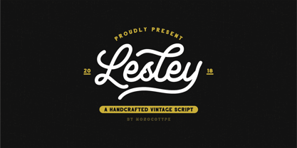 Lesley is a High quality monoline script font with swashes inspired by adventorous vibe and vintage design. Plus OpenType features with Stylistic Alternates, Swashes, Ligatures, Stylistic set, Terminal Form and Ornament that allows you to mix and match pairs of letters to fit your design. This font good for vintage design, t-shirt, logo, labels,badges, posters and etc.
 - HK Guise by Hanken Design Co.,
$30.00 HK Guise is a typeface with legible characters for maximum readability and legibility—perfect for interface and signage design projects. Inspired by Swiss Typographic design, HK Guise aims to be a standard go-to typeface for the adventurous graphic designer. Guise, defined literally; is an external form, appearance, or manner of presentation, typically concealing the true nature of something.
 - Calevor by DM Studio,
$15.00 The Calevor Elegant Font is a sophisticated and refined typeface that embodies timeless beauty and a touch of class. With its graceful letterforms and stylish design, this font adds an air of elegance and professionalism to your branding, invitations, editorials, and various design projects. Features: Elegant and Timeless Style: The Calevor Elegant Font exudes a timeless and sophisticated aesthetic. Its graceful letterforms, balanced proportions, and stylish design create an atmosphere of refined elegance, making it perfect for projects that demand a touch of class and sophistication. Refined Design: The font's design is characterized by its clean lines and harmonious curves. It's meticulously crafted to ensure every detail reflects the epitome of elegance, making it suitable for projects that require a polished and professional look. Versatile Application: This font is versatile and well-suited for a wide range of design projects where an elegant and timeless typeface is needed. Use it in branding, invitations, editorial design, luxury packaging, and more to add an element of sophistication and class to your designs. Uppercase and Lowercase Letters: The font includes both uppercase and lowercase letters, providing flexibility and creative freedom in your designs. Mix and match the cases to create visually appealing and balanced typography. Punctuation and Symbols: In addition to the alphabet, the Calevor Elegant Font includes a comprehensive set of punctuation marks, numerals, and common symbols. This ensures consistency and ease of use when incorporating the font into your design projects. Easy to Use: Installing and utilizing the Calevor Elegant Font is hassle-free. It is compatible with both Windows and Mac operating systems and seamlessly integrates into popular design software such as Adobe Photoshop, Illustrator, and InDesign. This ensures a smooth and efficient design workflow. Elevate your designs with the timeless elegance of the Calevor Elegant Font. Let its graceful letterforms and refined design add an air of sophistication and professionalism to your branding, invitations, and various design projects. Embrace the classic beauty of this font and create designs that exude elegance and style.
 - User Stencil by DSType,
$30.00 User is a monospaced type family with 30 styles, from Hairline to Bold, divided in Regular, Upright and Stencil, with five weights (Hairline, ExtraLight, Light, Medium and Bold) all with Cameo versions. Complexity and versatility are the keywords for this type family. Despite being a monospaced font, which means there's no kerning, all the glyphs were designed in order to sit comfortably in the 600 points width, a hard task because some glyphs are too narrow ('i' and 'l'), while others are too wide ('m' and 'w'), but they must fit the same width. The desire for keeping a comfortable readability in User was one of the key elements, therefore we designed several ligatures that fit both single and double space width, allowing to maintain a certain idea of proportional design. In this digital booklet you will find a detailed vision of the anatomy of the typefaces, the amount of characters available, the styles and weights, along with a series of features, specially designed to make User a very versatile and usable type system.
 - User Upright by DSType,
$30.00 User is a monospaced type family with 30 styles, from Hairline to Bold, divided in Regular, Upright and Stencil, with five weights (Hairline, ExtraLight, Light, Medium and Bold) all with Cameo versions. Complexity and versatility are the keywords for this type family. Despite being a monospaced font, which means there's no kerning, all the glyphs were designed in order to sit comfortably in the 600 points width, a hard task because some glyphs are too narrow ('i' and 'l'), while others are too wide ('m' and 'w'), but they must fit the same width. The desire for keeping a comfortable readability in User was one of the key elements, therefore we designed several ligatures that fit both single and double space width, allowing to maintain a certain idea of proportional design. In this digital booklet you will find a detailed vision of the anatomy of the typefaces, the amount of characters available, the styles and weights, along with a series of features, specially designed to make User a very versatile and usable type system.
 - User by DSType,
$30.00 User is a monospaced type family with 30 styles, from Hairline to Bold, divided in Regular, Upright and Stencil, with five weights (Hairline, ExtraLight, Light, Medium and Bold) all with Cameo versions. Complexity and versatility are the keywords for this type family. Despite being a monospaced font, which means there's no kerning, all the glyphs were designed in order to sit comfortably in the 600 points width, a hard task because some glyphs are too narrow ('i' and 'l'), while others are too wide ('m' and 'w'), but they must fit the same width. The desire for keeping a comfortable readability in User was one of the key elements, therefore we designed several ligatures that fit both single and double space width, allowing to maintain a certain idea of proportional design. In this digital booklet you will find a detailed vision of the anatomy of the typefaces, the amount of characters available, the styles and weights, along with a series of features, specially designed to make User a very versatile and usable type system.
 - Apresia Script by Asritype,
$42.00 Inspired by various shapes such as leaves, flowers, hearts etc., Apresia Script is harmonically crafted. My first intention is only for standard design, but, later added simpler characters for normal(standard) typings. Apresia Script is rich with capital letter variants and ornaments. There are also lowercase variants in lesser numbers. I assume that many or perhaps most people want to have their name or the other of their important designs to be written with some letters that are in various shapes harmoniously. Apresia Script with more then 4000 glyphs support this aim, also support many latin based languages. However, because of many variations, except the standard characters, the full marked capitals are only set in two variants; in ss01 and ss02, which is also some marked lowercases included here. Swash variants (swsh) consist only one variant of every uppercase and lowercase characters, but no marked characters. All the others capital and lowercase variants are put in stlystic alternatives (salt). There are tens of unmarked caps and fewer for unmarked lowercase in salt (see Apresia Script opentype features(1) poster for some). The ornaments can be accessed via opentype ornaments(ornm), using less() characters for easier access. There are also beginning small letter(lowercase) ornaments, end word(lowercase) ornaments and insertion ornaments to make your typing/design more flourish, using ornm via “[“ (bracketleft), “]” (bracketright) and “\” (backslash), respectively. For marks; marks via combining marks and mkmk was set for many characters variants, however, it seem most applications not yet support this features. Alternatively, you can add non standard unicode combining marks via ornaments for the language supported: asterisk “*” list for uppercase marks above letters; ASCIIcircum “^” list for lowercase marks above letters; underscore “_” for uppercase and lowercase marks below the letters; numbersign “#” for slashing characters, horn, caron alternate and reversed comma for g, (see Apresia Script opentype features(2) poster and save it if you download the font). Thus, it is recommended to have the application which are support these opentype features such as: Adobe in Design, Adobe Illustrator, CorelDRAW or others for easier accessing the glyphs. Still, for non supported applications, you can insert these glyphs via Character maps, insert symbols or other similar tools. Apresia Script will go for most typing/design such as invitation, wedding card, greeting card, banners, logos and many others. Use it for whatever you intended to, Apresia script will give an amazing end design, though you are not a designer. As intended to be able to be used by many, this font is set in an affordable price. Thank you very much for downloading this font.
 - Leaves and Twigs by Ana's Fonts,
$15.00 Leaves and Twigs is a quirky handwritten font trio and floral illustrations collection with fun variations, that is perfect for logotype design, branding and packaging, and social media posts. Just in time for the holidays, Leaves and Twigs is also perfect for homemade seasonal designs (such as postcards, prints, and present tags). Included in this collection: a tall, all-caps sans serif font - with a slant alternative a small, spaced sans serif font - with a jumpy alternative a spaced script font - with a slant alternative a floral illustrations dingbat font - with a blackout alternative All written with the same pen, at the same size, so that the line width is consistent throughout the collection, for easy pairing (floral illustrations are sized down by 4x).
 - Somersault by Fontforecast,
$15.00 Somersault is a nonchalant, rough edged, hand painted, brush font, with a spontaneous personality. With its natural charm it brings cheer and lightness to any design. Alternate characters for upper and lowercase letters and lots of ligatures enable you to avoid repetition of identical glyphs.They are managed by Opentype features such as stylistic alternates, swashes and discretionary ligatures. Somersault also comes with some fun extra's like strokes, hearts and splatters to play with. Somersault is PUA encoded, so no special design software is needed to access all glyphs. You can easily access all of them in Fontbook (Mac) or Character map (Windows). Somersault is paired with Somersault Tall, a complementary all caps font. The result is a versatile font duo. A perfect match.
 - Yolan Script by FadeLine Studio,
$15.00 This is a new font script with a unique and thin style. Not only unique, the font is made in detail also has an elegant style, sweet, simple and firm character. With a unique style that dancing, this font can make your design more alive. When you use this font sometimes you do not need to use other fonts pairing, this font can be used in single, but still as you wish! If you are curious, please try it! With a style like this, this font will be suitable in use for logo's, branding projects, homeware designs, product packaging, mugs, quotes, posters, shopping bags, logo's, t-shirts, book covers, name card, invitation cards, greeting cards, and all your other lovely projects.
 - Happy Pumpkin by Nadezda Gudeleva,
$14.00 Happy Pumpkin is a fancy hand drawn font. Aimed for printing greeting cards, especially for quotes with humor. Can also be used on t-shirts design and other print products. Happy Pumpkin season!
 - Very Loose by Page Studio Graphics,
$25.00Very Loose is a new alphabetic font. A casual display face with a design personality providing great versatility of association. Thoroughly pair-kerned, including all accented characters for use in western European languages. - President by Linotype,
$29.99In 1952, Charles Peignot made a bold and fortuitous move: he invited a young Swiss designer to Paris to be the art director of the Deberny & Peignot type foundry. This started the professional type design career of Adrian Frutiger; and since then he has designed an astonishing range of masterful typefaces. One of the earliest for Deberny & Peignot was Président, a sharp-seriffed Latin titling face. Latin" is a typographic designation for roman typefaces with wedge or triangular-shaped serifs, a stylistic form that Frutiger would return to later with his beautiful typeface Méridien. Président™ has wide, solid shapes; very little contrast between thick and thin strokes; and an air of assurance. Use this titling font for business cards, announcements, or artistic signage." - Noble Serenity by Hipfonts,
$9.00 Introducing Noble Serenity, where timeless beauty meets serene elegance. This exquisite serif font is a harmonious blend of sophistication and tranquility, designed to elevate your designs with a touch of refined grace. With its clean lines, delicate curves, and perfectly balanced proportions, Noble Serenity exudes an aura of understated charm and sophistication. Each letter is meticulously crafted, reflecting the meticulous attention to detail and craftsmanship of a bygone era. Whether you're designing wedding invitations, luxury branding, or editorial layouts, Noble Serenity brings an air of refined beauty to your projects. Discover the captivating allure of Noble Serenity and let your designs embrace the essence of timeless elegance. Elevate your typography to new heights with this font that whispers of tranquility and commands attention with its noble presence.
 - Mandrel by insigne,
$39.99 From the realm of insigne, a new family has risen. By name, Mandrel. Courtly in character and elegant in appearance, the face finds great favor among those with whom it seeks audience. With confident air, Mandrel carries itself gracefully before each pair of eyes, never faltering or stumbling in its refined step. But while dressed with gentility, this elegant family is not faint of heart when challenged. Crafted well for high-impact resistance, Mandrel steps boldly and prominently into the arena of the reader’s eye, boasting its tall x-heights, high contrast, confident bends, and sharp serifs. Skillfully, it wields its sharp serif endings, cutting swiftly through opponents’ crude clutter, which fights for the reader’s attention. From Thin to Black, nine weights and their matching italics make up this noble family. Mandrel furthermore includes an abundant treasury of OpenType variables to adorn your text. Ligatures, old-style figures, and stylistic sets are available to accompany the family’s 500 glyphs and its support for more than 70 languages. Raise your cup to this new Mandrel! With strong serifs and high contrast, you’ll find this champion ready to take up your challenge in many a test ahead.
 - ITC Lubalin Graph by ITC,
$40.99 ITC Lubalin Graph® was initially designed by Herb Lubalin and drawn to fit the requirements of typographic reproduction by Tony DiSpigna and Joe Sundwall in 1974. Its underlying forms are those of Lubalin's previously released ITC Avant Garde Gothic, but its shapes were modified to accommodate large slab serifs. Its condensed weights, which include small caps and oldstyle figures, were later additions by Helga Jörgenson and Sigrid Engelmann in 1992. The family, with its generous x-height and overall tight fit has come to represent the typographic style of American graphic design in the 1970s. The typeface is at home when paired with mid-century modern design and spare sanses or more traditional text faces from the period. ITC Lubalin Graph covers four weights in its condensed width from Book to Bold, and five weights in its normal width.
 - Duero by Eurotypo,
$34.00 The Duero is one of the major rivers of the Iberian Peninsula, flowing from its source across northern-central Spain and Portugal to its outlet at Porto. The "Duero viñatero", is an area of the Duero Valley where its famous wines are produced. "Duero", a new script font designed by Olcar Alcaide. Its slight bounce and intentional irregularity gives your words a wonderful flow. The thick and thin strokes in this typeface combine balance and harmony. "Duero" has OpenType features such as Stylistics and Contextual alternates, Swashes, Ligatures, that allow you to mix and match pairs of letters and a Central European language support to fit your design. This will help your creativity and make it easier to make the impressive and elegant typographic work. "Duero" looks good on food packaging, logo design, business-cards, fashion, magazines, menus, book covers and much more!
 - Minister by Linotype,
$29.99Designed by M. Fahrenwaldt for the Schriftguss foundry in 1929, Minister font is a contemporary design based on Garalde types. The letters have an oblique stress, capitals are wide, serifs are prominently concave. Minister font has obvious calligraphic overtones, making it a good informal text face. - Raleigh by Linotype,
$29.99The Raleigh typestyle is based on Carl Dair's original 1967, Cartier typeface. which was designed for the Canadian Centennial and the 1967 Montreal World's Fair. It was renamed Raleigh after Dair's death. Adrian Williams added three weights for a display series, and Robert Norton designed the text version. - Casual Font Bundle by Konstantine Studio,
$12.00 Please welcome, Casual Font Bundle. A pack of fun and variative fonts for your playful design. Every single fonts have their own personality and characters. Would be a perfect mate for your fun and casual design projects. Pair up each of them and you'll never disappointed at all!
 - Diegeometrische by Michael Browers,
$25.00Diegeometrische is an all uppercase geometric-based serif typeface featuring Latin, Extended Latin and Cyrillic character sets. - Latin, Extended Latin and Cyrillic character sets offer multilingual support. - Over 1000 kerning pairs for optimal letter spacing. - Unique combination of serif, geometric, and stencil design elements provides a distinct design. - Caleb Grotesk by Brenners Template,
$19.00 It seeks a stable balance through the pairing of plain contrasts and ink trap interfaces. The ordinary yet sophisticated ink trap digging is designed to minimize the discomfort caused by the change in weight. This stability is consistent no matter what weight or style you choose. So it has a wide coverage area ranging from logo design, editorial design, web UI, and app design.
 - Neo Sans Arabic by Monotype,
$114.99The futuristic forms of Neo® Sans are captured beautifully in this fine Arabic accompaniment from Patrick Giasson. The subtly futuristic forms of Neo Sans are carried through to the Arabic with aplomb, making these fonts an ideal companion to the Latin in both text and display settings.Neo Sans Arabic is available in six weights, from the airy Light, through to the heavy-hitting Ultra – all with companion italics. Ideal for multilingual projects, but just as accomplished on its own. - Minimo by Ahmet Altun,
$19.00 Minimo Font Family comes in 4 weights; Normals and Obliques. To have an eye-pleasing view, the corners are rounded and the lowercases are made smaller than the standard. With its soft structure, it is aimed to be legible even in the small sizes and also to be suitable for usage as webfont and application font. Moreover, with this font family, you can create eye-pleasing, cute and also nice works such as posters, printings, t-shirts, adds, magazines etc.
 - ALS Scripticus by Art. Lebedev Studio,
$63.00 There are many script typefaces but there is only one Scripticus. Scripticus is like a chameleon: In whatever surroundings you put it, it adapts itself and looks like it couldn't be anywhere else. Be it a sales advertisement, a music Website, a comic strip or a journal with complex chemical formula – Scripticus always solves the problem in a natural and leisurely way. And it never makes compromises concerning clarity. But where does Scripticus come from? … From the good old high school blackboard! Blackboards have become almost obsolete in teaching, but be it a black or white background – clear, strong characters placed on the board while the facts are explained are still one of the best ways to make and keep things understandable. Scripticus is dedicated to my high school chemistry teacher who was an expert in just this. While the letterforms come from different inspirations, its aim is the same as the pedagogical aim of my teacher: Combining clarity with a strong personality. Scripticus has a special trick to give it its natural look: Four alternates for each letter and each number plus rotation coding make the glyphs appear in lively melodic flow. In this way even mathematic equations look nice! Scripticus has a lot of OT-features that help it do its job. They are: capital spacing, localized forms, subscript, scientific inferiors, superscript, numerators, denominators, fractions, ordinals, tabular figures, historical forms, ligatures, stylistic alternates, stylistic set and ornaments. Finally, as is my general goal in type design – Scripticus supports close to one hundred languages from Latin extended to Cyrillic extended.
 - Vtg Stencil Italy No. 2 by astype,
$29.00 The Vtg Stencil fonts from astype are based on real world stencils from several countries. The Italian stencils that I chose as a model for this font are roughly based on classic French stencil letters. Please compare the figures (numbers) with their French counterparts. However, the Italian stencils are made with a different production technique. The design of the letters is clearly not punch-cut into the plates, maybe they are drilled, milled or etched. Details such as the serifs look bold and clumsy, and when using the stencils as they are meant, with viscous sign paint, smaller details easily fade away. So I took my freedom to design a font close to the original design but adding several typographic tweaks to let it shine, hoping to get closer to the intended design idea of these Italian stencils. Enjoy the vintage!
 - Fleuraloha by Wiescher Design,
$39.50FleurAloha are flowery embellishments Hawaiian style! Your very "Aloha" designer, Gert Wiescher - Batick Rodist by Alcode,
$20.00 Batick Radist collection is a luxury and elegant font pair that will bring a unique style and a trendy look to your designs. Comes with Serif Typeface and Chic handwritten with trending ligatures and special character, this will make Batick Radist Collection usable in all design projects and work perfectly to pair with any other font. With duo styles you can create design such as wedding media, book covers, greeting cards, logos, branding, business cards and certificates, even for any design work that requires a classic, formal or luxurious look. Included multiligual support and special ligatures Try Batick Radist collection, Enjoy the richness of OpenType features and let her fun and elegant excitement make you happy and enhance your creativity! You can use this font very easily.
 - Schnorr Gestreckt by HiH,
$12.00 Peter Schnorr was a German artist/illustrator of Art Nouveau period (called Jugendstil in Germany and Austria). He was quite adept at calligraphy and did a variety of commercial work, including business signs. He designed at least four different alphabets and collaborated with Bruce Rogers on advertising work and title page designs for books. One of their clients was the publishing house of Houghton Mifflin. I have not been able to discover anything else about him, but I suspect he might be the grandson of the Bavarian artist Jules Schnorr von Carolsfeld, who was once commissioned to do a mural by Ludwig II of Bavaria (whose famous castle was copied by Disneyland). Schnorr did not give individual names to his fonts. Where there is no historical name, we like to follow the tradition initiated by Bauer and name fonts after their designer, with a descriptive adjective in the designer’s native language. Gestreckt is German for stretched or elongated. An interesting deign detail of this typeface is the cross bar of the “T” --it is NOT symetrical. The right hand side extends only 88% as far as the left hand side (a ratio of 9:8). I presume this was done for a more pleasing letter fit. Today Schnorr’s design is frequently offered under the name “Ambrosia.” However. close inspection will usually reveal that the serifs have been treated differently. I believe our font has a greater fidelity to the original design. Please also compare the design of the various auxiliary characters to those in other fonts. Often they are either borrowed from an inappropriate font of a different period or are missing altogether. We make every effort to design characters that are in keeping with the overall design and spirit of the typeface. For example, see the superscript Registered Trademark symbol (0174) and the Double s (0223). I think both are quite successful. Schnorr Gestreckt ML represents a major extension of the original release. In addition to the standard 1252 Western Europe Code Page with character slots up to decimal position 255, there are glyphs for the 1250 Central Europe, the 1252 Turkish and the 1257 Baltic Code Pages. There are also two alternate letter forms, one ornament and seven ligatures with Unicode codepoints (Private Use Area) and OpenType aalt, ornm & liga GSUB layout features. There are a total of 318 glyphs and 351 kerning pairs. Please note that some older applications may only be able to access the Western Europe character set (approximately 221 glyphs). This release also incorporates a redesign of several glyphs: the comma, quotes, acute accent, and grave accent.
 - Baraboo Banner by Solotype,
$19.95This was put together by Dan X. Solo to provide a quick way to set headings for a circus brochure. The name was given in recognition of the Baraboo Circus Museum. The end pieces are in pairs on the uppercase keys A-B, C-D, etc. The alphabet itself is in the lowercase position. - Kraftwied by Alexey Makarov,
$16.00 An original flat font, light and clean. Works best for accents and any small blocks of text. There are over 1000 kerning pairs to ensure that the flow of the font is natural and easy to work with. Language support: Contains full set of Latin alphabet, including diacritical marks for European languages and Cyrillic alphabets.
 - Jump by Linotype,
$40.99Jump is a lighthearted, handwritten script. Its quick and informal style is perfect for short notes and messages to convey charisma. The letters 'jump' up and down on the baseline giving words and sentences a lively impression. Try out Jump for invitations, cards, and announcements when you are aiming for the hand-made effect. - Wayfinder CF by Connary Fagen,
$35.00 Wayfinder® CF imparts both elegance and urgency to any text. Equally warm and intense, Wayfinder is a display font family made for logos, headlines, titles, and other short texts. Seven weights cover everything from an airy thin to a brilliant heavyweight. Wayfinder® CF pairs nicely with simple, unadorned typefaces. Great options include Artifex Hand CF and Greycliff® CF. All typefaces from Connary Fagen include free updates, including new features, and free technical support.
 - La Luxes by Set Sail Studios,
$22.00 Indulge yourself in a luxurious typography pairing with La Luxes; a classic font duo consisting of an elegant Script & ligature-rich Serif. These fonts are designed to pair harmoniously, and lend themselves to high end branding, logo designs, product packaging & invitation designs. Here’s a run through the fonts in more detail; 1. La Luxes Script • A clean, elegant hand-drawn script font containing upper & lowercase characters, all punctuation and numerals. Also contains 30 ligatures to help the text flow naturally and add a custom-made feel. 2. La Luxes Serif • A stylish & modern all-caps serif containing upper & new lowercase characters, all punctuation & numerals. Also contains 38 ligatures and 11 special characters giving you a variety of layout options. Using Ligatures and Special Characters; Both fonts contain a large range of ligatures (unique double-letter pairings) to provide you with more customisation options; Most programs will automatically have Standard Ligatures switched on for you, if not you will need to enable this OpenType feature. The Serif font contains a number of raised ‘small caps’ (A, E, O, U, C) and characters with elongated tails (L, K, R,). These can be accessed by switching on ‘Stylistic Alternates’ in any OpenType capable software and typing these characters. The star icon can be accessed simply by typing the asterisk key (*) with the Serif font. All Ligatures and Special Characters can also be accessed via a Glyphs panel. This is available on most Adobe software & Affinity Designer. The stylised vertical ‘AND’ and ‘CO’ icons can only be accessed this way. Language Support; Both fonts support English, French, Italian, Spanish, Portuguese, German, Swedish, Norwegian, Danish, Dutch, Finnish, Indonesian, Malay, Hungarian, Polish, Turkish, Slovenian
 - Sackers Gothic by Monotype,
$32.99 Sackers Gothic is part of the larger Sackers series, a collection of fonts drawn from templates for producing engraved stationery and social cards by Gary Sackers, a Charlotte, North Carolina intaglio printer. Many typefaces were made from similar sources, including Monotype’s Engravers series, as well as Jim Spiece’s ITC Blair, and Mark van Bronkhorst’s Sweet Sans. Sackers’ typefaces, which were initially made into photo-set type, were digitized by Compugraphic and released in the late 1980s. Sackers Gothic has since become a popular choice for conveying sincere and plainspoken language on dust jackets, posters, and of course, in stationery. The face pairs well with display faces of a disparate nature, and serves as a ready foil for anything requiring an air of typographic sophistication.
 - Barata Display by Estudio Arellano Type Foundry,
$25.00 Barata Display is an all caps script family font inspired by the street vendors and informal commerce in Latin countries. A condensed defined and thick stroke evokes the chalk signs that are made in "tianguis", markets, greengrocers, barbecues and flea markets from Los Angeles to Buenos Aires. It is a typeface that "SCREAM" buy me, save money, discounted, almost Free, opportunity!. What distinguishes the New Barata Display from Estudio Arellano Type Foundry is the expressive power of its structure. The Alphabet is built on the geometric principle of free traces from freehand writing. Composed of 236 capital Roman characters, Barata Display includes most common accents and diacritics. Barata Display can be used in any kind of commercial or personal promotion, in graphic design, web, print, animation, etc. Perfect for price labels, tags and other applications such as posters and t-shirts. It is a typeface ideal for headlines and Lettering.