9,266 search results
(0.01 seconds)
- Fontocide - Unknown license

- Sláine - Unknown license

- Publication JNL by Jeff Levine,
$29.00If Publication JNL looks very familiar, this is no accident of design. It is Jeff Levine’s rendering of De Vinne, a classic typeface designed in honor of T.L. De Vinne (circa 1890-91) and given the gentle nuance of emulating hand-set type. - Symptomatic by Hanoded,
$15.00 No, rest assured - I am not ill. I just liked the letter combination of Symptomatic! Symptomatic is a messy connected brush script. Use if for your book titles, posters and product packaging. Comes with double letter ligatures and a whole lotta diacritics.
 - Ongunkan Greek Script by Runic World Tamgacı,
$50.00 This beautiful writing, which belongs to the Greek culture, is in a good place among the world writing cultures. I wouldn't have done it if I didn't make the font in this article. Dozens of beautiful fonts all have the same elegant lines.
 - Lazy Monk by Mirco Zett,
$18.00 In the past it was the monk's duty to duplicate the bible, as they wrote everything by hand. The "Lazy Monk" font shows how these replica could have appeared if the monks had been too drunk or too lazy to rewrite the bible.
 - Love Princes by Sulthan Studio,
$10.00 Love Princes is a handwritten script font that was written using a marker on paper and then I made it into a charming and very natural font, with two very cool writing characters if paired or used in one of your works
 - Oatlander by Almarkha Type,
$29.00 Introducing, Oatlander ! A bold script that will stands out from the crowd! Perfect to be used as logotype, badge and label! This has many opentype features like stylistic alternate,and support multi language. if you have any Question please Message Me. Thank You
 - LD Dear Diary by Illustration Ink,
$3.00If you've got a secret to tell, or just crave a unique font for cool scrapbook journaling, "Dear Diary" will fit the bill. This true type font looks handwritten with tall uppercase letters, and small, narrower lowercase script. Have some fun with it! - HeroesX by Mightyfire,
$10.00 If you are looking for a font that have strong looks, meet HeroesX. We create HeroesX with a firm, strong and tough looks. This font is perfectly suit for book title, gymnastic logo, sport logo, game logo and any other creative arts.
 - Okay Marker by Okaycat,
$19.50 Okay Marker is a natural hand-printed font, designed to appear as if it was written by wide marker. A clean legible style yet friendly & fun. Okay Marker features extended characters, containing West European diacritics & ligatures, making it suitable for international environments & publications.
 - Tough Cookie by Hanoded,
$15.00 Tough Cookie is a handmade font that looks like it has been cut out. It comes in three varieties that work together really well. Use it for your book covers and product packaging, or (if you’re a tough cookie) for your christmas cards…
 - LD Engraved by Illustration Ink,
$3.00This font looks as if it was engraved on a plaque. Each letter has a top and bottom line. When you put the ending parts using the [ and ] keys, it forms a beautiful plaque. It is great for a more formal title. - Combust by Typefactory,
$14.00 Combust is a modern playful display font with fire. The font is thick so it can still be read even if there is a burning fire, suitable for various purposes, poster design, for video game or movie titles, or promotions on social media.
 - Celtics Modern by Dharma Type,
$14.99 Inspired from ancient Celtic lettering such like insular-half-uncial. New interpretation of Celtic letters bring a whole new feel to old letterings. At the same time, the font has handwritten-style glyphs as if they were handwritten same as the ancient letters.
 - Stellar Moon by ArimaType,
$18.00 Stellar Moon is an authentic, bold and simple serif font. Whatever the topic, this font will be a wonderful asset to your font library, as it has the potential to enhance any creation. If you have questions, please contact us at arimatype@gmail.com
 - Nouveau Romance JNL by Jeff Levine,
$29.00 The hand lettered title on the sheet music for 1917's "If They'd Never Take You from Me" was the basis for the Art Nouveau sans design of Nouveau Romance JNL. This elegant sans serif is available in both regular and oblique versions.
 - Luxory by Viswell,
$22.00 Luxory is a handwritten font made with natural hand strokes. This font is inspired by handwriting made with markers. Luxory features : • Uppercase and Lowercase characters • Numerals & Punctuation • Ligatures • Alternates If you have any issues or questions, just let me know agamrahmadan36@gmail.com Thanks
 - Valerio by Stefano Giliberti,
$15.00 Valerio is the font family to use if you wish to convey your ideas with elegance and a pinch of eccentricity without being out of touch with modernity. Valerio supports 117 languages, features a total of 504 glyphs and includes an italicized version.
 - Blober by LomoHiber,
$- I'm proud to present my Blober. He is a cute young font which will be helpful if you are going to design something cute and lovely. Fill him with pattern or texture and Blober will reflect the emotion in any way you want.
 - Big Tent Players NF by Nick's Fonts,
$10.00A WPA poster announcing the latest production by—guess who?—the Big Tent Players inspired this eye-catching, if somewhat unconventional, typeface. Both versions of the font include the 1252 Latin and 1250 CE character sets (with localization for Romanian and Moldovan). - Analogue Photography by sizimon,
$25.00 Analogue Photography is a handwritten signature font with fashionable themes. The Analogue Photography matches apply in some designs such as the logotype, quotes, wedding invitation, business card, packaging, branding, and more custom design. If you have any questions, please contact us info@sizimon.com
 - Julius by Wiescher Design,
$49.50 Julius comes in very handy if you want to jump back in time to the middle of the last century. Julius is also one of my first typefaces, recently I added the light version. Enjoy your trip back into the past, Gert Wiescher
 - Able by T-26,
$39.00The history of Able’s connection with the Harry Potter phenomenon is really up in the air. It’s a catch-22 in this business - you either promote your own work and negotiate expensive exclusive licenses, or you work with a promoter and sell your designs to anyone and everyone. It could have been an in-house designer at Rowling’s publisher, Scholastic, or a freelancer who proposed Able for the headings and such. The responsible party licensed it from T26, and JK Rowling’s storytelling made it a star. (I suppose it’s ironic that there’s a whole lot of unwritten history in the typography business.) Able’s rise to fame really is a classic love story between reading and type design. If the books weren’t so popular, Able might still be waiting for some Mexican fast food chain to pick it up for packaging design. The movie deal certainly made the font all the more recognizable, what with its merchandising campaign. Popularity can also cripple a great decorative face. It’s always being recognized as “The Harry Potter Font.” It might just have to wait a few decades for the Potter phenomenon to subside to be freed from the “Chamber of Pigeonholed Fonts.” In the meantime, I’m sure that a lot of fledgling graphic design apprentices are reading their new Potter books, being charmed by the idea of type design when they’re not turning the pages too fast to notice. - Allrounder Monument by Identity Letters,
$22.00 An inscriptional titling font for truly epic headlines. Allrounder Monument is an inscriptional, dignified member of the Allrounder superfamily. This all-caps typeface with delicate serifs was inspired by ancient inscriptions on columns, monuments, and buildings in Rome: letters as old as two millennia that radiate their own classic charm. Allrounder Monument picks up this atmosphere in order to create a typographic tool that lives up to contemporary demands. It infuses today’s designs with a hint of history and an air of exclusivity. Allrounder Monument is a timeless titling typeface. You might use it for posters, magazines, book covers, greeting cards, advertising or packaging work, and even signage. If you want an even more spectacular and exciting headline or title, additional Discretionary Ligatures and a Stylistic Set provide the necessary OpenType power to achieve this goal with ease. As Allrounder Monument is a part of the Allrounder superfamily, you can combine the three weights Book, Regular and Medium with the corresponding weights of Allrounder Grotesk. The Allrounder superfamily is a series of typefaces sharing the same color and horizontal metrics (cap height, small cap height and x-height): a typesetting system whose components match each other perfectly. Any other part of this design kit, e. g., Allrounder Grotesk or Allrounder Antiqua, may be easily combined with Allrounder Monument. Whenever you need a truly epic headline, Allrounder Monument is the best horse in your barn. Ad astra!
 - Canturiana by Latinotype,
$39.00 According to the Dictionary of the Spanish Royal Academy, «canturía» is the exercise of singing, and a way of singing musical compositions. Canturiana Type (derived from «canturía») has a romantic and musical air, as well as a clear sensuality thanks to its sinuous construction. The curves seduce us, conquer us, hypnotize us and the letters acquire a resounding lightness, and a very earthly presence that is complemented by a certain aerial, spiritual expressiveness. Canturiana Type is inspired by Canterbury, a font designed in the 1920s by the legendary American type designer and engineer Morris Fuller Benton and published by the American Type Founders (ATF). Canturiana Type collects all this heritage and transforms it into a digital typeface perfectly functional and adapted to the visual communication of the 21st century. Its elegant art deco essence provides it with a unique and heterodox imprint that works in very different media, giving them distinction and depth. The creative process of Canturiana Type has gone through various mutations to a point where each episode of its creation has left its mark, a multiple imprint that makes it unique, singular in its essence and plural in its possibilities. For this reason, Canturiana Type expresses itself with several voices without any variation in its essence. A conceptual ambiguity that makes it truly versatile. Canturiana Type is a typographic choir, a complex entity that has infinite nuances and tones. Classic and cool. Disruptive and romantic. Literary and musical. Canturiana Type is composed of 5 weights, and has a large number of swashes, alternate characters, ligatures and various visual elements to make compositions as titles or for use in short texts. Canturiana Type has more than a thousand glyphs and offers a wide range of languages that use the Latin alphabet.
 - Selfie Neue Sharp by Lián Types,
$29.00 INTRODUCTION When I started the first Selfie back in 2014 I was aware that I was designing something innovative at some point, because at that time there were not too many, (if any) fonts which rescued so many calligraphy features being at the same time a monolinear sans. I took inspiration from the galerías’ neon signs of my home city, Buenos Aires, and incorporated the logic and ductus of the spencerian style. The result was a very versatile font with many ligatures, swashes and a friendly look. But… I wasn’t cognizant of how successful the font would become! Selfie is maybe the font of my library that I see the most when I finally go out, (type-designers tend to be their entire lives glued to a screen), when I travel, and also the font that I mostly get emails about, asking for little tweaks, new capitals, new swashes. Selfie was used by several renowned clients, became part of many ‘top fonts of the year’ lists and was published in many magazines and books about type-design. These recognitions were, at the same time, cuddles for me and my Selfie and functioned as a driving force in 2020 to start this project which I called Selfie Neue. THE FONT "Selfie for everything" Selfie Neue, because it’s totally new: All its glyphs were re-drawn, all the proportions changed for better, and the old and somehow naive forms of the first Selfie were redesigned. Selfie Neue is now a family of many members (you can choose between a Rounded or a Sharp look), from Thin to Black, and from Short to Tall (because I noticed the feel of the font changed notoriously when altering its proportions). It also includes swashy Caps, which will serve as a perfect match for the lowercase and some incredibly cute icons/dingbats (designed by the talented Melissa Cronenbold, see also Selfie Neue Rounded for more!) which, as you see in the posters, make the font even more attractive and easy to use. You'll find tons of alternates per glyph. It's impossible to get tired with Selfie! Like it happened with the old Selfie, Selfie Neue Sharp was thought for a really wide range of uses. Magazines, Book-covers, digital media, restaurants, logos, clothing, etc. Hey! The font is also a VF (Variable Font)! So you can have fun with its two axes: x-height and weight, in applications that support them. Let me take a New Sharp Selfie! TECHNICAL If you plan to print Selfie Neue VF (Rounded or Sharp), please remember to convert it to outlines first. The majority of the posters above have the "contextual" alternates activated, and this makes the capitals a little smaller. I'd recommend deactivating it if you plan to use Selfie for just one word. Use the font always with the "fi" feature activated so everything ligatures properly. The slant of the font is 24,7 degrees, so if you plan to have its stems vertical, you may use Selfie with that rotation in mind. THANKS FOR READING
 - TA Bankslab by Tural Alisoy,
$33.00 The building of the Northern Bank of St. Petersburg's Baku branch was built in 1903-1905. It was the first Art Nouveau-style building in Baku, Azerbaijan. Later the bank was transformed into the Russian-Asian Bank. After the oil boom in Baku in the 19th century, branches of many banks and new banks were opened in the city. The branch of the Northern Bank of St. Petersburg was among the first banks that was opened in Baku. N.Bayev was the architect of the building for the branch of the Northern Bank of St. Petersburg located at Gorchakovskaya 3 in 1903-1905. The building currently houses the Central Branch of the International Bank of Azerbaijan. My purpose in writing this is not to copy and paste the information from Wikipedia. What attracted me to the building was the word "Банкъ" (Bank) written in Cyrillic letters, which was also used in Azerbaijan during the Soviet era. The exact date of the writing is not known. Every time I pass by this building, I always thought of creating a font of this writing someday. I had taken a photo of the building and saved it on my phone. I did a lot of research on the font and asked a lot of people. However, some did not provide information at all and some said they did not have any information. I was interested in the history of this font but I do not know if this font really existed or it was created by the architect out of nowhere. If there was such a history of this font, I wanted to recreate this font and make it available. If not, I had to create it from scratch in the same way, using only existing letters on the building. Finally, I made up my mind and decided to develop the font with all letters I have got. It was difficult to create a font based on the word, Банкъ. Because in the appearance of the letters, the midline of the letters on A, H, K was very distinct, both in the form of inclination and in more precise degrees. The serif part of the letters, the height of the upper and lower sides, differed from each other. I don't know whether it was done this way when the building was constructed or it happened over time. I prepared and kept the initial version of the font. I took a break for a while. I started digging on the story of the font again. Meanwhile, I was researching and got inspired by similar fonts. Unfortunately, my research on the font's history did not yield any results. I decided to continue finishing up the font. After developing the demo, I created the font by keeping certain parts of these differences in the letters. In addition, I had to consider the development of letters in the Cyrillic, as well as the Latin alphabet, over the past period. Thus, I began to look at the appearance of slab-serif or serif fonts of that time. In general, as I gain more experience in developing fonts, I try to focus on the precision of the design for each font. In recent years, I specifically paid attention to this matter. YouTube channel and articles by Alexandra K.'s of ParaType, as well as, information and samples from TypeType and Fontfabric studios on the Cyrillic alphabet were quite useful. I gathered data regarding the Latin alphabet from various credible sources. I do not know if I could accomplish what I aimed at but I know one thing that I could develop the font. Maybe someday I'll have to revise this font. For now, I share it with you. I created the font in 10 styles. 7 weight from Thin to Extra Black, an Outline, Shadow, and Art Nouveau. The Art Nouveau style was inspired by the texture in the background used for the text on the building. The texture I applied to capital letters adds beauty to the font. If you like the font feel free to use it or simply let me know if your current alphabet doesn't support this font.
 - TA Bankslab Art Nouveau by Tural Alisoy,
$40.00 TA Bankslab graphic presentation at Behance The building of the Northern Bank of St. Petersburg's Baku branch was built in 1903-1905. It was the first Art Nouveau-style building in Baku, Azerbaijan. Later the bank was transformed into the Russian-Asian Bank. After the oil boom in Baku in the 19th century, branches of many banks and new banks were opened in the city. The branch of the Northern Bank of St. Petersburg was among the first banks that was opened in Baku. N.Bayev was the architect of the building for the branch of the Northern Bank of St. Petersburg located at Gorchakovskaya 3 in 1903-1905. The building currently houses the Central Branch of the International Bank of Azerbaijan. My purpose in writing this is not to copy and paste the information from Wikipedia. What attracted me to the building was the word "Банкъ" (Bank) written in Cyrillic letters, which was also used in Azerbaijan during the Soviet era. The exact date of the writing is not known. Every time I pass by this building, I always thought of creating a font of this writing someday. I had taken a photo of the building and saved it on my phone. I did a lot of research on the font and asked a lot of people. However, some did not provide information at all and some said they did not have any information. I was interested in the history of this font but I do not know if this font really existed or it was created by the architect out of nowhere. If there was such a history of this font, I wanted to recreate this font and make it available. If not, I had to create it from scratch in the same way, using only existing letters on the building. Finally, I made up my mind and decided to develop the font with all letters I have got. It was difficult to create a font based on the word, Банкъ. Because in the appearance of the letters, the midline of the letters on A, H, K was very distinct, both in the form of inclination and in more precise degrees. The serif part of the letters, the height of the upper and lower sides, differed from each other. I don't know whether it was done this way when the building was constructed or it happened over time. I prepared and kept the initial version of the font. I took a break for a while. I started digging on the story of the font again. Meanwhile, I was researching and got inspired by similar fonts. Unfortunately, my research on the font's history did not yield any results. I decided to continue finishing up the font. After developing the demo, I created the font by keeping certain parts of these differences in the letters. In addition, I had to consider the development of letters in the Cyrillic, as well as the Latin alphabet, over the past period. Thus, I began to look at the appearance of slab-serif or serif fonts of that time. In general, as I gain more experience in developing fonts, I try to focus on the precision of the design for each font. In recent years, I specifically paid attention to this matter. YouTube channel and articles by Alexandra K.'s of ParaType, as well as, information and samples from TypeType and Fontfabric studios on the Cyrillic alphabet were quite useful. I gathered data regarding the Latin alphabet from various credible sources. I do not know if I could accomplish what I aimed at but I know one thing that I could develop the font. Maybe someday I'll have to revise this font. For now, I share it with you. I created the font in 10 styles. 7 weight from Thin to Extra Black, an Outline, Shadow, and Art Nouveau. The Art Nouveau style was inspired by the texture in the background used for the text on the building. The texture I applied to capital letters adds beauty to the font. If you like the font feel free to use it or simply let me know if your current alphabet doesn't support this font.
 - Grunge - Unknown license

- Nose Bleed - Unknown license

- PerfectPixel - Unknown license

- Grootesk - Unknown license

- Bloc - Personal use only

- Freight Display Pro by Freight Collection,
$39.00 Freight Display kicks it up another notch from the Freight Text family with more open counters and a bit more contrast. Those warmer proportions give balance for easily read headlines, running heads, and subheads while still standing tall if reversed-out at smaller sizes.
 - Walterosse by Almarkha Type,
$35.00 Hello Introducing, Walterosse - Elegant Stylish Display Serif is an unique font that uses ligatures to smoothly link letters. Perfect for adding a unique twist to word-mark logos, monograms or pull quotes. Walterosse has 7 cigatures can be turned off if required standard writing needs.
 - Carl Brown by Muntab Art,
$18.00 Carl Brown fonts includes uppercase letters, numerals, a large range of punctuation. Serif font with modern style. Created for poster, web design, branding, illustrations, badges and some other works. Please contact us if you have any question, we are happy to help you! Thank you!
 - Amber by MADType,
$21.00 Amber is a minimal font which is built on a grid of 3x3 squares. It was an experiment to see if I could build legible glyphs out of such a small grid. The 3 weights can be layered over each other to create interesting designs.
 - Gustav by Supfonts,
$16.00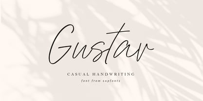 Gustav it is a Calligraphy chick font with exquisite accents. It is perfect for branding, wedding invitations and invitation cards and many more What's inside: Gustav Script Multilingual support Cricut support If you have any questions, please contact me directly or in instagram @supfonts
 - Amoebica by Hanoded,
$15.00 Amoebica font was created during a nasty bout of the flu. If you think it looks weird, well, I must have been hallucinating when I drew the glyphs! Amoebica is a fun, weird, unusual, happy, crazy kind of font which comes with all diacritics.


