10,000 search results
(0.032 seconds)
- Crisp Cracks by Maulana Creative,
$11.00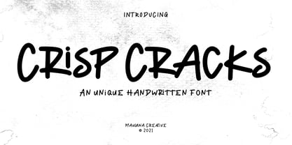 "Crisp Cracks" is a casual Handwritten font. With regular stroke, fun character with a bit of ligatures, lowercase alternates and swashes. To give you an extra creative work. "Crisp Cracks" font support multilingual more than 100+ language. This font is good for logo design, Social media, Movie Titles, Books Titles, a short text even a long text letter and good for your secondary text font with sans or serif. Make a stunning work with "Crisp Cracks" font. Cheers, MaulanaCreative
 - Boyflare by Maulana Creative,
$12.00 Boyflare is a cursive handwritten script font. With bold mono-line stroke, fun character with a bit of ligatures and alternates. To give you an extra creative work. Boyflare font support multilingual more than 100+ language. This font is good for logo design, Social media, Movie Titles, Books Titles, a short text even a long text letter and good for your secondary text font with sans or serif. Make a stunning work with Boyflare font. Cheers, Maulana Creative
 - Karma Koma by Maulana Creative,
$14.00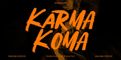 Karma Koma is a casual handwritten font. With bold brush stroke, fun character with a bit of ligatures and alternates. To give you an extra creative work. Karma Koma font support multilingual more than 100+ language. This font is good for logo design, Social media, Movie Titles, Books Titles, a short text even a long text letter and good for your secondary text font with sans or serif. Make a stunning work with Karma Koma font. Cheers, Maulana Creative
 - MC Bazelle by Maulana Creative,
$15.00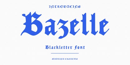 Bazelle is a modern experimental blackletter font. With medium low contrast stroke, fun character with a bit of ligatures and alternates. To give you an extra creative work. Bazelle font support multilingual more than 100+ language. This font is good for logo design, Social media, Movie Titles, Books Titles, a short text even a long text letter and good for your secondary text font with sans or serif. Make a stunning work with Bazelle font. Cheers, Maulana Creative
 - Hitshot Signature by Maulana Creative,
$12.00 Hitshot is an expressive signature brush script font. With regular brush stroke, slanted and fun character with some of ligatures and lowercase alternates. To give you an extra creative work. Hitshot font support multilingual more than 100+ language. This font is good for logo design, Social media, Movie Titles, Books Titles, a short text even a long text letter and good for your secondary text font with sans or serif. Make a stunning work with Hitshot font. Cheers, MaulanaCreative
 - MC Rasteira by Maulana Creative,
$16.00 Rasteira is an elegant classical display serif font. Regular contrast stroke, fun character with a bit of ligatures and alternates. To give you an extra creative work. Rasteira font support multilingual more than 100+ language. This font is good for logo design, Social media, Movie Titles, Books Titles, a short text even a long text letter and good for your secondary text font with script or serif. Make a stunning work with Rasteira font. Cheers, Maulana Creative
 - Sunnycyclops by Maulana Creative,
$12.00 Sunnycyclops is a Handwritten script font it's monoline and clean stroke with fun character. It has Opentype features ligature rich to give you an extra creative work. Sunnycyclops support multilingual more than 100+ language. This font is good for logo design, Social media, Movie Titles, Books Titles, a short text even a long text letter and good for your secondary text font with sans or serif. Make a stunning work with Sunnycyclops Handwritten font. Cheers, MaulanaCreative
 - MC Rib Cawmy by Maulana Creative,
$15.00 Rib Cawmy playful display font. Bold stroke, fun character with a bit of ligatures and alternates. To give you an extra creative work. Rib Cawmy playful display font support multilingual more than 100+ language. This font is good for logo design, Social media, Movie Titles, Books Titles, a short text even a long text letter and good for your secondary text font with script or serif. Make a stunning work with Rib Cawmy playful display font. Cheers, Maulana Creative
 - Franches by Maulana Creative,
$14.00 Franches is a Cute handwritten font. With high contrast bold stroke, upright and fun character with a bit of ligatures. To give you an extra creative work. Franches font support multilingual more than 100+ language. This font is good for logo design, Social media, Movie Titles, Books Titles, a short text even a long text letter and good for your secondary text font with sans or serif. Make a stunning work with Franches font. Cheers, MaulanaCreative
 - Maryam by Outras Fontes,
$24.00 Maryam is an Outras Fontes type family designed by Ricardo Esteves Gomes. With moderate contrast, these fonts have elegant and very legible forms even in small x-height sizes. There are more then 70 ligatures in each font, providing a lot of letterform variations that make this type family looks like a real handwriting on a page. It is currently available in two versions (Regular and Alternate) that you can combine with each other as you wish.
 - Fattalsfort by Maulana Creative,
$13.00 Fattalsfort is a Handwritten Brush font. With Bold raw brush stroke, slant and fun character with a bit of ligature and swashes. To give you an extra creative work. Fattalsfort font support multilingual more than 100+ language. This font is good for logo design, Social media, Movie Titles, Books Titles, a short text even a long text letter and good for your secondary text font with sans or serif. Make a stunning work with Fattalsfort font. Cheers, MaulanaCreative
 - Shasy Love by Maulana Creative,
$14.00 Shasy Love lovely display font. Bold stroke, fun character with a bit of ligatures and alternates. To give you an extra creative work. Shasy Love font support multilingual more than 100+ language. This font is good for logo design, Social media, Movie Titles, Books Titles, a short text even a long text letter and good for your secondary text font with script or serif. Make a stunning work with Shasy Love graffiti display font. Cheers, Maulana Creative
 - Malto by Maulana Creative,
$15.00 Malto is a condensed sans serif font. With semi bold soft edge stroke, fun character with a bit of ligatures and alternates. To give you an extra creative work. Malto font support multilingual more than 100+ language. This font is good for logo design, Social media, Movie Titles, Books Titles, a short text even a long text letter and good for your secondary text font with sans or serif. Make a stunning work with Malto font. Cheers, Maulana Creative
 - Horriblys by Maulana Creative,
$14.00 Horriblys is a decorative handwritten display font. With bold wavy stroke, fun character with a bit of ligatures and alternates. To give you an extra creative work. Horriblys font support multilingual more than 100+ language. This font is good for logo design, Social media, Movie Titles, Books Titles, a short text even a long text letter and good for your secondary text font with sans or serif. Make a stunning work with Horriblys font. Cheers, Maulana Creative
 - MC Granko by Maulana Creative,
$17.00 Granko is a a retro vibes condensed sans serif font. Bold stroke, fun character with a bit of ligatures and alternates. To give you an extra creative work. Granko font support multilingual more than 100+ language. This font is good for logo design, Social media, Movie Titles, Books Titles, a short text even a long text letter and good for your secondary text font with script or serif. Make a stunning work with Granko font. Cheers, Maulana Creative
 - Ponpewd Signature by Maulana Creative,
$11.00 Ponpewd is a Signature Script Brush Font. With bold mono-line stroke, slant and fun character with a bit of ligatures. To give you an extra creative work. Ponpewd font support multilingual more than 100+ language. This font is good for logo design, Social media, Movie Titles, Books Titles, a short text even a long text letter and good for your secondary text font with sans or serif. Make a stunning work with Ponpewd font. Cheers, MaulanaCreative
 - MC Harben by Maulana Creative,
$18.00 Harben is an wavy stem display sans font. With bold stroke, fun character with a bit of ligatures and alternates. To give you an extra creative work. Harben font support multilingual more than 100+ language. This font is good for logo design, Social media, Movie Titles, Books Titles, a short text even a long text letter and good for your secondary text font with script or serif. Make a stunning work with Harben font. Cheers, Maulana Creative
 - Bravhela by Maulana Creative,
$12.00 Bravhela is an unique western handwritten display script font. With bold consist stroke, fun character with a bit of ligatures and alternates. To give you an extra creative work. Bravhela font support multilingual more than 100+ language. This font is good for logo design, Social media, Movie Titles, Books Titles, a short text even a long text letter and good for your secondary text font with sans or serif. Make a stunning work with Bravhela font. Cheers, Maulana Creative
 - Sweet Girls by Haksen,
$12.00 Hello all, I will introduce my new font with the name “Sweet Girls” “Sweet Girls” is the form of letters that many variation and look very beautiful. available over than 50 glyphs for alternative letters that will make this font look so cute, funny, beautiful and fascinating. What's Included : Sweet Girls OTF Sweet Girls Slant OTF Sweet Girls Icons OTF Thanks so much for checking out my shop! Hope You enjoy it so much All the best, Haksen
 - Breadley Sans by Ardyanatypes,
$14.00 Introducing Breadley Sans, a modern, elegant tagline sans serif type look. This font equipped with 5 levels of thickness, from thin to black suits your needs. Pairs well with modern san serifs and scripts as pictured, or stands strongly on its own as a heading and brand representative for an elegant look. This Breadley Sans overcome with the professional modern characteristic font which could bring elegant and appealing identity to your company for business utilities use like business card, name tag, uniform as brand elevation Advertising usage? sure! This modern Breadley Sans Serif typeface obviously fit to embossed as a letter signboard or even splash it along your office with an elegant look cutting sticker. The type shape of this elegant Breadley Sans, also stunning for books cover or magazine writing You can view all of the available characters in the screenshots above, and you can try out the modern & elegant of Breadley Sans now for any design matter Breadley Sans is also equipped with many languages, so it is easy to use for any country and language usage, and also equipped with Ligatures and alternative stylistic to make your design more attractive. A guide to accessing all alternatives Adobe Photoshop go to Window – glyphs Adobe Illustrator go to Type – glyphs Thank you and have a nice day
 - Elegise by Nathatype,
$29.00 Elegise is a captivating script font that gracefully captures the essence of cursive handwriting with a touch of elegance. This typeface exudes an air of sophistication and refinement, making it perfect for projects that require a stylish and polished look. Each letter in this font is meticulously crafted with high contrast, adding a dynamic and eye-catching quality to the font. The combination of thick and thin strokes creates a sense of fluidity and movement, adding a touch of liveliness to your typography. The long swinging endings in some letters of Elegise bring a sense of graceful flair and drama to the font. These charming details add a touch of elegance and uniqueness, making the script come to life with a sense of poise and grace. For the best legibility you can use this font in the bigger text sizes. Enjoy the available features here. Features: Stylistic Sets Ligatures Multilingual Supports PUA Encoded Numerals and Punctuations Elegise fits in headlines, logos, movie posters, flyers, invitations, greeting cards, branding materials, print media, editorial layouts, headers, and many more. Find out more ways to use this font by taking a look at the font preview. Thanks for purchasing our fonts. Hopefully, you have a great time using our font. Feel free to contact us anytime for further information or when you have trouble with the font. Thanks a lot and happy designing.
 - Levigate by Nathatype,
$29.00 Levigate is a graceful script font that beautifully captures the essence of cursive handwriting with a touch of sophistication. This typeface exudes an air of elegance and refinement, making it perfect for projects that require a stylish and polished look. Each letter in this font is meticulously crafted with high contrast, adding a dynamic and eye-catching quality to the font. The combination of thick and thin strokes creates a sense of fluidity and movement, adding a sense of energy and vibrancy to your typography. The swinging endings in some letters of Levigate bring a touch of whimsy and personality to the font. These charming details add a flourish of creativity and uniqueness, making the script come to life with a sense of playfulness. For the best legibility you can use this font in the bigger text sizes. Enjoy the available features here. Features: Stylistic Sets Ligatures Multilingual Supports PUA Encoded Numerals and Punctuations Levigate fits in headlines, logos, movie posters, flyers, invitations, greeting cards, branding materials, print media, editorial layouts, headers, and many more. Find out more ways to use this font by taking a look at the font preview. Thanks for purchasing our fonts. Hopefully, you have a great time using our font. Feel free to contact us anytime for further information or when you have trouble with the font. Thanks a lot and happy designing.
 - Sunday Popice by Nathatype,
$29.00 Sunday Popice is a delightful display font that brings a dose of cuteness and whimsy to your designs. With its rounded shapes and high contrast, this typeface exudes a unique charm that is perfect for adding a touch of playfulness to any project. Designed with love and attention to detail, Sunday Popice captures the essence of childlike joy and innocence. Each character is carefully crafted with rounded edges, creating a friendly and approachable appearance. The high contrast between thick and thin strokes adds a dynamic and lively quality to the font, making it truly stand out. This font's rounded and soft shapes evoke a sense of warmth and coziness, reminiscent of a Sunday afternoon spent in the company of loved ones. Because of the unique style, for the best readability use this font at large text sizes. Enjoy the available features here. Features: Multilingual Supports PUA Encoded Numerals and Punctuations Sunday Popice fits in children's books, product packaging, greeting cards, headlines, logos, and any design project that requires a touch of whimsical elegance. Find out more ways to use this font by taking a look at the font preview. Thanks for purchasing our fonts. Hopefully, you have a great time using our font. Feel free to contact us anytime for further information or when you have trouble with the font. Thanks a lot and happy designing.
 - Pacioli by MADType,
$29.00 This font is based on an alphabet published by Luca Pacioli in his 1509 mathematical treatise De divina proportione. In this book, Pacioli describes how to build the Roman alphabet geometrically using lines, squares and circles. Pacioli was not the first or the last man in his era to describe the building of letters mathematically. Felice Feliciano did this before Pacioli, and Albrecht Dürer further developed these forms years after. According to Pacioli, the thick strokes should be 1/9th of the height, and the thin strokes should have 1/2 the weight of the thick strokes. I felt that this beautiful alphabet needed to be restored to its full geometric glory and set out to construct an accurate replica using Pacioli's instructions. Included in the font you'll find the letters that have the grid overlay and also the letters without the grid. The letters J, W, U, and Z were not included in the book, so I have created my own versions of these characters that fit into Pacioli's grid. Pacioli shows two different Os in the book, so I have included the second O as well as a second J, Q, and Z as OpenType stylistic alternates. Also included in the font are border patterns and a fleuron taken from the cover of the book.
 - Stylish Classy by Azetype,
$11.00 Have you ever used a handwritten font on your design project? Have you ever felt bored or dissatisfied with its glyphs style that looks stiff and doesn't flow even doesn't really characterize the peculiarities of a handwritten font? Or fonts that don't have alternative glyphs so they look monotonous in a word or even sentence. And in the end, it makes your projects so far from your expectations, even your clients. It's so frustrating, isn't it? Just wake up from your dissatisfaction and this is your time to make a good choice for your design project. So, we have a solution to fix it. We introduce 'Stylish Classy' just for you. This is a font that really characterizes from the handwritten style. This font is crafted carefully in every its single scratch, created to look as close to a natural handwritten script so that it can create the perfect combination on each glyph. When we make this font, we really want to create a touch that is so free-flowing that it gives a natural impression on its use later. For example, if you want letter 's' that has a flow sketch with letter 't', you can find it in 'st' ligature glyph. So if you really want a so natural and flowing touch in your project, Stylish Classy Font gives you 210 Natural Ligatures ( combining of two or more letters in a glyph ), Two Alternates, and Slant Version. Stylish Classy is a fashionable handwritten script font and obviously it's so Stylish and Classy :) Stylish Classy Font offers beautiful typographic harmony for your design projects diversity e.g. logos & branding, wedding designs, social media posts, advertisements, product designs, quotes, watermark, photography, poster design, magazine, stationery, or simply as a stylish text overlay to any background image. - Included Languages support: Afrikaans, Albanian, Catalan, Danish, Dutch, English, Estonian, Finnish, German, Icelandic, Indonesian, Italian, Norwegian, Malay, Portuguese, Spanish, Swedish, Zulu. - All Natural Ligatures (210 Glyphs): Bh Cl Cr Cs Ct Cy Hy Jh Ji Kh Kl Lo My Mrs Mr Mt Si Sl Sp Sp St St1 St2 St3 Ul1 Un1 Ut1 Ul Un Ut Wh Yo aa ab ab1 ab2 ak1 all ant app arr art ask ast at at2 at3 at4 att af ah aj ak ak1 al al1 an ap ap ar av bb1 bb cc ch ck co ct dd ever ee1 ee2 ent er1 err ett ee ek el en er es et ff1 ff2 ful ff fi gg1 gh gh2 ght gn1 gf gg gh gi gl gn hh ight ill1 ill2 it's itt1 if1 ill ion ism it1 it2 ith itt ity if ii il it jj1 jj kk ll1 ll2 la lh ll most nt oll on2 on1 op1 ops or1 orr oth ous of oh ok ol om on oo op or ot ow ox oz ph pp pt rk1 rta rk rr rt sl1 sl2 sl3 ss1 ss2 st1 st2 st3 st4 st5 st sh si sl sp ss st the tt1 tt2 th to tt tv ty ull ure ut1 ut2 ut3 us ut ve vs wh wt yl1 yl2 yl3 you yr yr2 yl yn yr mm1 mm2 mm3 mm ms nn1 nn -Swash on pictures are not included
 - Lyra by Canada Type,
$39.95 Lyra is an Italian Renaissance script that might have developed if metal type had not broken the evolution of broad pen calligraphy. It lies in the area between the humanist bookhand and the chancery cursive, combining the fullness and articulation of the Roman letters with a moderate italic slant and condensation. A steep pen-angle allows use of a broader pen relative to the x-height, giving the letters more contrast with light verticals and heavy curves. Lyra embodies the Renaissance spirit of refining technical advances of the late middle ages with reintroduction of ancient classical principles. Based on the moving penstroke with constantly changing pen-angle, it brings the vitality of handwriting to the ordered legibility of type. Lyra is a formal italic, too slow for copying books. By eliminating the element of speed, digital technology opens up a new level of calligraphy, bringing it into the sphere of typography as would naturally have happened if metalworkers had not controlled the process. If classical Western traditions are respected, digital calligraphy has the potential to recapture the work of the past and restart its stalled evolution. There is of course no substitute for the charm of actual writing, with each letter made for its space; but the tradeoff is for the formal harmony of classical calligraphy as every curve resonates in tune with every other. This three-weight font family marks Philip Bouwsma's much-requested return from a three year hiatus. It also reminds us of his solid vision in regards to how calligraphy, typography and technology can interact to produce digital beauty and vesatility. Each of the three Lyra fonts contains almost three character sets in a single file. Aside from the usual wealth of alternates normally built into Bouwsma's work, Lyra offers two unique features for the user who appreciates the availability of handy solutions to subtle design space issues: At least three (and as many as six) length variations on ascending and descending forms, and 65 snap-on swashes which can be attached to either end of the majuscules or minuscules. The series also offers 24 dividers and ornaments built into each weight, and a stand-alone font containing 90 stars/snowflakes/flowers, symmetric contstructs for building frames or separators, masking, watermarking, or just good old psychedelia.
 - Wavetable by Typodermic,
$11.95 The Wavetable typeface is not your ordinary run-of-the-mill typeface. Its unique rectangular letterforms and sophisticated techno look sets it apart from other fonts in its category. This ultramodern typeface has been designed with the utmost attention to detail, inspired by the sleek designs of electronic musical instruments. One cannot help but admire the intricate details of the Wavetable typeface. Its unorthodox letterforms are reminiscent of the precision and finesse of a well-tuned musical instrument. Each character is carefully crafted to create a harmonious balance between form and function. But the Wavetable typeface is not just about looks. Its OpenType fractions, primes, and all currency symbols make it a versatile font suitable for a wide range of design applications. Whether you’re designing a sleek and modern logo or a futuristic poster, Wavetable has got you covered. In summary, the Wavetable typeface is a masterpiece of modern design, inspired by the world of electronic music. Its sophisticated techno look and unique rectangular letterforms make it a standout headliner that is sure to capture the attention of any audience. Most Latin-based European, Vietnamese, Greek, and most Cyrillic-based writing systems are supported, including the following languages. Afaan Oromo, Afar, Afrikaans, Albanian, Alsatian, Aromanian, Aymara, Azerbaijani, Bashkir, Bashkir (Latin), Basque, Belarusian, Belarusian (Latin), Bemba, Bikol, Bosnian, Breton, Bulgarian, Buryat, Cape Verdean, Creole, Catalan, Cebuano, Chamorro, Chavacano, Chichewa, Crimean Tatar (Latin), Croatian, Czech, Danish, Dawan, Dholuo, Dungan, Dutch, English, Estonian, Faroese, Fijian, Filipino, Finnish, French, Frisian, Friulian, Gagauz (Latin), Galician, Ganda, Genoese, German, Gikuyu, Greenlandic, Guadeloupean Creole, Haitian Creole, Hawaiian, Hiligaynon, Hungarian, Icelandic, Igbo, Ilocano, Indonesian, Irish, Italian, Jamaican, Kaingang, Khalkha, Kalmyk, Kanuri, Kaqchikel, Karakalpak (Latin), Kashubian, Kazakh, Kikongo, Kinyarwanda, Kirundi, Komi-Permyak, Kurdish, Kurdish (Latin), Kyrgyz, Latvian, Lithuanian, Lombard, Low Saxon, Luxembourgish, Maasai, Macedonian, Makhuwa, Malay, Maltese, Māori, Moldovan, Montenegrin, Nahuatl, Ndebele, Neapolitan, Norwegian, Novial, Occitan, Ossetian, Ossetian (Latin), Papiamento, Piedmontese, Polish, Portuguese, Quechua, Rarotongan, Romanian, Romansh, Russian, Rusyn, Sami, Sango, Saramaccan, Sardinian, Scottish Gaelic, Serbian, Serbian (Latin), Shona, Sicilian, Silesian, Slovak, Slovenian, Somali, Sorbian, Sotho, Spanish, Swahili, Swazi, Swedish, Tagalog, Tahitian, Tajik, Tatar, Tetum, Tongan, Tshiluba, Tsonga, Tswana, Tumbuka, Turkish, Turkmen (Latin), Tuvaluan, Ukrainian, Uzbek, Uzbek (Latin), Venda, Venetian, Vepsian, Vietnamese, Võro, Walloon, Waray-Waray, Wayuu, Welsh, Wolof, Xavante, Xhosa, Yapese, Zapotec, Zarma, Zazaki, Zulu and Zuni.
 - ITC Bodoni Seventytwo by ITC,
$29.99Giambattista Bodoni (1740-1813) was called the King of Printers; he was a prolific type designer, a masterful engraver of punches and the most widely admired printer of his time. His books and typefaces were created during the 45 years he was the director of the fine press and publishing house of the Duke of Parma in Italy. He produced the best of what are known as modern" style types, basing them on the finest writing of his time. Modern types represented the ultimate typographic development of the late eighteenth and early nineteenth centuries. They have characteristics quite different from the types that preceded them; such as extreme vertical stress, fine hairlines contrasted by bold main strokes, and very subtle, almost non-existent bracketing of sharply defined hairline serifs. Bodoni saw this style as beautiful and harmonious-the natural result of writing done with a well-cut pen, and the look was fashionable and admired. Other punchcutters, such as the Didot family (1689-1853) in France, and J. E. Walbaum (1768-1839) in Germany made their own versions of the modern faces. Even though some nineteenth century critics turned up their noses and called such types shattering and chilly, today the Bodoni moderns are seen in much the same light as they were in his own time. When used with care, the Bodoni types are both romantic and elegant, with a presence that adds tasteful sparkle to headlines and advertising. ITC Bodoni™ was designed by a team of four Americans, after studying Bodoni's steel punches at the Museo Bodoniana in Parma, Italy. They also referred to specimens from the "Manuale Tipografico," a monumental collection of Bodoni's work published by his widow in 1818. The designers sought to do a revival that reflected the subtleties of Bodoni's actual work. They produced three size-specific versions; ITC Bodoni Six for captions and footnotes, ITC Bodoni Twelve for text settings, and ITC Bodoni Seventytwo - a display design modeled on Bodoni's 72-point Papale design. ITC Bodoni includes regular, bold, italics, Old style Figures, small caps, and italic swash fonts. Sumner Stone created the ornaments based on those found in the "Manuale Tipografico." These lovely dingbats can be used as Bodoni did, to separate sections of text or simply accent a page layout or graphic design." - ITC Bodoni Twelve by ITC,
$29.99Giambattista Bodoni (1740-1813) was called the King of Printers; he was a prolific type designer, a masterful engraver of punches and the most widely admired printer of his time. His books and typefaces were created during the 45 years he was the director of the fine press and publishing house of the Duke of Parma in Italy. He produced the best of what are known as modern" style types, basing them on the finest writing of his time. Modern types represented the ultimate typographic development of the late eighteenth and early nineteenth centuries. They have characteristics quite different from the types that preceded them; such as extreme vertical stress, fine hairlines contrasted by bold main strokes, and very subtle, almost non-existent bracketing of sharply defined hairline serifs. Bodoni saw this style as beautiful and harmonious-the natural result of writing done with a well-cut pen, and the look was fashionable and admired. Other punchcutters, such as the Didot family (1689-1853) in France, and J. E. Walbaum (1768-1839) in Germany made their own versions of the modern faces. Even though some nineteenth century critics turned up their noses and called such types shattering and chilly, today the Bodoni moderns are seen in much the same light as they were in his own time. When used with care, the Bodoni types are both romantic and elegant, with a presence that adds tasteful sparkle to headlines and advertising. ITC Bodoni™ was designed by a team of four Americans, after studying Bodoni's steel punches at the Museo Bodoniana in Parma, Italy. They also referred to specimens from the "Manuale Tipografico," a monumental collection of Bodoni's work published by his widow in 1818. The designers sought to do a revival that reflected the subtleties of Bodoni's actual work. They produced three size-specific versions; ITC Bodoni Six for captions and footnotes, ITC Bodoni Twelve for text settings, and ITC Bodoni Seventytwo - a display design modeled on Bodoni's 72-point Papale design. ITC Bodoni includes regular, bold, italics, Old style Figures, small caps, and italic swash fonts. Sumner Stone created the ornaments based on those found in the "Manuale Tipografico." These lovely dingbats can be used as Bodoni did, to separate sections of text or simply accent a page layout or graphic design." - ITC Bodoni Ornaments by ITC,
$29.99Giambattista Bodoni (1740-1813) was called the King of Printers; he was a prolific type designer, a masterful engraver of punches and the most widely admired printer of his time. His books and typefaces were created during the 45 years he was the director of the fine press and publishing house of the Duke of Parma in Italy. He produced the best of what are known as modern" style types, basing them on the finest writing of his time. Modern types represented the ultimate typographic development of the late eighteenth and early nineteenth centuries. They have characteristics quite different from the types that preceded them; such as extreme vertical stress, fine hairlines contrasted by bold main strokes, and very subtle, almost non-existent bracketing of sharply defined hairline serifs. Bodoni saw this style as beautiful and harmonious-the natural result of writing done with a well-cut pen, and the look was fashionable and admired. Other punchcutters, such as the Didot family (1689-1853) in France, and J. E. Walbaum (1768-1839) in Germany made their own versions of the modern faces. Even though some nineteenth century critics turned up their noses and called such types shattering and chilly, today the Bodoni moderns are seen in much the same light as they were in his own time. When used with care, the Bodoni types are both romantic and elegant, with a presence that adds tasteful sparkle to headlines and advertising. ITC Bodoni™ was designed by a team of four Americans, after studying Bodoni's steel punches at the Museo Bodoniana in Parma, Italy. They also referred to specimens from the "Manuale Tipografico," a monumental collection of Bodoni's work published by his widow in 1818. The designers sought to do a revival that reflected the subtleties of Bodoni's actual work. They produced three size-specific versions; ITC Bodoni Six for captions and footnotes, ITC Bodoni Twelve for text settings, and ITC Bodoni Seventytwo - a display design modeled on Bodoni's 72-point Papale design. ITC Bodoni includes regular, bold, italics, Old style Figures, small caps, and italic swash fonts. Sumner Stone created the ornaments based on those found in the "Manuale Tipografico." These lovely dingbats can be used as Bodoni did, to separate sections of text or simply accent a page layout or graphic design." - ITC Bodoni Brush by ITC,
$29.99Giambattista Bodoni (1740-1813) was called the King of Printers; he was a prolific type designer, a masterful engraver of punches and the most widely admired printer of his time. His books and typefaces were created during the 45 years he was the director of the fine press and publishing house of the Duke of Parma in Italy. He produced the best of what are known as modern" style types, basing them on the finest writing of his time. Modern types represented the ultimate typographic development of the late eighteenth and early nineteenth centuries. They have characteristics quite different from the types that preceded them; such as extreme vertical stress, fine hairlines contrasted by bold main strokes, and very subtle, almost non-existent bracketing of sharply defined hairline serifs. Bodoni saw this style as beautiful and harmonious-the natural result of writing done with a well-cut pen, and the look was fashionable and admired. Other punchcutters, such as the Didot family (1689-1853) in France, and J. E. Walbaum (1768-1839) in Germany made their own versions of the modern faces. Even though some nineteenth century critics turned up their noses and called such types shattering and chilly, today the Bodoni moderns are seen in much the same light as they were in his own time. When used with care, the Bodoni types are both romantic and elegant, with a presence that adds tasteful sparkle to headlines and advertising. ITC Bodoni™ was designed by a team of four Americans, after studying Bodoni's steel punches at the Museo Bodoniana in Parma, Italy. They also referred to specimens from the "Manuale Tipografico," a monumental collection of Bodoni's work published by his widow in 1818. The designers sought to do a revival that reflected the subtleties of Bodoni's actual work. They produced three size-specific versions; ITC Bodoni Six for captions and footnotes, ITC Bodoni Twelve for text settings, and ITC Bodoni Seventytwo - a display design modeled on Bodoni's 72-point Papale design. ITC Bodoni includes regular, bold, italics, Old style Figures, small caps, and italic swash fonts. Sumner Stone created the ornaments based on those found in the "Manuale Tipografico." These lovely dingbats can be used as Bodoni did, to separate sections of text or simply accent a page layout or graphic design." - ITC Bodoni Six by ITC,
$40.99Giambattista Bodoni (1740-1813) was called the King of Printers; he was a prolific type designer, a masterful engraver of punches and the most widely admired printer of his time. His books and typefaces were created during the 45 years he was the director of the fine press and publishing house of the Duke of Parma in Italy. He produced the best of what are known as modern" style types, basing them on the finest writing of his time. Modern types represented the ultimate typographic development of the late eighteenth and early nineteenth centuries. They have characteristics quite different from the types that preceded them; such as extreme vertical stress, fine hairlines contrasted by bold main strokes, and very subtle, almost non-existent bracketing of sharply defined hairline serifs. Bodoni saw this style as beautiful and harmonious-the natural result of writing done with a well-cut pen, and the look was fashionable and admired. Other punchcutters, such as the Didot family (1689-1853) in France, and J. E. Walbaum (1768-1839) in Germany made their own versions of the modern faces. Even though some nineteenth century critics turned up their noses and called such types shattering and chilly, today the Bodoni moderns are seen in much the same light as they were in his own time. When used with care, the Bodoni types are both romantic and elegant, with a presence that adds tasteful sparkle to headlines and advertising. ITC Bodoni™ was designed by a team of four Americans, after studying Bodoni's steel punches at the Museo Bodoniana in Parma, Italy. They also referred to specimens from the "Manuale Tipografico," a monumental collection of Bodoni's work published by his widow in 1818. The designers sought to do a revival that reflected the subtleties of Bodoni's actual work. They produced three size-specific versions; ITC Bodoni Six for captions and footnotes, ITC Bodoni Twelve for text settings, and ITC Bodoni Seventytwo - a display design modeled on Bodoni's 72-point Papale design. ITC Bodoni includes regular, bold, italics, Old style Figures, small caps, and italic swash fonts. Sumner Stone created the ornaments based on those found in the "Manuale Tipografico." These lovely dingbats can be used as Bodoni did, to separate sections of text or simply accent a page layout or graphic design." - Konstructa Humana Stencil by TypoGraphicDesign,
$19.00 CONCEPT/ CHARACTERISTICS »Konstrukta Humana Stencil« aka »Hot Cold« is a modern designed sans serif typeface with humanist influences and Stencil character. The partially strong line thickness difference (line contrast) gives the font a touch of elegance and creates tension as fats. The font comes in 3 font styles. From elegant warm tenderness »Thin« to the solid, bold, and robustness cold »Regular«. APPLICATION AREA The »Thin« font weight would probably dig on festive invitations and »Regular« as concise poster font. From headlines in magazines or websites about poster design and flyers to t-shirt design. Just type it. TECHNICAL SPECIFICATIONS Headline Font | Display Font | Sans Serif Stencil Font »Konstructa Humana Stencil« OpenType Font (Mac + Win) with 375 glyphs & 3 styles (regular, light, thin). With alternative letters, ligatures, accents & €.
 - Stinger by Zetafonts,
$39.00 Since their first appearance as Italians on the pages of the 1821 William Caslon type specimens, reverse contrast typefaces have been typography's best loved quirky outcasts. Subverting the traditional relationship between thick verticals and thin horizontals made them perfect for eye-catching advertisements. The unexpected contrasts and the thick slabs produced by reverse-contrast serifs became ubiquitous in period posters, and synonymous with wild west and circus iconography. In designing Stinger, the Zetafonts design team composed by Maria Chiara Fantini, Andrea Tartarelli and Francesco Canovaro and orchestrated by Cosimo Lorenzo Pancini decided to marry this subversive tradition with the workhorse approach of modernist sans serif typefaces like Univers, developing a super-family with four widths, each in five different weights, from thin to heavy. This gives the designer a full range of options for type setting, with the Normal and Fit widths providing two different text-sized alternatives, the wide width adding display and titling options and the Slim ready to deal with the space-saving necessities of extremely long texts. True italics have been added developed for all weights and variants, bringing the Stinger family to a total of 40 fonts, with a latin extended + Russian Cyrillic character set covering over 200 languages, and open type features including positional numbers, stylistic sets and alternate forms. In the crowded panorama of contemporary grotesque typefaces, all aiming to stark geometric perfection, Stinger stands out with its bold choices and strong personality. From the calligraphy-inspired terminals in the thin weights to the logo-ready sculptural approach in the heavy weights, each variant manages to look striking without forgetting the readability and flexibility lessons of modern reverse-contrast classics like those designed by Excoffon or Novarese. A variable version is included with the full family, allowing maximum flexibility and control for the designer over the wide range of expression capabilities of the Stinger super family.
 - Pirouette by Linotype,
$40.99Pirouette is based on a logo that Japanese designer Ryuichi Tateno created for a packaging design project in 1999 (a shampoo container!). Tateno's logo experimented with complex, overlapped swash letterforms. He continued to develop these outside of the initial packaging project, until they took on a life of their own. Eventually, Tateno designed a full typeface out of the logo, Pirouette, which was the first place display face in Linotype's 2003 International Type Design Contest. The Pirouette typeface contains six different fonts. The basic font is Pirouette Regular. This is an engraver's italic lowercase paired with elaborate swash capitals. The swash capitals have two visual elements in their forms: thick strokes and thin strokes. Pirouette Text includes the same lowercase as Pirouette Regular, but the uppercase letters are much shorter and simpler. This "text" font can be used to set longer amounts of copy. Pirouette Alternate contains different lowercase glyphs and additional ligatures, which can be used as substitutes for the lowercase forms in the Pirouette Regular and Pirouette Text fonts. Pirouette Ornaments contains swashes and other knick-knacks that can either be added onto the end of a letter, or used as separate decorative elements or swooshes (accolades) on a page. Pirouette Separate 1 and Pirouette Separate 2 are two fonts that can be layered over top of one another in software applications that support layering (e.g., most Adobe and Macromedia applications, as well as QuarkXPress). Pirouette Separate 1 contains the thick stroke elements from Pirouette Regular's uppercase letters, as well as the same lowercase glyphs that can be found in Pirouette Regular and Pirouette Text. Pirouette Separate 2 contains only the thin stroke elements from Pirouette Regular's uppercase letters. By layering Pirouette Separate 1 and Pirouette Separate 2 over one another, you can give the uppercase letter's thick and thin stroke elements different colors and create unique, more calligraphic designs. The Pirouette family, Tanteno's first commercial typeface, was greatly influenced by the calligraphic and typographic work of the master German designer, Prof. Hermann Zapf, especially his Zapfino typeface. - Astro Bats by Greater Albion Typefounders,
$5.00 AstroBats is a fun set of ornaments with a 'Retro Sci-Fi' theme. Think of those 1950s Japanese tinplate robots, think ray guns, think spaceships! Have fun!
 - Neela by Bykineks,
$10.00 Neela is an Art Nouveau serif typeface designed for a variety of design needs. With 27 font families consisting of thin, extralight, light, regular, medium, semibold, bold, extrabold, and black, as well as condensed and expanded types, Neela can be used for various sizes and design needs. Neela is characterized by sleek and elegant letters, with typical Art Nouveau elements, such as subtle and elegant decorative flourishes. This font is suitable for various design needs, such as: Book covers, wine labels, wedding invitations, exhibitions, packaging, merchandise, event billboards, posters and many others. Neela also supports 65 Latin alphabet languages, so it can be used for various design needs throughout the world. Characteristics The letters are sleek and elegant Distinctive Art Nouveau elements Suitable for a variety of design needs Neela is the perfect typeface for designers looking for an elegant and versatile Art Nouveau serif typeface. This font can be used for various design needs, from book design, labels, invitations, to graphic design.
 - Coral Blush by Set Sail Studios,
$16.00 Explore a stunning typography pairing with Coral Blush; a carefully crafted and perfectly balanced set of elegant serif and realistic script typefaces. Here’s what’s included; Coral Blush Serif • An all-caps Serif font containing uppercase, all punctuation & numerals. Coral Blush Script • A thin and realistic textured handwriting font, hand-drawn with a real fine-tip pen. Contains, lowercase, uppercase, all punctuation & numerals. Also includes 88 built-in ligatures. Coral Blush Script Alt • This is a second version of Montrose Script, with a completely new set of upper & lowercase characters. 88 Script Ligatures • Coral Blush Script fonts contain 88 ligatures (double letter glyphs) to help your text flow more naturally and recreate authentic, handwritten text. Many programs will automatically have this feature switched on for you, but if you need any help accessing them, please feel free to drop me a message. Language Support; English, French, Italian, Spanish, Portuguese, German, Swedish, Norwegian, Danish, Dutch, Finnish, Indonesian, Malay, Hungarian, Polish, Turkish, Slovenian
 - Morning Flower Serif by Letterfreshstudio,
$15.00 Morning Flower is a luxury font Duo. which comes with a combination of modern and elegant fonts, namely serif and signature style. You can combine it to make beautiful typography. This hand display style makes it perfect for use in all your design projects be it logos, labels, packaging designs, blog titles, posters, wedding designs, social media posts, Instagram designs, card invitations, art quotes, home decor, book / cover titles , etc. Already matched up and ready to be used together for your next design! Here’s what’s included : Morning Flower Script Regular / Serif • Thin and realistic signature fonts lowercase letters, uppercase letters, all punctuation & numbers. Language Support • Morning Flower supports the following languages; English, French, Italian, Spanish, Portuguese, German, Swedish, Norwegian, Danish, Dutch, Finnish, Indonesian, Malay, Hungarian, Polish, Croatian, Turkish, Romanian, Czech, Latvian, Lithuanian, Slovak, Slovenian. I hope you enjoy this font. If you have questions, don't hesitate to give me a message :) Thank you for your purchase!
 - Core Sans B by S-Core,
$20.00 The Core Sans B Family is a part of the Core Sans Series, such as N, NR, N SC, M, E, A, D, G, R and BR. The family has very small x-heights and large ascenders(descenders) which give an elegant feeling in body text. It is a sans-serif family but it’s structure is similar to serif fonts, so you can make paragraphs beautiful with this font family. It is very legible and readable even in small size because of its open counters and distinctive shapes. This font family consists of 7 weights (Thin, Light, Regular, Medium, Bold, Heavy, Black) and Italics for each format. Core Sans B supports complete Basic Latin, Cyrillic, Central European, Turkish, Baltic character sets. Each font includes proportional figures, tabular figures, oldstyle figures, numerators, denominators, superscript, scientific inferiors, subscript, fractions and case features. We highly recommend it for use in books, web pages, screen displays, and so on.