10,000 search results
(0.026 seconds)
- Granville by Greater Albion Typefounders,
$14.95 Granville, is inspired by traditional British (and transatlantic) shop signage. It's an elaborate confection, drawing on Roman and Blackletter influences and is ideal to give any project an instant Victorian feel. Granville is offered in Regular, Condensed and Expanded widths as well as an oblique form and a yet more decorative 'Grand' form. These faces are especially suitable for posters, period advertising, Chapter headings and signage.
 - Lusta by Device,
$29.00 Lusta plays with the interchangeability of an inline and an outline, negative and positive space. Often one single character will epitomise the design of a font, and here the S served as the conceptual starting point. The inline/outline was then applied to sans and serif variants, and extended into a multi-line prisma and an offset layered shadow version, probably inspired by Face Photosetting’s Stack.
 - Bernhard Fashion by Bitstream,
$29.99 This is an American face designed by Lucian Bernhard for ATF in 1929. An extra light face with tall ascenders and stylized bars that extend off to the left. The lower-case sits on the baseline and the much-taller-than-normal capitals have an imaginary baseline that sits about two-thirds of the distance from the real baseline to the bottom of the EM.
 - XXII Totenkult by Doubletwo Studios,
$21.99 The “XXII Totenkult” is inspired by the classical letterforms of old roman/renaissance typefaces and an ode to the decay. This is an allCapitals-font and the lowercase glyphs contain a variation of the uppercase. With activated “calt”-feature every second lowercase will be replaced by an alternate, this will give the font a more natural look. Detailed information here: XXII Totenkult on Behance.
 - Termit by Ditatype,
$29.00 Termit is a striking display font designed with a game theme, featuring large letters with a fairly thick weight and a rectangular shape with sharp corners. This font shows large letters that demand attention and create a bold statement. The rectangular shape with sharp corners in Termit adds a sense of structure and stability to the font. The clean lines and defined angles create a visually bold and impactful appearance. This unique feature evokes a sense of strength and resilience, reflecting the competitive and strategic nature of the gaming world. Each character shares the same height and width, creating a cohesive and pleasing visual experience. With its low-contrast design, it offers a subtle and understated look. The minimal variation in stroke width adds a sense of uniformity and simplicity to the font, allowing the overall design to take center stage. This feature ensures that the focus remains on the content while still maintaining a strong visual impact. Enjoy the available features here. Features: Stylistic Sets Multilingual Supports PUA Encoded Numerals and Punctuations Termit fits in headlines, logos, posters, titles, branding materials, print media, editorial layouts, website headers, and any other game-themed projects. Find out more ways to use this font by taking a look at the font preview. Thanks for purchasing our fonts. Hopefully, you have a great time using our font. Feel free to contact us anytime for further information or when you have trouble with the font. Thanks a lot and happy designing.
 - Soul Lotion by TypoGraphicDesign,
$19.00 CONCEPT/CHARACTERISTICS The typeface “Soul Lotion” is a sans serif font for display sizes. Constructed, clear and simply with monoline character. The round and unadorned look is modern & simple. APPLICATION AREA The modern, clear and simply sans serif font “Soul lotion” would be happy as a display typeface in headline size on the following areas and there simply feel good: Logos/Wordmarks, party flyer, album covers, CD covers, Poster design, video game design, and much more as display typeface for print and digital magazines, books and websites. TECHNICAL SPECIFICATIONS Headline Font | Display Font | Sans Serif Font “Soul Lotion” OpenType Font (Mac + Win) with 6 styles (regular, bold, light + 3x italic) & 354 glyphs. Incl. accents, alternative letters, ligatures & €. Desktop Font (.otf) + Web Font (.svg, .eot, .woff) KONZEPT/BESONDERHEITEN Die Schrift »Soul Lotion« ist ein serifenloser Font für Headlinegrößen. Konstruiert, klar und einfach mit gleichbleibender Strichstärke. Die runden und schnörkellosen Formen wirken modern & schlicht. EINSATZGEBIETE Die moderne, klare und einfache Sans Serif Schrift »Soul Lotion«, würde sich als Auszeichnungsschrift in Headlinegröße über folgende Einsatzgebiete sehr freuen und sich dort schlicht wohlfühlen: Logos/Wortmarken, Flyer für fast jede Party, PlattenCover, CD-Cover, PlakatDesign, Videospiel Design, als Headlineschrift für print und digitale Magazine, Bücher und Webseiten u.v.m. TECHNISCHE INFORMATIONEN Headline Font | Display Font | Sans Serif Font »Soul Lotion« OpenType Font (Mac + Win) mit 6 Schriftschnitten (regular, bold, light + 3x italic) & 354 Glyphen. Inkl. diakritisches Zeichen, alternative Buchstaben, Ligaturen & €. Desktop Font (.otf) + Web Font (.svg, .eot, .woff)
 - Capitolium 2 by TypeTogether,
$58.00 Capitolium was designed in 1998 at the request of the Agenzia romana per la preparatione del Giubileo for the Jubilee of the Roman Catholic Church in 2000. This type design was the central part of the project for a wayfinding and information system to guide pilgrims and tourists through Rome. Capitolium also continues Rome’s almost uninterrupted two-thousand-year-old tradition of public lettering . It is a modern typeface for the twenty-first century and strongly related to the traditions of Rome. Soon after the completion of this project Unger began contemplating the possibility of bringing the atmosphere of this design to newspapers. Though Capitolium works well in most modern production processes and also on screens, it is too fragile for newsprint. For newspapers sturdier shapes were required as well as more characters to a line of text, and Capitolium News has a bigger x-height than Capitolium. Capitolium News is a thoroughly modern newsface, with classic letterforms linked to a strong tradition. Capitolium News for running text comes in the variations regular, italic, semibold, semibold italic, bold and bold italic. As is possible with most of Unger’s type designs, Capitolium News can be condensed and expanded without any harm to the letterforms. The update to this beautiful font family, Capitolium News, includes the addition of over 250 glyphs featuring full Latin A language support, new ligatures, 4 sets of numerals, arbitrary fractions and superiors/inferiors. Furthermore, kerning was added and fine tuned for better performance.
 - Berimbau by PintassilgoPrints,
$29.00 Berimbau is a whimsical narrow hand-drawn typeface. It’s stylish, versatile and loaded with amazing OpenType features that do their magic in OpenType savvy applications. Its sprightly swashes and twisting stylistic alternates (say that 3 times fast!) play together to deliver a really cool contextual feature that, in a push-button way, substitutes the first letter in a word with its left swash version and the last letter with its right swash version (please type a space before and after the words).The feature also applies stylistic variants to some of the intermediate letters. Which button to push? The Contextual Alternates one! If you're not a one-click-way-person you can pick your preferred glyphs through the glyphs palette. There you’ll find at least 4 variations for each letter: left swash, right swash and 2 regular forms that correspond to the upper and lower case keys. Some letters also have a 5th variation that acts as stylistic alternate. This font is conveniently packed with the ‘access all alternates’ functionality, so when you click on a glyph at the glyphs palette you’ll see all variations available for it, making it easier to choose the one that will fit better. A bold weight was made to provide that extra-strength when a bit of… boldness is needed. Please note that it doesn’t have the advanced OpenType features (but is still very charming!). Yet, both weights have a handy set of ornaments for added yumminess.
 - Morgan Sans by Feliciano,
$50.00The Morgan Project can be considered a big type family with ‘many styles’ or a set of different types that match with each other. For me it’s one typeface with different versions with deliberate and visible differences according to the propose to which each version was created. The design started in 2000 as a display type with the design of the Morgan Tower, to which more two display versions were added; Morgan Poster and Morgan Big — all together the make our: FTF Morgan Display Kit 1. All three versions consist only in uppercase with alternate letters in the lowercase and a set of special ligatures. Morgan Tower has four variants that differ in width/weight, Morgan Poster has six variants (often called styles), three weights in upright and oblique and Morgan Big has twelve, six weights in upright and oblique. Lately, the FTF Morgan Tex Kit 1 was added. Apropriate versions to use in text setting. Both versions, FTF Morgan Sans and FTF Morgan Sans Condensed share the same structure and character mapping. Four variants each; regular, bold, oblique and bold oblique with a large character set including: small caps, lining and old style figures (here called Office figures) — both tabular —, small caps lining figures, mathematical symbols and fraction figures, and, a set of foreign characters expanding the possibilities of use for a wider range of languages. Characters are distributed in six different font layouts: Lining, Office, Expert, Caps, Figures & Pi. - Mareline Script by Mega Type,
$10.00 Introducing Mareline Script Font Duo, a sweet handlettered font, casual and dynamic with a bold and irregular baseline. Contains a complete set of lowercase, uppercase, alternates, ligatures, punctuation, numbers, and multilingual support. And additional Mareline Sans, working in harmony with Mareline script to create awesome typographic creations. Get some inspiration from the preview above. This font ideal for use in watercolor design or bold hand lettering style, such as posters, wedding elements, t-shirt, apparel, cover books, business cards, greeting cards, branding, merchandise, invitations and handmade quotes and more. Mareline Script Font Duo features OpenType stylistic alternates, ligatures and International support for most Western Languages. To enable the OpenType Stylistic alternates, you need a program that supports OpenType features such as Adobe Illustrator CS, Adobe Indesign & CorelDraw X6-X7, Microsoft Word 2010 or later versions. How to access all alternative characters using Adobe Illustrator: https://www.youtube.com/watch?v=XzwjMkbB-wQ Mareline Script Font Duo is coded with PUA Unicode, which allows full access to all the extra characters without having special designing software. Mac users can use Font Book , and Windows users can use Character Map to view and copy any of the extra characters to paste into your favorite text editor/app. How to access all alternative characters, using Windows Character Map with Photoshop: https://www.youtube.com/watch?v=Go9vacoYmBw If you need help or have any questions, please let me know. I'm happy to help. Thanks & Happy Designing!
 - Andron 2 ABC by SIAS,
$44.90 Andron 2 ABC is a product developed especially for children’s literature. It is an ideal choice for primers and other books for the age when children are learning to read. The typeface has the same peak typographic quality as any other font of the praised Andron series—the very best is just good enough for our kids, is it not? As a difference from the normal glyph set (as in Andron 1 Latin or Andron Mega), the letters a, g and y have those simpler single-story shapes that resemble the forms usually taught in writing, which are sometimes called infant letterforms. Now, Andron 2 ABC is available in a full four-font family set.
 - Future Bugler by Breauhare,
$35.00 Future Bugler is a font based on the second logo created by Harry Warren in early 1975 for his sixth grade class newsletter, The Broadwater Bugler, at Broadwater Academy in Exmore, Virginia, on Virginia’s Eastern Shore. This font can convey several perspectives or moods. It can suggest a space-age vision of the future, or an art-deco perspective of the future as in the movie “Sky Captain and the World of Tomorrow”. It also communicates the idea of high performance, or extreme sports, without the grunge. Also be sure to check out the upright version of this font, Future Bugler Upright, available separately. Digitized by John Bomparte. Additional tags: NFL, NFL Network, NFLN
 - Brittes by Eurotypo,
$60.00 Brittes is a fontface inspired in a formally English round hand, also called anglaise or Copperplate script. The calligraphy was the dominant style among 18th-century writing masters, whose copybooks were splendidly printed from models engraved on copper. In the mid-1800's, the Spencerian form of penmanship became a standard. An elegant handwriting was much prized. Today, in our computer age, a fine, beautiful, and legible handwriting brings a warm personal touch to your graphic design and visual communications projects. This font comes with three different kinds of capitals, regular and swashes to choose from, a full set of stylistic alternates, standard and discretional ligatures. Old style numerals ornaments and tails.
 - Meguro Serif by GT&CANARY,
$34.00 Potent, clean and classy. Meguro serif has a modern-styled boxy shape with small glyphic serifs emphasizing the edge of its vertical and horizontal strokes. Inspired by iconic fonts of the 1900s, Meguro serif incorporates the sophistication of the digital age to strike its own unique character. Its mono-line oriented, pointy serifs and very high X-height ensure that it is extremely legible and creates a strong impression. The Meguro serif font family is comprised of 10 styles with 5 different weights from light to black, along with matching italics offering possibilities for use in web, print, package and sign design, all with the goal of building an established look for brands in wide range of industries.
 - Nomos Sans by Identity Letters,
$45.00 What is a brutalist typeface? The exact definition is anyone’s guess. Regardless, the Nomos superfamily is our take on the genre. Like the eponymous architectural style, Nomos is raw, direct, and honest. Its unrefined aesthetics reveal an orderly construction that is as firmly rooted in classic modernism as in the internet age—with simple, functional letterforms and the blunt convergence of diagonal and vertical stems. The Nomos Sans subfamily is a low-contrast neogrotesk with 18 styles and a set of 1000+ characters. A confident choice for fashion and finance, for apps and advertising: humble and expedient in body text, vigorous in display sizes. Has extra poise when paired with Nomos Slab.
 - Londonderry Air NF by Nick's Fonts,
$10.00 An elegant face with dashing swash caps, based on an old American Type Founders typeface called Canterbury. The Opentype version of this font supports Unicode 1250 (Central European) languages, as well as Unicode 1252 (Latin) languages.
 - Next Time by Seemly Fonts,
$14.00 Next Time is an incomparable and simple handwritten font. It can easily be matched to an incredibly large set of projects, so add it to your creative ideas and notice how it makes them stand out!
 - Fatin Gengky by Stringlabs Creative Studio,
$15.00 Fatin Gengky is an authentic and neat serif font. It can easily be matched to an incredibly large set of projects, so add it to your creative ideas and notice how it makes them stand out!
 - Seaside Charm by Seemly Fonts,
$12.00 Seaside Charm is an incomparable and simple handwritten font. It can easily be matched to an incredibly large set of projects, so add it to your creative ideas and notice how it makes them stand out!
 - Crackle by Klaudia Krynicka,
$19.00 To design this font, Crackle, I was inspired by an advertisement in the polish weekly "Tygodnik Powszechny" from 1938. From a few letters I have created an entire typeface - uppercase characters - in crackled and uncrackled versions.
 - Fortnight by ErlosDesign,
$12.00 Fortnight is an incredibly stylish script font which will look stunning in a wide variety of contexts. Created with the help of an outstanding brush pen, this font will elevate your projects to the highest level.
 - erqif by Guixis,
$24.75 This font is a nod to paper notebooks in which a long time ago students made notes. That's why the font looks like written by hand. The inspiration of this family font is the phrase, "Let me go back to the past".
 - Pondicherry by Hanoded,
$15.00 Pondicherry is a nice city in the South-East of India. It has changed colonial hands over time, but after the last colonial power (the French) left in 1954, it reunited with India. I have always liked the name Pondicherry. It evokes something happy and exotic and I guess I had the same feeling when I developed this font. Pondicherry font is an outlined affair with an uneven baseline and an overall 'happy' feel. It is an all caps font, but upper and lower case differ and you can use them together. Pondicherry comes with a treasure chest full of diacritics.
 - Bannock Brae Gothic by Red Rooster Collection,
$45.00 Bannock Brae Gothic is a sans serif typeface. It is an original creation of Steve Jackaman (ITF) and was created for the Red Rooster Collection in 1999. The typeface was loosely inspired by a typeface from an old obscure wood type specimen book from the turn of the 20th century. Due to its turn-of-the-century roots, Bannock Brae Gothic has an informal 1920’s art deco look. It finds an ideal home in lighthearted projects concerning crafts, food, festivals, and music, but its alternates still give it the flexibility to showcase a classic and timeless feel in any project.
 - Azzury Script by Akifatype,
$14.00 Azzury Script is highly legible Script typeface wit a touch of abold, classic and fun Vintage Script fonts. With glyphs and opentype features with stylistic alternates. Can be used for various purposes. such as posters, t-shirts, signage, logos, news, badges etc. To enable the OpenType Stylistic alternates, you need a program that supports OpenType features such as Adobe Illustrator CS, Adobe Indesign & CorelDraw X6-X7, Microsoft Word 2010 or later versions. Azzury Script is coded with PUA Unicode, which allows full access to all the extra characters without having special designing software. Mac users can use Font Book , and Windows users can use Character Map to view and copy any of the extra characters to paste into your favorite text editor/app.
 - MoTenacity AOE by Astigmatic,
$19.95An serif-sans mix offbeat comic font. - Sweets by Agnieszka Ewa Olszewska,
$29.00 Sweets is an illustrative, hand made font.
 - Cubage by The Type Fetish,
$10.00 Cubage is an extended version of Squarish.
 - Bakeapple by Hanoded,
$15.00 Bakeapple is an elegant, handmade kids’ font.
 - Follow You Into The World by Kimberly Geswein,
$5.00 The handwriting of an Australian teen girl.
 - Deco Experiment 5 by Intellecta Design,
$9.00a naive typeface from Art Deco ages - Goatskin Brush by Mans Greback,
$59.00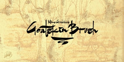 An untamed typeface built with contrasting brushstrokes.
 - Stirling by Red Rooster Collection,
$45.00An original new design with angled serifs. - Belmont by Rook Supply,
$15.00 Looking for an elegant font to class up the place? Maybe you have some wedding invitations that you've been putting off for a month. Belmont is an elegant, modern script font that is perfect for contemporary occasions.
 - Glorita by Gerald Gallo,
$20.00 Glorita is an original, clean and crisp, sans serif condensed font, excellent for text and at large sizes an effective display font. The font includes upper and lowercase alphabets, numbers, punctuation, accented characters, symbols, and miscellaneous characters.
 - Keynsia by Greater Albion Typefounders,
$7.95 The Keynsia family revives the spirit of the 1950s. Its simple and elegant lines make for an eye-catching set of display faces. A range of different styles are on offer, all with an extensive character set.
 - Superior Mind by Seemly Fonts,
$14.00 Superior Mind is an incomparable and simple lettered handwritten font. It can easily be matched to an incredibly large set of projects, so add it to your creative ideas and notice how it makes them stand out!
 - Enduring Promise by Seemly Fonts,
$14.00 Enduring Promise is an incomparable and simple-lettered handwritten font. It can easily be matched to an incredibly large set of projects, so add it to your creative ideas and notice how it makes them stand out!
 - Arabetics Symphony by Arabetics,
$59.00 Arabetics Symphony is a Sans Serif Latin typeface with a comprehensive support for the Arabetic scripts, including Quranic texts. It is designed with a uniform glyph thickness and weight throughout, using a combination of simplified and clear open lines and curves and plenty of spikes and visual hints to compensate for the missing Latin serifs or traditional cursive Arabic calligraphic influence. This type family is suitable for both text and display applications. Additional Latin spacing is added to match an overall open-looking Arabic and is further maintained by a careful implementation of a typical Latin font kerning process. The design of this font family, including metrics and dimensions, was intended to make its Latin harmonize with other Arabetics foundry fonts. Arabetics Symphony fully supports MS 1252 Western and 1256 Arabic code pages, in addition to all the transliteration characters required by the ALA-LC Romanization tables. Users can either select an accented character directly or form it by keying the desired combining diacritic mark following an unaccented character. For Arabic, it fully supports Unicode 6.1, and the latest Arabic Supplement and Extended-A Unicode blocks. The Arabic design of this font family follows the Mutamathil Taqlidi design style with connected glyphs, emphasizing vertical strokes to bring added harmony, and utilizing slightly varying x-heights to match that found in Latin. The Mutamathil Taqlidi type style uses one glyph for every basic Arabic Unicode character or letter, as defined by the Unicode Standards, and one additional final form glyph, for each freely-connecting letter of the Arabic cursive text. Arabetics Symphony includes the required Lam-Alif ligatures in addition to all vowel diacritic ligatures. Soft-vowel diacritic marks (harakat) are selectively positioned with most of them appearing on similar high and low levels—top left corner—, to clearly distinguish them from the letters. Tatweel is a zero-width glyph. Keying the “tatweel” key (shft-j) before Alif-Lam-Lam-Ha will display the Allah ligature. Arabetics Symphony includes both Arabic and Arabic-Indic numerals, in addition to generous number of punctuation and mathematical symbols. Available in both OpenType and TrueType formats, it includes two weights, regular and bold, each has normal, Italic, and left-slanted styles.
 - Lisbeth by TypeTogether,
$39.00 Louisa Fröhlich’s Lisbeth is the charming all-italic trailblazer that handles branding and text with internal vividness. With no roman style, it’s an italic-only family whose creation was guided by imagination instead of restrictive writing tools. Some type families aren’t sure what they want. Lisbeth proceeds with the utmost confidence on its own terms — it’s a feisty three-dimensional thespian amidst the cast of strait-laced characters you’re used to. With branding and magazine usage in mind, Lisbeth addresses the distinct challenges of text and display in a characterful way. The curves of the text weights show a soft angularity, emphasising the handwritten quality and the subtle twist inside the letters. The stroke’s carefully balanced contrast is more pronounced in the vibrant heavier weights but almost absent in the graceful structure of the thin weight. The angle of the letters is almost upright and the x-height is relatively large, so longer texts can be read comfortably and without effort. Lisbeth is slightly condensed and so uses a smaller area to efficiently impart much information. So if a type design can be thought of as the clothing letters wear, then Lisbeth is an energetic, freely flowing stroke wrapped around practical and efficient letter proportions. Another highlight of the family is the quirky high-contrast display style, easily catching every eye. The design concept of the twisted stroke shows at the extreme here and makes the letters dance a little on the page. Even though the shapes behave wildly, every letter is carefully balanced in itself so that the rhythmic repetition of the lettershapes results in an even and harmonic total picture. Lisbeth’s five text weights (from thin to bold) perform excellently in text settings, and its funky display style amps up the internal shimmer within each glyph. It supports numerous languages (Latin-A extended) and comes with ligatures and contextual alternates to produce beautiful typography. The character set contains proportional lining and oldstyle figures, tabular figures, subscripts, superscripts, and fractions. The complete Lisbeth family, along with our entire catalogue, has been optimised for today’s varied screen uses.