10,000 search results
(0.043 seconds)
- An Electronic Display LED LCD LED7 Seg 3 by Fortune Fonts Ltd.,
$15.00 * For when you need the most realistic looking electronic display. * See User Manuals Main advantages: - Spacing between characters does not change when entering a decimal point or colon between them. - Custom characters can be produced by selecting any combination of segments to be displayed. Low cost electronic displays have a fixed number of segments that can be turned on or off to represent different symbols. A digital watch would be the most common example. Fonts typically available for depicting electronic displays are often in the artistic style of these common LED or LCD displays. They provide the look-and-feel, but fall short when technical accuracy is required. Failure to represent an accurate and consistent representation of the real thing can be a cringe-worthy experience for the product design and marketing team, or even the hobbyist for that matter. To solve this problem, Fortune Fonts has released a range of fonts that accurately depict the displays typically found on low cost electronic devices: watches, answering machines, car stereos, alarm clocks, microwaves and toys. These fonts come with numbers, letters and symbols predefined. However, they also allow you to create your own segment combinations for the custom symbols you need. When producing manuals, marketing material and user interfaces, accuracy is an all-or-nothing concept. Instructions in the user manual describe how to turn these fonts into realistic displays according to your own design, in the manner of the images above. If you cannot see a license option for your specific application, such a license may be purchased from here. By purchasing &/or using &/or distributing the fonts the buyer user and distributor (including Monotype Imaging Inc. & Monotype Imaging Hong Kong) agree to (1) indemnify & hold harmless the foundry, for any consequential, incidental, punitive or other damages of any kind resulting from the use of the deliverables including, but not limited to, loss of revenues, profits, goodwill, savings, due to; including, but not limited to, failure of the deliverables to perform it’s described function, or the deliverable’s infringement of patents, copyrights, trademarks, design rights, contract claims, trade secrets, or other proprietary rights of the foundry, distributor, buyer or other parties (2) not use the fonts to assist in design of, or be incorporated into, non-software displays
 - An Electronic Display LED LCD LED7 Seg 2 by Fortune Fonts Ltd.,
$15.00 * For when you need the most realistic looking electronic display. * See User Manuals Main advantages: - Spacing between characters does not change when entering a decimal point or colon between them. - Custom characters can be produced by selecting any combination of segments to be displayed. Low cost electronic displays have a fixed number of segments that can be turned on or off to represent different symbols. A digital watch would be the most common example. Fonts typically available for depicting electronic displays are often in the artistic style of these common LED or LCD displays. They provide the look-and-feel, but fall short when technical accuracy is required. Failure to represent an accurate and consistent representation of the real thing can be a cringe-worthy experience for the product design and marketing team, or even the hobbyist for that matter. To solve this problem, Fortune Fonts has released a range of fonts that accurately depict the displays typically found on low cost electronic devices: watches, answering machines, car stereos, alarm clocks, microwaves and toys. These fonts come with numbers, letters and symbols predefined. However, they also allow you to create your own segment combinations for the custom symbols you need. When producing manuals, marketing material and user interfaces, accuracy is an all-or-nothing concept. Instructions in the user manual describe how to turn these fonts into realistic displays according to your own design, in the manner of the images above. If you cannot see a license option for your specific application, such a license may be purchased from here. By purchasing &/or using &/or distributing the fonts the buyer user and distributor (including Monotype Imaging Inc. & Monotype Imaging Hong Kong) agree to (1) indemnify & hold harmless the foundry, for any consequential, incidental, punitive or other damages of any kind resulting from the use of the deliverables including, but not limited to, loss of revenues, profits, goodwill, savings, due to; including, but not limited to, failure of the deliverables to perform it’s described function, or the deliverable’s infringement of patents, copyrights, trademarks, design rights, contract claims, trade secrets, or other proprietary rights of the foundry, distributor, buyer or other parties (2) not use the fonts to assist in design of, or be incorporated into, non-software displays
 - An Electronic Display LED LCD LED7 Seg Platz by Fortune Fonts Ltd.,
$15.00 * For when you need the most realistic looking electronic display. * See User Manuals Main advantages: - Spacing between characters does not change when entering a decimal point or colon between them. - Custom characters can be produced by selecting any combination of segments to be displayed. Low cost electronic displays have a fixed number of segments that can be turned on or off to represent different symbols. A digital watch would be the most common example. Fonts typically available for depicting electronic displays are often in the artistic style of these common LED or LCD displays. They provide the look-and-feel, but fall short when technical accuracy is required. Failure to represent an accurate and consistent representation of the real thing can be a cringe-worthy experience for the product design and marketing team, or even the hobbyist for that matter. To solve this problem, Fortune Fonts has released a range of fonts that accurately depict the displays typically found on low cost electronic devices: watches, answering machines, car stereos, alarm clocks, microwaves and toys. These fonts come with numbers, letters and symbols predefined. However, they also allow you to create your own segment combinations for the custom symbols you need. When producing manuals, marketing material and user interfaces, accuracy is an all-or-nothing concept. Instructions in the user manual describe how to turn these fonts into realistic displays according to your own design, in the manner of the images above. If you cannot see a license option for your specific application, such a license may be purchased from here. By purchasing &/or using &/or distributing the fonts the buyer user and distributor (including Monotype Imaging Inc. & Monotype Imaging Hong Kong) agree to (1) indemnify & hold harmless the foundry, for any consequential, incidental, punitive or other damages of any kind resulting from the use of the deliverables including, but not limited to, loss of revenues, profits, goodwill, savings, due to; including, but not limited to, failure of the deliverables to perform it’s described function, or the deliverable’s infringement of patents, copyrights, trademarks, design rights, contract claims, trade secrets, or other proprietary rights of the foundry, distributor, buyer or other parties (2) not use the fonts to assist in design of, or be incorporated into, non-software displays
 - An Electronic Display LED LCD LED7 Seg dots1 by Fortune Fonts Ltd.,
$15.00 * For when you need the most realistic looking electronic display. * See User Manuals Main advantages: - Spacing between characters does not change when entering a decimal point or colon between them. - Custom characters can be produced by selecting any combination of segments to be displayed. Low cost electronic displays have a fixed number of segments that can be turned on or off to represent different symbols. A digital watch would be the most common example. Fonts typically available for depicting electronic displays are often in the artistic style of these common LED or LCD displays. They provide the look-and-feel, but fall short when technical accuracy is required. Failure to represent an accurate and consistent representation of the real thing can be a cringe-worthy experience for the product design and marketing team, or even the hobbyist for that matter. To solve this problem, Fortune Fonts has released a range of fonts that accurately depict the displays typically found on low cost electronic devices: watches, answering machines, car stereos, alarm clocks, microwaves and toys. These fonts come with numbers, letters and symbols predefined. However, they also allow you to create your own segment combinations for the custom symbols you need. When producing manuals, marketing material and user interfaces, accuracy is an all-or-nothing concept. Instructions in the user manual describe how to turn these fonts into realistic displays according to your own design, in the manner of the images above. If you cannot see a license option for your specific application, such a license may be purchased from here. By purchasing &/or using &/or distributing the fonts the buyer user and distributor (including Monotype Imaging Inc. & Monotype Imaging Hong Kong) agree to (1) indemnify & hold harmless the foundry, for any consequential, incidental, punitive or other damages of any kind resulting from the use of the deliverables including, but not limited to, loss of revenues, profits, goodwill, savings, due to; including, but not limited to, failure of the deliverables to perform it’s described function, or the deliverable’s infringement of patents, copyrights, trademarks, design rights, contract claims, trade secrets, or other proprietary rights of the foundry, distributor, buyer or other parties (2) not use the fonts to assist in design of, or be incorporated into, non-software displays.
 - An Electronic Display LED LCD LED14 Seg 1 by Fortune Fonts Ltd.,
$15.00 * For when you need the most realistic looking electronic display. * See User Manuals Main advantages: - Spacing between characters does not change when entering a decimal point or colon between them. - Custom characters can be produced by selecting any combination of segments to be displayed. Low cost electronic displays have a fixed number of segments that can be turned on or off to represent different symbols. A digital watch would be the most common example. Fonts typically available for depicting electronic displays are often in the artistic style of these common LED or LCD displays. They provide the look-and-feel, but fall short when technical accuracy is required. Failure to represent an accurate and consistent representation of the real thing can be a cringe-worthy experience for the product design and marketing team, or even the hobbyist for that matter. To solve this problem, Fortune Fonts has released a range of fonts that accurately depict the displays typically found on low cost electronic devices: watches, answering machines, car stereos, alarm clocks, microwaves and toys. These fonts come with numbers, letters and symbols predefined. However, they also allow you to create your own segment combinations for the custom symbols you need. When producing manuals, marketing material and user interfaces, accuracy is an all-or-nothing concept. Instructions in the user manual describe how to turn these fonts into realistic displays according to your own design, in the manner of the images above. If you cannot see a license option for your specific application, such a license may be purchased from here. By purchasing &/or using &/or distributing the fonts the buyer user and distributor (including Monotype Imaging Inc. & Monotype Imaging Hong Kong) agree to (1) indemnify & hold harmless the foundry, for any consequential, incidental, punitive or other damages of any kind resulting from the use of the deliverables including, but not limited to, loss of revenues, profits, goodwill, savings, due to; including, but not limited to, failure of the deliverables to perform it’s described function, or the deliverable’s infringement of patents, copyrights, trademarks, design rights, contract claims, trade secrets, or other proprietary rights of the foundry, distributor, buyer or other parties (2) not use the fonts to assist in design of, or be incorporated into, non-software displays
 - ITC Stone Humanist by ITC,
$40.99 Type designers have been integrating the design of sans serifs with serifed forms since the 1920s. Early examples are Edward Johnston's design for the London Underground, and Eric Gill's Gill Sans. These were followed by Jan van Krimpen's Romulus Sans, Frederic Goudy's ITC Goudy Sans, Hermann Zapf's Optima, Hans Meier's Syntax and Adrian Frutiger's Frutiger. Now, ITC Stone Humanist joins this tradition. It is a careful blend of traditional sans serif shapes and classical serifed letterforms. ITC Stone Humanist grew out an experiment with the medium weight of ITC Stone Sans, a design that already showed a relationship to these sans serif-serif hybrids. ITC Stone Sans has proportions based on those of ITC Stone Serif, and its thick-and-thin stroke contrast suggests the bloodline of humanistic sans serif typefaces. But other aspects of ITC Stone Sans are more closely aligned to the gothics and grotesques, a tradition that accounts for the largest portion of sans serif designs. Enter ITC Stone Humanist. During his experiments with the earlier design, Sumner Stone recalls, I was actually quite surprised at how seemingly subtle changes transformed the face," moving the design firmly into the humanist tradition. "The form of the 'g,' 'l,' 'M,' 'W,' and more subtly the 'a' and 'e' are part of the restructuring of the family," he explains. The top endings of vertical lower case strokes have been cropped on an angle, as have the ascender and descender stroke endings. ITC Stone Humanist is a full-fledged member of the ITC Stone family. It has been produced with the same complement of weights, and the x-heights, proportions, and underlying character shapes are completely compatible with the three original designs. The original ITC Stone Sans is a popular typeface, in part because of its notable versatility. ITC Stone Humanist shares this virtue, and can be used successfully at very small sizes, in long passages of text copy, and even as billboard-sized display type."
 - Bron by Jeremia Adatte,
$49.00 Bron is based on Zelek, designed in the 70s by Polish type designer Bronisław Zelek. This typeface was originally made for dry transfer lettering sheets. It has been drawn following the principles of impossible geometry and is derived from simple geometric forms (perfect circles, triangles and squares). It has been carefully redrawn and updated and is now available for contemporary technology and design. Use Bron’s rounded and smooth optical shapes in your headlines, logos, packagings, posters to instantly attract attention. This style offers two separate layered fonts to make your own awesome two color compositions. These can be used separately to create even more subtle effects. Bron is packed with an extended character set, supporting Central, Western and Eastern European languages. Check its semi-outline version here!
 - Courteous by Motokiwo,
$17.00 Courteous is absolute elegance. It's semi-condensed serif font with straight and consistent shape in every letter that will give a taste of professional feels to any design. Adding ligature will make it more stylish and modish, very suitable for fashion or beauty projects. Courteous also have the bold version that will looks more gentle. FEATURES: Regular and Bold Version Uppercase and Lowercase are the same 35 Ligature that only works with lowercase, so you can access regular letter by using only uppercase. Ligature: od ai ad ap ed eb ab ib ob ud id ub ou rt yl al le an lu ur gn ha ri ce ho ry ev in ro um ox ve as on Numbers, symbols, and punctuation Multi language support
 - Stencil Moonlight by Linotype,
$29.00Latvian designer and educator Gustav Grinbergs created Stencil Moonlight as an attempt to slightly lighten up the stencil type scene. Intended as a lively, semi-formal face, its shapes are smooth and compact. It leaves a very heavy feeling on the page, as its letters display a very fat bold design. Stencil Moonlight is available is two separate font styles, Regular and Small Caps. When used together, the Stencil Moonlight family can create the perfect combination for your next display need. Stencil Moonlight works best in larger sizes, where it is clear that its forms stem from an experiment with stencil design. Grinbergs recommends the face for application in package design, advertising, poster design, and perhaps even for the subtitling of foreign films! - Catholic Girls by Scholtz Fonts,
$21.00Catholic Girls is a timeless, handwriting-based, semi-calligraphic font that is highly readable yet has an informality combined with a quiet elegance. Above all else, Catholic Girls is well-behaved, ladylike, and can be expected to behave correctly and make the right impression in a wide range of situations. This "hand" is based on the style of handwriting taught at many Catholic Girls' Schools. It is feminine, elegant and readable. Use "Catholic Girls" for a great variety of applications, including: ? party invitations, wedding stationery, social event media, ? marketing material for seminars, property developments, leisure & lifestyle promotions, fashion, interior design, restaurants, florists, cosmetics ? publishing: magazines, books, children's books, greeting cards, ? packaging: girls' clothing, girls' toys, household consumables, cosmetics, fashion items, interior decor products - Kingthings Trypewriter Pro by CheapProFonts,
$10.00 I have made this font properly monospaced (all characters are the same width) as that is how an old typewriter worked. In addition to correcting and expanding the character set, of course. Keving King says: "Kingthings Trypewriter is a deconstructed typewriter face. I have always loved decayed fonts, this is the first of mine - and yes, I know there are lots of these around - this one is MINE". ALL fonts from CheapProFonts have very extensive language support: They contain some unusual diacritic letters (some of which are contained in the Latin Extended-B Unicode block) supporting: Cornish, Filipino (Tagalog), Guarani, Luxembourgian, Malagasy, Romanian, Ulithian and Welsh. They also contain all glyphs in the Latin Extended-A Unicode block (which among others cover the Central European and Baltic areas) supporting: Afrikaans, Belarusian (Lacinka), Bosnian, Catalan, Chichewa, Croatian, Czech, Dutch, Esperanto, Greenlandic, Hungarian, Kashubian, Kurdish (Kurmanji), Latvian, Lithuanian, Maltese, Maori, Polish, Saami (Inari), Saami (North), Serbian (latin), Slovak(ian), Slovene, Sorbian (Lower), Sorbian (Upper), Turkish and Turkmen. And they of course contain all the usual "western" glyphs supporting: Albanian, Basque, Breton, Chamorro, Danish, Estonian, Faroese, Finnish, French, Frisian, Galican, German, Icelandic, Indonesian, Irish (Gaelic), Italian, Northern Sotho, Norwegian, Occitan, Portuguese, Rhaeto-Romance, Sami (Lule), Sami (South), Scots (Gaelic), Spanish, Swedish, Tswana, Walloon and Yapese.
 - Siamese Katsong Pro by CheapProFonts,
$10.00 A faux Thai font - but not over the top, just stylishly hinting at the foreign script. I have introduced lots of alternate glyphs, so it now has both lower- and uppercase letterfoms. Perfect for that travel brochure, ad or restaurant menu - in many languages. Vic Fieger simply says: "A font based on a boldface sign in Thai". ALL fonts from CheapProFonts have very extensive language support: They contain some unusual diacritic letters (some of which are contained in the Latin Extended-B Unicode block) supporting: Cornish, Filipino (Tagalog), Guarani, Luxembourgian, Malagasy, Romanian, Ulithian and Welsh. They also contain all glyphs in the Latin Extended-A Unicode block (which among others cover the Central European and Baltic areas) supporting: Afrikaans, Belarusian (Lacinka), Bosnian, Catalan, Chichewa, Croatian, Czech, Dutch, Esperanto, Greenlandic, Hungarian, Kashubian, Kurdish (Kurmanji), Latvian, Lithuanian, Maltese, Maori, Polish, Saami (Inari), Saami (North), Serbian (latin), Slovak(ian), Slovene, Sorbian (Lower), Sorbian (Upper), Turkish and Turkmen. And they of course contain all the usual "western" glyphs supporting: Albanian, Basque, Breton, Chamorro, Danish, Estonian, Faroese, Finnish, French, Frisian, Galican, German, Icelandic, Indonesian, Irish (Gaelic), Italian, Northern Sotho, Norwegian, Occitan, Portuguese, Rhaeto-Romance, Sami (Lule), Sami (South), Scots (Gaelic), Spanish, Swedish, Tswana, Walloon and Yapese.
 - Boogie Nights NF Pro by CheapProFonts,
$10.00 A typical Art Deco font. I have redesigned the uppercase “S” to mach the lowercase, tweaked a little here and there - and completely redesigned all the diacritics (which didn't really match the letter designs). Nick Curtis says: "The inspiration for this font came from a poster for an Austrian trade show from the 1920s, credited simply to Wasserman." ALL fonts from CheapProFonts have very extensive language support: They contain some unusual diacritic letters (some of which are contained in the Latin Extended-B Unicode block) supporting: Cornish, Filipino (Tagalog), Guarani, Luxembourgian, Malagasy, Romanian, Ulithian and Welsh. They also contain all glyphs in the Latin Extended-A Unicode block (which among others cover the Central European and Baltic areas) supporting: Afrikaans, Belarusian (Lacinka), Bosnian, Catalan, Chichewa, Croatian, Czech, Dutch, Esperanto, Greenlandic, Hungarian, Kashubian, Kurdish (Kurmanji), Latvian, Lithuanian, Maltese, Maori, Polish, Saami (Inari), Saami (North), Serbian (latin), Slovak(ian), Slovene, Sorbian (Lower), Sorbian (Upper), Turkish and Turkmen. And they of course contain all the usual “western” glyphs supporting: Albanian, Basque, Breton, Chamorro, Danish, Estonian, Faroese, Finnish, French, Frisian, Galican, German, Icelandic, Indonesian, Irish (Gaelic), Italian, Northern Sotho, Norwegian, Occitan, Portuguese, Rhaeto-Romance, Sami (Lule), Sami (South), Scots (Gaelic), Spanish, Swedish, Tswana, Walloon and Yapese.
 - Wooden Nickel NF Pro by CheapProFonts,
$10.00 A nice, black display face - for a retro/western poster look. I have kept the quirky “t”, increased the dot above “i” and “j” slightly, improved the spacing/kerning and modified/added all the usual diacritics. A pretty easy reworking of a good quality font. Nick Curtis says: "An old favorite, Bernhard Antique Bold Condensed, cleaned up and fattened up. Warm, charming, personable … suitable for any occasion." ALL fonts from CheapProFonts have very extensive language support: They contain some unusual diacritic letters (some of which are contained in the Latin Extended-B Unicode block) supporting: Cornish, Filipino (Tagalog), Guarani, Luxembourgian, Malagasy, Romanian, Ulithian and Welsh. They also contain all glyphs in the Latin Extended-A Unicode block (which among others cover the Central European and Baltic areas) supporting: Afrikaans, Belarusian (Lacinka), Bosnian, Catalan, Chichewa, Croatian, Czech, Dutch, Esperanto, Greenlandic, Hungarian, Kashubian, Kurdish (Kurmanji), Latvian, Lithuanian, Maltese, Maori, Polish, Saami (Inari), Saami (North), Serbian (latin), Slovak(ian), Slovene, Sorbian (Lower), Sorbian (Upper), Turkish and Turkmen. And they of course contain all the usual “western” glyphs supporting: Albanian, Basque, Breton, Chamorro, Danish, Estonian, Faroese, Finnish, French, Frisian, Galican, German, Icelandic, Indonesian, Irish (Gaelic), Italian, Northern Sotho, Norwegian, Occitan, Portuguese, Rhaeto-Romance, Sami (Lule), Sami (South), Scots (Gaelic), Spanish, Swedish, Tswana, Walloon and Yapese.
 - Kingthings Petrock Pro by CheapProFonts,
$10.00 For these fonts I have reworked the spacing a bit, and completely redesigned the "N" as they were calligraphically very wrong. Kevin King says: "Petrock is based on letterforms found in a small city Church in Exeter - from a display case about bell ringing. A lovely simple labeling hand, I think I've done it justice... Petrock Light is a lighter form of Petrock - makes both of them more usable." ALL fonts from CheapProFonts have very extensive language support: They contain some unusual diacritic letters (some of which are contained in the Latin Extended-B Unicode block) supporting: Cornish, Filipino (Tagalog), Guarani, Luxembourgian, Malagasy, Romanian, Ulithian and Welsh. They also contain all glyphs in the Latin Extended-A Unicode block (which among others cover the Central European and Baltic areas) supporting: Afrikaans, Belarusian (Lacinka), Bosnian, Catalan, Chichewa, Croatian, Czech, Dutch, Esperanto, Greenlandic, Hungarian, Kashubian, Kurdish (Kurmanji), Latvian, Lithuanian, Maltese, Maori, Polish, Saami (Inari), Saami (North), Serbian (latin), Slovak(ian), Slovene, Sorbian (Lower), Sorbian (Upper), Turkish and Turkmen. And they of course contain all the usual "western" glyphs supporting: Albanian, Basque, Breton, Chamorro, Danish, Estonian, Faroese, Finnish, French, Frisian, Galican, German, Icelandic, Indonesian, Irish (Gaelic), Italian, Northern Sotho, Norwegian, Occitan, Portuguese, Rhaeto-Romance, Sami (Lule), Sami (South), Scots (Gaelic), Spanish, Swedish, Tswana, Walloon and Yapese.
 - Blue Goblet Drawn by insigne,
$5.00 This best selling series has now been extended to include a new member, Blue Goblet Drawn. Blue Goblet is hand-drawn by the artist, Cory Godbey, and is organic, charming and exuberant. Characters bounce and dance above and below the baseline and x-height, making this a whimsical and fun script. Not only is Blue Goblet Drawn a excellent choice, it also is also a versatile member of a wide family of different fonts. You can use it side by side with the original Blue Goblet fonts, and there are a wide range of ornaments available in the supplemental ornament sets--over 370 illustrations! These illustrations include doodley frames, lovely florals and other text ornaments that can be inserted into your text and resized at will. This makes the Blue Goblet series a great pick when you want a type system for a very unique and consistent look. The Blue Goblet series also continues to expand, making any of these family members a valuable investment for the future. Blue Goblet Drawn comes in three weights and three widths in each weight, with complementary italics for maximum impact for a total of eighteen pro fonts. The compact thin weights are delicate and tall, while the Regular has just enough heft for those situations where subtlety doesn't work. If you don't need the professional features, there are three stripped down fonts that include only the basic character set! Blue Goblet Drawn also includes auto-replacing ligatures that make it appear that the script was drawn by the artistís own hand--just for you! Blue Goblet Drawn also includes a wide variety of alternates that can be accessed in any OpenType enabled application. Blue Goblet includes over 190 additional glyphs and is loaded with features including an even more unique alternate alphabet. Included are swash alternates, style sets, old style figures and small caps. Please see the informative PDF brochure to see these features in action. OpenType enabled applications such as the Adobe suite or Quark can take full advantage of the automatic replacing ligatures and alternates. This family also includes the glyphs to support a wide range of languages. Blue Goblet Drawn is a great choice for friendly display type in children's books, packaging, organic packaging or other unique applications. Use Blue Goblet whenever you want to inject a handmade sense of fun and whimsy to your designs. Give the Blue Goblet series a whirl today!
 - Vemanem Pro by ffeeaarr,
$11.00 Vemanem is dynamic sans serif display fonts, you can use it for advertising, movie, titles & more.
 - Adoquin by Huy!Fonts,
$20.00 Adoquin is a clean and friendly semi serif family. It comes in seven weights with small caps, wich makes it a versatile typeface. The design is based on geometric sans serif typefaces and the calligraphic features of old school models, making Adoquin a functional and warm font family. Its informal but elegant look makes it the perfect display type fitted for logotypes, book design, packaging or magazines. Its wide range of weights and discreet alternates makes it very enjoyable to read, so its also perfectly fitted for longer texts. Adoquin has an extended character set for Central and Eastern European languages, and shows all its potential wit OpenType-savvy applications. Every font includes small caps, ligatures, old style figures, fractions, numerators and denominators and alternative characters without some calligraphic features suited for smaller or longer texts (in this case, the alternative charecters are less ornamented).
 - Hansplatz Grotesk by Heypentype,
$20.00 Hansplatz Grotesk is a sans serif type family of nine weight. Influenced by Akzidens Grotesk, Hansplatz typeface bring a new approach to this utilitarian style of grotesk. With more square proportions rather than geometric style, Hansplatz grotesk aimed to ease typesetting job when arranging a words or paragraph easily. A wide range of weight gives flexibility to every design project, hansplatz fit nicely to grid-system because of proportions. Furthermore Hansplatz Grotesk supplied with smart Opentype scripting to assist typesetter and designer very easily to Hansplatz feature. Hansplatz Grotesk truly a utilitarian, workhorse, neutral, and of course faceless. But, it makes the work done quickly. For display use, Hansplatz Grotesk Black to Semi-Bold is recommended, for paragraph heavy design, use regular and light weight. To spice up, adding Hairline or extra-light weight will make a design execution looks great and catchy but not intimidating.
 - Daisy Lovers by Sarid Ezra,
$15.00 Introducing, Daisy Lovers, a tall handwritten sans! Daisy Lovers is a sans font with handwritten touch. This font will make your project or your design more human. You can use this font for your brands, quotes, book covers, etc. With unique lowercase, Daisy Lovers can make your project more stand out! This font also support multi language. Happy Creating!
 - Big Bright by loryn ipsum,
$14.00 Meet Big Bright, a (very) tall sans serif inspired by some photo of a vintage mid-century furniture catalogue I saw on instagram. It's perfect for logos, headings and posters. Big Bright has a vintage edge yet and modern feel and can sway from soft and gentle to striking and bold depending on how it's styled. Hope you have big love for Big Bright
 - Courier New OS by Monotype,
$50.99 Designed as a typewriter face for IBM, Courier New was re drawn by Adrian Frutiger for IBM Selectric series. A typical fixed pitch design, monotone in weight and slab serif in concept.
 - Castles&Shields by Deniart Systems,
$15.00For all your royal invitations. The Castles & Shields Series contains over 85 unique and decorative characters depicting numbers and alphabets in castle and shield silhouettes to give your documents a medieval feel. - Western Adventure JNL by Jeff Levine,
$29.00Western Adventure JNL is based on a classic lettering stencil of the 1950s. Part of a growing series of such stencil fonts by Jeff Levine, it's a perfect complement to Buckdance JNL. - Hannover Modern by Type-Ø-Tones,
$40.00 Hannover Modern belongs to a series of typefaces used at the Estudio Mariscal in Barcelona. José Manuel Urós developed this weight, a vigorous egyptian-style, the embodiment of the Javier Mariscal style.
 - MC Rilego by Maulana Creative,
$17.00 Rilego is a semi monospaced with serif font. Regular stroke, fun character with a bit of ligatures and alternates. To give you an extra creative work. Rilego font support multilingual more than 100+ language. This font is good for logo design, Social media, Movie Titles, Books Titles, a short text even a long text letter and good for your secondary text font with script or serif. Make a stunning work with Rilego font. Cheers, Maulana Creative
 - Sirkle by Invasi Studio,
$19.00 Sirkle is a semi-serif typeface for display, constructed with sharp and curvy characters. All Letters are handcrafted and made to fit each other perfectly without exception, with a modern and edgy style that gives them a unique look. Sirkle comes with ligatures, alternates, and supports 60+ Latin-based languages. The Sirkle is ideal for logotype, signage, posters, packaging, and much more! Features: Uppercase & Lowercase Numerals & Punctuation Alternates and Ligatures Multilanguage Supports 60+ Latin based languages
 - Sueno by Mix Fonts,
$13.00 Looking for a font that's chic, stylish, and oh-so-slightly handwritten? Look no further than MIX SUENO! This monoline semi-script was crafted with care using an iPad Pro and Apple Pencil, and is the perfect addition to any design project. Whether you're creating invitations, social media graphics, or just sprucing up your website, MIX SUENO will bring a touch of sophistication and personality to your work. So don't hesitate - give MIX SUENO a try today!
 - MC Blitez by Maulana Creative,
$19.00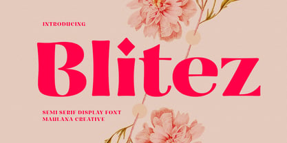 Blitez is a modern semi serif display font. Bold stroke, fun character with a bit of ligatures and alternates. To give you an extra creative work. Blitez font support multilingual more than 100+ language. This font is good for logo design, Social media, Movie Titles, Books Titles, a short text even a long text letter and good for your secondary text font with script or serif. Make a stunning work with Blitez font. Cheers, Maulana Creative
 - Chiffon by SilkType,
$35.00 Chiffon is a serif, display typeface. With high contrast and elegant curves. Chiffon includes three different versions of ‘c’ and ‘e’, which are carefully placed throughout the typeface, paired seamlessly with the following glyph. However, OpenType features and stylistic sets make the alternate forms available for the user to choose from as they see fit. Velour is available in 5 weights, from Extra light to Semi Bold, and supports Western, Central, and South-Eastern European languages.
 - Zennat Pro by Latinotype,
$29.00 This font is inspired by the compact, high-impact design aesthetic of the 1990s in Chile, which was defined by the use of very heavy fonts to create eye-catching graphic pieces. With this idea in mind, Zennat Pro was born, a “semi-slab serif” that takes advantage of OpenType features which rotate in alternate characters to best fit the design. Zennat pro comes in 10 weights, and is ideal for magazine design, motion graphics, trademarks, logos, posters, etc. ...
 - Bighat by Grontype,
$14.00 Bighat is a unique hand-written semi-bold typeface. Comes with extra ligatures and alternates that makes your writing have more alternate typing pairs. This font is perfect for your designs that want unique style, modern vintage and elegant such as logotype, cards, posters, quotes, social media posts and so much more! Features: Basic Latin Glyphs Uppercase and Lowercase Letters Alternates & Ligatures Numeral and Punctuation Multilingual Support Thankyou for picking up this font, hope you enjoy it.: Regard. Grontype
 - De Floras by Dikas Studio,
$15.00 Hello, let me introduce my font called de Floras - 5 Fonts Family. de Floras is a lovely and beautiful script typeface that designs manually by hand and love. de Floras comes with 5 weight, light, regular, semi bold, bold and extra bold. de Floras comes with a beautiful start and end swash that made who look for the first time is falling in love. Very suitable for designing wedding cards, birthday cards, invitation, greeting, and many more.
 - MC Arkevs by Maulana Creative,
$12.00 Arkevs is a modern Decorative contrast semi serif Display font. Bold stroke, fun character with a bit of ligatures and alternates. To give you an extra creative work. Arkevs font support multilingual more than 100+ language. This font is good for logo design, Social media, Movie Titles, Books Titles, a short text even a long text letter and good for your secondary text font with script or serif. Make a stunning work with Arkevs font. Cheers, Maulana Creative
 - Bullzy by Maulana Creative,
$21.00 Bullzy a playful display font. Semi Bold stroke, fun character with a bit of ligatures and stylistic. To give you an extra creative work. Bullzy playful display font support multilingual more than 100+ language. This font is good for logo design, Social media, Movie Titles, Books Titles, a short text even a long text letter and good for your secondary text font with script or serif. Make a stunning work with Bullzy playful display font. Cheers, Maulana Creative
 - Rigrok by Meat Studio,
$38.00 Rigrok is a 14 style semi serif designed by Stew Deane. The design of the typeface was intended to create a premium feel that is suitable for the widest range of tasks, while still maintaining a unique sense of character. Stew designed Rigrok to draw on his graphic design experience to create a typeface that is suitable for many a design or branding job. The result is an easy to use, versatile typeface that charms with personality and character.
 - Rossanova by Eko Bimantara,
$21.00 Rossanova is a complete semi-serif font family. Its consist of 36 fonts; 2 optical sizes, 8 weight from thin to black with each matching italics. Rossanova is enriched with beautiful personality, it's shaped in high contrast strokes for the normal optical style and moderate contrast strokes for the text styles which fit for reading. Contains more than 470 glyphs with some OpenType features e.g, stylistic alternates, ligature, discretionary ligature, old number, variation of figures etc.
 - Mochalatte by Grontype,
$14.00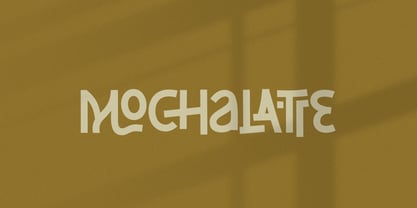 Mochalatte is an attractive and modern semi bold, elegant decorative font with a fun, dashing style look. This font equipped with extra ligatures and alternates, that will make your creative designs projects look impressive and stunning. Mochalatte is perfect for logotype, posters, t-shirt designs, packaging brand, or quotes, magazine header etc. Features: Basic Latin Glyphs Multilingual Numeral and Punctuation Standard Ligatures Stylistic Alternates Thankyou for picking up this font, hope you enjoy it. Regard. Grontype
 - Cervo Neue by Typoforge Studio,
$29.00 Cervo Neue is the new perfected and extended version of Cervo, containing 18 variants. It differs from the previous version with the higher accents over glyphs, enlarged punctuation, old-style numerals and the newly added varieties Semi Bold, Bold, Extra Bold and Black. Additionally, there is the variety of grotesque. Font Cervo is inspired by a “You And Me Monthly” published by National Magazines Publisher RSW „Prasa” that appeared from Mai 1960 till December 1973 in Poland.
 - Corda by Hoftype,
$39.00 Corda – an elegant serif family with an easygoing, flowing ductus. It is semi-contrasted and even in the heavier styles appears light and breezy. Pleasant for reading and in display sizes very attractive. Corda comes in ten styles, in OpenType format and with extended language support for more than 40 languages. All weights contain standard and discretionary ligatures, proportional lining figures, tabular lining figures, proportional old style figures, lining old style figures, matching currency symbols, fraction- and scientific numerals.