8,653 search results
(0.025 seconds)
- Churchward Ta Tiki by BluHead Studio,
$20.00Churchward Ta Tiki is a new font release by BluHead Studio, LLC from the exciting and unique typefaces of New Zealand designer Joseph Churchward. We will be releasing fonts from his extensive library in OpenType format on a regular basis. - Love4Sale by Jelloween,
$15.95This summer there's LOVE FOR SALE! Come get some... Love4Sale is a sexy, boldish font that will certainly steal your heart away. It contains a wide range of accented characters and is available in Truetype, Opentype and Windows PostScript format. - Celtic Astrologer Symbols by Deniart Systems,
$15.00 Containing over 130 symbols. Unlike traditional western zodiacs, the Celtic zodiac contains 13 signs instead of 12. This series contains the zodiacs, the planets as well as the Ogham numbers. NOTE: this font comes with an interpretation guide in pdf format.
 - Masteria Script by Mans Greback,
$59.00 Masteria Script is a retro script typeface. An optimistic calligraphy lettering to bring you back to the golden age of hand-drawn advertisements, Masteria is a professional quality handwriting font family. Drawn and created by Mans Greback in 2022, it is perfect for a vintage restaurant headline or nostalgic logotype design. Use underscore _ to make a swash. Example: Mast_eria Use multiple underscores to make a longer swash. Example: Super___human (Download required.) Masteria Script is provided in six diverse styles, such as Thin, Bold, Black, Italic and combinations to compliment each other and maximise your options and design experience. The font is built with advanced OpenType functionality and has a guaranteed top-notch quality, containing stylistic and contextual alternates, ligatures and more features; all to give you full control and customizability. It has extensive lingual support, covering all Latin-based languages, from Northern Europe to South Africa, from America to South-East Asia. It contains all characters and symbols you'll ever need, including all punctuation and numbers.
 - Cotford Variable by Monotype,
$188.99 New from the Monotype Studio, Cotford is a contemporary serif from Creative Type Director, Tom Foley. Dynamic, adaptable, and surprising—Cotford is a languid serif that ranges from delicate thins, bending and reaching like flower stems, to bold heavy weights that command the page and screen with confidence and vintage charm. And as a variable font, Cotford allows designers to explore and refine the design almost endlessly, unearthing its many visual tones and hidden secrets. Foley set out to design a soulful, contemporary serif typeface that delivers all the versatility and robustness today's designers expect. The variable font unlocks an expandsive spectrum of visual expression that allows designers to explore, tweak, and adjust the typeface until they find the perfect weight, contrast, and optical size for their project. At the same time, Cotford’s static weights follow a traditional model of 3 text and 5 display weights, making it a strong choice for brands looking for simple implementation. A pop serif for the digital age, Cotford takes you places.
 - Sinkwitz Gotisch by preussTYPE,
$29.00 Sinkwitz Gotisch is a new release of the font of the same name originally designed by Paul Sinkwitz in 1942. The Sinkwitz Gotisch was 1942 by Schriftguss AG Dresden font cast first cast and later supplied by the East German firm VEB Typoart. Paul Sinkwitz (1899-1981) has created them. This font displays not the characteristics of a chunky Gothic, which have influenced the image of national socialism. Paul Sinkwitz was a painter, graphic artist, wood engraver, was interested in religious topics, which he had presented in numerous graphics. But also his interpretation of his Gothic font is modern, without having the font this is ugly. In addition to the GOTISCH he created Roman Uppercase letters, which perfectly harmonize with the lowercase letters. This extra font is called BASTARD. The digital version of Sinkwitz is a beneficial addition to a Gothic with calligraphic character and should be in any historically interested graphic design.
 - Neil Bold by Canada Type,
$49.95 This is the one and only Neil Bold, designed by Wayne Stettler in 1966 and originally published as a Typositor typeface. An award-winner and instant celebrity upon its release, Neil Bold became synonymous with magnified modernism for a whole generation. It was a jazz record packaging favorite, especially at Blue Note records, and made regular appearances on science fiction book covers during the last stretch of the genre's golden age. This digital version greatly expands on the film type one. New small caps and biform styles were added to the authentically revived main face (for a set of three fonts), and language support has been extended to include all Latin-based tongues. Neil Bold Pro, the OpenType version, comes in a single font that combines all three fonts into a single file, with programmed features for small caps, stylistic alternates (for biform shapes), a few extra alternates, class-based kerning, and additional language support for Cyrillic and Greek scripts.
 - Masteria Wide by Mans Greback,
$69.00 Masteria Wide is a retro script typeface. An optimistic calligraphy lettering to bring you back to the golden age of hand-drawn advertisements, Masteria Wide is a professional quality handwriting font family. Drawn and created by Mans Greback in 2022, it is perfect for a vintage restaurant headline or nostalgic logotype design. Use underscore _ to make a swash. Example: Mast_eria Use multiple underscores to make a longer swash. Example: Super___human (Download required.) Masteria Wide is provided in eight diverse styles, such as Thin, Bold, Black, Italic and combinations to compliment each other and maximise your options and design experience. The font is built with advanced OpenType functionality and has a guaranteed top-notch quality, containing stylistic and contextual alternates, ligatures and more features; all to give you full control and customizability. It has extensive lingual support, covering all Latin-based languages, from Northern Europe to South Africa, from America to South-East Asia. It contains all characters and symbols you'll ever need, including all punctuation and numbers.
 - ITC CuppaJoe by ITC,
$29.99 Nick Curtis's love affair with typography began when he was barely past adolescence, in a neighborhood alley of East Dallas. On a routine patrol for tossed treasures, he came across a type specimen catalog: a big, fat green binder displaying hundreds of fonts! He was hooked. Curtis's career has taken him from production art to graphic design to art direction, but type has always remained his graphic passion, especially the provocative designs produced from the late 19th through the early 20th centuries. Curtis's inspiration for ITC CuppaJoe comes from Art Deco lettering, but not from the typical sources. Depending upon your age or your interest in early twentieth-century package design ITC CuppaJoe might look familiar. Its foundation is the label art for Bokar, A&P's premium coffee during the 1930s. Curtis built on the gently sweeping curves and bold angular strokes of the original coffee-can lettering to create a distinctive typeface that commands attention. Rich, full-bodied, satisfying - now that's a ITC CuppaJoe!
 - Kronix by Hazztype,
$20.00 Introducing Kronix, a geometric, futuristic font that embodies the essence of technology in the digital age. Kronix combines sleek lines, precise angles, and contemporary design elements to create a visually striking font perfect for technology-themed projects. Its clean and minimalist letterforms embody the essence of modernity and sophistication, capturing the attention of tech-savvy audiences. With its crisp edges and precise spacing, this font creates a harmonious visual rhythm that adds a touch of elegance to any design. Kronix is versatile and adaptable, making it suitable for a wide range of applications, including websites, mobile apps, and branding materials. Its modern aesthetic aligns perfectly with the fast-paced advancements in technology, allowing your design to stay relevant and visually impactful. Whether you're designing a tech magazine cover, creating a sci-fi movie poster, or developing a high-tech product packaging, Kronix is the ultimate choice for adding a geometric, futuristic flair that captivates the imagination and elevates your design to the forefront of modern technology.
 - Saracen by Hoefler & Co.,
$51.99 Saracen is the Latin (wedge serif) member of The Proteus Project, a collection of four interchangeable type families designed in different nineteenth century styles. The Saracen typeface was designed by Jonathan Hoefler in 1992. Saracen is a design in the ‘latin’ style, characterized by wedge-shaped serifs, a genus of type that emerged in the mid-nineteenth century. A part of The Proteus Project, the typographic theme-and-variations based on related Regency styles, Saracen was created for Rolling Stone, in whose pages the typeface first appeared in 1993 . From the desk of the designer: Though the wedge serif printing type is a nineteenth century innovation, Saracen does not resemble any font from this era. It’s mysterious that typefounders of the Victorian age who sought the extreme and fanciful in their work — exploring all manner of serif treatments, and creating extra-condensed and super-expanded designs — never made a latin font of this straightforward proportion. <
 - Semikolon by URW Type Foundry,
$35.00 SemikolonPlus: Optimal readability by reduced, distinct letter forms. Appropriate for early readers of any age in schools and other educational institutions. SemikolonPlus minimizes the risk of confusing similar characters and therefore is predestinated for the use in text blocks, work sheets, educational games et cetera. Furthermore, with its accented characters, currency signs, true fractions and other special characters, SemikolonPlus is suited for numerous typographic tasks and – thanks to its distinct letter forms - offers great readability, even in lower point sizes. SemikolonPlus is recommended by the German association of alphabetization and basic education, which uses it for adult education, reading magazines, teaching material and the own YouTube-channel. SemikolonClassic: Is the familiar font with alternative character forms. E.g. it contains the lower case double level a and g, as well as glyphs harmonically formed to the typeface. The SemikolonClassic is suitable for diverse uses in various sectors. Together or in combination SemikolonPlus and SemikolonClassic offer extensive possibilities for the layout of text material with their heavy font weights.
 - Ongunkan Old Turkic by Runic World Tamgacı,
$50.00 Orkhon inscriptions (Orkhon inscriptions, Orkhon inscriptions, Khöshöö Tsaidam monuments (also known as Khoshoo Tsaidam, Koshu-Tsaidam or Höshöö Caidam) or Kul Tigin steles (simplified Chinese: 阙特勤碑; traditional Chinese: 闕特勤碑; pinyin: Què tèqín bēi )) They are two monumental installations written by the Göktürks in the Old Turkic alphabet in the Orkhon Valley in Mongolia at the beginning of the 8th century. They were erected in honor of two Turkish princes Kül Tigin and his brother Bilge Kagan. Both Chinese and Old Turkish inscriptions describe the legendary origins of the Turks, the golden age of their history, their subjugation by the Chinese and their liberation by İlteriş Kağan. According to one source, the inscriptions contain "rhythmic and parallel passages" similar to those of epics. In the Old Turkish Alphabet, 38 letters are accepted academically and this pattern is generally used in the books. But there are more than 38 letters in this alphabet, these special letters are included in this font.
 - Ongunkan Lydian by Runic World Tamgacı,
$50.00 Lydia (Lydian: 𐤮𐤱𐤠𐤭𐤣𐤠, Śfarda; Aramaic: Lydia; Greek: Λυδία, Lȳdíā; Turkish: Lidya) was an Iron Age kingdom of western Asia Minor located generally east of ancient Ionia in the modern western Turkish provinces of Uşak, Manisa and inland Izmir. The ethnic group inhabiting this kingdom are known as the Lydians, and their language, known as Lydian, was a member of the Anatolian branch of the Indo-European language family. The capital of Lydia was Sardis. The Kingdom of Lydia existed from about 1200 BC to 546 BC. At its greatest extent, during the 7th century BC, it covered all of western Anatolia. In 546 BC, it became a province of the Achaemenid Persian Empire, known as the satrapy of Lydia or Sparda in Old Persian. In 133 BC, it became part of the Roman province of Asia. Lydian coins, made of silver, are among the oldest coins in existence, dated to around the 7th century BC.
 - House of the Dragon by Mans Greback,
$59.00 House of the Dragon is a gothic blackletter typeface, drawn and created by Mans Greback. Its large, decorative fraktur initials contrasts against the clear, minimalist medieval lowercase, as thrones amongst chairs. With more than one thousand high-quality glyphs, House of the Dragon supports all languages. It is provided in four beautiful styles: Regular, Bold, Outlined and Deco. In addition, the complementary House of the Dragon Color font, with an amazing, classical gold/red effect. This Middle Age typeface is perfect for an Olde English/German logotype, a fantasy game or a poster for a historic battle. The font is built with advanced OpenType functionality and has a guaranteed top-notch quality, containing stylistic and contextual alternates, ligatures and more features; all to give you full control and customizability. It has extensive lingual support, covering all Latin-based languages, from North Europe to South Africa, from America to South-East Asia. It contains all characters and symbols you'll ever need, including all punctuation and numbers.
 - Klint by Linotype,
$40.99 Type designer Hannes von Döhren created Klint. A sans serif typeface with a technical appearance and humanistic streak. The family includes five weights; each weight ships in three widths: condensed, regular, and extended. All of the 15 Klint variants have a companion Italic, rounding out family at 30 fonts. Klint's large x-height makes the design especially legible at small point sizes. In today's day and age, appliance manufacturers and/or companies in the mobile phone, computer hardware and software or Internet sectors are becoming ever more important. Klint fills the rising need for superfamilies with a technical feeling that are also legible in both text and display settings. Through conspicuous letters like R, K, k, or g, as well as the independent nature of its Italic, Klint exudes an ethos that separates it from the competition. Longer text passages in brochures, catalogs, or magazines would be well served by Klint's Light, Regular, and Medium weights. The heavier cuts are optimized for poster settings and headlines."
 - Tepuy by John Moore Type Foundry,
$20.00 Tepuy is the name given to the ancient plateau-shaped mountains that abound in the Venezuelan Amazon. Tepuy is a display typeface inspired by the symbolic forms of the Venezuelan ethnic roots. It is constructed based on a very precise geometry of open forms that produce a double letter in form and counterform. Tepuy originates as an evolution curve of my Font Makiritare rectilinearly. Was devised for a book of photographs of the ancient mountains of the Venezuelan Amazon, its form and Makiritare are morphologically inspired crafts in the ethnic groups of the region. Tepuy is held in a very precise geometric construction based on rounded forms, each letter is a form envelope enclosing another in counterform, is a letter to display. Tepuy comes in four versions Regular, Light and thin, and there is a double line version enclosed. Tepuy recommended for creative headlines for the label and packaging design aimed at all ages.
 - Signsurfers Script by Learning Kiddos,
$18.99 Signsurfer is a unique retro font - a signpainter font, handwritten by me. Inspired by the golden ages of handlettering, this script font highlights: - a bouncy baseline - tight spacing - and full Latin support --- Lots of really cool catchwords & shapes (you will get all the catchwords & shapes seen in the preview pics), five alternates and 37 ligatures help you to really get creative with this one. --- What you can use it for: - branding - logotype - poster - t-shirt designs - all kind of labels - greeting cards - wedding invitations ...and so much more --- This font also works great as a running text, too. = ) --- Process behind it: first I drew all of those fancy letters & catchwords with a brush on paper. I then carefully traced all of those letters & catchwords in Illustrator and transferred them into my Font Creator program. This helped getting the unique sign painters flow. --- Note: You will a need program that support OpenType Features for accessing the alternative glyphs.
 - Amoresa by Andrey Sharonov,
$22.00 Amoresa script was handwritten under inspiration of traditional calligraphy and the wonderful mystic soundtrack of Wojciech Kilar. This font comes with a clean and aged version, beautiful uppercase and lowercase alternates, ligatures and end-swashes. You can easy get alternate characters just by adding number 2, 3, or 4 after any uppercase. Each of them has from one to four stylistic alternates. Lowercase has alternates too. Aurora has eight lengths of end-swashes. Just add underscore and a number from 1 to 8 after any letter at the end of the word ( _1 _2 _3 ... _8). Amoresa has multi-lingual support (Western European characters) for the following languages: English, Danish, Dutch, Estonian, Faroese, Filipino, Finnish, French, German, Hungarian, Icelandic, Irish, Italian, Norwegian, Polish, Portuguese, Spanish, Swedish. In my examples I show how this script can be used. It's very well suited for logotypes, wedding invitations, alcohol labels, romantic cards and others. Recommended to use in Adobe Illustrator or Photoshop. The special features don't work in Microsoft Word.
 - VAG Rounded by Linotype,
$34.99 Originally commissioned in 1979 as a new corporate typeface for Volkswagen AG, the VAG Rounded™ family’s geometric sans letterforms feature distinct rounded terminals, imparting the design with a friendly, approachable demeanor. With its design led by Gerry Barney, the VAG Rounded family remained in use for Volkswagen AG’s unified, worldwide automobile marketing for over a decade. The design was released for public use in 1989, and was bundled with many desktop publishing software titles available at the time. This opened the door for millions of computer users to work with the VAG Rounded type family. Available in four weights—from thin to black the VAG Rounded family is an apt choice for logo design, identity systems, or any application where a typographic warmth is desired. For contrast in voice, consider pairing the design with a more reserved serif typeface, or a sans serif with narrow styles, such as those found in the Alternate Gothic, Trade Gothic, or FF DIN type families.
 - Amika by Craceltype,
$39.00 Amika™ is a rational geometric sans serif with an engaging personality and a contemporary profile. The large x-height, minimal contrast and the double storey 'a' makes Amika™ a highly legible typeface suited for any kind of text applications, from display poster type to massive text layouts. Amika™ has 22 styles and it's a workhorse type system. Versatile and reliable, it covers 230+ languages, including extended Latin, Cyrillic and Greek writing systems. With over 1280 glyphs per style, its Opentype features include alternative shapes, small caps, standard and discretionary ligatures, localized forms in Latin and Cyrillic, case sensitive forms, numerators and denominators, proportional and tabular figures, slashed zero, fractions and more. With a tectonic touch, Amika™ is a prototypical sans serif of the New Media age that, due to its extensive set of features, conveys a great choice for a wide range of applications, from branding to broadcast.
 - Aeternus by Unio Creative Solutions,
$4.50 “Aeternus”, a new geometric Sans Serif typeface, with matching italics. The combination of several weights, provides versatility in any text usage. Developed in a range of nine weights from thin to heavy, with a matching set of italics, Aeternus has been designed to optimize the space and preserve the legibility in any text size. Use effortlessly this typeface for titling, contemporary branding, web design, UI/ UX design, clothing, large print formats. Specifications. - Files included: Aeternus Thin, Aeternus ExtraLight, Aeternus Light, Aeternus Regular, Aeternus Medium, Aeternus SemiBold, Aeternus Bold, Aeternus ExtraBold, Aeternus Heavy with corresponding italics - Formats:.otf - Multi language support (Central, Eastern, Western European Languages)
 - Caviar Dreams - 100% free

- Wiegel Latein Medium - 100% free

- Quirkus - 100% free

- Wiegel Kurrent Medium - 100% free

- Admiral by Greater Albion Typefounders,
$12.00 Admiral was inspired by and extrapolated from the Art Nouveau lettering incised into the facade of a local hostelry. This gave us some inspiration for the capitals 'A', 'B', 'C', 'E', 'H', 'I', 'L', 'O', 'S', 'T' and 'U'; we then had great fun extrapolating the rest! The source of the name Admiral can be spotted if you look at characters such as 'A', 'H' and 'N'. Admiral's distinctive charm and humour lends it to projects with a 1900s Art Nouveau theme, be they book covers, posters, signage, invitations, cards, or anything else you enjoy!
 - Aishanaziha by Matra Creative,
$13.00 Aishanaziha is a brush script font based on original handwritten expressions, allowing you to transform types into interesting and beautiful works. The handwriting display adds a real human touch to things and is accompanied by many loving details. Aishanaziha has many alternatives that give you the possibility to build your text almost like handwriting with all the imperfections and charming variations that real handwriting has. It will work perfectly for fashion, brand e-commerce, trend blogs, wedding boutiques or any business that wants to look luxurious and elegant
 - ITC Verkehr by ITC,
$29.99ITC Verkehr was designed by Mott Jordan, who based its forms on those of narrow sans serif typefaces but also chose a departure from the tradition to set the font apart from the rest. The upper half of each character is heavier than the lower half, although this is usually the other way around. Diagonal strokes, like the horizontal of the lower case e, relax the otherwise regular, bar-like look of the font. ITC Verkehr is suited exclusively for use in headlines and display in larger point sizes. - Charlemagne by Adobe,
$29.00The capital alphabet Charlemagne was designed in 1989 by Carol Twombly. The basic forms are modelled on those used in classical Roman engravings. They are distinguished by pointed serifs which sometimes extend beyond the bounds of the forms, for instance on the E, F and S. These serif forms have made other historial appearances, for example, in handwritten rectangular capitals of the 9th century. The serifs lend the typeface a light ornamental touch. Charlemagne is a typical titling typeface and is best used in large and very large point sizes to emphasize its classical elegance. - Chunkie by Hackberry Font Foundry,
$24.95 Chunkie is a simple serif experiment going for minimal width and maximum height. I made it into my display version of OpenType Pro, but mainly it was a vehicle for me to try out some more extreme serif ideas and glyph shapes. The solutions for the lowercase a and e are unique, for example. The double g ligature is a fun solution. I like the solution for the @, but I’m not sure how it will be received. That being said, it turned into a useful dark display face with a small x-height.
 - Zentral by Wilton Foundry,
$29.00 My goal in designing Zentral was to create a distinctive sculptural font intentionally in Regular and Italic only. I believe Zentral Regular and Italic has the latitude and flexibility needed in most type scenarios without having to resort to multiple weights. Zentral Regular upper/lowercase provides a very pleasant contrast and can be varied by using Zentral Regular capitals. Zentral Italic is ideal for creating emphasis of words, quotes or phrases. This combination provides maximum impact and readability. Zentral is a contemporary font ideal for branding, packaging, advertising, editorial in print and e-print applications.
 - Display Explicit by Gerald Gallo,
$20.00 Display Explicit is a display font not intended for text use. It was designed specifically for display, headline, logotype, branding, and similar applications. Display Explicit has an uppercase alphabet located under the shift+character set keys with alternate characters for A, B, C, D, E, F, G, J, K, M, N, P, Q, R, and W located under the option+character and shift+option+character set keys. Under the character set keys are condensed uppercase characters. There are sets of numbers matching each of the uppercase sets, and punctuation.
 - Litera by ITC,
$29.99Litera was designed in 1983 by Michael Neugebauer, who used the same strict constructed design found in his typeface Circulus. In its figures are the clear geometric forms of the circle, triangle and rectangle, which were also the main forms of Bauhaus designs. The overall look of Litera is modern, clear and light. Distinguishing characteristics are the openness and the e and P and the particularly long cross stroke of the G. The cool Litera is best for middle length texts and headlines. Similar typefaces include Futura from Paul Renner and Avenir from Adrian Frutiger. - Cattus by Craft Supply Co,
$15.00 Cattus is a handwritten script font based on the expression of real handwriting. Cattus will work perfectly for fashion, e-commerce brands, trend blogs, wedding boutiques or any business that wants to appear upscale and chic. Cattus is also suitable for logos, greeting cards, quotes, posters, branding, name cards, stationary, design titles, blog headers, art quotes, typography, art, modern envelope lettering or book design, happening style like hand-drawn design or watercolor design themes, craft design, any DIY project, book titles, or any purpose to make your art/design project look pretty and trendy.
 - Linotype Fehrle Display by Linotype,
$29.99Erich Fehrle designed this robust alphabet for headlines and titles in 1976. The constructed figures of Linotype Fehrle Display were built on the geometric form of the rectangle. Lines of text look closed and compact. The letter forms are the result of fine open spaces. Design-specific characteristics of Linotype Fehrle Display are its serif-like additions to the strokes of the figures a, c, G or M, and the alternating rounded and angular outlines of the figures a, e, s and others. Typefaces similar to Linotype Fehrle Display: Bigband, Frutiger 95. - Billsheva by Keristyper Studio,
$14.00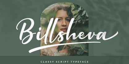 Billsheva Classy Script Font is a modern handwritten script font with lovely touch. Billsheva Font will work perfectly for fashion, e-commerce brands, trend blogs, wedding boutiques or any business that wants to appear upscale and chic. Featured : Standard Uppercase & Lowercase Numeral & Punctuation Multilingual : ä ö ü Ä Ö Ü ß ¿ ¡ Alternate & Ligature PUA encoded We recommend programs that support the OpenType feature and the Glyphs panel such as Adobe applications or Corel Draw. so you can use all the variations of the glyphs. Hope you enjoy our fonts!
 - Pittsbrook by Fontdation,
$15.00 Pittsbrook Family, a pack of classic typefaces that inspired by the letters used in old advertisement and packagings. Its rigid shape gives you strong, sharp and blocky feelings, no curves were harmed in the making of these typefaces. Comes in three styles; Sans, Serif and Outline, all of them are consistently mouse-crafted characters, we spent a lot of attention to every details. Suits best for any classic/vintage design project, such as E-Sport logo, liquor/food label, packaging, headline, space-filler, logotype, typographic quote writings, etc.
 - Belinsky Text by Tabular Type Foundry,
$32.99 Belinsky is a monospace sans serif typeface inspired by early 20th century geometric sans serifs, architectural letterings, and retro video games to some extent. Its exaggerated proportions and sharp details appear less harsh thanks to the corner rounding. It is comprised of a standard and text families, and the latter is especially suited for small text and programming, with wider spacing and more centralised gravity of certain letters like E. It still gives your codes a lot of personality. The typeface name is a reference to the designer�s favourite animated film, American Pop.
 - Wood Type Calendar JNL by Jeff Levine,
$29.00 Wood Type Calendar JNL is a set of components for making monthly calendar pages. Based on a set of vintage wood type numbers, the dates 1 through 31 are found on the "A-Z" and "a-e" keys; the 23/30 and 24/31 ligatures are on the "f" and "g" keys. On the "h" and "i" keys are blank outline and solid blocks for balancing the calendar layout. The "j" through "u" keys have the names of the months, and the "1" through "7" keys contain the days of the week.


