10,000 search results
(0.047 seconds)
- Butcher by RodrigoTypo,
$25.00 Butcher is a Rough font with 2 styles, a medium and a black to play with the weights, it contains the Greek and Cyrillic alphabet, special for action titles
 - Case Lot JNL by Jeff Levine,
$29.00 A style example found within the pages of a vintage type foundry catalog inspired Case Lot JNL. The design is a classic early 20th Century sans with chamfered corners.
 - Sketchetik Fill by Hiekka Graphics,
$19.00 Sketchetik Fill – brother of famous Sketchetik – is a hand-drawn font in four styles: Light, Regular, Bold and Black. Sketchetik Fill is recommended for use as a display typeface.
 - Georado by Balpirick,
$15.00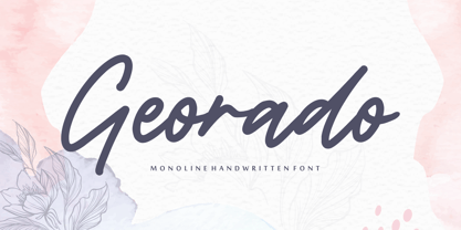 Georado is a sweet and friendly handwritten font. Its natural and unique style makes it incredibly fitting to a large pool of designs. The only limit is your imagination!
 - Love Radiate by Seemly Fonts,
$12.00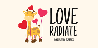 Love Radiate a joyful and casual handwritten font. Its natural and unique style makes it incredibly fitting to a large pool of designs. The only limit is your imagination!
 - Lovelier Typewriter by BeckMcCormick,
$12.00 Say hello to Lovelier, a handlettered typewriter style font. Lovelier is cute, quirky, and clean. Lovelier includes: - full upper + lowercase characters - numbers + punctuation - Western European Language Support - PUA-encoding
 - Graffick Wide by Graffiti Fonts,
$12.99Halfway between graffiti & typeography you find styles like Graffick™. These fonts are derived directly from hand written letters made mechanically perfect to behave more like common digital fonts. - Elah Pro by RodrigoTypo,
$29.00 Elah Pro is a Title Typography, which contains different styles such as Ornaments and Dingbats, special to play and combine and make a much more pleasant and entertaining title.
 - Roquero by FallenGraphic,
$19.00 Roquero is an amazing, sport styled, display font and will make your design more beautiful and powerful. This font is suitable for any design like branding, quotes and more
 - Formative by Studio Few,
$24.00 Sharp angular terminals, squared off bowls, and a balance of curved paths with straight. Formative is a grotesk with charm. Includes a stylistic set featuring standard 'text' style terminals.
 - Stay Kind by Sans And Sons,
$12.00 Stay Kind is Modern Retro with Fun and Groovy Style is perfect for branding, logos, shirts, invitation, stickers, master heads, Cricut projects, social media, posters, magazine, prints and more.
 - Easter Discover by Seemly Fonts,
$14.00 Easter Discover a joyful and casual handwritten font. Its natural and unique style makes it incredibly fitting to a large pool of designs. The only limit is your imagination!
 - Dreamland by Monotype,
$29.00 Dreamland is a bold, top-heavy style inspired by mid-20th century poster lettering. It has a lower case and is quite informal. Featured in: Best Fonts for Logos
 - Kemuning by Phoenix Group,
$9.00 Kemuning font is a traditional handwriting style font with thin and beautiful lines, this font is a reflection of naturalism, and the beauty that exists in the surrounding environment.
 - Derivation by Seemly Fonts,
$12.00 Derivation is a sweet and friendly handwritten font. Its natural and unique style makes it incredibly fitting to a large pool of designs. The only limit is your imagination!
 - BaselSans ITD by Isaco Type,
$30.00 BaselSans is a discrete, legible typeface, inspired by the international typographic style, with a humanistic touch. It is suitable for many uses, from small size texts to large titles.
 - TOMO Catcher by TOMO Fonts,
$15.00 TOMO Catcher is a sweet and friendly handwritten font. The extra narrow style makes it incredibly fitting to a large pool of designs. The only limit is your imagination!
 - Rackham by Scriptorium,
$18.00Rackham Italic is based on the hand lettered titles of Arthur Rackham from the book English Fairytales. The Rackham font is based on his more familiar title lettering style. - LDJ Dear Santa by Illustration Ink,
$3.00Letters to Santa are a highly anticipated holiday tradition. Use this fun font to add pizzaz and an endearing childish style to that letter or any creative lettering project. - Canbera by Viswell,
$19.00 Canbera is an old style serif font, its funky, round, hight-contrast and bold shape with a retro touch is perfect for displayed, head text, logotype and many more.
 - FrankieDos by Type-Ø-Tones,
$40.00 Following in the footsteps of his brother Frankie, FrankieDos entered our catalogue a few years later. FrankieDos follows the same pattern: how to imitate analogic features in a vector-based typeface.
 - One Code by Letterhead Studio-VG,
$15.00 One Code was made in the end of 1998. Original naive character was specially created for an unique design project, but now it is ready for use as an ordinary typeface.
 - Fidelity Caps by Jonahfonts,
$19.95 A tall upright CAP font with small caps. Now includes the Capital German double S (Eszett) ß. Applications include Captions, headlines, packaging, posters, ads, greeting cards, book jackets and/or covers.
 - Squaron by Fontron,
$35.00Another of my hand drawn originals now digitized. It started out as a very bold, decorative initial capital letter - a 'font within a font' - but got extended to the full alphabet. - Weeneez JNL by Jeff Levine,
$29.00 Weeneez JNL is an out-and-out novelty font made entirely of hot dogs. The font contains only the alphabet and numerals and a few other symbols including basic punctuation marks.
 - Ranch Land JNL by Jeff Levine,
$29.00 Ranch Land JNL is based on a classic French Clarendon wood type, many of which were popular in the 1800s and are now associated with either Western motifs or circus events.
 - Sign Decal JNL by Jeff Levine,
$29.00Sign Decal JNL is an outline version of Sheldrake JNL - lettering based on original water-applied decal transfers once made by the Duro Decal Company (now Duro Art Industries) of Chicago. - Candykitchen by Vanderfont,
$19.00 Casual and sugary, Candykitchen is an inline face with a weight problem. Frosted with occasional swashy finishing strokes and a few errant bulbous terminals, this face wants space in your cupboard.
 - Feel Script by Sudtipos,
$79.00 Feel Script is based on lettering that calligrapher and logo designer Rand Holub created for Intertype for his face Monterey. Fortunately, I didn’t have the technological limitations today that Intertype had back then. Holub’s lettering is presented in its entirety within Feel Script. Some letterforms were redrawn from vintage American magazine ads (some by Holub himself), along with many new alternates, ligatures, ending forms, and strangely beautiful character combinations. The experience I’ve accumulated from my previous calligraphy typefaces (Ministry Script, Affair, Buffet Script, Burgues Script, et al.) made it easier for me to apply Holub’s lettering in a new context using OpenType technology. The usual extended treatment was given to Feel Script, all the way into the implementation of three-letter ligatures and the dreamiest swashes I could imagine. I changed some of the connections between the lowercase letters in order to fit Holub’s calligraphy as opposed to the limited Intertype metal attempt. I hope you like Feel Script. I also hope what I contributed to this particular Holub design is somewhat of a happy ending to a calligraphy story that crosses many technologies. From the pen to computer Bézier. My part of this story stops here ... and yours begins. Feel Script has more than 1200 glyphs including: stylistic alternates, contextual alternates, titling alternates, swashes, and ligatures. Check out the PDF!
 - Brahma by Tall Chai,
$15.00 Brahma V2 is here. The new version has been three years in the making. It has multiple new updates and improvements based on user feedback. The focus for this version has been improved readability while maintaining the unique, modern identity of Brahma type family that has received so much love since V1 was launched in Dec 2020. Brahma is a modern geometric sans-serif font family with weights ranging from Thin (100) to Black (900). Features: Available in 9 weights Over 550 glyphs supporting extended Latin Ideal for display texts: Titles, Logos and Headlines etc. Perfect for branding and rebranding Supports OpenTypes features like Ligatures and Stylistic Alternates Tabular Numerals included Symbols for 10 major currencies including Bitcoin provided in all weights Description: The name comes from Brahmā who is known as the god of creation. And manifesting the same spirit, the Brahma font family focuses on modern creativity. Every character effortlessly integrates with current design standards and interfaces. The fonts are professional yet have a hint of informal personality in them. This makes Brahma perfect for use in modern apps and websites. Brahma is built for the designing and marketing squads. It has a trendy geometric characteristic which is ideal for any branding and rebranding. Brahma has lot of OpenType features (like ligatures and tabular numerals) and the Extended Latin character set supports over a hundred languages. Start Creating!
 - Tazugane Info by Monotype,
$187.99 Tazugane Info is a screen-ready Japanese font family, that follows on the debut of Monotype's first original Japanese typeface – Tazugane Gothic. It offers a more restrained personality, with calligraphic design details pared back to create a geometric letterform – a good alternative for designers looking for a matter-of-fact alternative to the warmer Tazugane Gothic tone of voice. Tazugane Info was updated to support the “Reiwa” new era symbol. Reiwa can be written as two kanji: 令和. This update to Tazugane Info includes Reiwa designed as a single ligature and is encoded as U+32FF. “While Tazugane Gothic fits perfectly when your job requires an organic and friendly tone of voice, Tazugane Info provides a more solid look,” says Kobayashi. “I hope that having two options will make it easier to choose an appropriate tone of voice to convey information or brand messaging.” Its strokes create a smooth uninterrupted flow that's designed for use on-screen. Although books, newspapers and magazines are traditionally set vertically in Japan, smartphones, information panels and car navigation systems are all set horizontally – and Tazugane Info has been tailored to this environment, featuring a new set of kana phonetic symbols. Tazugane Info is available in 10 weights, and includes the complete set of kanji and latin found in Tazugane Gothic.
 - Abrect by Hackberry Font Foundry,
$24.95 My first font for the summer of 2009, Abrect is a new sans serif font where I try to maximize the x-height and keep the design fresh and personal. It fits in with my continuing objective of designing book fonts that I can really use. Abrect is a tangent for me just taking an idea out to its end. In particular, it is a radical modification of my first font in 1993, Nuevo Litho. The hand-drawn shapes vary a lot, many pushing the boundaries of the normal character. With many of the new releases I see, the digital perfection is getting pretty extreme. It’s looking like a Rococo stage of development for many with decoration taking over from function. I'm consciously trying to head a different direction. This is not a normal font for me in that it has caps, lowercase, with the appropriate figures for each case, no small caps. This is the first time I have skipped small caps in over a decade. This font has all the OpenType features in the display set for 2009 except for the small caps. There are several ligatures for your fun and enjoyment: bb gg ff fi fl ffi ffl ffy fj ft tt ty Wh Th and more and many of them are experimental in form. Enjoy!
 - Farao by Storm Type Foundry,
$21.00Originally designed in 1998 as a 3-font family, updated in 2016 by new italics, small caps and many OpenType functions, resulting in a set of highly visible poster typefaces. If a text is set in a good Egyptienne, we can observe a kind of sparkle in the lines. Slab-serifs are cheerful typefaces, possibly due to the fact that they developed simultaneously with Grotesque typefaces. The design principle originating from the first half of the 19th century does not have such firm and long-established roots as for example, the Venetian Roman typefaces, hence it’s much more prone to a “decline”. We know of Egyptiennes with uneven color, with letters falling backwards (this often happens in the case of “S”), and especially with slightly bizarre modeling of details. In the course of time, however, it was realized that such things could be quite pleasant and tempting. After a century and a half, we find that such Egyptiennes could refresh uniform computer typography. The forms of many twisted letters resemble the gestures of a juggler: others, rectangularly static ones, reflect the profile of a rail or a steel girder – things which, in their times, were new and were observed by the first creators of Egyptiennes. These typefaces are ideal for circus posters and programs for theatre performances, just as for printing on cement sacks. - Metro Office by Linotype,
$50.99The Metro Office family is designed after the model of the original sans serif family – Metro No.1 – produced by W.A. Dwiggins and Mergenthaler Linotype’s design studio during the late 1920s and 1930s. A distinctly new interpretation of the sans serif idea, Metro was a thoroughly “American” sans serif when it was released. However, over the ensuing decades, it became a favorite the world over. Moreover, it is one of the first “humanist” sans serif typefaces designed. While redesigning Metro in 2006, Linotype’s Type Director Akira Kobayashi drew from his own knowledge of humanistic letterforms. The result is a redefined Metro; a typeface that is finally ready for heavy text setting. The original Linotype Metro No.1 never had italic variants. Kobayashi has created oblique variants, extending its use in document setting. A double-storey a and g, as well as a wider w were features of Dwiggins’ original Metro design that were filtered out by Mergenthaler Linotype in the 1930s. Kobayashi remedied this historical slight, retooling Dwiggins’ original forms and optimizing their legibility. Kobayashi has additionally retooled some of Metro’s more troublesome letters, which has black elements that became too dense. By opening up the troublesome joins (like that on the Q), Kobayashi has given his new Metro a more even color in text, improving its legibility while retaining its original spirit. - LiebeLotte by LiebeFonts,
$29.90 Forget that hipster coolness for a minute and design something cute and charming with LiebeLotte! Go ahead and make beautiful things with her: birthday cards, wedding invitations, love letters, new signage for your deli—so many things look sweeter when you use this well-crafted handwriting font. We’ve put all of our heart and soul into this typeface—it took us a whole year to draw, refine, and interconnect all these loopy letterforms. We hope it’s really hard to tell that this is a typeface at all—the perfect connections and many swash variations make it look like you actually sat down with a pen. A pretty good pen in fact. LiebeLotte comes with a state-of-the-art character set. She also sports a variety of ligatures and alternative forms, available through OpenType features. (Please make sure your software supports ligatures for the letter connections and OpenType if you wish to use the advanced features.) Advanced designers, please take a look at our best-sellers LiebeErika and LiebeKlara: the all-new LiebeLotte makes a great companion for these popular fonts. We do think you’ll have plenty of fun with this versatile package of loopy letters for letter lovers. Or lovely letters for loop lovers. And hey, you can absolutely use LiebeLotte to make happy hipster designs, too! Promise!
 - Mariage by Linotype,
$40.99Morris Fuller Benton, the principal designer of the American Type Founders, designed Mariage in 1901. Mariage, which has been sold under a plethora of different names during the last century, is a blackletter typeface belonging to the Old English category. The term blackletter refers to typefaces that stem out of the historical printing traditions of northern Europe. These letters, called gebrochene Schriften, or "broken type" in German, are normally elaborately bent and distorted. Their forms often print large amounts of ink upon the page, creating text that leaves a heavy, black impression. The Old English style is a subset of blackletter type that dates back to 1498, when Wynken de Worde introduced textura style printing to England. Continental printers had been printing with textura style letters since Gutenberg's invention of the printing press fifty years earlier. Italian printers stopped using them around 1470. For northern Europeans, texturas remained the most popular form of typeface design until the invention of the fraktur style in Nuremberg. Mariage is heavily classicized sort of Old English type. During the Victorian era, designers admired the Middle Ages for its chivalric, community-based values and its pre-industrial lifestyle. Yet they also found the basic medieval textura letterform too difficult to read by present standards. They desired to modernize this old style. Today, this sort of update is often referred to not as "modernization" but as classicism. Benton's design for ATF builds upon earlier Victorian classicist interpretations of Old English/textura letters. For an example of what these Victorian designs looked like, check out the popular 1990 revival of the genre, Old English . Old English style types often appear drastically different from other blackletters. For contrast, compare Mariage to a classical German fraktur design, Fette Fraktur , a schwabacher style face, or the popular early 20th Century calligraphic gothic from Linotype, Wilhelm Klingspor Gotisch . Especially in the United States, classicist Old English typefaces are thought to espouse tradition and journalistic integrity. These features, together with the inherent, complex beauty of Mariage's forms, make this typeface a perfect choice for certificates, awards, and newsletter mastheads. - Imagine if your handwriting decided to hit the gym, attend a few self-improvement workshops, and then came back with a new swagger—that's Billion Dreams for you, crafted by the wizard of letters, Mån...
- Liliane Classe by Brenners Template,
$25.00 This is a challenge for elegant but radical typography layouts. Standard styles include classic and sophisticated serifs, while italic styles are designed with more adventurous handwritten touches. This serif font family included a total of 14 styles, including 7 weights and separately created italics. It can be the best choice for a unique and meaningful logo and branding design, and it will maintain a refined sense of unity. You need to understand OpenType Features to use these fonts well. Please check first whether the your apps plan to use supports these OpenType Features. Thanks. OpenType Features Discretionary Ligatures : ac, ad, ai, ak, ar, ay, az, ce, ci, ck, co, de, do, dr, er, ft, he, ho, ng, ro, se, sp, te, to, tr Standard Ligatures : fi, fl Alternates : a, d, h, i, k, n, u, z Oldstyle Figures Tabular Figures Fractions
 - Linotype Puritas by Linotype,
$29.99The German designers Gerd Sebastian Jakob and Jörg Ewald Meißner developed the Linotype Puritas family in 1999. The family, which has six text styles as well as a ornament set, displays a very geometric design, which harks back to the German modernist experiments with typography and lettering from the 1920s. The letters in Linotype Puritas Light, Linotype Puritas Medium, and Linotype Puritas Bold all have a slight slant to them. Not to be confused with an italic-grade slant, which may be found in the Light, Medium, and Bold Italic styles, these acute slants add a dynamic quality to text. The Linotype Puritas Ornaments font contains several dingbats and border elements, all drawn in the same line style as the companion letters. The entire Linotype Puritas family is included in the Take Type 4 collection from Linotype GmbH." - Mezalia by Arrière-garde,
$9.00 Mezalia is a one of a kind typeface. Its shapes were strongly influenced by bastarda scripts of high medieval times. Unlike most fonts sharing similar origin, Mezalia is not just another blackletter but a fully functional text typeface, blending medieval poise and character with modern sensibilities. Stroke widths, imitating a broad nibbed pen of a scribe, fluctuate constantly giving paragraphs a characteristic vibrating texture. Despite it's strong character Mezalia is very legible and will be an excellent choice for a book or an elegant magazine. Mezalia has two distinct styles: straight and cursive (true italic if you will, although the word is not really correct here), which come in seven weights, from thin to black. Each weight contains a set of old-style figures, lining figures, small caps and ligatures. A separate style containing drop-cap initials is also available.