10,000 search results
(0.025 seconds)
- Grave Ornamental by Intellecta Design,
$25.95Grave is a Intellecta's best seller, a classic font design remastered, distressed and antique, merging the bodonian style with tendrils and victorian ornaments. Ideal to use in in display purposes for a stylized type design. Its family of fonts has too Grave Ornaments , a dingbat/decorative display font featuring many different styles of flourishes and ornaments, great for a vintage antique feel. Completes the collection Grave Plus , where six different fonts has different styles of victorian fleurons and ornaments merging with a bodonian shaded typeface in great style. A beautiful and big family, available single or in pack with an attractive price. - White Wisteria by Asenbayu,
$15.00 White Wisteria is an elegant versatile serif font family consisting of 9 styles. This font has natural curved proportions and has soft corners. You can use this font in vintage, classic and retro designs. This font gives a beautiful, classy and luxurious impression to your design. This font is perfect for a variety of projects such as logos, branding, fashion, magazines, labels, posters, album covers and many more. White Wisteria fonts are available in 9 styles: Thin, Extra Light, Light, Regular, Medium, Semibold, Bold, Extra Bold, Black. These fonts feature Kerning, Ligature Style, Alternative Style, Numeral, Symbol and Multilingual Supports.
 - Cargan by Hoftype,
$49.00 Cargan merges the strength of the slab serif with a gentle line flow. The result is a versatile typeface family with a distinct personality that performs superbly in headlines as well as subheads and shorter text applications. The Cargan family consists of 16 styles and is well suited for ambitious typography. It comes in OpenType format with extended language support. All weights contain ligatures, superior characters, proportional lining figures, tabular lining figures, proportional old style figures, lining old style figures, matching currency symbols, fraction- and scientific numerals and matching arrows. The roman styles offer alternative versions for the ”a” and ”g” characters.
 - Battina by Attype Studio,
$15.00 Introducing Battina - Inspired by typeface on 70s era, Battina has the vintage font & retro font style. with 2 font style, It's super easy to use 3D effect with Battina family font. Two style Font: Regular & Extruded Battina is perfect for children product, branding, logo, invitation, stationery, product packaging, merchandise, monogram, blog design, game titles, cute style design, Book/Cover Title and more. Features : - Battina Extruded - Battina Ending Swash - Ligatures - Multilingual Support - Made it into separated file to make it easier to use by beginner & separated file user can use the font with software which doesn't accept open type features.
 - Grave Plus by Intellecta Design,
$29.90 Grave is a Intellecta's best seller, a classic font design remastered, distressed and antique, merging the bodonian style with tendrils and victorian ornaments. Ideal to use in in display purposes for a stylized type design. Its family of fonts has too Grave Ornaments, a dingbat/decorative display font featuring many different styles of flourishes and ornaments, great for a vintage antique feel. Completes the collection Grave Plus, where six different fonts has different styles of victorian fleurons and ornaments merging with a bodonian shaded typeface in great style. A beautiful and big family, available single or in pack with an attractive price.
 - Neutraliser Sans by HamburgerFonts,
$20.00 The Neutraliser family is a versatile collection of geometric-based fonts with 24 styles. The 6 Alternate styles are suitable for headlines and are complemented by the Sans and Serif styles suitable for small amounts text. The Caps styles allow for extra typographic variation within the family. Neutraliser is a direct result of the designer's initial exploration of typography and is uncompromising in its geometric nature. As the name suggests, the typeface celebrates the precision of the digital medium as a drawing tool in which the critical points that make up a letterform can be almost ‘plotted’ according to a grid-based logic.
 - Xotor by Typogama,
$19.00 Xotor is a double styled typeface family destined for use in titling and headlines. The main style, the Triline weight, is a modular typeface composed of three strokes and is best used in large sizes. For smaller bodies of text, the second Regular style is based on the same letter construction but in a simple, solid stroke. Both weights can either be used individually or combined to add extra effect to any layout. With an extended Latin language support, Xotor covers most Latin based scripts and equally features a range of Opentype features, from ligatures, alternative letters or different styles of numerals.
 - Neutraliser Caps by HamburgerFonts,
$20.00 The Neutraliser family is a versatile collection of geometric-based fonts with 24 styles. The 6 Alternate styles are suitable for headlines and are complemented by the Sans and Serif styles suitable for small amounts text. The Caps styles allow for extra typographic variation within the family. Neutraliser is a direct result of the designers' initial exploration of typography and is uncompromising in its geometric nature. As the name suggests, the typeface celebrates the precision of the digital medium as a drawing tool in which the critical points that make up a letterform can be almost 'plotted' according to a grid-based logic.
 - Burger Honren by IRF Lab Studio,
$12.00 Burger Honren is a beautiful collection of fonts, consisting of scripts, monolines and serifs. In this collection you will see fonts in various styles. With their help, many options open up for you to create your projects, both in vintage and modern styles. The script fonts in this collection provide both charisma and charm, crafted with care and complemented by alternatives and strokes. Serif comes in 10 styles and it is possible to choose the required style for your design. This font is PUA encoded which means you can access all the glyphs and sweeps easily!
 - Grave Ornaments by Intellecta Design,
$19.90 Grave is a Intellecta's best seller, a classic font design remastered, distressed and antique, merging the bodonian style with tendrils and victorian ornaments. Ideal to use in in display purposes for a stylized type design. Its family of fonts has too Grave Ornaments, a dingbat/decorative display font featuring many different styles of flourishes and ornaments, great for a vintage antique feel. Completes the collection Grave Plus, where six different fonts has different styles of victorian fleurons and ornaments merging with a bodonian shaded typeface in great style. A beautiful and big family, available single or in pack with an attractive price.
 - Compass Next by TipografiaRamis,
$35.00 Compass Next is a third edition of Compass TRF designed in 2002. The first time Compass TRF has been conceived was as a “geometric” Didone – all letters literally were drawn with a ruler and a compass. Second edition (2009) got additional styles – Flourish Initials and Small Caps. This time, the objective was to bring overall extreme geometrical expression closer to traditional letterform style of its “modern style” typeface category (Didone). All glyphs were redrawn including in alternative Decorative style, and additional Bold weight has been added. Typeface is released in OpenType format with extended support for most Latin languages.
 - Rhumba by Stiggy & Sands,
$24.00 A Lost Art Deco Style Reborn and Multiplied Rhumba began as a digitization of a film typeface from LetterGraphics in the early 70's known as "Barrio Lined". Originally only a single typeface, represented by our Rhumba Lined style, it was fun and offered more diversity to expand out the styles of this gem. Playing off the stylings of fonts like Prisma, Rhumba fills in gaps between the various lines of the original to offer 3 alternate looks. The Rhumba family contains 382 characters per font. A comprehensive character map preview is at the end of the poster graphics collection.
 - Neutraliser Serif by HamburgerFonts,
$20.00 The Neutraliser family is a versatile collection of geometric-based fonts with 24 styles. The 6 Alternate styles are suitable for headlines and are complemented by the Sans and Serif styles suitable for small amounts text. The Caps styles allow for extra typographic variation within the family. Neutraliser is a direct result of the designers' initial exploration of typography and is uncompromising in its geometric nature. As the name suggests, the typeface celebrates the precision of the digital medium as a drawing tool in which the critical points that make up a letterform can be almost 'plotted' according to a grid-based logic.
 - Neutraliser Alternate by HamburgerFonts,
$20.00 The Neutraliser family is a versatile collection of geometric-based fonts with 24 styles. The 6 Alternate styles are suitable for headlines and are complemented by the Sans and Serif styles suitable for small amounts text. The Caps styles allow for extra typographic variation within the family. Neutraliser is a direct result of the designers' initial exploration of typography and is uncompromising in its geometric nature. As the name suggests, the typeface celebrates the precision of the digital medium as a drawing tool in which the critical points that make up a letterform can be almost 'plotted' according to a grid-based logic.
 - Basilio by Canada Type,
$29.95 In the late 1930s, old Egyptiennes (or Italiennes) returned to the collective consciousness of European printers and type houses — perhaps because political news were front a centre, especially in France where Le Figaro newspaper was seeing record circulation numbers. In 1939 both Monotype and Lettergieterij Amsterdam thought of the same idea: Make a new typeface similar to the reverse stress slab shapes that make up the titles of newspapers like Le Figaro and Le Frondeur. Both foundries intended to call their new type Figaro. Monotype finished theirs first, so they ended up with the name, and their type was already published when Stefan Schlesinger finished his take for the Amsterdam foundry. Schlesinger’s type was renamed Hidalgo (Spanish for a lower nobleman, ‘son of something’) and published in 1940 as ‘a very happy variation on an old motif’. Although it wasn’t a commercial success at the time, it was well received and considered subtler and more refined than the similar types available, Figaro and Playbill. In the Second World War, the Germans banned the use of the type, and Hidalgo never really recovered. Upon closer inspection, Schlesinger’s work on Hidalgo was much more Euro-sophisticated and ahead of its time than the too-wooden cut of Figaro and the thick tightness of Playbill. It has a modern high contrast, a squarer skeleton, contour cuts that work similarly outside and inside, and airy and minimal solutions to the more complicated shapes like G, K, M, N, Q and W. It is also much more aware of, and more accommodating to, the picket-fence effect the thick top slabs create in setting. Basilio (named after the signing teacher in Mozart’s Figaro) is the digital revival and major expansion of Hidalgo. With nearly 600 glyphs, it boasts Pan-European language support (most Latin languages, as well as Cyrillic and Greek), and a few OpenType tricks that gel it all together to make a very useful design tool. Stefan Schlesigner was born in Vienna in 1896. He moved to the Netherlands in 1925, where he worked for Van Houten’s chocolate, Metz department store, printing firm Trio and many other clients. He died in the gas chambers of Auschwitz in 1944. Digital revivals and expansions of two of his other designs, Minuet and Serena, have also been published by Canada Type.
 - SDCyberGlitch by Sudezine,
$10.00 SDCyberGlitch is a futuristic cyber-style and dystopian futuristic style font. You can use this font for logos, quotes, invitations, greeting cards, journals, posters, clothing, and more. This font will infuse your designs with playfulness and fun!
 - Rilo by Michael Prewitt,
$20.00 Rilo is an 18 style semi-condensed sans-serif with 9 weights + Italics. This unique OpenType typeface has a handful of unique glyphs with conservative stylistic alternatives. • 18 Styles (9 weights + italics) • OpenType alternates • Western European language
 - Arrogant by Ametype,
$5.00 ARROGANT is a geometric monospace, which in use is supposed to resemble an unknown (sci-fi) script. The letters was made in geometric style consist of repetitive modules. Font is available in 8 styles and variable version.
 - Buzzer Three by ITC,
$29.00Buzzer Three is the work of Tony Lyons and Paul Crome. Its futuristic appearance is in the OCR style, however, it contains unique design characteristics that separate it from the more predictable geometric styles in this category. - Ashgabat by GlyphStyle,
$16.00 Ashgabat is a signature style font that looks natural with a pen stroke-like texture. A bold and elegant looking font like the original signature style. Font feature Uppercase, Lowercase, Numerals & Punctuations, Stylistic Alt, Swash Ligature, Multilanguage
 - Nord by Letterwerk,
$25.00 Nord is a capital letter font made for display use. The 4 styles can either stand alone or be used for effects by adding different colors to each stackable style. Check the PDF-FILE for more informations.
 - Stitching of Children by Wildan Type,
$9.00 Stitching of Children is a fun and quirky handwritten font with a unique style, playful look & feel! embodies fun. Use this gorgeous and unique font to bring any DIY. you also can enjoy many unic alternate style
 - Sweet Valley by Funk King,
$5.00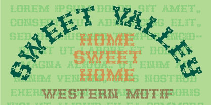 Sweet Valley is a western-style font.
 - LHF Equinox by Letterhead Fonts,
$39.00 Classic extended style with jumbo decorative caps.
 - KG As The Deer by Kimberly Geswein,
$5.00 Fun mixed cursive and print styled lettering.
 - KG Already Home by Kimberly Geswein,
$5.00 A cute doodled outline typewriter style font.
 - Remix by Intellecta Design,
$20.00a typewriter font with many style variations - Janda Flower Doodles by Kimberly Geswein,
$5.00 Flower doodles in a variety of styles.
 - Skinny Walrus by m u r,
$15.00 A tall, thin, hand written style font.
 - Letra Pro Headline by Stawix,
$35.00 Let's see your style with Letra Pro.
 - Banks and Miles by K-Type,
$20.00 K-Type’s ‘Banks & Miles’ fonts are inspired by the geometric monoline lettering created for the British Post Office in 1970 by London design company Banks & Miles, a project initiated and supervised by partner John Miles, and which included ‘Double Line’ and ‘Single Line’ alphabets. The new digital typeface is a reworking and extension of both alphabets. Banks & Miles Double Line is provided in three weights – Light, Regular and Dark – variations achieved by adjusting the width of the inline. Banks & Miles Single Line develops the less used companion sans into a three weight family – Regular, Medium and Bold – each with an optically corrected oblique. Although the ‘Banks & Miles Double Line’ and ‘Banks & Miles Single Line’ fonts are based on the original Post Office letterforms, glyphs have been drawn from scratch and include numerous adjustments and impertinent alterations, such as narrowing the overly wide Z and shortening the leg of the K. Several disparities exist between the Post Office Double and Single Line styles, and K-Type has attempted to secure greater consistency between the two. For instance, a wide apex on the Double Line’s lowercase w is made pointed to match the uppercase W and the Single Line’s W/w. Also, the gently sloping hook of Single Line’s lowercase j is adopted for both families. The original Single Line’s R and k, which were incongruously simplified, are drawn in their more remarkable Double Line forms, and whilst the new Single Line fonts are modestly condensed where appropriate, rounded letters retain the essentially circular form of the Double Line. Many characters that were not part of the original project, such as @, ß, #, and currency symbols, have been designed afresh, and a full set of Latin Extended-A characters is included. The new fonts are a celebration of distinctive features like the delightful teardrop-shaped bowl of a,b,d,g,p and q, and a general level of elegance not always achieved by inline typefaces. The Post Office Double Line alphabet was used from the early 1970s, in different colours to denote the various parts of the Post Office business which included telecommunications, counter services and the Royal Mail. Even after the Post Office was split into separate businesses in the 1980s, Post Office Counters and Royal Mail continued use of the lettering, and a version can still be seen within the Royal Mail cruciform logo.
 - Navigator by Andrew Footit,
$12.00 The Navigator family is inspired by the early explorers, the early sailors with their old-style tattoos and the cowboys in the old west. I mashed up these to styles to create the Navigator display family. It has a vintage feel with a more modern day approach. Use the regular styles to give your artwork a more clean look and feel or the rough styles to take on the more vintage old-style. This family is great for display use on posters, packaging, editorial and logos. It is created with the designer in mind to have some fun and mix up some great looking Upper / Lower case combinations. The Navigator hand font is an informal, rounded sans-serif that works perfectly with the Navigator display fonts to create beautiful logo and type lockups.
 - Town by J Foundry,
$20.00 Town is a display collection inspired by art deco and contemporary lettering. The fonts have a classic feel, with contemporary proportions, styling and details. There are eight base weights and nine decorative styles in multiple weights. The variety of styles are designed to create bespoke brand marks, stylish liquor labels, unique restaurant menus, engaging websites and fresh magazine layouts. The fonts are built on the same foundations, so the display and decorative styles can be mixed and matched while maintaining a harmonious look. Several of the styles can also be layered together; add a subtle shadow to your headline or create a full dimensional look with an inline face. The collection is rounded out with two sets of accent fonts, and a set of text weights, with matching italics.
 - Aestetico by Latinotype,
$29.00 This beautiful font explores 3 very individual styles of one typeface. Each style pays homage to classic sans serif typefaces while adding contemporary flair to its characteristics. With both formal and informal styles, Aestetico explores how the shapes and curves of letters change their perception and focus. The informal letters are rounder and more quirky while the formal style utilizes more traditional sans serif letterforms. The whole set (54 styles) consists of 3 sister families, each in 9 weights with matching italics. The 3 variants ensure every design project is covered by Aestetico; its versatile nature is perfect for a huge variety of applications from editorial design to branding, advertising, publications and digital. As you would expect from Latinotype, this font comes with a standard character set (395 glyphs) and supports over 200 languages.
 - Diane Script by GroupType,
$27.00 In 1995, FontHaus came upon a rare opportunity to create a revival of Aries, a little known and previously unavailable typeface by the legendary Eric Gill. Discovering a lost typeface by one of the major designers of the 20th Century, was the discovery of a buried treasure, and being the first type company to release it was an honor. Thirteen years later, FontHaus came across another little known typeface treasure: Diane. Designed by the legendary French designer Roger Excoffon in 1956, this remarkable script has never been faithfully recreated until now. In close collaboration with Mark Simonson, FontHaus and Mr. Simonson painstakingly researched rare type books, publications, European metal type services, and period showings from the United States, England, Germany and from the University of Groningen in the Netherlands. Finding full specimens of the font turned out to be quite a challenge. In most cases, only the caps and lowercase were shown. Furthermore, the more we researched Diane, many curious facts came to light. The caps in earlier specimens of Diane are completely different from specimens published later, suggesting that the face was redesigned at some point, perhaps in the mid-1960s. So we are left with two different sets of caps. The original had very elaborate, swirly strokes, very characteristic of Excoffon¹s gestural designs for posters and logos. Later on, these appear to have been replaced by a set of simpler, more traditional script caps. The original caps are criticized in one source Mark found (Practical Handbook on Display Typefaces, 1959) as being "exquisite" but "not highly legible". Perhaps this is what led to the simpler caps being introduced. Nevertheless, FontHaus's release includes not only both sets of caps, but a range of alternates and a number of new characters not originally available such as the Euro, and a magnificent alternate Ampersand to name a few.
 - ITC Aram by ITC,
$29.99Jana Nikolic was finishing her degree program at the Faculty of Applied Arts, in Belgrade, with a final project that would combine her two majors: type and book design. Three stories from William Saroyan's My Name Is Aram would provide the text for the book, to be set in a typeface that Nikolic would design. Nikolic knew something special was happening the moment she put pen to paper. The letters just emerged," she recalls. "I started to explore a few new pens and found one I loved. I was able to make its tip bend with pressure." Like the family Saroyan writes about, the design flowing from Nikolic's pen would be simple but a little quirky. "When there were a whole bunch of little black letters around me," continues Nikolic, "I saw that this was going to be a very interesting typeface family." Nikolic drew Latin and Cyrillic letters, lowercase and capital letters, wide letters and narrow letters. She was surprised at how quickly and easily the design came. "There were no badly written letters," she says. "I hardly had to rework them and they fit together remarkably well." ITC Aram's standard character complement consists of one set of lowercase letters and two sets of capitals: one narrow and the other wide. The wide caps can be used with the standard lowercase, or mixed with the narrow caps for a variation on "cap and small cap" copy. The ITC Aram create the opportunity to mix and combine the letters into playful typographic expressions. Words and sentences that twinkle; text that seems light and alive - one runs the risk of creating work that is both delightful and charming when setting copy in ITC Aram." - Piel Script by Sudtipos,
$89.00 Over the past couple of years I received quite a number of unusual and surprising requests to modify my type designs to suit projects of personal nature, but none top the ones that asked me to typeset and modify tattoos using Burgues Script or Adios. At first the whole idea was amusing to me, kind of like an inside joke. I had worked in corporate branding for a few years before becoming a type designer, and suddenly I was being asked to get involved in personal branding, as literally “personal” and “branding” as the expression can get. After a few such requests I began pondering the whole thing from a professional perspective. It was typography, after all, no matter how unusual the method or medium. A very personal kind of typography, too. The messages being typeset were commemorating friends, family, births, deaths, loves, principles, and things that influenced people in a deep and direct way, so much so that they chose to etch that influence on their bodies and wear it forever. And when you decide to wear something forever, style is of the essence. After digging into the tattooing scene, I have a whole new respect for tattoo artists. Wielding that machine is not easy, and driving pigment into people’s skin is an enormous responsibility. Not to mention that they're some of the very few who still use a crafty, hands-on process that is all but obsolete in other ornamentation methods. Some artists go the extra mile and take the time to develop their own lettering for tattooing purposes, and some are inventive enough to create letters based on the tattoo’s concept. But they are not the norm. Generally speaking, most tattoo artists use generic type designs to typeset words. Even the popular blackletter designs have become quite generic over the past few decades. I still cringe when I see something like Bank Script embedded into people’s skin, turning them into breathing, walking shareholder invitations or government bonds. There’s been quite a few attempts at making fonts out of whatever original tattoo designer typefaces can be found out there - wavy pseudo-comical letters, or rough thick brush scripts, but as far as I could tell a stylish skin script was never attempted in the digital age. And that’s why I decided to design Piel Script. Piel is Spanish for skin. In a way, Piel Script is a removed cousin of Burgues Script. Although the initial sketches were infused with some 1930s showcard lettering ideas (particularly those of B. Boley, whose amazing work was shown in Sign of the Times magazine), most of the important decisions about letter shapes and connectivity were reached by observing whatever strengths and weaknesses can be seen in tattoos using Burgues. Tattoos using Adios also provided some minor input. In retrospect, I suppose Affair exercised some influence as well, albeit in a minor way. I guess what I'm trying to say is there is as much of me in Piel Script as there is in any of the other major scripts I designed, even though the driving vision for it is entirely different from anything else I have ever done. I hope you like Piel Script. If you decide it to use it on your skin, I'll be very flattered. If you decide to use it on your skateboard or book cover, I'll be just as happy. Scripts can't get any more personal than this. Piel Script received the Letter2 award, where they selected the best 53 typefaces of the last decade, organised by ATypI.
 - BLT Norfolk by Black Lab Type,
$12.00 Norfolk is a vintage-inspired font based on the styles found on packaging from the early 1900's. It evokes a genuine and timelessly crafted look from this period. Three styles are included in this family: Fill, Inline and Outline. The styles can be used together or layered to create a variety of vintage looks for any project. Norfolk works well as a header or title for branding, packaging or publications.
 - Bazoka by Juncreative,
$15.00 Bazoka font is a display style that mimics the look of hand-drawn graffiti lettering. The letters are rounded and bubbly in shape, with a bold appearance. This style is perfect for informal or urban-themed designs, such as posters, flyers, and street art. Overall, graffiti bubble font is a fun and energetic way to add personality to your design. and this font include 3 styles regular, outline and extrude.
 - Pontifica by Scriptorium,
$18.00Pontifica is based on ‘protogothic’ calligraphy, a style developed at the monastery of St. Gall in the 12th century to replace Carolingian minuscule with a more efficient and compact system of lettering. Ultimately it became the progenitor of the gothic lettering styles of the late Medieval period. Also available to go with this font is a special swash version with a very different style, but compatible overall appearance.