1,105 search results
(0.016 seconds)
- Volkswagen Serial by SoftMaker,
$15.99
- Horsham Serial by SoftMaker,
$-
- Ravenna Serial by SoftMaker,
$-
- Stafford Serial by SoftMaker,
$15.99
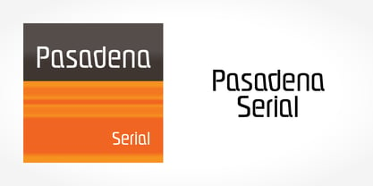
- Pasadena Serial by SoftMaker,
$-
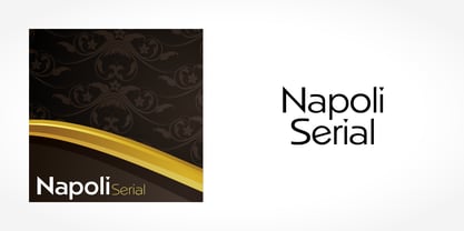
- Napoli Serial by SoftMaker,
$-
- Riccione Serial by SoftMaker,
$- Times New Roman alternative
 - Ballantines Serial by SoftMaker,
$15.99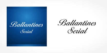
- Valencia Serial by SoftMaker,
$15.99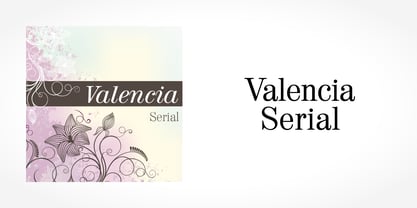
- Dragon Serial by SoftMaker,
$-
- Clarendon Serial by SoftMaker,
$15.99
- Worcester Serial by SoftMaker,
$-
- Veracruz Serial by SoftMaker,
$-
- Formula Serial by SoftMaker,
$-
- Salzburg Serial by SoftMaker,
$-
- Marseille Serial by SoftMaker,
$-
- Raleigh Serial by SoftMaker,
$-
- Arialic Hollow - Personal use only

- Arial Nova by Monotype,
$45.99The Arial® Nova family takes Arial back to its roots. Character spacing has been adjusted and a number of subtle modifications were made to the design to return the shapes and proportions to those of the original 1982 design created for IBM's then new high-speed laser printers. Although these first Arial fonts, called "Sonora Sans" by IBM, were low-resolution bitmaps, it was apparent that the design could also be an important high-resolution digital typeface, and Arial was redrawn for Monotype's imagesetters in the late 1980s. In the process Arial evolved from its original design loosing some of its earlier personality. The restored Arial Nova family is made up of three weights of roman design of standard proportions and three weights of condensed - all with complementary italic designs. The Arial Nova family is also compatible with the fonts that Microsoft® provides in the Windows® 10 operating system. - Arial Unicode by Monotype,
$208.99Arial was designed for Monotype in 1982 by Robin Nicholas and Patricia Saunders. A contemporary sans serif design, Arial contains more humanist characteristics than many of its predecessors and as such is more in tune with the mood of the last decades of the twentieth century. The overall treatment of curves is softer and fuller than in most industrial style sans serif faces. Terminal strokes are cut on the diagonal which helps to give the face a less mechanical appearance. Arial is an extremely versatile family of typefaces which can be used with equal success for text setting in reports, presentations, magazines etc, and for display use in newspapers, advertising and promotions. - Arial Paneuropean by Monotype,
$92.99Arial was designed for Monotype in 1982 by Robin Nicholas and Patricia Saunders. A contemporary sans serif design, Arial contains more humanist characteristics than many of its predecessors and as such is more in tune with the mood of the last decades of the twentieth century. The overall treatment of curves is softer and fuller than in most industrial style sans serif faces. Terminal strokes are cut on the diagonal which helps to give the face a less mechanical appearance. Arial is an extremely versatile family of typefaces which can be used with equal success for text setting in reports, presentations, magazines etc, and for display use in newspapers, advertising and promotions. - Arial Arabic by Monotype,
$172.99 - MT Bleu Feelin Mono by MametosType,
$20.00 MT Bleu Feelin — is a display font with a monospace typographic feel. Please pay attention to Small Caps, Oldstyle Figures, and Alternates. Good for music album covers, posters and magazines. Inspired by the electronic band from Bandung, Bleu House, which has a light and edgy electronic pop experimental music character, the idea emerged to create a font that changes from sound to visual language, namely font. The use of the design for this font is for Display, and while it is issued one regular weight, in the future will develop multiple masters and other experiments. The design concept of the MT Bleu Feelin Mono Regular font is to take a 45 degree diagonal and geometric cut technique. also every corner is rounded which gives a dynamic impression like electronic music. I created this font design because I like visual experiments, and applied it to the character of the font. By using monospaced font characters have an even width. This is a unique feature in that most fonts are 'proportionally' spaced with characters varying in width. While monospace is perfect in certain ways, it is a proportional font that reigns supreme. Proportional fonts are faster to read. however, the MT Bleu Feelin Mono Regular font is intended for display fonts. MT Bleu Feelin Mono Regular supports language settings - Western Europe - Central Europe - Southeastern Europe - South American - Oceania - Esperanto
 - Gill Sans MT Greek by Monotype,
$67.99The successful Gill Sans® was designed by the English artist and type designer Eric Gill and issued by Monotype in 1928 to 1930. The roots of Gill Sans can be traced to the typeface that Gill's teacher, Edward Johnston, designed for the signage of the London Underground Railway in 1918. Gill´s alphabet is more classical in proportion and contains what have become known as his signature flared capital R and eyeglass lowercase g. Gill Sans is a humanist sans serif with some geometric touches in its structures. It also has a distinctly British feel. Legible and modern though sometimes cheerfully idiosyncratic, the lighter weights work for text, and the bolder weights make for compelling display typography. Gill Sans is also available as Value Pack for Macintosh, PC or as Hybrid CD with both platforms. - Gill Sans MT WGL by Monotype,
$92.99The successful Gill Sans® was designed by the English artist and type designer Eric Gill and issued by Monotype in 1928 to 1930. The roots of Gill Sans can be traced to the typeface that Gill's teacher, Edward Johnston, designed for the signage of the London Underground Railway in 1918. Gill´s alphabet is more classical in proportion and contains what have become known as his signature flared capital R and eyeglass lowercase g. Gill Sans is a humanist sans serif with some geometric touches in its structures. It also has a distinctly British feel. Legible and modern though sometimes cheerfully idiosyncratic, the lighter weights work for text, and the bolder weights make for compelling display typography. Gill Sans is also available as Value Pack for Macintosh, PC or as Hybrid CD with both platforms. - Gill Sans MT Cyrillic by Monotype,
$67.99The successful Gill Sans® was designed by the English artist and type designer Eric Gill and issued by Monotype in 1928 to 1930. The roots of Gill Sans can be traced to the typeface that Gill's teacher, Edward Johnston, designed for the signage of the London Underground Railway in 1918. Gill´s alphabet is more classical in proportion and contains what have become known as his signature flared capital R and eyeglass lowercase g. Gill Sans is a humanist sans serif with some geometric touches in its structures. It also has a distinctly British feel. Legible and modern though sometimes cheerfully idiosyncratic, the lighter weights work for text, and the bolder weights make for compelling display typography. Gill Sans is also available as Value Pack for Macintosh, PC or as Hybrid CD with both platforms. - Gill Sans MT Infant by Monotype,
$43.99The successful Gill Sans® was designed by the English artist and type designer Eric Gill and issued by Monotype in 1928 to 1930. The roots of Gill Sans can be traced to the typeface that Gill's teacher, Edward Johnston, designed for the signage of the London Underground Railway in 1918. Gill´s alphabet is more classical in proportion and contains what have become known as his signature flared capital R and eyeglass lowercase g. Gill Sans is a humanist sans serif with some geometric touches in its structures. It also has a distinctly British feel. Legible and modern though sometimes cheerfully idiosyncratic, the lighter weights work for text, and the bolder weights make for compelling display typography. Gill Sans is also available as Value Pack for Macintosh, PC or as Hybrid CD with both platforms. - Brial - Unknown license

- Ceria by Omotu,
$16.00 DETAILS Ceria! A handwritten fun font with two styles, textured and clean. Clean font is suitable for branding, logotype, apparel, T-shirt, Hoodie, product packaging, quotes, flyer, poster, advertising, etc. Whats Include? 1. Uppercase and lowercase characters 2. Multilingual support. 3. Numerals, punctuations, and alternates 4. Accessible in the Adobe Illustrator Glyphs panel, or under Stylistic Alternates in the Adobe Photoshop OpenType menu, Adobe InDesign, Corel Draw, even work on Microsoft Word. Please message me if you're unsure of any language support. Thanks for looking, and I hope you enjoy it! Please don't hesitate to drop me a message if you have any issues or queries. Omotu Studio
 - Atria by AVP,
$29.00 A modern sans-serif, Atria is pinched at the junction of certain strokes, providing a distinctive appearance and aiding screen definition at small sizes. The glyphs cover Baltic languages and Cyrillic.
 - Arian by Linotype,
$187.99 For decades, the Persian-born Naghi Naghashian has been working as a graphic designer and illustrator in Germany. Arian™ is his first commercial Arabic typeface. Named after his mother, Naghi created the Arian typeface family after years of systematically analyzing the Arabic script. The Arian design is sought to fulfill the many needs and was developed for multiple languages and writing conventions. It's extremely legibilitable not only in small sizes, but also when the type is filtered or skewed. This typeface offers a fine balance between calligraphic tradition and the contemporary sans serif aesthetic now common in Latin typography.
 - Aerator by T-26,
$19.00 - Aprilous by Akifatype,
$14.00 Product Description Aprilous is a modern smooth brush font, organic, dynamic and energetic sytle.Can used for various purposes. such as the title, signature, logo, correspondence, wedding invitations, letterhead, signage, labels, newsletters, posters, badges, etc. Aprilous is coded with PUA Unicode, which allows full access to all the extra characters without having special designing software. Mac users can use Font Book , and Windows users can use Character Map to view and copy any of the extra characters to paste into your favourite text editor/app.
 - Arielle by Anastasia Kuznetsova,
$26.00 I present the new handwritten font "Ariel" - a fashionable and super-cooled new font for handwriting with some stylish watercolor additions :) The font of the signature collection was created in such a way as to look as close as possible to a natural handwritten font, which includes a full set of characters in lowercase. Font Features • A-Z; a-z character set; • 1 language (English); • numbers and punctuation marks, symbols Fonts can be opened and used in any software that can read standard fonts, even in MS Word. No special software is required, and to get started. It is recommended to use it in Adobe Illustrator or Adobe Photoshop Made with love ♡
 - Geralize by Yoga Letter,
$15.00 "Geralize" is a very elegant and professional modern slab serif font. This font is equipped with uppercase, lowercase, ligatures, numerals, punctuations, and multilingual support. It is suitable for logos, branding, banners, posters, prints, and more.
 - Abril by TypeTogether,
$39.00 Conceived specifically for intensive editorial use, whether it is in newspapers, magazines or digital media, Abril is a font family of two worlds. The titling weights, based on a contemporary revamp of classic Didone styles, display both neutrality and strong presence on the page, attracting the reader’s attention with measured tension in its curves, good color and high contrast. It also features typographic niceties such as ornaments, borders, special dingbats and alternate letters and numbers that propose a broad palette of tools to the designer. The text weights are more closely inspired by both, 19th century slab serifs and scotch roman types. They maintain consistency with the headline styles, and at first glance may appear to have the same shapes only with lower contrast. However, in reality the letter forms of Abril Text were engineered from scratch to achieve a color, texture and overall width that allow using the font comfortably in the most challenging environments for continuous reading, such as newspapers. This also makes it a great font family for pocketbooks and magazines. Abril competes, in terms of economy of space, head to head with some newspaper classics such as Utopia or Nimrod, but featuring a more contemporary look and feel; and unlike them, includes a full set of small caps with numbers and punctuation. The four main text weights of Abril Text were also manually hinted which grants the possibility of a smooth transition from printed media to web platform. Abril consists of 8 text styles and 12 display styles, all of them containing the standard TypeTogether character set that supports over 50 languages including those from Central and Northern Europe.
 - Aelia by Scrowleyfonts,
$18.00 Aelia is a creative, decorative font inspired by the simple and overlapping twirls of Victorian ironwork. It is particularly suited for use with floral, organic, natural imagery. While it is undeniably pretty, it is also carefully constructed and robust with several features including kerning and oldstyle figures.
 - Geria by LetterMaker,
$21.00 Geria is a hand drawn sans serif in four weights. Despite being rough and organic, Geria retains the basic structure and shape of a readable sans serif. The result is a functional typographic tool with a lot of personality. The family comes in four carefully balanced weights that offer a lot of contrast from the delicate Light to the punchy Heavy weight. Geria is perfect for display use in branding, packaging, editorial design, posters and advertising.
 - April by URW Type Foundry,
$35.00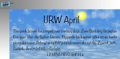
- Modern MT for Dior CS by Monotype,
$29.99Cut by Monotype between 1900 and 1902, the Monotype Modern font family was based on Miller & Richards News 23 and 28; slightly condensed news text types of the 1890s. Monotype Modern is a lively typeface, with long, fine hairlines and well rounded letterforms, representing the best of nineteenth century modern face design. A classic text face, and typical of the moderns that were produced in the United Kingdom at that time, being less extreme in its rendering than some of the models of purer form being produced elsewhere. Monotype Modern is an excellent text face for magazines, newspapers and books, the heavier and more condensed versions are useful in headlines and display.

