10,000 search results
(0.046 seconds)
- Metairie by insigne,
$24.99 Get in the swing with Metairie. This high-contrast script from Jeremy Dooley sets the rhythm for your next headline or short phrase with its fresh, expressive forms. Metairie’s (sometimes exaggerated) scrawled letterforms play on the colorful world of calligraphy to bring you a fully developed personality of its own. Inspired by elixirs and pharmaceuticals of the 1800s, this design has forms that dig down deep to the soul. It brings a unique, vibrant feel for your next message. The typeface supports all major Latin languages, and the expanded OpenType capabilities let you slide elements easily and quickly into your design. Metairie also includes a number of distressed options. Improv a bit, too, with Metairie’s decorative ornaments, variations on the fleur de lis. Ornaments and tails are accessed through the glyph palette or using the Swash function. An extensive set of ligatures gives you more options for humanizing the handwriting on the page. Then take it up a notch by using the glyph palette to find the perfect solution for project. You have full access to this amazing capability with InDesign, Illustrator, QuarkXpress and similar software. We recommend that you explore what this font can offer by using the glyph palette. Get a glimpse of the font’s strength by looking over the brochure in PDF format in the "Gallery" section. Ready to step in? Take a stab at your next design with Metairie. It could be just the color you need.
 - Ongunkan Camunic Script by Runic World Tamgacı,
$60.00 The Camunic language is an extinct language that was spoken in the 1st millennium BC in the Valcamonica and the Valtellina in Northern Italy, both in the Central Alps. The language is sparsely attested to an extent that makes any classification attempt uncertain - even the discussion of whether it should be considered a pre–Indo-European or an Indo-European language has remained indecisive. Among several suggestions, it has been hypothesized that Camunic is related to the Raetic language from the Tyrsenian language family, or to the Celtic languages. The extant corpus is carved on rock. There are at least 170 known inscriptions, the majority of which are only a few words long. The writing system used is a variant of the north-Etruscan alphabet, known as the Camunian alphabet or alphabet of Sondrio. Longer inscriptions show that Camunic writing used boustrophedon. Its name derives from the people of the Camunni, who lived during the Iron Age in Valcamonica and were the creators of many of the stone carvings in the area. Abecedariums found in Nadro and Piancogno have been dated to between 500 BC and 50 AD. The amount of material is insufficient to fully decipher the language. Some scholars think it may be related to Raetic and to Etruscan, but it is considered premature to make such affiliation. Other scholars suggest that Camunic could be a Celtic or another unknown Indo-European language.
 - Vasetters by Ingrimayne Type,
$9.00 In Vasetters the letters are cut from the shape of a tessellating vase. To get the tessellating effect, the two sets of letters (and numbers and some symbols) must alternate, and this is done automatically in applications that support the OpenType feature of Contextual Alternatives (calt). Vasetters is monospaced and comes in two weights. The regular weight is tightly spaced, which should not be a problem at large point sizes. At small point sizes adjacent letters can be colored differently or the character spacing can be increased. The lighter weight can be used alone or layered above the regular weight to create the effect of hollow lettering. Vasetters is is fun, bizarre, weird, and obviously a decorative display font.
 - Shibuya Dancefloor by Megami Studios,
$10.00 Inspired by Rob’s years of living in Japan, Shibuya Dancefloor is an expanded version of an earlier font that we did, adding hiragana and katakana to the mix. It's perfect for anime artwork, sci-fi lettering or even just making flyers for that party you're planning down in Roppongi!
 - Popfun by Surotype,
$20.00 Popfun is a display typeface with playful taste. It comes in two different styles, normal and extrude paired with a mono style, this font fits perfectly. Really playful font to make it easier for you creative work such as — branding, film titles, packaging, advertising, posters, and web or app.
 - Bygone by Hanoded,
$20.00 Bygone is an elegant brush font - well, insofar a brush font can actually be elegant that is… It is an all caps typeface, completely handmade using Chinese ink and a rather expensive brush. Use it for posters, book covers and packaging. Comes with an old-fashioned amount of diacritics.
 - Brussels by Solotype,
$19.95The Stephenson Blake foundry in England, made two fonts, Flemish Expanded and Flemish Condensed. In our view, one was too wide, the other too narrow; so we redrew it and renamed it Brussels. Why not? Belgium is one of the few places where you may still hear Flemish spoken. - Paul Maul XT by !Exclamachine,
$9.99 PaulMaul XT is a lighthearted typeface made for energetic expression. Bold and casual, PaulMaul jumps at the reader with distinct punctuation and style in headers, captions, sidebar quotes and fun interfaces. PaulMaul has been greatly expanded and now features a rich set of accents for European and Asian applications!
 - P22 Allyson by IHOF,
$39.95 P22 Allyson is based on an old metal font by Barnhart Bros. & Spindler named Hazel Script. This font is perfect for elegant invitations and certificates and has been expanded to meet the needs of today's computer user to include a full character set. Allyson Pro contains OpenType features.
 - Debonair Inline NF by Nick's Fonts,
$10.00This typeface expands Herbert Bayer's 1931 experimental, all-lowercase "universal modern face," Architype Bayer-Type, by adding an uppercase and adding an architectural inline treatment. Sleek, modern and sophisticated, it's the perfect choice for elegant headlines. Both versions of the font contain characters to support all major European languages. - Rockgen by Typebae,
$10.00 Rockgen is a sans serif font that has 4 cool styles. It has a strong and unique look and it is perfectly suited for branding, logos, magazines, films, websites, headlines, titles and more. What's Included? 4 Font Style Regular, Expanded & Rounded Uppercase & Lowercase Numbers & Punctuation Multilingual support PUA Encoded
 - Rachee by Studio Sun,
$18.00 Rachee Display is a modern serif typeface. Inspired by late Renaissance-era type and intended for display font, perfect for logotype, logogram, title, caption, and more. Rachee comes with 6 weights with some opentype features (Linnning figure, full 'ff' ligature, luballin avantgarde ligature, stylistic set, fraction, and more).
 - Display Prominent by Gerald Gallo,
$20.00 Display Prominent is a display font not intended for text use. It was designed specifically for display, headline, logotype, branding, and similar applications. In place of a lowercase there are short caps that are centered horizontally on the tall caps. There are also short numbers, punctuation, and miscellaneous characters.
 - Judera by deFharo,
$11.00 Judera is an unicase and monospaced experimental typography of subtractive geometric construction with no diagonals with two styles plus italics which have a 13° inclination. • Flat: font of straight lines with all angles at 90° • Ring: Rounded in its external vertices with angles proportional to the constructive grid.
 - Sauber Script by Typejockeys,
$25.00 After its period of exclusivity expired, the corporate typeface of the Saubermacher recycling company was revised and expanded. Now it is available for everyone! Whether on fresh buttermilk, a Honolulu surfer bar, or a hotel on the Arlberg, this preppy script face is versatile and full of character.
 - Glowing Bubble by Crumphand,
$10.00 Introducing the new fonts, Glowing Bubble. Glowing Bubble is a Pop, Bold and Retro fonts. Good for your brand cute brand. as long as you can matching your layout. Glowing bubble comes with 4 style : Regular Outline Shadows/Extrude Hightlights The font has include Multilingual Language. Thank You, Regards.
 - Alardo by MysticalType,
$12.00 Alardo is intended for branding that is synonymous with sports. The initial character was built in bold with a bold personality, but thin strokes and flowing italics provide a flexible and unique family series. Glyphs are made in low contrast strokes, short ascenders and descenders, and low caps.
 - Break Snooze by Crumphand,
$30.00 Introducing, Break Snooze fonts. Break Snooze have a unique shape, rounded and fun. Comes with 3 style Regular, Outline and Extrude, then can mix and match with Stylistic Set. What's Included Inside The Fonts ? Uppercase Lowercase Symbols Numerals Stylistic Set 1 Stylistic Set 2 European Multilingual Thank you, Regards!
 - Groovy Happy by Haksen,
$18.00 GROOVY HAPPY FONT A hand-drawn, bubbly font with a groovy look! There are three fonts included : Regular Outline Extrude. GROOVY HAPPY is perfect for: shirts, retro designs, procreate, stickers, logos, branding, greeting cards, Cricut projects, posters, magazines, social media, prints and more! Have a great day, Haksen
 - Conqueror Text by Letterhead Studio-YG,
$45.00 Conqueror Text consists of 12 faces and is a part of a super family Conqueror. It is intended for big text blocks. Someone considers that the Conqueror Text — not so text font, because it too bright and unusual. But others, more courageous, use ConText and are quite happy.
 - Donau by Renzler Design,
$12.00 The font Donau is named after the german name for the river Danube. It is an art nouveau inspired sans and slab serif typeface, sharing proportions and widths across two weights. It is intended for any kind of display use as well as short amounts of text. Enjoy!
 - Old Dreadful No. 7 by Bitstream,
$29.99Old Dreadful No. 7 is truly a unique typeface design. Bitstream’s designers and other employees all contributed individual letterforms to the character set. This typeface is definitely not recommended for long blocks of texts! David Robbins expanded his contribution of the capital I into a complete typeface, Eyeballs. - Silent Drama JNL by Jeff Levine,
$29.00 An ad in the April 19, 1919 edition of Motion Picture News for the (now lost) silent drama "Josselyn's Wife" featured some wonderfully stylized Art Nouveau hand lettering. Primarily a condensed character set with rounded serifs, there are a number of letters that take liberties in both width and character shape. Adding to this, [mostly vertical] parallel lines are cut through the characters to create a "striped' type of "double engraved' effect. Silent Drama JNL is available in both regular and oblique versions. **Uppercase
 - Motorway by K-Type,
$20.00 MOTORWAY is the companion typeface to TRANSPORT, the British road sign lettering. The Motorway alphabet was created for the route numbers on motorway signage, and is taller and narrower than the accompanying place names and distances which are printed in Transport. However, for Motorway Jock Kinneir and Margaret Calvert created only the numbers 0 to 9, the capitals A, B, E, M, N, S and W, ampersand, slash, parentheses and a comma. So, although the lettering made its first appearance on the Preston bypass in 1958, K-Type Motorway is the first complete typeface and contains all upper and lower case letters, plus a full complement of punctuation, symbols and Latin Extended-A accented characters. As with the Transport alphabet the starting point was Akzidenz Grotesk, Motorway taking inspiration from condensed versions. Changes were mainly driven by a quest for legibility, resulting in some reduced contrast between horizontal and vertical strokes, and Gill-esque straight diagonal limbs on the 6 and 9, and high vertex for the M. Kinneir and Calvert designed the limited range of characters in two weights; a SemiBold 'Permanent' weight for use as white letters on blue motorway signs, and a Bold 'Temporary' weight for heavier black letters on yellow non-permanent signage. In addition to creating full fonts in both original weights, the K-Type family adds a new Regular weight, plus a set of italics, completing a highly usable condensed typeface which, while rooted in history, is fully functional for both print and web usage. The K-Type fonts are spaced and kerned normally, simply increase the tracking to recapture the generous spacing of motorway signage.
 - Kursk 205 by Talbot Type,
$19.50 A text and display font with square proportions, inspired by the type styles of soviet-era Russia. Very shallow ascenders and descenders and a large relative x-height, exaggerate the compact and geometric look. Related to Kursk 105 , its squarer-edged cousin.
 - Trebuchet MS by Microsoft Corporation,
$49.00Trebuchet™ Family, designed by Vincent Connare in 1996, is a humanist sans serif designed for easy screen readability. Trebuchet Family takes its inspiration from the sans serifs of the 1930s which had large x heights and round features intended to promote readability on signs. The typeface name is credited to a puzzle heard at Microsoft, where the question was asked, 'could you build a Trebuchet (a form of medieval catapult) to launch a person from the main campus to the consumer campus, and how™' The Trebuchet fonts are intended to be the vehicle that fires your messages across the Internet. 'Launch your message with a Trebuchet page'. Character Set: Latin-1, WGL Pan-European (Eastern Europe, Cyrillic, Greek and Turkish). - Albion's Americana by Greater Albion Typefounders,
$18.00 Albion's Americana is a fun display family and a tribute to our transatlantic friends. The stars and stripes motif is applied to an American inspired all capitals Roman display face, producing something that is bold and boisterous and well...American. The regular face is intended for conventional use, while the 'Black', 'Red', 'White' and 'Blue' faces are designed to facilitate patriotic multi-coloured lettering (of course, you can use other colours as well). It's worth trying out different combinations here- Black and White alone work well, as does read, white and blue minus black. Albion's Americana Companion is also offered, intended as a small or all capitals face for subsidiary lettering. Next time you need some graphic typesetting with that American feel, this is your answer!
 - HWT Lustig Elements by Hamilton Wood Type Collection,
$24.95 'Euclid. A New Type,' originally designed in the 1930s by modern American designer Alvin Lustig (1915-1955), has been revived as 'Lustig Elements' through a collaboration of designers Craig Welsh and Elaine Lustig Cohen. Only twelve letterforms from the original font design had been retained in archive material in the many decades since its initial development. Lustig Elements combines four simple, geometric shapes aligned to an underlying grid with letterform designs that hold true to the spirit of the original font. Lustig Elements initially came to life in 2015 as wood type cut at Hamilton Wood Type & Printing Museum. The digital version expands on the basic character set with a pro expanded latin character set, small caps and even an Inline variation.
 - Ranch Vintage by Gleb Guralnyk,
$15.00 Hello! Presenting a typeface named "Ranch Vintage" with layered textured effect. It consists of four font variations for easy recoloring and combining. This font has a multilingual support.
 - LHF Firehouse by Letterhead Fonts,
$42.00 This style was actually inspired by some old stock certificates Tom had collected. It’s a very versatile font and allows for some horizontal stretching. Fits almost any space.
 - Chlorophyll by Alit Design,
$18.00 Introducing "Chlorophyll" - A Sans Serif Font with a Refreshing Natural Elegance Unveil the beauty of nature in your design projects with "Chlorophyll," a stunning sans serif font that combines modern simplicity with the organic charm of leaf illustrations. This elegant typeface is designed to infuse your creations with a sense of natural harmony, making it perfect for a wide range of applications, from branding to packaging and beyond. Key Features: Sans Serif Sophistication: "Chlorophyll" boasts a clean and versatile sans serif style, making it ideal for both display and body text. Its balanced letterforms exude a sense of modern sophistication, ensuring legibility and impact in all your design endeavors. Leafy Delight: With meticulously crafted leaf illustrations integrated into the font's characters, "Chlorophyll" embodies the spirit of the great outdoors. Each letter and symbol subtly incorporates the elegance of leaves, creating a seamless connection to the natural world. Elegance in Simplicity: "Chlorophyll" captures the essence of natural beauty through its simplicity. This font is a testament to the idea that less is more, allowing your content to shine while adding a touch of eco-friendly charm. Versatile Usage: Whether you're designing a logo for an eco-conscious brand, creating invitations for a garden wedding, or crafting a menu for a farm-to-table restaurant, "Chlorophyll" adapts effortlessly to diverse design projects. It's a versatile tool that can evoke a sense of elegance and sustainability in any context. Extensive Character Set: "Chlorophyll" includes an extensive character set, encompassing uppercase and lowercase letters, numerals, punctuation, and a wide range of special characters. This ensures compatibility with multiple languages and enables you to express your message with clarity and grace. Digital and Print Ready: "Chlorophyll" is delivered in multiple formats, making it ready for both digital and print applications. Its high-quality vectors ensure crisp and sharp rendering in any size or medium. Embrace the allure of nature and elevate your design projects with "Chlorophyll." This sans serif font, inspired by the beauty of leaves and the elegance of simplicity, brings a touch of the natural world to your creative endeavors. Elevate your designs, evoke a sense of harmony, and make a lasting impression with "Chlorophyll" today.
 - Helvetica Now Variable by Monotype,
$328.99 Helvetica Now Variable Helvetica Now 2.0 builds on the groundbreaking work of 2019’s Helvetica Now release—all of the clarity, simplicity, and neutrality of classic Helvetica with everything 21st-century designers need. In this 2021 release, we introduce Helvetica Now Variable and add condensed weights to the Helvetica Now static fonts. Helvetica Now 2.0 includes 96 fonts in three distinct optical sizes (Micro, Text, and Display), now with 48 new condensed weights. The Helvetica Now Variable fonts include even more: 144 instances—48 normal, 48 condensed, and 48 compressed. Helvetica Now Variable gives you over a million new Helvetica styles in one state-of-the-art font file (over two-and-a-half million with italics!). Use it as an extension of the Helvetica Now family or make custom-blends from its weights (Hairline to ExtraBlack), optical sizes (four point to infinity), and new Compressed and Condensed widths. Create infinite shades of expression, incredible typographic animations, and ultra-refined typography. Its single font file makes it easier to use and wickedly fast. Load one file and access a million fonts—in a fraction of the size of a traditional font family. More freedom. More expression. More power. More. Helvetica. Now. Each one of the Helvetica Now static fonts has been carefully tailored to the demands of its size. The larger Display versions are drawn to show off the subtlety of Helvetica and spaced with headlines in mind, while the Text sizes focus on legibility, using robust strokes and comfortably loose spaces. Helvetica Now's Micro designs are simplified and exaggerated to maintain the impression of Helvetica in tiny type. There's also an extensive set of alternates, which allow designers the opportunity to experiment with and adapt Helvetica's tone of voice. The new Condensed weights put more type into smaller spaces—for intense emphasis, sophisticated contrast, or just everyday space-fitting. Helvetica Now 2.0 is, quite simply, more: more versatility; more power; and more creative possibilities. “For more than six decades, Helvetica has been the essential typeface,” says Monotype Type Director Charles Nix. “The release of Helvetica Now insures that it will be a typographic force for decades to come.”
 - Lettro Script by Ferry Ardana Putra,
$15.00 Make your own retro design with Lettro Font! Lettro is an exquisite bold script typeface inspired by the retro design from 70-80-ish. Lettro is created with a ton of stylistic alternates, swashes, and ligatures, and also comes with 5 total Layered fonts: Regular, Extrude, Extrude Outline, Double Extruded, and Double Extruded Outline. Perfect fitted layer to give you more contrast, more bold look of the title. Every glyph for alternates is curated for the best and possible without eliminating the characteristic of these fonts! Combine that many styles and create an awesome retro design! This retro typeface is perfect for logotypes, t-shirts, vintage badges, retro quotes, branding, packaging, posters, signboards, social media needs, etc. ——— Lettro features: A full set of uppercase & lowercase characters Layered Style Numbers & punctuation Multilingual language support PUA Encoded Characters OpenType Features +563 Total Glyphs +212 Stylistic Alternates +49 Ligatures +47 Swashes and more (Shiny and Spray Effect Included!) ——— ⚠️To enable the OpenType Stylistic alternates, you need a program that supports OpenType features such as Adobe Illustrator CS, Adobe InDesign & CorelDraw X6-X7, Microsoft Word 2010, or later versions. There are additional ways to access alternates/swashes, using Character Map (Windows), Nexus Font (Windows), Font Book (Mac), or a software program such as Pop Char (for Windows and Mac). ⚠️For more information about accessing alternative, you can see this link: http://adobe.ly/1m1fn4Y ——— 🔑Important tutorial from the author: Tutorial for Mollusca font trio: https://lnkd.in/d984CQD6 How to use Midway | Retro Script Font on illustrator: https://lnkd.in/eusbZd7s How to use Midway | Retro Script Font on Photoshop: https://lnkd.in/evsYrwgs Happy Designing...😊
 - Simplo by Durotype,
$49.00 Simplo: the ‘Italian Futura’. Simplo is a geometric sans serif typeface, built in sixteen styles. It is a tribute to the 1930s typeface Semplicità, designed by Nebiolo’s Alessandro Butti. Although many details of Simplo differ from Semplicità, it preserves the spirit of the original. Simplo is ideal for use in display sizes. It is also quite legible in text, and is well suited for graphic design and corporate identity design. Simplo has sixteen styles, extensive language support, eight different kinds of figures, sophisticated OpenType features — so it’s ready for advanced typographic projects. The most notable characteristics of this typeface are the ‘t’ and the ‘f’. The ‘t’ is the culmination of simplicity: a vertical line with just a simple right-side crossbar. The ‘f’ also has just a right-side crossbar, and is really tall: it reaches both the highest and lowest vertical position of the typeface. The top of the distinctive ‘s’, is much narrower than its bottom. The ‘a’, ‘b’, ‘d’, ‘g’, ‘p’, ‘q’, and ‘u’ are spurless, and show a family resemblance with Hans Reichel’s 1990s typeface Dax. However, these letters are rounder and more geometric than Dax’s counterparts, because of Dax’s higher x-height and narrower design. In Paul Shaw’s Imprint article about typefaces that have been overlooked and/or underappreciated, “Overlooked Typefaces”, he concluded his discussion of Semplicità as follows: “These idiosyncrasies suggest that Semplicità might find a warm reception today, given the current love affair with Gotham, Neutraface and Proxima—and the resurgence of ITC Avant-Garde Gothic.” Free demo font available. For more information about Simplo, download the PDF Specimen Manual.
 - Sombrieul by Greater Albion Typefounders,
$38.00 Sombrieul is Greater Albion’s greatest and grandest Edwardian display typeface yet. Just the thing for any project with a late 19th/early 20th century inspiration. Sombrieul has a LOT of opentype features:- stylistic alternates, ligatures, discretionary ligatures, small capitals, title forms, swash capitals, old-style and lining numerals, numeral title forms. Of course, these features don’t allow for infinite variability in appearance, there must be some limits after all! They do allow for a lot of variety, however! There are over 1,000 glyphs...
 - Anisette Std Petite by Typofonderie,
$59.00 Geometric font inspired by shop signs in 4 styles Anisette has sprouted as a way to test some ideas of designs. It has started with a simple line construction (not outlines as usual) that can be easily expanded and condensed in its width in Illustrator. Subsequently, this principle of multiple widths and extreme weights permitted to Jean François Porchez to have a better understanding with the limitations associated with the use of MultipleMaster to create intermediate font weights. Anisette built around the idea of two widths capitals can be described as a geometric sanserif typeface influenced by the 30s and the Art Deco movement. Its design relies on multiple sources, from Banjo through Cassandre posters, but especially lettering of Paul Iribe. In France, at that time, the Art Deco spirit is mainly capitals. Gérard Blanchard has pointed to Jean Francois that Art Nouveau typefaces designed by Bellery-Desfontaines was featured before the Banjo with this principle of two widths capitals. The complementarity between the two typefaces are these wide capitals mixed with narrow capitals for the Anisette while the Anisette Petite – in its latest version proposes capitals on a square proportions, intermediate between the two others sets. Of course, the Anisette Petite fonts also includes lowercases too. Anisette Petite, a geometric font inspired by shop signs in 4 styles So, when Jean François Porchez has decided to create lowercases the story became more complicated. His stylistic references couldn’t be restricted anymore to the French Art-déco period but to the shop signs present in our cities throughout the twentieth century. These signs, lettering pieces aren’t the typical foundry typefaces. Simply because the influences of these painted letters are different, not directly connected to foundry roots which generally follow typography history. The outcome is a palette of slightly strange shapes, without strictly not following geometrical, mechanical and historical principles such as those that typically appear in typefaces marketed by foundries. As an example, the Anisette Petite r starts with a small and visible sort of apex that no other similar glyphs such as n or m feature, but present at the end of the l and y. The famous g loop is actually inspired by Chancery scripts, which has nothing to do with the lettering. The goal is of course to mix forms without direct reports, in order to properly celebrate this lettering spirit. This is why the e almost finishes horizontally as the Rotis – and the top a which must logically follow this principle and is drawn more round-curly. This weird choice seemed so odd to its designer that he shared his doubts and asked for advise to Jeremy Tankard who immediately was reassuring: “Oddly, your new top a is fine, it brings roundness to the typeface, when the previous pushes towards Anisette Petite to unwanted austerity.” The Anisette Petite, since its early days, is a mixture of non-consistent but charming shapes. Anisette, an Art Déco typeface Anisette Petite Club des directeurs artistiques, 46e palmarès Bukva:raz 2001
 - SpideRaY - Personal use only

- Chrimbo by Seemly Fonts,
$12.00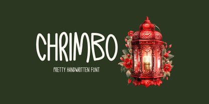 Chrimbo is a handwritten font that radiates warmth and charm. Its distinct style adds a unique touch to an array of design possibilities, allowing your creative ideas to flourish.
 - Aksara Murka by Gassstype,
$29.00 Hello Everyone, introduce our new product Font Aksara Murka This Is Blackletter Display Font.This is a Textured Natural Style and classy style with a clear style and dramatic movement.
 - Lovelier Typewriter by BeckMcCormick,
$12.00 Say hello to Lovelier, a handlettered typewriter style font. Lovelier is cute, quirky, and clean. Lovelier includes: - full upper + lowercase characters - numbers + punctuation - Western European Language Support - PUA-encoding
