10,000 search results
(0.039 seconds)
- Abril Titling by TypeTogether,
$35.00 Abril is an extension of the Abril typographic system that was engineered as a response to a very specific requirement from the editorial design community: a low contrast typeface for head- lines. Given its broad range of styles though, Abril deserves to be considered a separate font family on its own. Based on the original text styles of Abril, the letter shapes are sturdy, very legible, and deliver a newsy and trustworthy feel. The accented editorial style of the Scotch Roman finds continuity in this new type family, but some of the details have been ironed out for improved performance in headline, both in print and on screen. The family is conceived as four series of different widths, with four weights in each series plus matching italics, a total of 32 fonts. This wide range of styles allows for setting titles at almost any size. The wider series are aimed for smaller point sizes while the con- densed weights can deliver a striking and cohesive appearance as front cover headlines. Abril was designed as a versatile tool for those graphic and web designers looking for a workhorse with high impact. It is also an excellent companion for the rest of the Abril type family: Abril Titling and Abril Narrow.
 - FG April by YOFF,
$14.95FG April works great with all caps as well emphasized by the double lines. It doesn't connect but feels like a script. - Ariel Conditios by Warisand,
$17.00 Ariel Conditios is a Vintage Font inspired by beautiful vintage sign art and lettering. The font comes with unique alternate design characters to give your designs an elegant and artistic look. It is perfect for logo and packaging design, short phrases or headlines.
 - Acherus Feral by Horizon Type,
$30.00 Acherus Feral is sharpened version of Acherus Grotesque. In this new version all sharp edges are flattened and rounded corners are sharpened. Alternative character "G" and optional "t" character have been added. Some of the characters like "A,K,M,N,Q,R,V,W,Z,v,w,z" have been changed completely for the stability of the typeface, in this way it looks more confident and serious. As you can see on the banners, Feral is excellent choice for many platform needs. For further information please check the pdf specimens. Behance Pdf Specimen (White) Pdf Specimen (Black)
 - Epoque Seria by Rafaeiro Typeiro,
$24.00 Époque Seria is that kind of person who looks really cute when angry. This font was derived from the Époque family. She is the little sister to Époque - a little shorter with her smaller x-height and — how do you say it in the typographic circle — your eyes are also smaller (and you know you squint when things get serious, isn't it?). The genealogy of these font face is undeniable, but Époque Seria has a ‘personality’ very different from her older sister. The reduction of the x-height also shakes somewhat with the cap that had crossbar. To accompany the package of standardization, the letters that don't have their straight axes were changed, which brought to the set more Cs and Gs contemporaries. In addition, other measures were taken as a greater softness in the variation of the weights and the abandonment of the black weight, being considered too heavy for this version.
 - Axial cut by deFharo,
$21.00 Axial Cut is a sans serif typeface (Latin Extended-A), a contemporary and rounded evolution of geometric fonts for screen, but this time the letters are built on an axial axis that results in trapezoidal counter-shapes, joints with reduced antlers and rounded corners that correct optical effects in small sizes to make the typography more legible, and at the same time, in large sizes it shows its original shapes. The Axial Cut typeface family is made up of four weights: Light, Regular, Medium and Bold, each with 785 characters. I have taken particular care with the metrics and dimensions of each letter or sign, with a very careful and precise kerning configuration to achieve the For maximum readability, these are fonts with slightly higher ascenders than capitals and short descenders to make it more compact. The editing possibilities and unique designs with these complex typefaces are very wide, the fonts have a complete set of uppercase letters and a lowercase set with alternative characters as well as lowercase letters and numbers in different positions (lowercase, denominators, numerals, and uppercase) that They also work as automatic fractions, they also incorporate small capital letters and three sets of alternative numbers (Normal, Old style numbers, Square numbers), etc. Discover other alternative signs, characters and Open Type functions in the PDF: Specimen & The Cheat Sheet.
 - Afrile Script by Masinong Studio,
$15.00 Afrile Script is a modern calligraphy font with the current handwriting style. This font is perfect for branding, wedding invites, magazines, mugs, business cards, quotes, posters, and more. Afrile Script is equipped with 462 glyphs. and by having many of these glyphs there will be able to choose the letters according to your likes, lots of variations and options for each letter, so you can customize on your design choices. To access the variety of OpenType features you can use applications such as Adobe Photoshop Cs / Adobe Photoshop CC, Adobe Illustrator CS / Adobe Illustrator CC, Adobe Indesign and Corel Draw. If you do not have a program that supports OpenType, you can access all the alternate glyphs using Font Book (Mac) or Character Map (Windows) If you have any question, do not hesitate to contact me by email masinong.studio@gmail.com Thanks and happy designing :-)
 - Ariane Coachella by UICreative,
$23.00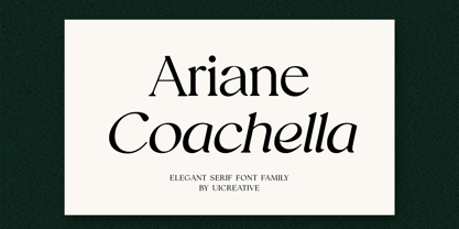 Introducing our new product the name Ariane Coachella Elegant Serif Font Family comes with 9 different weights. Modern Serif font that feels beautiful classy, elegant, and modern. This font is perfectly suited for a wide variety of projects, such as signature, stationery, logo, wedding, typography quotes, magazine or book covers, website headers, clothing, branding, packaging design, and more. Also for fashion-related branding or editorial design and displays both masculine and feminine qualities.
 - Avril MF by Masterfont,
$59.00 So elegant, clear, contrast, will suit your next greeting card or cosmetic package.
 - Seria Pro by Martin Majoor,
$49.00 The multi award-winning Seria (1996) is Martin Majoor’s second comprehensive typeface family and the successor to his popular text letter Scala. Seria explores the proportions of classical text typefaces. Its degree of sophistication is perfect to be used for poetry and other refined literature, its eye-catching details however makes Seria also suitable as a display typeface. The first sketches for Seria emerged in the summer of 1996 on the train from Berlin to Warsaw, to be precise, on July 25 – the date Majoor noted on the napkins of the train’s on-board restaurant, which he used for lack of suitable drawing paper. The italics are almost upright which contributes much to Seria’s delicately proportioned appearance. The Seria family consists of Seria Serif and Seria Sans. Combining the two creates countless possibilities of expression.
 - Adria Slab by FaceType,
$- Adria Slab is a smooth slab serif typeface that comes in seven weights and charming upright italics. Try combine it with its super friendly family member Adria Grotesk. Enjoy making great typography with a vast choice of lining, tabular and old style figures, numerators, denominators, tabular figures, fractions, ligatures, some sweet symbols and even alternate arrows.
 - April Rain by Scrowleyfonts,
$16.00 April rain is a delicate, elegant font with teardrop line endings. It is designed to be interesting and a little unusual while remaining robust enough to be used in a variety of contexts from titling and lists to short paragraphs.
 - Adria Grotesk by FaceType,
$- Adria Grotesk is a superfriendly and sunny humanist typeface that comes in 7 carefully crafted weights and charming upright italics. Try combine it with its stylish family member Adria Slab. You will find a fine choice of lining, tabular and old style figures, numerators, denominators, tabular figures, fractions, ligatures, some sweet symbols and even alternate arrows.
 - April Samuels by Samuelstype,
$20.00 - Robotaur Expanded - Unknown license

- MKaputt-Expanded - Personal use only

- Pixeldust Expanded - 100% free

- Uberhölme Expanded - Personal use only

- Engebrechtre Expanded - Unknown license

- U.S.A. Expanded - Unknown license

- Silkscreen Expanded - Unknown license

- Engebrechtre Expanded - Unknown license

- Zado Expanded - Unknown license

- Silkscreen Expanded - Unknown license

- Quartermain Expanded - Unknown license

- Pixeldust Expanded - 100% free

- Ro'Ki'Kier Expanded - Personal use only

- Engebrechtre Expanded - Unknown license

- Engebrechtre Expanded - Unknown license

- Gunship Expanded - Unknown license

- Walkway Expand - Unknown license

- Neospace Expanded by deFharo,
$21.00 Neospace Expanded is an avant-garde typeface designed for technology and science fiction lovers. With its elegant geometric minimalism, Neospace redefines typographic aesthetics with a perfect fusion between modern and futuristic. Geometric Inspiration Designed with an expanded proportion and thin thickness, it exudes its own high-tech, futuristic and space style. Each Neospace character has been sculpted from the letter “O”, using the mathematical proportions of the Fibonacci sequence in curves, metrics and kerning, adding a golden ratio to each character. This meticulous approach ensures exceptional readability and a unique aesthetic that evokes a sense of order and precision. Three styles: Regular, which provides a modern and clean look; the Dot Layer, which adds a touch of color and creativity to typographic titles; and the Bold version, which evokes the feeling of futuristic and sophisticated electronic circuits, bringing a sense of avant-garde and advanced technology to your projects. Neospace allows you to create typographic titles in various colors, imitating the sophistication of futuristic electronic circuits. Limitless Versatility Neospace goes further by offering alternative letters and signs, multiple sets of numbers and capital letters, as well as monetary and cryptocurrency symbols. In addition, it incorporates complex OpenType functions that further enrich the design possibilities, allowing even greater customization in your typographic designs.
 - Oscan Expanded by Afkari Studio,
$17.00 Oscan Expanded - Display Sans Serif Font Oscan Expanded is A special display sans serif font with expanded style and lowercase included. This font also contains some alternates to make your design cooler. The oscan expanded font is perfect for headline titles, fashion, magazines, logos, branding, photography, invitations, poster, movie title, quotes, blog headers, advertisements, postcards, book covers, websites, branding, etc. Features; – 3 Styles; Regular, Rounded and Outline – Uppercase, Lowercase, Number, and Punctuation – Special Alternates – Works on PC & Mac – Simple installations – Accessible in Adobe Illustrator, Adobe Photoshop, Adobe InDesign, even work on Microsoft Word – Fully accessible without additional design software. - Mültîlíñgúãl Sùppört for; ä ö ü Ä Ö Ü ß ¿ ¡ Hope you enjoy our font and this font is useful for your projects!
 - Nokia Expanded by Lone Army,
$10.00 Introducing "Nokia Expanded" - a bold and expansive font designed to capture attention. Inspired by the iconic Nokia brand, this typeface embodies a sense of reliability and modernity. With its bold strokes and expanded proportions, Nokia Expanded commands a strong presence in any design. The font's clean lines and geometric forms lend a touch of precision and sophistication, reflecting Nokia's commitment to quality and innovation. Ideal for various applications, including branding, advertising, and display graphics, Nokia Expanded ensures legibility and impact. Its bold and expansive nature makes it suitable for creating attention-grabbing headlines and eye-catching designs. Embrace the essence of Nokia with Nokia Expanded, a font that encapsulates reliability and modernity while adding a distinctive touch to your projects.
 - Hustony Extrude by MJB Letters,
$16.00 Hustony is a layered retro bold script that comes with a regular and extrudes version which will make it easier for you to make a retro effect on a design, this font is designed carefully to be used for many purposes such as logo design, poster design, branding, labels, covers, magazine, wedding design, fashion design and more. You will get : Hustony Regular Hustony Extrude In order to use the beautiful swashes, you need a program that supports OpenType features such as Adobe Illustrator CS, Adobe Photoshop CC, Adobe Indesign, and Corel Draw. but if your software doesn’t have a Glyphs panel, you can install additional swash font files: if you have questions about the latest fonts, please provide a short message to us Thank You! MJB Letters
 - Obvia Expanded by Typefolio,
$29.00 'Obvia' appeared as a result of direct observation on typefaces classified as geometric and the plan to explore for the first time width axes Condensed, Narrow (soon), Normal and new Wide and Expanded. The idea behind 'Obvia's design was to create a distancing from geometrically pure shapes, in this case, square shapes. Then some details were added, such as subtle inktraps, concave endings of the stems and carefully drawn alternate characters, giving a 'geohumanist' tone to the font. This first family of 'Obvia' has 9 weights ranging from Thin to Black, delivering a strong typographic identity, from the paper to the pixel.
 - Century Expanded by URW Type Foundry,
$35.99 The first Century typeface was cut in 1894 by Linn Boyd Benton in conjunction with T L DeVinne for the Century Magazine. It was a blacker, more readable face than the type previously used. Morris Fuller Benton designed the Century Expanded version in 1900 for American Type Founders to meet the Typographical Union Standard of the day. The 'expansion' was in the vertical plane. Century Expanded is a useful font family for text setting in magazines, books, presentations and newsletters.
 - Century Expanded by Bitstream,
$29.99Shortly after the preparation of the original Century, the two Bentons (father Linn Boyd and son Morris Fuller) prepared a wider version for De Vinne’s press and called it Century Broadface. In 1900 ATF released the design for general use as Century Expanded, one of the most popular and effective of typefaces, to this day the text face of the New York Daily News. - Brigends Expanded by Multype Studio,
$19.00 Brigends Expanded is a bold sans serif font which looks great to be modern and strong impression to your design. This font is also suitable to be applied especially in logo, branding, promotions, posters, book covers, magazine layouts, social media, headlines, titling, movie title, logo brand, logo company, layout website and other design. What’s Included : All Caps Numbers & Symbols Works on PC / Mac Simple installations Accessible in the Adobe Illustrator, Adobe Photoshop, Adobe InDesign, even work on Microsoft Word PUA Encoded Characters, Fully accessible without additional design software Multilingual support Thank you for your purchase! Hope you enjoy with our font!
 - Brodaers Expanded by Trustha,
$17.00 Brodaers Expanded is a display sans serif font. With the initial concept of the inner shape, made round. Comes in six styles, which makes it easier for the project you are working on, as well as alternative glyphs as an attractive option. Brodaers Expanded is an expanded version of Brodaers typeface. It comes with 400+ glyphs, which also include multilingual languages. Brodaers is perfect for headlines, branding, and many more.


