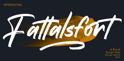
Fattalsfort is a Handwritten Brush font. With Bold raw brush stroke, slant and fun character with a bit of ligature and swashes. To give you an extra creative work. Fattalsfort font support multilingual more than 100+ language. This font is good for logo design, Social media, Movie Titles, Books Titles, a short text even a long text letter and good for your secondary text font with sans or serif. Make a stunning work with Fattalsfort font. Cheers, MaulanaCreative
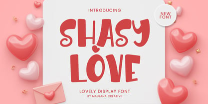
Shasy Love lovely display font. Bold stroke, fun character with a bit of ligatures and alternates. To give you an extra creative work. Shasy Love font support multilingual more than 100+ language. This font is good for logo design, Social media, Movie Titles, Books Titles, a short text even a long text letter and good for your secondary text font with script or serif. Make a stunning work with Shasy Love graffiti display font. Cheers, Maulana Creative
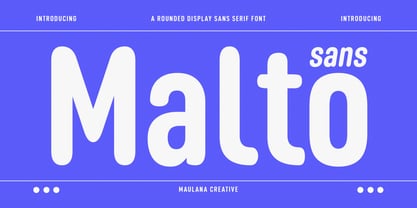
Malto by Maulana Creative, $15.00 Malto is a condensed sans serif font. With semi bold soft edge stroke, fun character with a bit of ligatures and alternates. To give you an extra creative work. Malto font support multilingual more than 100+ language. This font is good for logo design, Social media, Movie Titles, Books Titles, a short text even a long text letter and good for your secondary text font with sans or serif. Make a stunning work with Malto font. Cheers, Maulana Creative
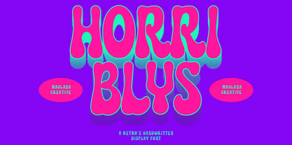
Horriblys is a decorative handwritten display font. With bold wavy stroke, fun character with a bit of ligatures and alternates. To give you an extra creative work. Horriblys font support multilingual more than 100+ language. This font is good for logo design, Social media, Movie Titles, Books Titles, a short text even a long text letter and good for your secondary text font with sans or serif. Make a stunning work with Horriblys font. Cheers, Maulana Creative
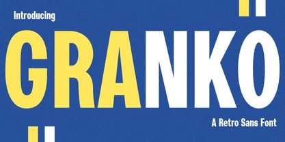
Granko is a a retro vibes condensed sans serif font. Bold stroke, fun character with a bit of ligatures and alternates. To give you an extra creative work. Granko font support multilingual more than 100+ language. This font is good for logo design, Social media, Movie Titles, Books Titles, a short text even a long text letter and good for your secondary text font with script or serif. Make a stunning work with Granko font. Cheers, Maulana Creative
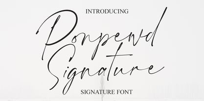
Ponpewd is a Signature Script Brush Font. With bold mono-line stroke, slant and fun character with a bit of ligatures. To give you an extra creative work. Ponpewd font support multilingual more than 100+ language. This font is good for logo design, Social media, Movie Titles, Books Titles, a short text even a long text letter and good for your secondary text font with sans or serif. Make a stunning work with Ponpewd font. Cheers, MaulanaCreative
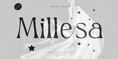
Millesa by Muflihin Nurhabib, $18.00 Introducing Millesa: An elegant and modern serif typeface. With its modern and elegant appearance, Millesa brings a luxurious and clean style to your projects such as websites, modern logos, branding identities, social media quotes, wedding stationery and various other needs! Millesa displays capital letters A to Z which are unique and classy, of course because they are made with great care so that they become beautiful fonts and can be adapted to various large projects that you want.
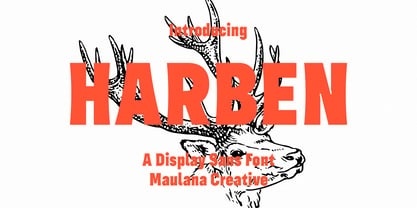
Harben is an wavy stem display sans font. With bold stroke, fun character with a bit of ligatures and alternates. To give you an extra creative work. Harben font support multilingual more than 100+ language. This font is good for logo design, Social media, Movie Titles, Books Titles, a short text even a long text letter and good for your secondary text font with script or serif. Make a stunning work with Harben font. Cheers, Maulana Creative
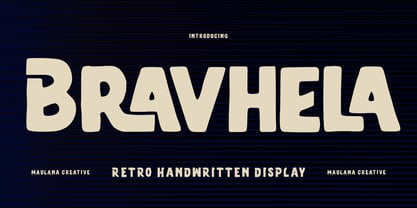
Bravhela is an unique western handwritten display script font. With bold consist stroke, fun character with a bit of ligatures and alternates. To give you an extra creative work. Bravhela font support multilingual more than 100+ language. This font is good for logo design, Social media, Movie Titles, Books Titles, a short text even a long text letter and good for your secondary text font with sans or serif. Make a stunning work with Bravhela font. Cheers, Maulana Creative
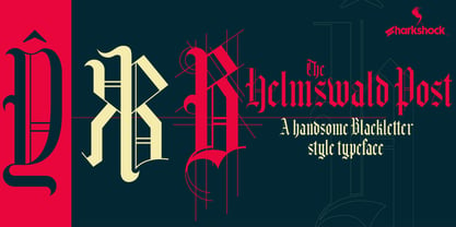
Helmswald Post is a handsome Blackletter that's been years in the making. There's a mix of wispy terminals, flamboyant caps, and the use of negative space to create contrast. Elements from High German, Old English, and many other styles make their way into this gorgeous display font. The result is a medieval looking script with cleaner, more modern feel. In addition to European accents Helmswald Post is equipped with Cyrillic, alternates and ligatures. Old world numerals are present by default but may be substituted by accessing the stylistic sets. Use it for a book cover, web headings, or a restaurant logo.
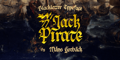
Jack Pirate is a hand-drawn blackletter typeface, created by Måns Grebäck during 2019. It is a genuine medieval font with fraktur-inspired letter forms, Gothic decorations and a mysterious undertone. Use it for projects relating to the Middle Ages, or in modern contexts such as tattoo or storefront graphics. It contains an alternate alphabet, to be used as a stand-alone font or to give decoration and variation to the regular style. The font is multilingual and has an extensive range of glyphs; it supports all Latin-based European languages, contains numbers as well as all symbols and characters you'll ever need.
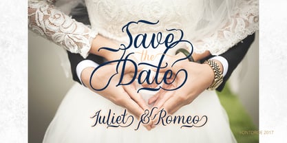
Bluesmate is a new another modern script font built in 878 glyphs. It has opentype features with PUA encode. of course this is a smart font works with poluler design software like Photoshop, Coreldraw X version, Illustrator, Microsoft Office, ect. This Modern Calligraphic typeface welcomes you to use it for various desing need such as logo, card, wedding invitation, headings, signatures, t-shirt, letterhead, cutting sticker, hot stamping, signage, labels, posters and more. It's craft friendly!!!! OPENTYPE TECHNOLOGY: - Stylistic alternate - Contextual alternates - Standard Ligatures - Discretionary Ligatures - Contextual Ligatures - Initial form - Medial form - Terminal form - Swashes - Numerals - Punctuations
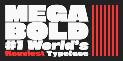
Megabold is the overweight champion of type. Designed to consume as much space as possible while retaining a modicum of legibility, Megabold is ideal for posters, logos and bold headlines. Simple yet immense letterforms make it friendly but at the same time, unstoppable. Express your own slant with left and right oblique styles ranging from 2–16 degrees, or fine-tune precisely with the included variable font ¹. ¹ Variable fonts are widely supported by web browsers, but not all desktop applications support them fully yet. Adobe Illustrator, Photoshop and InDesign support variable fonts if you’re using the latest versions.
The VTCSuperMarketSaleSC font, crafted by the Vigilante Typeface Corporation, embodies the spirit of whimsical commerce and playful advertising, reminiscent of bustling supermarket aisles and vibrant...
"You Are the One" is a unique font designed by the talented artist behind the name PizzaDude. This font stands out for its creative flair and playful character, which captures the essence of personal...
The Windlass font, designed by the talented David F. Nalle, is a distinctive typeface that captures the essence of historical and adventure narratives through its design. This font is a product of th...

Hibernica is a new genuine Irish sans in the classical modern style. With Hibernica it is possible to express Irishness in an up-to-date fashion rather than the traditionalist way. The design of Hibernica is based on my Lapidaria family. With Lapidaria it shares the classic appearance and coolness, stroke pattern, proportions and dimensions. Therefore Hibernica and Lapidaria are a perfect couple for bilingual text editing, e.g. Irish–English (not to forget the Greek parts of Lapidaria!). All fonts contain the full set of dotted ḃ ċ ḋ ḟ ġ ṁ ṗ ṡ ṫ in upper- and lowercase and an additional set of a dozen celtic ornaments. Hibernica also ows its “Minor-Medior” concept to Lapidaria, that is a special uncial-style variant set for lowercase letters. Choose from the six Hibernica fonts which suits your needs best! The Minor fonts are performing elegantly even in longer text bodies, whereas the Medior sorts offer a brillant and entirely new typographic look for headings and captions. Use Hibernica for outstanding designs – for a contemporary Irish understatement in typography. Wether you’re designing menus or shop signs, banners or ads, wether you do textwork upon historic topics or create T-shirts for St Patrick’s day – Hibernica is your new friend! For more new wonderful Irish fonts look at Ardagh and Andron Gaeilge!

Rex Stephane, designed by Mans Greback, is a striking blackletter font that artfully blends medieval influences with modern geometric shapes. Inspired by the tall stature of Gothic architecture, merged with sharpened edges, this font captures the essence of strict ruling while having an elegance of the Middle Ages. First imagined while exploring an abandoned castle, the typeface is based on ancient manuscripts adorned with calligraphic lettering. These texts became the foundation for Rex Stephane, as Mans Greback aimed to recreate the rich history and grandeur of the medieval era while adding his own contemporary twist. The font is built with advanced OpenType functionality and has a guaranteed top-notch quality, containing stylistic and contextual alternates, ligatures, and more features; all to give you full control and customizability. It has extensive lingual support, covering all Latin-based languages, from Northern Europe to South Africa, from America to South-East Asia. It contains all characters and symbols you'll ever need, including all punctuation and numbers. Mans Greback is a Swedish typeface designer with a passion for creating unique and versatile fonts. With an extensive background in design and typography, Mans has built a reputation for his meticulous attention to detail and prolific craftsmanship. His many fonts are widely used by designers around the world, making his work synonymous with creativity and innovation.
Americana Dreams Expanded, crafted by ShyFoundry (SF), is an invitation into the retro and the bold, where typographic artistry meets nostalgia with a modern flair. This font draws heavily from the s...
The Oaxaqueña Tall font, designed by Spanish typeface designer Fernando Haro (deFharo), is a captivating and elegantly structured font that radiates a unique charm and sophistication. Inspired by the...
The font "Nanosecond Thick BRK" by AEnigma is a distinctive typeface that captures the essence of modernity and boldness, appealing to designers looking for a robust and attention-grabbing font. Crea...
The Pilsen Plakat font, crafted by the talented Dieter Steffmann, is a remarkable typeface that stands out for its distinctive characteristics and historical connections. This font manages to capture...
Snobjury, crafted by the creative minds at KLoNk, is a unique font that strikes an intriguing balance between playful whimsy and structured elegance. Its design philosophy seems to espouse a kind of ...
Monoment, designed by the renowned typeface designer Måns Grebäck, stands as a testament to the intersection of tradition and modernism in the world of typography. Characterized by its sleek and refi...
The Faltura font, designed by the talented Swedish type designer Måns Grebäck, is a masterpiece of typography that captures a perfect balance between artistic elegance and functional readability. Thi...
The "HALCION PERSONAL USE" font by Billy Argel is a distinct and artistic typeface that radiates personality and character. Known for its unique blend of elegance and edginess, this font is a popular...
As of my last update, the font named "Medyson" by Risca Anitawati is a distinctive and tastefully crafted typeface that stands out for its blend of classic charm with modern flair. Medyson, created b...
The Tiffy font by IMSI MasterFonts is a unique and expressive typeface that has been crafted to add a distinctive touch to a wide range of design projects. As a creation under the banner of IMSI Mast...
LT Highlight, a font created by LyonsType, emerges as a contemporary and versatile typeface, designed to capture the attention and imagination of its viewers. This font distinguishes itself through i...
The Albertino font, crafted by the talented Davide Ardissone, is a remarkable work of typographic art that beautifully marries elegance with functionality. At its core, Albertino embodies a modern se...
WinterthurCondensed is a captivating typeface designed by the accomplished German type designer, Manfred Klein. This particular font is named after the Swiss city of Winterthur, suggesting a connecti...
Edmunds, a captivating font crafted by the renowned Canadian type designer, Ray Larabie, stands as a vivid testament to the harmonious blend of tradition and innovation in typography. Larabie, known ...
"Dot Your Eyes" by StimulEye Fonts is a creative and quirky font that plays heavily on the theme of dots, embodying a playful and somewhat whimsical character. This font sets itself apart through its...
Jasper BRK, designed by AEnigma, stands as a distinct and versatile typeface that captures the attention of both designers and viewers alike. This font belongs to the unique family of fonts created b...
As of my last knowledge update in April 2023, "URAL 3d" by Fenotype appears to be a specific font design that, while not universally known in existing major font directories, may be part of a special...
Trapper is so named because it exploits a typographic design mechanism known as ink traps purely for graphic effect. Ink traps are a device used by type designers to create significantly higher legibility under adverse printing conditions, especially when the intended use of the type is to be printed at small sizes on mediocre substrate. For Trapper the ink trap is overused for exaggerated visual effect. This gives the Round version a playful twisted balloons look while the Sharp has a stern mechanical default effect. Trapper is a versatile font family of 8 fonts -- Sharp and Round variations in regular and bold weights each with an accompanying oblique.
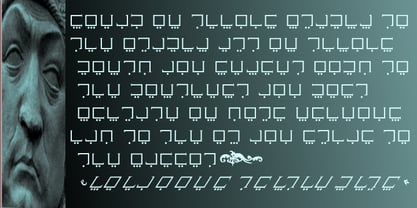
Trithemius, a 15th century Abbott, and influential counselor to Emperor Maximilian I, was also an author who wrote both histories and the first printed work on cryptography which gained him much adverse notoriety. He has been long regarded as a mystic and some of his works were therefore banned. However, it may have been his intention to cloak his cryptology essays in mystical writing to keep people from easily grasping the subject matter, which it has been recently demonstrated, at heart was really cryptological methodology. This font is based on a printed version of the Polygraphiae a text that included many methods of encryption.

Bunyan Pro is the synthesis of Bunyan, the last face Eric Gill designed for hand setting in 1934 and Pilgrim, the machine face based on it, issued by British Linotype in the early 1950s — the most popular Gill text face in Britain from its release until well into the 1980s. Gill’s last face doesn't date itself anywhere near as obviously as Gill’s other serif faces, which were all really products of their time, heavily influenced by the richly ornamental and constantly changing aesthetic trends of the interwar period. When compared to Gill’s previous work, Bunyan seems like a revolution in the way he thought and drew. It’s as if he was shrugging off all heavy burden of what was popular, and going back to the basics of older standards. Bunyan had no bells and whistles, doesn't risk functionality with contrasts that are too high or too low, and didn't venture far outside the comfortable oldstyle rhythm Gill grew up with. By interbellum standards, this was utter austerity, a veritable denial of deco excess. Surprisingly, even without all the cloying trivialities, Bunyan still stood indisputably as an aesthetically pleasing, space saving design that could have been made only by Eric Gill. Bunyan Pro comes in three weights and their italics. The main font is intended for use between 8 and 14 points. The medium and the bold are great for emphasis but also have good merit in larger sizes, so can make effective display types as well. All six fonts include small caps, ligatures, alternates, six sets of figures, and three original Gill manicules. We tried to keep the best features of the handset (Bunyan) and machine (Pilgrim) versions while building a text face that can function in today’s immersive reading media. Deciding on which useful letterpress features to preserve for aesthetic importance was hell on our eyeballs — which lead to complex and painstaking ways of ironing out irregularities and inconsistencies related to metal technologies, in order to provide something with authenticity. The result is a unique typeface based on a Gill design that, to a much greater extent than any of his other faces, works well as a text face that can be used for entire books and magazines. For more information on Bunyan Pro’s character set, features, development process and some print tests, please consult the PDF in the gallery section of this page.

The font superfamily Vianova contains each 12 weights of Sans and Slab and 8 weights of the Serif style. The design from Jürgen Adolph dates back into the 1990s, when he studied Communication Design with Werner Schneider as a professor at the Fachhochschule Stuttgart. Adolph started his carrier 1995 at Michael Conrad & Leo Burnett. He was responsible for trade marks as Adidas, BMW, Germanwings and Merz. He has been honored as a member of the Art Directors Club (ADC) with more than 100 awards. On February 26, 2014, Jürgen Adolph wrote the following: “I was already interested in typography, even when I could not yet read. Letterforms, for instance, above storefronts downtown, had an irresistible appeal for me. Therefore, it is probably not a coincidence that, after finishing high school, I began an apprenticeship with a provider of signage and neon-advertising in Saarbrücken, and – in the late 1980s – I placed highest in my field in my state. When I continued my studies in communications design in Wiesbaden, I was introduced to the highest standards in calligraphy and type design. “Typography begins with writing” my revered teacher, Professor Werner Schneider, taught me. Indefatigably, he supported me during the development of my typeface “Vianova” – which began as part of a studies program – and accompanied me on my journey even when its more austere letterforms did not necessarily conform to his own aesthetic ideals. The completely analogue development of the types – designed entirely with ink and opaque white on cardboard – covered several academic semesters. In order to find its appropriate form, writing with a flat nib was used. Once, when I showed some intermediate designs to Günter Gerhard Lange, who occasionally honored our school with a visit, he commented in his own inimitable manner: “Not bad what you are doing there. But if you want to make a living with this, you might as well order your coffin now.” At that time, I was concentrating mainly on the serif version. But things reached a different level of complexity when, during a meeting with Günther Flake which had been arranged by Professor Schneider, he suggested that I enlarge the offering with a sans and slab version of the typeface. So – a few more months went by, but at the same time, Elsner+Flake already began with the digitilization process. In order to avoid the fate predicted by Günter Gerhard Lange, I went into “servitude” in the advertising industry (Michael Conrad & Leo Burnett) and design field (Rempen& Partner, SchömanCorporate, Claus Koch) and worked for several years as the Creative Director at KW43 in Düsseldorf concerned with corporate design development and expansion (among others for A. Lange & Söhne, Deichmann, Germanwings, Langenscheidt, Montblanc.”

The font superfamily Vianova contains each 12 weights of Sans and Slab and 8 weights of the Serif style. The design from Jürgen Adolph dates back into the 1990s, when he studied Communication Design with Werner Schneider as a professor at the Fachhochschule Stuttgart. Adolph started his carrier 1995 at Michael Conrad & Leo Burnett. He was responsible for trade marks as Adidas, BMW, Germanwings and Merz. He has been honored as a member of the Art Directors Club (ADC) with more than 100 awards. On February 26, 2014, Jürgen Adolph wrote the following: “I was already interested in typography, even when I could not yet read. Letterforms, for instance, above storefronts downtown, had an irresistible appeal for me. Therefore, it is probably not a coincidence that, after finishing high school, I began an apprenticeship with a provider of signage and neon-advertising in Saarbrücken, and – in the late 1980s – I placed highest in my field in my state. When I continued my studies in communications design in Wiesbaden, I was introduced to the highest standards in calligraphy and type design. “Typography begins with writing” my revered teacher, Professor Werner Schneider, taught me. Indefatigably, he supported me during the development of my typeface “Vianova” – which began as part of a studies program – and accompanied me on my journey even when its more austere letterforms did not necessarily conform to his own aesthetic ideals. The completely analogue development of the types – designed entirely with ink and opaque white on cardboard – covered several academic semesters. In order to find its appropriate form, writing with a flat nib was used. Once, when I showed some intermediate designs to Günter Gerhard Lange, who occasionally honored our school with a visit, he commented in his own inimitable manner: “Not bad what you are doing there. But if you want to make a living with this, you might as well order your coffin now.” At that time, I was concentrating mainly on the serif version. But things reached a different level of complexity when, during a meeting with Günther Flake which had been arranged by Professor Schneider, he suggested that I enlarge the offering with a sans and slab version of the typeface. So – a few more months went by, but at the same time, Elsner+Flake already began with the digitilization process. In order to avoid the fate predicted by Günter Gerhard Lange, I went into “servitude” in the advertising industry (Michael Conrad & Leo Burnett) and design field (Rempen& Partner, SchömanCorporate, Claus Koch) and worked for several years as the Creative Director at KW43 in Düsseldorf concerned with corporate design development and expansion (among others for A. Lange & Söhne, Deichmann, Germanwings, Langenscheidt, Montblanc.”
