10,000 search results
(0.117 seconds)
- Retail Shop JNL by Jeff Levine,
$29.00 Vintage New York neon signage alongside the landmark Dubrow's Cafeteria [probably circa the 1940s] of the words "retail shop" inspired the namesake digital type design. Retail Shop JNL is a bold and somewhat eccentric Art Deco font with varying widths and unusual character forms available in both regular and oblique versions.
 - Ransley by Muksal Creatives,
$12.00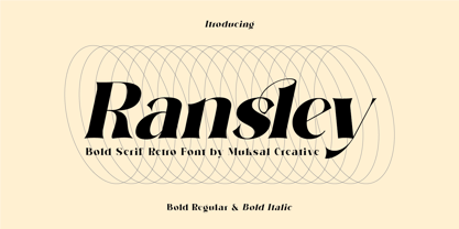 Ransley Modern Bold serif Font typeface with beautiful Ligature, special glyphs, ornament and multilingual support. It's a very versatile font that works great in large and small sizes. Perfect for editorial projects, Logo design, Clothing Branding, product packaging, magazine headers, or simply as a stylish text overlay to any background image.
 - Sugar Crakers by Atom,
$19.00 Sugar Crakers is a bold signature font with pointed corners and supported with over 45 ligatures. Use your imagination to make company logos, product labels, headlines, and other designs that will make your designs come alive and become more selling points. Use Sugar Crackers for the success of your next project.
 - PocketWrench by Deniart Systems,
$20.00 Make a bold statement with this modern, angular design - go wild and use it together with it's partner font, PolkaDot Wrench. This typeface features over 90 extended characters for setting European languages such as Czech, Danish, Dutch, Esperanto, Finnish, French, German, Italian, Hungarian, Polish, Portuguese, Romanian, Spanish, Swedish, Turkish & Welsh.
 - Fox Turkey by Fox7,
$12.00 Fox Turkey is a bold and playful display font that adds a captivating and energetic touch to your designs. Its main feature is its vibrant and expressive design, allowing you to create attention-grabbing headlines, t-shirt typography, banners, product labels, and more. With its versatility and eye-catching presence.
 - Compton by Greater Albion Typefounders,
$10.00 Compton is a clean modern slab serif face that emphasises simplicity of line and legibility. It's offered in three weights: regular, bold and light. Compton brings the spirit of the 60s and 70s to the present day. It is ideal for clear, simple graphic design that makes an immediate impact.
 - Bitline by Grontype,
$15.00 Bitline is bold swirly font. comes with more alternate style each glyphs and ligature. The font is unique and modern vintage look. This is an adaptable font. Suitable for any project types, from magazine header, wedding invitation, branding design, poster or flyer header design, until logo tagline and so much more.
 - Ayr Thrope by Aiyari,
$25.00 Introducing Thrope the irregular retro display font family heavy influence by motter ombra typeface, geometric basic shape, and 60s to 70s pop culture. Thrope typeface includes 3 font family (regular, bold,& heavy) it comes with stylistic alternates 01-04 & ligatures. Thrope font family best used for logotype, headline, header, signage.
 - Asia by Superfried,
$32.50 Asia by Superfried is an ornate, display typeface inspired by trips throughout the continent. Its distinct, bold style has been designed to evoke the curves and beautiful intricacy of Asian typographic characters and patterns. Asia has been featured on Creative Boom and named font of the day by Creative Bloq.
 - Rataczak by Ingrimayne Type,
$9.00 Rataczak is a stiff, awkward serifed font that was inspired by similar fonts from the 19th century. It is legible as a text font but not graceful. In addition to plain, italic, bold, bolditalic, extrabold, condensed, and condenseditalic styles, there is a striped style and a font of swash capitals.
 - Black Indie by Din Studio,
$29.00 Black Indie is a bold and authentic display font. The font is suitable for any branding project like logo, t-shirt printing and many more. outstanding in a wide range of contexts. Featured : Accents (Multilingual characters) PUA encoded Numerals and Punctuation (OpenType Standard) Thanks for downloading premium font from Din Studio
 - Chinte by FonTastic Designs by Chez,
$10.99 Looking for a fun new font? Look no further I have just what you've been waiting for. This new novelty font that I call Chinte is a bold fullcase font. This font comes with multiple languages and symbols. And had multiple uses: Branding, Logos, and many more of your projects.
 - Storyboard by Atlantic Fonts,
$26.00 Storyboard is expressive, rough, partly connected and full of painterly, brushed energy like the sketches of a storyboard. It's bold and kind of edgy, but can be friendly too. There are tons of ligatures you can turn on or off depending on the look you're after. So what's your story?
 - Fun Play by FunFont,
$17.00 Fun Play is A Fun and Playful display typeface family with 5 wights variant; from Light to Bold. Comes with many features; Multilingual Support, Ligatures, Stylistic Alternate and more. Each character represents a child's joy. ‘Fun Play’ can be used for branding, packaging, headline and all styles of children-related design.
 - Maple Leaf Rag NF by Nick's Fonts,
$10.00The book Modern Alphabets, published in 1930, called this diamond in the rough from Continental Typefounders Nova Bold. Well, it’s neither new nor modern anymore, but it’s a warm, friendly face that’s sure to please. Both versions of this font contain complete Latin 1252 and Central European 1250 character sets. - Take Charge JNL by Jeff Levine,
$29.00 Take Charge JNL is based on the opening title card for the 1936 film "The Charge of the Light Brigade" starring Errol Flynn and Olivia de Havilland, Donald Crisp and David Niven. The typeface is a simple, bold titling font with the slight feel of Art Deco influence in its design.
 - Guildhall by Device,
$39.00 Class, with a punch. It's rare to find fonts that are refined without being too delicate, stylish while still being bold and impactful. Guildhall is a heavy rectangular flared serif in face widths with matching italics. Suitable for film posters, rock concerts and band logos, beer labels, packaging and magazine headlines.
 - Ghiberti LP by LetterPerfect,
$39.00 Ghiberti is a contemporary interpretation of the bold Florentine lettering style used with marble inlaid and bronze cast inscriptions of the fourteenth and fifteenth centuries. The font, consisting of caps and small caps, was designed by Paul Shaw and Garrett Boge in 1997. Ghiberti is part of the LetterPerfect Florentine Set.
 - Blog by BA Graphics,
$45.00Blog has a new distinctive look and comes in four weights light, regular, medium and bold. It can be seen as quite elegant in the light weights while looking masculine in the heavy weight. Its unique look lends to so many different applications. Blog works well for both headline and text. - Lindisfarne Nova BT by Bitstream,
$50.99 Lindisfarne Nova is an uncial-like design based on the script found in the Lindisfarne Gospels. Created by Harry Pears and Margaret Layson, it is available in two weights, regular and bold. Lindisfarne Nova is Harry’s first completed font. There are also two companion styles, Lindisfarne Nova Incised and Lindisfarne Runes.
 - Phantaztik by PintassilgoPrints,
$27.00 Phantaztik is a bold and groovy font packed with stylish interlocks, uncommon alternates, extended language coverage, and clever OpenType programming. Full of cheer and optimism, it's a fantastic option for packaging projects, book covers, game titles, apparel, and many more creative applications. Feel-good designs just got easier, check it out!
 - Kendrick by Monotype,
$15.99 A heavy-set but lively font, Kendrick’s dense strokes were hand-painted using a thick wet brush. This all-caps set of letters is bold but brushy, textured and expressive; fun but very much meaning business. Kendrick is streetwise and no-nonsense, but with a big cheesy grin to boot.
 - Michaello by Letterara,
$14.00 Michaello is a casual natural handwritten font with an incredibly friendly feel and a stunning brush texture with a bold vibe. It is the perfect font for making original and outstanding designs. This font is PUA encoded which means you can access all of the glyphs and swashes with ease!
 - Bunny Hop by Larin Type Co,
$10.00 Bunny Hop - funny playful bold typeface. Will not leave you indifferent, thanks to its brave forms. It is great for creating your project, it can be used to create beautiful inscriptions on t-shirts, children's books, branding, book covers, stationery, marketing, color, toy branding, a blog, magazines and much more.
 - Jingle Binder by Balpirick,
$15.00 Jingle Binder is a Modern Handwritten Bold Font. Jingle Binder is perfect for product packaging, branding project, magazine, social media, wedding, or just used to express words above the background. Jingle Binder also multilingual support. Enjoy the font, feel free to comment or feedback, send me PM or email. Thank you!
 - Uncle Hours by Adante Creative,
$23.00 Introducing by Adante.Creative Proudly Present, Uncle Hours Uncle Hours is A Bold Display Typeface Font Uncle Hours is perfect for product packaging, branding project, megazine, social media, wedding, or just used to express words above the background. Enjoy the font, feel free to comment or feedback, send me PM or email.
 - Rockland by Monotype,
$15.99 This is an original, confident and cheeky little font; characterised by its boldness and dense letterforms, which boast a solid texture and distinctive lack of counters. Drawn with a marker pen, the bounciness of Rockland counteracts its solidity to make for a friendly aesthetic that’s as confident as it is playful.
 - Eye Monsta by Illushvara,
$15.00 Eye Monsta is a bold and fun display font, carefully handcrafted to become a true favorite. Its casual charm makes it appear wonderfully down-to-earth, readable and, ultimately, incredibly versatile. This font will look outstanding in any context, whether it’s being used on busy backgrounds or as a standalone headline!
 - Minimal by Kmaz,
$10.00 Minimal is a distinguished sans serif display family with minimalistic modern edges, designed by Khalid Al-Mazrouei and published by Kmaz. Minimal packs a complete set of uppercase and lowercase letters, numbers and punctuation and comes in 3 weights (Thin, Regular, and Bold). Perfect for headlines, magazines, and much more.
 - Escondido NF by Nick's Fonts,
$10.00This unusual face features letterforms inspired by an Austrian travel poster designed by Johann Süssenbek in the 1930s, and rendered in a bold chiaroscuro manner. In case you're wondering, Escondido is Spanish for hidden. Both versions of the font include 1252 Latin, 1250 CE (with localization for Romanian and Moldovan). - CA Rusty Nail by Cape Arcona Type Foundry,
$19.00 Rusty Nail is a carefully hand-made uppercase only typeface with a full Central European character set which comes in two styles, Regular & Bold. It was created for a liquor company where hand-made letters were part of the corporate design. It’s perfect for labels or lettering with a "used look".
 - Addison by Kimmy Design,
$15.00 Addison is a typeface that brings together modern western styles with a rustic texture. Between Addison West, with thick block serifs, and Circus, a more decorative face, the two would bring an authentic and unique style to any artwork. The bold faces make a stand and standout for any design concept.
 - Alishba by Nandatype Studio,
$19.00 Alishba is a handcrafted font with a regular and bold vibe. It was handmade with an irregular baseline and is equipped with alternatives and ligatures. It can be used to add a natural touch to your stationery designs, quotes, branding, logos, greeting cards, t-shirts, packaging designs, posters and more.
 - Kemading by Differentialtype,
$10.00 Kemading is a retro serif font that has a vintage, cute, fun and bold feel. Comes with four styles, regular, italic, outline and outline italic. Kemading's design is unique and energetic, making it perfect for adding a touch of fun nostalgia to logos, crafts, posters, branding, stickers and many other projects.
 - Retail Price JNL by Jeff Levine,
$29.00 Redrawn from lettering found on a British publication circa the 1930s, Retail Price JNL is an extra bold display inline sans that’s great for catchy headlines, price cards, banners or any other attention-getters. Retail Price JNL is offered in regular, oblique, solid and solid oblique versions. Caps only Fonts.
 - Mono Polz by Four Lines Std,
$15.00 "Mono Polz" takes its inspiration from the zany and eccentric world of cartoons. Every letter is an explosion of creativity, with bold lines and playful shapes that'll make your designs pop right off the page. It's the perfect font to add a touch of comic mischief to your projects. - Uppercase
 - Balcon Round by Tour De Force,
$25.00 Balcon is condensed sans family designed to be your first web font choice. Contains 5 weights: Light, Regular, Bold, ExtraBold and Black, it fits perfect into any project, from editorial editions to packages, labels, posters. If you're looking for "sharp" version of this family, feel free to check Balcon sans family.
 - Insigne Display by Gian Studio,
$15.00 Insigne Display A bold, modern and fun display font that lives up to its name. The way you can uniquely combine the different parts of this font makes it a lot of fun to use! Perfect for all purposes. , Suitable for magazine design, logo design, headlines, posters, packaging, cards etc. Enjoy!
 - Fox Minutes by Fox7,
$12.00 Fox Minutes is a bold and playful slab serif font that adds a captivating and energetic touch to your designs. Its main feature is its vibrant and expressive design, allowing you to create attention-grabbing headlines, t-shirt typography, banners, product labels, and more with its versatility and eye-catching presence.
 - Boxer Punch by Putracetol,
$28.00 Boxer Punch - Soft Bold Font Boxer Punch - Soft Bold Font is a stylish and modern font designed to catch the attention of your audience. The font's unique design combines a soft bold shape with a cute sans serif, making it perfect for creating eye-catching designs. The idea behind creating Boxer Punch was to incorporate the concept of understated realism into the font. This is evident in the font's smooth and elegant lines, which make it perfect for a variety of design projects. The font is ideal for those looking to create a professional touch in their designs, while also maintaining a stylish and modern feel. Boxer Punch is an excellent choice for anyone looking for a font that is versatile and can be used in a variety of different contexts. It is perfect for sports-themed work projects, as well as branding, packaging, logo design, album covers, posters, and social media graphics. One of the standout features of Boxer Punch is its versatile OpenType features, including alternates and ligatures, which allow for even more creative freedom when designing with the font. Additionally, the font comes with uppercase and lowercase characters, as well as support for multilanguage, numbers, punctuation, and symbols. Inside the font package, you'll find three different file formats: Boxer Punch otf, Boxer Punch ttf, and Boxer Punch woff. This means that no matter what platform you are using, Boxer Punch will work seamlessly with your software. Boxer Punch is a font that is sure to make your designs stand out from the crowd. Its unique design and versatile features make it perfect for anyone looking to add a touch of elegance and style to their work. If you're looking for a stylish and modern font that is perfect for sports-themed work projects or a variety of other design projects, then Boxer Punch is the font for you. In summary, Boxer Punch - Soft Bold Font is a versatile and modern font that combines a soft bold shape with a cute sans serif to create a unique and stylish design. With its versatile OpenType features, multilanguage support, and uppercase and lowercase characters, Boxer Punch is perfect for a wide range of design projects.