10,000 search results (0.013 seconds)
  1. F. O. T. R. by JAF 34, $9.90
    F. O. T. R. is experimental sans serif display font. Space travelling is near so I decided to bring you a brand new typeface based on insight into the future. Clean shapes, a lot of atypical alternates and the futuristic appearance. F. O. T. R. typeface is conceptually connected with a chronophotography project FUTURE OF THE RHYTHM.
  2. Button T. - Personal use only
  3. T-Air - Unknown license
  4. Zupagargonizer T - Unknown license
  5. ocr-t by FaceType, $7.00
    Being a geometric sanserif ocr-t comes in eleven weights from ultrawhite to infrablack (brightwhite, white, silver, lightgrey, grey, darkgrey, anthracite, black, jetblack). With more than 600 glyphs it covers all your typographic needs and manages to stay at the same place no matter which width you’re using. Its readability and legibility is more than fine although it needs no kerning. The infrablack is really black, in order to achieve this, the form of letters change from darkgrey to anthracite from upright to some kind of upright italic. This also gives opportunity to mix two weights with same colour but different architecture. Find also stylistic sets, alternate letters, lots of bullets, different arrows, hands and well: kind of hearts.
  6. kooler O - 100% free
  7. (((O))) Basic - 100% free
  8. Jack O - Unknown license
  9. Jackie O by TypeSETit, $24.95
  10. ADD by Sea Types, $20.00
    A minimalist typography for short texts and individual words.
  11. T-piyo Font - Unknown license
  12. A T & Love - Personal use only
  13. K&T Sasha by K and T, $70.00
    This clean looking (all caps) font has characters made of gaps, which form the stencil divisions, spaced evenly along the strokes. The letterforms have a well-proportioned constructional appearance. The characters look like they have been built from interlocking bricks, the stencil gaps give them both rhythm and texture. The sans serif typeface also has a sense of movement because of the way the stencil gaps follow the horizontal, vertical or curved direction of the stroke.
  14. K&T Heidi by K and T, $70.00
    This is a well-built, functional (all caps) typeface, which is very modern in character. The use of diagonal corners in this angular typeface is inspired by the pennant numbers on British Royal Navy warships, which adds an military quality to this typeface. The gaps, which form the Stencil divisions, follow pre-established horizontal and vertical lines, they help to achieve both geometric and proportional harmony. The direction of the gaps is always at a right angle to the stroke.
  15. K&T Martine by K and T, $70.00
    This is an angular typeface inspired by axonometric construction diagrams (for flat-pack furniture), particularly the way their lines impart a sense of 3-D space. The horizontal, vertical, and diagonal constraints of stroke direction produce interesting results in characters such as the 'R', 'S', and 'V' and contribute the mechanical appearance of this typeface. There is a high degree of repetition amongst different characters (upper and lower case) for instance the ’M’ and ‘W’ are similar and so are the ’m’ and ‘w’.
  16. URW Imperial T by URW Type Foundry, $35.00
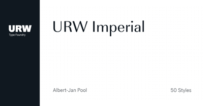
  17. Futura No7 T by URW Type Foundry, $89.99
  18. Collective O BRK - Unknown license
  19. Collective O (BRK) - Unknown license
  20. o-wee-ental - Unknown license
  21. cart o grapher - Unknown license
  22. Amalgamate O BRK - Unknown license
  23. Knick O Teen - Unknown license
  24. Plain O Matic - Unknown license
  25. P22 Daddy-O by P22 Type Foundry, $24.95
    Based on the lettering and graphic design of the Beat Generation era, Daddy-O was produced in conjunction with the Whitney Museum of American Art to coincide with the exhibition Beat Culture and the New America: 1950-1965. These way gone fonts and extras both capture and affectionately satirize the graphic design of the era. Package now features poet Rod McKuen in an updated version of the Beatsville album cover from 1959.
  26. Marker O Type by O Type Foundry, $15.00
    Introducing, Marker O Type. Marker O Type is new signature font like a child's handwriting. The unique typeface brush also feels childish look similar like comic sans. Great for body text in comic book. A unique brush typeface with chill out. This font is perfectly made to be applied mainly in logos and various other formal forms such as invitations, labels, magazines, books, greeting / wedding cards, packaging, fashion, make up, stationery, novels, labels or any type of advertising purpose.
  27. Ring O Fire by Cool Fonts, $24.00
    Ring O Fire was inspired by a game I used to play where you suspend a coin over a glass with a paper napkin and take turns burning holes in the napkin with a cigarette until the coin drops. Is that weird or what?
  28. Hell O Ween by Forberas Club, $16.00
    Introducing Hell O Win by forberas, This font born to be a Halloween Project. But still can be made as a display font, and still suit your other fun project. Your review and response are most welcome.
  29. Card-O-Mat by PintassilgoPrints, $30.00
    Card-O-Mat is an inspiring font family that makes it easy to design awesome greeting cards for many occasions. Each font is packed with an impressive number of items, check out the glyphs map and get surprised! Card-O-Mat Messages font counts more than 170 unique lettering designs, with a great assortment of messages. From an effusive ‘Happy Birthday’ to a sensible ‘Thank You’, you'll find charming choices for many situations. Card-O-Mat BuddyBirds brings more than 180 picture elements, comprising a pocketful of birds and handy adornments such as flowers, leaves, stars, clouds, speech bubbles and so on. Beyond making a perfect pair with Card-O-Mat Messages, it also goes brilliantly well with our hand-crafted fonts, like Populaire, Oyster, Berimbau, Amarelinha and many others. Pick the ones that fit you better and happy card making!
  30. O-Berta SB by Scangraphic Digital Type Collection, $26.00
    Since the release of these fonts most typefaces in the Scangraphic Type Collection appear in two versions. One is designed specifically for headline typesetting (SH: Scangraphic Headline Types) and one specifically for text typesetting (SB Scangraphic Bodytypes). The most obvious differentiation can be found in the spacing. That of the Bodytypes is adjusted for readability. That of the Headline Types is decidedly more narrow in order to do justice to the requirements of headline typesetting. The kerning tables, as well, have been individualized for each of these type varieties. In addition to the adjustment of spacing, there are also adjustments in the design. For the Bodytypes, fine spaces were created which prevented the smear effect on acute angles in small typesizes. For a number of Bodytypes, hairlines and serifs were thickened or the whole typeface was adjusted to meet the optical requirements for setting type in small sizes. For the German lower-case diacritical marks, all Headline Types complements contain alternative integrated accents which allow the compact setting of lower-case headlines.
  31. Pind-O-Rama by PintassilgoPrints, $24.00
    Pind-O-Rama is quite an unconventional font, with strange counters and shapes and choices and interlocks that just stand out. For sometimes fitting in is absolutely not wanted. Pindorama is how the native Tupi people originally called Brazil before colonization by the Portuguese. This font draws inspiration from a book on Brazil colonial background, precisely from a 1961 edition - the book was first published in 1943. Unfortunately the cover design is uncredited. Why fit in? Let's stand out!
  32. O-Anton SB by Scangraphic Digital Type Collection, $26.00
    Since the release of these fonts most typefaces in the Scangraphic Type Collection appear in two versions. One is designed specifically for headline typesetting (SH: Scangraphic Headline Types) and one specifically for text typesetting (SB Scangraphic Bodytypes). The most obvious differentiation can be found in the spacing. That of the Bodytypes is adjusted for readability. That of the Headline Types is decidedly more narrow in order to do justice to the requirements of headline typesetting. The kerning tables, as well, have been individualized for each of these type varieties. In addition to the adjustment of spacing, there are also adjustments in the design. For the Bodytypes, fine spaces were created which prevented the smear effect on acute angles in small typesizes. For a number of Bodytypes, hairlines and serifs were thickened or the whole typeface was adjusted to meet the optical requirements for setting type in small sizes. For the German lower-case diacritical marks, all Headline Types complements contain alternative integrated accents which allow the compact setting of lower-case headlines.
  33. Adis Ababa by Simeon out West, $20.00
    Adis Ababa is a font based on an ancient Ge'ez script. The Ge'ez alphabet is the written language of the ancient ancestors of the Ethiopian and Eritrean nation. It is not a Latin or Greek based alphabet and I have striven in this font to present a readable Latin alphabet that visually reminds me of some of the examples of the writing that I have seen.
  34. Claudia Alves by DYSA Studio, $19.00
    Claudia Alves is a New Modern Serif Typeface. This another collection of Serif is perfect for your next branding project, excellent for your business. Claudia Alves have a smooth edges, so this font gives an authentic handcrafted feel style.
  35. Much Ado by The Very Awkward, $12.95
    Much Ado is a quirky-yet-practical all-caps handwritten font family with just enough subtle variation between uppercase and lowercase letters to keep things interesting. It's pretty great on: Informative infographics Clever indie comics K-Pop cover band posters (and other types of posters) Invitations to cool parties for cool people Eye-catching Instagram posts Sliced bread ...or anything that needs a pinch of fun and a double dose of legibility. Whimsical but supremely readable, Much Ado is imperfectly perfect for both body and headers.
  36. ASV Codar by Linotype, $187.99
    ASV Codar is a modern Arabic text typeface with two weights: ASV Codar Light and ASV Codar Bold. Both of the fonts include Latin glyphs (Palatino Roman and Palatino Bold), allowing a single font to set text in both most Western European and Arabic languages. The two ASV Codar fonts include the Basic Latin character set and the Arabic character set, which supports Arabic, Persian, and Urdu. They include tabular and proportional Arabic, Persian, and Urdu numerals, as well as a set of tabular European (Latin) numerals.
  37. Pep O Mint Normal - Unknown license
  38. Unexplored Galaxies O BRK - Unknown license
  39. Typesource Extol O BRK - Unknown license
  40. Your Complex O BRK - Unknown license
Looking for more fonts? Check out our New, Sans, Script, Handwriting fonts or Categories
abstract fontscontact usprivacy policyweb font generator
Processing