10,000 search results
(0.212 seconds)
- Pekin by HiH,
$15.00 Pekin is an unusual design with an oriental flavor. It was originally designed by Ernst Lauschke and released by The Great Western Type Foundry of Chicago as “Dormer,” which is similar to the French verb ‘to sleep,’ not exactly a marketing triumph. Barnhart Bros. And Spindler (independently-operated subsidiary of ATF since 1911) bought Great Western in 1918. According to McGrew, AMERICAN METAL TYPEFACES of the TWENTIETH CENTURY, BB&S renamed the typeface prior printing their 1925 specimen book — guess they wanted something just a tad more exciting. Quirky, distinctive and fun. Pekin ML represents a major extension of the original release, with the following changes: 1. Added glyphs for the 1250 Central Europe, the 1252 Turkish and the 1257 Baltic Code Pages. Added glyphs to complete standard 1252 Western Europe Code Page. Special glyphs relocated and assigned Unicode codepoints, some in Private Use area. Total of 415 glyphs (compared to 218 glyphs in the original release). 2. 652 Kerning Pairs. Note: Ag, Aj and gj will cross unless kerned. Alternative A may also be used. 3. Added OpenType GSUB layout features: onum, salt, liga, dlig, hist, ornm and kern. 4. Revised vertical metrics for improved cross-platform line spacing. 5. Refined various glyph outlines, based on improved scans. 6. Added set of Tabular Numbers at cap height, based on original design; added Old-Style Numbers based on default design. 7. Added a bunch of alternative characters: 18 upper case letters, 10 lower case letters, 1 ampersand and 1 bullet. The alternate c is actually the original design, but I don't like it - easily confused with e. Alt E H M h m n r t are from the original design. I added the rest. 8. 7 Ligatures, 4 Ornaments, 18 Geometric Shapes, 6 Arrows and 12 Misc. Symbols. The zip package includes two versions of the font at no extra charge. There is an OTF version which is in Open PS (Post Script Type 1) format and a TTF version which is in Open TT (True Type)format. Use whichever works best for your applications.
 - Wiggles - Unknown license

- Wobbles - Unknown license

- Wibbles - Unknown license

- Primitivus by PizzaDude.dk,
$18.00 It all started with making of a simple all-caps font. I drew the whole alphabet, numbers all else needed - but something wasn't quite right...the lettershapes were fine, but quite boring. Then I took a drastic decision: I started all over again ... meaning, I printed the whole thing, messed it up using a wet cloth and wrinkled the paper - then scanned it all again, and imported all the graphics yet again. A lot of work, yes - but personally I think it was worth it! But anyway, that's the story of how Primitivus was made ... well, almost, but not quite ... but that's another story! Use Primitivus for anything that needs that special kind of look were handdrawn letters meets grunge! Play around with the 4 different versions of each letter to make your text look even more random and natural!
 - Uniform Pro by Miller Type Foundry,
$29.00 THE SPARK Uniform started as a spark of inspiration one day while I was shopping at the store. I was looking at some typography on a can of dog food and the idea popped into my head, “What if there was a geometric typeface with a circular O that when condensed, the O became straight sided, instead of becoming an oval?” I quickly sketched out the concept of Uniform and liked what I saw, the only problem was I was working full time as a graphic designer, and as a newly married husband, I didn’t have any time to make the extensive typeface. LETDOWN A year and a half later, shortly after the birth of my first child, my boss cut my hours in half. Although stressful, I saw this event as an opportunity to finally have time to complete the typeface I had in my head. I spent a couple months putting together a Kickstarter campaign, thinking it would be a smashing success, and I would be able to live off the donations long enough to complete the typeface. Wrong! The campaign was a flop and I was left discouraged and dejected, thinking that the great idea I had in my head would never become a reality... PERSEVERANCE At the end of the year, in December 2013, I decided to go for it and make this new type family no matter what it took. I began waking up a few hours before work each morning (getting only four hours of sleep each night) carefully crafting each individual glyph day by day. After nine months of hard work (and just about killing myself in the process!) in October 2014, I finally had a finished product ready to be released to the public! THE PINNACLE Fast forward a few years and now Uniform has reached it's pinnacle, Uniform Pro. Uniform Pro now offers extended language support including Cyrillic and Greek character sets, integrated italic styles, additional weights, and additional OpenType features.
 - Lust Script by Positype,
$49.00 Boom. You asked for more, um, well just ‘more’—more swashes, more options, more weights, more of everything. I cannot give you more weights. The design just won’t allow it and anything else would be a compromise or a bastardization of the exemplars just to make money that I am unwilling to do. But, I did give you an overly indulgent, 90% cacao bar and espresso, Lust Script Fine. The ending strokes on these glyphs will literally draw blood. Enjoy it as much as I have. The Lust Collection is the culmination of 5 years of exploration and development, and I am very excited to share it with everyone. When the original Lust was first conceived in 2010 and released a year and half later, I had planned for a Script and a Sans to accompany it. The Script was released about a year later, but I paused the Sans. The primary reason was the amount of feedback and requests I was receiving for alternate versions, expansions, and ‘hey, have you considered making?’ and so on. I listen to my customers and what they are needing… and besides, I was stalling with the Sans. Like Optima and other earlier high-contrast sans, they are difficult to deliver responsibly without suffering from ill-conceived excess or timidity. The new Lust Collection aggregates all of that past customer feedback and distills it into 6 separate families, each adhering to the original Lust precept of exercises in indulgence and each based in large part on the original 2010 exemplars produced for Lust. I just hate that it took so long to deliver, but better right, than rushed, I imagine.
 - Ace Attitude by Limelight Artistry,
$24.00 Ace Attitude is a friendly, readable font with character and flair. When I started designing this font I wanted something that was readable as well as interesting and appealing. Something that showed character. When I look at this font now I think of an old fashioned aviator. One of those poeple that likes to show off and have fun but can still follow rules. This font is perfect for logo's and branding. But its also very versatile would be great in things like magazines, posters, packaging, billboards, etc. Ace Attitude has an impressive 179 Contextual alternates. These are like ligatures, but oh so much better. These contextual alternates will give any project that personal touch - all without any extra effort. All you have to do is make sure that they are turned on in your program. Unfortunately, these do not yet show up in the sample text. To help with this I have created a demo version of the font so that you can still try it out before you spend the money. Ace Attitude also has Over 800 glyphs and includes features such as small caps, ordinals, ligatures, fractions, tabular numbers, proportional numbers, subscript, superscript, numerators and denominators.
 - Petale by LomoHiber,
$15.00 Petale is my new elegant experimental typeface I'd love to present. At the beginning, I was intended to create a bold wide font, I started sketching options and came out with the letter 'M' design first. I thought it may be interesting and had continued developing the style with letters N, O, etc., spending hours on some letters to match the design and my vision. I liked how it looked (especially digits) and added different weighs. And it came out pretty stylish. You may like it to use in magazine designs, posters, websites, packaging, branding, logo, and so on. Petale can grant your work some graceful modern touch with a brutalist-feminine note. Works well with elegant and strict serif fonts. Also try to experiment with script fonts. I used my Stormy Youth font: https://www.myfonts.com/fonts/lomohiber/stormy-youth and Bodoni 72 Smallcaps If you have some issues or questions, please let me know: lhfonts@gmail.com Hope you'll enjoy using Petale! Language support: Afrikaans, Albanian, Bulgarian, Catalan, Croatian, Czech, Danish, Dutch, English, Estonian, Finnish, French, German, Hungarian, Icelandic, Italian, Latvian, Lithuanian, Maltese, Norwegian, Polish, Portuguese, Romanian, Russian (Русский), Slovak, Slovenian, Spanisch, Swedish, Turkish, Ukrainian (Украинский), Zulu
 - Utroligt by Hanoded,
$15.00 I am (trying to) learn Danish using an app on my phone. The grammar and vocabulary are not that difficult, as the Danish language is very close to the Dutch language. The pronunciation, however, is quite tricky. Words look simple when written down, but when pronounced, they sound very different. Take ‘pige’ (‘girl’) - it reads ‘pee-guh’, right? Well, it is pronounced ‘pee-uh’. Or how about ‘brød’ (meaning bread)? If you keep in mind that the o-slash is pronounced as the ‘i’ in bird - almost like ‘uh’, it should be br-uh-d, right? Wrong again. It is pronounced br-uh-l. Aaargghh! I will succeed, hopefully! Utroligt is a Danish word meaning ‘incredible’. It is a nice, uncomplicated all caps font. I made it with a cheap rollerball pen and some nice French paper. Comes with double letter ligatures and all the diacritics you’d like - including the danish ones.
 - FF Market by FontFont,
$76.99 German type designer H. A. Simon created this script FontFont in 1996. The family contains 3 weights: Regular, Condensed, and Bold and is ideally suited for advertising and packaging, festive occasions, editorial and publishing, poster and billboards as well as software and gaming. FF Market provides advanced typographical support with features such as ligatures, alternate characters, case-sensitive forms, fractions, super- and subscript characters, and stylistic alternates. It comes with tabular lining figures.
 - MPI Tuscan Extra Condensed by mpressInteractive,
$5.00 Tuscan X Condensed (whose actual name is Gothic Concave Tuscan Extra Condensed) was first produced in wood type by William H. Page & Company around 1872. The design is derived from a Gothic Condensed typeface, but with vertical stokes bowing inwards at the center. We modified the weight of the uppercase characters (since the original wood type has a lowercase much thinner than the caps) to harmonize with the lowercase when used digitally.
 - PAG Novembris by Prop-a-ganda,
$19.99Prop-a-ganda offers retro-flavored fonts inspired by lettering on retro propaganda posters, retro advertising posters, retro packages all the world over. This is perfect font for your retrospective project. PAG Novembris is narrow and serif font with art deco look. “A”, “G”, “H” and “M” have different letter form in uppercase and lowercase, and they give decorative accents on your typography. PAG Novembris is perfect font for your retrospective project. - Balder Dash NF by Nick's Fonts,
$10.00The distinguishing characteristics of this typeface were suggested by cover artwork for the May 1930 issue of Inland Printer: a combination of caps based on Breda Gotisch, released by H. Berthold AG in 1928, and a lowercase based on Goudy Text. The result is a remarkably elegant and retro-stylish blackletter face. Both versions of the font contain the complete Latin 1252 character set plus support for Central European (Unicode 1250) languages as well. - Clarified JNL by Jeff Levine,
$29.00 Based on William H. Page’s Clarendon Extended wood type from the 1800s, Clarified JNL is digitally available in both regular and oblique versions. In the days of wood and metal type, foundries often made changes to an existing design to make their font more unique and different from their competitors. Clarified JNL is different from Clarenwood JNL (which is partially based on another wood type Clarendon and features many alternate letter forms).
 - Materhorn NF by Nick's Fonts,
$10.00This is a new and improved version of an old freeware font named Materhorn, hased on a design originally called Fanfare, designed by Louis Oppenheim in 1927 for H Berthold AG. The outlines have been completely redrawn, the entire font has been thoughtfully hand-kerned, and OpenType features have been added. Additionally, the font contains not only the complete Latin language character set (Unicode 1252) plus also support for Central European (Unicode 1250) languages - Scarecrow by Scratch Design,
$10.00 Introducing "Scarecrow" handwritten brush font. An authentic dry ink brush touches in every character of this font, the realistic dry ink brush effects will be suitable for any design such as poster band, clothing design, product design, packaging, label design, film/movie title, quote, etc. Scarecrow file downloaded : Multi-languages supports Ligatures Stylistic alternates Swashes and splash I hope you enjoy this font.
 - Maya Duo by Factory738,
$10.00 Maya - Luxury Signature Font is a contemporary pair of script and san-serif fonts. Its offers beautiful typographic harmony for a diversity of design projects, headlines, branding visual identity, poster, logo, magazines and etc. Maya also includes full set of uppercase and lowercase letters, multilingual symbols, numerals, punctuation. Alternate glyphs Latin alphabets Thanks for looking, and I hope you enjoy it!
 - Sport Lines by Kaer,
$19.00 Typeface for sport labels, business headlines, finance posters, delivery cards etc. Letters made of two parallel lines. I hope you enjoy this font. Follow my shop to receive updates of products and the very hottest news! If you have any question or issue, please contact me: kaer.pro@gmail.com Please request to add additional characters and glyphs if you need! Thank you!
 - Wilden by Garisman Studio,
$25.00 Wilden born from an inspiring vintage display. This font gives a feel of a vintage, classic, old, and based on handmade. Already PUA Encoded and I think this font is perfect for people looking for vintage aesthetic or logo-type. Suitable for any graphic designs such as branding materials, t-shirt, print, business cards, logo, poster, t-shirt, photography, quotes .etc.
 - Amoore by Garisman Studio,
$20.00 Amoore is born from original and hand-drawn style font. This font gives a feel of a classic, old, handmade looked like. Already PUA Encoded and I think this font is perfect for people looking for an aesthetic or hand-drawn logo. Suitable for any graphic designs such as branding materials, t-shirt, print, business cards, logo, poster, t-shirt, photography, quotes .etc.
 - Baby Boho by Bosstypestudio,
$12.00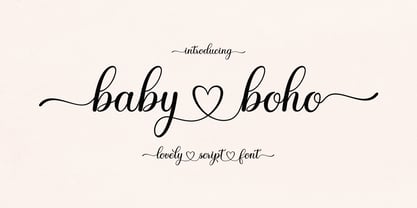 Introducing Baby Boho Baby Boho with a smooth handwriting style and very pretty and lovely. Baby Boho is perfect for branding projects, home appliance design, product packaging, use in business cards, invitation cards, etc. Just like a stylish text overlay to a wallpaper or anything that needs a touch of love. Thanks for checking! I really hope you enjoy it.
 - Hey Magdison by Amelia Studio,
$12.00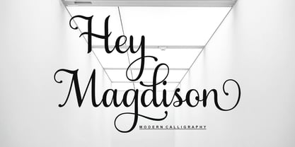 Introducing Hey Magdison Hey Magdison with a smooth handwriting style and very pretty and lovely. Hey Magdison is perfect for branding projects, home appliance design, product packaging, use in business cards, invitation cards, etc. Just like a stylish text overlay to a wallpaper or anything that needs a touch of love. Thanks for checking! I really hope you enjoy it.
 - Rolling Back by Din Studio,
$29.00 Introducing Rolling Back Font. Made with naturally handwritten. Rolling back font has a casual style. This font is suitable for any design like branding, quotes, t-shirt printing and etc. Included: Rolling Back OTF Features: Accents (Multilingual characters) Beautiful ligatures PUA encoded Numerals and Punctuations (OpenType Standard) Customer support I hope you enjoy it !!Thanks for visiting and purchasing my font!
 - Trio smoothie by Factory738,
$10.00 Smoothie is a classy, contemporary pair of script and sans-serif fonts. Its offers beautiful typographic harmony for a diversity of design projects, headlines, branding visual identity, poster, logo, magazines and etc. 3 Fonts (Script, Script Italic, and Sans) Upper and lowercase characters, numerals, punctuation Alternate & lignature glyphs are available Multilingual support Thanks for looking, and I hope you enjoy it!
 - Dethrone by Rillatype,
$17.00 Introducing, Dethrone! Dethrone is a modern serif font that bring you clean and sharp feels. this font also comes with lowercase, ligatures, and multi lingual support. Dethrone is perfect for your branding project, headline, logotype, packaging, invitation, advertising, etc. I hope you enjoy the font, if you have any question please feel free to contact me at rillatype@gmail.com Thank You!
 - Samuel by Gian Studio,
$12.00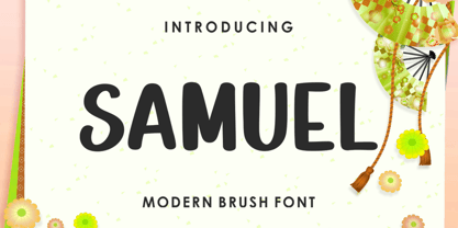 INTRODUCING Samuel is modern brush font, stylish and organic. can be used for stationery, fashion, logo, merchandise, books, clothing, magazines, cover artwork etc. Syaquita includes several ligatures, alternates and international support for most western languages. Thanks so much for looking, I really hope you enjoy it and please don't hesitate to drop me a message if you have any issues or queries :)
 - Stay Golden by Rotterlab Studio,
$15.00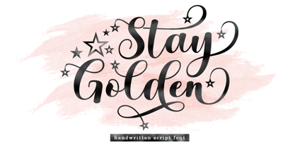 Introducing Stay Golden Script font in a smooth handwriting style and very pretty and classy. Stay Golden is perfect for branding projects, home appliance design, product packaging, use in business cards, invitation cards, etc. Simply as a stylish text overlay onto a background image or anything else that needs a touch of elegance. Thanks for checking! I really hope you enjoy it.
 - Chattelyne by ZetDesign,
$10.00 Introducing our new font that we named Chattelyne Script. It gives a beautiful and natural impression. This font is very suitable for clothing, logos, Wedding Invitations, Branding, Posters, Quotes, magazines, banners, etc. all with a natural touch. This font is the best choice for your business. What you get? Standart Ligature, Stylistic Alternate and multilingual accents. I hope you enjoy my creation.
 - Forward Script by Bosstypestudio,
$14.00 Introducing Forward Script Forward Script with a smooth handwriting style and very pretty and lovely. Forward Script is perfect for branding projects, home appliance design, product packaging, use in business cards, invitation cards, etc. Just like a stylish text overlay to a wallpaper or anything that needs a touch of love. Thanks for checking! I really hope you enjoy it.
 - Mati by Sudtipos,
$19.00 Father's Day, or June 17 of this year, is in the middle of Argentinian winter. And like people do on wintery Sunday mornings, I was bundled up in bed with too many covers, pillows and comforters. Feeling good and not thinking about anything in particular, Father's Day was nowhere in the vicinity of my mind. My eleven year old son, Matías, came into the room with a handmade present for me. Up to this point, my Father's Day gift history was nothing unusual. Books, socks, hand-painted wooden spoons, the kind of thing any father would expect from his pre-teen son. So you can understand when I say I was bracing myself to fake excitement at my son's present. But this Father's Day was special. I didn't have to fake excitement. I was in fact excited beyond my own belief. Matí's handmade present was a complete alphabet drawn on an A4 paper. Grungy, childish, and sweeter than a ton of honey. He'd spent days making it, three-dimensioning the letters, wiggle-shadowing them. Incredible. A common annoyance for graphic designers is explaining to people, even those close to them, what they do for a living. You have to somehow make it understandable that you are a visual communicator, not an artist. Part of the problem is the fact that "graphic designer" and "visual communicator" are just not in the dictionary of standard professions out there. If you're a plumber, you can wrap all the duties of your job with 3.5 words: I'm a plumber. If you're a graphic designer, no wrapper, 3.5 or 300 words, will ever cover it. I've spent many hours throughout the years explaining to my own family and friends what I do for a living, but most of them still come back and ask what it is exactly that I do for dough. When you're a type designer, that problem magnifies itself considerably. When someone asks you what you do for a living, you start looking for the nearest exit, but none of the ones you can find is any good. All the one-line descriptions are vague, and every single one of them queues a long, one-sided conversation that usually ends with someone getting too drunk listening, or too tired of talking. Now imagine being a type designer, with a curious eleven year old son. The kid is curious as to why daddy keeps writing huge letters on the computer screen. Let's go play some ball, dad. As soon as I finish working, son. He looks over my shoulder and sees a big twirly H on the screen. To him it looks like a game, like I'm not working. And I have to explain it to him again. This Father's Day, my son gave me the one present that tells me he finally understands what I do for a living. Perhaps he is even comfortable with it, or curious enough about that he wants to try it out himself. Either way, it was the happiest Father's Day I've ever had, and I'm prouder of my son than of everything else I've done in my life. This is Matí's font. I hope you find it useful.
 - ITC Vineyard by ITC,
$29.99Although inspired by the engraved lettering on eighteenth-century English trade-cards, ITC Vineyard has unusual characteristics of its own. The type retains some quality of copperplate scripts, but the differentiation between thicks and hairlines is not very sharp. There are a few cursive forms, but most of the letters are romanized: they are almost upright and not joining. Occasional flourishes are casually interpreted from various sources such as the lettering on trade-cards and writing masters' copybooks. “I think it is a new kind of 'copperplate script' which is not too formal and easier to read,” claims designer Akira Kobayshi. Irregularities are apparent in the angle of caps and numerals, but the face's quirkiness gives a type page some friendliness rather than cold brilliancy. ITC Vineyard is designed in two weights: regular and bold. Each variation includes several extra characters such as an alternative lowercase 'd' with a long arm, a T-h ligature, swelled rules, and a pair of flourishes. Swash caps are available for both weights. The swash caps variation also includes oldstyle figures. Kobayashi notes: “There are a few swash-cap lowercase combinations that collide or look awkward. In that case, I recommend using the plain caps. Setting all swash cap copy should also be discouraged.” Featured in: Best Fonts for Tattoos - Pacific Clipper SG by Spiece Graphics,
$39.00 Pacific Clipper has its roots in an old 1930s showcard lettering style. An extra bold version of this sign painter’s relic is shown in Carl Holmes' wonderful book on lettering. It may be described as what happens when Rudolf Koch's Kabel Heavy meets ATF's Novel Gothic. Also known as Sam’s Tune, Pacific Clipper’s noteworthy features include wedged crossbars in the capital A, E, F, and H. Overcurving is present in the capital B, D, P, and R while vertical strokes in the lowercase b, d, h, k, l, and t are chopped off obliquely. Figures in Pacific Clipper are also refreshingly different, particularly the number 4. This lettering favorite turned retro typeface has been extended to include a variety of weights. Pacific Clipper is now available in the OpenType format. Some new characters have been added to this OpenType version as Stylistic Alternates and Historical Forms. These advanced features work in current versions of Adobe Creative Suite InDesign, Creative Suite Illustrator, and Quark XPress. Check for OpenType advanced feature support in other applications as it gradually becomes available with upgrades.
 - EasyPeasyLemonSqueezy by lgtm,
$25.00 There is an addiction to symmetry. When I draw, when I write, when I take pictures, when I design. So in this font. Best use in Headlines.
 - Blythe by Scholtz Fonts,
$19.92 Blythe is a stylish and contemporary handwriting font that captures the elegant hand of the 50s with the immediacy of handwriting fonts such as Affable. There are many handwriting fonts out there, many of which border on being grungy and irregular. This font combines beauty with individuality and panache. Blythe is characterized by dramatic ascenders and descenders (found on characters such as f, g, h, j etc) and it may be necessary to increase the line-spacing a little in some applications to accommodate these features. Suggestions for use: -- wedding stationery -- greeting cards -- valentines day mediaa -- beauty product media -- lingerie tags -- women's magazine pages -- classical music media -- award certificates The font is fully professional: carefully letterspaced and kerned. It contains over 235 characters - (upper and lower case characters, punctuation, numerals, symbols and accented characters are present). (It has all the accented characters used in the major European languages).
 - Trio CT by CastleType,
$39.00 I was commissioned by Publish magazine to digitize Trio in 1990. Originally designed in a Light weight only, Trio is now available in Medium and Bold weights as well. Uppercase only, but each weight includes two alphabets, one more "deco," the other more "modern."
 - Aderyn by Hanoded,
$15.00 Aderyn is a hand drawn, elegant font with a light touch to it. Aderyn is soft and sleek, but also comes in bolder styles to give a little extra oomph to your designs. Aderyn is Welsh for 'bird', a language I meant to master, but never took beyond 'good morning', 'bird' and 'cat'. I know, it's pathetic… Aderyn comes in 12 styles, all of which have kerning, stylistic and contextual alternates for both lower and upper case letters. It even has a smiley!
 - Hypop by Factory738,
$15.00 HYPOP is a strong and condensed sans serif font family with a nostalgic vibe. Combining retro and minimalist elements resulted in an elegant design. The different weights give you a lot of options when it comes to choosing the right typographic color for your project. 5 Weights (Thin, Light, Regular, Medium, Bold, Black) 2 Styles (Regular and Italic) Basic Latin A-Z and a-z Numerals & Punctuation Stylistic Ligatures glyphs Multilingual Support for ä ö ü Ä Ö Ü ... Free updates and feature additions Thanks for looking, and I hope you enjoy it.
 - Le Blanc by Factory738,
$15.00 Le Blanc is a strong and condensed sans serif font family with a retro vibe. Combining vintage and minimalist elements resulted in an elegant design. The different weights give you a lot of options when it comes to choosing the right typographic color for your project. 5 Weights (Thin, Light, Regular, Medium, Bold, Black) 2 Styles (Regular and Italic) Basic Latin A-Z and a-z Numerals & Punctuation Stylistic Ligatures glyphs Multilingual Support for ä ö ü Ä Ö Ü ... Free updates and feature additions Thanks for looking, and I hope you enjoy it.
 - Caniste by Ilham Herry,
$20.00 The vintage typeface returns with the Caniste typeface family. My passion for something with a vintage aesthetic is one reason I created Caniste. Inspired by antique ephemera such as cigar box labels that were common in the 19th century, it harkens back to the beauty of typographic design at that time. The Caniste font family is an all-caps serif font with uppercase titling. It comes in 6 weights: Extra Light, Light, Regular, Semibold, Bold, and Ultra Bold. It also has very user-friendly Extras, such as scrolls, ornaments, and panels, and allows you to create beautiful ornamentation to suit your needs. I hope you enjoy using the Caniste fonts. Thank you!


