6,042 search results
(0.02 seconds)
- Landry Gothic by E-phemera,
$12.00Landry Gothic is inspired by a wood type alphabet by an unknown designer. It was digitized in order to make prop signage for movies and television. Its imperfect lines and rounded corners are meant to capture the feeling of real wood or metal type that's worn from use. - Artistry JNL by Jeff Levine,
$29.00 The 1935 sheet music for Shirley Temple's "That's What I Want for Christmas" [from her 20th Century Fox film "Stowaway"] provided the hand lettered sans which became the model for Artistry JNL. A condensed block design with rounded corners, the typeface is available in both regular and oblique versions.
 - RMU Pittoreske by RMU,
$35.00 This great Victorian display font of the late 19th century was revived for today’s use. You also find two frame elements. To start setting a frame, type [shift] + [alt] + p for the corner, and continue with typing [alt] + p. Duplicate and mirror the lines to get a fantastic frame.
 - Second Guess JNL by Jeff Levine,
$29.00 The cover of the 1934 sheet music for "Your Guess Is Just as Good as Mine" offers up another hand lettered Art Deco sans with a classic period look. The square-ish lettering with rounded corners of Second Guess JNL is available in both regular and oblique versions.
 - Pleasantville JNL by Jeff Levine,
$29.00 Pleasantville JNL is a condensed slab serif font with angled corners emulating a popular style of lettering most prevalent in the 1920s. Modeled from Cornfield JNL (which in turn was based on a vintage popcorn box's logo), the letters were given a more standardized treatment in form and balance.
 - Barb by chicken,
$17.00 Heavy as hell, awkward, asymmetric, sort-of-gothic… Four alternates for every letter, carefully kerned together and nicely shuffled for you by OpenType apps… Blunt has the sharp corners ever so slightly rounded off for a softer look at large sizes. Wired chops everything up for an origami angle…
 - Formal Dance JNL by Jeff Levine,
$29.00 A vintage Canadian-published music book circa the 1940s had the title "Strauss Waltzes" hand lettered in a bold Art Deco sans serif that featured block style letters with rounded corners. This was the working model for Formal Dance JNL, which is available in both regular and oblique versions.
 - Metral by The Northern Block,
$19.30 A geometric sans serif with a precise fabricated appearance. Smooth corners are mixed with subtle angles to form a strong, legible typeface ideally suited for a wide range of applications. Details include 6 weights with italics, an extended European character set, manually edited kerning, stylistic alternatives and Opentype features.
 - Zitkid by PizzaDude.dk,
$15.00A clumbsy font with an attitude! More adorable than grunge and trash! - KG Flavor And Frames by Kimberly Geswein,
$5.00 Adorable accents for your work including frames, labels, chevrons, mustaches, and more!
 - Kiro by Dharma Type,
$24.99 Kiro is a minimal, simple condensed sans-serif family designed by Ryoichi Tsunekawa and the whole family consists of 12 style: six weights from Thin to ExtraBold and their matching Italics. The range of styles provides flexibility for title, headline and body text. And the large x-heights gives them legibility and readability. The basic skeleton was designed semi-modularly and the letterform was minimalized by removing their unnecessary stems. Their corners were finished with subtle rounded effect. The minimalized semi-modular design gives this family contemporary urbane taste and rounded corners make this family warm and friendly. Kiro supports almost all European languages: Western, Central, South Eastern Europeans and afrikaans. And superior figures, inferior figures, denominators, numerators and fraction can be accessed by using OpenType features.
 - Cell by Type Minds,
$7.50 Cell is a sturdy, geometric typeface with many potential applications. Though it is best suited to display sizes, its construction is simple enough for use in smaller settings. Its octagonal, almost mechanical design is softened by rounded corners. The face is characterized by a single thick stroke in each letter, lending it a unique appearance. It also features an oblique counterpart with several italic-style glyphs. Both members of the family also include small capitals mapped to the Private Use Area. Cell was designed to be at once simple and unique. Its grid-based structure is enhanced by slight adjustments for optical consistency. Glyphs which are normally round instead have 45-degree angles at the corners, sticking to the grid system without losing legibility.
 - Hebrew Marge Tanach by Samtype,
$149.95 This is the classical font to make a Tanach, Siddur or a regular hebrew book. These fonts include all diacritic marks: Nikud, Teamim and modern pontuation. You can find in these fonts: shevana, kamats katan, cholam chasser and dagesh chazak. The best program to use these fonts is Adobe Indesign.
 - Hebrew Marge by Samtype,
$39.00 This is the classical font to make a Tanach, Siddur, or a regular Hebrew book. These fonts include all diacritic marks: Nikud, Teamim, and modern punctuation. You can find in these fonts: shevana, kamats katan, cholam chasser and dagesh chazak. The best program to use these fonts is Adobe Indesign.
 - Qobliyah by Twinletter,
$15.00 The Qobliyah font is beautiful, elegant, and luxurious – that’s what you get when you use our font set. This font is easy to install and use in programs like Adobe Photoshop, Illustrator, InDesign, and Word, among others. Each font is designed by a professional graphic designer to ensure a flawless finish.
 - Tahu Bullats by HansCo,
$15.00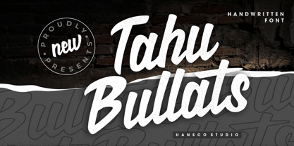 Tahu Bullats a Handwriting typeface. Tahu Bullats is a bold and fun typeface with many ligatures and alternates. Comes with a full uppercase, lowercase, numbers and punctuation + standard multilingual support. It’s great for branding, logo designs, lettering, logotype, clothing, posters, magazines, and much more. We recommend using Adobe Illustrator or Photoshop.
 - Hebrew Vilna Tanach by Samtype,
$189.00 This is the classical font to make a Tanach, Siddur or a regular hebrew book. These fonts include all diacritic marks: Nikud, Teamim and modern pontuation. You can find in these fonts: shevana, kamats katan, cholam chasser and dagesh chazak. The best program to use these fonts is Adobe Indesign.
 - Quaint Notions NF by Nick's Fonts,
$10.00This rollicking fun face is based on legendary lettering artist Alf Becker's Super Thick-and-Thin, his twenty-third offering in "Signs of the Times" magazine. The package includes two fonts: a full Adobe Standard character set, and an Alternates version, which features the more extreme elements of Becker's original design. - Illuminations Woodcut by Just My Type,
$10.00 Illuminations Woodcut is inspired by the decorated initial capitals of Medieval manuscripts… and an old book of clip art in which they were found. Try decomposing them in Adobe Illustrator and coloring the pieces or dropping color into them in Photoshop: you can get some stunning results. Caps and TrueType only.
 - Nouveau Display JNL by Jeff Levine,
$29.00 Vintage sheet music for the 1920s song "Where Did Robinson Crusoe Go with Friday on Saturday Night?" yielded the hand lettered Art Nouveau alphabet for Nouveau Display JNL. Because the Art Nouveau movement was so influential in the graphic designs of the 1960s "Love Generation" counter culture, this typeface blends itself well with projects crossing many decades and varying styles.
 - Secret Mango by Bejeletter,
$14.00 "Secret mango" ia a simple character shapes and open counters, make for an exceptionally legible design. Secret mango consist 9 weight of slab serif with matching oblique to make more touch and allowing you to make each word look completely stylish. True to the reflection of Slab serif, always associated with confidence, solidarity and courage, "Secret Mango" represents all of that.
 - PAG Julio by Prop-a-ganda,
$19.99Prop-a-ganda offers retro-flavored fonts inspired by lettering on retro propaganda posters, retro advertising posters, retro packages all the world over. This is perfect font for your retrospective project. PAG Julio is a eye-catching, counter-contrast font with retro touch. This cool and cute font woks best for display uses, headlines, branding, print, and web design projects. - Capitol Skyline by Device,
$39.00 DF Capitol features two faces, DF Capitol Skyline and DF Capitol Capitals (a multi-weight all-caps compliment) that epitomise Streamline Moderne. Strong geometry and large, open counters with heavily condensed verticals and a succession of contextual alternates and discretionary ligatures. DF Capitol presents a nice companion in two weights. Both contain full support for Eastern and Central European languages.
 - Capitol Capitals by Device,
$29.00 DF Capitol features two faces, DF Capitol Skyline and DF Capitol Capitals (a multi-weight all-caps compliment) that epitomise Streamline Moderne. Strong geometry and large, open counters with heavily condensed verticals and a succession of contextual alternates and discretionary ligatures. DF Capitol Skyline presents a nice companion in two weights. Both contain full support for Eastern and Central European languages.
 - Libran by Bean & Morris,
$35.00 The Libran font family consists of Libran Regular, Libran Italic, Libran Antique and Libran Small Caps. The broad open counters make for easy reading with a touch of classic roman clarity. The diminutive serifs add a suggestion of the hand crafted origins without obstructing Its clean, contemporary lines. Libran’s generous x-height and short ascenders have been carefully proportioned to maximise reproduction qualities.
 - Spaceland by Pepper Type,
$35.00 Spaceland is a narrow display font family with constant counter width and gradually growing stroke over 11 weights with matching obliques. Spaceland is a perfect choice for designs that require extra narrow but legible letters, such as movie posters, health warnings, bold titles etc. It has rich language support, including Cyrillic, as well as numerous OpenType features to customize your design.
 - Aladin Pro by Sudtipos,
$29.00 Aladin is a calligraphic art deco face with an eastern touch, designed by Angel Koziupa and produced by Alejandro Paul. Casual, airy counters and friendly terminals give it an advantage as a packaging font for exotic coffees and teas. It also serves quite well on posters and book jackets where relaying the famous sense of Eastern hospitality and playfulness is a must.
 - Burobu by Hanoded,
$12.00 Burobu, in case you’d like to know, means ‘blob’ in Japanese. I thought it was quite an appropriate name for this blob-like font! Burobu is a messy font and comes with a generous helping of jittery, jumping glyphs, exaggerated strokes and over-the-top arms, ties, bars and counters. Comes with an ultra-cute blob dingbat font and copious amounts of diacritics.
 - Likely by Adam Ladd,
$25.00 Likely is a joyful, brush script type family with complementary sans and extras styles. Hand drawn freely but carefully, each font is designed to work together to present a vibrant and natural package. Layer and colorize the free Counter styles to easily enhance the color palette or use the over 170 matching catchwords and shapes to make your designs even more fun!
 - Loudine by PintassilgoPrints,
$19.00 Loudine is a striking decorative display typeface, great for posters, book covers and magazine headlines. It comes in two widths, each of them packed with a set of stylistic alternates: just turn on the feature in an OpenType savvy program to instantly get into a new mood, with filled counters and slightly different lettershapes. Be sure to play it loud!
 - Pebl by Formation Type Foundry,
$25.00 Pebl is inspired by the naturally simplified and smoothed shapes of beach pebbles. The result is a bold, super-rounded display typeface. It's pared back to just the most basic, smooth outlines without counters, for a friendly and organic look. It’s ideal for logos, branding, headlines or just abstract type shapes in print, in displays, on the web, on T-shirts, wherever. Enjoy.
 - Tanseek Sans by Monotype,
$29.99The Tanseek™ Sans family provides interactive and print designers with a suite of powerful and versatile communication tools. Square shoulders, open counters and distinctive character shapes also ensure high levels of legibility. Designed by Dave Farey and Richard Dawson, the lower case has a subtle calligraphic emphasis, creating an inviting rhythm and typographic flow when letters combine into words and sentences. - Sackem PB by Pink Broccoli,
$14.00 There’s just nothing quite like a heavyweight geometric typestyle with tiny counters, you just love it like the Bee Gees. Sackem started as a digitization of a singular film typeface called Benman Jumbo by Lettergraphics. From there, this mechanical typeface was expanded into a giant family of playful widths and obliques: from the condensed “Slim” style to the original “Jumbo” style.
 - Fleur by Lián Types,
$39.00 La vie est une fleur dont l'amour est le miel Fleur is the French for flower and I've chosen this language for a good reason. Over the past 5 years, I've had the opportunity to travel a lot to Paris and I've always tried to catch every moment and detail of this delightful city through the eyes of the designer inside me. Paris is full of surprises, mainly for us, artists. In fact, I believe the city is a museum itself. Every corner of any street has something inspiring. But, there’s something I particularly love and I want to address here: The Palais Garnier. Built between 1861 and 1875, this opera house is a dream made true for many of us, who love somptuosité. Garnier, the architect of this magnificent building, said that the style he proposed was not Grecian nor Roman/baroque, he created something new and called it Napoleonic: Luxurious at its best. Fleur is inspired in this palace which, in fact, has some similar letters inside. Garnier put his name at the ceiling of the Rotonde des Abonnés: Letters are interlacing each other with nicely done art nouveau curves. I thought I could take this idea and achieve something very delicate and imposing at the same time if the font consisted entirely of caps with the logic of a didone and a bit of art-nouveau. This mix of elegance and flamboyance gave birth to Fleur which has a wide range of uses but was mainly intended for perfumes, fashion magazines, storefronts, book covers or logos. Not only you'll find many decorative glyphs, but also a vast amount of unique ligatures will make you really adore this font. Get Fleur and profite de la vie TECHNICAL As suggested above, the font has many open-type coded alternates and a vast amount of unique ligatures. Install the font in applications that support them, like Adobe Illustrator or Photoshop.
 - Bordonaro Spur by Estudio Calderon,
$35.00 Bordonaro Spur - Bordonaro Script’s partner - is a typography strongly influenced by old beer labels and includes some serifs based on Frederic W. Goudy’s Copperplate, but with some softened spurs adding an elegant and soft texture to the text. It is ideal to be used on large bodies and has a set of special ligatures ideal to be used in branding. Psss...Check out the NEW Bordonaro Spur with Rounded corners , same version but soft! FEATURES Co = company1 Co = company2 Estd = established Inc = incorporated Ltd = limited Mc = mac Rd = Road St = street And also from Adobe CC you can activate Style Sets (SS) and get ideal ligatures for ordinal numbers: 1st = st 2nd = nd 3rd = rd 4th = th Bordonaro Script and Bordonaro Spur are two typographic styles that were designed under the same characteristic features with the idea of combining them to obtain better results, for that reason, we recommend merging them in a creative way and you will realize everything you can design with them. The banners designs are based on old brands of beer labels, coffee packaging, sports logos and in some cases we use Copperplate Gothic but only as a complementary font in order to harmonize the layout of the elements in each banner.
 - Museum Ornaments by T4 Foundry,
$7.00Museum Borders and Ornaments is part of a typographical treasure, the Norstedts type collection in Sweden. Type designer Torbjörn Olsson has painstakingly translated the original 34 Ornament matrices in the collection to Open Type. Among them are several of Granjon's arabesques, as well as symbols from both Swedish and Danish typefoundries. The signs were cut in the 16th, 17th and 18th centuries. The old Swedish name for these "type trademarks" were "rössjor". Museum Borders and Ornaments is an OpenType creation, for both PC and Mac. Swedish type foundry T4 premiere new fonts every month. Museum Borders and Ornaments is our tenth introduction. Museum Borders and Ornaments is part of the growing Museum type family. Museum also includes Museum Tertia Cursive, an exquisite 1700's typeface with modern additions, and Museum Fournier, a set of Rococo capitals designed by Pierre Simon Fournier le Jeune circa 1760. - 1742 Civilite by GLC,
$38.00 In the late medieval period appeared a "semi-cursive" writing, the French "écriture de civilité". Quickly, it is carved and melted down in lead for printing. It is a very elegant running font, with numerous variants, both final than initial characters, many of the accented small characters were present in the model I was inspired by, after “Fournier Le jeune ”, in his catalogue "Modèles des caractères de l'imprimerie et des autres choses nécessaires au dit art nouvellement gravés par Simon-Pierre Fournier le jeune" published in 1742 in Paris. A render sheet, included in the font file, makes all characters easy to identify on keyboard. This font, very attractive and decorative may be used for web-site titles, posters and flyer designs, editing ancient texts, labels, greeting cards... and anything you want! It supports as easily enlargement as small size, remaining elegant and pretty.
 - Eidetic Modern by PSY/OPS,
$36.00 Eidetic Modern is the sanserif counterpart to Eidetic Neo. Both families were developed in tandem, however the Modern was the first to be published by PSY/OPS [1997]. Eidetic Modern's features -- gently tapered stems, buffed corners and junctures, vertical stress, non-classical proportions -- combine to create a unique, contemporary humanist sans.
 - Posterizer KG Rounded by Posterizer KG,
$40.00 Posterizer Kg Rounded, is basically rounded version of Egyptian, Slab Serif font Posterizer Kg. By adding rounded corners on serifs, the strict form disappears, in that way, the font gets softer form. Posterizer Kg Rounded is useful for sweet themes like cookies, puppies, love, joy, or some other similar things.
 - Disgrunged ABCD by Aah Yes,
$12.00Disgrunged is a distressed grunge font, as you might guess, and industrial sans-serif in feel. The Disgrunged ABCD family resembles bad printing with rubber stamps, with corners showing, along with misprinted letters, and the typeface has four versions (A, B, C, D) giving increasing amounts of chaos, jumbledness and irregularities.