6,042 search results
(0.022 seconds)
- Compatil Text by Linotype,
$50.99Compatil is the first comprehensive type system which enables all typographical elements to be used to full effect in order to reproduce the message conveyed by text information. Four different type styles with a total of 16 weights including italics have been merged into a unique typographical network. There are now no limits to the font user's creativity. The system is a product of technical innovation and constitutes a new design approach which meets the highest aesthetic standards. For almost two years, a team of experts from Linotype has been working with initiator Professor Olaf Leu under the direction of Silja Bilz, Erik Faulhaber and Reinhard Haus to create the Compatil type system. Despite the Internet and TV, it is essential today to be able to absorb information quickly by being able to read it with ease. A fact that is becoming increasingly important both on-screen and on paper. It is the role of the font to increase legibility and to ensure typographically perfect results for text design work. The new Compatil type system meets all these needs. The Compatil is a part of the Platinum Collection. The following four different styles are available: Compatil Exquisit, Compatil Fact, Compatil Letter and Compatil Text. Compatil is available in various font formats: 16 separate OT Pro fonts including the small caps and Adobe Central European character set for OpenType-supporting applications like Adobe InDesign, or as 32 separate OpenType Com fonts for office communication, with the following special features: 1. Optimized display capabilities for computer screens eXcellent Screen Fonts (XSF-quality). 2. An extended, international character set, which supports 48 different languages for Microsoft Office applications like MS Word or as 64 PostScript fonts, which can be used in non-OpenType-supporting applications like Quark XPress. - Zapfino Extra Paneuropean by Linotype,
$103.99ZapfinoExtra is an OpenType format typeface available in two versions. The Contextual version contains a treasure-trove of extra contextual features. When created in 2004, this was the most advanced OpenType font released to date. By purchasing the Contextual version, users of OpenType-supporting applications, such as Adobe InDesign, may access all of the features available in the entire Zapfino family through just two fonts, Zapfino Extra LT Pro (Contextual), and Zapfino Forte LT Pro! Unfortunately, most non-Adobe applications currently do not support the contextual features made possible by recent OpenType developments. Users of Quark XPress and Microsoft Office should instead purchase all of the non-contextual fonts of Zapfino Extra Pro family, in order to access all of the Zapfino family's 1676 glyphs. The Zapfino family's character set supports 48 western and central European languages. More Zapfino History: Today's digital font technology allowed the world-renowned typeface designer/calligrapher Hermann Zapf to finally realize a vision he first had more than fifty years ago: creating a typeface that could capture the freedom and liveliness of beautiful handwriting. The basic Zapfino™ font family, released in 1998, consists of four alphabets with many additional stylistic alternates that can be freely mixed together to emulate the variations in handwritten text. In 2003, Herman Zapf completely reworked the Zapfino design, creating Zapfino™ Extra. This large expansion of the Zapfino family was designed in close collaboration with Akira Kobayashi. Zapfino™ Extra includes a cornucopia of new characters. It features exuberant hyper-flourishes, elegant small caps, dozens of ornaments, more alternates and ligatures, index characters, and a very useful bold version-named Zapfino™ Forte. Use Zapfino to produce unusual and graceful advertisements, packaging, and invitations. Zapfino Extra is so joyously abundant that it's tempting to over-indulge, so be sure to check out the tips for working well with the possibilities!" - Negaroa by Ardyanatypes,
$15.00 Negaroa comes with an aesthetic style, and the serif-type tagline is modern and elegant. This font comes in eight thickness levels, from thin to black to suit your needs. Negaroa is also equipped with the latest professional characteristics that can present an elegant and attractive identity for your company or project for business purposes. It goes well with modern serifs and scripts depicted or stand firm as a title and brand representative for an elegant look. Negaroa also comes with multiple languages, making it easy to use for any country and language use. It also comes with alternative Ligatures and styles to make your designs more attractive. Negaroa is suitable for branding projects and various design purposes such as business cards, name tags, uniforms as a brand enhancement. Advertisements, posters, invitations, branding, logos, magazines, merchandise, presentations, etc. Supports languages: Afrikaans, Albanian, Asturian, Asu, Azerbaijani, Basque, Bemba, Bena, Bosnian, Breton, Catalan, Chiga, Colognian, Cornish, Croatian, Czech, Danish, Dutch, Embu, English, Esperanto, Estonian, Faroese, Filipino, Finnish, French, Friulian, Galician, German, Gusii, Hungarian, Icelandic, Igbo, Indonesian, Irish, Italian, Kabuverdianu, Kalaallisut, Kalenjin, Kamba, Kikuyu, Kinyarwanda, Latvian, Lithuanian, Low German, Lower Sorbian, Luo, Luxembourgish, Luyia, Machame, Makhuwa-Meetto, Makonde, Malagasy, Malay, Maltese, Manx, Meru, Morisyen, North Ndebele, Norwegian Bokmål, Norwegian Nynorsk, Nyankole, Oromo, Polish, Portuguese, Quechua, Romanian, Romansh, Rombo, Rundi, Rwa, Samburu, Sango, Sangu, Scottish Gaelic, Sena, Shambala, Shona, Slovak, Slovenian, Soga, Somali, Spanish, Swahili, Swedish, Swiss German, Taita, Teso, Turkish, Turkmen, Upper Sorbian, Vietnamese, Vunjo, Walser, Welsh, Western Frisian, Yoruba, Zulu A guide to accessing all alternatives can be read at http://adobe.ly/1m1fn4Y Adobe Photoshop go to Window - glyphs Adobe Illustrator go to Type - glyphs Features: A – Z Character Set a – z Characters set Numerals & Punctuations (OpenType Standard) Multilingual Thank you and have a nice day
 - Betthofen Script by Ferry Ardana Putra,
$12.00 Betthofen |Handwriting Bouncy Script font manufactured by Ferry Ardana Putra, this typeface support OpenType features and includes numeral, punctuation, ligatures and it also supports multi-languages. Combine this bouncy font with its ligature and ton of ornaments that you can freely choose for your precious project! This font is perfect for branding projects, wedding designs, advertisements, product packaging, product designs, label, photography, invitation, quotes and any project spiced up! Betthofen features: A full set of upper & lowercase characters Numbers & punctuation Multilingual language support PUA Encoded Characters +350 Glyph Ligatures Swashes Ornaments OpenType Features ——— ⚠️To enable the OpenType Stylistic alternates, you need a program that supports OpenType features such as Adobe Illustrator CS, Adobe InDesign & CorelDraw X6-X7, Microsoft Word 2010 or later versions. There are additional ways to access alternates/swashes, using Character Map (Windows), Nexus Font (Windows), Font Book (Mac) or a software program such as Pop Char (for Windows and Mac). ⚠️For more information about accessing alternative, you can see this link: http://adobe.ly/1m1fn4Y ——— 🔑Important tutorial from the author: Tutorial for Mollusca font trio: https://lnkd.in/d984CQD6 How to use Midway | Retro Script Font on illustrator: https://lnkd.in/eusbZd7s How to use Midway | Retro Script Font on Photoshop: https://lnkd.in/evsYrwgs ——— ❤️Get in touch with the author: Instagram: https://www.instagram.com/ardana619 Behance: https://www.behance.net/ardana619 ——— 📢Shout out to: https://unsplash.com (for awesome photos) https://graphicburger.com (for outstanding mockups) ——— 🔥Thankyou for purchasing our product, hope you like and have fun with our product. If you have any queries, questions or issues, please don't hesitate to contact us directly. If you satisfied with our product, please give 5 stars rating. ——— Happy Designing...😊
 - Armature Neue Sans by fontBoy,
$15.00 Armature Neue Sans is an extension of the original Armature Neue family released in 2010. Like Armature Neue, Armature Neue Sans consists of six weights with accompanying italics. Armature is one result of my interest in typefaces that are constructed, rather than drawn. Although it is basically a monoline design, there are subtle details throughout that compensate for a monoline’s evenness. As with all fontBoy fonts, there are dingbats hidden away in the dark recesses of the keyboard. When I first started designing this face in 1992, I called it Dino - I thought I would name all my fonts after famous pets, so the dingbats for Armature are dinosaurs. To access the alternate characters (closed counter B and R, and others) use Stylistic Set 1 or the glyphs palette in your OpenType-enabled application. Designed by Bob Aufuldish with editing and production by Psy/Ops.
 - Stadia by Device,
$29.00 Stadia is designed around a series of modular units: quartercircles, teardrop shapes, squares, circles and variations thereon. The versatility of these basic shapes is such that a teardrop, for example, can represent a looped bowl, as in the lower part of the a, while also representing a curved arc at the top of the same character. The strict grid is broken for the T and the Y, and the placement of accents. The alternative – basing a T, for example, across three units – though rational, is far less aesthetically pleasing. As always with type design, one has to know when the internal structural rules should be bent for a more beautiful result. The horizontal lines appear to travel through the letters, bursting into stars in the counters of lower-case characters such as the o and p. The outline version is weighted to the same width as the gaps between the units.
 - Cyclic by ArtyType,
$29.00 Cyclic is a stylish and modern slab serif in three practical, highly legible weights. The name ‘cyclic’ suits this typeface in several ways. Firstly because I wanted to create an ‘all-round’ typeface (pun intended) that could adapt to most applications, but also, as the dictionary definition explains - “occurring in circles, regularly repeated”. The basis for a lot of the characters did begin with a circle or sections of one; the equally distributed, rounded forms of this font are complemented however by the vertical strokes, and further counter-balanced by angular slab serifs on the remaining glyphs. Curved alternates with a celtic vibe are also included in the fonts and feature on the default slots in the separate Cyclic Uncial set. In summary, the whole Cyclic type family comprises a combined palette of circles and straight lines; something the cubist movement would have been proud of!
 - Hargloves Sans by Heypentype,
$20.00 Hargloves sans remixes between grotesque proportions and 80’ industrial inspired-typefaces. Yes, it is a major improvement from original Hargloves fonts with completely different projections. Hargloves Sans intended primarily for text, editorial or long-form text. This new design emphasized on reader joy experience when reading text without losing typeface characters. Hargloves Sans support almost all Latin script language, roughly around 356 latin language according to hyperglot analytics. This language coverage is heypentype priority to serve all possible Latin script language all over the world. The premise is simple, because it is text typeface it should cover all Latin script languages whether its popular language or not. Hargloves Sans have a higher x-height compared to Hargloves. Higher x-height will give a seamless, undistracted reading. The open counter on nearly squared proportions is Hargloves Sans main character. There’s a lot of feature coming for this typeface in the future.
 - Cyclic Uncial by ArtyType,
$29.00 Cyclic is a stylish and modern slab serif in three practical, highly legible weights. The name ‘cyclic’ suits this typeface in several ways. Firstly because I wanted to create an ‘all-round’ typeface (pun intended) that could adapt to most applications, but also, as the dictionary definition explains - “occurring in circles, regularly repeated”. The basis for a lot of the characters did begin with a circle or sections of one; the equally distributed, rounded forms of this font are complemented however by the vertical strokes, and further counter-balanced by angular slab serifs on the remaining glyphs. Curved alternates with a celtic vibe are also included in the fonts and feature on the default slots in the separate Cyclic Uncial set. In summary, the whole Cyclic type family comprises a combined palette of circles and straight lines; something the cubist movement would have been proud of!
 - Carmensin by Rafael Jordan,
$35.00 Carmensin is a beautiful humanist serif typeface created by Rafael Jordán. Designed in the 21st Century with all the flavor of the Renaissance. The conclusion of a story that began in Type@Paris program in June, 2015 & ended at February, 2020. Inspired by historical models, its classic conventional appearance with small details, smooth curves, large x-height and open counters made of Carmensin a great, efficient and solid typeface for long text settings. Also, its bigger sizes styles show the beautiful shapes and contrast, exhibiting its exuberance. Carmensin has a great collection of OpenType features that will satisfy any typographic necessity as ornaments, ligatures, stylistic sets, small caps, automatic fractions and more options along 3 optical styles (Text, Headline and Display) plus a fancy Stencil style. With an extensive Latin character set, Carmensin covers a wide amount of Latin-based languages, including Latin Plus encoding.
 - Ceebo by Oliver Matelowski,
$55.00 Ceebo is a friendly sans-serif, which show some aspects of a humanist and grotesque typeface. It retained more details of writing and got some forms and characteristics of an italic. The font contains some alternative glyphs. It also contains some ligatures and discretionary ligatures. In addition, there are adjusted figures and additional character for uppercase letters, lowercase letters and small caps, which react by OpenType-Feature. The font was designed to stay legible also in small sizes: beside as possible open counters, a tall x-high, distinct vents and cuts, it especially are the details of the glyphs which make it discernable. The regular weight is slightly thinner than other sans-serif fonts, moreover the diacritics and small glyphs were designed for small sizes by taller and more open forms. The resulting “ruggedness” is mellowed by half-rounded stems and pointed stem ends.
 - Unitext by Monotype,
$50.99 Created with the needs of branding design in mind, Jan Hendrik Weber's Unitext is a crisp, clean typeface that functions well across print and online use. It blends humanist and grotesque qualities, adopting a style that the designer describes as “neo grotesque”. Narrow spacing is what sets this typeface apart, however it also uses open counters and angled details to boost readability. “The ideal font should work at every touchpoint,” says Weber. “And designers shouldn’t need an introduction or a set of rules on how to handle this typeface. Unitext allows designers to work without explanation.” The Unitext family includes 7 weights, spread across 14 fonts with extensive Western, Central and Eastern European language support. Unitext Variables are font files which are featuring one axis and have 14 names instances: Hairline, Hairline Italic, Extralight, Extralight Italic, Light, Light Italic, Regular, Italic, Semibold, Semibold Italic, Bold, Bold Italic, Black, Black Italic
 - Short Films by Dharma Type,
$19.99 Short Films is an all-new-styled family, which kind of looks like Art Deco Style. Wide opened counters and softly rounded bowls create a new feeling – Retro but futuristic, geometric but humanistic. Exquisite contrast between thin and bold parts of glyphs make mixed feeling – Pop and feminine, formal and casual, strong and soft. The most distinctive feature is a coexistence of decorativeness and Readability. This coexistence expands the range of font usage. You can use this font for not only titling but also body-text. Short Films consists of 6 weights and their matching Italics for a wide range of usages. Further, Short Films supports international Latin languages and basic Cyrillic languages including Basic Latin, Western Europe, Central and South-Eastern Europe. Also, Short Films covers Mac Roman, Windows1252, Adobe1 to 3. This wide range of international characters expands the capability of your works.
 - Regulator Nova by Device,
$39.00 A high lower-case x-height geometric sans with open counters, Regulator Nova is extremely legible at text sizes and in extended settings while the range of weights also make it suitable for headlines. The stoke terminals are all cut at close to 90 degrees, lending a sharp precision to the characters. Alternate versions of the g, j, r, w, K, R, W, # and ampersand are available in both upright and italic, and can be toggled on and off in the Opentype panel or the Glyphs palette. Clean, elegant and legible, Regulator Nova has a classical proportions based on a circumscribed circle and square, and shares structural similarities to early sans serifs such as Rudolf Koch’s Kabel, while adopting more British forms for the M and R. Regulator Nova is an extension and reworking of Regulator, now with extra weights, reweighed italics, Opentype-savvy alternates and a full European character set.
 - PF Square Sans Condensed Pro by Parachute,
$79.00 Square Sans Pro is one of Parachute’s most popular typefaces. It has been used by the likes of companies such as Samsung and organizations like the European Commission. Now a new version has been released. Square Sans Condensed Pro is a square-shouldered, modern and self-assured text typeface which lends style to a variety of projects. With its generous x-height, full-bodied counters and uniform stroke weight, it provides high legibility and uniform typographic color at all sizes. This is an exceptionally warm and comprehensive type family -with slightly rounded edges and softened curves- which possesses a robust and friendly appearance. The family consists of 12 fonts -from extrablack to thin- including true italics. It supports opentype features like small caps, fractions, ordinals, etc. and offers multilingual support for all European languages including Latin, Greek and Cyrillic. Download its complehensive PDF Specimen Manual for further details.
 - Decrypt H1 by Type Innovations,
$39.00 Say hello to Decrypt H1—a geometric typeface that features highly stylized capitals with sharp corners, circular forms and generous proportions. Specifically created for visual impact—use Decrypt H1 when you want your words to stand out from the rest of the crowd. The concept is modern, futuristic and non-traditional. Perfect for display text, logos and headings. The development of Decrypt H1 started in 1997, inspired by Alex Kaczun’s best selling grotesque font family called Contax Pro. Decrypt H1 is specifically introduced here as a bold weight, but Alex plans to expand the design to include many weights, styles and alternative design treatments. Stay tuned! If you like Decrypt H1—check out it’s alternate twins Decrypt 01, Decrypt 02 and all of Type Innovations fonts at: http://www.myfonts.com/person/Alex_Kaczun/
 - WBP Emperio by Studio Jasper Nijssen,
$20.00 A classic serif font with a twist. WBP Emperio has an interesting shape. She has rounded corners and a slightly 'curvy' look. The little indent makes her stand out above the rest. A sensation in the making. Emperio has two styles. The Regular: Great for designing friendly corporate identities. And there's the Hand Drawn style: Great for design posters of prints with a handmade feel. Combine the two and you can go infinite. WBP Emperio was a sketch I designed when I started my company. So you can say it's been five years in the making XD. When I was invited to add two pages to the Typodarium 2022, I speeded up the process and added the hand-drawn style. The end result is awesome. A classic serif font, with a crazy extra style.
 - Geis by Galapagos,
$39.00In 1978 I went to work at Mergenthaler as a letter drawer. Being an inquisitive sort I decided that I should take a stab at this type design 'stuff'. I drew 25 or 30 glyphs before the work found its way to a high shelf in a dark corner of my apartment. Just 23 years later I found the drawings on a different shelf, in a different home, in a different city and decided to finish what I had started. I'm still trying to deal with my predisposition toward procrastination but I've finished the font. The name of the font is the last name of somebody I played softball with before I moved to Beantown. Ronnie Geis was one of the courageous firefighters we lost on September 11th when the WTC collapsed. - Shrub by Chank,
$59.00 The new OpenType font Shrub feels like a printed, textural typestyle, influenced by the great slab-serif fonts of the 20th century and organic, messy effects of old Xerox copiers. You might call this one a “multi-messter font” because it not only comes grainy and coarse, but also features a special stylistic alphabet set to add extra schmutz as you see fit. Users of Adobe’s Creative Suite applications can access this feature as either “Stylistic Set #1” in InDesign or “Stylistic Alternates” in Illustrator. The extra blotches can be turned on or off as you see fit. Put a little organic texture mixed with old-school legibility to make you flyers and other designs look like they were really printed! Shrub speaks with a compelling, grounded personality in a voice that’s easy to read.
 - Miguity by Nathatype,
$29.00 Miguity is a display serif font in thick volumes designed to leave professional, formal, lovely impressions. This font’s character is the hook on the final corners of each letter. Plus, some of the letters show swinging wipes on their edges. It surely eases the eyes to explore the text to add its readability. Features: Ligatures Stylistic Sets Multilingual Supports PUA Encoded Numerals and Punctuations You can use Miguity on various designs, for example the posters, banners, logos, magazine covers, quotes, name cards, headings, printed products, merchandises: social media, and so on. Find out how to use this font by watching the font preview. Hopefully you have great experience using this font. Feel free to contact us if you require more information when you are experiencing a problem. Thank you. Happy designing.
 - Halcom by The Northern Block,
$49.50 A modern sans serif typeface inspired by the historic geometric’s of the 1920’s, specifically Futura. The design is not a simple pastiche of what went before this is much more than that. It is a close investigation to how Futura inspired other type designs like Avenir and helped push the boundary of what is a modern typeface of its generation. Overlaying perfect geometric shapes careful adjustment is made for each character and each corner to a point of balance between pure mathematics and optical correctness. The result is a distinctively modern geometric font family that is strikingly simple in design yet perfectly pleasing to the readers eye. Details include 550 characters with an alternative lowercase a, g and y, five variations of numerals, manually edited kerning and Opentype features.
 - Moon Swing by IKIIKOWRK,
$17.00 Proudly present Moon Swing - Futuristic Type, created by ikiiko. Moon Swing is a thin-minimalist style typography that embodies both modernism and futurism. The simplicity and clean forms combined with the decorative curves convey a futuristic aspect that represents the future. The sans-serif styling and the font's light strokes and gentle curves give this font a clean and elegant look. The corners of the letterforms are rounded to provide a precise geometric feel, making it perfect for applications where a contemporary look is required. This typeface is perfect for an elegant logo, branding, fashion brand, luxury brand, layout magazine, beauty product, packaging product, quotes, or simply as a stylish text overlay to any background image. What's Included? Uppercase & Lowercase Numbers & Punctuation Ligature (Bonus) Multilingual Support Works on PC & Mac
 - Graphie by Dharma Type,
$24.99 Graphie is a modern geometric sans-serif family designed by Ryoichi Tsunekawa and the whole family consists of 16 style: eight weights from Thin to ExtraBold and their matching Italics. The range of styles provides flexibility for title, headline and body text. And the clear-cut-corner, vibrant straight lines and large x-heights give them legibility, readability and keenness. The basic skeleton of their letterform was designed geometrically and optically corrected. The sophisticated geometric design gives them universality, neutrality and sense of unity and make it possible to be used across a wide range of applications in all medias, all purposes. Graphie supports almost all European languages: Western, Central, South Eastern Europeans and afrikaans. And superior figures, inferior figures, denominators, numerators and fraction can be accessed by using OpenType features.
 - Darlene by Dominik Krotscheck,
$12.00 Darlene is a sans with contrast and round corners. The absence of serifs results in a clean look, the contrast adds a touch of elegance and the soft edges help to keep it all friendly looking. So whenever you need to convey any of these traits, Darlene is perfect for you. Mainly intended for headlines, logos, invitations or other display uses, this font family provides enough readability to be used for short texts, especially the lighter weights. This means that Darlene is great if you want to use it as a counterpart to a script or handlettering, or simply to juxtapose a more playful or kitschy font. Darlene is available in three weights with italics and equipped with lots of accented characters to cover heaps of languages using the latin alphabet.
 - Decrypt 02 by Type Innovations,
$39.00 Say hello to Decrypt 02—a geometric typeface that features highly stylized capitals with sharp corners, circular forms and generous proportions. Specifically created for visual impact—use Decrypt 02 when you want your words to stand out from the rest of the crowd. The concept is modern, futuristic and non-traditional. Perfect for display text, logos and headings. The development of Decrypt 02 started in 1997, inspired by Alex Kaczun’s best selling grotesque font family called Contax Pro. Decrypt 02 is specifically introduced here as a bold weight, but Alex plans to expand the design to include many weights, styles and alternative design treatments. Stay tuned! If you like Decrypt 02—check out it’s alternate twin Decrypt 01 and all of Type Innovations fonts at: http://www.myfonts.com/person/Alex_Kaczun/
 - Homura by Arterfak Project,
$18.00 Homura is a sans-serif display font that is inspired by newspaper headlines and modern typography. It comes in four styles: regular, rounded, slanted, and slanted rounded. This font is condensed, bold, and elegant, with a tight design that includes ink-traps in some sharp corners, giving it a fancy, fun, and minimalist impression. Flexible for various design themes. With its condensed and elegant look, Homura is perfect for creating high impact logos, headlines, and quotes. Homura's versatility makes it a great choice for any project. This font is perfect for large displays or headlines, such as logos, short quotes, stickers, label and posters. What you'll get : Uppercase & lowercase Numbers & punctuation Symbols & multilingual Stylistic alternates Give it a try today and see the difference it can make! Thanks!
 - Thole by Twinletter,
$12.00 Introducing the Thole font, a very elegant and clean san serif family, with a characteristic width and graceful impression, for designs with feminine or masculine themes, this font will look strong and strong in your design projects. There is a strong impression in this font, both from the width of the letters, the corners in this font are also equipped with ligatures and alternates to complement your needs. This font is perfect for games, sporting events, branding, banners, posters, movie titles, book titles, quotes, clothing, logotypes, and more. of course, your various design projects will be perfect and extraordinary if you use this font because this font is equipped with a complimentary font family, both for titles and subtitles and sentence text. start using our fonts for your amazing projects.
 - Decrypt He2 by Type Innovations,
$39.00 Say hello to Decrypt He2—a geometric typeface that features highly stylized capitals with sharp corners, circular forms and generous proportions. Specifically created for visual impact—use Decrypt He2 when you want your words to stand out from the rest of the crowd. The concept is modern, futuristic and non-traditional. Perfect for display text, logos and headings. The development of Decrypt He2 started in 1997, inspired by Alex Kaczun’s best selling grotesque font family called Contax Pro. Decrypt He2 is specifically introduced here as a bold weight, but Alex plans to expand the design to include many weights, styles and alternative design treatments. Stay tuned! If you like Decrypt He2—check out it’s alternate twins Decrypt H1, Decrypt 01, Decrypt 02 and all of Type Innovations fonts at: http://www.myfonts.com/person/Alex_Kaczun/.
 - Hargloves by Heypentype,
$17.99 Hargloves is a modern sans serif font family. The overall design shapes taken from advance engineering technology themes in various industries like motorsports, biotech, games, architecture, robotics, and aerospace tech. A distinct visual characteristic of this font family can be found on 'G','O','P','Q', and 'R' letter. Each glyph design combined a geometric shapes and stylished ink-traps with parabolic curves. The design of the glyph curves taken from fast corner often found on motorsports circuit, when diagonal glyph shapes taken from aerodynamic in machine engineering and kinetic movement on sports. Hargloves consist of 12 font with 6 weight: From thin to Bold with each matching italics.It also contains extras 4 Icons designed specifically for sports entertainment. Hargloves support for most western languages and several opentype features.
 - City Boys Soft by Dharma Type,
$19.99 City Boys Soft is a fashionable contrasted sans-serif that can be used in almost any situation. City Boys has basic, natural and neutral letterforms and skeletons for a wide range of usage. The glyphs are somewhat humanist yet they have vertical stress for modern and sophisticated impression. The ratio of the contrast was carefully designed for modern usage –websites, digital, printings and merchandises–. City Boys consists of 7 weights and their matching Italics for a wide range of usages. Farther, City Boys is supporting international Latin languages and basic Cyrillic languages including Basic Latin, Western Europe, Central and South-Eastern Europe. Also CSS covers Mac Roman, Windows1252, Adobe1 to 3. This wide range of international characters expands the capability of your works. City Boys is a normal corner version of this City Boys Soft.
 - Bleak by Andinistas,
$34.00 @andinistas presents Bleak , an experimental font designed by #carlosfabiancg. Bleak is based on the imaginative use of contrast applied in the empty space and on the dramatic distributions of the wide and compressed horizontal of more than 400 textured symmetric capitals inspired by compositions of the Lissitzky, Theo van Doesburg, among others. In the Europe of the 20s, scarce resources prevailed, which gave these great artists the firm determination and dedication to create a visual vocabulary, characteristic of the composition with movable types of wood and metal. As they did not readily dispose of the forms of the letters they required, they did not hesitate to construct them with metal rulers, ornaments and other improvised pieces and remains and obtained in the forgotten corners of the typographic composition workshop.
 - Wonder Pleasure by Invasi Studio,
$19.00 Introducing Wonder Pleasure, a new display font collection. The Wonder Pleasure font comes in a hand-drawn vintage style with rounded corners. Adding a vintage touch to your project is easy using Wonder Pleasure Font. Ensuring carefully crafted styles result from the use of this font. You can use the alternates from this font to add more fun to your projects. Its imperfections keep it casual but allow it to still be legible. There is an incredibly wide range of uses for it, so give it a try and see how it inspires your creativity! It's ideal for headlines, flyers, posters, greeting cards, product packaging, book covers, printed quotes, logotype, and album covers, among other applications. Features: - Total 210 Glyph - Uppercase & Lowercase - Numerals & Punctuation - Multilanguage Supports 60+ Latin based languages - Alternates
 - Ekorre by Mans Greback,
$49.00 Ekorre is a professional serif typeface. Drawn and created by Mans Greback in 2021, this creative font family has a vivid retro style and a strong personality, and is constructed with soft corners and flowing shapes. The letterforms express empathy, while retaining seriousness. It is provided in six complementing high-quality styles: Ekorre Regular, Ekorre Bold, Ekorre Black and each one as Italic. Ekorre is built with advanced OpenType functionality and has a guaranteed top-notch quality, containing stylistic alternates, ligatures and more features; all to give you full control and customizability. It has extensive lingual support, covering all Latin-based languages, from North Europa to South Africa, from America to South-East Asia. It contains all characters and symbols you'll ever need, including all punctuation and numbers.
 - Blessed Efforts by Epiclinez,
$18.00 This playful display font has a handwritten style that's perfect for any project. Get ready for eye-catching headlines and adorable quotes with this fun typeface! You can even use it for logo designs or scrapbooking projects! So what’s included : Basic Latin Uppercase and Lowercase Numbers, symbols, and punctuations Ligatures Multilingual Support. PUA Encoded and fully accessible without additional design software Simple Installations works on PC & Mac Thank You and Happy Designing!
 - Kandaline by Almarkha Type,
$25.00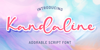 Kandaline Adorable Script font perfect for any creative design. This handmade font will make your design has a beautiful natural touch for each details. It is perfect for any design project as Invitation,logo, book cover, craft or any design purposes. This font is PUA encoded which means you can access all of the magical glyphs and swashes with ease! It also features a wealth of special features including alternate glyphs and ligatures.
 - Canoodle by Hanoded,
$17.00 To canoodle means to hug and kiss passionately. I leave the rest to your imagination. Canoodle is also a very adorable font - some would even go as far as calling it kissable. It is an all caps typeface, but upper and lower case differ and love to mix and match. I won’t guarantee a spot of canoodling if you use this font, but who knows, maybe you’ll get lucky. Canoodle speaks many tongues.
 - Yukura by CONNECRE,
$10.00 Yukura is a charming and approachable sans-serif font that combines cuteness and friendliness. This font features a plump shape that is perfect for designs aimed at children or with a cute aesthetic, and its bold lettering makes it especially suitable for logos and headlines. With its endearing and approachable qualities, Yukura can effortlessly infuse your designs with an irresistible charm. Don't hesitate to incorporate it into your designs and showcase its adorable personality.
 - Heart Of Mine by Epiclinez,
$18.00 Heart Of Mine is a fun and cute handwritten font that allows you to add an adorable touch to your projects. This font is perfect for the Valentine's Day season, but also for any other time of the year when you want to add a little love and warmth to your writing. So what’s included : Basic Latin Uppercase and Lowercase Numbers, symbols, and punctuations Multilingual Support. Simple Installations works on PC & Mac
 - PF Lindemann Sans by Parachute,
$49.00 Lindemann Sans is an immediately-inviting typeface with a pleasing distinct visual voice grounded by geometry and golden proportions. This modern geometric san serif typeface serves the interpretive needs of modern design through its legibility. This legibility is achieved through proportional balance of each letter based on the golden ratio, open counters, high x-height and wider individual shapes. In addition, a high level of legibility is arrived through distinctive glyphs like a, e, @, and f, which are engaging and add to Lindemann Sans visual voice. Being a modern, spirited, tech-savvy typeface, Lindemann Sans has many of the features demanded by today's designers. These features include 800 characters within each font, many ligatures, full numbers sets, small caps, alternative characters and other niceties found in opentype fonts. Due to Lindemann Sans high legibility, geometric sans tradition, and a large feature set list, it is a very versatile typeface and can be used in replacement of the more commonly used sans. Specifically, Lindemann Sans can be used by technology corporations, architectural firms in their supporting materials, in magazines as headers and key-points, as the typeface for professional keynotes, for the package design industry as a whole, in automotive concept projects, and for cosmetic branding for high class hair products. With its inviting nature it may also be used for liberal arts promotional materials. In addition, this typeface can be used by green industries because of its nature derived proportions. Each style and weight of Lindemann Sans adheres to the same geometric and golden proportions, however, each weight is innately noteworthy. For example, there is a charm that is found in the ultralight weight's elegant geometry and lights impressive use as oversized headlines. It shines with true clarity of vision with the book weight and the versatility of the medium. One cannot overlook the power and pacing of the bold and extra bold weights with its clear counters and restrained letter forms. Within Lindemann Sans family each weight has a distinctive role to play but stays true to its purpose.
 - Biome by Monotype,
$29.99 In the sketches that formed the basis for his typeface Biome, Crossgrove experimented with inner and outer shapes in different styles, adapted letters to the form of the super-ellipse, and added curves only to remove these again. His challenge was to find a harmonious and coherent approach that provided sufficient contrast with existing fonts. Biome is essentially in the sans serif tradition and the letters exhibit only minor variations in terms of line thickness. There is still a suggestion of the super-ellipse at many points, but this never becomes the predominant design factor. While most of the terminals of the vertical strokes are only slightly rounded, the horizontals and diagonals have pronounced arches and it is these that basically determine the round and soft character of the typeface. The more unconventionally shaped letters, such as the lowercase 'g' with its two semi-open counters and the 'k' and 'x' with their crossbars, provide Biome with an individual personality. And this effect is emphasized by the generously rounded links in the 'v' and 'w' and the uppercase 'M' and 'N'. Biome has been designed as a typeface super-family. From the near hairline Extra Light to the amply proportioned Ultra, there are seven clearly differentiated weights and three tracking widths. There are oblique italic versions of all variants. The range includes small caps and numeral sets containing lowercase and uppercase digits. With its available range of characters, Biome can be used to set texts in all Eastern European languages. Although the remarkable individuality of Biome is most clearly apparent in the larger point sizes, this typeface is not just suitable for producing headlines and logos. Biome's elegant visual effects mean that it is equally comfortable in short texts while its large x-height and generous counters make it readily legible even in the small font sizes. Biome is a contemporary typeface that employs mid-20th century futurist elements which ironically give it a retro feel.