7,306 search results
(0.038 seconds)
- Amderais by Sealoung,
$15.00 Give your typographic designs a touch of retro style with Amderais! Amderais is one of our 2022 fonts inspired by the famous retro typographic designs of the late 60s to 70s. This font has an extruded version so you can easily create retro effect fonts. This typeface is very suitable to be applied especially to logos, and various other formal forms such as invitations, labels, logos, magazines, books, greeting/wedding cards, packaging, fashion, make-up, stationery, novels, and labels or other types of fonts. advertising purposes. Feature : - upper & lower case - numbers and punctuation - multilingual - ligature - alternative - swashes - PUA encoded We highly recommend using a program that supports the OpenType feature and the Glyphs pane like many Adobe and Corel Draw applications, so that you can view and access all variations of Glyphs.
 - Achiever by Letterhend,
$19.00 Introducing, The Achiever- a unique display script with reverse contrast. The unusual reverse contrast make this typeface one of a kind. This type of font perfectly made to be applied especially in logo, and the other various formal forms such as invitations, labels, logos, magazines, books, greeting / wedding cards, packaging, fashion, make up, stationery, novels, labels or any type of advertising purpose. Features : uppercase & lowercase numbers and punctuation multilingual alternates and ligatures PUA encoded We highly recommend using a program that supports OpenType features and Glyphs panels like many of Adobe apps and Corel Draw, so you can see and access all Glyph variations. How to access opentype feature : letterhend.com/tutorials/using-opentype-feature-in-any-software/ Email us to letterhend@gmail.com if you need something! Happy Designing!
 - Midmoon Gothik by Andy Peat,
$10.00 About this font family Midmoon Gothik was designed for typesetting magazines and information-heavy publications; using simple, clean letterforms for clear communication but with enough character to make it enjoyful. The new lighter weights are a nice addition to the set allowing for finer control over the texture of the page. Features 4 weights; Hairline, Thin, Light and Regular. Multi language Ligatures: fi fl ij ffi ffl fb fj ff fk fh Numerals: tabbed lining, proportional lining, proportional oldstyle Fractions: ½, ¼, ¾, ⅛, ⅜, ⅝, ⅞ Symbols: ¶ § © ® ℗ ™ ° † ‡ ℮ ¢ ¤ $ € ₣ ₤ ₧ £ ₽ ¥ Maths: ⁼+−×÷=≠> Arrows: ↑↗→↘↓↙←↖↔↕ Capital spacing To be able to access alternative fonts, make sure the software you use can support opentype features such as Microsoft Word, Paint, Adobe, Corel draw, Cricut and other applications. Designed and published by Andy Peat. www.andypeat.com Released October 2022
 - Annette Bradford by Letterhend,
$22.00 Introducing, Annette Bradford - Ballpoint Signature Script. This typeface made from a natural ballpoint handwriting, so if you need digital signature or natural hand writing for quotes, this is the perfect typeface for you! This font perfectly made to be applied especially in logo, and the other various formal forms such as invitations, labels, logos, magazines, books, greeting / wedding cards, packaging, fashion, make up, stationery, novels, labels or any type of advertising purpose. Features : uppercase & lowercase numbers and punctuation multilingual ligatures alternates extra doodle (in glyphs panel) PUA encoded We highly recommend using a program that supports OpenType features and Glyphs panels like many of Adobe apps and Corel Draw, so you can see and access all Glyph variations. Email us to letterhend@gmail.com if you need something! Happy Designing!
 - Valegan by Letterhend,
$17.00 Introducing, Valegan Display Font, display font with a touch of vintage look and feel. This font duo is also perfectly made to be applied especially in logo, headline, signage and the other various formal forms such as invitations, labels, logos, magazines, books, greeting / wedding cards, packaging, fashion, make up, stationery, novels, labels or any type of advertising purpose. Features : Regular & Stamp Style uppercase & lowercase numbers and punctuation multilingual alternates / swashes and ligatures PUA encoded We highly recommend using a program that supports OpenType features and Glyphs panels like many of Adobe apps and Corel Draw, so you can see and access all Glyph variations. How to access opentype feature : letterhend.com/tutorials/using-opentype-feature-in-any-software/ Email us to letterhend@gmail.com if you need something! Happy Designing!
 - Winter Rosetta by Letterhend,
$19.00 Winter Rosetta is a pretty script font based on authentic hand writing with natural signature style with winter theme. It comes with floral / botanical hand drawn illustration object in vector. This type of font perfectly made to be applied especially in logo, and the other various formal forms such as invitations, labels, logos, magazines, books, greeting / wedding cards, packaging, fashion, make up, stationery, novels, labels or any type of advertising purpose. Features : uppercase & lowercase numbers and punctuation multilingual alternates and ligatures swashes PUA encoded free ornament vector We highly recommend using a program that supports OpenType features and Glyphs panels like many of Adobe apps and Corel Draw, so you can see and access all Glyph variations. How to access opentype feature : letterhend.com/tutorials/using-opentype-feature-in-any-software/
 - Abigale by Hustletter Studio,
$15.00 Abigale was built with OpenType features and includes beginning and ending swashes, heart / love swashes, numbers, punctuation, alternates, ligatures and it also supports other languages :) Say hello to Abigale - A font that you were meant to find, and is now destined to be with you :) Abigale is a lovingly handwritten script , with an air of grace and flamboyancy. Abigale is special in that one word can be written in a many different ways - thanks to the large selection of extra letters that it has built in. To access all the extra characters , Opentype capable software is recommended - most apps support Opentype features now days. The alternates are accessible by turning on 'Stylistic Alternates' and 'Ligatures' buttons on in Photoshop's Character panel, or via any software with a glyphs panel, e.g. Adobe Illustrator, Photoshop CC, Inkscape.
 - Logirent by Letterhend,
$17.00 Logirent is a unique typeface which is speciality made for a logotype. The customized ligatures is what makes this font unique. This type of font perfectly made to be applied especially in logo, headline, signage and the other various formal forms such as invitations, labels, logos, magazines, books, greeting / wedding cards, packaging, fashion, make up, stationery, novels, labels or any type of advertising purpose. Features : numbers and punctuation ligatures multilingual alternates / swashes and ligatures PUA encoded We highly recommend using a program that supports OpenType features and Glyphs panels like many of Adobe apps and Corel Draw, so you can see and access all Glyph variations. How to access opentype feature : letterhend.com/tutorials/using-opentype-feature-in-any-software/ Email us to letterhend@gmail.com if you need something! Happy Designing!
 - Daisy Rider by Blythe Green,
$13.00 Daisy Rider is a handcrafted, mixed-case, semi-script font with an authentic feel and lots of extras! It's perfect for: logos, branding, wedding invitations, business cards, greeting cards, posters, magazines, social media, planners, prints, and more. NOTE: Since this is a semi-script font, I programed Daisy Rider with many alternate characters and ligatures that ensure the characters work seamlessly together (unlike what you're seeing with the sample text on My Fonts). See the sample images for reference. Once you download the file, you can access these features through any Open Type program such as Adobe Creative Suite, Microsoft Word, etc. FEATURES: 60 ligatures to help make your type look as handwritten as possible Alternate characters to give a unique touch to each word Multilingual accents + characters
 - The Dorrington by Letterhend,
$17.00 The Dorrington is a font trio package contain a monoline script and sans serif which looks great to be paired especially for vintage and adventure theme! This font trio is purposely made for headline, display or logotype, and signature which need a standout appearing. This font is also suitable to be applied especially in logo, and the other various formal forms such as invitations, labels, logos, magazines, books, greeting / wedding cards, packaging, fashion, make up, stationery, novels, labels or any type of advertising purpose. Features : 2 Monoline Script Font and 1 Sans serif font uppercase & lowercase numbers and punctuation multilingual alternates & ligatures PUA encoded We highly recommend using a program that supports OpenType features and Glyphs panels like many of Adobe apps and Corel Draw, so you can see and access all Glyph variations.\
 - Mellios by Keristyper Studio,
$14.00 Mellios is a modern semi-script font that combines elegant calligraphy with a contemporary twist. With its smooth and flowing curves, Mellios is perfect for adding a touch of sophistication to your designs. Whether you're creating invitations, logos, or social media graphics, Mellios is sure to impress. Its versatility makes it suitable for a wide range of projects and purposes, from branding to editorial design. With Mellios, you can elevate your designs and create a memorable impression. Featured: Standard, Uppercase & Lowercase Numeral & Punctuation Multilingual : ä ö ü Ä Ö Ü ß ¿ ¡ Alternate & Ligature PUA encoded We recommend programs that support the OpenType feature and the Glyphs panel such as Adobe applications or Corel Draw, so you can use all the variations of the glyphs. Hope you enjoy our fonts!
 - ITC Jambalaya by ITC,
$29.99The talented designer of the well-known Formata typeface, Bernd Möllenstädt was born on February 22, 1943 in Germany. He has lived in Westfalia, Berlin and Munich, Germany, and now permanently resides in Munich. From his earliest years he was interested in typography, first studying as a typesetter (1961-64) and then a student of graphic design (1964-1967). In 1967 Möllenstädt joined the Berthold typefoundry and his career as one of the leading type personalities began. One year after joining Berthold, he became the head of the type design department. For 22 years he worked as the head of that department, under the leadership of Günter Gerhard Lange. Upon Lange’s retirement in 1990, Möllenstädt ascended to the type directorship of Berthold where he was responsible for type design and font mastering. Möllenstädt designed two typeface for the Berthold Exklusiv Collection, Formata (1988) and Signata (1994). Under license from Berthold, Adobe marketed Formata as part of the Adobe Type Library. Formata is now one of the most successful sans serifs in the world, used both in American and European magazines, as well as newsletters in the Far East (Gulf New Kuwait). Formata also was chosen as the corporate typeface of Postbank, Allianz, VW Skoda, Infratest Burke, etc. In addition to his work for Berthold, Möllenstädt has lectured at local Munich schools on typography and graphic design, and designed corporate type identities and diverse logos for major corporations, including Allianz, Commerzbank, Mauser Officer and Hoepfner. Möllenstädt continues his association with Berthold as a designer. He most recently completed small caps and fractions for Formata. He also has substantially contributed to Berthold's Euro symbol program (e.g. adding the Euro symbol design-specific to the most popular families). Möllenstädt currently is working on a new Berthold Exklusiv design. - Elly Sandeo Cyrillic by Ira Dvilyuk,
$21.00 The Elly Sandeo Cyrillic font is a handwritten calligraphic wedding script font with. It is the font pair with will be the best option for branding, logos, wedding invitations, social media, packaging, business cards, DIY projects, social media, and many others. Elly Sandeo Latin part contains a full set of uppercase and lowercase letters. Also, lowercase letters have 6 sets of variable flourishes with teils. To make a needed form type a letter with a number such as a1, a2, a3, a4... b1, b2, b3... c1, c2, c3...after that select the word and apply the Open Type Features in programs such as Adobe Illustrator, Photoshop, and others And 17 ligatures can be used to create a handwritten calligraphy look. The Cyrillic part of the font contains uppercase letters and 2 complete sets of lowercase letters, (standard, and final form. To make a needed form type a letter with a number such as a1, a2, a3, a4... б1, б2, б3... в1, в2, в3... After that select the word and apply the Open Type Features in programmes such as Adobe Illustrator, Photoshop, and others) The Elly Sandeo Symbols is a font with 26 hand-drawn elements and swashes that can help you to make your design unique and matchless. just use A-Z and a-z keys in the included Symbols font. A different symbol is assigned to each uppercase or lowercase standard character, so you do not need graphics software, just type the letter you need. Multilingual Support for 33 languages: Latin glyphs for Afrikaans, Albanian, Basque, Bosnian, Catalan, Danish, Dutch, English, Estonian, Faroese, Filipino, Finnish, French, Galician, Indonesian, Irish, Italian, Malay, Norwegian Bokmål, Portuguese, Slovenian, Spanish, Swahili, Swedish, Turkish, Welsh, Zulu. And Cyrillic glyphs support Russian, Belorussian, Bulgarian, Ukrainian, and Kazakh languages.
 - Compatil Fact by Linotype,
$50.99Compatil is the first comprehensive type system which enables all typographical elements to be used to full effect in order to reproduce the message conveyed by text information. Four different type styles with a total of 16 weights including italics have been merged into a unique typographical network. There are now no limits to the font user's creativity. The system is a product of technical innovation and constitutes a new design approach which meets the highest aesthetic standards. For almost two years, a team of experts from Linotype has been working with initiator Professor Olaf Leu under the direction of Silja Bilz, Erik Faulhaber and Reinhard Haus to create the Compatil type system. Despite the Internet and TV, it is essential today to be able to absorb information quickly by being able to read it with ease. A fact that is becoming increasingly important both on-screen and on paper. It is the role of the font to increase legibility and to ensure typographically perfect results for text design work. The new Compatil type system meets all these needs. The Compatil is a part of the Platinum Collection. The following four different styles are available: Compatil Exquisit, Compatil Fact, Compatil Letter and Compatil Text. Compatil is available in various font formats: 16 separate OT Pro fonts including the small caps and Adobe Central European character set for OpenType-supporting applications like Adobe InDesign, or as 32 separate OpenType Com fonts for office communication, with the following special features: 1. Optimized display capabilities for computer screens eXcellent Screen Fonts (XSF-quality). 2. An extended, international character set, which supports 48 different languages for Microsoft Office applications like MS Word or as 64 PostScript fonts, which can be used in non-OpenType-supporting applications like Quark XPress. - Apple Pie by FontMesa,
$25.00 You might call this a Bodoni Ornate font that Bodoni never made, close examination of this old 1800s font and it's plain to see that the top half of the letters is very Bodoni in appearance. Apple Pie is a revival of and old font from the William Hagar Type Foundry, which I've been able to date back to 1850. The William Hagar type specimen book from the 1850s only shows this font as a caps only typeface plus numbers, later in 1869 MacKellar Smiths and Jordan offered this font with a lowercase. Over a two year period I was able to collect enough letters to begin production of this old decorative font, the type specimen books only showed a small line of text for this font so I would search through old documents on eBay and also shows relating to Ephemera. I could have easily developed a new font based on a very small sample of letters but I wanted to wait and find as many letters as possible, I was unable to find the Q, X, Z and ten lowercase letters so those missing letters are of my own design. New to this font is the addition of an all Caps Greek character set, accented letters for Eastern Central and Western European countries is also within this font. Fill fonts are available for the Apple Pie font, you will need an application that works in layers such as Adobe Photoshop, Adobe Illustrator or Corel Graphics in order to use the Fill fonts. Some Fill fonts may be used as stand alone fonts but the versions for Apple Pie look best when layered behind the parent or main Apple Pie fonts. Be sure to check out the left and right hands located on the Less Than and Greater Than keys.
 - Compatil Fact Paneuropean by Linotype,
$103.99Compatil is the first comprehensive type system which enables all typographical elements to be used to full effect in order to reproduce the message conveyed by text information. Four different type styles with a total of 16 weights including italics have been merged into a unique typographical network. There are now no limits to the font user's creativity. The system is a product of technical innovation and constitutes a new design approach which meets the highest aesthetic standards. For almost two years, a team of experts from Linotype has been working with initiator Professor Olaf Leu under the direction of Silja Bilz, Erik Faulhaber and Reinhard Haus to create the Compatil type system. Despite the Internet and TV, it is essential today to be able to absorb information quickly by being able to read it with ease. A fact that is becoming increasingly important both on-screen and on paper. It is the role of the font to increase legibility and to ensure typographically perfect results for text design work. The new Compatil type system meets all these needs. The Compatil is a part of the Platinum Collection. The following four different styles are available: Compatil Exquisit, Compatil Fact, Compatil Letter and Compatil Text. Compatil is available in various font formats: 16 separate OT Pro fonts including the small caps and Adobe Central European character set for OpenType-supporting applications like Adobe InDesign, or as 32 separate OpenType Com fonts for office communication, with the following special features: 1. Optimized display capabilities for computer screens eXcellent Screen Fonts (XSF-quality). 2. An extended, international character set, which supports 48 different languages for Microsoft Office applications like MS Word or as 64 PostScript fonts, which can be used in non-OpenType-supporting applications like Quark XPress. - Compatil Letter by Linotype,
$50.99Compatil is the first comprehensive type system which enables all typographical elements to be used to full effect in order to reproduce the message conveyed by text information. Four different type styles with a total of 16 weights including italics have been merged into a unique typographical network. There are now no limits to the font user's creativity. The system is a product of technical innovation and constitutes a new design approach which meets the highest aesthetic standards. For almost two years, a team of experts from Linotype has been working with initiator Professor Olaf Leu under the direction of Silja Bilz, Erik Faulhaber and Reinhard Haus to create the Compatil type system. Despite the Internet and TV, it is essential today to be able to absorb information quickly by being able to read it with ease. A fact that is becoming increasingly important both on-screen and on paper. It is the role of the font to increase legibility and to ensure typographically perfect results for text design work. The new Compatil type system meets all these needs. The Compatil is a part of the Platinum Collection. The following four different styles are available: Compatil Exquisit, Compatil Fact, Compatil Letter and Compatil Text. Compatil is available in various font formats: 16 separate OT Pro fonts including the small caps and Adobe Central European character set for OpenType-supporting applications like Adobe InDesign, or as 32 separate OpenType Com fonts for office communication, with the following special features: 1. Optimized display capabilities for computer screens eXcellent Screen Fonts (XSF-quality). 2. An extended, international character set, which supports 48 different languages for Microsoft Office applications like MS Word or as 64 PostScript fonts, which can be used in non-OpenType-supporting applications like Quark XPress. - Inkarus by Scratch Design,
$10.00 Introducing Inkarus a playful font with a bold and all uppercase characters style. This font is perfect for posters designs, packaging, logotype, title, label, print ads, gift card, magazine title, movie title, sign, and the beautiful and curvy shape will give your designs that alternative look to your creative work looks innovative. Amazing curvy was hand-drawn and make the outlines look irregular and beautiful. This font has a lot of hand-lettered looks and the characters give a retro or urban feel. Inkarus has a serif style but can collaborate with sans-serif style together because the modern bold sans serif typeface has been the alternatives and ligatures of this font. Combine that bold shapes together will make your work a more unique, retro attitude. Ligatures Inkarus has 32 ligatures that you can turn on via the glyphs panel in Adobe applications. The ligatures make a innovative difference in the look of this font. It switches out between serif and sans serif styles that make your designs look still unity. Opentype The Alternatives and Ligatures use OpenType features. First, you will need a design app to access these options an application such as Adobe Photoshop, Illustrator, or InDesign. Alternatives All lowercase a,d,e,h, I, j,k,l,m,n, p,r, t, r you can switch out letters for other and makes your design look more like hand-lettering and innovative although you using in a repetitive way. Inkarus font includes; All uppercase characters 32 ligatures option Support for multi-languages characters Punctuation, Symbols, and Numbers Alternative lowercase characters ( a,d,e,h, I, j,k,l,m,n, p,r, t, r ) The font format is OTF So what you are waiting for? Grab it fast this font and make your innovative design. If you have any questions drop me a message.
 - Compatil Text by Linotype,
$50.99Compatil is the first comprehensive type system which enables all typographical elements to be used to full effect in order to reproduce the message conveyed by text information. Four different type styles with a total of 16 weights including italics have been merged into a unique typographical network. There are now no limits to the font user's creativity. The system is a product of technical innovation and constitutes a new design approach which meets the highest aesthetic standards. For almost two years, a team of experts from Linotype has been working with initiator Professor Olaf Leu under the direction of Silja Bilz, Erik Faulhaber and Reinhard Haus to create the Compatil type system. Despite the Internet and TV, it is essential today to be able to absorb information quickly by being able to read it with ease. A fact that is becoming increasingly important both on-screen and on paper. It is the role of the font to increase legibility and to ensure typographically perfect results for text design work. The new Compatil type system meets all these needs. The Compatil is a part of the Platinum Collection. The following four different styles are available: Compatil Exquisit, Compatil Fact, Compatil Letter and Compatil Text. Compatil is available in various font formats: 16 separate OT Pro fonts including the small caps and Adobe Central European character set for OpenType-supporting applications like Adobe InDesign, or as 32 separate OpenType Com fonts for office communication, with the following special features: 1. Optimized display capabilities for computer screens eXcellent Screen Fonts (XSF-quality). 2. An extended, international character set, which supports 48 different languages for Microsoft Office applications like MS Word or as 64 PostScript fonts, which can be used in non-OpenType-supporting applications like Quark XPress. - Zapfino Extra Paneuropean by Linotype,
$103.99ZapfinoExtra is an OpenType format typeface available in two versions. The Contextual version contains a treasure-trove of extra contextual features. When created in 2004, this was the most advanced OpenType font released to date. By purchasing the Contextual version, users of OpenType-supporting applications, such as Adobe InDesign, may access all of the features available in the entire Zapfino family through just two fonts, Zapfino Extra LT Pro (Contextual), and Zapfino Forte LT Pro! Unfortunately, most non-Adobe applications currently do not support the contextual features made possible by recent OpenType developments. Users of Quark XPress and Microsoft Office should instead purchase all of the non-contextual fonts of Zapfino Extra Pro family, in order to access all of the Zapfino family's 1676 glyphs. The Zapfino family's character set supports 48 western and central European languages. More Zapfino History: Today's digital font technology allowed the world-renowned typeface designer/calligrapher Hermann Zapf to finally realize a vision he first had more than fifty years ago: creating a typeface that could capture the freedom and liveliness of beautiful handwriting. The basic Zapfino™ font family, released in 1998, consists of four alphabets with many additional stylistic alternates that can be freely mixed together to emulate the variations in handwritten text. In 2003, Herman Zapf completely reworked the Zapfino design, creating Zapfino™ Extra. This large expansion of the Zapfino family was designed in close collaboration with Akira Kobayashi. Zapfino™ Extra includes a cornucopia of new characters. It features exuberant hyper-flourishes, elegant small caps, dozens of ornaments, more alternates and ligatures, index characters, and a very useful bold version-named Zapfino™ Forte. Use Zapfino to produce unusual and graceful advertisements, packaging, and invitations. Zapfino Extra is so joyously abundant that it's tempting to over-indulge, so be sure to check out the tips for working well with the possibilities!" - Negaroa by Ardyanatypes,
$15.00 Negaroa comes with an aesthetic style, and the serif-type tagline is modern and elegant. This font comes in eight thickness levels, from thin to black to suit your needs. Negaroa is also equipped with the latest professional characteristics that can present an elegant and attractive identity for your company or project for business purposes. It goes well with modern serifs and scripts depicted or stand firm as a title and brand representative for an elegant look. Negaroa also comes with multiple languages, making it easy to use for any country and language use. It also comes with alternative Ligatures and styles to make your designs more attractive. Negaroa is suitable for branding projects and various design purposes such as business cards, name tags, uniforms as a brand enhancement. Advertisements, posters, invitations, branding, logos, magazines, merchandise, presentations, etc. Supports languages: Afrikaans, Albanian, Asturian, Asu, Azerbaijani, Basque, Bemba, Bena, Bosnian, Breton, Catalan, Chiga, Colognian, Cornish, Croatian, Czech, Danish, Dutch, Embu, English, Esperanto, Estonian, Faroese, Filipino, Finnish, French, Friulian, Galician, German, Gusii, Hungarian, Icelandic, Igbo, Indonesian, Irish, Italian, Kabuverdianu, Kalaallisut, Kalenjin, Kamba, Kikuyu, Kinyarwanda, Latvian, Lithuanian, Low German, Lower Sorbian, Luo, Luxembourgish, Luyia, Machame, Makhuwa-Meetto, Makonde, Malagasy, Malay, Maltese, Manx, Meru, Morisyen, North Ndebele, Norwegian Bokmål, Norwegian Nynorsk, Nyankole, Oromo, Polish, Portuguese, Quechua, Romanian, Romansh, Rombo, Rundi, Rwa, Samburu, Sango, Sangu, Scottish Gaelic, Sena, Shambala, Shona, Slovak, Slovenian, Soga, Somali, Spanish, Swahili, Swedish, Swiss German, Taita, Teso, Turkish, Turkmen, Upper Sorbian, Vietnamese, Vunjo, Walser, Welsh, Western Frisian, Yoruba, Zulu A guide to accessing all alternatives can be read at http://adobe.ly/1m1fn4Y Adobe Photoshop go to Window - glyphs Adobe Illustrator go to Type - glyphs Features: A – Z Character Set a – z Characters set Numerals & Punctuations (OpenType Standard) Multilingual Thank you and have a nice day
 - Blessed Efforts by Epiclinez,
$18.00 This playful display font has a handwritten style that's perfect for any project. Get ready for eye-catching headlines and adorable quotes with this fun typeface! You can even use it for logo designs or scrapbooking projects! So what’s included : Basic Latin Uppercase and Lowercase Numbers, symbols, and punctuations Ligatures Multilingual Support. PUA Encoded and fully accessible without additional design software Simple Installations works on PC & Mac Thank You and Happy Designing!
 - Kandaline by Almarkha Type,
$25.00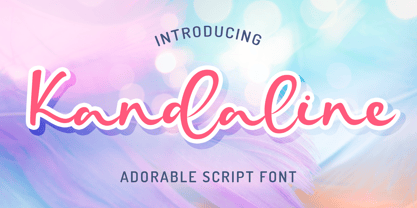 Kandaline Adorable Script font perfect for any creative design. This handmade font will make your design has a beautiful natural touch for each details. It is perfect for any design project as Invitation,logo, book cover, craft or any design purposes. This font is PUA encoded which means you can access all of the magical glyphs and swashes with ease! It also features a wealth of special features including alternate glyphs and ligatures.
 - Canoodle by Hanoded,
$17.00 To canoodle means to hug and kiss passionately. I leave the rest to your imagination. Canoodle is also a very adorable font - some would even go as far as calling it kissable. It is an all caps typeface, but upper and lower case differ and love to mix and match. I won’t guarantee a spot of canoodling if you use this font, but who knows, maybe you’ll get lucky. Canoodle speaks many tongues.
 - Yukura by CONNECRE,
$10.00 Yukura is a charming and approachable sans-serif font that combines cuteness and friendliness. This font features a plump shape that is perfect for designs aimed at children or with a cute aesthetic, and its bold lettering makes it especially suitable for logos and headlines. With its endearing and approachable qualities, Yukura can effortlessly infuse your designs with an irresistible charm. Don't hesitate to incorporate it into your designs and showcase its adorable personality.
 - Meritocracy by Up Up Creative,
$29.00 Introducing Meritocracy, a full-featured handwritten font with tons of alternate characters and OpenType features. My goal with this font was to make you a typeface that will look as much like hand lettering as possible. Using the built-in OpenType pseudo-random contextual alternates and over 300 individually drawn ligatures, you can infuse your typography with personality and variety.** OpenType Features Meritocracy comes with more than 900 glyphs! Specific OpenType features include contextual alternates, stylistic alternates, a second stylistic set for variety, multiple alternate glyphs for many letters (accessed through the glyphs panel), multilingual support (including multiple currency symbols), standard numbers, and seven ampersand styles. It also includes 325+ standard and discretionary ligatures, all of them individually hand-drawn to be different from all other glyphs in the font. These ligatures allow you to give a super-realistic hand-lettered look to your typography. You can write the same word in so many different ways if you combine the default set, stylistic set 01, and standard and discretionary ligatures in different ways. SPECIAL OPENTYPE FEATURE: If you are using OpenType-capable software like Adobe Illustrator, Photoshop, InDesign, or CorelDraw and you have contextual alternates turned on, you can see the letters randomize themselves as you type, mixing from the default character set and stylistic set 01. (You can always turn on contextual alternates after you have already typed your passage and it will randomize all at once, or you can choose to turn off contextual alternates and substitute specific glyphs yourself - I find that if I'm typing a word or two, I prefer to control the individual glyphs myself; if I'm typing a paragraph, I like to use the built-in randomness of the contextual alternates feature). Note that this pseudo-randomization (aka contextual alternate feature) is ON by default in Apple's Pages app and OFF by default in Microsoft Word, but it can be turned on. The OpenType features can be very easily accessed by using OpenType-savvy programs such as Adobe Illustrator and Adobe InDesign. (To access most of these awesome features in Microsoft Word, you'll need to get comfortable with the advanced tab of Word's font menu. If you have questions about this, ask me!) Files included: Meritocracy-Regular.otf Please note: there is only one file for this font. That's the magic of OpenType - all of the alternates, ligatures, etc. are built right into the .otf file! Mail support : julie@upupcreative.com --- Find inspiration (and sneak peeks at my next font-in-progress) on - Instagram: http://instagram.com/julieatupupcreative - Facebook : https://www.facebook.com/upupcreative - Pinterest: https://www.pinterest.com/upupcreative - My website: http://upupcreative.com --- **PLEASE ENJOY! I can't wait to see what you make with Meritocracy! Feel free to use the #upupcreative and #meritocracyfont tags to show me what you've been up to!**
 - Kis Classico by Linotype,
$29.99Kis Classico™ is named after the Hungarian monk Miklós Kis who traveled to Amsterdam at the end of the seventeenth century to learn the art of printing. Amsterdam was a center of printing and punchcutting, and Kis cut his own type there in about 1685. For centuries, Kis's type was wrongly attributed to Anton Janson, a Dutch punchcutter who worked in Leipzig in the seventeenth century. Most versions of this type still go by the name Janson. In 1993, the Italian/Swedish type designer Franko Luin completed Kis Classico, his own contemporary interpretation of the Kis types. About the Kis/Janson story, Luin says: If you understand Hungarian I recommend you read the monograph, 'Tótfalusi Kis Miklós' by György Haiman, published in 1972 by Magyar Helikon. It has hundreds of reproductions from his Amsterdam period and from the time when he was an established printer in Kolozsvár (today's Cluj in Romania)." Kis Classico has five weights, and is an admirable version of this classic type. - HWT Arabesque by Hamilton Wood Type Collection,
$24.95 A long lost Art Nouveau wood type from the Hamilton Museum Collection evokes the excesses of Victorian design and the equally quirky 1960s Psychedelic era revival of the Victorian type styles. Free flowing organic designs that flourished with Art Nouveau in the late 1800s were directly referenced and further distorted with with phototype in the late 1960s. This design, known as Arabesque, was produced by the Morgans & Wilcox Co. and the Wm. Page Co. as almost identical designs. Both manufacturers were acquired by Hamilton and offered briefly by Hamilton as design #618. This curious wood type defies most of the basic tenets of type design and what comes to mind when one thinks "wood type". Many characters have a lively eccentricity that were all left true to the original design. Additional characters were designed to fill out the standard range of characters found in digital fonts. This font includes over 280 characters for full unicode support of Western and Central European Latin characters.
 - Tita Script by Latinotype,
$59.00 Tita is dedicated to my grandmother Hebe, witty and arrabalera 1. The font is inspired by Milonga 2 music and the fileteado porteño 3. I picture it at The Moulin Rouge, sparkling, provocative, loving. It evokes Tita Merello and my grandmum singing her music. Tita is Argentinean to its very core. A font to shout goal and dulce de leche 4 with passion! Its curves originate from polirhythmic calligraphy, which I learnt from my mentor Silvia Cordero Vega. Tita is a pedigree script that is based on hand lettering and Sandra Biondi’s calligraphy works. Font digitalisation by Daniel Hernández. Edited by Javier Quintana / Programmed by Manuel Corradine. 1. A person from the arrabal (a working class neighborhood on the outskirts of the city of Buenos Aires) 2. Musical genre originated in the Río de la Plata areas of Argentina and Uruguay 3. Decorative hand lettering and artistic style that is frequently spotted in Buenos Aires 4. Sweet milk sauce
 - Ghost Town by Comicraft,
$19.00 The Gold Rush is over, the prospectors have made their fortune and the mine has been worked out! The inhabitants of Boomtown USA have moved on -- the saloon is dry, the sheriff has hung his hat and the only visitors to the local whorehouse are tumbleweeds. Yeah, the buildings remain -- hollowed out husks carrying memories of bar room brawls, high noon shootouts and high stake poker games between outlaws -- but if you take a walk down the street be careful not to kick up too much dust... Turn the corner and you might see Ol' Toothless Joe standing on the corner sucking on a bottle of whiskey... And don't walk too slowly past the storefront of the undertaker -- that guy made his living putting strangers like you in a wooden overcoat from sunrise to sundown. Spooks and Spectres linger everywhere... there's a sign just down the road -- didn't you see it? "Ghost Town! Abandon Hope all who Enter Here!"
 - Baro B by Our House Graphics,
$15.00 Baro is a powerful, fun and expressive font, great for loud, cheerful and super-fat headlines and packaging for odd novelty toys. With its bold and distinctive stylized geometric forms, it is ideal for logos, heavy machinery and wacky party invites. Baro had its beginning in a handful of rigidly geometric uppercase letters from an unidentified 1960�s or 70�s era press-down lettering font, which in turn was possibly a revival of a 20�s era Art Deco font. The exercise quickly expanded into a complete typeface with 300+ characters, including several catch words (word glyphs), stylistic alternates, discretionary ligatures, multilingual support and both lining and old style numerals. Baro maintains much of the characteristic geometric rigidity of the original handful of letters, but � With the addition of just a little bit of flare, a bit of cheerfulness breaks through, like a wink and a smile on the face of a fat and otherwise stern policeman.
 - Omni Serif by ArtyType,
$29.00 Typefaces don't simply appear fully formed to a designer, even with a clear concept in mind, they evolve naturally during the design & development process. Out of the current 'Artytype' collection, Omni has evolved the most, being a stripped back off-spring from several exploratory exercises. At first glance and particularly at small scale, you'd be forgiven for thinking the basic characteristics have a conventional outlook; but on closer inspection, it's own distinctive, clean cut, subtle styling becomes apparent, revealing enough personality to stand alone or complement a wide variety of projects; subsequently, it's a font that won't go out of style quickly and may even become a modern classic in time. The Omni family has 2 distinct styles, sans and serif, each style being available in 4 weights; all 8 fonts have slanted options to match making a total of 16 fonts. Dictionary definition of OMNI: Combining form - Of all things, in all ways or places. Quite an apt name for a font with ubiquitous aspirations.
 - Cadmium by AVP,
$- Cadmium has a comprehensive latin character set and many Opentype features to enhance text, including small capitals, case-sensitive forms, superscript and subscript. Plenty of numeral variants include old-style figures, lining figures and fractions. Default numerals are proportionally spaced. Alternative styles for a handful of key characters provide some useful variations where stylistic sets can be implemented. The fonts are presented as four width-based sub-families: Expanded, Normal, Condensed and Compressed. Each width has a matching range of six weights and italics (obliques). Regular and Bold weights are style-linked, together with their respective oblique forms. Each width differs in its basic construction but all fonts share the same vertical metrics and may be used in combination with each other. Letter spacing is optimised for text sizes but is tolerant of significant tracking changes. Cadmium is good for signage, publicity and packaging, screen credits and titling, general print and publication, as well as web and screen applications.
 - Gravitica Mono by Ckhans Fonts,
$34.00 Features: • Support for 28 languages: Afrikaans Albanian Catalan Croatian Czech Danish Dutch English Estonian Finnish French German Hungarian Icelandic Italian Latvian Lithuanian Maltese Norwegian Polish Portugese Romanian SlovakSlovenian Spanisch Swedish Turkish Zulu Swedish Turkish Zulu • Contains OpenType features with alternates or substitutes • Tabular Figures • Ordinal numbers • 74 icons (It will keep updating.) • 72 graphic patterns for designer (It will keep updating.) • 28 brand symbols (It will keep updating.) • 27 arrows glyphs • 0-99 line circled glyphs • 0-99 solid circled glyphs • A-Z line circled glyphs • A-Z solid circled glyphs Gravitica Mono family consists of 18 styles (6 weights, 6 Italics, 6 Icons), in each of which there are more than 508+ glyphs. In the typeface, each weight includes extended language support, fractions, tabular figures, arrows, ligatures and more. Perfectly suited for graphic design and any display use. Useful links: Gravitica PDF Type Guide and Specimen (You can know how to use icons and arrows, other glyphs.)
 - Empirical by Type Associates,
$32.50 When I first approached this design back in 2003 I wrote myself a design brief that called for a simple sans serif "avec serifs" (with serifs). Its emphasis needed to be on text usage but to be at home in display sizes. A range of weights with a controlled step from one weight to the next, uniform character sets, spacing and kerning throughout the range. Attention to openness of counter spaces would be paramount to work in text sizes. Matching italics should be true italics not merely slanted - with a cursive feel. During extensive testing I decided to include a suite of ligatures to eliminate the hairline gaps that occur between slab serifs at display sizes. The user may activate "Discretionary Ligatures" or "Stylistic Set 1" for ligatures that are not included in the Standard Ligatures (ff, fi, fl, ffi and ffl). A concise User Guide can be downloaded at this link.
 - Reverse Vintage by Din Studio,
$29.00 Choosing fonts for design projects can be an endless task to do because there’s thousands of fonts out there all that you could use. Wait no more, we will give you the best choice. Reverse Vintage-A Display Font The Reverse Vintage aims to bring out a modern and stylish view. This font is made specifically designed to fit a variety of different content needs and projects. Everything’s well with cursive! The curvature of the Reverse Vintage was fully thought out to easily meld inside your designs. These fonts make a good foundation of what you want it to be. Show your opulence and decadence with this fancy font and blow your audience’s mind away as you put these cursive letters in your projects. Reverse Vintage includes Multilingual Support to make your branding reach a global audience. Features: Ligature Stylistic Alternates Swashes PUA Encoded Numerals and Punctuation Thank you for downloading premium fonts from Din Studio
 - Marlin Soft by FontMesa,
$25.00 Marlin Soft is a rounded corner version of our Marlin Geo font family and like its parent font also includes two sets of italics. The standard italic is set at twelve degrees and the slant version set at six degrees, the slant version is perfect for signage and headlines where you may want the look of an italic but are limited on horizontal space. Marlin Soft includes many alternates which may be accessed using opentype aware applications, with over three hundred alternates to choose from your creative possibilities are great. Whether you're looking for a round dot or a square dot Marlin Soft is one font family that delivers both set up as two separate fonts so you may change a whole page of text at one time. Your projects are sure to look nice and cozy with the warm feeling Marlin Soft will bring to your product label or page design. Three free sample basic fonts are available which are fully functional minus the alternates.
 - Optika by Designova,
$15.00 The design concept of OPTIKA is inspired by our all-time best-selling typeface NORD Optika is a minimal and modern Sans-Serif typeface that makes your designs stand out from the crowd. Optika is an all-purpose typeface, a perfect choice for creating logotypes, branding, headlines, corporate identities, and marketing materials for web, digital & print alike. The typeface will be a great option for branding, logo/logotype design projects, marketing graphics, banners, posters, signage, corporate identities and editorial design. Adding extra letter spacing will make this font the perfect choice for minimal headlines and logotypes, as shown in the promo designs attached. Handcrafted and designed with powerful OpenType features in mind, each weight includes extended language support with Western European, Central European and South Eastern European sets. A total of 394 glyphs are available. Optika typeface includes 14 fonts in total, with seven upright weights (Thin / Light / Regular / Medium / Bold / Heavy) and Italic equivalents of all seven weights.
 - Marmellata Jar 01 by Fontscafe,
$39.00 When you think of marmalade or jam (that’s Marmellata in Italian), images of a happy breakfast table are conjured up into the mind, with of course the unforgettable emotive response accompanied. These emotions are exactly what our Marmellata fonts can conjure up for your designs as well (we agree, nothing can beat marmalade on a hot toast)! Our Jar 1 is ideal for all designs where you need to send across a feeling of care, childhood, comfort, motherhood or friendship...amongst all those ideas you will get on your own! With that classic breakfast table feel, you are sure to connect on a very comforting level with all those who view your designs using these fonts. May we suggest, these fonts go very well with unusually dull colours, and can add a spark of life to the most mundane of words! Try getting a taste of our Jar 2 if you want even more of the classic taste (sorry, touch!).
 - Sales Pitch JNL by Jeff Levine,
$29.00 Have you ever wanted to set a headline within a burst, but found the drawing of all of those angles was a bit too tedious? Sales Pitch JNL solves that problem by setting letters, numbers and punctuation inside individual sections which, when typed out, generates an extended burst pattern. For a flat sided pair of end caps, use the left or right bracket keys. For burst ends, use the left or right brace keys. A blank space is located on the equal sign keystroke, and a wider blank space is on the plus sign. Keep in mind the optical illusion in some program that shows line gaps between characters on the screen. All characters have equal sidebar settings, and are flush with each other. Sales Pitch JNL contains the basic A-Z and 0-9 characters as well as numerous punctuation. For a companion font with a more complete character set, use Prankster JNL, the same type design, but without the burst pattern.