10,000 search results
(0.064 seconds)
- MC Thesh by Maulana Creative,
$16.00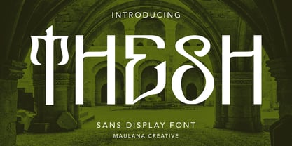 Thesh is a modern Decorative Display font. Bold stroke, fun character with a bit of ligatures and alternates. To give you an extra creative work. Thesh font support multilingual more than 100+ language. This font is good for logo design, Social media, Movie Titles, Books Titles, a short text even a long text letter and good for your secondary text font with script or serif. Make a stunning work with Thesh font. Cheers, Maulana Creative
 - Cenios by Craft Supply Co,
$15.00 Presenting Cenios: An expanded sans-serif font that ushers in a new era of design. With its generously spaced letterforms and contemporary charm, Cenios injects a fresh modernity into your projects. Embrace the broadened possibilities with Cenios' expansive style, perfect for making bold statements and maximizing visual impact. This typeface is ideal for greeting card, packaging, brand identity, poster, or any purpose to make your design project look eye catching and trendy.
 - Quickstep by Holland Fonts,
$30.00The Quickstep Bold, a 'quick' font, originally made for the 25th anniversary of SSP Printing Co. in Amsterdam. First used for an intro spread of a Brian Eno quote in Wired Magazine (#3.05, May 1995): "The problem with computers is that they don't have enough Africa in them. What's pissing me off is that they use so little of my body". For a less outspoken expression, the Quickstep Sans was developed later. - RainCity by SRS Type,
$35.00 RainCity is a beautiful contemporary sans-serif font with delicate curves. Inspired by the movement of raindrops on the street, we created this font to evoke the excitement of a rainy day in Paris. Using this font will give you an elegant, dynamic, and unique image. RainCity is suitable for a variety of design work such as branding, poster design, and editorial design. It is a display font available in two weights, Regular and Bold.
 - MC Creammie by Maulana Creative,
$15.00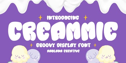 Creammie Groovy Decorative Display Font. Bold stroke, fun character with a bit of ligatures and alternates. To give you an extra creative work. Creammie font support multilingual more than 100+ language. This font is good for logo design, Social media, Movie Titles, Books Titles, a short text even a long text letter and good for your secondary text font with script or serif. Make a stunning work with Creammie font. Cheers, Maulana Creative
 - Nighty Night by Maulana Creative,
$15.00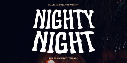 Nighty Night horror display font. Bold stroke, fun character with a bit of ligatures and alternates. To give you an extra creative work. Nighty Night font support multilingual more than 100+ language. This font is good for logo design, Social media, Movie Titles, Books Titles, a short text even a long text letter and good for your secondary text font with script or serif. Make a stunning work with Nighty Night font. Cheers, Maulana Creative
 - Octo by Gunjan,
$32.00 Octo is square bold/display font with italics. Letterform is bit quirky and square shaped, it can fill all kind of spaces. Octo has nice form that relate to industrial, machines and italics helps denoting speed. Octo is good for branding in fields of sports, automobile. It has full glyph set of numerals and signs. Octo is an excellent choice for headline-typesetting and logo design. Octo is developed by Gunjan Panchal based in India.
 - Monstafaller by Maulana Creative,
$11.00 Monstafaller is a Horror Vibe Decorative display font. With Bold Sharp stroke, Upright and fun character with a bit of ligatures. To give you an extra creative work. Monstafaller font support multilingual more than 100+ language. This font is good for logo design, Social media, Movie Titles, Books Titles, a short text even a long text letter and good for your secondary text font with Script. Make a stunning work with Monstafaller font. Cheers, MaulanaCreative
 - Figgins Standard by Shinntype,
$39.00 To meet the burgeoning demands of commerce, type founders in 1830s London introduced a plethora of new fonts which abandoned the traditional nib-informed model. Most radical were bold, capital-only designs with almost no stroke contrast, stripped bare of serifs. To all intents and purposes these minimal expressions of utility were identical to 20th century functionalism. Recontextualizing one of the original sans fonts, Shinn offers an alternative proposition to the myth of modernism.
 - Acholic by Maulana Creative,
$17.00 Acholic horror display typeface, bold stroke, fun character with a bit of ligatures. To give you an extra creative work. Acholic horror display typeface support multilingual more than 100+ language. This font is good for logo design, Social media, Movie Titles, Books Titles, a short text even a long text letter and good for your secondary text font with script or serif. Make a stunning work with Acholic horror display typeface. Cheers, Maulana Creative
 - MC Rothers by Maulana Creative,
$17.00 Rothers is a slab serif display font. Bold stroke, fun character with a bit of ligatures and alternates. To give you an extra creative work. Rothers font support multilingual more than 100+ language. This font is good for logo design, Social media, Movie Titles, Books Titles, a short text even a long text letter and good for your secondary text font with script or serif. Make a stunning work with Rothers font. Cheers, Maulana Creative
 - MC Alvani by Maulana Creative,
$17.00 Alvani psichedelic display typeface. Bold stroke, fun character with a bit of ligatures. To give you an extra creative work. Alvani psichedelic display typeface support multilingual more than 100+ language. This font is good for logo design, Social media, Movie Titles, Books Titles, a short text even a long text letter and good for your secondary text font with script or serif. Make a stunning work with Alvani psichedelic display typeface. Cheers, Maulana Creative
 - Loophole by ArtyType,
$23.00 Loophole is a visually striking display typeface in 3 weights (Light, Regular & Bold), its DNA firmly rooted in the Cyclic Sans family which makes the perfect foil to this somewhat decorative font styling. The Loophole name is quite simply based on the ubiquitous hole motif, which is strategically deployed on each character across the 3 font styles. Each font contains an extended Latin character set covering Western & Central Europe, the Baltic States & Turkey.
 - Flagtail Display by Pekotype,
$23.00 Flagtail Display combines the familiar feeling of classic typeface with the modernish touch to suit the nowadays trend. With its semi-bold and sharp type of shape, it can easily catch and engage the reader's attention in an instant. The excellent readability of Flagtail Display will put any of the messages being delivered to be the limelight. This typeface suits for you who aim to catch attention through headlines, rebrand your products, and beyond.
 - Scripty by Turtle Arts,
$20.00Scripty is a hand drawn, calligraphy longhand handwritten font. With careful spacing, the letters can be used together to create words that look like theyπve been written with an old≠fashioned fountain pen, or used alone as embellishment to more plebean text. - Life Cinema Screen by Andrey Ukhanev,
$- This font was inspired by an old photographic film package I found. Over time, the vertical slits in the letters have become more complex and acquired slanted sections. The font is suitable for accidences: headlines, posters... maybe you can suggest something interesting ;)
 - Summerhaven JNL by Jeff Levine,
$29.00Summerhaven JNL and Summerhaven Italic JNL were partially inspired by sign lettering spotted in an old black and white movie. These fonts are somewhat reminiscent of the Art Deco style, and their casual look can be applied to both formal and informal messages. - BPmono - Unknown license

- Heinemann by Heinemann Collection,
$39.00 The Heinemann fonts were initially developed by the in-house design team at Heinemann educational publishing out of the necessity to find the perfect font for use in early primary reading books and literacy products. Basic Heinemann is defined by longer ascenders and descenders which help children to distinguish between letters; rounded edges on all letterforms help focus the reader on the individual letter shape; and modified characters (eg. a, g,) ensure instant recognition of letterforms. Heinemann Special offers further modified characters and kerning pairs ideal for dyslexic or special needs use (eg a, d, b). The Heinemann fonts were developed in partnership with children, literacy advisors, teachers of special needs/dyslexia and primary school teachers, and are now released in response to hundreds of requests from publishers, designers and teachers to purchase them. They have been trialled in schools and learning institutions over an 8 year period, and are a favorite for use in both print and electronic product. The modern, clean aesthetic of the fonts ensures that their use can span beyond educational application.
 - Afsane by Naghi Naghachian,
$94.00 Afsane is a sans-serif headline font family designed by Naghi Naghashian in 3 weights, Light, regular and Bold.This font is a contribution to modernisation of Arabic typography, gives the font design of Arabic letters real typographic arrangement und provides more typographic flexibility. Afsane supports Arabic, Persian and Urdu. It also includes proportional and tabular numerals for the supported languages. Afsane design fulfills the following needs: A. Explicitly crafted for use in electronic media fulfills the demands of electronic communication. B. Suitability for multiple applications. Gives the widest potential acceptability. C. Extreme legibility not only in small sizes, but also when the type is filtered or skewed, e.g., in Photoshop or Illustrator. Afsane’s simplified forms may be artificial obliqued in InDesign or Illustrator, without any loss in quality for the effected text. D. An attractive typographic image. Afsane was developed for multiple languages and writing conventions. Afsane supports Arabic, Persian and Urdu. It also includes proportional and tabular numerals for the supported languages. E. The highest degree of calligraphic grace and the clarity of geometric typography.
 - Nameh by Naghi Naghachian,
$105.00 Nameh is a single weight sans-serif headline font designed by Naghi Naghashian. It is a condensed big title font. This font is a contribution to modernize the Arabic typography, gives the font design of Arabic letters real typographic arrangement and provides more typographic flexibility. Nameh supports Arabic, Persian (Farsi) and Urdu. It also includes proportional and tabular numerals for the supported languages. Nameh design fulfills the following needs: A Explicitly crafted for use in electronic media fulfills the demands of electronic communication. B Suitability for multiple applications. Gives the widest potential acceptability. C Extreme legibility not only in small sizes, but also when the type is filtered or skewed, e.g., in Photoshop or Illustrator. Nima’s simplified forms may be artificial oblilqued in InDesign or Illustrator, without any loss in quality for the effected text. D An attractive typographic image. Nameh was developed for multiple languages and writing conventions. Nameh supports Arabic, Persian and Urdu. It also includes proportional and tabular numerals for the supported languages. E The highest degree of calligraphic grace and the clarity of geometric typography.
 - Jekta by Naghi Naghachian,
$104.00 Jekta is a sans-serif headline font designed by Naghi Naghashian. This is a single weights font, ExtraBold. This font is a contribution to modernisation of Arabic typography, gives the font design of Arabic letters real typographic arrangement und provides more typographic flexibility. Jekta supports Arabic, Persian and Urdu. It also includes proportional and tabular numerals for the supported languages. Jekta design fulfills the following needs: A Explicitly crafted for use in electronic media fulfills the demands of electronic communication. B Suitability for multiple applications. Gives the widest potential acceptability. C Extreme legibility not only in small sizes, but also when the type is filtered or skewed, e.g., in Photoshop or Illustrator. Nima’s simplified forms may be artificial oblilqued in InDesign or Illustrator, without any loss in quality for the effected text. D An attractive typographic image. Jekta was developed for multiple languages and writing conventions. Jekta supports Arabic, Persian and Urdu. It also includes proportional and tabular numerals for the supported languages. E The highest degree of calligraphic grace and the clarity of geometric typography.
 - Homa by Naghi Naghachian,
$108.00 Homa is a sans-serif sigle weight font designed by Naghi Naghashian. It is extremely legible even in very small size. This font is The contribution to modernisation of Arabic typography, gives the font design of Arabic letters real typographic arrangement und provides more typographic flexibility. Homa supports Arabic, Persian ( Farsi) and Urdu. It also includes proportional and tabular numerals for the supported languages. Homa design fulfills the following needs: A Explicitly crafted for use in electronic media fulfills the demands of electronic communication. B Suitability for multiple applications. Gives the widest potential acceptability. C Extreme legibility not only in small sizes, but also when the type is filtered or skewed, e.g., in Photoshop or Illustrator. Homa’s simplified forms may be artificial oblilqued in InDesign or Illustrator, without any loss in quality for the effected text. D An attractive typographic image. Homa was developed for multiple languages and writing conventions. Homa supports Arabic, Persian and Urdu. It also includes proportional and tabular numerals for the supported languages. E The highest degree of calligraphic grace and the clarity of geometric typography.
 - Heinemann Special by Heinemann Collection,
$39.00 The Heinemann fonts were initially developed by the in-house design team at Heinemann educational publishing out of the necessity to find the perfect font for use in early primary reading books and literacy products. Basic Heinemann is defined by longer ascenders and descenders, which help children to distinguish between letters; rounded edges on all letterforms, which help the reader focus on the individual letter shape; and modified characters (eg., a and g), which ensure instant recognition of letterforms. Heinemann Special offers further modified characters and kerning pairs ideal for dyslexic or special-needs use (eg., a, d, and b). The Heinemann fonts were developed in partnership with children, literacy advisors, teachers of special needs/dyslexia, and primary-school teachers and are now available in response to hundreds of requests from publishers, designers, and teachers to purchase them. They have been tested in schools and learning institutions over an 8-year period, and they are a favorite for use in both print and electronic products. The modern, clean aesthetic of the fonts ensures that their use can spread beyond educational applications.
 - Apadana by Naghi Naghachian,
$100.00 Apadana is a new creation of Naghi Naghashian. Apadana design fulfills the following needs: A. Explicitly crafted for use in electronic media fulfills the demands of electronic communication. Apadana is not based on any pre-digital typefaces. It is not a revival. Rather, its forms were created with today's technology in mind. B. Suitability for multiple applications. Gives the widest potential acceptability. C. Extreme legibility not only in small sizes, but also when the type is filtered or skewed, e.g., in Photoshop or Illustrator. Apadana's simplified forms may be artificial obliqued in InDesign or Illustrator, without any loss in quality for the effected text. D. An attractive typographic image. Apadana was developed for multiple languages and writing conventions. Apadana supports Arabic, Persian, and Urdu. It also includes proportional and tabular numerals for the supported languages. E. The highest degree of geometric clarity and the necessary amount of calligraphic references. This typeface offers a fine balance between calligraphic tradition and the contemporary sans serif aesthetic now common in Latin typography.
 - Jojo by Canada Type,
$24.95 A little more flower and a little less power, please. Fun, friendly, fashionable, and feminine to a fault, Jojo takes display typography to a whole new level, where eyes can’t help but appreciate the day and the design at hand. It takes a graphic designer very little imagination to see these letters on posters, book covers, clothes, and craft paraphernalia. Or how about a sign over a bakery? A music sleeve? A romantic comedy titling? Cosmetics products? Pretty much anywhere! Jojo takes its name from a Beatles song about getting back to where we once belonged. It also takes most of its shapes from vintage photo-setting days, when an art nouveau typeface called Spring, by B. Jacquet, was putting happy times back where they belonged, which was everywhere. The original photo-setting face came in just 26 letters and 10 numerals. This digital retooling optimizes the original forms and expands on them, for a full character set of over 430 glyphs, including ligatures and stylistic alternates, and support for the majority of Latin languages.
 - Ekbatana by Naghi Naghachian,
$75.00 Ekbatana is a new creation of Naghi Naghashian. Ekbatan design fulfills the following needs: A. Explicitly crafted for use in electronic media fulfills the demands of electronic communication. Ekbatana is not based on any pre-digital typefaces. It is not a revival. Rather, its forms were created with today's technology in mind. B. Suitability for multiple applications. Gives the widest potential acceptability. C. Extreme legibility not only in small sizes, but also when the type is filtered or skewed, e.g., in Photoshop or Illustrator. Ekbatana's simplified forms may be artificial obliqued in InDesign or Illustrator, without any loss in quality for the effected text. D. An attractive typographic image. Ekbatana was developed for multiple languages and writing conventions. Ekbatana supports Arabic, Persian, and Urdu. It also includes proportional and tabular numerals for the supported languages. E. The highest degree of geometric clarity and the necessary amount of calligraphic references. This typeface offers a fine balance between calligraphic tradition and the contemporary sans serif aesthetic now common in Latin typography.
 - Homayoon by Naghi Naghachian,
$102.00 Homayoon is a sans-serif sigle weight font designed by Naghi Naghashian. It is extremely legible even in very small size. This font is The contribution to modernisation of Arabic typography, gives the font design of Arabic letters real typographic arrangement und provides more typographic flexibility. Homayoon supports Arabic, Persian (Farsi ) and Urdu. It also includes proportional and tabular numerals for the supported languages. Homayoon design fulfills the following needs: A Explicitly crafted for use in electronic media fulfills the demands of electronic communication. B Suitability for multiple applications. Gives the widest potential acceptability. C Extreme legibility not only in small sizes, but also when the type is filtered or skewed, e.g., in Photoshop or Illustrator. Homayoon’s simplified forms may be artificial oblilqued in InDesign or Illustrator, without any loss in quality for the effected text. D An attractive typographic image. Homayoon was developed for multiple languages and writing conventions. Homayoon supports Arabic, Persian and Urdu. It also includes proportional and tabular numerals for the supported languages. E The highest degree of calligraphic grace and the clarity of geometric typography.
 - Dara by Naghi Naghachian,
$88.00 Dara is a sans-serif sigle weight font designed by Naghi Naghashian. It is extremely legible even in very small size. This font is The contribution to modernisation of Arabic typography, gives the font design of Arabic letters real typographic arrangement und provides more typographic flexibility. Dara supports Arabic, Persian ( Farsi ) and Urdu. It also includes proportional and tabular numerals for the supported languages. Dara design fulfills the following needs: A Explicitly crafted for use in electronic media fulfills the demands of electronic communication. B Suitability for multiple applications. Gives the widest potential acceptability. C Extreme legibility not only in small sizes, but also when the type is filtered or skewed, e.g., in Photoshop or Illustrator. Dara’s simplified forms may be artificial oblilqued in InDesign or Illustrator, without any loss in quality for the effected text. D An attractive typographic image. Dara was developed for multiple languages and writing conventions. Dara supports Arabic, Persian and Urdu. It also includes proportional and tabular numerals for the supported languages. E The highest degree of calligraphic grace and the clarity of geometric typography.
 - Anti by Type Firm,
$39.99 If we look up the definition of the word "grotesque", we find the following: "Odd or unnatural in shape, appearance, or character; fantastically ugly or absurd; bizarre." Following this definition, the design for Anti aims to create an un-compromised version of a grotesque sans-serif – where decorative details live in balance with brutalist shapes. The result is an alphabet with a slightly modernist feeling and an eccentric touch, that work wonders at small sizes. The typeface comes with four weights – light to bold – and features a character set supporting Central and Eastern European as well as Western European languages.
 - Sassoon Handwriting Starter by Sassoon-Williams,
$45.99 Sassoon fonts package for handwriting starters The three upright "infant" fonts developed to meet the demand for letters to produce pupil material for handwriting as well as for reading. Letters have extended ascenders and descenders ideal on screen and print. They facilitate word recognition. The exit strokes link words together visually, also crucially, they space the letters for improved legibility. The "joined" font puts the skills gained into practice producing joined-up handwriting. Together these typefaces provide a valuable resource for Teachers to create consistent material across the curriculum. Sassoon Infant Tracker B font: This font with its direction arrows helps pupils to start in the correct place. Motor movements can be refined by keeping inside the line. When starting and direction is no problem, the arrow font can be dropped and the Dotted font used. Sassoon Infant Dotted B font: Writing over the dots of this font refines motor skills. The aim here is to give confidence by reinforcing starting points, exits and to now encourage fluidity. Sassoon Infant font: With some words in this font and a baseline beneath to copy onto, pupils can use their learned starting points and exit strokes to write freely along the baseline - still unjoined. Once learned, this leads to spontaneous joins along the baseline leading logically to a joined-up hand. Sassoon Joined font: Having learned to write letters with correct starts and exits, this is when the joined font for teaching handwriting can be used. With some words in this font and a baseline beneath to copy onto, pupils can use their learned starting points and simply extend their exit strokes to make joined-up writing. The default joins the font provides are recommended, however there are alternative letterforms that are so important for some Teachers which can be accessed. Create ‘pen lifts’ anytime too! NOTE: Fonts display unjoined by default on this website and are delivered that way - joining is controlled by your text editing application such as Word or TextEdit, read more for instructions… Free to download PDF resources: Stylistic Sets and how to access the alternative letters feature in these OpenType fonts. Using the separate letter fonts Using the joined font Teachers copybooks using these fonts: How to teach pre-cursive Copybook How to teach cursive handwriting Copybook
 - ITC Chivalry by ITC,
$29.99ITC Chivalry is a calligraphic hybrid that honors the tradition of combining Roman capitals with italic lowercase letters. Drawn by Missouri lettering artist Rob Leuschke, who used a flat-nib pen on textured watercolor stock and then converted the drawings into a digital font, the design combines an old world" feel with "new world" legibility. A companion set of black letter caps completes the suite of characters. "I've loved drawing letters for as long as I can remember," says Leuschke. "Even in kindergarten, I tried to draw letters like my teacher." After graduating from college, Leuschke worked for a short time at a sign company in St. Louis, and in the early 1980s began working at Hallmark Cards in Kansas City. His talent as a calligrapher and lettering artist eventually brought him back to St. Louis to begin a freelance career. Since then Leuschke has created over 250 fonts, primarily for the greeting card industry, that are now being used on work for his clients all over the world. Leuschke first conceived of the face as just the black letter caps; he later added the Roman letters to give the design more versatility. The Roman caps of ITC Chivalry combined with the lowercase are well suited to blocks of copy, while the more decorative black letter caps are ideal for showcasing short text of just a few words. Both sets of capitals also make great initial letters." - Whisper Script by Ferry Ardana Putra,
$15.00 Whisper is a stunning hand-lettered dry brush font. This typeface is very unique! It has an unique natural dry-brush feel which will outstand your project with ease! Combine it with its remarkable swashes which you can choose dozens of them! This typeface is perfect for creating elegant branding and headlines for handmade, food & beverage and artisan goods, quotes, invites, t-shirts, Logos, or use it to make your social media feed into another level! Whisper features: A full set of upper & lowercase characters Numbers & punctuation Multilingual language support PUA Encoded Characters Dozen of Swashes OpenType Features Whisper includes: ——— ⚠️To enable the OpenType Stylistic alternates, you need a program that supports OpenType features such as Adobe Illustrator CS, Adobe InDesign & CorelDraw X6-X7, Microsoft Word 2010 or later versions. There are additional ways to access alternates/swashes, using Character Map (Windows), Nexus Font (Windows), Font Book (Mac) or a software program such as Pop Char (for Windows and Mac). ⚠️For more information about accessing alternative, you can see this link: http://adobe.ly/1m1fn4Y ——— 🔑Important tutorial from the author: Tutorial for Mollusca font trio: https://lnkd.in/d984CQD6 How to use Midway | Retro Script Font on illustrator: https://lnkd.in/eusbZd7s How to use Midway | Retro Script Font on Photoshop: https://lnkd.in/evsYrwgs ——— ❤️Get in touch with the author: Instagram: https://www.instagram.com/ardana619 Behance: https://www.behance.net/ardana619 ——— 🔥Thankyou for purchasing our product, hope you like and have fun with our product. If you have any queries, questions or issues, please don't hesitate to contact us directly. If you satisfied with our product, please give 5 stars rating. ——— 😊Happy Designing...
 - Preto Serif by DizajnDesign,
$24.00 Preto is an extensive type family, which explores the function of serifs on readability and legibility. Preto consist of three subfamilies: Sans, Semi and Serif. Preto is designed for multilingual typesetting. All of the subfamilies have equal gray value but different texture which can be use to differentiate languages. Preto sub-families have two text weights and two bold styles (Regular -> Bold, Medium -> Black). Every weight has a companion Italic style as well. The serif version has been designed to work best at small point sizes (around 8, 9 points). You will not achieve calm, boring or invisible look of your text with Preto Serif. Its long, spiky and sharp serifs contribute to give the typeface a distinct and energetic character. It is very suitable for magazines, corporate identity, brochures or other print materials where a typeface for continuous reading is required. The ligatures in Preto Serif are very special. You can set them in different tracking values and spacing will increase/decrease consistently in the ligatures as well. Alternative characters in the font files allow you to change the feeling of the text from typical to more special (J, Q, g , &). Each font contains a full set of small caps and many alternative characters for complex typesetting.
 - Roves by Andrew Footit,
$12.00 Roves is a font family dedicated to exploration, adventure and the early merchants of history. The word rove means “a journey, especially one with no specific destination; an act of wandering”. the family consists of three Stencil versions each with a Regular and Bold weight as well as two Sans versions each also with a regular and bold weight, this is a total of 10 different options to work with. When combined these two fonts create great looking typography that compliment each other but each also strong enough to be used on their own. The Roves family is a display font with a great rust vintage feel to it which gives the user an authenticity when working with typographic projects. Roves has been created with the designer in mind, to create with and explore the different options with in the family.
 - Magic Spell JF by Jukebox Collection,
$32.99 Magic Spell is a mystical, fun font based on a handlettered alphabet in an old 1930s book on lettering. It captures that old world feel of magical wizards and fairy tales. Conjur up some fantastic designs with this bewitching font! Jukebox fonts are available in OpenType .otf format and all fonts contain basic OpenType features as well as support for Latin-based and most Eastern European languages.
 - Bright Sunday by Lythcreative,
$30.00 Bright Sunday is a cool and charming font duo. When combined, these two fonts will add a unique spark to any design project! Bright Sunday is perfect for branding projects, logos, wedding designs, social media posts, advertisements, product packaging, product designs, labels, photography, watermarks, invitations, stationery, and any projects. What's Included: Web Fonts Tons of glyphs Ligature Works on PC & Mac Simple installations Accessible in Adobe Illustrator, Photoshop, Adobe InDesign, and even Microsoft Word.
 - Alevander by Rotterlab Studio,
$15.00 Introducing Alevander Script Alevander Script is a classic calligraphy font. This is a classic thin font with an italic style. Here will get a beautiful classic font. This font has several modern swirls that can make work look elegant, sweet and perfect. With a style like this, this font would be perfect for logos, branding projects, homeware designs, product packaging, mugs, quotes, posters, shopping bags, logos, t-shirts, book covers, business cards, invitation cards, greeting cards, and more. all other beautiful projects. Can use this font for work very easily. Because there are many features in it. Contains a full set of lowercase and uppercase letters, punctuation marks, numbers, web fonts and multilingual support. This font also includes several binding styles and an alternative Stylistic Set for those who have software capable of working with OpenType (Corel Draw / Photoshop / Illustrator / InDesign). If you don't have a program that supports OpenType features like Adobe Illustrator and CorelDraw X Versions, you can access all the alternative glyphs using Font Book (Mac) or Character Map (Windows): Thank you for buying!
 - Epitet by Tour De Force,
$25.00 Epitet, a subtle compact type family with a modern mixture of geometrical and simple shapes, comes in 6 weights, from Thin to Bold. It is a clean elegant sans serif typeface, with a small x-height. Epitet is highly legible in all sizes. Very versatile and easy to use, Epitet can be used in a wide range of corporate and editorial applications. I'm sure Epitet could get even more epitets, but the appropriate use of Epitet would be the biggest one it could get.
 - Stepside by Sean Thorenson,
$12.00 Stepside is a slick retro display face with plenty of horsepower. Stepside’s heavy-duty type chassis of sturdy uprights and bold strokes was modified with sweet retro details like graceful curves and tapered fins. Inspired by street rods, custom vans and power wagons, Stepside modestly hides its muscle like a true sleeper. Take Stepside for a spin on logos, posters and t-shirts for a more classic look. Need more speed? Step on the gas with Stepside Italic — perfect for type in need of emphasis.
