1,965 search results
(0.032 seconds)
- Bricked by Cristian Mielu,
$9.00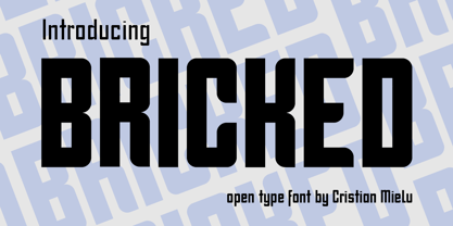 Bricked is a font family, containing 3 weights: Bolt, Regular and Light, plus their Italic versions, results in a total of 6 styles, 375 glyphs each one of them. The shapes of Bricked font, are borowed from the straight lines of the bricks, as the name says. Bricked is created to suit perfectly as a logo font for a construction company, ingineering company, auto garage, and many other activities with a relative profile, but not only, Bricked can be versatile and can be a perfect choice for other type of businesses to. Bricked supports a wide variety of Latin from Latin0 to Latin10, Windows Latin and Macintosh Latin.
 - Rompies by Arterfak Project,
$22.00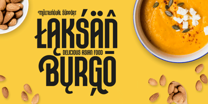 Rompies is a modern condensed font, designed specifically for display. Rompies has thick strokes of letterforms and tight letterspacing to emphasizes the legibility and showing the unique letter-shape combinations. This font is an all-caps font that combines the lowercase as the uppercase that gives flexibility and decrease the negative space. Rompies equipped with a bunch of ligatures and alternates that makes this font so playfully to mix and match and get the modern typographic design. Perfect for the headline, menu, logotype, labels, signage, quote, modern poster, urban poster, sports themes, apparel, and many more! Featured : Uppercase Small caps Numbers Symbols Accented characters Stylistic alternates Ligatures
 - Linotype Go Tekk by Linotype,
$29.00Linotype Go Tekk is a part of the Take Type Library, selected from the contestants of Linotype’s International Digital Type Design Contest. The font was designed by the German artist Critzler and is available in three weights, thin, medium and black. Go Tekk is a cool, constructed with unusual cross strokes, appearing in almost every character at exactly the same height. The capital letters do not end on the baseline, rather drop even farther down than the descenders of the lower case letters, making it necessary to allow for generous line spacing. Linotype Go Tekk is a relatively static font designed exclusively for headlines and displays. - Bodoni Campanile Pro by Red Rooster Collection,
$60.00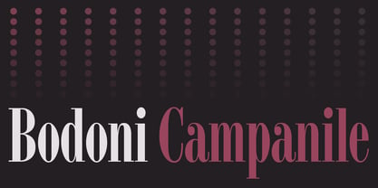 Bodoni Campanile Pro is a font that bridges the gap between a “fat” and a compressed traditional serif typeface. It was originally designed in 1936 by Robert H. Middleton for Ludlow. International TypeFounders exclusively licensed the family from the Ludlow Collection, and Steve Jackaman (ITF) produced a digital version in 1998. Jackaman completely redrew the font for its 2017 release. Bodoni Campanile Pro, much like its transitional status as a font, is successful in both formal and casual roles. The free-flowing aspects of the family, seen especially in the lowercase ‘g’ and the leg of the uppercase ‘R,’ give the family an air of elegance.
 - Rosabella by ParaType,
$30.00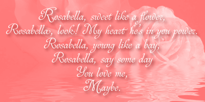 Rosabella is a script typeface with plenty of decorative details — flourishes, swashes, twists and other elements, which impart to the face a gorgeous festive look. An unusually large number of alternates and ligatures make it possible to imitate live calligraphic writing. Lower case letters are divided into several stylistic sets from relatively modest variants to the most decorative contextually-dependent swash shapes. Besides that there are two sets of upper case letters — the second one contains larger and more complex shapes. Letters from the different stylistic sets can be used in a wide variety of combinations with the different levels of embellishments. Rosabella was designated for display material, greetings and advertising.
 - Zwart by Holland Fonts,
$30.00Originally created with cutting in red litho film, as a headlining typeface for Vinyl music magazine. Its geometric structure was very applicable for early type design experiments on the computer. ...in the early 1980s, he (Max Kisman) became the designer of a small, independent music magazine Vinyl. This Amsterdam-based publication was set up very much as a response to the innovative British magazine, The Face. Responding to Neville Brody's radical designs for that magazine, Kisman began to experiment by creating new headline typefaces for each issue... (Emily King. New Faces: type design in the first decade of device-independent digital typesetting. 1987-1997. - ITC Tempus Serif by ITC,
$29.99ITC Tempus is the work of British designer Phill Grimshaw. He claims that every calligrapher's aspiration is to draw perfect roman capitals with a pen, but admits that this is extremely difficult. For this typeface, Grimshaw used a fountain pen on cheap, porous paper and, of course, the ink bled. The resulting forms are classic but their rugged edges deviate from the perfection of roman type. And Tempus Sans is just Tempus with the serif surgically removed, yet the proportions of the characters work nicely," says Grimshaw. Because of its rough quality, the typeface works best in larger point sizes, yet maintains its characters even in smaller sizes. - Chronosfer by Anomali Creative,
$19.99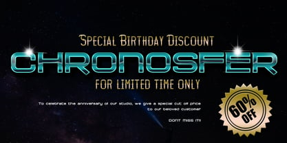 The concept of this font are Inspired by stories of space travel, interstellar war. social life in the galaxy. So we chose the name Chronosfer, which was said to be similar to Chromosphere. The chromosphere is the second most outer layer of the Sun. Several thousand kilometres thick, it resides above the photosphere and beneath the corona. Due to its low density, it is relatively transparent, resulting in the photosphere being regarded as the visual surface of the Sun. What Featured on this font? Glyphs count is 281 glyphs each style. Have some alternate characters International Language Support Best to use on Hi-Tech Style design Space or cosmos theme design
 - Nouveau LX Stencil by Vanarchiv,
$31.00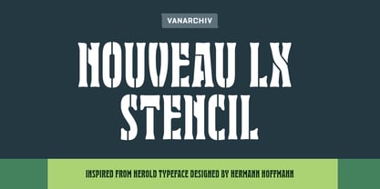 The original design came from Berthold Herold typeface, designed by Hermann Hoffmann during 1913 (Art Nouveau style) in Germany. This project started from flyer printed during 1947 with movable type, the specimen was scanned as a source to development some of the uppercase letterforms. However the most unusual and tricky element from this sample is the leg from the uppercase (R) which is different from the original Herold design, until now I didn’t found where this version originally came from. This stencil typeface only contain the bold weight, but there are also available other versions without stencil cuts, like Nouveau LX and Nouveau LX Expanded.
 - Downhill Dive by Hanoded,
$15.00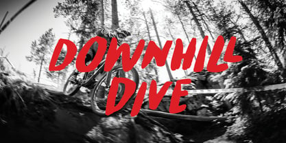 I used to live in the English Lake District, where I worked in an outdoor gear store. I bought a bright red mountain bike and each day, after work, I cycled up the mountain and hurtled down - heavy metal blasting from my MP3 player. Of course, the bike was a regular MTB, so it got some serious damage after a while, but the adrenaline rush was great! Downhill Dive is a great brush font (made with actual brushes and ink on paper - no tablets involved here!). It is an ode to that wonderful time spent in England. Downhill Dive comes with some really nice ligatures.
 - Cambria Math by Microsoft Corporation,
$49.00OpenType Layout features: smallcaps, stylistic alternates, localized forms, standard ligatures, uppercase-sensitive forms and spacing, oldstyle figures, lining figures, smallcap figures, arbitrary fractions, superscript, subscript. Cambria has been designed for on-screen reading and to look good when printed at small sizes. It has very even spacing and proportions. Diagonal and vertical hairlines and serifs are relatively strong, while horizontal serifs are small and intended to emphasize stroke endings rather than stand out themselves. This principle is most noticeable in the italics, where the lowercase characters are subdued in style, to be at their best as elements of word-images. This font is suitable for business documents, email, web design. - FS Dillon by Fontsmith,
$80.00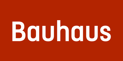 Bauhaus Geometric, economical, functional... The good, wholesome, modernist values that once fired up the tutors and students of the Bauhaus became the inspiration for FS Dillon after an exploration of the work of the pre-war art and design powerhouse in the Fontsmith studio. The font combines simplicity and directness with a characteristic Fontsmith warmth. Letterforms are compact, with a generous x-height, and built for maximum clarity and impact. The Bauhaus sought beauty through function. FS Dillon achieves it. Made for TV The weights of fonts for TV sometimes have to be adjusted so as not to “blow” on-screen. FS Dillon was originally drawn for the on-screen presentation branding of Film Four, whose primary colour was red. Black type on a red background looks heavier than white, so Dillon needed two weights that would allow white and black type to be used together, looking balanced and equal. Type design is an organic process. Years after developing FS Dillon, we revisited it, redrawing elements and adding italics to maintain consistency. Olympic You don’t get a much higher confirmation of the functional fitness of a typeface than to have it selected to guide visitors around an Olympic complex. FS Dillon was selected as the font for signage at some of the key venues at the London 2012 Olympic Park, helping to get spectators, athletes and officials from all over the world to their seats and starting blocks on time.
 - Freaky Vibes by Blankids,
$20.00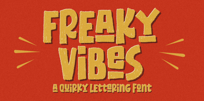 Elevate your design with the distinctive charm of “Freaky Vibes Font”, a unique font that seamlessly blends rugged textures with contemporary style. This versatile font is meticulously crafted to add character and personality to your projects, making it an ideal choice for various creative applications. Key Features: Unique Texture: The font boasts a captivating rough texture that exudes authenticity and individuality, setting it apart from conventional typefaces. Versatility: “Freaky Vibes Font” is designed to meet diverse design needs. Whether you’re working on branding, logotypes, displays, posters, or even food-related projects, this font is your go-to choice for a touch of rustic elegance. Bold Presence: Make a statement with the bold and impactful presence of “Freaky Vibes Font.” Its strong and confident strokes command attention, ensuring your message is conveyed with style. Perfect for: Branding: Establish a memorable and distinctive brand identity with the unique flair of “Freaky Vibes Font.” Logotypes: Craft logos that stand out and leave a lasting impression with this font’s rugged yet refined aesthetic. Display and Poster Design: Infuse your designs with a bold and eye-catching appeal, perfect for grabbing attention in displays and posters. Food-related Projects: Capture the essence of artisanal and rustic culinary experiences with a font that complements the visual language of the food industry. Embrace the rustic charm and modern appeal of “Freaky Vibes Font” – a font that goes beyond letters and becomes a visual signature for your creative endeavors.
 - Workhorse by Borges Lettering,
$35.00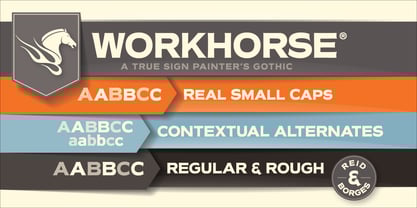 Workhorse is a Sign Painter’s Gothic developed by Master Sign Painter Greg Reid. Workhorse captures the true essence of hand lettering. From the tapered waists to the elegant snaps of the brush; these elements present a warmth unseen in today’s mechanically stiff Gothics. Greg Reid and Charles Borges de Oliveira collaborated to bring this truly one of a kind typeface to fruition. With the power of Open type, Workhorse utilizes Contextual Alternates to create random variations of the capitals and lowercase letters. This allows your text to have subtle differences in the letters without losing form which helps to create an honest hand lettered look. This feature can be turned on or off to suit your individual style. You also have the ability to manually choose the glyph variations from the glyph pallet to help you create one of kind designs. Both versions of Workhorse feature complete variations of the capitals and lowercase letters (56 total), Small Caps and six alternates. The Small Caps are not just the capitals scaled down. They have been designed as a unique second set that adjusts the stroke thickness to match the existing letters, creating what we like to refer to as “Real Small Caps”. Workhorse is a timeless classic that can be used from early Americana advertising all the way up to present day modern use. No matter how you use Workhorse it always looks and reads well.
 - Planetype by CozyFonts,
$20.00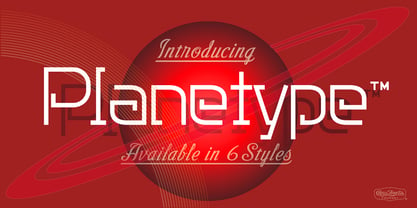 The Planetype Font Family is Modern. It has 6 Font Styles: X-Light, Light, Medium, Inline, Bold, & X-Bold. Each style has a consistent weight with a square serif of equal weight to its vertical and horizontal strokes. Planetype™ for short or Planet-Type font styles all have extremely clean edges and are sharply defined. There is a standard kerning applied, however evenly letter-spacing these family members give a distinct personality and continues to command the negative space just as in tight kerned examples. The compatible relationship of these font family members, weight to weight, and X-Light to X-Bold is seamless and the overall design coloring of words and sentences is well balanced and extremely legible. The Planetype Family fonts are matching members glyph to glyph. This family works in modern, contemporary and vintage settings. The Planetype Medium matches the outer weight of Planetype Inline. Their are several unique Glyphs that set the character of this family, such as: Caps B, M, Q, R, X and Lower Case a, e, k, r, z to begin with. The numerals and dingbats also have several unique glyphs that flow with the family Style in every matching weight. These characteristics lend well in designing logos, brands, and even monograms. Starting with Planetype X-Light the designer has a command of the clean lines yet expressing Modernism and a touch of Architectural structure. Planetype Medium & Planetype Inline are a dynamic duo giving a positive/negative readability.
 - Tabloid News by Jeff Levine,
$29.00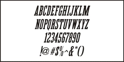 Sans serif characters re-drawn from old newspaper headlines (and used in the design for Late Breaking News JNL) were given a slab serif treatment in order to create a condensed type face with both grotesk and block influences. The end result is Tabloid News JNL, which is available in both regular and oblique versions.
 - Sans Culottes by K-Type,
$20.00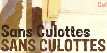 A misprinted sans serif loosely based on Phillip Cavette’s 1999 font 4990810, but with re-drawn outlines, more distress marks, a neater vertical aspect and no baseline irregularity. Unlike its inspiration, Sans Culottes is a complete font which includes a lower case, accented characters and as many dingbats as you can shake a stick at.
 - Marching Band JNL by Jeff Levine,
$29.00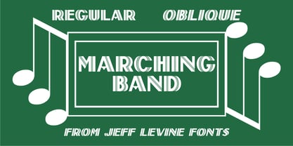 The cover of "Intermediate Steps to the Band" (an instructional book for marching band originally published by Mills Music in 1947) featured the title in a hand lettered multi-line sans serif with Art Deco influence. Re-drawn as a digital typeface named Marching Band JNL, it is available in both regular and oblique versions.
 - Trencher JNL by Jeff Levine,
$29.00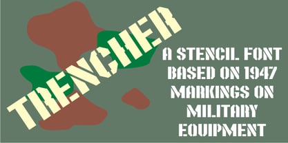 Trencher JNL is based on hand-cut stencils spray-painted onto a vintage 1947 Cleveland Trencher acquired by the Marine Corps Mechanized Museum at Camp Pendleton, California. Restoration volunteer Brian Platzer supplied to Jeff Levine the images of the stencil markings - and they were quickly re-drawn and turned into a digital type face.
 - Handy Dandies JNL by Jeff Levine,
$29.00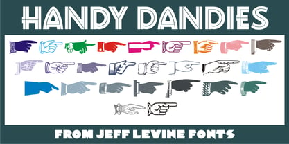 Handy Dandies JNL is a third collection from Jeff Levine Fonts of pointing hands along with a few card holders thrown in for good measure. The images were re-drawn from vintage source material and these embellishments (also known as "Printer's Fists" or "Bishop's Fists") will enhance wood type projects as well as contemporary designs.
 - Art Event JNL by Jeff Levine,
$29.00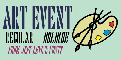 A 1930s WPA (Works Progress Administration) poster advertising an exhibit of New Jersey area posters had its main lettering rendered in a very condensed hand lettered interpretation of the ever-popular Futura Black Art Deco style. This has now been re-drawn and digitized as Art Event JNL, in both regular and oblique versions.
 - Romantic Jets by Typodermic,
$11.95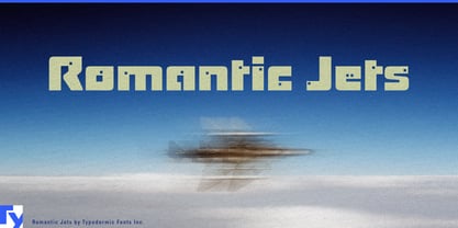 Introducing Romantic Jets—a display typeface that breaks all the rules and challenges the traditional norms of typography. Inspired by the raw and rugged beauty of brutalist architecture, Romantic Jets infuses an unconventional and futuristic appeal to your designs. With its sharp edges and unconventional shapes, this typeface injects a unique technical aesthetic to your message. The way Romantic Jets uses negative space will not only make your text stand out, but also create a mesmerizing visual experience for your audience. But what truly sets Romantic Jets apart is its peculiar index holes. These little cutouts add a touch of quirkiness and playfulness to an otherwise bold and brutal typeface. Use them to add character to your designs, or make them the focal point of your message. Whether you’re looking to create a bold, eye-catching poster, a sleek and modern logo, or a futuristic sci-fi book cover, Romantic Jets is the typeface that will make your designs truly stand out. Try it out today and experience the power of unconventional typography. Most Latin-based European writing systems are supported, including the following languages. Afaan Oromo, Afar, Afrikaans, Albanian, Alsatian, Aromanian, Aymara, Bashkir (Latin), Basque, Belarusian (Latin), Bemba, Bikol, Bosnian, Breton, Cape Verdean, Creole, Catalan, Cebuano, Chamorro, Chavacano, Chichewa, Crimean Tatar (Latin), Croatian, Czech, Danish, Dawan, Dholuo, Dutch, English, Estonian, Faroese, Fijian, Filipino, Finnish, French, Frisian, Friulian, Gagauz (Latin), Galician, Ganda, Genoese, German, Greenlandic, Guadeloupean Creole, Haitian Creole, Hawaiian, Hiligaynon, Hungarian, Icelandic, Ilocano, Indonesian, Irish, Italian, Jamaican, Kaqchikel, Karakalpak (Latin), Kashubian, Kikongo, Kinyarwanda, Kirundi, Kurdish (Latin), Latvian, Lithuanian, Lombard, Low Saxon, Luxembourgish, Maasai, Makhuwa, Malay, Maltese, Māori, Moldovan, Montenegrin, Ndebele, Neapolitan, Norwegian, Novial, Occitan, Ossetian (Latin), Papiamento, Piedmontese, Polish, Portuguese, Quechua, Rarotongan, Romanian, Romansh, Sami, Sango, Saramaccan, Sardinian, Scottish Gaelic, Serbian (Latin), Shona, Sicilian, Silesian, Slovak, Slovenian, Somali, Sorbian, Sotho, Spanish, Swahili, Swazi, Swedish, Tagalog, Tahitian, Tetum, Tongan, Tshiluba, Tsonga, Tswana, Tumbuka, Turkish, Turkmen (Latin), Tuvaluan, Uzbek (Latin), Venetian, Vepsian, Võro, Walloon, Waray-Waray, Wayuu, Welsh, Wolof, Xhosa, Yapese, Zapotec Zulu and Zuni.
 - Arch Creek JNL by Jeff Levine,
$29.00Arch Creek JNL is Jeff Levine's all-caps re-interpretation of a classic typeface of the past; Beton. Clean lines and slab serifs make this design a wonderful display face for attention-getting headlines. The beautiful watercolor print used in the font flag is by a good friend of Jeff's - Miami artist Michael George, and is used by permission. - SomaSkript Tall by ArtyType,
$19.00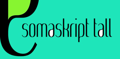 Somaskript Tall shares the same concept as Somatype Skwosh, namely a desire to ignore traditional rules and re-scale along one axis only. This time the starting point was Somaskript and the end result is a condensed & uniquely elegant display face, vertically extended by the process but with legibility very much intact and its personality preserved.
 - Mymra by TipografiaRamis,
$35.00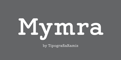 Mymra fonts – an upgraded version of Mymra Forte and Mymra Mono (2009), with a careful re-dress of glyph shapes, and the extension of glyph amounts – which enables support of more Latin languages. One more weight – Black – has been added to the original three of Mymra Forte fonts. Fonts are intended for use in a vast variety of publications.
 - Caxtonian Black by URW Type Foundry,
$49.99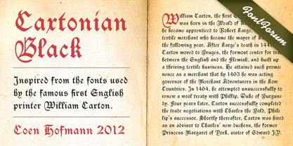 Coen Hofmann has rediscovered Blackletter font design and enriches URW’s FontForum with two new and very beautiful fonts: Caxtonian Black and Holland Gothic. Caxtonian Black is a remarkable classical Fraktur inspriced inspired from the fonts used by the famous first English printer William Caxton. Coen Hofmann digitally re-mastered and completed the font for usage with modern technology.
 - Chuck by Parkinson,
$20.00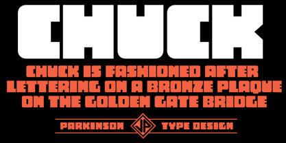 Chuck. Designed in 2004 by Jim Parkinson. Originally released as a Type 1 font, Chuck was refreshed (version2) and re-released as simple Open Type in 2012. The models for this massive Deco typeface appear on a bronze plaque on the South Tower of the Golden Gate Bridge. The plaque commemorates the builders of the bridge.
 - Digitany by Zealab Fonts Division,
$10.00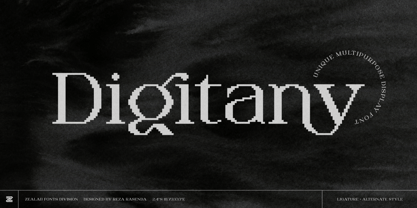 Digitany is a multipurpose display font, its a combination between luxury serif font and 8bit/pixel art style. Effortlessly re-create the classic fun vibes of the 80's using this display typeface that goes well with retro t-shirt designs, posters, illustrations, logos, and more. Digitany include uppercase and lowercase, ligature and alternate style, and also multilingual support.
 - Songbook JNL by Jeff Levine,
$29.00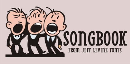 Songbook JNL is based on a promotional blurb from the back of a piece of vintage sheet music. Its interesting style of slab serif lettering with strong Art Deco influence was worthy of re-drawing into a digital typeface. This design is the 900th release from Jeff Levine Fonts since its inception in January of 2006.
 - FreeDee by HouseOfBurvo,
$-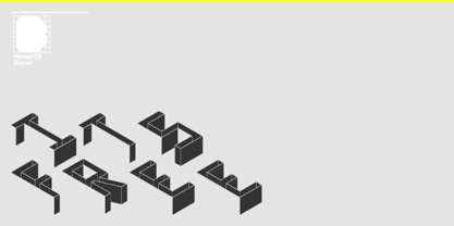 FreeDee is a re-draw of some experimental lettering first drawn during A-Level (just after high-school) art and design studies. It was originally purely self initiated, and one of the first things I used Illustrator to draw. This version takes the original handful of letters and extrapolates a full alphabet with basic latin accents.
 - Art Lover JNL by Jeff Levine,
$29.00While browsing through a Dan Solo type reference book, Jeff Levine fell in love with the multiline stylings of one particular typeface, then sat down and re-drew from scratch his own interpretation of the design. Jeff's version is called Art Lover JNL - offering kudos to art in general, the Art Deco movement and (of course) type design. - Breakfast Burrito by Hanoded,
$15.00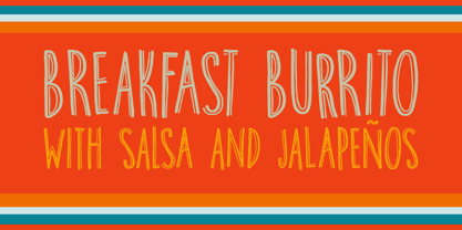 Recently I have been watching some re-runs of Dexter. In season 1, Debra has a rough morning and complains she cannot make it through the day without eating a breakfast burrito. The name stuck, a font was born and the result is Breakfast Burrito font. It is a tall, all caps typeface with a little twist.
 - Mic 32 New by moretype,
$25.00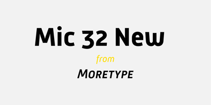 Mic32 New is a revival of the of the original Mic32 released in 2004. Keeping its futuristic appeal, this popular font has been re-drawn from the ground up, with new spacing and kerning. A range of Opentype features have been added, and the new version includes small caps, tabular, proportional and old style numerals and ligatures.
 - Ms Augustine by Calamar,
$18.00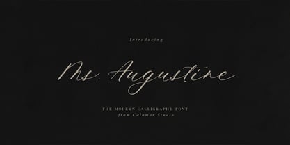 Ms. Augustine is a light, lovely and modern calligraphy font with sophisticated flows. This beautiful script particularly well suited for wedding invitations, save the date cards and feminine branding. Ms. Augustine includes full set of Uppercase and Lowercase Basic Characters, Numbers and Punctuation. Also it contains a lot of stylistic alternates to perfectly re-create natural calligraphy.
 - Tee Franklin by Suomi,
$19.00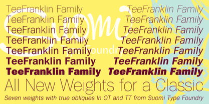 The British Vogue commissioned this typeface for their magazine re-design in 2001. After studying the originals of Morris Fuller Benton and the existing versions, this font was designed with all new thin weights. Just when the family was finished, Vogue informed that they had decided to use American Typewriter instead. Bastards. But here is a true classic typeface with a facelift. The pun intended. Tee Franklin has seven weights with obliques, the Heavy being just slightly heavier than the existing versions from Adobe and ITC, and moving down to totally new Ultra Light, using Luc(as) de Groot's formula to keep the weights optically correct. The glyphs are the same as the Morris Fuller Benton's original from 1902, except for the upper case Q, which was re-designed with a loop in the counter for added differentiation.
 - Bluset Now Mono by Elsner+Flake,
$35.00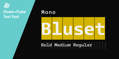 Bluset Monospaced enlarges the re-worked and expanded text- and headline typeface family Bluest Now with 6 new cuts. The concept for Bluest Now was based, in its original form, on a corporate design typeface by Elsner+Flake in 2004, ordered by the Landor Agency for a large German energy corporation. Regularly re-worked and brought up to modern standards, the typeface is still used to this day. Because of its large x-height and its well-balanced appearance, Bluset Now Mono is also excellent for use in small typesizes. The three Roman cuts, Regular, Medium and Bold, and the corresponding obliques, allow a clear differentiation of base- and display applications for every typesize. The character complement has been created for 72 Latin-based language areas and thus allows a neutral text exchange across language borders. Translation Inga Wennik
 - Aspen by Ludwig Type,
$39.00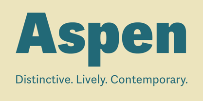 Aspen is a refreshing and resilient typeface for text of any kind. Functional but not faceless, Aspen derives a very distinctive character from an unusual pedigree. It is loosely influenced by early American and European grotesques, but with more warmth and improved legibility. And where these historical models were rigid and bulky, Aspen’s curves have a gentle sway that makes for very comfortable reading. Relatively generous ascenders and descenders allow the typeface to feel spacious even when set with tight leading. These amiable qualities are matched with a lively italic based on cursive writing. The family consists of nine weights, and is intended for both text and display usage. Visit this minisite to see Aspen in action.
 - M Razor HK by Monotype HK,
$523.99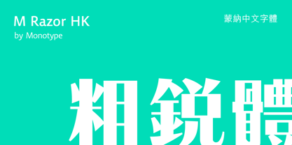 M Razor is so called ""neo Sung-style"" typefaces. Crossbars (橫) and stems (豎) are orthogonal and upright. Their entry and finial points are squarish, parallel without flare. Contrast of strokes is extremely high. This creates sharpness, stiffness in the midst of elegance of Sungti. Even distribution of space, careful positioning, size and proportion of radicals create a slightly expanded, opened and balanced construction. Zhonggong are slightly expanded, its relatively less inter-character spacing makes the line of text better coupled and aligned. Its features and construction create a feel of wholesome, elegance with contrasting sharpness and stiffness. It is best suited for casual, creative display eye-catching text, set upright (non-slanted), non-condensed.
 - Batoswash by T4 Foundry,
$21.00Avantgarde fonts Batory and Batoswash are monoline sansserifs designed by Bo Berndal. The futuristic Batory (think Bladerunner and Total Recall) and the spicier relative Batoswash come in three versions: Narrow, Middle and Wide. The font family is available in Truetype and Postscript for Mac and PC. Bo Berndal, born 1924, has been designing typefaces over 56 years, for Monotype, Linotype and other foundries. "Batory is a monoline reaction to my many calligraphic fonts", says Bo Berndal. "That is also the reason I did several widths instead of weights. Batory has short stems and high x-height. Batoswash is a Batory gone wild!" The successful Batory has already been used for logotypes, vignettes in magazines and as headline type. - Linotype Syntax Lapidar Serif Text by Linotype,
$29.99Modeled on the writings chiseled in stone in the second century B.C., Syntax™ Lapidar is an energetic, spirited typeface designed by Hans Eduard Meier in 2000. Linotype Syntax Lapidar Text and Linotype Syntax Lapidar Serif Text have five weights each, with both cap and lowercase letterforms. Lapidar Display and Lapidar Serif Display also have five weights each, with mostly all cap letterforms and many alternates. It's a terrifically fun and inventive family, and if you look closely, you can see the resemblance to the more modern and restrained Syntax™ relatives. Great for menus, artist books, travelogues, or advertising - and if used very sparingly, it could add just the right element of lapidary significance to corporate documents.