10,000 search results
(0.049 seconds)
- Geometra by T4 Foundry,
$21.00 Geometra is a new font family from Swedish type designer Bo Berndal and the T4 font foundry. Somewhere between a slab serif and a sans it has a crisp, geometric feel and is both 20’s retro and modern. Its soft curves and openness makes it very readable in smaller print. The powerful serifs give the font lots of character in larger sizes. Geometra comes in three weights, regular, semibold and bold.
 - Bermula by Typehill Studio,
$25.00 Bermula is a Contemporary, Classy, and Warm Serif typeface. Bermula has a Clean and Smooth details. The design was intended to improve upon the Legibility. Bermula included 16 Fonts. Regular and matching Italic, from Light to Black weight. Also included Variable Font support. OpenType features allow for the implementation of typographic such as Ligatures. and added Latin Language support. It’s a perfect choice for Branding, Magazines, Posters, Advertising, Print, Packaging, Headlines, Logos, Web Design etc.
 - FF Wunderlich by FontFont,
$41.99 German type designer Martin Wunderlich created this sans FontFont in 1993. The family has 6 weights, ranging from Regular to Bold (including italics) and is ideally suited for editorial and publishing and logo, branding and creative industries. FF Wunderlich provides advanced typographical support with features such as ligatures, alternate characters, and case-sensitive forms. It comes with a complete range of figure set options – oldstyle and lining figures, each in tabular and proportional widths.
 - Smoothread by Dhan Studio,
$14.00 Smoothread is a handwritten brush font, a contemporary approach to design, handmade natural look, suitable for use in title design such as clothing, invitations, book titles, stationery designs, quotes, branding, logos, greeting cards, T-shirts, packaging designs, posters, and more. Smoothread has two weights: Smoothread Regular and Smoothread Slant. They are complete with uppercase and lowercase letters, as well as multi-language support, numbers, punctuation. Ligatures and extra swash characters are also provided.
 - Rito by Wilton Foundry,
$19.00 Rito Regular and Italic is a clean, crisp and modern monospaced font ready to make your work shine. Its distinctive ink-trap inspired chiseled glyphs create a unique flavor that is more pronounced in the italics. Rito is not your typical monospaced boring font - from the outset the goal was to develop an exuberant, dynamic and contemporary mono-spaced font. Ideal for coding, writing and has plenty of attitude to stretch into display formats!
 - Cursive Script by Scrowleyfonts,
$12.00 Cursive Script is a digital handwriting font. It is slightly different from many other handwriting fonts as it is designed to be regular and highly legible. As such it is clearly a digital font, inspired and informed by natural handwriting rather than attempting to emulate it. It contains 697 glyphs, mostly lower case alternates to ensure natural, flowing script. It also has stylistic alternates for many lower case letters, particularly those with ascenders and descenders.
 - Fashionable JNL by Jeff Levine,
$29.00 For years, the print ads for the Hickok Jewelry Company [renowned for their line of men's belts, suspenders, wallets, cufflinks, etc.] featured its name and related main line ad copy hand-lettered in a condensed monoline with Art Deco styling. This has been reproduced in Fashionable JNL, available in both regular and oblique versions. For those of you who are wondering: yes, the founder of the company was a distant relative of "Wild Bill" Hickok.
 - Pronter by Larin Type Co,
$16.00 Pronter It is a stunning vintage font that comes in three styles: Regular, Rough and Stamp style and also includes two font styles: shadow and rough shadow. This font contains many alternates, so make them up to the extent that your design's creativity is enough. Pronter font versatile it can be used both in modern projects and in vintage ones, as a main or additional one. This font is easy to use, has OpenType features.
 - Kathy Style by Creativemedialab,
$20.00 Kathy Style is a modern, elegant, classic typeface with a timeless look. It comes with five weights with matching italic. Kathy Style has many alternative characters that can be adjusted to create a pretty heading, title or logotype. Kathy Style is perfect for fashion-related concepts, Luxury and Elegant design, Classy or high-end branding, logo, and many more. Try to combine the regular and italic styles for a modern and elegant look.
 - Boleo by Salsipuedes,
$19.00 Boleo is a typeface designed to work in short texts such as headlines, banners, logos, signs, packaging and posters. It is a display font but has a good legibility thanks to well-proportioned shapes which let it works fine both on paper and screen. Boleo’s shapes remind to ribbons in motion, so that its lines, all curved, can be traced all at once. Boleo displays in three weights: regular, bold and black.
 - Lemon Smash by Bogstav,
$18.00 Lemons here and lemons there - I really love lemons! I use them in foods, deserts and drinks. I even eat them just for the taste of it! And, I name a lot of my fonts something with lemon! This Lemon font has 3 different versions of each lowercase letter and comes in both Regular, Outside and Inside versions - use them as single fonts, or mix them for nice results! Go go Lemon Smash!
 - Peapod by Atlantic Fonts,
$24.00 Peapod Regular is all-cap and all about hand-drawn patterns. Each letter has two pattern options easily available in upper/lower places and is designed to be used with Peapod Solid for color changing ease. Peapod is inspired by the publishing tradition of an ornate initial at the beginning of a fairytale, but why resist the fun of putting pattern everywhere... Posters also feature Atlantic Font’s Sanderling, Atlantic Doodles, Rowboat, Dinghybats and Quince Designs.
 - Maraka by Rosario Nocera,
$12.00 Maraka is a handwritten font family, drawn with a paint marker on rough paper, then scanned and turned into vector format. Maraka has a lot of alternative letters and is available in three versions: “Regular”, characterized by an unique look obtained by drawing the letters on a rough sheet, "Solid" and "Serif". Maraka is ideal for large headers, straplines and typographic compositions, but it still gives a great dynamic effect when writing wordy paragraphs.
 - Whoopie Sunday by IKIIKOWRK,
$17.00 Proudly present Whoopie Sunday - Bubble Graffiti Font, created by ikiiko. The vibrant bubble graffiti font Whoopie Sunday unleashes the energy of the streets with each character. This font, which is bold, edgy, and dripping with street attitude, explodes with urban vitality and inventiveness. This font has 2 types, namely regular and stylist. By using the stylist font, you can explore by playing with colors and outlines Get SPECIAL OFFER and Freebies : www.ikiiko.com contact : ikiikowrk@gmail.com
 - Apple Peach by Jafar07,
$18.00 Apple Peach is a font that is designed cubby and childish but can also be easily used in the modern era who want to have a fat and smooth design that has a high level of legibility. The advantage of this font is that it can be used for various product designs according to your needs. What did you get? Regular font Uppercase & Lowercase Numbers & Punctuation Multilingual Support Works on PC & Mac Simple Installations
 - Wild Comedy JNL by Jeff Levine,
$29.00 John Sigvard ‘Ole’ Olsen and Harold Ogden ‘Chic’ Johnson were musicians-turned-comedians who rose to fame in the zany 1938 Broadway musical review “Hellzapoppin'”. They reprised their roles in the 1941 film adaptation of the show, and the opening title card of the film has “Hellzapoppin'” hand lettered in a tall, condensed sans serif design with an inline. This is now available as Wild Comedy JNL in both regular and oblique versions.
 - Leonore by ArimaType,
$15.00 Leonore is a strong and elegant family font display. Inspired by the style of design that is currently popular, and this is the answer to all the needs of every idea that you will pour in this modern era, with a thick and solid style in each letter as if this font has a soul in it. Features: *Uppercase & Lowercase *Number & Symbol *Multi-language *Regular, Italic, and Outline Happy Creating! ArimaType@gmail.com #1266576
 - Stovepipe Stencil JNL by Jeff Levine,
$29.00 Stovepipe Stencil JNL was not directly designed from a vintage source, but it does draw its influences from classic sans serif lettering of the past. Even its name borrows (somewhat gratuitously) from the "stovepipe" lettering so popular with sign painters. True stovepipe letters tend to be squarer with rounded corners, but the name has also been loosely associated with some tall, condensed type styles. The typeface is available in both regular and oblique versions.
 - Voire by Creativemedialab,
$22.00 Introducing Voire is an Elegant stylish and playful modern serif family. Voire comes with two versions display and Regular, and it has 9 weights from thin to Black with tons of alternates and ligatures This modern pretty serif family is perfect for all sorts of elegant designs like wedding invitations, but can also work great for logo, branding, website font and headers, or product labels. It's easy to read and the alternates are visually interesting
 - Kanzaki by Locomotype,
$18.00 Kanzaki is a display typeface sculpted with special curves inspired by old typography combined with semi-reversed contrast. A semi-serif font that has a classic and elegant feel, yet warm and friendly. To beautify your creations, Kanzaki is equipped with various opentype features such as disrectionary ligatures, alternates, swashes and stylistic sets. Available in 5 weights: Thin, Light, Regular, Medium, Bold and its matching italics. Perfect for branding, packaging, logotypes, labels and posters.
 - Gome Pixel by Fitrah Type,
$12.00 Gome Pixel is focused on the purpose of the display. It contains uppercase and lowercase characters. Suitable for use in retro game design and computing vibes. Gome Pixel is inspired by bitmap fonts This is the first release of the Fitrah Type. The entire typography has been designed to work on large sizes and display purposes such as branding, titles, thumbnails, posters, and animation. This font is available in 2 styles, regular and rounded
 - Galora by Gravia Design,
$15.55 Galora is a sleek and contemporary high-contrast serif font. The typeface comes in two different styles. Regular has round and curvy lines to bring a soft aesthetic to your designs. The oblique style features sharp angles and diagonal lines for a more dynamic look. Galora is perfect for designing logos, headlines, posters, packaging, and invitations, adding a modern and captivating charm. Features Uppercase & Lowercase Number & Symbol Ligatures Multi-language 2 Styles
 - Park West JNL by Jeff Levine,
$29.00 The thin, stylish Art Deco slab serif lettering featured on the cover of the 1934 sheet music for “Then I’ll be Tired of You” inspired the digital type face Park West JNL, which is available in both regular and oblique versions. Central Park West has always been the upscale area for affluent New Yorkers, but in the Great Depression years of the 1930s the mystique of the well-to-do held an even stronger significance.
 - Sergel by T4 Foundry,
$21.00Tobias Sergel was the greatest Swedish sculptor and draughtsman of the 18th century. The typeface that carries his name has a sculptural quality, with the white line decorating the stems and curves of the letters. "However," says Bo Berndal, the designer of Sergel, "the general shape of the typeface is timeless". The Sergel fontpack includes four fonts: Regular, Italic, Semibold and Semibold Italic, and is an OpenType typeface for both PC and Mac. - Beyond Worth by Java Pep,
$17.00 Introducing a fresh product that can be a reference for your collection, we called Beyond Worth, this font has a fun and bold style so your project can feel more outstanding and elegant. *Beyond Worth* made with regular and outline styles so you can mix and match for your design project. Beyond Worth font is perfect for headline, title, logotype, branding, bold text, etc that especially for the purpose feel outstanding and stand out.
 - Caldense by Tiago Cândido,
$20.00 The typeface was baptized as "Caldense" in order to honor the city of Caldas da Rainha, a small city in Portugal, the typography's birth place. It has three weights, Regular, Demi Bold and Bold and it is a sans serif and grotesque. Each character was based on a grid and was built in modules, having round edges and straight finishes. The font can be used in titles and normal text while being easy to read.
 - Antique Slabserif JNL by Jeff Levine,
$29.00 Antique Slabserif JNL is a reinterpretation of Monotype's Modern Antique 26, released in 1909. The name of the typeface is an oxymoron because Modern conflicts with Antique. Despite many critics of the "mechanical" look of the font's design, it has developed a bit of charm with age and the passing of time. Available in both regular and oblique versions, Antique Slabserif JNL can be used as both a text and headline font.
 - Autumn Song JNL by Jeff Levine,
$29.00 The cover of the sheet music for the 1931 song "When the Autumn Leaves of Life Begin to Fall" has the song's title hand lettered in a thin monoline Art Deco Style. The song itself was co-written by Buddy G. De Sylva, who would go on to be one of the founders of Capitol Records. Now digitally re-drawn as Autumn Song JNL, the font is available in both regular and oblique versions.
 - Spiro 2020 by Etewut,
$30.00 Introducing rounded sans serif Spiro. The family includes 3 styles: regular, bold and italic. Spiro supports multi language symbols as æ, ß, ç, etc. It also has all necessary ligatures and extra glyphs you may need. To use them you have to open glyphs panel in menu Window. The font is compatible on both Windows and Mac. You can use it in all popular apps like Adobe, Corel Draw, Microsoft, Final Cut etc.
 - Rasonic by Arendxstudio,
$16.00 Rasonic is a type of Vintage Font that is very different in character and very suitable for the display needs of each of your designs, has two variations, namely regular and outline. I'm sure you will like it. Rasonic comes with OpenType features such stylistic alternates, stylistic sets & ligatures and is good for logotype, posters, badges, book covers, tshirt design, packaging and ,much more. Features: -Uppercase & Lowercase -Multilingual support -Numbers -Symbols -Punctuation
 - Laurentian by Monotype,
$29.99 Maclean's is a weekly Canadian newsmagazine with a broad editorial mission. A typical issue covers everything from violence on the other side of the globe to the largest pumpkin grown in a local county. In 2001, Maclean's invited Rod McDonald to become part of the design team to renovate" the 96-year-old publication. The magazine wanted to offer its readers a typographic voice that was professional, clean, and easy to read. Above all, the typeface had to be able to speak about the hundreds of unrelated subjects addressed in each issue while remaining believable and uncontrived. A tall order, perhaps? Now add in that this would be the first text typeface ever commissioned by a Canadian magazine. McDonald, who some have called Canada's unofficial "typographer laureate," took on the challenge. McDonald used two historic models as the basis for Laurentian's design: the work of French type designer Claude Garamond, and that of the English printer and type founder, William Caslon. From Garamond Laurentian acquired its humanist axis, crisp serifs and terminals that mimic pen strokes. Caslon's letters are less humanistic, with a more marked contrast in stroke weight and serifs that appear constructed rather than drawn. These traits also made their mark on Laurentian. Using these two designs as a foundation, McDonald drew Laurentian with the narrow text columns and small type sizes of magazine composition in mind. He gave his letters strong vertical strokes and sturdy serifs, a robust x-height and a slightly compressed character width A tall order, per McDonald's genius is evident in the face's legibility, quiet liveliness and in the openness of the letters. The result is a typeface that not only met Maclean's demanding design brief, but also provides exceptional service in a wide variety of other applications. Laurentian is available in three weights of Regular, Semi Bold and Bold, with complementary italics for the Regular and Semi Bold, and a suite of titling caps."
 - Bologna by David Turner,
$35.00 Inspired by pointed pen calligraphy and modulated sans serif typefaces used for advertising in the 1920´s, Bologna is a high contrasted sans serif with a modern and fashionable look. Bologna comes in three weights: Regular, Bold and Black. The Regular and Bold weights are, despite of their high contrast, also build for body texts. Whereas Bologna Black, with a more expressive look and sharp angles, is specially designed for large and striking headlines, packaging or identities. Overview: 3 weights - Regular, Bold, Black Regular/Bold: 657 Glyphs Black: 871 Glyphs Lining, tabular and old style figures Ligatures: fl, fi, ff, ffi ffl, Unicase Letters: a, e, m, n, r Alternative Guillemets Case Sensitive Arrows Bologna Black: hairline accents and interpunctations Fractions Extended Language Support Stylistic Sets: ss01 = Alternative Guillemets / Alternative y ss02 = Unicase glyphs ss03 = Numerals in circle ss04 = Numerals in black circle ss05 = Hairline Accents and Interpunctations (Bologna Black)
 - SK Cuber by Shriftovik,
$10.00 SK Cuber™ is an expanded monumental pseudo-pixel typeface. It is based on a strict grid that is not broken in any glyph. This makes the type more organic and consistent. The type's characters are monospaced, but they do not look ridiculous and do not cause discomfort as it usually happens. This could only be achieved by carefully working out each glyph. The type also deliberately uses the contrast between geometric strokes and smooth transitions. It adds to his liveliness and character. SK Cuber is inspired by the monumental architecture of our days. It is brutal and extremely stable, which makes it an excellent font for working with posters, headlines, etc.
 - PUJI by pororoca,
$25.00 PUJI is an experimental sans serif perfectly suited for graphic design and any display use. It could work for web, print, motion graphics etc. PUJI has the other version "PUJI narrow" which has different letter's width in "A","V","W".
 - SomaSlab Tall by ArtyType,
$19.00 SomaSlab Tall has all the same characteristics as SomaSlab, transferred into a style which has been condensed along the horizontal axis only. Available in 2 weights, XBold & Heavy, with an extended Latin character set and several glyph alternates for maximum versatility.
 - Tanto by Lomax Design,
$17.00 Tanto is a boxy, futuristic sans-serif that is not directly inspired by any particular typestyle, but is more of an exploration of shapes. It has a very modern feel and although very geometric, still has a character that's not robotic.
 - Rennie Mackintosh Artlover by CRMFontCo,
$29.00Charles Rennie Mackintosh's artwork has an art deco feel that has been reproduced on fabrics, jewellery and all sorts of household items. Now, with this font, you can add Mackintosh icons and letter tiles with just the touch of a key. - Cori by HiH,
$8.00 You wrote on your school notebooks, didn't you. Of course, just about everyone did. And those that didn't are probably in therapy trying to overcome the repression and guilt. Balloon letters are fun, easy to draw and have a light-hearted presence. With little autonomy, what young person can resist the opportunity to make a public, personal statement on their notebook. Guess what! Adults do it too - with our cars, our houses, our toys, our accessories and so on. And how "grown-up" are we really? Anyway, my niece, Cori, made this nice, colorful, hand-drawn birthday card. It was so vibrant and fun - in warm circus colors - that I could not resist making it into a font. Use it for positive, fun stuff, stuff with a light touch - an invitation for an informal party perhaps, but probably not a formal dinner at the White House. This font is not comfortable in a bowtie. But don't be fooled. Casual as Cori is, you can set at least twelve major European languages with it, in addition to English: Albanian, Danish, Dutch, Finnish, French, German, Hungarian, Italian, Norwegian, Portuguese, Spanish and Swedish. Cori Valentine adds a decorative Valentine border to the upper case of Cori. By leaving out the bow in the upper center of the border we were able to fit the border around the accented caps. Similarly, we omitted the butterfly for the Ccedilla glyph. Blank versions of the regular border & the bowless border are provided at positions 135 & 137 in case you want to put a border around your signature or something like that. Just for reference, the letterforms for Cori Valentine are 75% the size as the regular Cori font. We would like to assure you that it is permissible to use Cori Valentine to create a romantic card, flyer or note during any month with less the 32 days.
 - Beneficha by Almarkha Type,
$35.00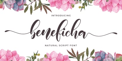 Hello Font lovers, Introducing New Collections Beneficha – Natural Script Font Beneficha – is a Natural Script Calligraphy font with a natural handwritten feel. It has lovely ligatures and alternates that are perfect for any creative design. This handmade font will make your design has a beautiful natural touch for each details. It is perfect for any design project as Invitation,logo, book cover, craft or any design purposes. This font is PUA encoded which means you can access all of the magical glyphs and swashes with ease! It also features a wealth of special features including alternate glyphs and ligatures.
 - Grandecort by Ingrimayne Type,
$9.95Grandecort is derived from the OakPark family. It has lost the serifs, and has moved to a more traditional look. The upper case letters are a bit heavier than the lower case letters, but overall the letter shapes are fairly conventional for a bold, display face. In later 2018 the family was expanded to 9 fonts. GrancMitStripes was reworked to make four new faces: GrancAllStripes, GrancTopStripes, GrancBottomStripes, and GrancCaps. The last can be used as a background layer for the others. Also, The interior of GrandecortShadow was separated out to form GrandecortShadowInside. It has the same shapes as Grandecort-Regular but the spacing of GrandecortShadow and can be layered with the shadowed style to easily create bi-colored letters.