10,000 search results
(0.058 seconds)
- Sungent by Alexey Makarov,
$16.00 This font was inspired by the mountains of Altay. Soft lines and a little asymmetry add a natural touch to Sungent. This font will help add authenticity and personality to your digital work. Contains over 1500 kerning pairs. Language support: Contains full set of Latin alphabet, including diacritical marks for European languages and Cyrillic alphabets.
 - Hewy by Kaer,
$19.00 HEWY is an elegant sans serif font family in Scandinavian design style. Simple line letters will add a touch of style to your projects. What you will get: Line and regular styles Uppercase and lowercase glyphs Numbers and symbols Multilingual support Ligatures Please feel free to request to add characters you need: kaer.pro@gmail.com
 - Pial by Eurotypo,
$20.00 Pial fonts Family includes: Pial Regular that is totally hand-designed, casual and youthful, with lines that sometimes swell extremely, contain 546 glyphs with many stylistic variations, swashes and ligatures. Pial Sans Regular and Expanded, also hand-designed, and Pial Serif Regular and Condensed to add a little seriousness. We have added also, a font of ornaments, extras and catchwords in the family. Using this font you will achieve a very elegant and warm work. Pial Family is very versatile and ideal for logotype design, magazines and book covers, children's material, fashion, headlines, cards, posters, websites, packaging and, basically, anywhere you want.
 - RePublic by Suitcase Type Foundry,
$75.00In 1955 the Czech State Department of Culture, which was then in charge of all the publishing houses, organised a competition amongst printing houses and generally all book businesses for the design of a newspaper typeface. The motivation for this contest was obvious: the situation in the printing presses was appalling, with very little quality fonts existing and financial resources being too scarce to permit the purchase of type abroad. The conditions to be met by the typeface were strictly defined, and far more constrained than the ones applied to regular typefaces designed for books. A number of parameters needed to be considered, including the pressure of the printing presses and the quality of the thin newspaper ink that would have smothered any delicate strokes. Rough drafts of type designs for the competition were submitted by Vratislav Hejzl, Stanislav Marso, Frantisek Novak, Frantisek Panek, Jiri Petr, Jindrich Posekany, and the team of Stanislav Duda, Karel Misek and Josef Tyfa. The committee published its comments and corrections of the designs, and asked the designers to draw the final drafts. The winner was unambiguous — the members of the committee unanimously agreed to award Stanislav Marso’s design the first prize. His typeface was cast by Grafotechna (a state-owned enterprise) for setting with line-composing machines and also in larger sizes for hand-setting. Regular, bold, and bold condensed cuts were produced, and the face was named Public. In 2003 we decided to digitise the typeface. Drawings of the regular and italic cuts at the size of approximatively 3,5 cicero (43 pt) were used as templates for scanning. Those originals covered the complete set of caps except for the U, the lowercase, numerals, and sloped ampersand. The bold and condensed bold cuts were found in an original specimen book of the Rude Pravo newspaper printing press. These specimens included a dot, acute, colon, semicolon, hyphens, exclamation and question marks, asterisk, parentheses, square brackets, cross, section sign, and ampersand. After the regular cut was drafted, we began to modify it. All the uppercase letters were fine-tuned, the crossbar of the A was raised, E, F, and H were narrowed, L and R were significantly broadened, and the angle of the leg and arm of the K were adjusted. The vertex of the M now rests on the baseline, making the glyph broader. The apex of the N is narrower, resulting in a more regular glyph. The tail of Q was made more decorative; the uppercase S lost its implied serifs. The lowercase ascenders and descenders were slightly extended. Corrections on the lower case a were more significant, its waist being lowered in order to improve its colour and light. The top of the f was redrawn, the loop of lowercase g now has a squarer character. The diagonals of the lowercase k were harmonised with the uppercase K. The t has a more open and longer terminal, and the tail of the y matches its overall construction. Numerals are generally better proportioned. Italics have been thoroughly redrawn, and in general their slope is lessened by approximatively 2–3 degrees. The italic upper case is more consistent with the regular cut. Unlike the original, the tail of the K is not curved, and the Z is not calligraphic. The italic lower case is even further removed from the original. This concerns specifically the bottom finials of the c and e, the top of the f, the descender of the j, the serif of the k, a heavier ear on the r, a more open t, a broader v and w, a different x, and, again, a non-calligraphic z. Originally the bold cut conformed even more to the superellipse shape than the regular one, since all the glyphs had to be fitted to the same width. We have redrawn the bold cut to provide a better match with the regular. This means its shapes have become generally broader, also noticeably darker. Medium and Semibold weights were also interpolated, with a colour similar to the original bold cut. The condensed variants’ width is 85 percent of the original. The design of the Bold Condensed weights was optimised for the setting of headlines, while the lighter ones are suited for normal condensed settings. All the OpenType fonts include small caps, numerals, fractions, ligatures, and expert glyphs, conforming to the Suitcase Standard set. Over half a century of consistent quality ensures perfect legibility even in adverse printing conditions and on poor quality paper. RePublic is an exquisite newspaper and magazine type, which is equally well suited as a contemporary book face. - FruitForEars font is at once playful and imaginative, embodying a refreshing twist on traditional typefaces. Designed to capture the whimsy and joy of summertime orchards, this font features characte...
- Eastern by me55enjah,
$14.00 Eastern family, sans serif fonts designed with a vintage print look. Rounded edges and imperfections were added to the characters to give a vintage vibe. The font family also works great for creating quotes, title, and still legible in a bunch of text. For those looking for some peculiar characters, available on Blind and Rusty texture versions as well. Add some Ornament to complete your vintage print look.
 - The Scooter Boy Free font is a distinctive typeface that encapsulates the spirit of adventure, freedom, and youthful energy, reminiscent of the vibrant scooter culture. Its character design embodies ...
- Qilgabe by Letterena Studios,
$17.00 Qilgabe is a modern and stylish serif font. Add it confidently to your projects and you will love the results!
 - Gruyere by Atlantic Fonts,
$26.00 Gruyère is rich with character and always in good taste. Earthy and assertive, Gruyère adds distinctive flavor to every occasion.
 - MOO! - Personal use only

- Mikadan by Typodermic,
$11.95 Hear ye, hear ye! Adventurers of all realms, allow me to regale you with a tale of Mikadan, a font of great splendor and beauty. Behold, its letterforms are imbued with the grace and character of the medieval age, yet tempered with modern sensibilities. This typeface is a tribute to the great Verona of Stephenson Blake, a typeface of old that harks back to the days of yore, the age of kings and queens, and the rise of chivalry. Mikadan also draws inspiration from William Dana Orcutt’s Illumanistic, a font of great power and mystery from the turn of the century. Moreover, Mikadan possesses some of the accessible qualities of Morris Fuller Benton’s Motto, a font that has stood the test of time since 1915. Truly, Mikadan is a font that combines the best of old and new, of medieval fantasy and modern design. With its easy-to-read letterforms and medieval design, Mikadan is the ideal choice for all modern applications. Whether you’re designing a poster for a tournament, a sign for a market, or a banner for your guild, Mikadan will serve you well. And if your program supports OpenType alternates, you can access unique drop-down capital letters that will truly set your design apart. So come forth, brave adventurers! Embrace the medieval fantasy design of Mikadan and set forth on your journey to create designs that will endure through the ages. Most Latin-based European, and most Cyrillic-based writing systems are supported, including the following languages. Afaan Oromo, Afar, Afrikaans, Albanian, Alsatian, Aromanian, Aymara, Bashkir, Bashkir (Latin), Basque, Belarusian, Belarusian (Latin), Bemba, Bikol, Bosnian, Breton, Bulgarian, Buryat, Cape Verdean, Creole, Catalan, Cebuano, Chamorro, Chavacano, Chichewa, Crimean Tatar (Latin), Croatian, Czech, Danish, Dawan, Dholuo, Dungan, Dutch, English, Estonian, Faroese, Fijian, Filipino, Finnish, French, Frisian, Friulian, Gagauz (Latin), Galician, Ganda, Genoese, German, Greenlandic, Guadeloupean Creole, Haitian Creole, Hawaiian, Hiligaynon, Hungarian, Icelandic, Ilocano, Indonesian, Irish, Italian, Jamaican, Kalmyk, Kaqchikel, Karakalpak (Latin), Kashubian, Kazakh, Khalkha, Kikongo, Kinyarwanda, Kirundi, Komi-Permyak, Kurdish, Kurdish (Latin), Kyrgyz, Latvian, Lithuanian, Lombard, Low Saxon, Luxembourgish, Maasai, Macedonian, Makhuwa, Malay, Maltese, Māori, Moldovan, Montenegrin, Ndebele, Neapolitan, Norwegian, Novial, Occitan, Ossetian, Ossetian (Latin), Papiamento, Piedmontese, Polish, Portuguese, Quechua, Rarotongan, Romanian, Romansh, Russian, Rusyn, Sami, Sango, Saramaccan, Sardinian, Scottish Gaelic, Serbian, Serbian (Latin), Shona, Sicilian, Silesian, Slovak, Slovenian, Somali, Sorbian, Sotho, Spanish, Swahili, Swazi, Swedish, Tagalog, Tahitian, Tajik, Tatar, Tetum, Tongan, Tshiluba, Tsonga, Tswana, Tumbuka, Turkish, Turkmen (Latin), Tuvaluan, Ukrainian, Uzbek, Uzbek (Latin), Venetian, Vepsian, Võro, Walloon, Waray-Waray, Wayuu, Welsh, Wolof, Xhosa, Yapese, Zapotec, Zulu and Zuni.
 - Blank Manuscript by Aah Yes,
$14.95Blank Manuscript allows you to produce sophisticated musical scoresheets even on basic Word Processors - anything from simple plain staves to complex full-page orchestral scores of your own design, to write in the notation yourself. The basic stuff is really easy and straightforward, but there's some quite advanced things you can do as well. So Copy and Save these Instructions. • The main stuff is simple and tends to follow the initial letter. Treble, Bass and Alto clefs are on upper case T B A (there are more clefs, below). The 5 Lines for the clefs are on L or l. • A small v will give a small vertical line (like a bar line) and a Big U will give a Big Upright - these can start or end a line or piece. • Time Signatures - type the following letters: Think of W for Waltz and it's easy to remember that 3/4 time is on W. Then from that they go up or down together like this: V=2/4 W=3/4 X=4/4 Y=5/4 Z=6/4 Compound Times are on H I J K like this: H=3/8 I=6/8 J=9/8 K=12/8 Common Time and Cut Common symbols can be found on semi-colon and colon respectively (all begin with Co- ). 2/2 3/2 are on lower case a and b, 7/4 and 7/8 are on lower case c and d, 5/8 is on small k (think POL-k-A) • Flat signs are on the numbers. Flat signs on LINES 1 to 5 are on numbers 1 to 5. Flat signs on SPACES 1 to 5 are on numbers 6 to 0 (space 1 being above line 1, space 5 being above the top line of the stave). Sharp signs are on the letters BELOW the long-row numbers. Which is q w e r t for the sharp signs on Lines 1 to 5, and y u i o p for sharp signs on spaces 1 to 5. Doing it this way means it works the same for all clefs, whether Treble, Bass, Alto, Tenor or any other. Sharp and Flat Signs always go in this order, depending on how many sharps or flats your key signature requires: Treble Clef Sharps t i p r u o e Flats 3 9 7 4 2 8 6 Bass Clef Sharps r u o e t i w Flats 2 8 6 3 1 7 = Alto Clef Sharps o e t i w r u Flats 7 4 2 8 6 3 1 • Guitar Chord Boxes are on G and g (G for Guitar) Upper Case G has a thick line across the top Lower case g has an open top, for chords up the fretboard TAB symbols are available: Six-string Tablature is on s & S for Six. Four-string Tablature is on f & F for Four. (Lower case has the "TAB" symbol on it, Upper Case has just the lines to continue.) Five-string tablature, is on lower case "j" (as in BAN-j-O) and of course L or l will continue the 5 lines. •RARE CLEF SIGNS including Tenor Clef, are on various punctuation marks, i.e. dollar, percent, circumflex, ampersand & asterisk, above the numbers 4 to 8. NOTE: The important symbols were kept on the letter and number keys, which are fairly standard all over, but some of the less important symbols are on various punctuation keys, which in different countries are not the same as on my keyboard. If it comes out wrong on your system, all I can say is it's right on the systems we've tried, and they'll be in here somewhere, probably on a different key. CLOSING THE ENDS OF THE LINES and BAR-LINES is done with the 3 varieties of brackets - brackets, brace and parentheses - Left/Right for the Left/Right end of the line. Parentheses L/R () which are above 9, 0 give a clef with a small vertical upright (the same as a bar line). Brace L/R and Brackets L/R (both on the 2 keys to the right of P on my keyboard) will close off a staff line with tall upright bars. Brace gives a double upright - one thick, one thin. Brackets give a single tall upright. A Big Upright is on Big U, (Big U for Big Upright) and a small vertical line is on small v (small v for small vertical). The Big Upright is the maximum height, and the small vertical is exactly the same height as a stave. And there's a tall upright Bar, on Bar (which is to the left of z on my keyboard, with Shift,) which is the same height as the bar on upper case U but twice as broad. • There's a staff intended for writing melodies, which is a little bit higher up than an ordinary treble clef giving a space underneath to put lyrics in - on m and M for Melody line. Lower case has the Treble Clef on, Upper case M has just the higher-up staff lines with no clef. (Use mMMMMMMM etc.) However this clef will be in the wrong place to put in sharp and flat signs, key signatures and so on, so if you use this clef you'll have to write the sharps, flats and key signature yourself. There's also a clef that's smaller (less tall) than the ordinary clef, but with the same horizontal spacing so it will align with other standard-sized clefs - on slash (a plain clef) and backslash (with a Treble Clef). • There are some large brackets for enclosing groups of staves, such as you'd use on large orchestral scores, on Upper Case N O P Q R, which can aid clarity. N and O on the left, Q and R on the right. P is a Perpendicular line to be used on both sides to increase the height of the enclosure, in this way but with the staff lines in between: N Q P P P P P P O R OTHERS —————————————— • Repeat marks are on comma (left) and period/full stop (right). • Hyphen is left as a sort of hyphen - it's a thin line like a single staff line, with the same horizontal spacing as ordinary staff lines - in case you want to draw a line across for a Percussion Instrument, or a Title or Lyric Line. • Space is a Space, but with HALF the width or horizontal spacing as ordinary staff lines, so 2 space symbols will be the same width as a clef symbol or line. • Grave (to the left of 1 on the long row, or hold down Alt and type 0096 then let go) gives a staff line that is one eighth the width of an ordinary staff line. • If you want manuscript in a clef and key which requires a flat or sharp sign in the space underneath the 5 lines, they’re on = equals and + plus . SYMBOLS • Many of these symbols will only be useful if you have worked out in advance which bars will need them, but they are here in case you've done that and wish to include them. • Symbols for p and f (piano and forte) are on 'less than' and 'greater than' < > (above comma and full stop) and m for mezzo is on Question, next to them. They can be combined to make mp, mf, ff, pp, etc. These signs -- and other signs and symbols like Pedal Sign, Coda Sign and so on -- can be found on various punctuation mark keys, including above 1, 2, 3 in the long row, and others around the keyboard. There's a sort of logic to their layout, but in different countries the keys are likely to give different results to what is stated here, so it's probably best to just try the punctuation and see if there's any you might want to use. (But on my keyboard a Coda sign is on circumflex - because of the visual similarity. Pedal sign is on underscore. A "Sign" symbol is on exclamation mark.) They were only included in case you really need them to be printed rather than handwritten. • However, a Copyright symbol is deemed necessary, and also included are a "Registered" symbol and a TradeMark symbol. They are found in the conventional places, and can be accessed by holding down ALT and typing 0169, 0174 or 0153 respectively in the numberpad section and letting go. • Staff lines with arco and pizz. above are on capital C and D respectively ---C for ar-C-o. • An empty circle above a staff line (to indicate sections by writing letters A, B, C or 1,2,3 inside for rehearsal marks) is on n. The actual signs for an A, B, C and D in a circle above the staff line can be produced by holding down ALT and typing 0188, 0189, 0190 and 0191 respectively and letting go. • The word "Page", for indicating page numbers, is on the numbersign key. • The two quotes keys, (quote single and quote double) have symbols representing "Tempo is", and "play as triplets", respectively. • INSTRUMENT NAMES There's a whole lot of Instrument Names built in (over a hundred) which can be printed out above the clef, and you do it like this. Hold down Alt and type in the given number in the numberpad section, then let go. For Piccolo it's 0130, for Flute it's 0131, Cornet is on 0154, Violin is on 0193, and the numbers go up to over 0250, it's a fairly complete set. There's also a blank which is used to align un-named clefs on 0096. Put them at the very beginning of the line for the best results. Here they are: WOODWIND Piccolo 0130 Flute 0131 Oboe 0132 Clarinet 0133 Eng Horn 0134 Bassoon 0135 Soprano Sax 0137 Alto Sax 0138 Tenor Sax 0139 Baritone Sax 0140 Saxophone 0142 Contrabassoon 0145 Recorder 0146 Alto Flute 0147 Bass Flute 0148 Oboe d'Amore 0149 Cor anglais 0152 Pipes 0241 Whistle 0242 BRASS Cornet 0154 Trumpet 0155 Flugelhorn 0156 Trombone 0158 Euphonium 0159 Tuba 0161 French Horn 0162 Horn 0163 Tenor Trombone 0164 Bass Trombone 0165 Alto Trombone 0166 Piccolo Cornet 0167 Piccolo Trumpet 0168 Bass Trumpet 0170 Bass Tuba 0171 Brass 0172 VOICES Vocal 0175 Melody 0176 Solo 0177 Harmony 0178 Soprano 0179 Alto 0180 Tenor 0181 Baritone 0182 Treble 0183 Bass 0197 (see also PLUCKED STRINGS) Descant 0184 Mezzo Soprano 0185 Contralto 0186 Counter Tenor 0187 Lead 0206 BOWED STRINGS Strings 0192 Violin 0193 Viola 0194 Cello 0195 Contrabass 0196 Bass 0197 Double Bass 0198 Violoncello 0199 Violin 1 0200 Violin 2 0201 Fiddle 0252 PLUCKED STRINGS Harp 0202 Guitar 0203 Ac. Gtr 0204 El. Gtr 0205 Lead 0206 Bass 0197 Ac. Bass 0207 El. Bass 0208 Slide Gtr 0209 Mandolin 0210 Banjo 0211 Ukelele 0212 Zither 0213 Sitar 0214 Lute 0215 Pedal Steel 0216 Nylon Gtr. 0238 Koto 0239 Fretless 0244 KEYBOARDS + ORGAN Piano 0217 El. Piano 0218 Organ 0219 El. Organ 0220 Harpsichord 0221 Celesta 0222 Accordion 0223 Clavinet 0224 Harmonium 0225 Synth 0226 Synth Bass 0227 Keyboards 0228 Sampler 0249 PERCUSSION and TUNED PERCUSSION Percussion 0229 Drums 0230 Vibes 0231 Marimba 0232 Glockenspiel 0233 Xylophone 0234 Bass marimba 0235 Tubular Bells 0236 Steel Drums 0237 Kalimba 0240 OTHERS Harmonica 0246 Mouth Organ 0247 FX 0251 Intro 0243 Verse 0245 Refrain 0248 Chorus 0250 un-named 0096 (this is a small spacer stave for aligning clefs without a name) ALSO copyright 0169 registered 0174 TradeMark 0153 Rehearsal marks 0188-0191 (giving A, B, C, D in a circle, an empty circle is on n ) Clef signs for Treble Bass Alto without any staff lines 0253-0255 An Alphabetic List of all signs: a 2/2 time b 3/2 time c 7/4 time d 7/8 time e sharp sign, centre line f Tab sign for 4-string tab g Guitar Chord Box, no nut h half-width stave I sharp sign, third space up j Tab sign for 5-string tab k 5/8 time l Lines - 5 horizontal lines for a stave m Melody Clef - a standard clef but placed higher up, with Treble sign n Stave with an empty circle above o sharp sign, fourth space up p sharp sign, space above stave q sharp sign, bottom line r sharp sign, fourth line up s Tab sign for 6-string tab t sharp sign, top line (fifth line up) u sharp sign, second space up v vertical line (bar-line) w sharp sign, second line up x Fretboard, four strings y sharp sign, first space up z Fretboard, five strings A Alto Clef B Bass Clef C “arco” above stave D “pizz.” above stave E Double Vertical Lines F Four Horizontal lines (for 4-string tab) G Guitar Chord Box with nut H 3/8 time I 6/8 time J 9/8 time K 12/8 time L Lines - 5 horizontal lines for a stave M Melody Clef - a standard clef but placed higher up, plain N Bounding Line for grouping clefs - top left O Bounding Line for grouping clefs - bottom left P Bounding Line for grouping clefs - Perpendicular Q Bounding Line for grouping clefs - top right R Bounding Line for grouping clefs - bottom right S Six Horizontal lines (for 6-string tab) T Treble Clef U tall, thin Upright line V 2/4 time W 3 / 4 time X 4/4 time Y 5/4 time Z 6/4 time 1 flat sign, first line up (the lowest line) 2 flat sign, second line up 3 flat sign, third line up 4 flat sign, fourth line up 5 flat sign, fifth line up (the top line) 6 flat sign, first space up (the lowest space) 7 flat sign, second space up 8 flat sign, third space up 9 flat sign, fourth space up 0 flat sign, space above stave - Wavetable by Typodermic,
$11.95 The Wavetable typeface is not your ordinary run-of-the-mill typeface. Its unique rectangular letterforms and sophisticated techno look sets it apart from other fonts in its category. This ultramodern typeface has been designed with the utmost attention to detail, inspired by the sleek designs of electronic musical instruments. One cannot help but admire the intricate details of the Wavetable typeface. Its unorthodox letterforms are reminiscent of the precision and finesse of a well-tuned musical instrument. Each character is carefully crafted to create a harmonious balance between form and function. But the Wavetable typeface is not just about looks. Its OpenType fractions, primes, and all currency symbols make it a versatile font suitable for a wide range of design applications. Whether you’re designing a sleek and modern logo or a futuristic poster, Wavetable has got you covered. In summary, the Wavetable typeface is a masterpiece of modern design, inspired by the world of electronic music. Its sophisticated techno look and unique rectangular letterforms make it a standout headliner that is sure to capture the attention of any audience. Most Latin-based European, Vietnamese, Greek, and most Cyrillic-based writing systems are supported, including the following languages. Afaan Oromo, Afar, Afrikaans, Albanian, Alsatian, Aromanian, Aymara, Azerbaijani, Bashkir, Bashkir (Latin), Basque, Belarusian, Belarusian (Latin), Bemba, Bikol, Bosnian, Breton, Bulgarian, Buryat, Cape Verdean, Creole, Catalan, Cebuano, Chamorro, Chavacano, Chichewa, Crimean Tatar (Latin), Croatian, Czech, Danish, Dawan, Dholuo, Dungan, Dutch, English, Estonian, Faroese, Fijian, Filipino, Finnish, French, Frisian, Friulian, Gagauz (Latin), Galician, Ganda, Genoese, German, Gikuyu, Greenlandic, Guadeloupean Creole, Haitian Creole, Hawaiian, Hiligaynon, Hungarian, Icelandic, Igbo, Ilocano, Indonesian, Irish, Italian, Jamaican, Kaingang, Khalkha, Kalmyk, Kanuri, Kaqchikel, Karakalpak (Latin), Kashubian, Kazakh, Kikongo, Kinyarwanda, Kirundi, Komi-Permyak, Kurdish, Kurdish (Latin), Kyrgyz, Latvian, Lithuanian, Lombard, Low Saxon, Luxembourgish, Maasai, Macedonian, Makhuwa, Malay, Maltese, Māori, Moldovan, Montenegrin, Nahuatl, Ndebele, Neapolitan, Norwegian, Novial, Occitan, Ossetian, Ossetian (Latin), Papiamento, Piedmontese, Polish, Portuguese, Quechua, Rarotongan, Romanian, Romansh, Russian, Rusyn, Sami, Sango, Saramaccan, Sardinian, Scottish Gaelic, Serbian, Serbian (Latin), Shona, Sicilian, Silesian, Slovak, Slovenian, Somali, Sorbian, Sotho, Spanish, Swahili, Swazi, Swedish, Tagalog, Tahitian, Tajik, Tatar, Tetum, Tongan, Tshiluba, Tsonga, Tswana, Tumbuka, Turkish, Turkmen (Latin), Tuvaluan, Ukrainian, Uzbek, Uzbek (Latin), Venda, Venetian, Vepsian, Vietnamese, Võro, Walloon, Waray-Waray, Wayuu, Welsh, Wolof, Xavante, Xhosa, Yapese, Zapotec, Zarma, Zazaki, Zulu and Zuni.
 - Nulshock by Typodermic,
$11.95 Nulshock, the name itself invokes images of a bold, industrial design, with sleek, precise lines and curves that scream of the latest high-tech advancements. This typeface is not for the faint of heart, as it delivers your message with an unapologetic, explosive impact that will leave a lasting impression. Designed with the utmost attention to detail, Nulshock’s precise mechanical curves and accurate optical adjustments make it a natural fit for even the most demanding of high-tech environments. Its ultra-modern design and wide, industrial style set it apart from other fonts, making it the perfect choice for headlines, labels, indicators, logos, product names, and titles. And with a range of seven weights to choose from, you can fine-tune Nulshock’s visual impact to suit your specific needs. From the lightest weight for a more delicate touch, to the heaviest weight for maximum impact, Nulshock has you covered. But Nulshock isn’t just a pretty face—it’s also highly functional. With a wide range of symbols, including mathematical symbols, monetary symbols, fractions, and numeric ordinals, Nulshock is a versatile tool for any design project. In short, Nulshock is a font that demands attention, and it delivers on that demand with an ultra-modern, wide design that is optimized for high-tech environments. So if you’re looking to make a bold statement with your next design project, Nulshock is the typeface for you. Most Latin-based European writing systems are supported, including the following languages. Afaan Oromo, Afar, Afrikaans, Albanian, Alsatian, Aromanian, Aymara, Bashkir (Latin), Basque, Belarusian (Latin), Bemba, Bikol, Bosnian, Breton, Cape Verdean, Creole, Catalan, Cebuano, Chamorro, Chavacano, Chichewa, Crimean Tatar (Latin), Croatian, Czech, Danish, Dawan, Dholuo, Dutch, English, Estonian, Faroese, Fijian, Filipino, Finnish, French, Frisian, Friulian, Gagauz (Latin), Galician, Ganda, Genoese, German, Greenlandic, Guadeloupean Creole, Haitian Creole, Hawaiian, Hiligaynon, Hungarian, Icelandic, Ilocano, Indonesian, Irish, Italian, Jamaican, Kaqchikel, Karakalpak (Latin), Kashubian, Kikongo, Kinyarwanda, Kirundi, Kurdish (Latin), Latvian, Lithuanian, Lombard, Low Saxon, Luxembourgish, Maasai, Makhuwa, Malay, Maltese, Māori, Moldovan, Montenegrin, Ndebele, Neapolitan, Norwegian, Novial, Occitan, Ossetian (Latin), Papiamento, Piedmontese, Polish, Portuguese, Quechua, Rarotongan, Romanian, Romansh, Sami, Sango, Saramaccan, Sardinian, Scottish Gaelic, Serbian (Latin), Shona, Sicilian, Silesian, Slovak, Slovenian, Somali, Sorbian, Sotho, Spanish, Swahili, Swazi, Swedish, Tagalog, Tahitian, Tetum, Tongan, Tshiluba, Tsonga, Tswana, Tumbuka, Turkish, Turkmen (Latin), Tuvaluan, Uzbek (Latin), Venetian, Vepsian, Võro, Walloon, Waray-Waray, Wayuu, Welsh, Wolof, Xhosa, Yapese, Zapotec Zulu and Zuni.
 - Expressway Soft by Typodermic,
$11.95 Rev up your design game with Expressway Soft, the sans-serif font family that brings a touch of automotive style to your projects. Inspired by the U.S. Department of Transportation’s FHWA Series of Standard Alphabets, this font has been the go-to choice for road signs across the world, from the sweeping highways of Australia to the bustling streets of India. With its soft, rounded corners, Expressway Soft captures the feeling of cruising down an open road, while its twelve styles—including six weights and italics—offer versatility and flexibility for any design project. Old-style and monospaced numerals make it easy to create eye-catching price lists and other tabular data, while the font’s focus on design over regulation allows you to truly unleash your creativity. Whether you’re designing a bold, attention-grabbing billboard or a sleek, modern website, Expressway Soft has the style and functionality you need. So why settle for a font that’s strictly by the book when you can hit the road in style with Expressway Soft? And if you’re looking for a more angular variant, be sure to check out Typodermic Fonts’ Expressway with squared-off corners. Most Latin-based European, Vietnamese, Greek, and most Cyrillic-based writing systems are supported, including the following languages. Afaan Oromo, Afar, Afrikaans, Albanian, Alsatian, Aromanian, Aymara, Azerbaijani, Bashkir, Bashkir (Latin), Basque, Belarusian, Belarusian (Latin), Bemba, Bikol, Bosnian, Breton, Bulgarian, Buryat, Cape Verdean, Creole, Catalan, Cebuano, Chamorro, Chavacano, Chichewa, Crimean Tatar (Latin), Croatian, Czech, Danish, Dawan, Dholuo, Dungan, Dutch, English, Estonian, Faroese, Fijian, Filipino, Finnish, French, Frisian, Friulian, Gagauz (Latin), Galician, Ganda, Genoese, German, Gikuyu, Greenlandic, Guadeloupean Creole, Haitian Creole, Hawaiian, Hiligaynon, Hungarian, Icelandic, Igbo, Ilocano, Indonesian, Irish, Italian, Jamaican, Kaingang, Khalkha, Kalmyk, Kanuri, Kaqchikel, Karakalpak (Latin), Kashubian, Kazakh, Kikongo, Kinyarwanda, Kirundi, Komi-Permyak, Kurdish, Kurdish (Latin), Kyrgyz, Latvian, Lithuanian, Lombard, Low Saxon, Luxembourgish, Maasai, Macedonian, Makhuwa, Malay, Maltese, Māori, Moldovan, Montenegrin, Nahuatl, Ndebele, Neapolitan, Norwegian, Novial, Occitan, Ossetian, Ossetian (Latin), Papiamento, Piedmontese, Polish, Portuguese, Quechua, Rarotongan, Romanian, Romansh, Russian, Rusyn, Sami, Sango, Saramaccan, Sardinian, Scottish Gaelic, Serbian, Serbian (Latin), Shona, Sicilian, Silesian, Slovak, Slovenian, Somali, Sorbian, Sotho, Spanish, Swahili, Swazi, Swedish, Tagalog, Tahitian, Tajik, Tatar, Tetum, Tongan, Tshiluba, Tsonga, Tswana, Tumbuka, Turkish, Turkmen (Latin), Tuvaluan, Ukrainian, Uzbek, Uzbek (Latin), Venda, Venetian, Vepsian, Vietnamese, Võro, Walloon, Waray-Waray, Wayuu, Welsh, Wolof, Xavante, Xhosa, Yapese, Zapotec, Zarma, Zazaki, Zulu and Zuni.
 - Teeshirt by Typodermic,
$11.95 Hey there, so you want to look like a walking throwback to the 1980s? Well, lucky for you, Teeshirt is here to help you achieve that coveted slovenly appearance. If you’re looking for a typeface that screams, “I don’t care” then Teeshirt is your new best friend. It’s designed to mimic vintage t-shirt lettering, so you can rock that “I just rolled out of bed and put on the first thing I found on my floor” look. And if you’re worried about being too uniform with your letters, fear not! Teeshirt has got you covered with letter pair ligatures. Because who wants to look like they put any effort into their appearance, right? And if you’re feeling adventurous and want to shake things up a bit, you can always disable the “standard ligatures” feature in your application. Teeshirt comes in two styles: Regular and Pressed. The bouncy Regular style will make it look like your letters are ready to jump right off your shirt, while the orderly Pressed style will give you that crisp, just-ironed look (although let’s be real, who has time for ironing?). So what are you waiting for? Embrace your inner sloth and give Teeshirt a try. Because who needs effort and a polished appearance when you can look like a hot mess instead? Most Latin-based European writing systems are supported, including the following languages. Afaan Oromo, Afar, Afrikaans, Albanian, Alsatian, Aromanian, Aymara, Bashkir (Latin), Basque, Belarusian (Latin), Bemba, Bikol, Bosnian, Breton, Cape Verdean, Creole, Catalan, Cebuano, Chamorro, Chavacano, Chichewa, Crimean Tatar (Latin), Croatian, Czech, Danish, Dawan, Dholuo, Dutch, English, Estonian, Faroese, Fijian, Filipino, Finnish, French, Frisian, Friulian, Gagauz (Latin), Galician, Ganda, Genoese, German, Greenlandic, Guadeloupean Creole, Haitian Creole, Hawaiian, Hiligaynon, Hungarian, Icelandic, Ilocano, Indonesian, Irish, Italian, Jamaican, Kaqchikel, Karakalpak (Latin), Kashubian, Kikongo, Kinyarwanda, Kirundi, Kurdish (Latin), Latvian, Lithuanian, Lombard, Low Saxon, Luxembourgish, Maasai, Makhuwa, Malay, Maltese, Māori, Moldovan, Montenegrin, Ndebele, Neapolitan, Norwegian, Novial, Occitan, Ossetian (Latin), Papiamento, Piedmontese, Polish, Portuguese, Quechua, Rarotongan, Romanian, Romansh, Sami, Sango, Saramaccan, Sardinian, Scottish Gaelic, Serbian (Latin), Shona, Sicilian, Silesian, Slovak, Slovenian, Somali, Sorbian, Sotho, Spanish, Swahili, Swazi, Swedish, Tagalog, Tahitian, Tetum, Tongan, Tshiluba, Tsonga, Tswana, Tumbuka, Turkish, Turkmen (Latin), Tuvaluan, Uzbek (Latin), Venetian, Vepsian, Võro, Walloon, Waray-Waray, Wayuu, Welsh, Wolof, Xhosa, Yapese, Zapotec Zulu and Zuni.
 - Phantom Urbanism Graffiti by Sipanji21,
$22.00 "Phantom Urbanism" is a monoline font with a monoline graffiti theme and an option with stylistic set with arrow effect to add depth and decoration to the font. It is perfect for a wide range of urban or street-themed design projects, such as streetwear design, logo design, car/motosport decals, skateboard decals, and other similar designs. With its edgy and bold appearance, "Phantom Urbanism" brings a sense of energy and attitude to your designs. The font's monoline style and arrow effect optional to adds visual interest and makes your designs stand out. Whether you're looking to create a strong and impactful design or add a touch of urban style to your projects, "Phantom Urbanism" is the font for you.
 - Street Of Exodus by Sipanji21,
$18.00 "Street of Exodus" is a monoline font with a graffiti theme and a slight shadow effect to add depth and decoration to the font. It is perfect for a wide range of urban or street-themed design projects, such as streetwear design, logo design, car/motosport decals, skateboard decals, and other similar designs. With its edgy and bold appearance, "Street of Exodus" brings a sense of energy and attitude to your designs. The font's monoline style and slight shadow effect create a 3D effect that adds visual interest and makes your designs stand out. Whether you're looking to create a strong and impactful design or add a touch of urban style to your projects, "Street of Exodus" is the font for you.
 - Wakefield by Galapagos,
$39.00A gentle breeze caressed his face as his body took on the easy posture of a dancer on break. Flickering sparklets of light sprinkled the glass-smooth surface of the aqua liquid on which he floated. His mind wandered; he was only days away from his scheduled departure date. This day was no different from a hundred other days he had spent melded to his windsurfer, skittering along the breadth of the modest lake, soaking up the sun's rays and forgetting about the entire rest of the world. Lake Quannapowitt, and the town of Wakefield, Massachusetts, were familiar to Steve, a long-time resident of the picturesque New England town. This is where he grew up; this is where he married and lived for many years; and this is the place he was preparing to leave, not one week hence. Not generally prone to nostalgia, it was in just such a state he nonetheless found himself once Zephyrus retreated, as was his custom, periodically, while patrolling the resplendent lake. Steve was going to miss the lake, and he was going to miss the town. How many hours of how many days had he spent exactly like this, standing on his motionless board, waiting for his sail to fill, and staring at the lake's shores, its tiny beach, the town Common with its carefully maintained greenery, and equally well-tended gazebo, the Center church - its spire shadow piercing the water's edge, like a scissor-cut the better to begin a full-fabric tear? Yes, he was going to miss this place - this town which all of a sudden had become a place out of time, just as he was about to become a person out of place. Once this idea struck him, he couldn't shake it. He was transported back in time four score years, now watching his ancestors walk along the shore. Nothing in view belied this belief - not the church's century old architecture, not the gazebo frozen in time, nor the timeless sands of the beach, nor the unchanging Common. Everything belonged exactly where it was, and where it always would be. This, he decided, was how he would remember his hometown. And this is when it occurred to Steve to design a typeface that would evoke these images and musings - a typeface with an old-fashioned look, reflected in high crossbars, an x-height small in size relative to its uppercase, and an intangible quality reminiscent of small-town quaintness. Wakefield, the typeface, was born on Lake Quannapowitt in the town for which it was named, shortly before Steve moved away. It is at once a tribute to his birthplace and a keepsake. - Chewy Bubble by Balpirick,
$15.00 Chewy Bubble is a fat and handy font, a fun typeface that adds a cheerful and vibrant touch to your designs. This font features bold and rounded letterforms, reminiscent of fat bubbles floating in the air. Carefully crafted curves and generous spacing create a sense of fun and whimsy, giving your text a lively and interesting look. Whether you're designing a logo, poster, or children's book cover, this fat and cheerful font is sure to grab attention and add some fun to your designs
 - Nexa Rust by Fontfabric,
$35.00 Nexa Rust from Fontfabric Type Foundry is a multifaceted font system consisting of font sub-families Sans, Slab, Script, Handmade and Extras. Each of these sub-families contains a number of font weights which have a characteristic warm, rough look and display a few degrees of saturation. Nexa Rust is a rough version of the already popular Nexa and Nexa Slab families with added new matching Nexa Script and Nexa Handmade fonts. Along with all of this, you will also discover added groups of extras which could serve as a foundation or add that extra “cherry on the cake” to each unique design.
 - Begilas by Letterena Studios,
$17.00 Begilas is a stylish and modern serif font. Add it confidently to your unique projects and you will love the results!
 - Kalimar by Letterena Studios,
$17.00 Kalimar is a cool and modern serif display font. Add it confidently to your projects and you will love the results!
 - Grosfer by Typeskets,
$17.00 Grosfer is a cool, bold and thick lettered display font. This font reads as strong, confident, and dynamic and can add a fierce character to your designs.
 - Eurydome by Emboss,
$30.00 Eurydome is one of Jupiter's many moons, and was named after Eurydome, the mother of the Graces in Greek mythology. Eurydome was inspired by the Grotesque face Venus, with an additional flair added to the lowercase a, b, d and g. Eurydome was designed to complement any display face that may be used in your project. Add grace to your layout, with Eurydome.
 - Salt & Spices Pro by Fontforecast,
$29.00 Salt&Spices Pro is a welcome addition to the ever popular modern calligraphy genre. Digitizing the many handwritten samples into a fully functional connected script was done with great precision, carefully guarding the authentic look and feel of vintage dip pen calligraphy. Salt&Spices Pro is a very versatile 9 font family, consisting of 3 casual styles: Regular, Bold and Shadow. With 587 glyphs each, they offer great flexibility in customizing words and phrases to suit your personal taste. For instance: the appearance of initial and terminal letters can be customized using the glyph pallet. Contextual alternates, Swashes and Stylistic sets give you the ability to replace spaces by 3 alternate connecting spaces or add swashes to initial/terminal letters. Double letter ligatures help sustain the natural flow of handwriting. In addition to the 3 calligraphic family members 3 SmallCaps Sans styles and 3 SmallCaps Serif styles were added. They all have 435 glyphs and match very well because they were designed using the same vintage nib. Each of the styles can add great variation to your designs and they supplement and support each other perfectly. Add exceptional language support to all that and you have the perfect ingredient to spice up even the most demanding design project.
 - Mila Script Pro by FaceType,
$79.00 Proud to introduce: The all hand-drawn Mila Script Pro Family Mila Script is a handmade brush script with round and soft letterforms, a low x-height and jumping baseline. Smart OpenType features care about all letterforms and choose between connected and non-connected styles. AutomaticSwashControl adjusts the swashy letters to the available white space. It’s installed within Mila’s main features OpenType Contextual-Alternates, Swashes and Titling-Alternates. Switch one on and let Mila do the rest. · Please read over the manual. It describes the family in detail. · Of course there’s a little more know about Mila Script Pro: 2600+ characters offer four different initial styles, capital swash and titling alternates, connected words, 17 different initial and terminal swashes and much more. All of course with full ISO latin 1 & 2 language support. · Mila Script Basic (900+ characters) offers all single features contained in OpenType Contextual-Alternates: subtle contextual swash alternates, positional forms, ligatures, connecting and non-connecting characters … · Mila Script Sans: Mila Script Sans is a hand-drawn/handwritten “all caps” in three different weights. Mila Script and Mila Script Sans go well together: combine them and equal the line weights by choosing Light, Regular or Bold. Always keep it way smaller than Mila Script. Mila Script Sans also works well as a standalone. It offers negative typesetting, bicolor typesetting by layering two styles and even alternates without counters. Please see the manual for instructions. · Mila Script Ornaments: Change the size and keep the line weight: activate Contextual Alternates, type a letter and add + to enlarge all swashes according to your likings. Mila Script Ornaments contains 69 different swashes and symbols, all of them available in seven different sizes, which makes a total of 483 characters. All ornaments are within easy reach and there’s no need to access certain symbols manually via your glyph palette. · Have fun! · View other fonts from Georg Herold-Wildfellner: Sofa Serif | Sofa Sans | Mila Script Pro | Pinto | Supernett | Mr Moustache | Aeronaut | Ivory | Weingut · Language Report for Mila Script / 195 languages supported: Abenaki, Afaan Oromo, Afar, Afrikaans, Albanian, Alsatian, Amis, Anuta, Aragonese, Aranese, Aromanian, Arrernte, Arvanitic, Asturian, Aymara, Bashkir, Basque, Bikol, Bislama, Bosnian, Breton, Cape Verdean, Catalan, Cebuano, Chamorro, Chavacano, Chickasaw, Cimbrian, Cofan, Corsican, Creek, Crimean Tatar, Croatian, Czech, Danish, Dawan, Delaware, Dholuo, Drehu, Dutch, English, Estonian, Faroese, Fijian, Filipino, Finnish, Folkspraak, French, Frisian, Friulian, Gagauz, Galician, Genoese, German, Gooniyandi, Greenlandic, Guadeloupean, Gwichin, Haitian Creole, Han, Hawaiian, Hiligaynon, Hopi, Hotcak, Hungarian, Icelandic, Ido, Ilocano, Indonesian, Interglossa, Interlingua, Irish, Istroromanian, Italian, Jamaican, Javanese, Jerriais, Kala Lagaw Ya, Kapampangan, Kaqchikel, Karakalpak, Karelian, Kashubian, Kikongo, Kinyarwanda, Kiribati, Kirundi, Klingon, Ladin, Latin, Latino Sine, Latvian, Lithuanian, Lojban, Lombard, Low Saxon, Luxembourgish, Makhuwa, Malay, Maltese, Manx, Maori, Marquesan, Meglenoromanian, Meriam Mir, Mohawk, Moldovan, Montagnais, Montenegrin, Murrinhpatha, Nagamese Creole, Ndebele, Neapolitan, Ngiyambaa, Niuean, Noongar, Norwegian, Novial, Occidental, Occitan, Oshiwambo, Ossetian, Palauan, Papiamento, Piedmontese, Polish, Portuguese, Potawatomi, Qeqchi, Quechua, Rarotongan, Romanian, Romansh, Rotokas, Sami Lule, Sami Southern, Samoan, Sango, Saramaccan, Sardinian, Scottish Gaelic, Serbian, Seri, Seychellois, Shawnee, Shona, Sicilian, Silesian, Slovak, Slovenian, Slovio, Somali, Sorbian Lower, Sorbian Upper, Sotho Northern, Sotho Southern, Spanish, Sranan, Sundanese, Swahili, Swazi, Swedish, Tagalog, Tahitian, Tetum, Tok Pisin, Tokelauan, Tongan, Tshiluba, Tsonga, Tswana, Tumbuka, Turkish, Turkmen, Tuvaluan, Tzotzil, Uzbek, Venetian, Vepsian, Volapuk, Voro, Wallisian, Walloon, Waraywaray, Warlpiri, Wayuu, Welsh, Wikmungkan, Wiradjuri, Xhosa, Yapese, Yindjibarndi, Zapotec, Zulu, Zuni
 - Cheddar Gothic by Adam Ladd,
$25.00 Cheddar Gothic is a hand drawn, 8 style typeface family including Sans, Serif, Slab, and Stencil with Italics that all include 92 matching catchwords and icons to add variety and interest. Great for a variety of uses: packaging, posters, t-shirts, stamps, branding, headlines, etc. An all caps family, simply switch between upper and lowercase for alternates. Lowercase offers a classic, condensed look; uppercase adds a little more character, including extended crossbars and sliced terminals.
 - Nokrios by Twinletter,
$17.00 Nokrios is a font specifically inspired by the sport of racing. adopts the speed and power it tries to fully reflect to make a bold statement that stands out. We designed it to be a heavy-duty, functional add-on option for big, bold titles or small add-on types. This font features two different font options and two italic options. This font is perfect for adding punch to your projects without losing readability or impact at small sizes. What’s Included : - File font - All glyphs Iso Latin 1 - Alternate, Ligature - Simple installations - We highly recommend using a program that supports OpenType features and Glyphs panels like many Adobe apps and Corel Draw, so you can see and access all Glyph variations. - PUA Encoded Characters – Fully accessible without additional design software. - Fonts include Multilingual support
 - Czykago Rough by TypoGraphicDesign,
$19.00 From 2019 back to the 90s … The typeface “Czykago Rough” by Alexander Branczyk and Manuel Viergutz is a re-issue of the font “Czykago” published in 1995 by the font label “Face2Face”. Designed as a re-release for the Font Foundry “Typo Graphic Design” in 2019. The rough sans serif display font is inspired by the 80s and 90s. Glyhph-Set: Latin Extended (Adobe Latin 3). 907 glyphs with 3× A–Z & a–z and 350+ decorative extras like icons, arrows, dingbats, emojis, symbols, sign of the zodiac, geometric shapes, catchwords, decorative ligatures (type the word #LOVE for ❤ or #SMILE for ☺ as OpenType-Feature dlig) and stylistic alternates (4× stylistic sets). For use in logos, magazines, posters, advertisement plus as webfont for decorative headlines. The font works best for display size. Have fun with this font & use the DEMO-FONT (with reduced glyph-set) FOR FREE! ■ Font Name: Czykago Rough ■ Font Weights: Cond + Stretch + Mix + CondBG + Icons + DEMO (with reduced glyph-set) ■ Font Category: Display for headline size ■ Font Format: .otf (OpenType Font for Mac + Win) + .ttf (TrueType Font) ■ Glyph Set: 907 glyphs with 350+ decorative extras like icons ■ Language Support: 80+ for Latin Extended (Adobe Latin 3). Afrikaans, Albanisch, Baskisch, Bemba, Bena, Bosnisch, Dänisch, Deutsch, Englisch, Estnisch, Färöisch, Filipino, Finnisch, Französisch, Friulisch, Galizisch, Gusii, Indonesisch, Irisch, Isländisch, Italienisch, Kabuverdianu, Kalenjin, Katalanisch, Kinyarwanda, Kölsch, Kornisch, Kroatisch, Lettisch, Litauisch, Luhya, Luo-Sprache, Luxemburgisch, Machame, Madagassisch, Makhuwa-Meetto, Makonde, Malaiisch, Manx, Morisyen, Niederländisch, Niedersorbisch, Nord-Ndebele, Norwegisch Bokmål, Norwegisch Nynorsk, Nyankole, Obersorbisch, Oromo, Pare, Polnisch, Portugiesisch, Rätoromanisch, Rombo, Rukiga, Rumänisch, Rundi, Rwa, Samburu, Sango, Sangu, Schottisches Gälisch, Schwedisch, Schweizerdeutsch, Sena, Shambala, Shona, Slowakisch, Slowenisch, Soga, Somali, Spanisch, Suaheli, Taita, Teso, Tschechisch, Türkisch, Turkmenisch, Ungarisch, Vunjo, Zulu ■ Specials: Alternative letters, stylistic sets, automatic contextual alternates via OpenType Feature (3× different versions of A–Z & 0–9 + a–z), Euro, kerning pairs, standard & decorative ligatures, Versal Eszett (German Capital Sharp S), 350+ extras like Dingbats & Symbols, arrows, hearts, emojis/smileys, stars, further numbers, lines & geometric shapes ■ Design Date: 1995–2019 ■ Type Designer: Alexander Branczyk and Manuel Viergutz
 - Nerdropol by Typodermic,
$11.95 As I perused the latest offerings in the realm of graphic design, I chanced upon a curious creation that caught my discerning eye. Nerdropol, an offspring of the Neuropol X typeface, is a simulated bitmap typeface that touts a bevy of striking effects. This digital wonder is designed to capture the essence of original pixel fonts, rendering each character with precision and attention to detail. As I delved deeper into Nerdropol’s aesthetic, I couldn’t help but marvel at its distinctly industrial feel. Indeed, this font exudes a hard-edged, high-tech vibe that is sure to turn heads and captivate the senses. Every letter, meticulously crafted to evoke a sense of raw, unadulterated power, is sure to make an impact in any project. Nerdropol takes things to a whole new level by limiting kerning to full pixel increments, further emphasizing its digital origins. This meticulous attention to detail serves to heighten the overall effect of the font, resulting in a truly unique and visually stunning experience. In conclusion, if you seek to infuse your graphic design projects with a touch of cyberpunk flair, look no further than Nerdropol. With its daring aesthetic and unrivaled attention to detail, this font is sure to take your creations to new heights of digital excellence. Most Latin-based European writing systems are supported, including the following languages. Afaan Oromo, Afar, Afrikaans, Albanian, Alsatian, Aromanian, Aymara, Bashkir (Latin), Basque, Belarusian (Latin), Bemba, Bikol, Bosnian, Breton, Cape Verdean, Creole, Catalan, Cebuano, Chamorro, Chavacano, Chichewa, Crimean Tatar (Latin), Croatian, Czech, Danish, Dawan, Dholuo, Dutch, English, Estonian, Faroese, Fijian, Filipino, Finnish, French, Frisian, Friulian, Gagauz (Latin), Galician, Ganda, Genoese, German, Greenlandic, Guadeloupean Creole, Haitian Creole, Hawaiian, Hiligaynon, Hungarian, Icelandic, Ilocano, Indonesian, Irish, Italian, Jamaican, Kaqchikel, Karakalpak (Latin), Kashubian, Kikongo, Kinyarwanda, Kirundi, Kurdish (Latin), Latvian, Lithuanian, Lombard, Low Saxon, Luxembourgish, Maasai, Makhuwa, Malay, Maltese, Māori, Moldovan, Montenegrin, Ndebele, Neapolitan, Norwegian, Novial, Occitan, Ossetian (Latin), Papiamento, Piedmontese, Polish, Portuguese, Quechua, Rarotongan, Romanian, Romansh, Sami, Sango, Saramaccan, Sardinian, Scottish Gaelic, Serbian (Latin), Shona, Sicilian, Silesian, Slovak, Slovenian, Somali, Sorbian, Sotho, Spanish, Swahili, Swazi, Swedish, Tagalog, Tahitian, Tetum, Tongan, Tshiluba, Tsonga, Tswana, Tumbuka, Turkish, Turkmen (Latin), Tuvaluan, Uzbek (Latin), Venetian, Vepsian, Võro, Walloon, Waray-Waray, Wayuu, Welsh, Wolof, Xhosa, Yapese, Zapotec Zulu and Zuni.
 - Shilia by Linotype,
$103.99 SHILIA – AN ARABIC FONT THAT LIVES HAND IN HAND WITH LATIN TEXT CHARACTERS A special design principle underlies the Arabic font Shilia created by Mamoun Sakkal: the form of the characters means that they harmonise happily with sans serif Latin fonts, such as Univers. Because of this, Shilia is the ideal choice for any bilingual project and for use in international corporate branding. Shilia™ had its beginnings in the 1970s. Taking one of the oldest variants of Arabic script, the minimalist Kufic, as his inspiration, Mamoun Sakkal fashioned simple stroke shapes that are combined according to a geometric grid. Shilia is at home in both worlds, that of the East and that of the West. And although Shilia has been primarily designed to be used as a display font, it is also ideal for setting shorter texts. Before being published by Linotype, Shilia underwent major adaptation and updating, and is now available in the modern OpenType format. Mamoun Sakkal increased the characters available per individual typeface variant to over 1,800, and his daughter, Aida Sakkal, worked on programming the extensive OpenType features for the font. There are numerous ligatures that can be used to provide suitable variation and avoid repetition within a given context, and many special features such as the dots under the initial and final segments of words being automatically centralised. Shilia not only supports Arabic, but also Persian and Urdu. Special character combinations for setting texts in these languages, particularly Urdu, are provided through OpenType. And there are a total of 19 stylistic sets with additional character variants available to the user. An example of Urdu text Shilia is available in eight weights, from UltraLight to Black. The corresponding condensed versions are in the course of preparation. Along with the Arabic characters, all of the typeface versions include matching Latin alphabet letters of Adrian Frutiger’s Linotype Univers® family, making Shilia intrinsically suitable for setting bilingual texts. A set of ornaments carefully designed to allow for numerous compositions of bands and decorative patterns rounds off the range of characters on offer. With its 21 weights, Shilia is one of the most extensive of Arabic typeface families that is currently on the market. Its clear and well-balanced forms emphasise the linear nature of the font without allowing it to appear sterile or artificial. Shilia not only cuts a good figure as a display font for signage or in artistic projects, thanks to its substantial range of features, the font family can also be used to set texts, such as corporate and administrative documents. In addition, but the full compatibility between the Arabic and Latin characters makes Shilia the perfect choice for international and multilingual design projects.
 - Neue Aachen by ITC,
$40.99 Impressed by the quality of the Aachen typeface that was originally designed for Letraset in 1969 and extended to include Aachen Medium in 1977, Jim Wasco of Monotype Imaging has extended this robust display design to create an entire family. Derived from the serif-accented Egyptienne fonts dating to the early 20th century, Aachen has serifs that are very solid but considerably shorter than those of its precursor. The incorporated geometrical elements, such as right angles and straight lines, provide the slender letters of Aachen with a slightly technological, stencil-like quality. Despite this, the effect of Aachen is by no means static; its dynamism means that this typeface, originally designed for use in headlines, has come to be used with particular frequency in sport- and fitness-related contexts. Jim Wasco, for many years a type designer at Monotype Imaging, recognized the potential of Aachen and decided to extend the typeface to create an entire typeface family. He appropriated the existing Aachen Bold in unchanged form and first created the less heavy cuts, Thin and Regular. Wasco admits that he found designing the forms for Thin a particular challenge. It took him several attempts before he was able to achieve consistency within the glyphs for Thin and, at the same time, retain sufficient affinity with the original Aachen Bold. But he finally managed to adapt the short serifs and the condensed and slightly geometrical quality of the letters to the needs of Thin. The weights Light, Book, Medium and Semibold were generated by means of interpolation. Supplemented by Extralight and Extrabold, the new Neue Aachen can now boast a total of nine different weights. Wasco initially relied on his predilection for genuine cursives in his designs for the Italic cuts. But it became apparent with these first trial runs that the soft curves of cursives did not suit Aachen and led to the loss of too much of its original character. Wasco thus decided to compromise by using both inclined and cursive letters. Neue Aachen Italic is somewhat narrower than its upright counterparts; the lower case 'a' has a closed form while the 'f' has been given a descender, but the letters have otherwise not been given additional adornments. The range of glyphs available for Neue Aachen has been significantly extended, so that the typeface can now be used to set texts not only in Western but also Central European languages. Wasco has also added a double-counter lowercase 'g' while relying on the availability of alternative letters in the format sets for the enhancement of the legibility of Neue Aachen when used to set texts. The seven new weights and completely new Italic variants have enormously increased the potential applications of Aachen and the range of creative options for the designer. While the Bold weights have proved their worth as display fonts, the new Book and Regular cuts are ideal for setting text. And the subtlety of Ultra Light will provide your projects with a quite unique flair. The new possibilities and opportunities in terms of design and applications that Neue Aachen offers you are not restricted to print production; you can also create internet pages thanks to its availability as a web font.
 - Cruisader II by ARToni,
$14.00 Cruisader II is a cool, fresh and bold display font. This font reads as strong, confident, and dynamic and can add tons of nostalgic character to your designs.
 - Hamidah by IbeyDesign,
$18.00 Hamidah Modern Calligraphy Font is a gorgeous and bold handwritten font. It reads as strong, confident, and dynamic and can add tons of nostalgic character to your designs.
 - The font named Degrading Morals, created by GemFonts | Graham Meade, is a visually intriguing and artistically expressive typeface that embodies a unique blend of elegance and decay. This font stands...
- Under Storm 3d Graffiti by Sipanji21,
$15.00 "Under Storm" is a graffiti font with three unique layers: regular, inner shadow, and outer shadow. This font is designed to add depth and dimension to your typography, creating a captivating and dynamic look. The regular layer provides a bold and impactful appearance, while the inner and outer shadow layers add a 3D effect, giving your designs an edgy and urban vibe. With its layered style, "Under Storm" is perfect for creating eye-catching street art, posters, and other urban-themed projects. Embrace the storm of creativity with this versatile and dynamic graffiti font.
 - Boemia by Pedro Teixeira,
$14.00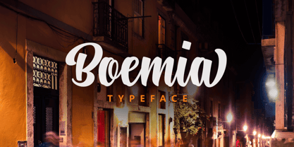 Boemia, with alternate lowercase and swashes to add value to your projects.
 - Monkey Chunks, created by the talented artist John Martz, is a distinctive font that embodies a playful and somewhat whimsical spirit. At its core, the font design captures the essence of creativity ...
- Sure thing! Picture a font that captures the sweet and whimsical spirit of an all-American bakery, and you've got American Donuts by Kat Rakos. This font is like a delightful confection for your eyes...
