10,000 search results
(0.043 seconds)
- Chella Lyfe by Chella Lyfe,
$25.00 Features: Chella Lyfe Print: Uppercase letters, numbers, & extended punctuation We Offer Non-English support for the international designer as well Same stroke thickness with each font, so you don't need to make any time-consuming adjustments to get it looking right! This is such a fun new display font, perfect for creating quotes, logos, or just adding a hand-written touch to any project! While other fonts usually take some size adjusting to look just right, The ChellaLyfe variations in stroke thickness for upper and lower case fonts, so you can so it can display creativity and life in every stroke! Each font also has alternates for each letter, so when you type uppercase or lowercase for each font, the letters will change slightly. For example, tying in all caps with the Script font will connect each letter, whereas typing all lowercase will disconnect each letter.
 - Labernia by Tipo Pèpel,
$22.00 In 1864, a new edition of ‘Labèrnia dictionary’ was published. The book is commonly known under this name as a homage to the author. The typeface used in this publication has been taken as the main reference for the design of a new type family. Labernia is a didone design that includes several variations in width, weight, and contrast. Labernia is a stylish typeface, which pushes its design features to the limit. The high-contrast strokes—seen in most modern typefaces—give a delicate softness to the titling cuts of Labernia. Meanwhile, the characters in the condensed version have a very compact body so they create a highly expressive text. In the italic letterforms, the long terminals aim to connect the characters without touching. And, if we look at the figures we will see a more decorative design, which helps to build a strong personality.
 - Lifehack by DearType,
$35.00 Dear type lovers, meet Lifehack - a casual script with a huge personality. Warm, amiable and organic, yet elegant, it is perfect if you want to convey individuality and style. The Lifehack family consists of the original Lifehack script, an Italic version, a narrow handdrawn Sans and a Basic version of limited glyph set with letters that do not connect. All fonts in the Lifehack family work easily together to create visually appealing logos, packaging, presentations, headlines or editorials. The combination of casual sans and a script has proven useful many times and thus preferred both for print and web. When it comes to OpenType features, Lifehack comes with swashes, stylistic alternates and initial/terminal forms for you to give a custom flare to your designs. All fonts have several weights and a lovely collection of goodies - various ornaments, borders and ribbons that complement the fonts' charm and uniqueness.
 - Papillon Script by Fenotype,
$30.00 Papillon Script is an eloquent pen script with large display capitals and small but legible lowercase letters. It’s ideal for logo, headline, brochure, model for a neon sign or any display use like that. Papillon Script is completely monolinear and it gives a clear but vivid impression of a hand writing style. Papillon Script is equipped with following OpenType features: • Standard Ligatures is automatically on and it adds variation and smoothness to typing. If a same letter repeats in the same word the latter will automatically change to an alternative version. • Contextual Alternates is an optional feature that cuts the connection between letters every once in awhile. • Titling Alternates changes the last character in every word into an ending Swash alternative. • From Stylistic Set 1 you’ll find a set of 34 ornaments, strokes and arrows. • Small Caps turns lowercase into a set of legible capital letters.
 - Metro New Two by JAB'M,
$15.00The main inspiration is from Art Nouveau which flourished in Europe at the end of the 19th and beginning of the 20th centuries. This design included furniture (Majorelle, Lalique) and architecture (Victor Horta, Henry Van de Velde, Gaudi, Alfons Mucha). But Hector Guimard remains the favorite for all aspects of its art and, of course, its typefaces used on the Parisian Metropolitan posters. In particular, the various kerning of the various letters he used to make the poster a whole design from singular designs, leading to numerous variations. As a designer, I initially worked a first version, called Metro New One, which is more geometric and traditional. This design "Two" has more flexible shapes and long vertical hooks. It can be used to enhance specific parts in letters and books in the context of Art, specially Art Nouveau and Art Deco of course, posters of any kind. - Christmas Reign by Mans Greback,
$59.00 Christmas Reign is a very decorative festive typeface. It is a professional typeface, containing advanced but easy-to-use. OpenType functions, such as contextual alternates and ligatures. Try it and see how each letter pair behaves differently, magically creating new ways to connect as the text goes on. Use it for a stand-alone logotype, or for a longer text which requires that extra touch of magic and mystery. Each letter has more than 10 alternate variations, making it truly adaptable with hundreds of possible ways to write any word. Very easy to use functions! Use characters + < > * # to create Christmas symbols. Example: +Merry Christmas+ Use ( ) [ ] to make a decorative border around any word. Underline _ makes a space with borders. Example: (Santa_Claus) The typeface has very extensive lingual support, and works for all European languages, including Cyrillic and Greek. It also contains numbers and all characters you will ever need.
 - ALS Klinkopis by Art. Lebedev Studio,
$63.00 Yana Klink is an illustrator at Art. Lebedev Studio, whose works are often accompanied by lines of fancy text written in her own recognizable manner with long strokes and “beauty spots.” Once we needed to apply that style to a number of pieces of text, we decided to design a decorative script called Klinkopis. It comes in one weight (regular). Text set in Klinkopis looks best when arranged in waves, like the original. It is recommended to use large sizes—from 24 pt and up—and have no more than just a couple of lines that become an essential part of the artwork. Klinkopis is designed to use OpenType Contextual Alternates. To beautify your project even further, some characters can be manually replaced with their more intricate or plainer variations depending on the neighboring letters. Klinkopis features long descenders and ascenders, which requires large leading to avoid congestion.
 - Nexus Typewriter Pro by Martin Majoor,
$49.00 Nexus (2004) consists of three matching variants – a serif, a sans and a slab – which makes it a highly versatile typeface. Nexus started as an alternative to Seria, a typeface Majoor had designed some 5 years earlier. But soon the design developed into a new typeface, with numerous changes in proportions and in details and with a redrawn italic. Besides the three connected versions (Nexus Serif, Nexus Sans, Nexus Mix) Majoor designed a monospaced version called Nexus Typewriter. The Nexus family is a workhorse typeface system like Scala, with features such as small caps in all weights, four different sorts of numbers and an extensive set of ligatures. All fonts in the Nexus family come in regular, italic, bold and bold italic. Free bonus: there are more than 100 elegant Swash italics and dozens of arrows and other icons. The Nexus family was awarded the First Prize at the Creative Review Type Design Awards 2006.
 - Nexus Mix Pro by Martin Majoor,
$49.00 Nexus (2004) consists of three matching variants – a serif, a sans and a slab – which makes it a highly versatile typeface. Nexus started as an alternative to Seria, a typeface Majoor had designed some 5 years earlier. But soon the design developed into a new typeface, with numerous changes in proportions and in details and with a redrawn italic. Besides the three connected versions (Nexus Serif, Nexus Sans, Nexus Mix) Majoor designed a monospaced version called Nexus Typewriter. The Nexus family is a workhorse typeface system like Scala, with features such as small caps in all weights, four different sorts of numbers and an extensive set of ligatures. All fonts in the Nexus family come in regular, italic, bold and bold italic. Free bonus: there are more than 100 elegant Swash italics and dozens of arrows and other icons. The Nexus family was awarded the First Prize at the Creative Review Type Design Awards 2006.
 - Higery by Craft Supply Co,
$20.00 Higery – Serif Typeface: Uniquely Engaging Distinctive Tapered Details: Higery – Serif Typeface stands out with its unique tapered serifs. These details add a sophisticated charm. This font is ideal for captivating visual displays. Perfect for Visual Displays: Higery’s elegant tapering makes it perfect for eye-catching displays. It excels in adding an artistic touch to posters, ads, and more. Its uniqueness ensures your design stands out. Versatility in Design: Though unique, Higery remains versatile for various design needs. It seamlessly fits into digital and print media. This adaptability makes it a valuable tool for designers. Ease of Use for All: Higery is designed with user-friendliness in mind. It’s easy to use for designers of all skill levels. This approachability makes it a popular choice in the design community. Elevating Aesthetic Appeal: Incorporating Higery into your projects can significantly enhance their aesthetic appeal. Its distinctive serifs and elegant design elevate any content. Higery isn’t just a typeface; it’s a visual experience.
 - Nexus Sans Pro by Martin Majoor,
$49.00 Nexus (2004) consists of three matching variants – a serif, a sans and a slab – which makes it a highly versatile typeface. Nexus started as an alternative to Seria, a typeface Majoor had designed some 5 years earlier. But soon the design developed into a new typeface, with numerous changes in proportions and in details and with a redrawn italic. Besides the three connected versions (Nexus Serif, Nexus Sans, Nexus Mix) Majoor designed a monospaced version called Nexus Typewriter. The Nexus family is a workhorse typeface system like Scala, with features such as small caps in all weights, four different sorts of numbers and an extensive set of ligatures. All fonts in the Nexus family come in regular, italic, bold and bold italic. Free bonus: there are more than 100 elegant Swash italics and dozens of arrows and other icons. The Nexus family was awarded the First Prize at the Creative Review Type Design Awards 2006.
 - 1885 Germinal by GLC,
$38.00 This script font was inspired by a lot of manuscripts, notes and drafts, written by the famous french novelist Émile Zola (1840-1902). Specially, letters and notes from the period he was writting "Germinal" one of his very famous novel (published in 1884-1885) depicting the french minor's life in the past middle of eighteens. It is an elegant pen written type, sometimes connected, sometimes disrupted, but always regular and legible, with many variants, ligatures and contextual alternate glyphs specialy numerous in the OTF version. It is used as variously as web-site titles, posters and fliers design or greeting cards, all various sorts of presentations, menus, certificates, letters. This font, in spite of its small size, supports very strong enlargements as well as small sizes ( the original size was about 22 to 30 pts ). When printed, it remain perfectly legible and elegant from 12/14 pts even if using an ordinary inkjet printer.
 - Grit Gothic by Baseline Fonts,
$39.00 You can hear the wheels of imagination turning within this font - Grit Gothic, from Grit History™ B Series, by Baseline Fonts. Both highly stylized and very legible, the extreme height of this font can give even a goblin vertigo. Extended X heights create lowercase that adventurously reach up through extended shoulders and spines while persistent grunge warns of skinned knees that may result along the climb. It’s easy to envision children’s rallying cries in Grit Gothic, perfect for book titles, film titles, poster headlines, and any other epic that needs a strong font with a dark edge of mystery and wonder. This font is rife with personality, including large and daunting punctuation, whittled wood-look vertical bars that berate and argue with beveled bowls, ascenders that attempt to intimidate one another with their height variances, and tittles that bully one another, as they're a variety of context dependent sizes. Grit Gothic is available in Regular and Bold with full Greek-lettered foreign language support.
 - Brightfield by Tadiar,
$19.00 Brightfield Font is classic and modern serif font carefully designed to excellent connections between letters. It is good for Text and Headers with lowercase and uppercase letters both! Please see the large preview images to see how it works.
 - FineArt OT by John Moore Type Foundry,
$10.00 FineArt OT is a casual typeface, created by brush, as an emulation of a conventional typography, however, comes with alternative FineArt Opentype OT for exploring other radical forms of expression. Thus FineArt offers 4 styles in a single font.
 - Niemi by Blank Is The New Black,
$10.00 Niemi is a continuation of the work started with Versteeg. Where Versteeg was separated into individual circles, Huet connects these circles and adds a sharp geometric style. This creates a nice juxtaposition between the rounded ends, and sharp corners.
 - Spicy Taste by Vozzy,
$10.00 A new script label typeface named Spicy Taste. This typeface contents caps and small letters, numbers, punctuation signs and some alternates for small letters. This is a handwritten brush font with authentic dry brush strokes like drawn on paper.
 - Gracia Solo by astype,
$30.00 Gracia Solo is a sister design of Gracia. Gracia Solo has left its connection forms without losing the typical look of English scripts. OpenType features: - central European faces - stylistic alternates - proportional, mediaeval numerals & Roman numerals - numerators, denominators and fractions
 - Colmena by ParaType,
$25.00 Colmena (means Beehive in Spanish) features soft viscous shapes and high contrast that resemble bees and honey. The font was entered into TypeArt Contest in 2005 under the name "FD_Harvey". Suitable for display purposes especially in books for children.
 - Basalt by Volcano Type,
$19.00 Basalt is a hard, black volcanic rock with less than about 52 weight percent silica. Because of basalt's low silica content, it has a low viscosity (resistance to flow). Basalt is erupted at temperatures between 1100 to 1250° C.
 - VIDEO PIRATE - Personal use only

- ZT Gatha by Khaiuns,
$14.00 ZT Gatha is a continuation of the "Gatha Duo font family", which focuses only on more complete variations of sans serif, this font has two variants, one of which is a normal sans font and the other is unique in that it minimizes edges. of each letter produces a unique character with a smoothly curved groove. ZT Gatha features 10 styles covering a complete set of beautiful upper and lower case letters, numbers, and various punctuation marks, providing a clean and realistic sans serif style with great versatility. With a lot of weight, this typeface can be used successfully in Magazines, Posters, Branding, Websites, etc. I hope you have fun using ZT Gatha. Thanks for using this font ~ Khaiuns X zelowtype
 - Alek Rodchenko by Ayi Studio,
$15.00 Font family based in the russian constructivist with three variants, solid, inline and shadow.
 - Flink Neue by Identity Letters,
$45.00 Geometric typefaces are a staple in every typographer’s toolbox since the 1920s. It was a time when iconic faces such as Futura, Erbar, and Kabel appeared on the scene and turned the world of type upside-down. Inspired by those early giants as well as later epigones with a legacy of their own (such as 1970’s Avant Garde Gothic), Flink Neue is the Identity Letters take on this genre, characterized by a clean and focused appearance. With neat shapes and the look of pure geometry, Flink Neue adapts to a vast range of applications and topics, from the fine print in contract to website body copy to logo design to billboard-size slogans. Its x-height is considerably larger than in classic geometric sans-serif fonts; its proportions are harmonized as opposed to strictly constructed. This makes for a more contemporary look, setting it apart from the classics. With three different widths, Flink is a true all-rounder. Geometric fonts are usually quite wide, which often leads to text-settings problems with headlines or small print. The Condensed and Compressed variants of Flink Neue solve this problem easily. This font family comes along in 18 weights from Thin to Black with matching Italics. There are almost 1400 characters per style, including nine stylistic sets that offer variations to the look and feel of Flink Neue, making it even more versatile. Besides the default mood of Flink Neue, there is also a Text and Bauhaus variant, where different letters have been changed to create a new mood. In theory, you just need one single font file to change between all three moods, but to make it easier for you, we also exported each mood within a separate file. Plenty of additional Open Type Features like ligatures, small caps, case sensitive forms, old-style figures, tabular figures and symbols make Flink Neue a valuable tool for the discerning typographer. Flink Neue is the reimagination of a classic genre, designed to suit the needs of our time.
 - Berimbau by PintassilgoPrints,
$29.00 Berimbau is a whimsical narrow hand-drawn typeface. It’s stylish, versatile and loaded with amazing OpenType features that do their magic in OpenType savvy applications. Its sprightly swashes and twisting stylistic alternates (say that 3 times fast!) play together to deliver a really cool contextual feature that, in a push-button way, substitutes the first letter in a word with its left swash version and the last letter with its right swash version (please type a space before and after the words).The feature also applies stylistic variants to some of the intermediate letters. Which button to push? The Contextual Alternates one! If you're not a one-click-way-person you can pick your preferred glyphs through the glyphs palette. There you’ll find at least 4 variations for each letter: left swash, right swash and 2 regular forms that correspond to the upper and lower case keys. Some letters also have a 5th variation that acts as stylistic alternate. This font is conveniently packed with the ‘access all alternates’ functionality, so when you click on a glyph at the glyphs palette you’ll see all variations available for it, making it easier to choose the one that will fit better. A bold weight was made to provide that extra-strength when a bit of… boldness is needed. Please note that it doesn’t have the advanced OpenType features (but is still very charming!). Yet, both weights have a handy set of ornaments for added yumminess.
 - Star Hound - Unknown license

- Movie Star - Unknown license

- Roamer by Loreley Design,
$56.00 The Roamer is big, bold and ready to be used by designers all over the globe. The appearance is quite rough and used like weathered wood or paint on concrete. It is perfect for big headlines or bold text passages.
 - PR Foxtail 01 by PR Fonts,
$5.00 The bushy weed commonly known as foxtail provides the inspiration for this set of ornaments, and reveals its connection to the prairies. The appearance has an affinity to cowboy themed work and would combine well with wood type decorative text.
 - Tidy Mom by Seemly Fonts,
$12.00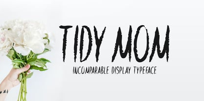 Tidy Mom is a unique display font. This font is a great choice for a wide variety of contexts! It looks stunning on thank you cards, quotes, greeting cards, logos, business cards, and every other design which needs a creative spark.
 - Camelleon by Balpirick,
$15.00 Camelleon is a monoline handwritten font. Its casual charm makes it appear wonderfully down-to-earth, readable and, ultimately, incredibly versatile. Camelleon will look outstanding in any context, whether it’s being used on busy backgrounds or as a standalone headline!
 - Timework by Seemly Fonts,
$14.00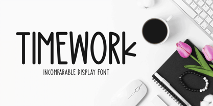 Timework is a unique display font. This font is a great choice for a wide variety of contexts! It looks stunning on thank you cards, quotes, greeting cards, logos, business cards, and every other design which needs a creative spark.
 - Propeller by Gleb Guralnyk,
$15.00 Introducing a script font named "Propeller". This font has a trendy look inspired by vintage aircraft ads. It has connected letters with smooth shape and round endings. Intersecting lines are made with a small overlay that gives a tiny volume effect.
 - Fairway by Alan Meeks,
$45.00 The thinking behind Fairway was to create a relatively conventional soft sans with a certain amount of movement at the top of the x-height line. The face is casual and quirky but can still be used as a text face.
 - Baguette by Balpirick,
$15.00 Baguette is a natural hand-brushed font. It’s perfect for logos, greeting cards, invitations, stationery, social media posts and much more! Baguette will look outstanding in any context, whether it’s being used on busy backgrounds or as a standalone headline!
 - Forest Cursive by Okaycat,
$29.95 Okaycat presents "Forest Cursive". Forest Cursive is an beautiful connected letter cursive script arriving with ornate & simplified styles. Forest Cursive features lovely detail & artistic nature. Forest Cursive is extended, containing West European diacritics & ligatures, making it suitable for multilingual environments & publications.
 - Honey Jar by Typefactory,
$14.00 Honey Jar is a bold and modern display font, carefully handcrafted to become a true favorite. This font will look outstanding in any context, whether it’s being used on busy backgrounds or as a standalone headline, especially on natural farm theme !
 - Myglaos by Sealoung,
$25.00 Myglaos is a lovely elegant font for branding and logo design. This typeface includes a massive selection of ligatures, making it perfect for a variety of creative projects such as branding, logo design, content creation, packaging designs, stationery & so much more.
 - Kelly Signature by Ake,
$15.00 Kelly Signature is a unique handwritten font. A little bit quirky, this font looks incredibly adept on a wide variety of contexts! This font is PUA encoded which means you can access all of the glyphs and swashes with ease!
 - Request by Din Studio,
$29.00 Request is a bold and authentic display font. It celebrates abstract shapes in all their eclectic beauty. This font will look truly outstanding in a wide range of contexts. Featured : Accents (Multilingual characters) PUA encoded Numerals and Punctuation (OpenType Standard)


