10,000 search results
(0.041 seconds)
- Nova Caere by Eurotypo,
$39.00 Nova Caere is a typical urban calligraphy, gestural with its fast lines, with short and slightly noticeable ascender and descender traits. Condensed lower case and rounded capital letters are quite similar in height. Nova Caere has been studied for alternating upper and lower case inside the words of the text, so as to reinforce their expressive content. Stylistic variations that combine particular couples of letters have been developed, as well as some descender traits have been highlighted that can be employed to characterize words and phrases.
 - Hildegard by Linotype,
$29.99Hildegard is a sans serif text face that works well in both larger and smaller point sizes. On close inspection, one will discover a world of subtle angle variation within the letters' structure that is loosely inspired the stroke movements one uses in calligraphy. These built-up strokes create visible ink traps at many joints, which in smaller sizes play a functional as well as an aesthetic role. The Hildegard typefaces received one of several awards in the 2003 International Type Design Contest, sponsored by Linotype GmbH. - Aluniea by IbraCreative,
$17.00 Aluniea is a classic modern serif typeface that effortlessly marries timeless elegance with contemporary design sensibilities. With its balanced letterforms, graceful strokes, and refined details, Aluniea exudes sophistication and versatility, making it a quintessential choice for a wide range of design applications. The typeface’s subtly flared serifs and harmonious proportions lend it a sense of balance and readability, while its clean lines and distinct character variations provide a distinctive, yet approachable, aesthetic that is perfect for conveying a sense of tradition and refinement in a modern context.
 - Traction by Schriftlabor,
$36.99 Traction was originally conceived and designed by Swiss astronomer Christian Thalmann. Schriftlabor designers Chiara Mattersdorfer and Miriam Surányi expanded, completed and produced the font family. This typeface sports signature serifs, soft edges and a fluid, organic design. Enlarged, the organic letters are reminiscent of the profiles of off-road tyres and hiking boots. In text sizes, it is the humanistic forms that set the tone to ensure fluid legibility. Totalling at 18 styles in nine weights, all fonts come with small capitals and all possible numerical variations.
 - Hallock by Arabetics,
$39.00 A text typeface design with completely isolated letters and extra emphasis on vertical feel and visual connectivity to aid easy reading. The Hallock font family is named after Homan Hallock, a New York based American type designer and typographer who created the first documented unified and isolated Arabic font design in July 1864. The Hallock font family has two styles, regular and left-slanted italic styles. This font family design follows the guidelines of Mutamathil Taqlidi type style with one glyph for every basic Arabic Unicode character or letter, as defined in the latest Unicode Standards, and one additional final form glyph, for the freely-connecting letters in traditional Arabic cursive text. Hallock employs variable x-height values. It includes only the Lam-Alif ligatures. Soft-vowel diacritic marks, harakat, are selectively positioned. Most of them appear by default on the same level, following a letter, to ensure that they would not interfere visually with letters. Tatweel is a zero-width glyph. Keying the tatweel key before Alif-Lam-Lam-Ha will display the Allah ligature. Hallock includes both Arabic and Arabic-Indic numerals, in addition to standard punctuations.
 - KG Only Human by Kimberly Geswein,
$5.00 A connected, delicate script font.
 - KG Manhattan Script by Kimberly Geswein,
$5.00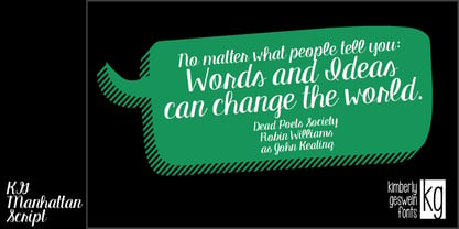 A connected, upright script font.
 - Hand Boys by Jorsecreative,
$20.00 Hand Boys Is a typeface signature font that is inspired from Boys handwriting style. Suitable for making Greeting Cards, invites, quotes, book content, T-shirt, child magazine contents, short story, poster label etc.
 - Pedroc by Craft Supply Co,
$20.00 Introducing Pedroc – Display Typeface Future-Inspired Geometric Blocks Pedroc is a Future-Inspired Display Typeface, a captivating Display Typeface, is born from the inspiration of future technology, thus infusing an industrial touch into its design. Sleek and Futuristic Aesthetics Pedroc’s design is a testament to sleek and futuristic aesthetics. This makes it a standout choice for modern and tech-inspired projects. Versatility for Contemporary Design This font’s adaptability shines in various contemporary design contexts. As a result, it’s suitable for a range of creative endeavors, from branding to posters. Engaging and High-Tech Future-Inspired Display Typeface guarantees your content remains engaging and high-tech. Consequently, it captivates your audience with its modern industrial charm, ensuring your message resonates. In Conclusion In summary, Pedroc – Display Typeface is the font for those seeking a futuristic, industrial touch. Its sleek and versatile design ensures it fits seamlessly into contemporary creative projects. Whether it’s for tech-inspired branding, posters, or other modern designs, Pedroc is the font that keeps your content engaging and high-tech, appealing to a diverse audience with its modern industrial charm.
 - Omni Serif by ArtyType,
$29.00 Typefaces don't simply appear fully formed to a designer, even with a clear concept in mind, they evolve naturally during the design & development process. Out of the current 'Artytype' collection, Omni has evolved the most, being a stripped back off-spring from several exploratory exercises. At first glance and particularly at small scale, you'd be forgiven for thinking the basic characteristics have a conventional outlook; but on closer inspection, it's own distinctive, clean cut, subtle styling becomes apparent, revealing enough personality to stand alone or complement a wide variety of projects; subsequently, it's a font that won't go out of style quickly and may even become a modern classic in time. The Omni family has 2 distinct styles, sans and serif, each style being available in 4 weights; all 8 fonts have slanted options to match making a total of 16 fonts. Dictionary definition of OMNI: Combining form - Of all things, in all ways or places. Quite an apt name for a font with ubiquitous aspirations.
 - Hejira by Sudtipos,
$49.00 Hejira means “rupture” and this concept was the primary principle that guided the creation of this typeface: to escape conventions and take up the challenge of designing letters with an unusual and fresh approach. Unlike traditional typefaces, each member of this somewhat atypical family has its own distinct personality and formal features. A thin, spiky font that looks like its sharp serifs could pierce through. A more experimental sibling, based on the same skeleton but taken to the extreme, that is best suited to setting big titles. An odd-one-out, sans-serif style whose shapes mimic those generated by the movement of a calligraphic pen. And a quirky fat-face with a flair for combining round curves with pointy elements. Regardless of how different they may be, all four styles feel part of the same system and can be used alongside each other seamlessly. The Hejira set includes multiple ligatures and supports a wide variety of Latin alphabet-based languages.
 - Flefixx by Sun Young Oh,
$54.00 Flefixx is a typeface designed to support a project "Flefixx", an idiosyncratic visual language and typeface system that unfolds narratives based on common combinations of letters. In this visual language, just as individual letters come together like puzzle pieces to form different meanings or words based on combinations, the typeface is also constructed from fragmentary elements, each playing a distinct role as if they are individual pieces. The intentional exposure of the intersections of these fragments emphasizes the typeface's creation through interconnected elements. Furthermore, diacritics and dots are strategically positioned as ornaments, enhancing their presence within the gaps between letters. This concept aligns with the theme of composition and connectivity among fragments, allowing strong rhythmic patterns to emerge as letters and symbols blend in a paragraph. Additionally, the prominent and bold punctuation marks serve to provide pauses and clarity within sentences that incorporate both letters and the visual language. They contribute to articulating sentence structure amidst the dynamic flow of sentences with combined characters and visuals.
 - Omni by ArtyType,
$29.00 Typefaces don't simply appear fully formed to a designer, even with a clear concept in mind, they evolve naturally during the design & development process. Out of the current 'Artytype' collection, Omni has evolved the most, being a stripped back off-spring from several exploratory exercises. At first glance and particularly at small scale, you'd be forgiven for thinking the basic characteristics have a conventional outlook; but on closer inspection, it's own distinctive, clean cut, subtle styling becomes apparent, revealing enough personality to stand alone or complement a wide variety of projects; subsequently, it's a font that won't go out of style quickly and may even become a modern classic in time. The Omni family has 2 distinct styles, sans and serif, each style being available in 4 weights; all 8 fonts have slanted options to match making a total of 16 fonts. Dictionary definition of OMNI: Combining form - Of all things, in all ways or places. Quite an apt name for a font with ubiquitous aspirations.
 - TT Trailers by TypeType,
$39.00 Meet the new TT Trailers! The first version of TT Trailers was conceived as a font suitable for the film industry. The font harmoniously looks in posters, it is ideally suited for setting titles. However, the font has gained wide popularity among designers, and now you can find TT Trailers on the covers of magazines, on restaurant signs and on the main pages of websites. TT Trailers useful links: Specimen | Graphic presentation | Customization options Since 2019 when we released the first version, the TypeType studio team has released dozens of fonts, constantly improving our skills. In 2022, we decided to look at TT Trailers again, improving and expanding the font. In the new TT Trailers, we expanded the character set, corrected the contours, and improved the technical content. We have added extended Latin and Cyrillic characters, new symbols, and additional sets of numbers. The number of glyphs in one style has increased from 1081 to 1242. The inclined styles were long-awaited. The italics in TT Trailers are as eccentric as the upright fonts. The 15-degree tilt looks absolutely harmonious, complementing the character of the font family. We added italics to the variable font, so the new font changes along two axes at once, weight and slant. From the technical point of view, TT Trailers has become more modern and correct, and the number of OpenType features has increased from 29 to 42. We have added new alternative versions of glyphs and created a large number of localized features. The font retained all the qualities thanks to which designers fell in love with it, but became even more convenient. TT Trailers in the new version is suitable for titles and posters, for websites and printed materials. The font will embellish in restaurant and cafe signs and look beautiful in posters. There are 19 styles in TT Trailers: 9 upright, 9 italic and 1 variable font.
 - Mostyn by Artisan Studio,
$20.00 Description Mostyn Variantions is the font family, Mostyn Variantions is a font family that has 8 variations plus extrude in every variety, it is a model of modern calligraphy typefaces, in combination with a calligraphy writing style. Can be used for various purposes.such as headings, logos, wedding invitation, t-shirt, letterhead, lable, news, posters, badges etc. Multilingual support for various languages including: French, German, Spanish, Portuguese, Italian, Dutch, Finnish, Swedish, and more. Mostyn Variantions works great in any branding, logos, magazines, films. The different weights give you a full range of whole hosts of applications, while the outlined fonts give a real modern feel to any project. OpenType features can be accessed by using OpenType smart programs such as Adobe Photo Shop, Adobe Illustrator, Adobe Indesign, Corel Draw and Microsoft Office. can also be accessed through the character map.
 - Kabrio by Zetafonts,
$39.00 Designed by Cosimo Lorenzo Pancini and Andrea Tartarelli, Kabrio is a sans serif typeface for the lovers of minimal design, and great curves. Kabrio features four different corner treatments to offer variation in display and logo use: the "alternate" variant features slightly rounded corners, that become even more round in the "soft" variant. "Abarth" features cut corner for a more mechanical, cold look. Each variant comes in seven weights with matching italics, for a grand total of 56 weights to add to your typographic palettes. All Kabrio weights feature an extended character set with accents to cover over forty European languages as well as Russian and Bulgarian Cyrillc. OpenType features include stylistic alternates and a wide arrange of numerals (oldstyle, tabular, tabular oldstyle, superior, inferior, fractions) to allow you maximum flexibility to use Kabrio in number-heavy documents: spreadsheets, tables, timetables.
 - Galimer by OneSevenPointFive,
$25.00 Galimer is a humanist variable sans serif family. It comes in 18 styles, 9 weights and their corresponding italics. It supports two axis variability - weight and italic. Each of the weights includes support for 80+ languages worldwide. It is packed with powerful opentype features - linked characters, kerning pairs, fractions, superiors, inferiors, etc. Galimer is perfectly suitable for all platforms (desktop, webfont, printing, etc.) Contact - https://forms.gle/VHM7b8FHQiqK8zx9A
 - HU Retroround KR by Heummdesign,
$50.00 'HU Retroround KR' is a font that captures the feel of the retro typefaces used on signboards during Korea's modernization era. This font has a variable function, allowing users to fine-tune the thickness they want. (Available only in Adobe programs.) Six basic weights are provided so that they can be used even in programs that do not apply the variable function. This font includes Hangul, Korean.
 - Hebrew Esther Tanach VF by Samtype,
$495.00 This is a font to build an Hebrew Bible (Tanach) or any Hebrew prayer book. This is a variable font with 5 styles! Hebrew Esther Tanach Variable has all Unicode Hebrew marks and others like ShevaNa, Dagesh Chazak, Qamats Katan, and Cholam Chaser. This font has a complex and exclusive Programmation of Opentype features. This font is very good to read even in small texts
 - Brenly by Valentino Vergan,
$16.00 Brenly is a modern variable sans serif font. Brenly has a unique and elegant look which makes it perfect for designing posters, brand packages & logos. Brenly also has a variable version, which makes it easy to manually adjust the slant from oblique to reversed oblique. If you are looking for something modern and unique for your next project, Brenly is the font for you.
 - Captura Now by TypeThis!Studio,
$54.00 Carefully refined shapes and sensitively balanced spacing and kerning create the gentle rythm that grants Captura Now its warm-hearted face, perfect in form and shape. Expanded with an enormous character set, Captura Now offers the freedom to transform your design into the Cyrillic-language world, as well as into any Latin based language — including Vietnamese. *Variable fonts work well in software that supports variable font technology.
 - HU Malrang KR by Heummdesign,
$50.00 'HU Malrang KR' is a font that gives a round and soft feel to its tightly packed modules. This font has a variable function, allowing users to fine-tune the thickness they want. (Available only in Adobe programs.) Six basic weights are provided so that they can be used even in programs that do not apply the variable function. This fonts contain Hangul, Korean.
 - ZT Yaglo by Khaiuns,
$16.00 ZT Yaglo is a dynamic and expressive display font, from the first impression you may have noticed that this font is a fishing rod-like concept, with a consistent rhythmic curve that gets sharper at the ends. The ZT Yaglo typeface is framed in a sans theme and added a serif feel to produce a bold, geometric typeface in all thicknesses. ZT Yaglo mixes a simple sans style for extra bold serif energy with the feel of calligraphic shapes. The thicker your choice of style, the more striking the flow of changes in shape becomes spiky. ZT Yaglo is a cool alternative for you to create branding projects, Logo designs, Apparel Branding, product packaging, magazine headers or just as a stylish text overlay onto any background image. ZT Yaglo has 9 Styles, 1 Free for Commercial, and one Variable font. each face has 457 glyphs. Includes Standard Ligature, and the "&" character has an alternate letter in each Weight. I hope you have fun using ZT Yaglo. Thanks for using this font ~ Khaiuns X zelowtype
 - Terminus by Dresser Johnson,
$25.00 The Terminus typeface is an exploration of what occurs to letterforms when flip-disc display and variable-message signs begin to malfunction. Whether caused by analog or computer error, there is a mechanical beauty and randomness in the deterioration of the forms. Dresser's wild take on this concept purposely pushes the limits of legibility along with incorporating historical bits and pieces from blackletter and uncial script forms into this modern digital grid. OpenType font features provide the user with four options to use the typeface. Simply load the default Terminus for a surprisingly legible breakdown of digital characters. Select “Contextual Alternates” for a random selection of altered forms from the 994 glyphs included in the font. With the Glyph Palette open, manually select from the five full character sets to create your own unique settings. Lastly, choose “Stylistic Alternates” for an extreme test of legibility. This setting combines characters from the default font with the most elaborate set of alternates and best exemplifies the organic disintegration of Terminus.
 - Grippo by Canada Type,
$24.95 The first Grippo sketches were done in the 1980s, but only now does it see the light of day as a complete series of interchangeable, layerable fonts. The original single-font concept was simple enough: Double the stems so they become sturdy handles. But then we elected to add more playfulness and versatility to the idea. By separating the main idea’s layers and producing them as individual fonts, layerability is achieved, and endless possibilities of play and variation arise. In 2D or 3D, colourful or demure, in titling or as initials, Grippo is a great eye-catcher that emphasizes the big fun aspect of your design. Each font of the Grippo suite comes with a few built-in alternates, a glyphset of over 385 characters, and support for the majority of Latin-based languages.
 - Oliviar Sans by Adam Fathony,
$10.00 Oliviar Sans Variable is a modern sans serif with Grotesque touch. It's my experimental to study the new trends for the future fonts that is Variable Fonts. Inspired by a Geometrical fonts and also Humanist Sans serif. Created with 8 Masters that export to the traditional OTF to 28 Styles!. On the Applications that support variable fonts such as Adobe Illustrator & Photoshop, you can get more than only 28, you can customize the Weight, Width and Slant. Weight created from Thin (100) to Bold (900), Width created from Standard (100) to Expanded (900) and Slant based on degree angle from 1˚ to 10˚. There is a new slider icons for accessing this features Check on Last Display Image. Another advantage on the Variable fonts are you just need 1 files to install to your computer and it will install all the styles available. All of the Fonts are support for Multilanguage, Carefully Crafted.
 - Reepy by The Design Speak,
$100.00 Reepy is a font designed with horror in mind and works for all your scary needs. The design concept was designed with Tim Burton and Jordan Peele's "Us". It is ideal to be used in communicating something a creepy or frightening and this is where the name comes from.
 - Monotype Courier 12 by Monotype,
$29.99Designed as a typewriter face for IBM, Courier was redrawn by Adrian Frutiger for the IBM Selectric series. Courier is a typical fixed pitch design, monotone in weight and slab serif in concept. The Courier font is used to emulate typewriter output for reports, tabular work and technical documentation. - Hubbard by Scriptorium,
$12.00Hubbard is based on hand lettering from the Roycroft Arts and Crafts movement of turn-of-the-century New York. The Roycrofters were heavily influenced by the design concepts of William Morris and Charles Rennie MacKintosh. The font takes its name from Elbert Hubbard, leader of the Roycroft movement. - Zenghief by Stringlabs Creative Studio,
$25.00 Zenghief is a script font with Modern hand brush style. The Zenghief font made with digital hand brush pen strokes that making this font look authentic and unique concept. This font is perfect for fashion brand, wedding invitation, business card, logo brand, Japanese font style, and then calligraphy.
 - Courier Line Draw by Monotype,
$29.99Designed as a typewriter face for IBM, Courier was redrawn by Adrian Frutiger for the IBM Selectric series. Courier is a typical fixed pitch design, monotone in weight and slab serif in concept. The Courier font is used to emulate typewriter output for reports, tabular work and technical documentation. - SK 1980 Unicase by Salih Kizilkaya,
$2.50 SK 1980 Unicase is a font that emerged with a modern interpretation of the 80's design concept. It was specially designed to create structural forms. Each character is the same size, so you can create structural designs without any difficulty. Includes 7 different versions and 2464 glyphs.
 - Burnston by Maculinc,
$16.00 This is a bold font with a simple and unique retro concept. We provide this font in uppercase, lowercase, number, and equipped with punctuation, alternatives and swash. Combine swash to add an interesting impression in every word you want, we provide swash as an alternative available in this font.
 - Miometry by HakanPolatovic,
$20.00 GEOMETRICAL PERFECTNESS Every letter of miometry has a ratio to one another SHARPNESS Due it's design,it has a elegant look at first sight RATIONALITY It can even be used in every kind of rational system like patterns etc INSPIRED BY Concepts like futurism,transhumanism,cyberpunk,cyberworld etc
 - Inside The BOX by Gleb Guralnyk,
$12.00 Hi! Introducing this conceptual modern typeface "Inside the BOX". It's a two-in-one font - big letters are made bold and fat :) and small letters are thin.
 - Identa by Sudtipos,
$39.00 Because we know that you will never get tired of using them and that you will always need a new tool for Identity Design, we created Identa. Conceived to translate corporate and humanist ideals in its typographic form, it seeks a dialogue between neutrality and contemporaneity. With a pragmatic attention to functionality that does not forget aesthetics. It is a Sans serif model, accessible and well-founded. All-terrain, workhorse that seeks to be reliable and durable. It solves any type of content with efficiency, intelligence and professionalism. Its clean forms and x-height make it a very competent face for both short identifiers and long text bodies, ideal for display use where legibility and personality must match new design needs within a company. It is available in eight styles, ranging from its White version to the darker Vantablack, each optimally set with its respective italic variables, and a Dingbats font designed to solve everyday cases. Each font contains 737 glyphs, macro and micro aesthetic details inspired by current visual communication systems and trends. The dingbats font includes 303 signs and is a set of icons and symbols that can be used in multiple environments, both for print and digital media. This typeface family seeks to meet the needs of brand designers looking to create an assertive appearance, whatever the case. It is a solid and self-confident typeface, without appearing overly constructed; on the contrary, its nuance makes it look fresh.
 - KG Eyes Wide Open by Kimberly Geswein,
$5.00 Legible, pretty, neat, connected cursive handwriting.
 - Linotype Sansara by Linotype,
$29.99Linotype Sansara, from Swiss designer Grégoire Poget, is part of the TakeType Library, chosen from the entries of the Linotype-sponsored International Digital Type Design Contest 1999 for inclusion on the TakeType 3 CD. This fun font is a type experiment behind whose oriental facade hide Arabic letters, recognizable only at second glance. This font displays generous, pointed ascenders and descenders as well as a bar-like emphasis on the upper third of the figures which connects lines and words and gives them a decorative look. Linotype Sansara reveals an astounding variety of details which bring to mind 1001 Arabian Nights, flowing gowns and snake charmers. This font is best for display in point sizes of 14 or larger. - Brillian by Fontex,
$29.00 A lot of time and effort has been put into the process of creating the Brillian Font. A careful analysis of the current font market and overly increasing customer needs have shaped Brillian’s final appearance and content. We don't have a precise target audience for Brillian, since the amazing amount and structure of the chosen characters enables a very wide utilization. Its look and feel came from a different designing approach, so that it can successfully satisfy the needs of even the neediest. Shining with calm and dignity, while in the roots being aggressive, it has successfully connected classic and modern styles - representing its largest value. A most complete set of Cyrillic, Greek and Latin characters included.
 - Acustica by Andinistas,
$49.67 Acústica is a display font family designed by Carlos Fabian Camargo G. Its styles were designed to form words and phrases related to delicate and feminine contexts. Acústica Caps, Italic, Swashes and Ornaments are drawn investigations with flexible tip pen inspired by Didot capitals. All ideal for mixing with Acústica Script whose idea represents the volatile sound of a fine tip brush against rapid tracing paper. Its script path in width condensed lowercase and uppercase letters in loose horizontal proportions are generous between letters laced with long, agile and thin connecting strokes. Its script sensitivity is in Italian calligraphy with uninterrupted lines of cursive English. Acústica was selected at the Bienal Tipos Latinos 2014. Photos by http://www.desdeesteladodemimundo.blogspot.com