9,410 search results
(0.027 seconds)
- Kareemah by Sea Types,
$19.00 Kareemah is humanist typography, composed of roman and italics with 16 styles and 8 weights (800 glyphs) including ligatures, alternates, small caps,old style figures, fractions, superiors, inferiors and more. Perfectly legible and clean for long, simple texts in headlines. "Specimen Kareemah PDF"
 - Moister by Ilham Herry,
$35.00 Introducing Moister, inspired by beer labels in the old days. This collection comes with several styles: script, block, and expanded. It is possible to combine and options to create label designs, headlines, logotypes, signage, posters, greeting cards, letterheads, t-shirts and much more.
 - Matrice by Studio Sun,
$20.00 Matrice is a sans serif (Semi Extended) display font family in 8 weights plus matching natural italics. support 75+ Languanges (Latin Based) influenced by the grotesk typefaces developed in the early 20th century, perfect for branding (Identity), logotype, headline text, and caption.
 - Gazeta Slab by Vanarchiv,
$35.00 This humanist slab-serif style is an extension from Gazeta font family, the letterform are more sharp, racional and mechanical. Italics are having small differences from roman letterforms, the characters are slightly more narrow (weight) and the proportions are less open (width).
 - Simeon by astype,
$40.00 Simeon is well suited for setting an short and medium amount of text with an historic impression. OpenType features: - over 650 glyphs - Central European faces - stylistic alternates and historical forms - ornaments, signs, zodiac, symbols - proportional & mediaeval numerals - numerators, denominators and fractions - Roman numerals
 - Big Trees by A New Machine,
$19.00 Inspired by a trip to Sequoia National Park, this bold, all cap font is reminiscent of the great west and wide open spaces. Upper case letters are solid while lower case letters feature shadow lines. Great for titles, branding and logo work.
 - Harder by Doehantz Studio,
$20.00 Fresh and New, Harder. Harder is an elegant script font. Made from vectorized hand strokes so that it will look neat on each side of the character. He has several character alternatives that will offer interesting options for any of your design projects
 - Ginseng JNL by Jeff Levine,
$29.00 Ginseng JNL evokes the mysticism and grandeur of the Far East. The font was originally conceived as either electricity in motion or glass shards, but the design simply built itself into a typeface that pays homage to the hand lettering of the Orient.
 - Patheos by Surplus Type Co,
$9.00 Patheos is a striking modern display serif typeface with high contrast lines and amazing ligature options that will make your life easy. Impress your clients with the 78 included ligatures to achieve a custom look in seconds. Patheos also includes multilingual support.
 - Birthmont by Typeskets,
$18.00 Birthmont is a vintage display style font, capital letters with interesting combinations, very suitable for use on label designs, titles, or other vintage themed designs. a font inspired by the 80's label designs that used it for the title and headline sections
 - Sato by Pedroglifos,
$10.00 Sato is a playful sans type designed to be legible without sacrificing authenticity. The subtle ink traps is a nice touch on display sizes, and the balance between curve and edgy terminals make it a great option for identity design and signage.
 - Centrale Sans Inline by Typedepot,
$19.00 A humanist design typeface incorporating elements from the more rationally constructed grotesque typefaces. Its characteristics are relatively large x-height and open apertures. The overall effect suggests approachability without the sentimentality carried by some of the more authentic humanist designs – contemporary and precise.
 - Explora by TypeSETit,
$24.95 This formal calligraphic face is light, and delicate with beautiful lines and curves. The Pro version adds extra elegance with alternate caps and beginning and ending swashes. Explora has over 600 glyphs and features international languages including the entire Cherokee Nation character set.
 - Astrospy JNL by Jeff Levine,
$29.00Astrospy JNL is a square-shaped, futuristic techno-style font from Jeff Levine. It is very well suited for short phrases, but caution should be used in setting too many words with it because of legibility issues. Best used in larger point sizes. - Historina by MJB Letters,
$17.00 Say hi to Historina elegant classy handwritten font which have a unique shape of each character and has ligature options. this font is perfect for wedding design, logo design, signature, packaging, posters, social media posts, business card design, quotes, branding and others.
 - Kapra by Typoforge Studio,
$15.00 To design a font Kapra, I was inspired by a You And Me Monthly published by National Magazines Publisher RSW „Prasa” that appeared from Mai 1960 till December 1973 in Poland. The font Kapra is designed in eight versions – lower and uppercase characters.
 - Dada Slab Pro by Dada Studio,
$20.00 Dada Slab Pro is simple in form but an elegant font with huge language support and open-type features like ligatures, stylistic alternates, fractions, four variations of numerals and many more... It is suitable for large headlines in applications like magazines or newspapers.
 - Vivala Slab by Johannes Hoffmann,
$15.99 The family includes eight styles being seven uprights and an inline style. Vivala Slab is ideal for use in headline sizes, but it also works properly within text blocks and information design. Opentype features are ligatures, ordinals, fractions, numerators, denominators, superscript and subscript.
 - Esenka by Differentialtype,
$10.00 Esenka is a family sans that comes with 9 weights, 9 italics and 2 outlines. Esenka has an expanded uppercase alternate, with a choice of 2x and 3x width options. Esenka is PUA encoded which mean you can access alternate with ease.
 - Grasted Rosta by Ergibi Studio,
$20.00 Grasted Rosta is a modern and elegant handcrafted signature font perfect for branding, photography, invitations, quotes, watermarks, advertisements, product designs, social media posts, stationery, labels, and more! Grasted Rosta includes Multilingual Options to make your branding globally acceptable. Thank you by Ergibi Studio
 - Bommer Slab Rounded by dooType,
$- Bommer Slab Rounded designed by Eduilson Coan is the softer sister of Bommer Slab released in April 2014. This family includes 14 weights: seven uprights and seven italics and opentype features such as: all caps, ligatures, ordinal, fractions, numerator, denominator, superscript and subscript.
 - Lizadah by IbeyDesign,
$17.00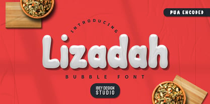 Lizadah Bubble font is a cool, trendy, and bubbly display font. It embodies playfulness and authenticity and is the perfect choice for any children's activity or school project.
 - Husk by Stiggy & Sands,
$24.00 A Flare Serif Family to Rule Them All The Husk Family began as a digitization of a film typeface called Maile by LetterGraphics. From there, it has evolved to a much more robust character set than its original reference. With multiple numerals sets, creative discretionary ligatures, as well as Swash Capitals and a few final forms, this gladiator of the type arena cuts through to let your designs shine. See the 5th graphic for a comprehensive character map preview. The Husk Family is loaded with features to give you plenty of customisation options: - Regular, Chiseled, and Inline styles that can be used alone or chromatically layered - A mix of specialized Capital letterforms for Caps & Lowercase standard - A Swash feature for Swash Capitals as E & R final forms. - Stylistic Alternates feature for Lining Numerals, an alternate & and M. - Discretionary Ligatures for a collection of unique ligature arrangements. - A Full set of Inferiors and Superiors for Limitless Fractions - An Oldstyle (default), Tabular, Proportional, and Lining figure sets Approx. 482 Character Glyph Set per font: The Husk Family comes with a glyphset that includes standard & punctuation, international language support, discretionary ligatures, alternate numeral styles, subscript and superscript.
 - Shocka by Skinny Type,
$16.00 Shocka - a serif look with simple, clean and visual elegance with smooth curves and beautiful ligatures, A very versatile font that works in both large and small sizes. This font is suitable for a wide variety of projects such as: headlines, logos, labels, branding projects, magazines, homeware designs, product packaging, mugs, quotes, posters, and more. It can also be more expressive and fun, thanks to the many alternatives and binders that combine harmoniously in this font and make it more interesting and versatile. Try to change alternatives, binders and you will get many options for your project which will make it bold & beautiful. Features: Section • Full set of uppercase, lowercase • Ligatures • Alternative • A wide variety of numbers, symbols & punctuation • Characters with accents • Support Multiple Languages • PUA encoded WHAT IS INCLUDED: • Shocka – Regular • Shocka– Outline This type of family has become the work of true love, making it as easy and fun as possible. I really hope you enjoy it! I can't wait to see what you do with Stanger Display! Feel free to use the #Skinny_Type and #Shocka Serif font tags to show what you've done visit my Instagram : https://www.instagram.com/skinny.type/ Thank you!
 - BF Corpa Gothic Pro by BrassFonts,
$39.00 BF Corpa Gothic™ Pro is a kind of “Neue”-Edition of the beloved typeface designed by Guido Schneider. Inspired by hand-drawn geometric fonts from 1920s posters, this sans serif typeface is slightly condensed, and it appears compact and captivates with its expressive shapes and unique details, despite its pronounced Grotesque character. With its rather constructed, technical – but also vivid – appearance, the BF Corpa Gothic™ Pro is not only suitable for headlines and display applications, but is also pleasant to read in short and middle length text. The type family is engineered for exciting, professional but unusual designs. It is equipped with OpenType Features like 4 figure sets (LF, TF, OSF, SC), nice ligatures, many currency symbols, fractions, alternates, special characters, arrows and symbols – and small caps. 9 style sets give you the option to individualize and adjust the typeface to the requirement of your design, without changing the general visual feeling. In this way you can also switch the simply slanted styled Italic into a “real Italic”. Each of the 16 fonts (Upright and Italic) contains more than 940 glyphs and supports up to 220 Latin-based languages.
 - Helios Antique by W Type Foundry,
$25.00 Helios Antique & Helios Stencil Check our PDF specimen for more details Helios type family is the result of a mixture between the early sans serif and the modern trends of our era. Its rational structure is subtly wider than the majority of the first sans, generating a higher impact in its uses. All the typeface terminals are more open in order to balance better the whites and blacks of Helios, and where the strokes meet it has a deeper contrast giving more legibility to the reader. Furthermore, in some letters it is possible to see some prominent features such as the leg of the "R" and the tail of the "Q", which are particular gestures that identify this type family. Helios Stencil is the tough version of this type family. All the stencil gaps were measured rigorously, thus in small sizes it conveys a neutral aesthetic whereas in big sizes a display logic appears. Helios Antique is composed by 36 styles, 782 glyphs and small caps. Besides, it has powerful OpenType features for each style, including alternates characters, ligatures, fractions, special numbers, arrows, extended language support and many more.
 - Diaconia Old Style by Hackberry Font Foundry,
$24.95Diaconia Old Style is a new rendition of my workhorse body copy font that I originally designed to use for the body copy of "Printing in a Digital World." I became increasingly upset with the lack of lowercase numbers and true small caps. Diaconia started life as a modification of one of the Dutch Bible fonts I traced. It has changed a lot since then (although I have a hard time telling how much because I have lost the original). The plain and italic work especially well when used in very large sizes as display faces. The other four variants (small caps, heavy, heavy italic, and black) are designed for use in book production. Because I format all my own books, I was able to design fonts that met my needs exactly: lowercase numbers, SMALL CAPS font, Mac Command, Option, and Control symbols, ballot box in the section slot, and several other special characters. DiaconiaPro is the OpenType family of my body copy workhorse. This is the first font family I ever created: classic, elegant, easy to read. 583 characters: small caps, oldstyle figures, numerators, denominators, lining figures, accents and a lot more. - Solitas Slab by insigne,
$- Slab serif, meet the curves of Solitas. The new slab sister of insigne’s successful Solitas family will turn your head with its soft, but distinct look. Solitas Slab defies the typical feel of the robust slab category with her more compact structure and rounded corners to create a confident charm that complements everything sweet from cookies and puppies to whiskers on kittens. Solitas Slab offers you a full suite of 42 well-rounded fonts that read well both in print and online. Its round, open letter types make it quick to read, and the intermediate weights execute impeccably for copy, while bolder versions make expressive headlines and subheadings. Using its subtle geometry, its seven weights and three widths along with its optically adjusted italics tackle even the most complicated, ambitious typography with heart-warming grace and poise. Solitas Slab OpenType options include titling caps, small capitals, ligatures, ordinal characters, fractions, numerator and denominator as well as superscript and subscript. Solitas Slab also supports Western European, Central and Eastern European languages. Enjoy the softer side of Solitas Slab today for your packaging, web, or print. You’ll soon find this friendly font to be one of your favorite things.
 - Haboro Contrast by insigne,
$- Meet Haboro Contrast, the stylish little sister of the Haboro hyperfamily. While built from the same clean, geometric shapes of Haboro Sans, this new addition has been rebalanced for elegant performance with her high-contrast sans letterforms and has been adjusted to provide the greatest impact for each weight. It's a personality all her own, gentle in approach yet refined and modern with a confident appearance. Capitalize on Contrast's style with OpenType features, too. Packed with options like OpenType ligatures, stylistic sets, fractions, crafted small caps and old-fashioned figures, this font will keep your work fresh and attractive. If you need even more combinations for the right statement, use the entire Haboro hyperfamily and create the right balance to capture your reader's eye. Haboro Contrast (along with the rest of the Haboro family) has been tested for the web and is ready for use in both print and digital applications. Designed to serve as a display character for such publishing projects as magazines and company brochures, Contrast gives you comfort in having a great amount of versatility in the fonts you rely on. It's a prime example where high contrast simplicity lends itself to achieve excellent design results.
 - Cotillion Pro by Canada Type,
$39.95 Cotillion is an original design Jim Rimmer finished just before the turn of the century. Alongside its evidence of Jim's nostalgia at the deco type designs he was exposed to as a child, it distinctly shows a type designer who has become very comfortable with that rarest of design abilities: Bringing efficient typographic solutions to what is essentially a calligraphic endeavour. This design has all the elements of what made a traditional deco typeface display unmistakable elegance and luxury: The expressively low x-height, the precisely calculated upwards comfort and reserved grace of the vertical metrics, the subtle fusion of calligraphic ornamentation and clean minimalist type technique, and the unique indentity of the original lowercase flow. Cotillion was refined and remastered in 2012 to include a weath of aesthetic and functionality improvements. This Cotillion Pro set includes small caps, true italics, ligatures, seven types of figures, automatic fractions, extended Latin language support, stylistic alternates that include lowercase serif angle options, and plenty of extra OpenType features like caps-to-small-caps substitution, case-sensitive positioning, ordinals, and extended class-based kerning. At over 780 characters, each of the Cotillion Pro fonts is the equivalent of three fonts in one.
 - Argo Supernova by Eliezer Grawe,
$9.00 Argo Supernova is a sans serif font, inspired by science fiction titles. Delicate on the thinest weights, strong on the thickest ones, it is perfect for modern branding and logo design, editorial design, web design, packaging and various other projects. Argo Supernova has a geometric and open structure, with shapes that create a solid texture on the page. Its large x-height produces good reading in long texts and its peculiarities, such as curved bars and endings, generate a strong presence in titles. The Argo Supernova family consists of 8 weights with matching italics, with Extended Latin character set. The italics makes use of more curves and smoothness, creating an interesting variation in design. • 16 styles: 8 weights + 8 italics; • 602 glyphs in each weight; • Special SS02 feature: "bend" alternates for majority of caps characters with curved details; • OpenType features: Access All Alternates, Stylistic Alternates, Standard Ligatures, Discretionary Ligatures, Numerators, Denominators, Fractions, Superior and Inferior Numbers, Kerning, Localized Forms, Lining Figures, Oldstyle Figures, Proportional Figures, Tabular Figures, Slashed Zero, Stylistic Set 1 to 6. • Supporting 219 latin based languages, which are spoken in different 212 countries.
 - BF Rotwang Pro by BrassFonts,
$39.99 The BF Rotwang™ Pro is a contemporary new edition and re-design of a formerly design by Guido Schneider. Named after the C.L. Rotwang, the inventor of the Mensch-Maschine from the film Metropolis (1925/1926), BF Rotwang plays with the character traits of high-contrast transitional serif typefaces and Didone-style typefaces. BF Rotwang is a typeface characterized by balanced elegance. It is sensitive, sophisticated and self-confident, but unobtrusive. The heavy weights have the power and dynamic for strong headlines and exciting logotypes, the lighter cuts the elegance and lightness for use in continuous text. All letters and characters are a touch condensed, so the typeface looks compact and works space-saving. BF Rotwang™ Pro supports up to 200 Latin-based languages. The family comes with 7 weights plus matching Italics. Each font contains more than 1.220 glyphs, featuring a wide range of alternate characters, small caps, figure sets, fractions, more than 35 ligatures, many currency symbols, special characters and other useful symbols. The style sets give you the option to individualize and adjust the typeface to the requirement of your design, without changing the general visual feeling.
 - Fer by ParaType,
$30.00 Fer is a sans-serif font for body text, not lacking in its own distinctive voice. The aftertaste of reading the text set in Fer is like reading the letters on old rusty plates somewhere in Southern Europe, hence the name (Fer means iron in French). Being a modern system that includes a variable font with weight and optical size axes, Fer combines the features of geometriс sans serifs and old sans serifs with closed apertures. The typeface contains three sets of styles: for captions, text and headings, — with the weight ranging from regular to black. Fer was created with the idea to unite nations. The Latin character set supports all European languages, most African languages and Vietnamese. Cyrillic has support for all living Cyrillic languages and some obsolete characters too. The font also supports the Greek language. Additionally, the character set includes currency signs of all supported languages’ countries, old style, lining, tabular and proportional figures as well as numbers in squares and circles. Lastly, the font has lots of localized letterforms and stylistic sets. Fer was designed by Dmitry Goloub for Paratype in 2020–2023.
 - Colville by Canada Type,
$29.95 The Colville fonts began their existence in 2015 as a project-specific typeface, made to be used on a custom-made headstone commemorating Canadian artist Alex Colville (1920-2013) and his wife Rhoda Wright. For that purpose, some initial shapes were modelled after letters Colville himself had used on a Governor General gold medal he designed in the mid-1970s. From there started a year-long project that culminated in a set of four comprehensive fonts ranging in weight from Light to Bold, each containing over 750 glyphs to cover Pan European language support, stylistic alternates, five sets of figures, automatic fractions, and some ornaments rooted in Alex Colville’s art. These fonts exhibit a strong art deco aesthetic that has always been a favourite of architects, metal casters, and sign makers. This is a very humanist geometry alternating from the precisely calculated to the curvy and lithe, subtle contrast, flat stroke stops, and airy proportions that make for a counterspace built for accommodation and comfort. The breadth and timeless humanism of the Colville set makes fit in a variety of applications, from straightforward headlines, titles, and emphasis captions, to branding and packaging.
 - Conthey by ROHH,
$29.00 Conthey™ is a highly customisable unicase sans serif family designed for headlines and display use. Its modern, sharp and friendly character will add a fresh, positive vibe to your projects. Conthey customization options include weight variants from hairline to extra bold, width variants from narrow to normal, as well as style variants - possibility to change the mood of the font - from normal unicase, which is already a little cheerful in character, to even more playful, neo-deco proportioned unicase. Conthey feels at home when used for modern branding, magazine layout, headlines and posters. Variable fonts, broad choice of styles and additional alternative stylistic set give the family a great versatility and uniqueness. Conthey consists of 126 fonts in 3 width variants and 3 style variants - 63 uprights and their corresponding italics. Conthey family contains also 2 variable 3-axis fonts, with axes: weight, width and style (that changes internal proportions of some letters, like A H a e g and more). The family has extended language support as well as broad number of OpenType features, such as alternative stylistic set, discretionary ligatures, titling alternates, contextual alternates, slashed zero, fractions, superscript and subscript, ordinals, currencies and symbols.
 - Graduate by Fontforecast,
$54.00 Graduate Script is a contemporary calligraphic script. With over 825 glyphs Graduate Script can be dressed up or down, to enliven its style. You can add curls to beginning and end of any lowercase letter, or even in between them. Alternates for both upper and lowercase, as well as ligatures for double letters are included too. OpenType features such as five numeral styles, fractions and both standard and discretionary ligatures, make Graduate Script a well equipped font. Graduate Ornaments has over 300 glyphs and expands the design possibilities of Graduate Script even further. It offers additional ornaments and curls to add to lowercase letters, frames, automated borders that can be accessed by the keyboard and a lot more fun glyphs to work with. On top of that there are catchwords in different styles. Not finding the catchword you’re looking for? Just create your own! A full set of capitals, including roman accented caps, currency, numerals and punctuation is part of Graduate Ornaments. Designed to fit the same frames that are being used for the different catchword-styles, so you can easily integrate custom text with the existing catchwords. A detailed user guide is available in the gallery section.
 - Spitzkant Variable by Julien Fincker,
$185.00 About the design Spitzkant is a serif typeface family that is characterized by strong contrasts. Pointed, sharp serifs and edges contrast with round and fine forms, making it very individual and expressive. This makes it particularly suitable for branding, editorial, packaging and advertising. The high-contrast display version has been complemented by a lower-contrast text version, making Spitzkant in combination suitable for both strong headlines and extensive body text. An allrounder that can be used for many purposes. Variable Font The Variable Font contains 3 axes: weight, oblique and optical size – all in just one file. Features With over 850 characters, it covers over 200 Latin-based languages. It also has an extended set of currency symbols and a whole range of open type features. For example, there are alternative characters as Stylistic Sets, Small Caps, automatic fractions and many other features. Ligatures Especially the extensive selection of ligatures (standard and optional) is a special feature which was an important part during the design process. With over 95 different ligatures there are many possibilities to give headlines and logos an individual touch. Get the usual version of the Spitzkant family here: https://www.myfonts.com/fonts/julien-fincker/spitzkant/
 - Organic Pro by Positype,
$29.00 When I released the original Organic in 2009, I was satisfied with it. It was what was possible from me and the technology at the time. The Organic Pro of 2021 takes those original desires of delivering a highly legible and friendly sans serif, and doubles down on those notions, while exploring what further infusing warmth in a highly structured sans serif can really do for a client. Free of distracting and potentially dating visual traits and cues that could be seen as endemic of a specific time period or ‘type trend’, Organic Pro is its own person—take it or leave it. Inviting warmth, assured reliability, and a head nod of confidence is what you walk away with—a stark contrast to the cold, impersonal geometrics and grotesques proliferating the design annuals currently. Releasing this typeface now, completely redrawing the masters, as well as expanding the weight and language options, should be seen as a laid back challenge that we need to do less with type, let it communicate confidently and warmly when it needs to, and stop forcing one-size-fits-all type trends on everyone.
 - Adelle Mono by TypeTogether,
$36.00 The Adelle family continues its stylistic expansion with the release of Adelle Mono and Adelle Mono Flex by Veronika Burian and José Scaglione. Monospaced typefaces are the default choice for developers and programmers and are also an aesthetic choice for many designers and communicators. The Adelle Mono font family has two widths to serve both breeds and a variable font for the flexible spectrum in between. Monospaced typefaces are born of necessity rather than purely aesthetic values. Each glyph is constrained to a strict box, making the naturally smaller ones the same width as the naturally wider ones. While this serves the functional purpose of keeping text aligned in vertical and horizontal rows, it is completely unnatural in terms of readability. A monospaced ‘l, i’ are overblown compromises while ‘m, w’ become compressed mutations. The Adelle Mono family was therefore designed with both the developer and the aesthete in mind. Adelle Mono respects its necessary constraints while still being visually appealing and easily read. Activate it for use in Sublime, Swift, Terminal, or your IDE of choice and see how well it performs. Clarity will lead to less developer mistakes, and its aesthetic appeal will make your work enjoyable. Adelle Mono Flex is the proportional width version that works for any kind of normal text reading or a design intended to invoke “system or information aesthetics”. Opposite the demands of the monospace family, Flex is reader friendly and intended for branding, annual reports, paragraphs, UI, logos, posters, screens, tables, captions, and more. Employ the Mono version where monospace is needed and the Flex version where reading or coherence is priority. Adelle Mono’s experimental 20-style design explores the space between proportional and monospaced types. It boosts creativity and coherence by providing flexible options in the same family, including italics and the variable font format with an axis of weight and a spectrum axis between multi-width and monospaced characters. Combining Adelle Mono with either Adelle or Adelle Sans adds more layers and adaptability to your work.
 - Jean Paul Fraktur by RMU,
$25.00A typographic treasure, originated at the end of the 18th and the beginning of the 19th century, had been brought back to life. With its charming touch it makes a wonderful font for poems, bookcovers, reprints and other historically relevant projects. To get access to all ligatures, it is recommended to activate both Standard and Discretionary Ligatures; the round s you find on the # key, and typing the combination N-o-period and activating the OT feature Ordinals gets you the numero sign.