10,000 search results
(0.049 seconds)
- M Circus PRC by Monotype HK,
$523.99 M Circus PRC is a graphic style Simplified Chinese typeface. Graphic font designs have strong personalities and visual impact. Graphic style Simplified Chinese fonts feature decorative elements and pronounced graphics characteristics, suitable for catching attention in display applications.
 - Mortadella by Josh Grzybowski,
$19.99 Mortadella is a hand drawn, burly looking OpenType sans-serif font with just the right rough edges and simple stylistic alternatives . Designed as a display font Mortadella works great for identity design and publication headers and sub-headers.
 - Noopla by Rex Face,
$20.00 Noopla is a modern sans-serif display font. Key characters are formed with sweeping and flowing lines, resulting in some really interesting word forms. With four weights, Noopla is great for branding, headlines, signage, social media and more.
 - Blue Creek Rounded by ActiveSphere,
$30.00 BlueCreek Rounded is a extra condensed geometric typeface, and works best in text and display applications, such as headline, posters, signage, magazine, print, product branding, corporate branding, logos and titles. Several alternate characters are included in this typeface.
 - Ceuphoria by Atasi Studio,
$18.00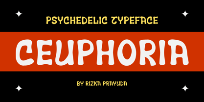 Ceuphoria is a display groovy font with a psychedelic look and trippy effect. Ceuphoria is ready and Perfectly fit for your logo designs, music projects & social media posts, event poster, brand imagery, product packaging, handwritten quotes, merchandise, etc.
 - Xenku by limitype,
$12.00 Xenku Is A Display Font With A Modern Sans Serif Style, Made With A More Dynamic And Flexible Impression, Making This Font Look More Futurustic. Xenku Comes With: - All Caps Fonts - Number - Symbol - Multi Language - And Italic Version
 - M Rocky HK by Monotype HK,
$523.99 M Rocky HK is a graphic style Traditional Chinese typeface. Graphic font designs have strong personalities and visual impact. Graphic style Traditional Chinese fonts feature decorative elements and pronounced graphics characteristics, suitable for catching attention in display applications.
 - Kallisto Lined by Device,
$39.00 A lined variant of Kallisto, suggestive of scan lines, speed and display screens. Kallisto weds a rational, machine-made aesthetic with a certain warmth that derives from more familiar letter shapes found on diestamped or embossed boilerplate signs.
 - GHEA Pastar by Edik Ghabuzyan,
$40.00 This Heavy weight Display font includes Basic Latin, Latin 1 Supplement, Latin extended A, Cyrillic, Armenian. May be used in titles, posters, labels, etc. The structure of glyphs does not require kerning for any pairs! Criation year: 2021
 - Al Crystasea by Aluyeah Studio,
$119.00 Crystasea, a Dawn Seeker Display Serif Font with Stunning 4 weight Style. Very suitable for magazine, headline, website, ads, product package and all type of design project you have. Features: OpenType support Multilingual support (15 languages) PUA Encoded
 - Runalto by Sensatype Studio,
$15.00 Runalto is a display serif font with luxury, elegant, modern, unique and classy-look. This font crafted specials for luxury-themed projects, ready to use on Magazine, Social Media, Branding, Logo, and Many more that needs Luxury touchs.
 - Milano by ITC,
$29.99Milano is definitely in the upper echelon of display typography with its superb, engraved chromium style, italic lowercase and extravagant initials. The lowercase is designed to be closely set. From the talented hand of British designer David Quay. - Crassified by Spareartist,
$6.66 Crassified is a modern display font inspired by blackletter typefaces. The typeface has a strong effect that adds a certain elegance and class to both digital and print designs. It’s ideal for crafting logos, posters, covers, and more.
 - Hayseed by Typadelic,
$19.00Round and square, curly and straight are contradictory in terms but aptly describe this unclassifiable typeface from Typadelic. Readable at small sizes but meant for display purposes, Hayseed will fill the bill in a variety of design applications. - Techno Race by Nirmana Visual,
$19.00 Techno Race - Sport Display with strong and Sporty. with 2 styles : Regular & Italic. Very suitable for the title, logo, typography, clothes, magazines, brochures, packaging and much more for your design needs, making your designs more modern and professional.
 - Spargo by Greater Albion Typefounders,
$8.50 Spargo is inspired by 20s and 30s American typefaces, often seen on share certificates and other securities. Spargo is offered in six all capitals display typefaces. Bring a touch of inter-war America to your next design project!
 - Razzle by Ayca Atalay,
$18.00 Razzle Sans | A Whimsical Sans Serif Razzle Sans is a clean sans serif typeface with a whimsical attitude. Playful yet legible letterforms that have a high x-height makes Razzle Sans an excellent choice as a display typeface.
 - M Computer HK by Monotype HK,
$523.99 M Computer HK is a graphic style Traditional Chinese typeface. Graphic font designs have strong personalities and visual impact. Graphic style Traditional Chinese fonts feature decorative elements and pronounced graphics characteristics, suitable for catching attention in display applications.
 - Shogi by Attractype,
$14.00 Attractype presents Shogi, a beautiful modern serif font, which has sharp shapes and high contrast. Suitable for easy-to-read text or attractive displays. Shogi comes with some beautiful ligatures that make your letter projects even more special.
 - Rockies by Subectype,
$17.00 Rockies is a Rough display font. It comes in a Regular and an italic version, so take your pick! This enchanting font is quirkiness and authenticity and will turn any creative idea into a true standout. Multilingual support.
 - Winter Cold by Sakha Design,
$10.00 Winter Cold is a sweet and adorable display font. Whether you’re using it for crafts, digital design, presentations, or making greeting cards, this font has the potential to become your favorite go-to font, no matter the occasion!
 - Wonderful Today by Subectype,
$16.00 Wonderful Today is a Whimsical Display font, described by a Cute style touch, perfect for your favorite projects. Fall in love with its incredibly distinct and timeless style and use it to create spectacular designs! Thank You, Subectype
 - Pitlines by Mevstory Studio,
$20.00 Pitlines is a display fonts collection. Pitlineswill perfect for many project: fashion, magazines, logo, branding, photography, quotes, blog header, poster, advertisements, etc. Files Includes: Pitliness Regular.otf Pitlines Italic.otf What's Included? Uppercase & alternate uppercase letters, numbers, punctuation Multilingual support
 - Kremlin Kourier II is a typeface that stands out due to its unique blend of historical essence and contemporary design. This font is reminiscent of the Cyrillic script, which is highly associated wit...
- Interrogator Stencil by Typodermic,
$11.95 Interrogator Stencil. This is not your average typeface. It’s a weapon in your design arsenal, engineered for maximum impact. With its military-inspired design and crosshair divisions, Interrogator Stencil is built to command attention and convey authority. Its technical style makes a bold statement, lending your message an assertive accuracy that cannot be ignored. Whether you’re creating a poster for a sci-fi blockbuster or designing a logo for a cutting-edge tech company, Interrogator Stencil is the perfect typeface to elevate your designs to the next level. This font is not for the faint of heart. It’s for those who demand perfection, who refuse to settle for anything less than the best. So if you’re ready to take your designs to the next level, gear up with Interrogator Stencil and get ready to dominate the battlefield of graphic design. Most Latin-based European writing systems are supported, including the following languages. Afaan Oromo, Afar, Afrikaans, Albanian, Alsatian, Aromanian, Aymara, Bashkir (Latin), Basque, Belarusian (Latin), Bemba, Bikol, Bosnian, Breton, Cape Verdean, Creole, Catalan, Cebuano, Chamorro, Chavacano, Chichewa, Crimean Tatar (Latin), Croatian, Czech, Danish, Dawan, Dholuo, Dutch, English, Estonian, Faroese, Fijian, Filipino, Finnish, French, Frisian, Friulian, Gagauz (Latin), Galician, Ganda, Genoese, German, Greenlandic, Guadeloupean Creole, Haitian Creole, Hawaiian, Hiligaynon, Hungarian, Icelandic, Ilocano, Indonesian, Irish, Italian, Jamaican, Kaqchikel, Karakalpak (Latin), Kashubian, Kikongo, Kinyarwanda, Kirundi, Kurdish (Latin), Latvian, Lithuanian, Lombard, Low Saxon, Luxembourgish, Maasai, Makhuwa, Malay, Maltese, Māori, Moldovan, Montenegrin, Ndebele, Neapolitan, Norwegian, Novial, Occitan, Ossetian (Latin), Papiamento, Piedmontese, Polish, Portuguese, Quechua, Rarotongan, Romanian, Romansh, Sami, Sango, Saramaccan, Sardinian, Scottish Gaelic, Serbian (Latin), Shona, Sicilian, Silesian, Slovak, Slovenian, Somali, Sorbian, Sotho, Spanish, Swahili, Swazi, Swedish, Tagalog, Tahitian, Tetum, Tongan, Tshiluba, Tsonga, Tswana, Tumbuka, Turkish, Turkmen (Latin), Tuvaluan, Uzbek (Latin), Venetian, Vepsian, Võro, Walloon, Waray-Waray, Wayuu, Welsh, Wolof, Xhosa, Yapese, Zapotec Zulu and Zuni.
 - Stadtmitte by Letritas,
$25.00 Stadtmitte is a grotesque font with a distinctly industrial flair. It is inspired on a reinterpretation of the Berlin’s vernacular signs and characters created under the DIN 1451 norm. By the early 1900s, german painters and sign makers started to spread this unmistakable way of font drawing used back then on freight trains. Such letter design was both very easy to read and build, hence it started to quickly spread until it became a standard in 1936 for highway signage. Stadtmitte is not aimed to be yet another literal remake of those drawings but rather a revision of shapes and concepts that seeks to transport us to Germany’s industrial way of creating and displaying information, therefore being suitable for a wide scope of design uses, considering its own nature and different available weights. The typeface has 8 weights, ranging from “thin” to “black”, and two versions: "regular" and "italic". Its 16 files contain 618 characters with ligatures, alternates, small caps, old-style and tabular numbers, and case sensitive figures. It supports 219 Latin-based languages, spanning through 212 different countries. Stadtmitte supports this languages: Abenaki, Afaan Oromo, Afar, Afrikaans, Albanian, Alsatian, Amis, Anuta, Aragonese, Aranese, Aromanian, Arrernte, Arvanitic (Latin), Asturian, Atayal, Aymara, Bashkir (Latin), Basque, Bemba, Bikol, Bislama, Bosnian, Breton, Cape Verdean Creole, Catalan, Cebuano, Chamorro, Chavacano, Chichewa, Chickasaw, Cimbrian, Cofán, Corsican Creek,Crimean Tatar (Latin),Croatian, Czech, Dawan, Delaware, Dholuo, Drehu, Dutch, English, Estonian, Faroese, Fijian Filipino, Finnish, Folkspraak, French, Frisian, Friulian, Gagauz (Latin), Galician, Ganda, Genoese, German, Gikuyu, Gooniyandi, Greenlandic (Kalaallisut)Guadeloupean, Creole, Gwich’in, Haitian, Creole, Hän, Hawaiian, Hiligaynon, Hopi, Hotcąk (Latin), Hungarian, Icelandic, Ido, IgboI, locano, Indonesian, Interglossa, Interlingua, Irish, Istro-Romanian, Italian, Jamaican, Javanese (Latin), Jèrriais, Kala Lagaw Ya, Kapampangan (Latin), Kaqchikel, Karakalpak (Latin), Karelian (Latin), Kashubian, Kikongo, Kinyarwanda, Kiribati, Kirundi, Klingon, Ladin, Latin, Latino sine Flexione, Latvian, Lithuanian, Lojban, Lombard, Low Saxon, Luxembourgish, Maasai, Makhuwa, Malay, Maltese, Manx, Māori, Marquesan, Megleno-Romanian, Meriam Mir, Mirandese, Mohawk, Moldovan, Montagnais, Montenegrin, Murrinh-Patha, Nagamese Creole, Ndebele, Neapolitan, Ngiyambaa, Niuean, Noongar, Norwegian, Novial, Occidental, Occitan, Old Icelandic, Old Norse, Oshiwambo, Ossetian (Latin), Palauan, Papiamento, Piedmontese, Polish, Portuguese, Potawatomi, Q’eqchi’, Quechua, Rarotongan, Romanian, Romansh, Rotokas, Sami (Inari Sami), Sami (Lule Sami), Sami (Northern Sami), Sami (Southern Sami), Samoan, Sango, Saramaccan, Sardinian, Scottish Gaelic, Serbian (Latin), Seri, Seychellois Creole, Shawnee, Shona, Sicilian, Silesian, Slovak, Slovenian, Slovio (Latin), Somali, Sorbian (Lower Sorbian), Sorbian (Upper Sorbian), Sotho (Northern), Sotho (Southern), Spanish, Sranan, Sundanese (Latin), Swahili, Swazi, Swedish, Tagalog, Tahitian, Tetum, Tok Pisin, Tokelauan, Tongan, Tshiluba, Tsonga, Tswana, Tumbuka, Turkish, Turkmen (Latin), Tuvaluan, Tzotzil, Uzbek (Latin), Venetian, Vepsian, Volapük, Võro, Wallisian, Walloon, Waray-Waray, Warlpiri, Wayuu, Welsh, Wik-Mungkan, Wiradjuri, Wolof, Xavante, Xhosa, Yapese, Yindjibarndi,
 - Copihue by Letritas,
$30.00 Copihue is the newest font from the foundry of Juan Pablo De Gregorio. A Sans-Serif with some humanist hints, it displays simple and subtle yet sober, vivid strokes. This font’s personality unfolds itself as long as we are reading it. The aim of Copihue is neither to be as neutral as a grotesque font nor to become as predictable as a fully geometric typeface can be. This typography wants to appeal to the likes of designers who prefer all-rounder fonts, the ones who fit well in most layouts. With this purpose in mind, Juan Pablo studied elements of different typefaces and styles to cast them into Copihue, which boasts a personality that makes it a great fit for different compositions and designs. Copihue has a slanted version with "real italics". These italics are slightly more condensed than the regular version, in order to give it a different text texture. The typeface has 9 weights, ranging from “hair” to “black”, and two versions: "regular" and "italic". Its 18 files contain 749 characters with ligatures, alternates, small caps, oldstyle and tabular numbers, fractions, and case sensitive figures. It supports 219 Latin-based languages, spanning through 212 different countries. Copihue supports this languages: Abenaki, Afaan Oromo, Afar, Afrikaans, Albanian, Alsatian, Amis, Anuta, Aragonese, Aranese, Aromanian, Arrernte, Arvanitic (Latin), Asturian, Atayal, Aymara, Bashkir (Latin), Basque, Bemba, Bikol, Bislama, Bosnian, Breton, Cape Verdean Creole, Catalan, Cebuano, Chamorro, Chavacano, Chichewa, Chickasaw, Cimbrian, Cofán, Corsican Creek,Crimean Tatar (Latin),Croatian, Czech, Dawan, Delaware, Dholuo, Drehu, Dutch, English, Estonian, Faroese, Fijian Filipino, Finnish, Folkspraak, French, Frisian, Friulian, Gagauz (Latin), Galician, Ganda, Genoese, German, Gikuyu, Gooniyandi, Greenlandic (Kalaallisut)Guadeloupean, Creole, Gwich’in, Haitian, Creole, Hän, Hawaiian, Hiligaynon, Hopi, Hotc?k (Latin), Hungarian, Icelandic, Ido, IgboI, locano, Indonesian, Interglossa, Interlingua, Irish, Istro-Romanian, Italian, Jamaican, Javanese (Latin), Jèrriais, Kala Lagaw Ya, Kapampangan (Latin), Kaqchikel, Karakalpak (Latin), Karelian (Latin), Kashubian, Kikongo, Kinyarwanda, Kiribati, Kirundi, Klingon, Ladin, Latin, Latino sine Flexione, Latvian, Lithuanian, Lojban, Lombard, Low Saxon, Luxembourgish, Maasai, Makhuwa, Malay, Maltese, Manx, M?ori, Marquesan, Megleno-Romanian, Meriam Mir, Mirandese, Mohawk, Moldovan, Montagnais, Montenegrin, Murrinh-Patha, Nagamese Creole, Ndebele, Neapolitan, Ngiyambaa, Niuean, Noongar, Norwegian, Novial, Occidental, Occitan, Old Icelandic, Old Norse, Oshiwambo, Ossetian (Latin), Palauan, Papiamento, Piedmontese, Polish, Portuguese, Potawatomi, Q’eqchi’, Quechua, Rarotongan, Romanian, Romansh, Rotokas, Sami (Inari Sami), Sami (Lule Sami), Sami (Northern Sami), Sami (Southern Sami), Samoan, Sango, Saramaccan, Sardinian, Scottish Gaelic, Serbian (Latin), Seri, Seychellois Creole, Shawnee, Shona, Sicilian, Silesian, Slovak, Slovenian, Slovio (Latin), Somali, Sorbian (Lower Sorbian), Sorbian (Upper Sorbian), Sotho (Northern), Sotho (Southern), Spanish, Sranan, Sundanese (Latin), Swahili, Swazi, Swedish, Tagalog, Tahitian, Tetum, Tok Pisin, Tokelauan, Tongan, Tshiluba, Tsonga, Tswana, Tumbuka, Turkish, Turkmen (Latin), Tuvaluan, Tzotzil, Uzbek (Latin), Venetian, Vepsian, Volapük, Võro, Wallisian, Walloon, Waray-Waray, Warlpiri, Wayuu, Welsh, Wik-Mungkan, Wiradjuri, Wolof, Xavante, Xhosa, Yapese, Yindjibarndi, Zapotec, Zulu, Zuni.
 - Romance Fatal Sans is a captivating typeface that effortlessly marms the line between the traditional and the contemporary. Designed with a keen eye for both form and function, this font stands out f...
- Univers Next Cyrillic by Linotype,
$49.00 Linotype Univers is a completely reworked version of the original Univers typeface family designed by Adrian Frutiger in 1957. After a long process of painstakingly detailed revision, Frutiger and the design staff at Linotype completed this large joint project in 1997. The result: a brilliant and cohesive font family of 63 weights and styles including the 4 monospaced typewriter weights. All the existing weights were completely redrawn, with careful attention paid to making the proportions more consistent with each other and improving fine details such as curves and thick-to-thin stroke ratios. The family was expanded from 27 to 63 weights, providing a much larger framework to graphic designers for choosing just the right style. The bold and condensed weights were reworked for improved legibility and on-screen application. The stroke weights were revised for consistency within each face as well as in relationship to the other weights. By following Frutiger's original designs, the humanist character of the sans serif Univers now comes through more distinctly. The systemized numbering system has also been updated. With its sturdy, clean forms Univers can facilitate an expression of cool elegance and rational competence. In fact, the strong familial relationships between all the styles and weights make it a serviceable choice for large graphic design projects that require versatility with consistency. Frutiger was successful in staying true to his initial aims; the new Linotype Univers does indeed work in longer texts as well as for display settings. In 2010 the typeface family was extended and renamed into a more logical naming of "Univers Next" to fit better in the Platinum Collection naming.
 - Univers Next Paneuropean by Linotype,
$89.00 Linotype Univers is a completely reworked version of the original Univers Univers typeface family designed by Adrian Frutiger in 1957. After a long process of painstakingly detailed revision, Frutiger and the design staff at Linotype completed this large joint project in 1997. The result: a brilliant and cohesive font family of 63 weights and styles including the 4 monospaced typewriter weights. All the existing weights were completely redrawn, with careful attention paid to making the proportions more consistent with each other and improving fine details such as curves and thick-to-thin stroke ratios. The family was expanded from 27 to 63 weights, providing a much larger framework to graphic designers for choosing just the right style. The bold and condensed weights were reworked for improved legibility and on-screen application. The stroke weights were revised for consistency within each face as well as in relationship to the other weights. By following Frutiger's original designs, the humanist character of the sans serif Univers now comes through more distinctly. T he systemized numbering system has also been updated. With its sturdy, clean forms Univers can facilitate an expression of cool elegance and rational competence. In fact, the strong familial relationships between all the styles and weights make it a serviceable choice for large graphic design projects that require versatility with consistency. Frutiger was successful in staying true to his initial aims; the new Linotype Univers does indeed work in longer texts as well as for display settings. In 2010 the typeface family was extended and renamed into a more logical naming of "Univers Next" to fit better in the Platinum Collection naming.
 - Taca by Rúben R Dias,
$42.00 Taca is a typeface built around a shape that Portuguese designer Rúben R Dias calls a “squircle” — neither square nor circle. We usually associate the rounded, convex box with the television screens of the 1960s and Aldo Novarese’s classic typeface, Eurostile. But whereas Eurostile is cold and machined, Taca is warm and rugged, as if it was molded from clay or carved from stone. Taca’s organic nature is also derived from another unique feature: rounded crotches at the right angles where perpendicular strokes meet. This subtle finish, along with blunt stroke endings, softens the otherwise rigid skeleton. With such a strong conceptual vision, Taca could be relegated to the bin of experimental designs, severely limited in their application. But that fate is usually born of a less experienced maker. As a teacher, designer, and letterpress printer, Dias is a type user, keenly aware of the functional requirements of good type. Taca is therefore not a slave to its concept, but a working font family, effective in various sizes and environments. Its lettershapes break away from the base shape whenever it makes sense for legibility, while still maintaining the flavor of the design as a whole. That said, a set of squircle-shaped alternates give the user the flexibility to get more stylized if the situation calls for it. Fitting to its functional aims, Taca has many of the features one expects of a proper text font: upper and lowercase figures, case-sensitive punctuation, and Extended Latin language support. The simplicity, openness, and squareness of Taca’s forms also make it an ideal design for the pixel grid of screen displays.
 - Neon Street by Ditatype,
$29.00 Neon Street is a captivating display font that takes inspiration from the dazzling glow of neon lights found on vibrant city streets. With its bold uppercase letterforms and neon-style inline elements, this typeface exudes energy and creates a visually stunning experience. Each letter is meticulously crafted with neon-inspired strokes that run through the center, adding a dynamic and luminous effect. This inline style brings a sense of urban excitement and nostalgia, evoking the vibrant atmosphere of neon-lit cityscapes. Inspired by the enchanting allure of neon signs, Neon Street infuses a sense of liveliness and modernity into each character. The font captures the captivating glow of neon lights, casting a radiant and vibrant hue that is both eye-catching and mesmerizing. This neon style adds a touch of urban energy, making the font truly stand out with its electrifying charm. The uppercase letter forms of Neon Street are bold and assertive, commanding attention with their distinctive design. Enjoy the various features available in this font. Features: Alternates Multilingual Supports PUA Encoded Numerals and Punctuations Neon Street is perfect for headlines, signage, logos, and any design that aims to make a bold statement with a touch of neon-inspired flair. This font will also inject your project with a vibrant and captivating element, whether you're creating posters, branding materials, digital artwork, or anything in between. Find out more ways to use this font by taking a look at the font preview. Thanks for purchasing our fonts. Hopefully, you have a great time using our font. Feel free to contact us anytime for further information or when you have trouble with the font. Thanks a lot and happy designing.
 - Cheer Forever by Ditatype,
$29.00 Cheer Forever is a delightful display font that merges the timeless simplicity of a sans serif with playful brush-style accents. With its uppercase letterforms and unique design, this typeface adds a touch of cheerfulness and character to your projects. The defining feature of Cheer Forever lies in its combination of a clean and geometric sans serif base with brush-inspired accents. The uppercase letters maintain a sleek and straightforward appearance, while the brush-style elements bring an element of spontaneity and liveliness. This fusion of styles creates a harmonious balance, resulting in a font that is both contemporary and playful. Inspired by the joyful nature of brush calligraphy, Cheer Forever captures the essence of creativity and self-expression. The brush-inspired accents add a touch of whimsy and personality to each letter, as if they were hand-drawn with a brushstroke. This unique style injects a sense of fun and positivity into your designs. Enjoy the various features available in this font. Features: Ligatures Multilingual Supports PUA Encoded Numerals and Punctuations Cheer Forever fits in logos, titles, headlines, and any design that aims to make a bold statement with a touch of playfulness. It is also particularly well-suited for designs related to children's products, event promotions, and any theme that calls for a touch of creativity. Find out more ways to use this font by taking a look at the font preview. Thanks for purchasing our fonts. Hopefully, you have a great time using our font. Feel free to contact us anytime for further information or when you have trouble with the font. Thanks a lot and happy designing.
 - Knight Souls by Ditatype,
$29.00 Knight Souls is a captivating display font inspired by epic medieval adventures. Designed in uppercase, this typeface captures the spirit of heroic quests with its bold and commanding style. The consistent letter proportions of Knight Souls create a sense of balance and harmony throughout the font. This design choice guarantees that every character fits seamlessly together, resulting in a typographic composition that exudes strength and resilience. With sharp endings, Knight Souls adds an element of dynamism and edge to the font. Each letter is defined by precise angles and sharp corners, evoking a sense of power and determination. This feature lends a bold and assertive quality to the font, reflecting the courage and bravery of knights on epic quests. High letter contrast in Knight Souls emphasizes readability and visibility. The distinct difference between thick and thin strokes enhances the visual impact of each character, making them easily distinguishable and captivating to the eye. The high contrast design adds depth and intensity to the font, making it stand out in any game-themed design. You can also enjoy the available features here. Features: Multilingual Supports PUA Encoded Numerals and Punctuations Knight Souls fits in headlines, logos, posters, titles, branding materials, print media, editorial layouts, website headers, and any projects that aim to transport players to a world of valor and fantasy. Find out more ways to use this font by taking a look at the font preview. Thanks for purchasing our fonts. Hopefully, you have a great time using our font. Feel free to contact us anytime for further information or when you have trouble with the font. Thanks a lot and happy designing.
 - FF Good Headline by FontFont,
$72.99 FF Good is a straight-sided sans serif in the American Gothic tradition, designed by Warsaw-based Łukasz Dziedzic. Despite having something of an “old-fashioned” heritage, FF Good feels new. Many customers agree: the sturdy, legible forms of FF Good have been put to good use in the Polish-language magazine ‘Komputer Swiat,’ the German and Russian edition of the celebrity tabloid OK!, and the new corporate design for the Associated Press. Although initially released as a family of modest size, the typeface was fully overhauled in 2010, increasing it from nine styles to 30 styles, with an additional 30-style sibling for larger sizes, FF Good Headline. In 2014, the type system underwent additional expansion to become FontFont’s largest family ever with an incredible 196 total styles. This includes seven weights ranging from Light to Ultra, and an astonishing seven widths from Compressed to Extended for both FF Good and FF Good Headline, all with companion italics and small caps in both roman and italic. With its subtle weight and width graduation, it is the perfect companion for interface, editorial, and web designers. This allows the typographer to pick the style best suited to their layout. As a contemporary competitor to classic American Gothic style typefaces—like Franklin Gothic, News Gothic, or Trade Gothic—it was necessary that an expanded FF Good also offers customers both Text and Display versions. The base FF Good fonts are mastered for text use, while FF Good Headline aims for maximum compactness. Its low cap height together with trimmed ascenders and descenders give punch to headlines and larger-sized copy in publications such as newspapers, magazines, and blogs.
 - Erotique Sans by Zetafonts,
$39.00 Designed by Cosimo Lorenzo Pancini and Maria Chiara Fantini with the help of Solenn Bordeau, Erotique Sans is the sans serif version of Erotique: a typeface that evolved the original design of Lovelace mixing its romantic curves with the glitchy & fluid aesthetic of trans-modern neo-brutalist typography with the aim of creating a design that was feminine in an assertive and self conscious way. With its restrained, didonesque elegance, Erotique Sans is mostly thought for display use. Its high-contrast design is ready to take center stage in projects where a subtle elegance and an edgy, contemporary touch are required. All its weights (regular, medium, bold and monoline) have been paired with an Alternate version to give immediate access to a wide array of exotic alternate letterforms, available as Open Type Stylistic Sets in the standard family. For logo design and titling use Erotique Sans is paired by Erotique Flourishes, a set of whiplike fleurons that can not only be added to some letters, but also be used as interlocking patterns. For editorial use, since its high contrast requires big text size, the family is complemented by the Erotique Text weight that allows for longer text typesetting thanks to streamlined design, lower contrast and better readability. With a character set of over 500 glyphs, all the the weights of Erotique cover almost 200 languages using extended latin, and include advanced Open Type features as Stylistic Alternates, Standard and Discretionary Ligatures, Positional Numerals, Swash and Case Sensitive Forms. If you liked Erotique, you won't be able to avoid falling in love with Erotique Sans - the font that can't keep its serifs on...
 - Luckiest by Krismagraph,
$19.00 Luckiest is a Stylish Ligature Serif Font. Its soft curves mixed with high-contrast glyphs, give it a feminine and masculine quality. Come in two versions, namely Regular & Italic. It comes with beauty ligatures. Great in layout design for quotes or body copy, best used as a display for headings, logos, branding, magazines, product packaging, and invitations. Accessible in Adobe Illustrator, Adobe Photoshop, Adobe InDesign, and even work on Microsoft Word. PUA Encoded Characters – Fully accessible without additional design software. Fonts include multilingual support: Afrikaans, Albanian, Asu, Basque, Bemba, Bena, Breton, Catalan, Chiga, Colognian, Cornish, Croatian, Czech, Danish, Dutch, Embu, English, Esperanto, Estonian, Faroese, Filipino, Finnish, French, Friulian, Galician, German, Gusii, Hungarian, Indonesian, Irish, Italian, Kabuverdianu, Kalenjin Kamba, Kikuyu, Kinyarwanda, Latvian, Lithuanian, Lower, Sorbian, Luo, Luxembourgish, Luyia, Machame, Makhuwa-Meetto, Makonde, Malagasy, Maltese, Manx, Meru, Morisyen, North, Ndebele, Norwegian, Bokmål, Norwegian, Nynorsk, Nyankole, Oromo, Polish Portuguese, Quechua, Romanian, Romansh, Rombo, Rundi, Rwa, Samburu, Sango, Sangu, Scottish, Gaelic, Sena, Serbian, Shambala, Shona, Slovak, Soga, Somali, Spanish, Swahili, Swedish, Swiss German, Taita, Teso, Turkish, Upper, Sorbian, Uzbek (Latin), Volapük, Vunjo, Walser, Welsh, Western, Frisian, Zulu. Image used: All photographs/pictures/vectors used in the preview are not included, they are intended for illustration only. Feel free to follow, like, and share. Thanks so much for checking out my shop!
 - Sisters by Type-Ø-Tones,
$40.00 Sisters is a lively set of stencil display typefaces designed by Type-Ø-Tones’ co-founder Laura Meseguer. The family features four fresh fonts that share foundational principles of construction yet complement each other—as sisters do—by celebrating their differences. Variations in contrast, weight, and design characteristics result in four distinct styles dubbed One through Four. This cool quartet contains no lowercase, asserting the family’s rightful place in the titling typography space. Like many Type-Ø-Tones typefaces, Sisters was conceived as a custom lettering project—in this case, the design was crafted for the identity of an art exhibition. Laura initially drew only the limited character set the show required, but from the outset, she saw great potential for a fully developed type family based on her lettering concept. The first member of Laura’s new family was, naturally, Sisters One. She later added contrast to produce Sisters Two, then equalized the weight of Sisters Two to create Sisters Three. To round out the group, Laura added a deco touch to Sisters Two, resulting in the festive but retro-elegant Sisters Four. Each Sister shares DNA with the other members of the family, just as human siblings do :). Credit for the Sisters name goes to Eider Corral and we couldn’t imagine a more fitting moniker for this little family.
 - Elanor by Dirtyline Studio,
$25.00 Elanor is a serif typeface inspired by Retro ’70s fonts mixed with Experimental touches. Its main features are a diagonal stress and soft curved teardrop shape terminals. It has ligatures that make it more elegant and grotesque elements that give it a modern look and make it more versatile.This typeface both impressive at display sizes and easily readable in text size, while the sharp shapes of the triangular serifs and the distinctive letter shapes show their strength in logo design and impressive editorial use. Elanor come with elegant style, Retro and contrasts, with features an extended latin character set of 555 glyphs covering over 94 languages, Latin & Cyrillic. Elanor is ready to making your projects looking classic but contemporary, finely tuned but assertive, and elegant as the best retro design. 94 languages : Afrikaans, Albanian, Asu, Basque, Belarusian, Bemba, Bena, Bosnian, Bulgarian, Catalan, Chiga, Colognian, Cornish, Croatian, Czech, Danish, Embu, English, Esperanto, Estonian, Filipino, Finnish, French, Friulian, Galician, German, Gusii, Hungarian, Indonesian, Irish, Italian, Kabuverdianu, Kalaallisut, Kalenjin, Kamba, Kikuyu, Kinyarwanda, Latvian, Lithuanian, Low German, Lower Sorbian, Luo, Luxembourgish, Luyia, Macedonian, Machame, Makhuwa-Meetto, Makonde, Malagasy, Malay, Maltese, Manx, Meru, Morisyen, North Ndebele, Norwegian Bokmål, Norwegian Nynorsk, Nyankole, Oromo, Polish, Portuguese, Romanian, Romansh, Rombo, Rundi, Russian, Rwa, Samburu, Sango, Sangu, Scottish Gaelic, Sena, Serbian, Shambala, Shona, Slovak, Slovenian, Soga, Somali, Spanish, Swahili, Swedish, Swiss German, Taita, Teso, Turkmen, Upper Sorbian, Vunjo, Walser, Zulu
 - Atyp by Suitcase Type Foundry,
$80.99 The sources of inspiration for the Atyp typeface are spread out widely both stylistically and chronologically. The basic proportions of the uppercase refer to the elementary geometric constructions of the Bauhaus. The subtle details in the drawing of the characters and the microscopic adjustments, which evoke the illusion of uniformity and mechanical purity, pay homage to the rationalism of the typefaces popular in the International Style. The increased contrast of the joints of the bowls and shoulders in the Display weight, which in certain diagonal curves transition into almost deconstructive permutations. For a change these take delight in doing things on purpose, teasing readability and breaking the rules of the new millennium's typography. Atyp was created by adapting a typeface originally made for a commercial television station. The potential of the neutral grotesque, proven by its excellent readability on screens, gave the impetus for its preparation into an extremely wide character set with full support for three language scripts. Coherence across all eight key masters lays the groundwork ideally for using the variable font format. The key benefits of this technology are a significant reduction in data consumption in the case of web fonts, as well as an unlimited access to the full range of styles, which in turn is a significant benefit in the area of responsive design.