10,000 search results
(0.047 seconds)
- Free Money by Jeremy Woods,
$10.00 Free money is an organic-looking display font. It was inspired by gig poster art, alternative comics and b-grade movies.
 - Lettres Angulaires by Wooden Type Fonts,
$20.00Based on a revival of one of the popular Textura fonts of the early 20th century; suitable for display, or text. - Mories by MlkWsn,
$15.00 Mories is an elegant display serif with unique letter shapes to complete any designs, especially in fashion, branding, and for logos.
 - PL Westerveldt by Monotype,
$29.99The PL Westerveldt font has a late twentieth-century style, with flared strokes. Use PL Westerveldt for display and short texts. - Orbis Pro by RMU,
$35.00 Walter Brudi's elegant shadowed display font brought to life again and carefully extended with Baltic, Turkish and Central European character sets.
 - Technical Expertise by Abesede Studio,
$18.00 Technical Expertise is a unique and eye-catching display font that takes inspiration from various shapes and expands them into letters.
 - Luxerie by MlkWsn,
$15.00 Luxerie is an elegant display sans with unique letter shapes to complete any design, especially in fashion, branding, and for logos.
 - Cheerful Hilarious by ahweproject,
$14.00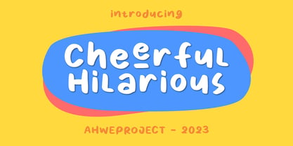 Cheerful Hilarious is a fun and quirky handwritten display font. Its whimsical vibe is perfect for creating unique, kid-friendly designs.
 - RMU Neptun by RMU,
$25.00 A turn-of-the-century Art Nouveau display font, originally from the Aktiengesellschaft fuer Schriftgiesserei und Maschinenbau, Offenbach, revived and extended.
 - Secca Stencil by astype,
$42.00Secca Stencil is a special display font for the Secca font series. For more info look for Secca and Secca Soft . - Number 515 by Wooden Type Fonts,
$20.00 A display style, with protuding bulb round ends at the serifs and mid-points, very bold, lower case originally not designed.
 - Chendolle by Rometheme,
$6.00 Chendolle is a bold display font, it has a fun and cute style and is perfect for creating playful kids designs.
 - Girder Heavy by Wooden Type Fonts,
$15.00Based on a revival of one of the popular wooden type fonts of the 19th century, suitable for display, or text. - Craska by Device,
$39.00 A bold and arresting geometric font built from parallel stripes. Most effective in short headings or logos at larger, display sizes.
 - Crazer by Atom,
$13.00 Crazer is a strange and irregular display typeface. Bringing tense, scary, powerful, and chaotic artwork. Create your creativity with Other Dangers!
 - Lifters by Ronin Design,
$15.00 Lifters is a unique and modern display font. Shifter will work perfectly for logos, branding, advertising, and any kind of project.
 - Cykor by K94 Studio,
$9.00 Cykor is a display typeface with reversed contrast inspired by typography of the late 70s designed in 2020 by Kacper Janusiak.
 - Marc Anthony by Zang-O-Fonts,
$25.00An imperfect mix between a Roman and a Modern font, Marc Anthony can be used easily for display or body text. - Plain Script by ParaType,
$25.00Designed at ParaType in 1995 by Tagir Safayev. Based on informal handwriting (caps-only). For use in advertising and display typography. - Times Gothic by Wooden Type Fonts,
$15.00 Based on a revival of one of the popular wooden type fonts of the 19th century, suitable for display, or text.
 - Tiramisu by Zang-O-Fonts,
$25.00This font has nothing to do with the delicious coffee-flavoured Italian dessert treat. Instead, it's a future-inspired display face. - Zombite by Little Red Studio,
$10.00 Zombite is a fun and whimsical display font. Quirky and mysterious, this font is perfect for all your Halloween-related projects.
 - BooRush by Nurf Designs,
$12.00 BooRush is a display font with a childish touch. The bold shape makes this font very suitable for any playful heading!
 - Elongated Roman by Aboutype,
$24.99An ultra light thins all caps Victorian design with a slight stroke contrast. Elongated Roman requires subjective display kerning and compensation. - Mia Mano by Kate Brankin,
$32.00 Based on designer's own handwriting, Mia Mano is a decorative display typeface ideal for headlines, logos, magazines, posters and short text.
 - Kimiko by Rodrigo Navarro Bolado,
$32.00 Personal project, recommend for display, poster or other big applications, some punctuation added and a few ligatures, hope you like it.
 - Grotesque by Wooden Type Fonts,
$15.00 Based on a revival of one of the popular type fonts of the 19th century, suitable for display, or text, bold.
 - Irina by ParaType,
$25.00 Designed at ParaType in 1995 by Tagir Safayev. Based on informal handwriting (caps-only). For use in advertising and display typography.
 - Geistig by Michael Browers,
$15.00 Geistig is a set of 26 individual letter monogram designs. Geistig works great for monograms, drop caps, and unique display settings.
 - Kalimar by Letterena Studios,
$17.00 Kalimar is a cool and modern serif display font. Add it confidently to your projects and you will love the results!
 - o-wee-ental - Unknown license

- IAM BLACK by Top Type,
$10.00 I Am Black is a sophisticated, charming sans serif font with a fashionable touch. Specially designed for luxury, elegant, feminine projects, this font is perfectly suitable for creating modern, chic designs. This font is PUA encoded which means you can access all the glyphs and ligatures with ease!
 - Tiresias by Bitstream,
$29.99Tiresias was designed for subtitling by Dr. John Gill from the Royal National Institute for the Blind (RNIB), in the United Kingdom. The Tiresias font is designed to have characters that are easy to distinguish from each other, especially important for the visually impaired. The following key factors were considered during the design process: character shapes, relative weight of character stokes, intercharacter spacing, and aspect ratios that affect the maximum size at which the type could be used. The benefits of the Tiresias font are greatest on lower resolution displays, such as televisions, train and airline information terminals, and low resolution displays on wireless communication and handheld devices. InfoFont is for printed instructions on public terminals where legibility is the primary consideration; these instructions are often read at a distance of 30 to 70 cm. Infofont is not designed for large quantities of text. The Tiresias LPfont is a large print typeface specifically designed for people with low vision. Large print publications should be designed to specifically help with reading problems, and should not just be an enlarged version of the ordinary print. The Tiresias LPfont family, made up of roman, italic, and bold weights, was designed to address and solve these issues. The RNIB developed PCfont for people with low vision to use on computer screens. It is designed for use at larger sizes only. PCfont includes delta hinting technology in the font to ensure pixel-perfect display at key sizes. Signfont is for fixed (not internally illuminated) signage. The recommended usage is white or yellow characters on a matt dark background. Note that the “Z” versions have slashed zeroes, and are identical in all other respects. These faces were developed together with Dr. John Gill of the National Institute of the Blind, Dr. Janet Silver; optometrist of Moorfields Eye Hospital, Chris Sharville of Laker Sharville Design Associates, and Peter O'Donnell; type consultant. Tiresias himself is a figure from Greek mythology, a blind prophet from Thebes. - Kingsbury Condensed SG by Spiece Graphics,
$39.00 This delicate condensed typeface evokes a distant 1930s style with its pointed and sloping capital letters. The splayed capital M gives the design a very a definite retro flavor. But deco quickly becomes modern day with the use of slab serifs. The thick body of Kingsbury Condensed is neatly anchored to long thin serifs giving the face an unusual and at the same time contemporary appearance. Great for book covers and large capital letter assignments where a modern revivalist look is appropriate. Kingsbury Condensed Book is also available in the OpenType Std format. Some new characters have been added to this OpenType version. Advanced features currently work in Adobe Creative Suite InDesign, Creative Suite Illustrator, and Quark XPress 7. Check for OpenType advanced feature support in other applications as it gradually becomes available with upgrades.
 - Hand of Hannah by TypoGraphicDesign,
$19.00 The typeface Hand of Hannah is designed from 2021 for the font foundry Typo Graphic Design by Hannah Englisch & Manuel Viergutz. The character of the handwritten script typeface is rough, ruggend and raw. With state-of-the-art OpenType-Feature (like Contextual Alternates (calt) and Stylistic Alternates (salt)). Each uppercase and each lowercase letter has automatically alternated two variations to bring humanly-random characteristics of handwriting to life. 4 font-styles (Regular, Bold, Heavy & Icons) with 732 glyphs (Latin 3) incl. 100+ decorative extras like icons, arrows, catch words, dingbats, emojis, symbols, geometric shapes (type the word #LOVE for ♥︎ or #SMILE for ☺ as OpenType-Feature dlig) and stylistic alternates. For use in logos, magazines, posters, advertisement plus as webfont for decorative headlines. The font works best for display size. Have fun with this font & use the DEMO-FONT (with reduced glyph-set) FOR FREE! ■ Font Name: Hand of Hannah ■ Font Styles: 4 font-styles (Regular, Bold, Heavy, Icon) + DEMO (with reduced glyph-set) ■ Font Category: Display Script for headline size ■ Font Format:.otf (Mac + Win, for Print) + .woff (for Web) ■ Glyph Set: 732 glyphs (Latin 3 incl. decorative extras like icons) ■ Language Support: 80 languages: Afrikaans Albanian Asu Basque Bemba Bena Breton Catalan Chiga Colognian Cornish Croatian Czech Danish Dutch English Estonian Faroese Filipino Finnish French Friulian Galician German Gusii Hungarian Indonesian Irish Italian Kabuverdianu Kalenjin Kinyarwanda Latvian Lithuanian Lower Sorbian Luo Luxembourgish Luyia Machame Makhuwa-Meetto Makonde Malagasy Manx Morisyen North Ndebele Norwegian Bokmål Norwegian Nynorsk Nyankole Oromo Polish Portuguese Quechua Romanian Romansh Rombo Rundi Rwa Samburu Sango Sangu Scottish Gaelic Sena Serbian Shambala Shona Slovak Soga Somali Spanish Swahili Swedish Swiss German Taita Teso Turkish Upper Sorbian Uzbek (Latin) Volapük Vunjo Zulu ■ Design Date: 2021 ■ Type Designer: Hannah Englisch, Manuel Viergutz
 - Aspire Narrow by Grype,
$18.00 While the Aspire family finds its roots of inspiration in the ACURA automotive company logo, with its wider base, the Aspire Narrow family condenses those styles into something more suitable for larger bodies of text in a more standardized width. Aspire pays homage the techno display styling of the inspiration logotype, further evolving beyond its brand inspired origin to give birth to a font family that pulls on modern and historical styles. It adopts a sturdy yet approachable style with its uniform stroke forms and curves, and goes on to include a lowercase, numerals, and a comprehensive range of weights, creating a straightforward, uncompromising collection of typefaces that lend a solid foundation and a broad range of expression for designers. Here’s what’s included with the Aspire Narrow Family bundle: 477 glyphs per style - including Capitals, Lowercase, Numerals, Punctuation and an extensive character set that covers multilingual support of latin based languages. (see the 6th graphic for a preview of the characters included) Stylistic Alternates - alternate characters that remove the angled stencil cuts for a more standardized text look. 3 weights in the family: Light, Regular, & Black. 3 obliques in the family, one for each weight: Light, Regular, & Black. Fonts are available in TTF & OTF formats. The TTF format is the standard go to for most users, although the OTF and TTF function exactly the same. Here’s why the Aspire Narrow Family is for you: - You’re in need of a narrow automotive sans font family with a range of weights and obliques. - You’re love that ACURA letter styling, and want to design with a narrow font within that genre. - You’re looking for an alternative to Eurostile with more stylized letterforms. - You’re looking for a clean techno typeface for your starship console labelling. - You just like to collect quality fonts to add to your design arsenal.
 - Meowtant Kittens by Hanoded,
$16.00 My youngest son Boris has his birthday in a week. He turns 8, and he loves to play with those Danish building blocks - you know what I’m talking about. Last year he developed an interest in Star Wars n(no idea how that came to be), so we bought him some Star Wars-themed blocks for his birthday. I am now watching the movies with him and it is fun to witness his enthusiasm. The only drawback is the fact that we now seem to have a Chewbacca in our home… Meowtant Kittens is a font I drew with a fineliner and then digitised. Of course the name was influenced by the movies I am watching with Boris, even though they don’t feature any Meowtant Kittens.
 - Pamplemousse by The Ampersand Forest,
$19.00 Meet Pamplemousse, a display font that's part fun, casual script and part elegant typeface! Pamplemousse is most decidedly a fellow who enjoys lazy Sunday mornings spent sipping mimosas or bloody marys over a plate of eggs benedict and the New York Times crossword puzzle. He enjoys dressing up for use in branding and headlines (he looks particularly dashing in all caps) and also sitting back and composing a casual note to a dear friend. Pamplemousse is mostly sweet and just a little sophisticated, and he likes being just as he is. Pamplemousse started out as a typeface based on the lettering of Gustav Klimt in his poster for the first exhibition of the Vienna Secession movement (Art Nouveau). This drifted into an homage to Rea Irvin's iconic masthead typeface for the New Yorker magazine. Finally, with the addition of a lowercase (absent from Irvin's typeface), a significant revision away from both Klimt and Irvin into a more casual space, Pamplemousse was born! Oh — why "pamplemousse?" "Pamplemousse" is French for grapefruit. What goes better in your Sunday gin and tonic than an aromatic slice of pamplemousse? Say it a few times. Preferably after a couple of those g & t's. You'll see how fun he can be...
 - Zamenhof by CastleType,
$59.00 Zamenhof is a family of five fonts that can be used singly or in combination to create a variety of bold, yet elegant, display styles. Inspired by Russian hand-lettering that appears to have been based on Jakob Erbar’s Phosphor, Zamenhof is essentially a Latin interpretation (with Cyrillic and Greek) of a Cyrillic interpretation of a Latin type design, with many changes along the way. (For example, all the Latin-only letters are quite different between the two designs: D, F, G, J, K, N, Q, R, S, U, V, W, Y, Z.) The Inline and Inverse styles of Zamenhof are the basic fonts and can be used effectively on their own. The Plain and Outline fonts — which I recommend using only in combination with the main designs — were created specifically to be combined with Inline and Inverse, as underlay and overlay layers, respectively. (You will need an application that supports layers, such as Adobe InDesign or Photoshop.) Zamenhof supports most European languages as well as modern Greek, and of course, Russian and other languages that use the Cyrillic alphabet. Needless to say, as Zamenhof is named after the father of Esperanto, it also supports Esperanto (as do all fonts from CastleType).
 - Telepath by Coniglio Type,
$19.95 TELEPATH Telepath by Coniglio Type, first appeared in 1998. It is now in opentype .otf as of 2021. Telepath is a master sampling of a Royal office typewriter of industrial strength provided by the Miller Furniture store, of Dunkirk, New York. It had a baseline set of numbers to make accounting practices easy and line up nicely on the statements. (No gentile old fashioned numerical ascenders and descenders.) Yet, for a a rather old and stolid machine, it was very luxurious and built to definitely take the test of time. Cudo's for Royal Typewriter Company, is all I can say. The set of images were very carefully gathered and has fallen into the preferred category for a typewriter font that has it all. The font has exceptional value as a text font -and- a display font. It contains a great deal of graphic information and doesn't spike at higher sizes. Telepath presents a strikingly handsome typewriter font with a uniquely intuitive difference. Unlike the original source material—scans of monospaced typewriter copy, every font is painstakingly hand kerned for your most demanding copy fitting work in justified or casually ragged settings for print or the web. All Coniglio Type fonts are 100% embeddable. It will get you there.
