10,000 search results
(0.056 seconds)
- Naveid by NamelaType,
$19.00 Inspired by Germany Type, Naveid comes with Old Style with different nuances. It was carefully designed to combine the cuppped serif on top and the tinny Subtle Flaring on the terminal, which makes this font look elegant. Naveid designed with low contrast, consists of 18 styles from thin to black with each matching italics, it makes this font not only great for Headlines, but also great for paragraph, text and printing.
 - Oook by FSD,
$329.00 oook is a sans serif variable font designed to be used at very low size but it works with great personality also as display font. Uppercases and lowercase heights ratio is designed to improve readability at very very small texts. A feature that can’t be ignored in the smartphone era. With its wide eyes on letters and numbers you’ll be surprised by the improved readability of Excel or LibreOffice spreadsheets.
 - Better Pallet by Ditatype,
$29.00 Better Pallet is a charming script font that beautifully captures the essence of continuous handwriting with brush details. The brush details infuse the font with a handcrafted charm. The continuous handwriting style of this font ensures that each letter flows gracefully into the next. For the best legibility you can use this font in the bigger text sizes. This font fits in headlines, logos, posters, flyers, invitations, branding materials, and many more. Thanks for purchasing our fonts.
 - FF Kievit Serif by FontFont,
$68.99 FF Kievit Serif subtlety melds oldstyle design traits and a 21st century mien into a clean, straightforward suite of typefaces. As part of the FF Kievit super family it helps brands carry their voices effectively and legibly. This includes small text to display sizes, in both print and digital environments, for internal and external audiences. FF Kievit takes inspiration from classic designs like Garamond and Granjon, and is available in seven weights, plus italics. Drawn as a collaboration between Michael Abbink, Paul van der Laan, FF Kievit Serif is a natural extension to the other members of the FF Kievit super family, that also includes FF Kievit and FF Kievit Slab. FF Kievit Serif stands on its own as a multi-talented and exceptionally legible design. Large counters, a generous x-height and ample apertures ensure that FF Kievit Serif translates well to both hardcopy and interactive environments. FF Kievit Serif is available in carefully defined weights, ranging from Light to Black. The Regular, Book and Bold weights are ideally suited to long form text copy. Ligatures, several suites of numbers and small caps are also available. In addition, FF Kievit Serif benefits from the same extensive language support of the other designs in the family.
 - Luckyfield by Allouse Studio,
$16.00 Proudly Presenting, Luckyfield a Fat Handwritten Font. Luckyfield is perfect for any titles, logo, product packaging, branding project, megazine, social media, wedding, or just used to express words above the background. Luckyfield also come with Multi-Lingual Support. Enjoy the font, feel free to comment or feedback, send me PM or email. Thank You!
 - Quichflour by Allouse Studio,
$16.00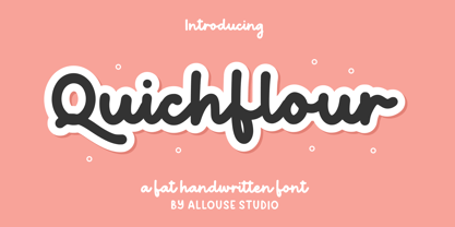 Proudly Presenting, Quichflour a Fat Handwritten Font. Quichflour is perfect for any titles, logo product packaging, branding project, megazine, social media, wedding, or just used to express words above the background. Quichflour also come with Multi-Lingual Support. Enjoy the font, feel free to comment or feedback, send me PM or email. Thank You!
 - Hasibuan by Letterhanna Studio,
$19.00 Hasibuan is a font with Signature style, but with the vibe of real hand lettering, with a lot of swashes, ligatures and stylistic alternate, Hasibuan Font is perfect for many different project such as logos & branding, invitation, wedding designs, social media posts, advertisements, product packaging, product designs, label, photography, watermark, special events or anything.
 - Wildwick by Allouse Studio,
$16.00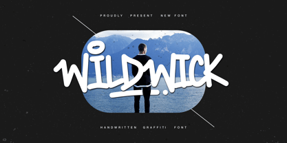 Proudly Present, Wildwick Fat Handwritten Graffitti Font. Wildwick is perfect for any titles, logo, product packaging, branding project, megazine, social media, wedding, or just used to express words above the background. Wildwick also come with Multi-Lingual Support. Enjoy the font, feel free to comment or feedback, send me PM or email. Thank You!
 - Bingkisan by Letterhanna Studio,
$19.00 Bingkisan is a font with Signature style, but with the vibe of real hand lettering, with a lot of swashes, ligatures and stylistic alternate, Bingkisan Font is perfect for many different project such as logos & branding, invitation, wedding designs, social media posts, advertisements, product packaging, product designs, label, photography, watermark, special events or anything.
 - Corner C by CarnokyType,
$20.00 Corner C is a part of Corner type family. This subfamily is designed with rounded shapes in the corners. The concept of the typeface Corner is based on variation of corner shapes in font characters, from what is also its name derived. The basis is a bitmap modular principle, to which by simple addition of “the missing pixels” in corners of the characters ( Corner A ) to the shape of diagonal ( Corner B ), curvature (Corner C), or inversion curvature ( Corner D ), three more font variations are created. The basic monolinear bitmap weight is supplemented by two more extreme thicknesses – hairline and fat weight. The character set supports the complete Latin, while the x-height of lowercase is drawn at the same height as in the uppercase characters. Corner is a strong display typeface, which allows you to easily experiment and to combine it with its mutual font variations.
 - Corner D by CarnokyType,
$20.00 Corner D is a part of Corner type family. This subfamily is designed with inverse rounded shapes in the corners. The concept of the typeface Corner is based on variation of corner shapes in font characters, from what is also its name derived. The basis is a bitmap modular principle, to which by simple addition of “the missing pixels” in corners of the characters ( Corner A ) to the shape of diagonal ( Corner B ), curvature ( Corner C ), or inversion curvature (Corner D), three more font variations are created. The basic monolinear bitmap weight is supplemented by two more extreme thicknesses – hairline and fat weight. The character set supports the complete Latin, while the x-height of lowercase is drawn at the same height as in the uppercase characters. Corner is a strong display typeface, which allows you to easily experiment and to combine it with its mutual font variations.
 - Corner A by CarnokyType,
$20.00 Corner A is a part of Corner type family. This subfamily is designed with square shapes in the corners. The concept of the typeface Corner is based on variation of corner shapes in font characters, from what is also its name derived. The basis is a bitmap modular principle, to which by simple addition of “the missing pixels” in corners of the characters (Corner A) to the shape of diagonal ( Corner B ), curvature ( Corner C ), or inversion curvature ( Corner D ), three more font variations are created. The basic monolinear bitmap weight is supplemented by two more extreme thicknesses – hairline and fat weight. The character set supports the complete Latin, while the x-height of lowercase is drawn at the same height as in the uppercase characters. Corner is a strong display typeface, which allows you to easily experiment and to combine it with its mutual font variations.
 - Corner B by CarnokyType,
$20.00 Corner B is a part of Corner type family. This subfamily is designed with diagonal shapes in the corners. The concept of the typeface Corner is based on variation of corner shapes in font characters, from what is also its name derived. The basis is a bitmap modular principle, to which by simple addition of “the missing pixels” in corners of the characters ( Corner A ) to the shape of diagonal (Corner B), curvature ( Corner C ), or inversion curvature ( Corner D ), three more font variations are created. The basic monolinear bitmap weight is supplemented by two more extreme thicknesses – hairline and fat weight. The character set supports the complete Latin, while the x-height of lowercase is drawn at the same height as in the uppercase characters. Corner is a strong display typeface, which allows you to easily experiment and to combine it with its mutual font variations.
 - Century Gothic by Monotype,
$40.99 Century Gothic™ is based on Monotype 20th Century, which was drawn by Sol Hess between 1936 and 1947. Century Gothic maintains the basic design of 20th Century but has an enlarged x-height and has been modified to ensure satisfactory output from modern digital systems. The design is influenced by the geometric style sans serif faces which were popular during the 1920s and 30s. The Century Gothic font family is useful for headlines and general display work and for small quantities of text, particularly in advertising. The Century Gothic family has been extended to 14 weights in a Pan-European character set from Thin to Black and their Italics. The already existing 4 weights of Regular and Bold with their Italics are additionally still available in the STD character set. The W1G versions featuring a Pan-European character set for international communications supports almost all the popular languages/writing systems in western, eastern, and central Europe based on the Latin alphabet including several based on Cyrillic and Greek alphabets. Looking for the perfect way to complete your project? Check out Aptifer™ Slab, ITC Berkeley Old Style®, FF Franziska™, Frutiger®, ITC Legacy® Square Serif or Plantin®.
 - Neacademia by Rosetta,
$70.00 Neacademia is a Latin and Cyrillic type family inspired by the types cut by 15th century punchcutter Francesco Griffo for Venetian printer Aldus Manutius. Beyond the letterforms themselves, however, the digital fonts themselves are based on the techniques and methods Griffo employed. The family comprises four distinct variants optimised for specific point sizes, as was traditional in metal type. While the display sizes maintain a visual link to calligraphic roots, text sizes exhibit more typographic qualities, following the hand of the carver. Likewise, Neacademia maintains its even colour on the page by carefully employing alternative letterforms, rather than leaning on a multitude of kerning pairs. A geeky little detail you’ll likely need to point out with a magnifying glass to your type friends, but creating a neat texture that works in readers favour nonetheless. Neacademia’s historically sensitive eye is put to work for modern typographers’ needs. It incorporates Griffo’s italic capitals and harmonizes them with the lowercase and the romans — where the original Aldine italics had no capitals of their own and simply re-used the uprights. It was designed with specific allowances for letterpress photopolymer printing. Printed digitally, it can tolerate – and even benefit from – low resolution, rough paper, and low-grade presswork. In many ways, it feels like using metal type again!
 - 1812 by Apostrof,
$40.00 '1812' type family is a revival and further development of the typeface '1812' by Lehmann Type Foundry (St. Petersburg). It was created for the centenary of the French invasion of Russia, known in Russia as the Patriotic War of 1812 along the lines of decorative engraved inscriptions and ornamented typefaces of that time, presumably by the artist Alexandre Benois. It was used mainly for the decoration of luxurious elegant publications. Later, in 1917, this typeface was used on the Russian Provisional Government banknotes. In the Soviet period of time '1812' appeared to be one of the few typefaces included in the first Soviet type standard OST 1337. It was produced for manual typesetting until the early 1990s. This typeface could be seen on Soviet letterheads, forms, posters and even air tickets. The digital version development was launched in 2010. The original version was supplemented with lowercase letters and alternative symbols, the extended Latin and Cyrillic alphabets were fully supported. The font was evolved into a family of 14 decorative styles which can refine any design giving it a festive and elegant but at the same time strict and nostalgic look. Despite its decorative nature, '1812' is perfectly readable in small emphasized text blocks due to its classic shape and careful spacing.
 - Butter Cookie by Bogstav,
$15.00 Did you ever taste a Butter Cookie that you didn't like? I bet the answer is no. It hasn't happened to me yet. Actually I did have a butter cookie and a cup of coffee while finishing this font - and it was great! :) The font, Butter Cookie, is a playful and whimsical comic font. Like magic, the letters change as you type - but that is really not magic, but the contextual alternates...they automatically cycles through the 3 different versions as you type!
 - Realgar by Emtype Foundry,
$69.00 Realgar is a generic and neutral typeface but with enough personality to be different, but not as much to be unfamiliar. The name refers to an ancient natural pigment, known for its vivid orange colour. It is a multipurpose typeface in an eclectic style that combines geometric and grotesque with some humanist touches. Some of its main features are the wide proportions, closed apertures and idiosyncratic numbers that make Realgar stand out. In addition, the rounded dots convey a friendly and contemporary look. A Variable Font version is included with the family or as a separate style.
 - Il Coliseum by Jonahfonts,
$30.00 A formal text font designed for legibility, suitable for documents, books and intense text requirements.
 - Majadira by Attype Studio,
$14.00 Introducing Majadira Font - a beautiful digital font that comes in two versions, Regular and Extrude. When combined, these two fonts give a 3D-like appearance to your designs. With its stylistic alternates, Majadira Font is visually appealing and perfect for wedding designs and Valentine's Day themes. Create stunning invitations, posters, and banners with this elegant font. Whether you're designing for a romantic event or just looking for a stylish touch, Majadira Font is the perfect choice. Features : - Majadira Font Family - Stylistic Alternates - Multilingual, US Roman, Latin 1 Support Hope you enjoy with our font! Attype Studio
 - Bordonaro Spur by Estudio Calderon,
$35.00 Bordonaro Spur - Bordonaro Script’s partner - is a typography strongly influenced by old beer labels and includes some serifs based on Frederic W. Goudy’s Copperplate, but with some softened spurs adding an elegant and soft texture to the text. It is ideal to be used on large bodies and has a set of special ligatures ideal to be used in branding. Psss...Check out the NEW Bordonaro Spur with Rounded corners , same version but soft! FEATURES Co = company1 Co = company2 Estd = established Inc = incorporated Ltd = limited Mc = mac Rd = Road St = street And also from Adobe CC you can activate Style Sets (SS) and get ideal ligatures for ordinal numbers: 1st = st 2nd = nd 3rd = rd 4th = th Bordonaro Script and Bordonaro Spur are two typographic styles that were designed under the same characteristic features with the idea of combining them to obtain better results, for that reason, we recommend merging them in a creative way and you will realize everything you can design with them. The banners designs are based on old brands of beer labels, coffee packaging, sports logos and in some cases we use Copperplate Gothic but only as a complementary font in order to harmonize the layout of the elements in each banner.
 - Freska by ActiveSphere,
$30.00 Freska is a custom font which is applicable for any type of graphic design - print, web, motion graphics etc.
 - TigerCat by ActiveSphere,
$30.00 TigerCat is a custom font which is applicable for any type of graphic design - print, web, motion graphics etc.
 - Xira by ActiveSphere,
$30.00 Xira is a custom font which is applicable for any type of graphic design - print, web, motion graphics etc.
 - Pink Crestelle by Creativemedialab,
$20.00 Been working on a tropical or fancy themed project? You will love this family. Introducing Pink Crestelle a fancy, versatile and playful font family. This family contains 9 weights and has tons of alternates and ligatures. Best for branding, webdesign project, Clothing brand, logo design, valentine's greetings, packaging and much more.
 - Fresh Hansler by Struggle Studio,
$11.00 Fresh Hansler contains a script style, a capitals style as well as a set of extras. They are made with brushes and so they look modern, organic, dynamic, and energetic. This family can be used for various purposes such as titles, signatures, logos, correspondence, wedding invitations, letterhead, signage, labels, bulletins, posters, badges, and more.
 - Sterling Script by Canada Type,
$54.95 Sterling Script was initially meant to a be digitization/reinterpretation of a copperplate script widely used during what effectively became the last decade of metal type: Stephenson Blake's Youthline, from 1952. The years from 1945 to 1960 saw a heightened demand for copperplate faces, due to post-war market optimism, as well as the banking and insurance industries booming like never before, which triggered the need for design elements that express formal elegance and luxury. The name Sterling Script is a tip of our hat to England, the Stephenson Blake foundry's country of origin. It is also a historical hint about copperplate scripts having been used mainly for banking and bonds in the 19th century. Originally we just wanted to resurrect a gorgeous metal type from the ashes of forgotten history. But after the main font was done we saw that the original s really needed an alternate. We made one. But we felt sorry for the original s and didn't want to see it dropped from use altogether, so we saved it by building a set of ligatures that solve the minor connection problem with the s at large sizes. Before the completion of the ligatures, a few different alternates were also drawn, and we were faced by the fact that the single font we set out to do was now a much larger set than we anticipated. While thinking about how to split up our unexpected bundle of large characters, we drew a few more alternates and some swashes. This abundance "problem" reached a certain point where there was no looking back, so we just decided to go all the way with this font. We added many more alternates, swashes, ligatures, and two full sets of each beginning and ending lowercase letter. The result is over 750 characters of sheer elegance. Sterling Script has many features that set it above and beyond other copperplate scripts: - It has 2 beginning and 2 ending alternates for every single lowercase character. The beginning and ending variants on the vowels are also available in accented form in the appropriate cells of the character map. - Sterling Script is the ultimate elegant font choice for luxury design. Very elegant, but not too soft. Its strong and confident shapes convey a message that is real, comforting and assuring. - One of the eventual purposes of expanding Sterling Script this extensively was to create a script that finds the middle ground between formal and informal without compromising either trait, a script where the degree of formality can be gauged, tweaked, cranked up or toned down depending on the layout's needs. Aside from beginnings and endings, there are multiple variations for the majority of the basic characters. This is a formal script on steroids, where twirls and swashes can be set to come out unexpectedly from any place in the word, which is great for reducing the inherent rigidity of words set in copperplate scripts and "humanizing" them whenever needed. This is especially useful for wedding, postcard and invitation design, where not every viewer of the collateral material has something to do with banking or insurance. - With such an extensive character set, a designer can easily set a word or a sentence in 10 or more different ways, and choose the perfect one for the task at hand. This is particularly useful for work where details are of utmost importance, like logos, slogans, or elegant engravings that consist of one to three words. Let those swashes and twirls intertwine for maximum elegance. The Sterling Script complete package consists of 7 fonts: Sterling Script, Alternates, Beginnings, Endings, Swashes, Swash Alternates, and Ligatures. Sterling Script is available in five different purchase options and price ranges. But with such a massive offering of variation, the Sterling Script complete package is definitely the most value-laden set in its class. Once you use Sterling Script, you will never want to go back to other copperplates.
 - Marilia Pro by Nantia.co,
$24.00 Marilia Pro is an elegant modern calligraphy typeface, which supports Extended Latin and Greek character set. This font does not only contain a complete set of lower and uppercase letters, punctuation, numbers, but also a set of ligatures and two sets of alternates. Equally important is the fact that the font has diacritics for multilingual support. Of course, with this typeface, you have access to a complete Greek set of characters, with diacritics and Greek ligatures. Marilia Pro is a high-quality calligraphy font that can infuse any project with glamorous vibes. Marilia Pro is the perfect wedding font if you want to achieve a fairy-tale style on your wedding invitation. For a whimsical style you can pair the font with a strong color palette and metallic papers. Of course, this modern script font is perfect for your graphic design needs like social media quotes, blog headers, posters, stationery, and why not branding, packaging, and logotypes. In addition, this calligraphy font is ideal for the fashion and apparel industry, if you want to achieve a glamorous chic, yet modern style.
 - MC Ronttsly by Maulana Creative,
$15.00 Ronttsly script brush font. This font is good for logo design, Social media, Movie Titles, Books Titles, a short text even a long text letter and good for your secondary text font with signature or script typeface. Make a stunning work with Ronttsly script brush font. Cheers, Maulana Creative
 - MC Begalih Brush by Maulana Creative,
$15.00 Begalih brush handmade font. This font is good for logo design, Social media, Movie Titles, Books Titles, a short text even a long text letter and good for your secondary text font with signature or script typeface. Make a stunning work with Begalih handmade brush font. Cheers, Maulana Creative
 - MC Slecter Cirus by Maulana Creative,
$15.00 Slecter Cirus monoline script font. This font is good for logo design, Social media, Movie Titles, Books Titles, a short text even a long text letter and good for your secondary text font with signature or script typeface. Make a stunning work with Slecter Cirus font. Cheers, Maulana Creative
 - Chrinol by Maulana Creative,
$15.00 Chrinol handmade brush font. This font is good for logo design, Social media, Movie Titles, Books Titles, a short text even a long text letter and good for your secondary text font with signature or script typeface. Make a stunning work with Chrinol handmade brush font. Cheers, Maulana Creative
 - Hogie Rough by Maulana Creative,
$14.00 Hogie Rough handmade script font. This font is good for logo design, Social media, Movie Titles, Books Titles, a short text even a long text letter and good for your secondary text font with signature or script typeface. Make a stunning work with Hogie Rough font. Cheers, Maulana Creative
 - FS Brabo Paneuropean by Fontsmith,
$90.00Worldly Even though it’s a new arrival, FS Brabo has seen the world. Designed by a Brazilian working in London and studying in Belgium under a Dutchman, it’s certainly well-travelled. And it was inspired by the extraordinary archive of early book typefaces at the world-renowned Plantin-Moretus Museum in Antwerp, while Fernando Mello was attending Frank Blokland’s Expert class Type Design course at the Plantin Institute of Typography. It was there that Fernando became engrossed in the collection of early metal type, matrices, punches and type samples by figures such as Garamond and Granjon. So much so that he took on the mighty task of developing ‘a beautiful, functional, serifed text font’ of his own. Heroic FS Brabo’s journey from sketch to font family took an epic three years, starting in Antwerp, continuing at Fontsmith in London, and reaching its conclusion back in Fernando’s home city of São Paulo. No wonder Fernando was reminded of another titanic face-off: that of Antwerp’s Roman hero of legend, Silvius Brabo, and the evil ogre, Antigoon. Brabo came to the town’s rescue after the tyrannical giant had been charging ships’ captains extortionate taxes and chopping off the hands of those who refused to pay up. Having finally downed Antigoon after a long and terrible duel, Brabo cut off the giant’s own hand and threw it into the river Scheldt, unwittingly giving the town its name: the Dutch for ‘hand-throw’ is hand werpen. What better way for Fernando to name his literary typeface than after the hero of Antwerp’s oldest tale? The garalde factor FS Brabo is not a revival, but a very much a contemporary, personal interpretation of a garalde – a class of typeface originating in the 16th century that includes Bembo, Garamond and Plantin, with characteristically rounded serifs and moderate contrast between strokes. Brabo’s ‘ct’ and ‘st’ ligatures, upper-case italic swashes and contextual ending ligatures – ‘as’, ‘is’, ‘us’ – all preserve the beauty and character of traditional typefaces, but its serifs are chunkier than a garalde. Their sharp cuts and squared edges give them a crispness at text sizes, helping to bring a beautifully bookish personality to hardworking modern applications. A workhorse with pedigree It may give the appearance of a simple, four-weight typeface, but FS Brabo has hidden depths beneath its simplicity and beauty. OpenType features such as cap italic swashes, contextual ending swashes – programmed only to appear at the end of words – and stylistic alternatives make this a complete and well-equipped typeface. Comprehensive testing was carried out at text and display sizes, too, to prevent counters from filling in. All of which makes FS Brabo a very modern take on a traditional workhorse serif typeface: colourful and versatile enough to adorn not just editorial projects but also signage, advertising and logotypes. - FS Brabo by Fontsmith,
$80.00 Worldly Even though it’s a new arrival, FS Brabo has seen the world. Designed by a Brazilian working in London and studying in Belgium under a Dutchman, it’s certainly well-travelled. And it was inspired by the extraordinary archive of early book typefaces at the world-renowned Plantin-Moretus Museum in Antwerp, while Fernando Mello was attending Frank Blokland’s Expert class Type Design course at the Plantin Institute of Typography. It was there that Fernando became engrossed in the collection of early metal type, matrices, punches and type samples by figures such as Garamond and Granjon. So much so that he took on the mighty task of developing ‘a beautiful, functional, serifed text font’ of his own. Heroic FS Brabo’s journey from sketch to font family took an epic three years, starting in Antwerp, continuing at Fontsmith in London, and reaching its conclusion back in Fernando’s home city of São Paulo. No wonder Fernando was reminded of another titanic face-off: that of Antwerp’s Roman hero of legend, Silvius Brabo, and the evil ogre, Antigoon. Brabo came to the town’s rescue after the tyrannical giant had been charging ships’ captains extortionate taxes and chopping off the hands of those who refused to pay up. Having finally downed Antigoon after a long and terrible duel, Brabo cut off the giant’s own hand and threw it into the river Scheldt, unwittingly giving the town its name: the Dutch for ‘hand-throw’ is hand werpen. What better way for Fernando to name his literary typeface than after the hero of Antwerp’s oldest tale? The garalde factor FS Brabo is not a revival, but a very much a contemporary, personal interpretation of a garalde – a class of typeface originating in the 16th century that includes Bembo, Garamond and Plantin, with characteristically rounded serifs and moderate contrast between strokes. Brabo’s ‘ct’ and ‘st’ ligatures, upper-case italic swashes and contextual ending ligatures – ‘as’, ‘is’, ‘us’ – all preserve the beauty and character of traditional typefaces, but its serifs are chunkier than a garalde. Their sharp cuts and squared edges give them a crispness at text sizes, helping to bring a beautifully bookish personality to hardworking modern applications. A workhorse with pedigree It may give the appearance of a simple, four-weight typeface, but FS Brabo has hidden depths beneath its simplicity and beauty. OpenType features such as cap italic swashes, contextual ending swashes – programmed only to appear at the end of words – and stylistic alternatives make this a complete and well-equipped typeface. Comprehensive testing was carried out at text and display sizes, too, to prevent counters from filling in. All of which makes FS Brabo a very modern take on a traditional workhorse serif typeface: colourful and versatile enough to adorn not just editorial projects but also signage, advertising and logotypes.
 - FranklinGothicHandLight by Wiescher Design,
$39.50 FranklinGothicHandLight is part of a series of hand-drawn fonts from way back in time – before computers changed the way we worked. When I was in advertising – before computers – a very time consuming part of my daily work was sketching headlines. I used to be able to sketch headlines in Franklin Gothic, Times, Futura, Helvetica and several scripts. We had a kind of huge inverted camera – which we called Lucy. We projected the alphabet onto a sheet of transparent paper, outlined the letters with a fineliner and then filled them in. It was very tedious work, but the resulting headline had its own charm and we had a permanent race going on who was best and fastest. I won most of the time! They used to call me the fastest "Magic Marker" this side of the Atlantic. Great days, just like today! Your sentimental type designer from the past Gert Wiescher
 - FranklinGothicHandDemi by Wiescher Design,
$39.50 FranklinGothicHandDemi is part of a series of hand-drawn fonts from way back in time – before computers changed the way we worked. When I was in advertising – before computers – a very time consuming part of my daily work was sketching headlines. I used to be able to sketch headlines in Franklin Gothic, Times, Futura, Helvetica and several scripts. We had a kind of huge inverted camera – which we called Lucy. We projected the alphabet onto a sheet of transparent paper, outlined the letters with a fineliner and then filled them in. It was very tedious work, but the resulting headline had its own charm and we had a permanent race going on who was best and fastest. I won most of the time! They used to call me the fastest "Magic Marker" this side of the Atlantic. Great days, just like today! Your sentimental type designer from the past Gert Wiescher
 - WHISPERS CALLIGRAPHY_DEMO_essential_BOLD - Personal use only

- Billowed by Ingrimayne Type,
$9.00 Billowed is a typeface family inspired by a simple shape that tessellates in three different ways: in a single orientation, in two orientations, and in four orientations. The shape resembles a billowing sail, with two concave edges that are adjacent and two convex edges, also adjacent. Forcing letters into this template shape results in some oddly shaped letters, but the result should not be judged by individual letters but by how the words and strings of words appear. Billowed was designed as an alternating-letter font in which two sets of characters alternate. The alternating is done automatically in applications that support the OpenType feature contextual alternatives (calt). To get the ripple pattern not just horizontally but also vertically, lines should alternate between the right and left styles and leading set to the same value as the font size. Billowed is monospaced with tight letter spacing to accentuate the ripple pattern. The family includes outline styles that can be used in a layer above the solid style to add color. Undulate was not designed for any particular use but as a challenge to fit letters into a particular geometric shape. The unusual patterns that result are eye-catching and may be useful for advertising or signage and in other places where one wants attention-grabbing lettering.
 - Alan Den - Unknown license


