10,000 search results
(0.055 seconds)
- Misslena by Din Studio,
$29.00 Have you been looking for a serif font? Do you sometimes have an appetite for a bit more wholesome typography? Do you dream of creating headings that stand out and inspire creativity, imagination, and endless fun? Wait no more, we will give you the best choice. Misslena-A Serif Font One of the most elegant, exquisite yet strong fonts. Misslena is made to bring out a modern and stylish view of what you make. This font contains upper & lowercase characters, all punctuation, and numerals. Also features ligatures and alternates characters to help the text flow naturally and add a custom-made feel. Its lighter weights are well-suited for body text. The available stylistic alternates offer a number of different characters that give your logo or business card a unique look. Misslena includes Multilingual Support to make your branding reach a global audience. Inspire your audience, clients, or guests with this beautiful, statement font. Features: Ligatures Alternates PUA Encoded Numerals and Punctuation Thank you for downloading premium fonts from Din Studio
 - Christmas Warmth by HandletterYean,
$14.00 This font is made special for the most wonderful time of the year, Christmas. Enjoy the warmth of Christmas with your family and friends by making a simple Christmas design using this font. It's casual style suitable for your various design needs like greeting cards, posters, invitations, social media posts, advertisements, product packaging, product designs, label, photography, watermark, special event, magazine, web design, etc. To access the alternate glyph, you need a program that supports Open-type features such as Adobe Illustrator CS, Adobe Photoshop CC, Adobe Indesign, and CorelDraw. More information about how to access alternate glyph, check out this link: http://goo.gl/ZT7PqK
 - Coastine by Typetemp Studio,
$20.00 Coastine Chic Modern Font is Sans-Serif Font with upper and lowercase is complemented by some of the same alternatives made with love. Access your OpenType features to access the large selection of alternate letters and ligatures, select the letters you like from the large variety to get the display font you like. Perfect for editorial projects, Logo design, Clothing Branding, product packaging, magazine headers, or simply as a stylish text overlay to any background image. Features : Uppercase and Lowercase Stylistic Alternates & Ligatures Numerals & Punctuation Multilanguange PUA Encoded Web Font Included Thank you for visiting my shop! Contact me with an inbox message If you have any question. Happy Creating
 - Quela by Mokatype Studio,
$20.00Quela is Reverse Serif Font with round nuances, inspired by retro style. Quela builds as a clean and versatile letterform that fits any display graphics design purposes. And still, this font can be used for extended text like quotes and etc. What's you get : Standard glyphs Ligatures (Opentype features) Web Font International Accent Works on PC & Mac Simple installations Accessible in Adobe Illustrator, Adobe Photoshop, Adobe InDesign, and even work on Microsoft Word. PUA Encoded Characters - Fully accessible without additional design software. Fonts include multilingual support Image used: All photographs/pictures/vectors used in the preview are not included, they are intended for illustration only. Thank You - Blooms by DearType,
$29.00 Say hello to Blooms - an edgy, brush script with lots of attitude! All handmade and then vectorized, Blooms is the perfect mix between sexy and serious. The script is made in two variations - one rough and one smooth for a more sleek look. The Blooms family comes with some great additions to support the script - a thick headline font for the ultimate impact and a narrow tagline font for more hand-style expression. Urban, modern and full of personality, Blooms is perfect for various occasions. Wedding invitations, T-shirts or cards, Instagram photos or interactive designs, it covers it all. Throw some ligatures and stylistic alternates on top of that and you have yourself a multipurpose family.
 - Murray Corn by Gassstype,
$23.00 Introducing Murray Corn is Rough Display Font Typeface that is written casually and quickly. Letters are made with brushes on Procreate. Then crafted carefully drawn into vector format. is great for your creative projects such as watermark on photography, and perfect for logos & branding, photography, invitation, watermark,advertisements,product designs, stationery, wedding designs,label ,product packaging, special events or anything that need handwritting taste. That is why Murray Corn has charming, authentic and relaxed characteristic more natural look to your text with a more natural look to your text. design more interesting.
 - Cyrillic Latino by Wiescher Design,
$39.50 Cyrillic Latino is a combination of the cyrillic and latin version of my Bodoni-Classic-Text typefaces. The typeface comes in very handy if you want text to look Russian but can be read by everyone. Since it is a combination of two of my typefaces I only charge the price for one typeface. Your trying-to-be-fair designer, Gert Wiescher
 - Sybilla Pro by Karandash,
$28.00 Sybilla Pro a humanist slab serif well suitable for broad range of design projects. Its unique, soft and almost cursive shapes help define a warm and friendly slab serif that is more legible and easier on the reader's eye. This newly developed extended type family consists of seven weights in three widths with complimentary true italics. It is ideally suited for advertising and packaging, editorial and publishing, logo, branding and creative industries, poster and billboards, small text and signage as well as web and screen design. Sybilla Pro provides a broad range of advanced typographical features such as small caps, case-sensitive forms, fractions, scientific inferiors, super- and subscript characters. It comes with a complete figure range set of oldstyle and lining figures, each in tabular and proportional widths. Sybilla Pro has extensive multilingual support, covering more than 70 Latin-based languages and specially designed Cyrillic that works harmoniously with its Latin counterparts - a perfect choice for projects that need both writing systems running side by side.
 - GreenCherry by Vishwakarma Studio,
$10.00 GreenCherry typeface is for regular texts. I have designed every glyph with kept perfection in mind. I also retained symmetry throughout all glyphs. They look very premium when placed together. The typeface has 3 fonts - Thin, Normal & Bold. Every font has 210 glyphs and supports Western European languages. It has essential OpenType features like Kerning and Hinting. Hence you can use it wherever you want. It works very well with print media and web media as well. This typeface is suitable for Websites, Apps, Blogs, Book Publication, Stationery, Signage, and other Printing media. I am sure you will enjoy this typeface.
 - Mantika News by Linotype,
$67.99 Mantika News™, from German designer Jürgen Weltin, was designed to expand the Mantika super family with text and display typefaces for setting newspapers and periodicals. The suite of typefaces is comprised of regular and bold designs, with italic counterparts, for setting continuous text, and light and extra bold versions for setting larger sizes in headlines, sub heads, pull quotes and decks. The typefaces intended for text copy were designed with shared character widths, so that changes can be made in typeface choice without disrupting line endings or column length. The display designs have a slightly smaller x-height and shorter ascenders creating a more elegant demeanor while ensuring compact multi-line display copy. In addition, fonts of Mantika News have a large Monotype W1G (World Glyph Set 1) character set enabling the setting of Greek, Cyrillic and over 20 Eastern and Western European Latin-based languages. Proportional figures are available, in the OpenType® fonts, as an alternative to the tabular designs.
 - Unless by Gassstype,
$23.00 Introducing of our new product Unless is Terror Brush Font and Multilanguage support font with a dramatic movement with special alternative glyph and Ligature glyph. This font is great for your next creative project such as logos, printed quotes, invitations, cards, product packaging, headers, Logotype, Letterhead, Poster, Label, and etc. That is why Unless has Rough and strong characteristic more natural look to your text with a more modern look to your text. You can activate Ligature and Alternative glyphs OpenType panel . Unless is perfect for homeware designs,branding projects, Logo design, Quotes product packaging,and cartoon.
 - Museo by exljbris,
$- Museo... it all started with my love for the letter ‘U’. This uppercase letter just came to me as an image in a daydream. The top of both stems bent into semi-slab serifs. From this principle I worked out the rest of the uppercase letters. My first intention was to make it an all-caps display font, but after a while, I changed my mind. I wanted it to be a bit more versatile, so I decided to add lowercase and adjust spacing and kerning to increase legibility. This OpenType font family comes in five weights, and each weight comes with support for CE languages, even Esperanto. Besides ligatures, contextual alternatives, stylistic alternates, fractions and proportional/tabular figures, Museo has a ‘case’ feature for case-sensitive forms.
 - Royalis by Julien Fincker,
$34.95 About Royalis: Royalis is an expressive and extravagant serif typeface family. It is characterized by a high contrast and dynamic features in the details, such as long terminals or deep inktraps. Royalis is available in three versions: a display version in six weights, a corresponding condensed version also for display applications, and a text version for body text in four weights. It also comes with all the corresponding italics. This makes Royalis versatile, especially for editorial, packaging, branding and advertising. The wide range of weights and possibilities allows Royalis to be used variably. The thinner weights are characterized by their elegance, while the thicker weights captivate with their powerful contrast. They complement each other like the three musketeers once did. Be it the charmingly elegant Aramis, the sober strategist Athos, the powerful ruffian Porthos or the charismatic d'Artagnan, who led the group. Features: The Royalis family has a total of 32 weights, from extralight to black with matching italics, as Display, Display Condensed and Text versions. With over 1027 characters, it covers more than 200 Latin-based languages, with a whole range of Open Type features. There are alternative characters as stylistic sets, small caps, automatic fractions - just to name a few. Arrows and numbers: In particular, the extensive selection of arrows and numbers should be mentioned here. Thanks to Open Type features and a simple system, the various designs of arrows and numbers can also be easily "written" without first having to select them in a glyph palette.
 - Aspire SmallCaps by Grype,
$18.00 Geometric/Technical style logotypes have been developed for car chrome labels since the early 1980's. Many of these sleek logotypes are lacking an expansive family to enhance and express their brand in a richer sense, becoming true brand workhorses. The Aspire SmallCaps family finds its origin of inspiration in the ACURA automotive company logo, and from there expands to an 6 font family of weights & oblique styles, striving to become a workhorse. Aspire SmallCaps is perhaps the most true to form tribute to the original all capitals inspiration logotype. It maintains all capital forms (whether standard or smallcaps) and yet is still strikingly powerful in its presence and readability including numerals, and a comprehensive range of weights, creating a straightforward, uncompromising collection of typefaces that lend a solid foundation and a broad range of expression for designers. Here's what's included with the Aspire SmallCaps Family bundle: - 438 glyphs per style - including Capitals, Small Caps, Numerals, Punctuation and an extensive character set that covers multilingual support of latin based languages. (see the 6th graphic for a preview of the characters included) - Stylistic Alternates - alternate characters that remove the angled stencil cuts for a more standardized text look. - 3 weights in the family: Light, Regular, & Black. - 3 obliques in the family, one for each weight: Light, Regular, & Black. - Fonts are provided in TTF & OTF formats. The TTF format is the standard go to for most users, although the OTF and TTF function exactly the same. Here's why the Aspire SmallCaps Family is for you: - You're in need of automotive sans font family with a range of weights and obliques - You're love that ACURA letter styling, and want to design anything within that genre - You're looking for an alternative to Eurostile with more stylized letterforms. - You're looking for a battle-tech typeface for your futuristic war chest labelling. - You just like to collect quality fonts to add to your design arsenal
 - TT Tricks by TypeType,
$35.00 TT Tricks useful links: Specimen | Graphic presentation | Customization options TT Tricks is a modern serif font family whose design refers us to the style of transitional serifs. The distinctive features of TT Tricks are the relatively low contrast of strokes, the slightly squarish shapes of round characters and the emphasized businesslike nature. The original idea of TT Tricks is based on the graduation project of student Sofia Yasenkova, who chose to create a daily planner font as her final project. This led to many stylistic decisions, for example, the large and asymmetrical serifs, low contrast strokes, and the presence of interesting details. In the process of working on TT Tricks, we have significantly revised the initial idea and expanded the areas of possible font application, while maintaining the original spirit of the project. Despite the large number of display details, the typeface looks great in a small point size, and also when it is used in large text arrays. TT Tricks features an original stylistic set which, when turned on, adds features of typical pointed-pen serifs to some of the lowercase characters. In addition, TT Tricks has small capitals for Latin and Cyrillic alphabets, as well as several interesting ligatures. The TT Tricks font family consists of two font subfamilies, these are the main version and the version with the original stencil cutting. Each subfamily consists of 12 fonts: Light, Regular, DemiBold, Bold, ExtraBold, Black + True Italics. Following a good tradition, TT Tricks supports a large number of OpenType features: ordn, case, c2sc, smcp, frac, sinf, sups, numr, dnom, onum, tnum, pnum, dlig, liga, calt, salt (ss01).
 - Body by Zetafonts,
$39.00 Body graphic project at Behance Body is a type family designed for Zetafonts by Cosimo Lorenzo Pancini with Andrea Tartarelli. Conceived as a contemporary alternative to modernist superfamilies like Univers or Helvetica, Body tries to maximize text readability while providing a wide range of options for the designer. It comes in two variants (Body Text and Body Grotesque), each in four widths and four weights: regular and bold for basic typesetting, light and extrabold for display use. Body Grotesque applies to the sans serif modernist skeleton little imperfections and quirks inspired by our research in early 20th century type specimens. Curves are slightly more calligraphic and a light inverse contrast is applied to bold weights, giving the typeface a slight vintage appearance in display use. Body Text, on the contrary, challenges the modernist aesthetics maximizing horizontal lines and using open terminals for letters like “s” and “a” that appear normally dark in modernist grotesques. For both variants, the normal width family is slightly condensed in an effort to maximize space usage; the Slim width is provided for extremely dense texts or side notes while the Fit width is optimized for display usage as in logos, headings or titles. The Large width manages to look elegant in its light weight while becoming a valid heading or subtitle font in its extrabold weights. All the 64 fonts in the Body superfamily include a complete latin extended character set with small caps for over 70 languages, Russian cyrillic, open type positional numbers, stylist sets and alternate forms.
 - Nighiri by Motokiwo,
$17.00 Nighiri, a classy and elegant handbrush signature typeface that will shine for multiple projects. Nighiri is recommended for poster, logo, headline, quote, wedding, branding, fashion, or anything else you want. It's good for display or just a text.
 - Sharpe Variable by Mans Greback,
$19.00 Sharpe Variable is a stylish serif typeface family. The original type was drawn between 2018 and 2019, and the variable font and its updated styles was created in 2020. It is clear, sharp and has brave, lively letter forms but with a conservative backbone. This font is provided as a Variable Font. It is only one font file, but this file contains multiple styles. Use the sliders in Illustrator, Photoshop or InDesign to manually set any weight and width. This gives you not only the 15 predefined styles, but instead more than half a million steps to customize the type to the exact look your project requires. Each style contains ligatures and support for a wide range of languages. More info about Variable Fonts: https://mansgreback.com/s/About_Variable_Fonts.pdf
 - Devina Rodent by UICreative,
$23.00 Introducing of our new product the name is Devina Rodent Sans Serif Font Family comes with 9 different weights. Modern Sans Serif font that feels beautiful classy, elegant, and modern .This font is perfect suited for a wide variety of projects, as to signature, stationery, logo, wedding, typography quotes, magazine or book cover, website header, clothing, branding, packaging design and more. Also for fashion related branding or editorial design and displays both masculine and feminine qualities.
 - Youngsters by UICreative,
$23.00 Introducing our new product the name is Youngsters Classy Display Sans Serif Font Family comes with 9 different weights. Modern Sans Serif font that feels beautiful classy, elegant, and modern. This font is perfectly suited for a wide variety of projects, such as signature, stationery, logo, wedding, typography quotes, magazine or book covers, website headers, clothing, branding, packaging design, and more. Also for fashion-related branding or editorial design and displays both masculine and feminine qualities.
 - RoglianoPro by Untype,
$25.00 RoglianoPro is a 70-font humanist slab serif super family (7 weights on 5 styles each plus matching italics) that while maintaining a strong and direct backbone, sustains a warm undertone that nods to the lettering and lithographic posters of the Victorian era when you take into account its multiple stylistic alternates, borders and decorative ornaments. Extremely legible for small text as well as finely-detailed enough to be very attractive when used in large settings, RoglianoPro is a versatile typeface that offers a wide range of voices that can move from mechanical to humanistic with absolute ease, and perform efficiently from branding to editorial design. Its Slab serif letterforms are strong, but gregarious and approachable – it’s friendly, but its solid presence is still a typographic force to be reckoned with. Rogliano includes a large set of over 900 glyphs, support for more than 200 latin script languages, a full complement of ligatures, small caps, swashes, William Morris-influenced borders and many Opentype features. In summary, a great addition to any multi-purpose type library.
 - Fantera by Alcode,
$17.00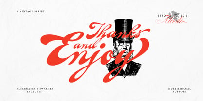 Fantera is a script typeface vintage style. Every letter has been carefully crafted to make your text look beautiful. This font is perfect for logos, badges, shirts, labels, clothing designs, etc. With Fantera, enjoy the wealth of OpenType features and let elegant fun and pleasure make you happy and increase your creativity! You can use this font very easily.
 - Paralucent Slab by Device,
$39.00 Paralucent Slab is an addition to the ever-popular Paralucent family. Paralucent is versatile all-purpose modern sans and slab serif design. Available in seven weights, from Thin to Heavy, with corresponding italics, it avoids some of the more eccentric calligraphic quirks of Akzidenz or Helvetica or the cool precision of Univers for an elegant, functional, yet warm design. Several core ideas inform Paralucent’s design. Prime attention has given to the negative space between characters, giving a more even “colour”, especially in text. For example, the J, L and T have shorter arms than comparable sans typefaces, while the M and W are wider. The A has a lower bar, opening up the interior counter. An unusually high lower-case x-height again helps to give a more even colour and improve legibility. Care has been taken to rationalise repeated elements like the tails on lower-case letters, or the Q and the “ear” of the g. Typographic design solutions that are consistent across all these features add more stylistic cohesion. ‘Ink traps’ are exaggerated incisions used to open up a letter's narrower internal angles, which can become clogged with ink, especially in small point sizes. Now largely redundant due to the high quality of modern print, they are still sometimes used as a stylistic quirk or design feature. Now that digital fonts are often reversed or outlined, or enlarged to enormous sizes, these can also lead to unexpected or obtrusive results. Paralucent takes these inevitable digital manipulations into account, and adds optical corrections without resort to ink traps. The family has been picked up by many UK and US publishers, featuring heavily in magazines like Loaded, Heat and TV Quick, as well as high-end coffee-table photography books and gallery websites. The addition of the Slab family adds even more options for running text and headline.
 - Nuno by Type.p,
$28.00 Nuno Sans is an elegant sans-serif typeface with a humanist touch. It offers 72 styles with 4 widths, ranging from Extended to Condensed, including 18 styles of both uprights and italics. This versatile font supports Western, Central, and Eastern European languages, as well as Vietnamese, ensuring widespread accessibility to readers. Nuno Sans excels in various applications and situations, from bold headlines to easy-to-read text, making it suitable for web, print, and corporate identity projects. Nuno Sans is a contemporary and diverse typeface, perfect for any design project.
 - Aure Nox by Aure Font Design,
$23.00 Aure Nox inspires the chill whimsy of a haunted forest. The roughhewn forms of this decorative, sans-serif font engage the reader with a subtext of rakish charm. Surprisingly legible, Nox adds a bit of rebelious sass to text and titles, and a daring stance to astrological expressions and chartwheels. Nox is an original design developed by Aurora Isaac. After more than a decade in development, 2018 marks the first release of the CJ and KB glyphsets in regular, italic, bold, and bold-italic. The CJ glyphset is a full text font supporting a variety of European languages. A matching set of small-caps complements the extended lowercase and uppercase glyphsets. Supporting glyphs include standard ligatures, four variations of the ampersand, and check-mark and happy-face with their companions x-mark and grumpy-face. Numbers are available in lining, oldstyle, and small versions with numerators and denominators for forming fractions. Companion glyphs include Roman numerals, specialized glyphs for indicating ordinals, and a variety of mathematical symbols and operators. The CJ glyphset also includes an extended set of glyphs for typesetting Western Astrology. These glyphs are also available separately in the KB glyphset: a symbol font re-coded to allow easy keyboard access for the most commonly used glyphs. Though Nox stands well on its own as a text font, the more traditional sans-serif forms of Aure Jane pair well as an innocuous foil to Nox's brazen presence. Give Aure Nox a trial run! You may discover a permanent place for this font family in your typographic palette. AureFontDesign.com
 - Meguro Sans by GT&CANARY,
$27.00 Meguro Sans has a modern-styled boxy shape that achieves clean, industrial yet friendly style lends itself well to brand building. Its mono-line oriented and very high X-height ensure that it is extremely legible and creates a strong impression. Meguro Sans is Sans serif version of Meguro Serif. The Meguro sans font family is comprised of 10 styles with 5 different weights from light to black, along with matching italics offering possibilities for use in web, print, package and sign design, all with the goal of building an established look for brands in wide range of industries.
 - Virtue Serif by Jehoo Creative,
$19.00 Virtue Serif is a variation of the Virtue Script which is more friendly to use as the body of your design without losing its unique and authentic features while still being a workhorse in display use. The rugged and spacious look is armed with a stylish set that is easy to control due to the simple design of the nodes. with a full range of weights from thin to black, it also includes multilingual support this typeface is truly complete. Used for logo design needs, posters, magazines, mockups, web ui, branding, Cover art and more Virtue Serif font family is ready for that.
 - Frudis by Luxfont,
$38.00 Unique family of color realistic fonts Frudis. Trick is to have two fonts - bold and thin. Each one can serve individually, but the real magic begins when you stack them in different colors, creating unique play of textures and colors. Features: - Duo Font - Ability to adapt letters to other languages - Kerning IMPORTANT: - Check the glyphs in the font before buying! - SVG fonts contain raster letters. - Check it www.colorfonts.wtf - Try a FREE DEMO version before buying. ld.luxfont@gmail.com
 - Black Star by Larin Type Co,
$10.00 Black Star is a new monoline font family. This font is ideal for branding and decorate your any project, are perfect for wedding invitation or your blog. Also with their help, you can create a logo or beautiful frame for your home. Or just use for your small business, book covers, stationery, marketing, magazines and more. Also for you, I have prepared many alternates so that you can make your project unique.
 - Pokland by Inumocca,
$12.00 POKLAND Modern Family Font, Come with 3 Style, Reguler One, Stencil Two and Stencil Three, Modern Futuristic, Minimalist and unique Glyphs Construction. Inspiration from Synthwave, Mecha, Modern Technology, Sci-fi Movie Poster, science and Space Theme. Really great font to covering your Project, like Lettering, Website Interface, Magazine, Branding, Poster, wedding invitations, Quotes Lettering, Logos, and more your project design. - Unique glyphs - Multilingual Characters - UPPERCASE - Lowercase - Numeric - Symbol - Punctuation Character - Stylistic Alternates inumocca type Studio
 - Supertuba by Tipos Pereira,
$10.00 Supertuba is a :) geometric sans vernacular humanist :) display type family with 6 weights. There's literally dozens of ligatures in this font so It works very well for flyers, package, stickers and posters, also you can use it as a text font if you're looking for something slightly bold. Supertuba has multilingual support and useful open type features. Letter boards that used to be seen in churches, dive bars and butcher shops are the main inspiration for this typeface. The name Supertuba came from an old supermarket that no longer exists in the city of Indaiatuba , I just believe this name is super fun (at least in Portuguese) and wanted to keep it alive. I was in Indaiatuba when I get started designing this typeface so this is fair enough. Supertuba the third piece of a particular trilogy of fonts that Stubby and Stubby Rough take part, from the lazy vernacular drawing to an unusual geometry. Enjoy!
 - Psych Handlettering by Mysterylab,
$14.00 Here's a font system distilled from the lettering styles of a thousand vintage psychedelic rock albums and posters from the swingin' sixties. All of the grooviness, but perhaps twice the legibility of some of the more "far out" examples from the genre. This family features an extensive character set and multilingual glyphs, so you can say "Trippy, Man." in many languages. The three versions allow you to harmonize letter bodies and highlight strokes with the color palette of your project Once loaded on your system, the three versions of the font show in your menu as the following three "weights": Psych Handlettering Bold, Psych Handlettering Incised, and Psych Handlettering Highlight. The 3-alphabet collection works together seamlessly to allow you to assign one color to the body of the letter, and a second color to the inset highlight lines. Just copy your text block, paste in place, reassign the font to the "highlight" version, choose a complimentary color, and off you go.
 - Scala Sans Pro by Martin Majoor,
$49.00 The award-winning Scala family (1990-1993) is a worldwide bestseller and has established itself as a ‘classic’ among digital fonts. It was one of the first serious digital text fonts to support small caps, ligatures and different set of numbers. In fact Scala and Scala Sans (1990-1993) are two workhorse-like typefaces sharing a common form principle: the skeletons of both Scala and Scala Sans are identical, therefore they can be combined perfectly. Where many of the modern sans serifs (like Helvetica and Univers) have rather ‘closed’ letter shapes, the same elements in Scala Sans are much more ‘open’. This greatly improves legibility, especially in the smaller point sizes. The italic of Scala Sans is not a slanted version of the roman, but rather a ‘real’ italic. Another part of Scala is very popular among its users: Scala Hands, containing more than one hundred decorative hands and pointers, is included in the Scala fonts and is a free bonus.
 - Rockwell Nova by Monotype,
$40.99The Rockwell® Nova family is a sturdy, optically monoweight design with blunt, straight-edged serifs and a no-nonsense attitude. It's the quintessential example of the appealing and eminently usable slab serif type style. The 13 designs of Rockwell Nova make for a robust and adaptable typeface family. Based on the original Monotype Rockwell suite of fonts, Rockwell Nova is an exceptionally durable design that suggests feelings of frank honesty when set in text composition. It is also an exceptionally versatile display design that can be used for headlines, subheads - or virtually anyplace where a strong presence is required. Rockwell Nova OpenType® Pro fonts have extended character set supporting Greek, Cyrillic, most Central European and many Eastern European languages, in addition to providing for the automatic insertion of ligatures and fractions. - Chalet by House Industries,
$33.00 Experience the precision, elegance and history of the Chalet font family. This collection of ten typefaces in three unique styles is the creative genius of acclaimed clothing designer René Albert Chalet. Originally used in his early advertising campaigns, Chalet appropriately echoes the attitude of its creator: function with flair. Modest and unpretentious yet bold and daring, Chalet’s distinctive air allows for a variety of uses ranging from text to display applications. Add modern panache to any design with the Chalet font family. CHALET CREDITS: Typeface Design: Ken Barber, René Albert Chalet Typeface Production: Rich Roat Typeface Direction: Ken Barber, Andy Cruz Like all good subversives, House Industries hides in plain sight while amplifying the look, feel and style of the world’s most interesting brands, products and people. Based in Delaware, visually influencing the world.
 - Vista Sans by Emigre,
$69.00 The concept for Vista began when I sketched a few characters in a notebook while staying in Sumatra on a one month holiday. I wanted to design a typeface for text and display that would retain some of the characteristics of the idiosyncratic shop signs that surrounded me in Sumatra. - Xavier Dupré The result is a comprehensive family spanning six weights, complete with small caps and lively alternate forms, striking a healthy balance between functionality and expressiveness. Each of the six weights includes alternate, small cap and italic variants for a total of 36 fonts in the family. They are available in a full volume of 36 fonts, or in four packages. The packages are grouped into two sets of contrasting weights, with the alternates and small caps divided into separate packages.
 - Intimo by Alias Collection,
$60.00 A two version type family, Intimo One is a serif dot matrix typeface, letterforms made up of grid-based dots. Intimo Two is also made up of dots, but in this case the lines are curved, giving a softer, more organic feel.
 - Osnova Navigation by AndrijType,
$18.75 The common Slavic word Основа (Osnova) means basis in English and βάση in Greek. This universal but still distinctive typeface can make a good ground for any design project. Special Navigation version separated by Western Latin, Greek and Cyrillic families is here.
 - Sassoon Sans US by Sassoon-Williams,
$48.00 North American version for teaching children’s first letterforms With dots and arrows these print script fonts have no ‘exit stroke’ found in the European version. An upright typeface family developed to meet the demand for letters to produce pupil material for handwriting as well as for reading. Upright letters with extended ascenders and descenders are ideal on screen. They facilitate word recognition. Teachers can print desk strips, charts of letter families and alphabet friezes, as well as consistent material across the curriculum. Together these typefaces provide a valuable resource for special needs teachers. Free to download resources How to access Stylistic Sets of alternative letters in these fonts
 - Bulgari by Slex Studio,
$15.00 Bulgari is an organic handwritten font suitable for branding, wedding invitations, promotions, product packaging and other necessities. This font is modern, simple, but still authentic. You'll get a full set of lowercase and uppercase letters, numbers and punctuation, multilingual symbols, lowercase start and end swashes, and ligatures.