10,000 search results
(0.047 seconds)
- Corner C by CarnokyType,
$20.00 Corner C is a part of Corner type family. This subfamily is designed with rounded shapes in the corners. The concept of the typeface Corner is based on variation of corner shapes in font characters, from what is also its name derived. The basis is a bitmap modular principle, to which by simple addition of “the missing pixels” in corners of the characters ( Corner A ) to the shape of diagonal ( Corner B ), curvature (Corner C), or inversion curvature ( Corner D ), three more font variations are created. The basic monolinear bitmap weight is supplemented by two more extreme thicknesses – hairline and fat weight. The character set supports the complete Latin, while the x-height of lowercase is drawn at the same height as in the uppercase characters. Corner is a strong display typeface, which allows you to easily experiment and to combine it with its mutual font variations.
 - Corner D by CarnokyType,
$20.00 Corner D is a part of Corner type family. This subfamily is designed with inverse rounded shapes in the corners. The concept of the typeface Corner is based on variation of corner shapes in font characters, from what is also its name derived. The basis is a bitmap modular principle, to which by simple addition of “the missing pixels” in corners of the characters ( Corner A ) to the shape of diagonal ( Corner B ), curvature ( Corner C ), or inversion curvature (Corner D), three more font variations are created. The basic monolinear bitmap weight is supplemented by two more extreme thicknesses – hairline and fat weight. The character set supports the complete Latin, while the x-height of lowercase is drawn at the same height as in the uppercase characters. Corner is a strong display typeface, which allows you to easily experiment and to combine it with its mutual font variations.
 - Corner A by CarnokyType,
$20.00 Corner A is a part of Corner type family. This subfamily is designed with square shapes in the corners. The concept of the typeface Corner is based on variation of corner shapes in font characters, from what is also its name derived. The basis is a bitmap modular principle, to which by simple addition of “the missing pixels” in corners of the characters (Corner A) to the shape of diagonal ( Corner B ), curvature ( Corner C ), or inversion curvature ( Corner D ), three more font variations are created. The basic monolinear bitmap weight is supplemented by two more extreme thicknesses – hairline and fat weight. The character set supports the complete Latin, while the x-height of lowercase is drawn at the same height as in the uppercase characters. Corner is a strong display typeface, which allows you to easily experiment and to combine it with its mutual font variations.
 - Corner B by CarnokyType,
$20.00 Corner B is a part of Corner type family. This subfamily is designed with diagonal shapes in the corners. The concept of the typeface Corner is based on variation of corner shapes in font characters, from what is also its name derived. The basis is a bitmap modular principle, to which by simple addition of “the missing pixels” in corners of the characters ( Corner A ) to the shape of diagonal (Corner B), curvature ( Corner C ), or inversion curvature ( Corner D ), three more font variations are created. The basic monolinear bitmap weight is supplemented by two more extreme thicknesses – hairline and fat weight. The character set supports the complete Latin, while the x-height of lowercase is drawn at the same height as in the uppercase characters. Corner is a strong display typeface, which allows you to easily experiment and to combine it with its mutual font variations.
 - Il Coliseum by Jonahfonts,
$30.00 A formal text font designed for legibility, suitable for documents, books and intense text requirements.
 - Realgar by Emtype Foundry,
$69.00 Realgar is a generic and neutral typeface but with enough personality to be different, but not as much to be unfamiliar. The name refers to an ancient natural pigment, known for its vivid orange colour. It is a multipurpose typeface in an eclectic style that combines geometric and grotesque with some humanist touches. Some of its main features are the wide proportions, closed apertures and idiosyncratic numbers that make Realgar stand out. In addition, the rounded dots convey a friendly and contemporary look. A Variable Font version is included with the family or as a separate style.
 - Butter Cookie by Bogstav,
$15.00 Did you ever taste a Butter Cookie that you didn't like? I bet the answer is no. It hasn't happened to me yet. Actually I did have a butter cookie and a cup of coffee while finishing this font - and it was great! :) The font, Butter Cookie, is a playful and whimsical comic font. Like magic, the letters change as you type - but that is really not magic, but the contextual alternates...they automatically cycles through the 3 different versions as you type!
 - Pink Crestelle by Creativemedialab,
$20.00 Been working on a tropical or fancy themed project? You will love this family. Introducing Pink Crestelle a fancy, versatile and playful font family. This family contains 9 weights and has tons of alternates and ligatures. Best for branding, webdesign project, Clothing brand, logo design, valentine's greetings, packaging and much more.
 - Balcon Round by Tour De Force,
$25.00 Balcon is condensed sans family designed to be your first web font choice. Contains 5 weights: Light, Regular, Bold, ExtraBold and Black, it fits perfect into any project, from editorial editions to packages, labels, posters. If you're looking for "sharp" version of this family, feel free to check Balcon sans family.
 - FS Brabo Paneuropean by Fontsmith,
$90.00Worldly Even though it’s a new arrival, FS Brabo has seen the world. Designed by a Brazilian working in London and studying in Belgium under a Dutchman, it’s certainly well-travelled. And it was inspired by the extraordinary archive of early book typefaces at the world-renowned Plantin-Moretus Museum in Antwerp, while Fernando Mello was attending Frank Blokland’s Expert class Type Design course at the Plantin Institute of Typography. It was there that Fernando became engrossed in the collection of early metal type, matrices, punches and type samples by figures such as Garamond and Granjon. So much so that he took on the mighty task of developing ‘a beautiful, functional, serifed text font’ of his own. Heroic FS Brabo’s journey from sketch to font family took an epic three years, starting in Antwerp, continuing at Fontsmith in London, and reaching its conclusion back in Fernando’s home city of São Paulo. No wonder Fernando was reminded of another titanic face-off: that of Antwerp’s Roman hero of legend, Silvius Brabo, and the evil ogre, Antigoon. Brabo came to the town’s rescue after the tyrannical giant had been charging ships’ captains extortionate taxes and chopping off the hands of those who refused to pay up. Having finally downed Antigoon after a long and terrible duel, Brabo cut off the giant’s own hand and threw it into the river Scheldt, unwittingly giving the town its name: the Dutch for ‘hand-throw’ is hand werpen. What better way for Fernando to name his literary typeface than after the hero of Antwerp’s oldest tale? The garalde factor FS Brabo is not a revival, but a very much a contemporary, personal interpretation of a garalde – a class of typeface originating in the 16th century that includes Bembo, Garamond and Plantin, with characteristically rounded serifs and moderate contrast between strokes. Brabo’s ‘ct’ and ‘st’ ligatures, upper-case italic swashes and contextual ending ligatures – ‘as’, ‘is’, ‘us’ – all preserve the beauty and character of traditional typefaces, but its serifs are chunkier than a garalde. Their sharp cuts and squared edges give them a crispness at text sizes, helping to bring a beautifully bookish personality to hardworking modern applications. A workhorse with pedigree It may give the appearance of a simple, four-weight typeface, but FS Brabo has hidden depths beneath its simplicity and beauty. OpenType features such as cap italic swashes, contextual ending swashes – programmed only to appear at the end of words – and stylistic alternatives make this a complete and well-equipped typeface. Comprehensive testing was carried out at text and display sizes, too, to prevent counters from filling in. All of which makes FS Brabo a very modern take on a traditional workhorse serif typeface: colourful and versatile enough to adorn not just editorial projects but also signage, advertising and logotypes. - FS Brabo by Fontsmith,
$80.00 Worldly Even though it’s a new arrival, FS Brabo has seen the world. Designed by a Brazilian working in London and studying in Belgium under a Dutchman, it’s certainly well-travelled. And it was inspired by the extraordinary archive of early book typefaces at the world-renowned Plantin-Moretus Museum in Antwerp, while Fernando Mello was attending Frank Blokland’s Expert class Type Design course at the Plantin Institute of Typography. It was there that Fernando became engrossed in the collection of early metal type, matrices, punches and type samples by figures such as Garamond and Granjon. So much so that he took on the mighty task of developing ‘a beautiful, functional, serifed text font’ of his own. Heroic FS Brabo’s journey from sketch to font family took an epic three years, starting in Antwerp, continuing at Fontsmith in London, and reaching its conclusion back in Fernando’s home city of São Paulo. No wonder Fernando was reminded of another titanic face-off: that of Antwerp’s Roman hero of legend, Silvius Brabo, and the evil ogre, Antigoon. Brabo came to the town’s rescue after the tyrannical giant had been charging ships’ captains extortionate taxes and chopping off the hands of those who refused to pay up. Having finally downed Antigoon after a long and terrible duel, Brabo cut off the giant’s own hand and threw it into the river Scheldt, unwittingly giving the town its name: the Dutch for ‘hand-throw’ is hand werpen. What better way for Fernando to name his literary typeface than after the hero of Antwerp’s oldest tale? The garalde factor FS Brabo is not a revival, but a very much a contemporary, personal interpretation of a garalde – a class of typeface originating in the 16th century that includes Bembo, Garamond and Plantin, with characteristically rounded serifs and moderate contrast between strokes. Brabo’s ‘ct’ and ‘st’ ligatures, upper-case italic swashes and contextual ending ligatures – ‘as’, ‘is’, ‘us’ – all preserve the beauty and character of traditional typefaces, but its serifs are chunkier than a garalde. Their sharp cuts and squared edges give them a crispness at text sizes, helping to bring a beautifully bookish personality to hardworking modern applications. A workhorse with pedigree It may give the appearance of a simple, four-weight typeface, but FS Brabo has hidden depths beneath its simplicity and beauty. OpenType features such as cap italic swashes, contextual ending swashes – programmed only to appear at the end of words – and stylistic alternatives make this a complete and well-equipped typeface. Comprehensive testing was carried out at text and display sizes, too, to prevent counters from filling in. All of which makes FS Brabo a very modern take on a traditional workhorse serif typeface: colourful and versatile enough to adorn not just editorial projects but also signage, advertising and logotypes.
 - Rocher by Harbor Type,
$29.00 🏆 Selected for Tipos Latinos 8. 🏆 Hiii Typography 2018 Merit Award. Rocher was designed while looking for an answer to a simple question: what would a typeface look like if it was made of stone? It certainly would look solid, but did we have to add cracks and rubble so it would resemble rocks? We didn’t think so. We decided to tackle the problem a different way. We added corners where there usually aren’t any and threw some unusual letterforms into the mix. The result is a typeface that feels like stone, but if you look closely there is nothing inherently stony about it. Unexpected corners provide just the right amount of roughness, while unusual letterforms give the text an informal aesthetic, traces of something naive and handmade. A family was born when the sturdy letterforms were turned into a series of playful layers. With 9 fonts in total, Rocher can be mixed and matched to create unique layered compositions that add depth to the layout. We designed Rocher to be used in logotypes, packaging, mobile apps and headlines. We are confident you will find another handful of scenarios where it can shine.
 - MC Ronttsly by Maulana Creative,
$15.00 Ronttsly script brush font. This font is good for logo design, Social media, Movie Titles, Books Titles, a short text even a long text letter and good for your secondary text font with signature or script typeface. Make a stunning work with Ronttsly script brush font. Cheers, Maulana Creative
 - MC Begalih Brush by Maulana Creative,
$15.00 Begalih brush handmade font. This font is good for logo design, Social media, Movie Titles, Books Titles, a short text even a long text letter and good for your secondary text font with signature or script typeface. Make a stunning work with Begalih handmade brush font. Cheers, Maulana Creative
 - MC Slecter Cirus by Maulana Creative,
$15.00 Slecter Cirus monoline script font. This font is good for logo design, Social media, Movie Titles, Books Titles, a short text even a long text letter and good for your secondary text font with signature or script typeface. Make a stunning work with Slecter Cirus font. Cheers, Maulana Creative
 - Chrinol by Maulana Creative,
$15.00 Chrinol handmade brush font. This font is good for logo design, Social media, Movie Titles, Books Titles, a short text even a long text letter and good for your secondary text font with signature or script typeface. Make a stunning work with Chrinol handmade brush font. Cheers, Maulana Creative
 - Hogie Rough by Maulana Creative,
$14.00 Hogie Rough handmade script font. This font is good for logo design, Social media, Movie Titles, Books Titles, a short text even a long text letter and good for your secondary text font with signature or script typeface. Make a stunning work with Hogie Rough font. Cheers, Maulana Creative
 - Idealista by Suitcase Type Foundry,
$39.00 Idealista directly responds to its other members, Nudista and Kulturista. It shares the same proportions and the same set of weights, yet it enriches the expression means of the two typefaces with new themes — the character set is smooth, even round, and it boasts a number of special details and perky moves. Most of all, Idealista relishes juicy magazine titles, typographic logotypes and propagandist posters. Unlike cold, technicist typefaces, it has great zest for life, so there's no wonder that in each of the letters, intuition wins over intellect. Owing to this, the text set in Idealista has a special voluptuous quality and unmistakable temperament — in a single typeface Idealista combines the best of sans-serif, slab-serif, as well as geometric and calligraphic construction principles, coming down to one impressive, expressive cocktail. Some letters have serifs, some do not, some are sharp, some are smooth, and all this results in the nice hip-hop beat of the line of text. The typeface has five weights and ten styles in total, so it can easily accommodate to the needs of complex texts, unlike many of its display counterparts. Idealista is valuable partner for the more text-suited Nudista and, if need for tiny sizes arises, to Kulturista as well.
 - Billowed by Ingrimayne Type,
$9.00 Billowed is a typeface family inspired by a simple shape that tessellates in three different ways: in a single orientation, in two orientations, and in four orientations. The shape resembles a billowing sail, with two concave edges that are adjacent and two convex edges, also adjacent. Forcing letters into this template shape results in some oddly shaped letters, but the result should not be judged by individual letters but by how the words and strings of words appear. Billowed was designed as an alternating-letter font in which two sets of characters alternate. The alternating is done automatically in applications that support the OpenType feature contextual alternatives (calt). To get the ripple pattern not just horizontally but also vertically, lines should alternate between the right and left styles and leading set to the same value as the font size. Billowed is monospaced with tight letter spacing to accentuate the ripple pattern. The family includes outline styles that can be used in a layer above the solid style to add color. Undulate was not designed for any particular use but as a challenge to fit letters into a particular geometric shape. The unusual patterns that result are eye-catching and may be useful for advertising or signage and in other places where one wants attention-grabbing lettering.
 - Orpheus by Scriptorium,
$18.00In response to many requests for Morpheus, an idea came to us. Why not make a font that looked a bit like Morpheus, but which had more attractive, more consistent character forms, was rendered cleanly and properly spaced and kerned? We took a look at Morpheus and decided to redo the concept from the ground up, replacing some of the amateurish characters, adding a bit of a Celtic look and feel, developing a set of alternate characters and making sure that the design elements were consistent from letter to letter. The result is Orpheus, a font which has the general look and feel of Morpheus, but is a much more complete and fully realized design. In addition, Orpheus is a fully developed font set, with not only regular and bold versions, but with a special customized italic style and a really neat looking heavy weight rough-outlined variant. - Street Stronger by Sipanji21,
$13.00 "Street Stronger" is a graffiti font with three layers that can be used to create a three-dimensional (3D) effect on your text. By using these three layers in your design, you can add depth and dimension to your typography. Fonts with these layers are often used in street art, posters, or other designs that aim to create a prominent 3D effect. With "Street Stronger," you have the ability to create text that looks different and adds a strong 3D impression by using the various layers. This allows you to customize the text's appearance to fit your design vision and add a powerful three-dimensional touch to your project.
 - ITC Simran by ITC,
$29.99ITC Simran was created by the London designer Satwinder Sehmi in 1998. The Indian influence is recognizable at first glance and lends the font an exotic feel - at least to the western eye. Sehmi borrowed forms and feelings from northern Indian writing systems for this typeface. Both the upper and lowercase letters make use of the same lowercase forms, but the upperacse letters have the addition of a horizontal bar running over them at the ascender height. This feature is directly reminiscent of writing systems in northern India, and is ITC Simran's most distinguishing characteristic. But there were other influences as well: Sehmi was also inspired by uncial forms when designing this typeface. ITC Simran exhibits the typical look of writing with a broad-tipped pen, with its strong strokes, as well as characteristic letter forms, for example, the a or h. ITC Simran is a fascinating and harmonious symbiosis of a variety of influences from different cultures. This font is best used for headlines and short texts in point sizes of 12 and larger. - Dexurita Outline by Dora Typefoundry,
$18.00 Dexurita is a mix of modern sans and serif combined in one beautiful and inspiring font. I also love the combination of Sans and serif which makes it classic and nostalgic. Dexurita brings a touch of charm and sophistication. It is recommended that you can use this font for magazines, posters, logos, titles, quotes, and is suitable for headlines. which makes your text stand out! You can see in the picture. Dexurita Regular. Dexurita Outline. Families like this have become a true labor of love, making it as easy and enjoyable as possible. I really hope you enjoy it! Thank You!
 - Grand Cru by Fenotype,
$25.00 Meet Grand Cru – a new approach to serif type. The type family is divided to three groups – Small, Medium and Large – according to the amount of contrast in letterforms. Forget about those old Text/Display categories – it’s up to you how to use your typeface. While the Grand Cru Large fonts are highly decorative, the Small versions function as reliable workhorses. All Grand Cru fonts come with thoughtful Open Type features – built-in small capitals are found in all of them, while the italics come with handsome Swash capitals. The romans are equipped with intelligent numeral styles including subscript and superscript and fractions.
 - Used Servers by AltaTech,
$17.99 Jump back to the future with both faces of the Used Servers family. This blocky titling font comes ready with ligatures and diacritics for all of your English, French, and German retro-future needs. Art Deco density combines with subtly-weighted horizontals for a slight 3D effect. As a retro omni-technical font with roots in OCR and n-segment displays, Used Servers is equally at home as: Titling in an 80s cassette-punk text adventure Environmental advertising in a cyberpunk megalopolis Art Deco filigree worked into a sacred orb Glyphs holding secrets from before time
 - Cholleo by Dora Typefoundry,
$20.00 Cholleo Display is a unique modern sans and serif type in different mixed types to combine in one font, it is recommended you can use this font for magazines, posters, logos, titles, quotes and suitable for headlines.which makes your text stand out! you can see on the picture. What you will get: All Caps Letters with different uppercase and lowercase letters Italic version as an alternative. Number & Symbol Multilingual support PUA Encoded This type of family has become a work of true love, making it as easy and enjoyable as possible. I really hope you enjoy it! Thank you
 - Mohr Rounded by Latinotype,
$29.00 Mohr Rounded—the new version of the original Mohr typeface—features curved and softer terminals which make the font look more organic, warm and friendly. The Mohr Rounded family comes in three versions: normal, alt and italic, each with 9 weights, from Thin to Heavy, resulting in a total of 27 styles. The versatility of the font makes it suitable for a wide range of applications, from small text to high-impact headlines. Mohr Rounded also includes initial and terminal swashes in most of the uppercase and lowercase characters. This provides a greater range of uses such as branding, packaging and identity design.
 - Corner Deli by Fenotype,
$25.00 Corner Deli is a layered script & sans pack inspired by American commercial sign culture. Corner Deli has three base fonts and four layer options for each + there is a set of extra end swashes for Corner Deli script and layers for them too. Corner Deli is easy to use, just write the same text with different layer-fonts and colors and stack them on top of each other: check the gallery for more detailed instructions. Corner Deli is a great family for any display use, especially for branding, packaging, menus & posters from print to online and it works stunning even without the layers.
 - Highfield by Surplus Type Co,
$9.00 Highfield is a luxury sans serif type family of three weights plus matching italics. It’s influenced by the modern and elegant style sans serif typefaces that are popular in high class editorial design. The fonts are based on geometric forms that have been optically corrected for better legibility. While the bold weight is a great performer in display sizes the light and regular wights are well suited to longer body & supporting text. Highfield is equipped for complex, professional typography. The OpenType fonts have an extended character set to support Central and Eastern European as well as Western European languages.
 - Neumatic Gothic Round by Arkitype,
$16.00 Neumatic Gothic Round is a condensed sans-serif family. It has a tall Cap Height as well as x-height to balance it. Neumatic Gothic Round is versatile in use as a Headline font or as a text font. Neumatic Gothic Round has loads of options to play around with. Included in the glyph set are small caps, a stylistic uppercase superscript, stylistic alternates and circled numbers to name some. The typeface was designed with the graphic designer in mind to make beautiful typographic layouts with ease by using all the options you have in Neumatic Gothic Round.
 - Spitting Image by preussTYPE,
$25.00 SpittingImage is a font which speaks of mechanical exactness, cool and reserved. The SpittingImage font family is formed by two different weights (regular and bold), each one with uppercase and lowercase letters, numbers, punctuation marks and diacritic characters in regular and italic. The outline version included as a part of OpenType-Feature. There are in all styles numerous ligatures, alternate characters, small caps, and different sets of numbers that you can put both headlines and short texts without any problems. OpenType features: contains over 1.000 Glyhps Central European Glyhps Standard Ligatures Small Capitals Stylistic Alternates Discretionary Ligatures OldStyle Figures Ordinals Slashed Zero Feature
 - Monckeberg by Latinotype,
$29.00 Monckeberg is an expressive font with a strong personality which is based on 15th century classic Venetian typefaces. High contrast between thin and thick strokes, calligraphic features and diagonal stress are its most striking characteristics. Monckeberg is ideal for short text and paragraphs, and specially designed for logos, branding, editorial design and web use. Monckeberg consists of 2 subfamilies of 9 weights, from Thin to Heavy, with matching italics, resulting in a total of 36 fonts. The basic family is classic and elegant while the alternative version allows for greater design freedom. Monckeberg contains 511 characters that support over 200 Latin-based languages.
 - BB Casual Pro by Bold Studio,
$49.00 BB Casual™ (Std/Pro) is a font family that appears between a contemporary neo and geogrotesque design. The characteristic is formed by the intermediate step of the font classifications on the most relevant shapes: geometry (shape and with), contrast (text and display), white space (initial and terminal) and chiriographic elements (linework, punctuation, style and variant). The character set also has a large selection of matching symbols and superscripts. ● 2 Variants: characterized and simplified ● 20 Stylistic-Sets ● 34 Styles ● 41 OpenType features ● 95 Languages Support ● 41,854 Glyphs (1,231/Style) Designer: Bold Publisher: Bold Design date: 2019-2020 Release date: 2020 Version: 2.0
 - Anchor by Etewut,
$20.00 I glad to introduce to you my new display font Anchor. I was inspired by Russian fairy tales with cyrillic lettering. So I hope you'll keep a bit of fairy in you upcoming products using my font. Please, mind a spirit! It perfectly fits to making design from corporative identity to Xmas cards. And it has extra symbols for european languages.
 - GP Leonardo by Intellecta Design,
$9.00a extensive family of naive brush typeface font... - Dambera Retro by Tour De Force,
$25.00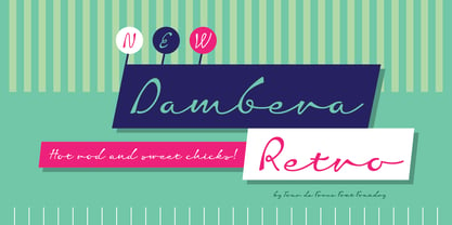 Dambera Retro is variation of "Dambera" font family.
 - FlagDay by Ingrimayne Type,
$8.00 These four variations on letters designed as flags are almost unreadable, but may be of some use as a patriotic display font. The four are all transformations of fonts from the FourJuly group. The solid and outline styles can be layered with the main fonts to easily create multiple-colored letters.
 - 1462 Bamberg by GLC,
$38.00 Font designed from that used in Bamberg by Albrecht Pfister, in early years of printing, exactly for a book titled "Ackermann Von Böhmen" writen in old German by Johannes Von Tepl, and decorated by a lot of splendid colored carved woods. This font include "long s", naturelly, as typically medieval, but any abbreviated characters, and, curiously no german "ß", no more than "W". (The only one I did found where a hand drawn one.) In addition, the "k" have not a German gothic form. Added, the accented characters, no longer existing on this time, and capitals when was a lack. A render sheet, in the font file, makes all easy to identify on a keyboard. This font is used as variously as web-site titles, posters and fliers design, editing ancient texts... This font supports as easily enlargement as small size, remaining readable, original and beautiful, especially in capitals.
 - Polin Sans by Borutta Group,
$39.00 For several years I have been thinking about the design of a type family that explores, on the one hand, the modernist aesthetic that we know, from the Alphabet "a.r." designed by Władysław Strzemiński, and on the other, to the multiscript pre-war Warsaw. This is how the idea of creating the Polin Sans typeface was born. After researching on geometric variants of the Cyrillic alphabet, I was inspired by the text "Towards an open layout: A letter to Volodya Yefimov". I was intrigued by the fact that circular forms, which we are mostly familiar with in the Bulgarian Cyrillic, can be implemented in the classical version, without disrupting the reading process. At the same time, while working on typoteka.pl, I was fascinated by the Hebrew typeface jaffa, published by the Idźkowski & Sk-a foundry, which at some points looks like the Hebrew equivalent of the Alphabet "a.r.". Ben Nathan from Israel joined the project and was responsible for creating his native script. The idea of creating a multiscript family expanded to include Greek and Vietnamese. As a result, Polin Sans is a historical journey through the nooks and crannies of Polish modernism, which was created by people with diverse cultural backgrounds. The Polin Sans family was designed by Mateusz Machalski and Ben Nathan with the support of Michał Gorczyca and Małgorzata Bartosik.
 - Dry Cowboy by Chank,
$99.00 Yee haw! Send me a shot of sarsparilla and let's celebrate a new cowboy font! This time we're pleased to introduce a new, more legible counterpart to Chank's Drunk Cowboy font. The resultant new font has a bit less of a drawl to it and is known as Dry Cowboy. Now you have a choice for smaller text setting when using Drunk Cowboy as the headline font. Wrangle the two together and put a little giddyup in your designs.