10,000 search results
(0.034 seconds)
- Hugest by Graphicxell,
$19.00 This typeface encapsulates a rhythm that is symmetrical and balanced due to a unique mix of different sources of inspiration. Proportions are precisely adjusted with subtle contours and subtle contrasts. These shapes give the font an attractive look without compromising on elegance and minimalism, ensuring that any glyph will work well in any graphic design purpose such as brochures, videos, advertising branding, logos, magazines, layout designs, posters, post templates, games and others
 - Knocky by Jehoo Creative,
$23.00 Knocky is a display typeface that is complete and versatile with a bold round condensed look with unique flexibility. We've added solid alternatives to letters, numbers, and some symbols, plus an outline style that will make the graphic look unique and stand out. With 8 styles and more than 530 glyphs in each. knocky has multi-language support, it will be perfect for many projects from editorial design to branding, advertising, publicity and digital.
 - Somnium Amor by Salsabiyl Studios,
$15.00 Introducing Somnium Amor Modern Serif Font Somnium Amor is a modern and elegant serif font. This serif font is perfect for your next branding project. This serif font has plenty Characters and has Multilingual Support. Somnium Amor is perfect choice for people looking for clean, modern, minimalist, elegant, beauty design styles. Suitable for almost any graphic designs such as logo, branding materials, business cards, gift cards, t-shirt, cover, thumbnail, print, poster, photography, quotes .etc.
 - Auto Signature Script by WEP,
$22.00 Introducing the Auto Signature Script Typeface. Your Personal Feel of Luxury. This methodically crafted typeface easily merges the timeless elegance of hand- lettered scripts with the modern flexibility of a digital font. Its elegant curves and moving strokes capture the essence of fluid script, bringing a personal feel to every design. Whether you're crafting wedding invitations, logos, packaging, or social media graphics, this font will add a feel of class that speaks with your audience.
 - Gussian by Flawlessandco,
$9.00 Introducing "Gussian" - A Modern Sans Serif Font. Gussian is a contemporary sans serif font that effortlessly combines modern aesthetics with clean simplicity. There's some connected letters and some alternates that suitable for any graphic designs. This font support for some multilingual. Also contains uppercase A-Z and lowercase a-z, alternate character, numbers 0-9, and some punctuation. If you need help, just write me! Thanks so much for checking out my shop!
 - Tropical Vibes by Flawlessandco,
$9.00 Introducing "Tropical Vibes" - A Display Retro Fon, a captivating display retro font that channels the essence of nostalgia and carefree spirit. There's some connected letters and some alternates that suitable for any graphic designs. This font support for some multilingual. Also contains uppercase A-Z and lowercase a-z, alternate character, numbers 0-9, and some punctuation. If you need help, just write me! Thanks so much for checking out my shop!
 - Million Design by Graphicxell,
$19.00 This typeface encapsulates a rhythm that is symmetrical and balanced due to a unique mix of different sources of inspiration. Proportions are precisely adjusted with subtle contours and subtle contrasts. These shapes give the font an attractive look without compromising on elegance and minimalism, ensuring that any glyph will work well in any graphic design purpose such as brochures, videos, advertising branding, logos, magazines, layout designs, posters, post templates, games and others
 - Amigos by Designova,
$23.00 Amigos is a classic handwritten script font for luxury / signature / branding / logotype / wedding invites / greeting cards / promotional graphics. Amigos is completely handmade with more than 140 hours of artistic craftsmanship bringing perfection and aesthetics at its level best. The font includes extended language support including Western European & Central European sets. Advanced Kerning & Essential Ligatures: We have performed advanced, in-depth kerning to make sure the font looks amazing on all possible letter combinations.
 - TT Wellingtons by TypeType,
$39.00 Specimen PDF | Graphic presentation | Customization options TT Wellingtons is reborn! Introducing the 2023 edition of the Humanist sans serif! Functional, aesthetic, and technically flawless. We have thoroughly worked on every contour and every detail of the font. The expanded character set now consists of 913 characters The font supports more than 230 languages 35 OpenType features, including new ligatures and stylistic alternates Most of the characters now have standardized and improved shapes
 - Finalist Round Slab by Bülent Yüksel,
$19.00 The font was intended primarily to have a stronger body. It has a simple geometrical surface. This font has a strong personality, that makes it perfect for use in headline sizes but means it also works gracefully within text blocks. "Finalist Round Slab" is carefully crafted and a unique slab serif. Use for websites, print, motion graphics, logo design, packaging design, t-shirts and more. The designation “Finalist Round Slab Regular” forms the central point. The first figure of the number describes the stroke thickness: Thin to Black. "Finalist Round Slab" comes 7 weights and italics total 14 types. The family contains a set of 450+ characters. Case-Sensitive Forms, Classes and Features, Fractions, Superior, Inferior, Denominator, Numerator, Old Style Figures just one touch easy In all graphic programs. You can enjoy using it. UPDATES: - 30 December 2015 Opentype Feature (fractions) and some kerning. - 11 June 2018 Solving some UNICODE problems on the internet. - 12 March 2019 Some error has been fixed. - 19 November 2019 Some error has been fixed. - 16 August 2021 New Version - 2.0 Some error has been fixed.
 - Nagel by ParaType,
$40.00 Nagel is a contemporary uniwidth display sans serif for headlines and short texts. It’s a closed low-contrast typeface with an emphasis on stroke joints. The length of the line set in Nagel remains the same in all weights. Nagel has all the advantages of monospaced typeface graphics, but none of their functional disadvantages. Characters in Nagel are made monospace-like wide, as opposed to traditionally narrow characters of proportional fonts, and often have slab serifs. Letters of monospaced fonts that have to be narrowed down considerably, have the usual width here. The scope of Nagel is branding and identity of IT companies, infographics, scientific and technical documentation — any areas where a technical, modern typeface with distinctive graphics may be required. The typeface includes three upright styles — Regular, Medium, Bold; two sets of 11 and 18 slanting degrees and a variable version with two axes: Weight and Slant. The character set includes extended Cyrillic and Latin alphabets, arrows, triangular bullets, index numbers and fractions. Designed by Alexander Lubovenko.
 - Caflisch Script by Adobe,
$35.00Caflisch Script was designed by Robert Slimbach in 1993. The design is based on the handwriting of Max Caflisch, one of the foremost graphic designers of this century. Caflisch, a teacher of graphic arts for over three decades in Zurich, is author of several books on typography and designer of the 1952 Columna typeface. Caflisch�s handwriting has a free flowing yet disciplined character, the result of years of practice and devotion to the calligraphic arts. Slimbach retained the subtleties and natural letter joins of Caflisch�s original handwriting while adapting it into a typographically sound and highly practical script typeface. Caflisch Script is a multiple master typeface with a weight axis that allows the typeface to transition smoothly from light to heavy weights, maintaining legibility and visual appeal at a full range of point sizes. Caflisch Script can be used anywhere the appearance of a fine hand is desired, as well as more sophisticated and practical situations such as display work in books and copysetting for advertisements. - Gilam by Fontfabric,
$39.00 Gilam is a sans serif font with semi-condensed proportions. The typeface was based on the famous DIN but combines its popular neo-grotesque look with characteristics, such as the pointed edges in the “W” and “M” as well as the outward cut terminals, which gives a distinctive look to the modern geometric typeface. The complete set of 9 weights plus italics gives to designers the absolute freedom to create anything. Perfect layouts with blocks of text, headlines, motion graphics, logos, apps, and websites are just part of the intended usage of this versatile typeface. Features: • 765 glyphs in 18 styles; • Extended Latin, Cyrillic and Greek; • Geometric forms and low contrast; • Prominent x-height which makes it legible in a text; • Perfect for headlines and logos; • Suitable for web, print, motion graphics etc. • Semi-condensed proportion; • Advanced typographical support and OpenType features including case-sensitive forms, fractions, superscript and subscript characters, and stylistic alternates; • Complete set of figures - old style and lining figures, which come with proportional and tabular variation; Gilam means “joy of people” so that you can enjoy it!
 - Stage Grotesk by Designova,
$15.00 A classic sans-serif typeface made with perfection and readability in focus, Stage Grotesk is your simple choice for textual representation at its level best. Created with a special focus on minimalism and simplicity in typography, this typeface can transform your design projects to another level of visual appeal. Stage Grotesk typeface family comes with a total of 14 fonts having 7 weights (Thin / Light / Regular / Bold / ExtraBold / Black) including upright as well as Italic versions of all weights. Handcrafted and designed with powerful OpenType features in mind, each weight includes extended language support including Western European & Central European sets. A total of 618 glyphs are included covering extra symbols, punctuations, and marks. Stage Grotesk is a perfect choice for graphic design, text presentation, web design, print, and display use. The typeface can be an amazing option for beautiful branding, logo/logotype design projects, marketing graphics, banners, posters, signage, corporate identities as well as editorial design. Adding extra letter-spacing for the upright capital letters will make this font perfect for minimal headlines and logotypes as shown in promo images here.
 - Sabre by Alias,
$60.00 I generally refer to our typefaces as ‘graphic’ rather than typographic. By that I mean their starting points are usually ways of constructing shapes and systems of shapes. As with other Alias typefaces, Sabre has stone and wood cut letterforms as a starting point. What is interesting about lettercutting is the connection between shape and material. These beautifully crafted letterforms have a particular sharpness which reflects, of course, how they were made. The idea of constructing letters from a kit of parts we first explored in early fonts Elephant and Factory. These are different in that they were very much grid-based, with a geometric structure. For Sabre I also had Fred Smeijers’ stencil construction drawings in mind. These show how a set of components can be the basis for a crafted, elegant typeface. Sabre is quite a loose interpretation of this idea. Sabre’s graphic shape means it works well at large sizes, with a dramatic, angular impact. Its aim is to be typographic enough to function for blocks of small-size text too.
 - Kaelawan by Sopheynoft,
$40.00 Kaelawan Regular is a beautiful and versatile script font that is perfect for a variety of design uses. It features elegant, flowing lines that are both feminine and elegant. Kaelawan Regular is also highly legible, making it a great choice for both print and digital designs. Possible design uses for Kaelawan Regular: Invitations and wedding stationery Logos and branding Social media graphics Product packaging Website design Book covers and magazines Greeting cards and posters And much more! What makes Kaelawan Regular unique: Kaelawan Regular has been carefully crafted to be both elegant and legible. The flowing lines and graceful curves give the font a touch of femininity, while the clear and concise letterforms make it easy to read. Kaelawan Regular is also highly versatile. It can be used for a variety of design purposes, from formal invitations to fun and whimsical social media graphics. Functional aspects of Kaelawan Regular: Kaelawan Regular is available in OpenType format. Kaelawan Regular includes a variety of special features, such as ligatures and alternates.
 - Magendfret by sugargliderz,
$24.00 Magendfret is a typeface that was designed very mechanically. However, it is also the optimal typeface for expressing soft warmth. Magendfret was designed by constructing a "line." That is: it is based on the concept "it is the combination of a straight line and a curve with a character." I made the character from the act of using and constructing a vector graphics editor, a mouse, and a keyboard. That, I thought when constructing it, should make neither a roman type nor italic type into a novel form, and a very general form. Once those characters were bit-map-ized, they traced again mechanically by the vector graphics editor. It became a soft impression by this work. The very mechanical act of changing the thickness of a line uniformly constitutes the family. The thickness of seven patterns was created first and, finally it results in four patterns. Respectively, styles called Light, Regular, Medium, and Bold are attached as usual. The name Magendfret is meaningless. It is an anagram of a certain words selected very arbitrarily.
 - Diad by Andinistas,
$29.95 Diad was born on 2000 in order to design posters about second World War. The original idea was obtained by breaking, burning and getting wet a bunch of written copies with an old writing machine. Today, Diad is a small typographic system useful for bringing relevance to any content with a grunge look. Each and every detail passed through a strict experimentation process. Its outrageous and unconventional spirit travels from high leveled corrosion, up to a delicate visual neglect. Diad 2 and 3 work for designing words. Diad 1 is ideal for long phrases and titles. Diad dingbats includes 26 illustrations about motocross. In total, adding Diad 1,2 and 3, it has around 260 glyphs. Diad will make your design shine providing different graphic atmospheres, optimizing time and work to its users. Diad is perfect for graphic design on contexts such as death metal, drum and bass, films, war and horror video games. It could work also for logos, words, titles and short texts in covers, tags, clothes, wraps, cards, stickers, toys, bicycles, surf boards, etc.
 - Enchanter by Cloveron Media,
$49.00 Cloveron Media unveils its first serif font that goes beyond the formal nature of typography. It celebrates the artistic expressions of graphic designers within themselves. The Name Mary Anne Remulla is the Master Designer behind the Enchanter Font. She aims to make graphic designers filled with delight and enjoy typography with its extensively artistic alternates and multilingual characters. The Font Style The serif style, known for its formal touch to typographic design, infuses the font with its professionalism as its regular. Using its middle alternate adds a hint of unique touch without losing the serif style's essence. The Enchanter font's start and end alternates are the designer's illustrations of design balance, which elevates its charm and enticing nature that adds to its overall artistic power. "I am fascinated by art and so by design. A font with alternates was my great revelation that I can do typography artistically, enthusiastically, and with freedom. I later found myself fascinated and lost in paper space, which then ended up that I completed my first font creation with extensive alternates for each letter." - Mary Anne Remulla
 - Leprechaun Vomit by Bellafonts,
$39.00 Leprechaun Vomit is just a pretty way of saying Lucky Charms, which I had to use something else besides the name of a cereal anyway. Leprechaun Vomit is a ding bat of luck including images of rainbows, horseshoes, clovers, diamonds, moons, the number 7, japanese "lucky" calligraphy, The Maneki Neko (the Beckoning Cat which is a lucky symbol), and some shooting stars (make a wish). You can use these images to create Irish themed designs like St. Patrick's Day art, or you can use them for lucky purposes. Bellafonts' user license allows for commercial use, so you can make products for re-sale, including services offering graphic design. You can choose from a variety of clovers for your own version of a "Kiss me I'm Irish" T-shirt, and you can add some shooting stars and rainbows to make any design for any occasion extra special. If you are a graphic designer with any clients like a ranch, horseback riding schools, and so forth, you may like these lucky horseshoes for your library.
 - Centerpiece by Heyfonts,
$18.00 Centerpiece is Psychedelic typeface refers to a style of typography that emerged in the 1960s during the height of the counterculture movement. It is characterized by its bold, vibrant colors, and graphic designs that incorporate abstract shapes, curves, and patterns. The psychedelic typeface is often associated with the mystical and surreal since it draws inspiration from altered states of consciousness experienced through the use of psychedelic drugs. It also incorporates a variety of lettering techniques such as bending, twisting, and outlining. The typefaces have a distinctive look that evokes a sense of free-spirited creativity and experimentation. Psychedelic typefaces can be used for various purposes, including posters, album covers, and promotional materials. To sum it up, psychedelic typeface is a unique style of typography that was popularized during the 1960s and is still relevant today. It incorporates bold colors, graphic designs, and a range of lettering techniques that create an eye-catching and trippy aesthetic. It is a testament to the counterculture movement and the power of artistic expression.
 - ITC Merss by ITC,
$29.99ITC Merss proves that sometimes accidents work out just fine. Late one evening Eduardo Manso, an Argentinean graphic and type designer, spilled coffee on his desk. When he began to wipe up the mess, he noticed that one of the splashes looked like a roman letter 'l' - complete with serifs. This triggered his imagination. “What if a complete alphabet was created with this same irregular flow to the character designs?” ITC Merss was the result of Manso's experiments with “fluid” letter shapes. The oddly handsome design looks aged and spontaneous at the same time. Its irregular texture is striking-the result of careful modeling of character shapes. While Manso wanted to maintain the free-form character of spilled liquid, he also knew the individual letters had to work together with an underlying harmony. When not experimenting with typefaces - or spilled coffee - Manso creates award-winning graphic and publication designs. A contributor to the design magazine el Huevo (the Egg), he also writes articles on type and typography and is part of the publication's design team. - Desmo by Craft Supply Co,
$20.00 Introducing Desmo Reversed Contrast Slab Serif Font Unique Design Meet Desmo Reversed Contrast Slab Serif Font. Its reversed contrast sets it apart. Thick horizontal lines and thin verticals create a striking look. This design choice grabs attention, perfect for impactful displays Versatile Display Font Desmo shines in display settings. Whether for headlines, posters, or advertising, it stands out. Its bold features ensure readability from a distance. Moreover, its unique style makes every design engaging. Engaging Typography Desmo’s typography is designed to captivate. Its slab serifs add a touch of elegance. The font’s balanced spacing ensures clarity in every word. Therefore, it’s ideal for brands aiming to make a statement. Accessibility and Ease of Use This font is accessible to a wide range of users. Its simplicity avoids complex vocabulary. Easy to install and use, Desmo suits various design projects. Additionally, its compatibility with multiple software enhances its versatility.
 - Possible by K-Type,
$20.00 POSSIBLE is both sans and serif, either is possible. The typeface is a sans-serif impersonating a spur serif, or it’s a glyphic with the look and feel of a sans. This clean, contemporary family is inspired by Percy J Smith’s ’Petit Serif’ from 1928, and similarly takes inspiration from Johnston’s Underground, though more recent influences provide geometric and humanist elements that, together with the tiny micro-serifs, improve clarity and legibility. Spur serifs such as Petit Serif, Copperplate and Liberty are often caps-only fonts, but Possible contains a lowercase, as well as a full Latin Extended-A character set. Possible is available in five weights – Thin, Light, Regular, Medium and Bold – each supplied with a corresponding, optically-corrected italic.
 - Moskau Pattern by Letter Edit,
$49.00 The design of the typeface Moskau Grotesk and Moskau Pattern is based on the signage created for the Café Moskau in Berlin by the graphic artist Klaus Wittkugel in the beginning of the 1960s. The Café Moskau, across from the Kino International on Karl-Marx-Allee in Berlin Mitte was one of the prestige edifices of the former DDR (German Democratic Republic). Built in the early 1960s, it advanced over the years and changing social developments to a trademark building of the capital. The lettering display on the roof was created by the graphic artist Klaus Wittkugel (October 17, 1910 – September 19, 1985). He had been Professor at the School for Applied Arts in Berlin, and, in addition to the creation of many posters, book covers and postage stamps, he was responsible for the signage of the Kino International as well as for the complete graphic treatment for the Palace of the Republik. The signage for the Café Moskau with the words »RESTAURANT«, »CAFÉ«, »KONZERT« and »MOCKBA« set in capital letters, becomes the basis for the Moskau Grotesk which was developed by Björn Gogalla in 2013. This face should not be seen as an imitation. A few shortcomings were »fixed«. In favor of maintaining the core characteristics some unique features were, however, not relinquished. Lower case letters and the missing capital letters were designed from scratch. It is not surprising that the plain, unassuming geometrical direction of the basic character style forms a bridge to the architecture of the 1960s. Inspired by the then favored, diverse possibilities inherent in the architectural example and wall reliefs, two complimentary pattern fonts emerged.
 - Moskau Grotesk by Letter Edit,
$39.00 The design of the typeface Moskau Grotesk is based on the signage created for the Café Moskau in Berlin by the graphic artist Klaus Wittkugel in the beginning of the 1960s. The Café Moskau, across from the Kino International on Karl-Marx-Allee in Berlin Mitte was one of the prestige edifices of the former DDR (German Democratic Republic). Built in the early 1960s, it advanced over the years and changing social developments to a trademark building of the capital. The lettering display on the roof was created by the graphic artist Klaus Wittkugel (October 17, 1910 – September 19, 1985). He had been Professor at the School for Applied Arts in Berlin, and, in addition to the creation of many posters, book covers and postage stamps, he was responsible for the signage of the Kino International as well as for the complete graphic treatment for the Palace of the Republik. The signage for the Café Moskau with the words »RESTAURANT«, »CAFÉ«, »KONZERT« and »MOCKBA« set in capital letters, becomes the basis for the Moskau Grotesk which was developed by Björn Gogalla in 2013. This face should not be seen as an imitation. A few shortcomings were »fixed«. In favor of maintaining the core characteristics some unique features were, however, not relinquished. Lower case letters and the missing capital letters were designed from scratch. It is not surprising that the plain, unassuming geometrical direction of the basic character style forms a bridge to the architecture of the 1960s. Inspired by the then favored, diverse possibilities inherent in the architectural example and wall reliefs, two complementary pattern fonts emerged.
 - Lexington by Canada Type,
$24.95A revival and major expansion of a 1926 Ludwig Wagner Schriftgiesserei typeface called Titanic, Lexington is the ultimate art deco expression of the high times of signage and theater during the first half of the twentieth century. Big feminine caps and cozy direct minuscules make for a unique combination rarely found in other deco faces. Topped off with the humorous and quite suave tall and pointy ascenders and descenders of the alternates, Lexington makes for a versatile and uniquely eye-catching display face beneficial to poster art, book covers, classy menus, product packaging and music paraphernalia. The original specimen Hans van Maanen worked from showed the majuscules, minuscules, figures, and 4 alternates of some ascending minuscules. This new digital version includes all of the above, plus many more additions: - Plenty more alternates, for some caps as well as for all the ascending and descending lowercase. - Three different size variations for the comma and the period. - Oldstyle figures. - A full complement of accented characters to support more Latin-based languages than ever, including Baltic, Celtic, Turkish, and Central/Eastern European languages. - A Handtooled style variation that covers both the main character set and the alternates. Lexington was named after Manhattan's Lexington Avenue, home of the some of the most famous and polished art deco architecture of the 1920s and 1930s. Lexington and Lexington Handtooled come in all popular font formats. The OpenType versions combine their respective alternates with the main character sets, for ease of use within OpenType-savvy applications. - Brightwall by Din Studio,
$22.00 Brightwall is made with a natural brush. This texture will make your design more beautiful and powerful. This font is suitable for any design like branding, quotes, t-shirt printing and more. Features: Accents (Multilingual Characters) Many Alternates Extra Swashes PUA encoded Numerals and Punctuations (OpenType Standard)
 - Loose Jeans by Epiclinez,
$18.00 Loose Jeans is a fun, playful, and quirky display font. It has a modern yet whimsical style an it will undoubtedly immerse your designs into a magical world. So what's included : Basic Latin A-Z & a-z Numbers, symbols, and punctuations Accented Characters : ÀÁÂÃÄÅÆÇÈÉÊËÌÍÎÏÑÒÓÔÕÖØŒŠÙÚÛÜŸÝŽàáâãäåæçèéêëìíîïñòóôõöøœšùúûüýÿžß Thank you
 - Avergent by Variatype,
$16.00 ABOUT THIS FONT Avergent is a simple display sans font that designed for modern corporate branding, copy ads, and much more. FONT FEATURES - Additional Accents - Stylistic Alternates - Cyrillic Support - Ligatures - 95 Languages SOFTWARE RECOMMENDATION - Adobe Photoshop - Adobe Illustrator - Adobe InDesign - Affinity Designer OS COMPATIBILITY - Mac OS - Windows
 - The Urbanists by Arendxstudio,
$18.00 The Urbanists is a free style font that has the characteristics of street art that shows freedom and is filled with unique characters. Features : • Character Set A-Z • Numerals & Punctuations (OpenType Standard) • Accents (Multilingual characters) • Ligature • Swash There it is! I really hope you enjoy it.
 - Dream Earth by Epiclinez,
$18.00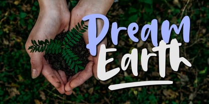 Dream Earth is a cool, brushed, and relaxed handwritten font. This font is suitable for designs such as t-shirts, sportswear, logos, advertisements, clothing, and more So what's included : Basic Latin A-Z & a-z Numbers, symbols, and punctuations Ligatures and swashes Accented Characters : ÀÁÂÃÄÅÆÇÈÉÊËÌÍÎÏÑÒÓÔÕÖØŒŠÙÚÛÜŸÝŽàáâãäåæçèéêëìíîïñòóôõöøœšùúûüýÿžß Thank you
 - Ferocious by Arendxstudio,
$15.00 Predator - Brush Font is a free style font that has the characteristics of street art that shows freedom and is filled with unique characters Features : • Character Set A-Z • Numerals & Punctuations (OpenType Standard) • Accents (Multilingual characters) • Ligature • Alternate There it is! I really hope you enjoy it
 - Erlissa by Epiclinez,
$18.00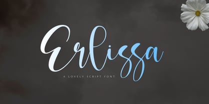 Erlissa is a sweet and elegant handwritten script font. This original look will appeal to a wide range of crafty ideas, from letterheads and titles to stationery. So what's included : Basic Latin A-Z & a-z Numbers, symbols, and punctuations Ligatures Accented Characters : ÀÁÂÃÄÅÆÇÈÉÊËÌÍÎÏÑÒÓÔÕÖØŒŠÙÚÛÜŸÝŽàáâãäåæçèéêëìíîïñòóôõöøœšùúûüýÿžß Thank you
 - Pigment by PizzaDude.dk,
$15.00 Crayon font gone crazy! 8 different versions of each letter, and they cycle as you type! Great variation, and enough to confuse people about this being a font or real crayon writing! And of course, the font has got a large amount of accented characters as well!
 - Justheros by ZetDesign,
$15.00 Justheros font is a very amazing bold font. This font is created by combining sharp angles and curves to produce a spectacular shape. This font can be used formally and informally, and is equipped with opentype features and international accents to support your best design work. ... thanks ...
 - Theyriad Script by FallenGraphic,
$20.00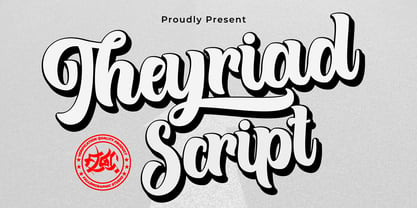 Theyriad Script is the great choice for watermarks on photography, logo designs, quotes, album covers, business cards, and many other design projects. Theyriad Script is here to elevate your work to the highest level. Features: -Accents (Multilingual Characters) -PUA encoded -Numerals and Punctuations (OpenType Standard) -Many alternates
 - Noman by Arendxstudio,
$15.00 Noman - Bold Display Fontl, retro looking display font. Whether you use it for cartoon related designs, children games or just any creation that requires a lovely touch, this font will be an amazing choice. Features : • Character Set A-Z • Numerals & Punctuations (OpenType Standard) • Accents (Multilingual characters) Ligature
 - Fashion Julian by Supfonts,
$19.00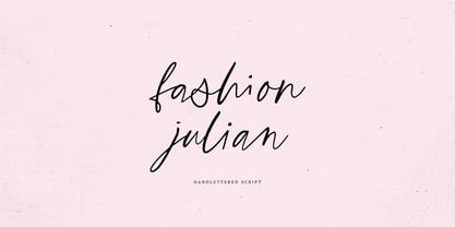 Fashion Julian it is a Calligraphy chick font with exquisite accents. It is perfect for branding, wedding invitations and invitation cards and many more What's inside: - Fashion Julian Script - Multilingual support - Cricut support If you have any questions, please contact me directly or in instagram @supfonts
 - Avalors by Din Studio,
$29.00 Avalors is a bold and authentic sans serif font. It suitable for your any project that needs the outer space touch. This font is the best for branding project, t-shirt print and many more. Featured : Accents (Multilingual characters) PUA encoded Numerals and Punctuation (OpenType Standard)