10,000 search results
(0.04 seconds)
- Dextor Script by ijemrockart,
$15.00 Dextor Script is a new carefully crafted and nicely balanced curves on a script typefaces with personality. You can use it as a logo, badges, insignia, packaging, headlines, posters, t-shirt/apparel, greeting cards, and wedding invitations. The flowing characters are ideal to make an attractive message. Mix and match Dextor Script with a bunch of alternative characters to fit your project. The alternative characters in this font were divided into several OpenType features such as Stylistic Alternates, Stylistic Sets, and Ligature. The OpenType features can be accessed by using the OpenType program such as Adobe Illustrator, Adobe Photoshop, and Adobe InDesign. That’s it! I really hope you enjoy it - please do let me know what you think. More importantly, please don't hesitate to drop me a message if you have any issues or queries. Thank you!
 - Ainslie by insigne,
$- Get your Aussie on! The new typeface, Ainslie, with its mix of influences from Oz, makes its mark as the first semi-serif from insigne Design. Ainslie, named for Mt. Ainslie and Canberra’s inner suburb of the same name, was originally developed for the Canberra Australia Centennial Typeface Competition. Canberra is Australia’s capital, and it’s a planned city designed by American Walter Burley Griffin, a contemporary and one-time associate of Frank Lloyd Wright. Griffin’s plan involved a distinctly geometric design with several focal points--one of which was Mt. Ainslie. This same purely geometric scheme is now the basis for insigne’s new release. Similar to the Chatype project in its scope, its challenge, and the way its concept was developed, Ainslie incorporates influences from Canberra and surrounding areas to form a font that is uniquely Australian. In comparison, Chatype was developed for the city of Chattanooga, Tennessee by insigne in conjunction with designer Robbie de Villiers. Chatype took elements from Chattanooga’s industrial character and Cherokee past and merged them with the area’s technological influences. Likewise, Ainslie takes Canberra’s distinct, geometric design and blends it with the organic, flowing effect of aboriginal art. Add in touches from the smooth, aerodynamic design of the boomerang and Ainslie gives you a look uniquely Australian yet usable in a wide range of applications. The fashionable typeface includes a multitude of alternates that can be accessed in any OpenType-enabled application. These stylish alternates along with a number of swashes as well as meticulously refined details with ball terminals and alternate titling caps keep the font well accessorized. Also included are capital swash alternates, old style figures, and small caps. Peruse the PDF brochure to see these features in action. OpenType enabled applications such as the Adobe suite or Quark can take full advantage of the automatic replacing ligatures and alternates. This family also offers the glyphs to support a wide range of languages. While Ainslie wasn't selected as the final font in the Canberra competition, the outcome allowed for additional adjustments to the typeface. Several approaches were attempted for the final product including a technological hexagonal concept, which may still be developed to another form later. Some of the organic forms were removed and substituted with more abrupt endings, leaving the face looking pretty spiffy and a fair bit more legible. In the end, Ainslie was pulled back to the basic forms from which it was started. Give it a go for your next project. It’s guaranteed to be anything but a barbeque stopper.
 - Fontocide - Unknown license

- Spooky Ghost by Sakha Design,
$12.00 Spooky Ghost is a cool, fun, and quirky decorative font. This font is PUA encoded which means you can access all glyphs and swashes with ease! Add it confidently to your favorite Halloween designs and let yourself be amazed by the outcome generated.
 - Black Manta Brush by Creaditive Design,
$12.00 Black Manta is a strong charactered, brushed display font. It looks fierce and urban and it will most certainly make each of your designs stand out. Add it confidently to your favorite creations and let yourself be amazed by the outcome generated.
 - Organic Benefit by Bogstav,
$15.00 Say hello to my new organic monospaced unicase font! It's handmade and has this true organic look to it! Choose between 5 different versions of each letter, or just type ahead and let the Contextual Alternates do their cycling of letters automatically!
 - Trollslayer by Hanoded,
$20.00 Picture this: you are in the woods, hunting for Elk, when all of a sudden you hear the sound of battle horns coming from the village. Troll attack! Thank Wodan you are armed with this brand new font: Trollslayer. Let the fight begin!!
 - Creepy Ghost by AEN Creative Studio,
$15.00 Creepy Ghost is a cool and spooky display font. This font is PUA encoded which means you can access all of the glyphs and swashes with ease! Add it confidently to your favorite creations and let yourself be amazed by the outcome generated.
 - Madela by Letterena Studios,
$10.00 Madela is a bold and thick lettered serif font. It is PUA encoded which means you can access all of the glyphs and swashes with ease! Add it confidently to your favorite creations and let yourself be amazed by the outcome generated.
 - Bat Boo by AEN Creative Studio,
$15.00 Bat Boo is a cool and spooky display font. This font is PUA encoded which means you can access all of the glyphs and swashes with ease! Add it confidently to your favorite creations and let yourself be amazed by the outcome generated.
 - Luxory by Viswell,
$22.00 Luxory is a handwritten font made with natural hand strokes. This font is inspired by handwriting made with markers. Luxory features : • Uppercase and Lowercase characters • Numerals & Punctuation • Ligatures • Alternates If you have any issues or questions, just let me know agamrahmadan36@gmail.com Thanks
 - Notably Absent by Ali Hamidi,
$10.00 Notably Absent is a cool and fun styled display font. It will elevate a wide range of crafting ideas, from cards, to branding, labels and much more. Add it confidently to your favorite creations and let yourself be amazed by the outcome generated.
 - Balencia by Mchcrafter,
$18.00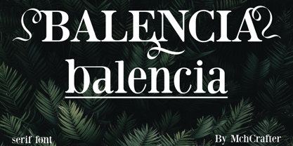 Balencia is an assertive and authentic serif font. It is PUA encoded which means you can access all of the amazing glyphs and ligatures with ease! Add it confidently to your favorite creations and let yourself be amazed by the outcome generated.
 - Murisa Mondriana by Murisa Studio,
$10.00 Mondriana is a cool and modern looking sans serif font. It will elevate a wide range of crafting ideas, from cards, to branding, labels and much more. Add it confidently to your favorite creations and let yourself be amazed by the outcome generated.
 - Aterline by AEN Creative Studio,
$15.00 Aterline is a simple but elegant slab serif font family. It will elevate a wide range of crafting ideas, from cards to branding, labels, and much more. Add it confidently to your favorite creations and let yourself be amazed by the outcome generated.
 - erqif by Guixis,
$24.75 This font is a nod to paper notebooks in which a long time ago students made notes. That's why the font looks like written by hand. The inspiration of this family font is the phrase, "Let me go back to the past".
 - Albion's White Christmas by Greater Albion Typefounders,
$14.00 “Albion’s White Christmas” can only be described as a snowy blackletter. In the tradition of old childrens' comics, yuletide magazine mastheads and vintage Christmas cards, it is a snow draped blackletter ideal for the winter holidays and letting in the spirit of Christmas.
 - Rabigail by Sensatype Studio,
$15.00 Rabigail is an unique and very elegant font for brand and logo design. Based on our experience as a graphic designer who works for a lot of companies, we often are requested to design a logo in a unique style but with an elegant shape. So, we try to brainstorming and create this font to make the idea is going out. This is perfect for BRANDING and LOGO DESIGN. You will get classy, elegant, and certainly unique logos with this font. To make it look more unique, here we prepared some ligatures: ab ah am an ar ak ap at oo cb ch ck cm cn cr ct eb eh ek em en ep er ub uh uk um un up ur st tb th tk tm tn tp tr tu ty fl fi ff ft oo cra ee ga gi it UPDATE v2 - New Additional Ligatures: ob oh om on op or Wish You enjoy it. :) Rabigail is also included full set of: uppercase and lowercase letters multilingual symbols numerals punctuation Wish you enjoy our font and if you have a question, don't hesitate to drop message & I'm happy to help :)
 - Salome by Canada Type,
$24.95 Salome is a revival, normalization and elaborate expansion of a 1972 film face called Cantini. The original film type, released by a tiny independent outfit called Letter Graphics, looked like it was hand drawn with little consideration for consistency in essential lettering flow measurements, like angles, stroke widths, and vertical metrics. All these issues have been resolved in this digital version, and the original character set, including the whole lot of alternates, was entirely redrawn and expanded to include even more alternates and many useful ligatures, as well as extended support for Latin-based languages. Combining elements of early 20th century art nouveau with common 1960s and 1970s signage and poster lettering flair, Salome uses curls and curves to wave its fantastic shapes in a most hypnotic dance. Salome simply cannot be unseen. Just like its namesake, the female seduction icon, it does not hesitate to put all of its natural beauty and energy on display in order to get what it wants. Salome comes in all popular font formats. The OpenType version, Salome Pro, combines the main font with the alternates one, and contains convenient features for push-button alternation and ligature substitution in supporting software programs.
 - Anselm Sans by Storm Type Foundry,
$63.00One of the good practices of today’s type foundries is that they release their type families as systems including both serif and sans serif type. Usually, the sources of inspiration need to be well tried with time and practice, since production of a type family is such a laborious and complex process. From the beginning, it needs to be clear that the result will be suited for universal use. Such systems, complete with the broad, multi-lingual variations permitted by the OpenType format, have become the elementary, default instrument of visual communication. Non-Latin scripts are useful for a wide scope of academic publications, for packaging and corporate systems alike. And what about outdoor advertisement designated for markets in developing countries? Cyrillics and Greek have become an integral part of our OpenType font systems. Maybe you noticed that the sans serif cuts have richer variety of the light – black scale. This is due to the fact that sans serif families tend to be less susceptible to deformities in form, and thus they are able to retain their original character throughout the full range of weights. On the other hand, the nature of serifed, contrasted cuts does not permit such extremes without sacrificing their characteristic features. Both weights were drawn by hand, only the Medium cut has been interpolated. Anselm Ten is a unique family of four cuts, slightly strengthened and adjusted for the setting in sizes around 10 pt and smaller, as its name indicates. The ancestry of Anselm goes back to Jannon, a slightly modified Old Style Roman. I drew Serapion back in 1997, so its spirit is youthful, a bit frisky, and it is charmed by romantic, playful details. Anselm succeeds it after ten years of evolution, it is a sober, reliable laborer, immune to all eccentricities. The most significant difference between Sebastian/Serapion and Anselm is the raised x-height of lowercase, which makes it ideal for applications in extensive texts. Our goal was to create an all-round type family, equally suitable for poetry, magazines, books, posters, and information systems. - Anselm Serif by Storm Type Foundry,
$63.00 One of the good practices of today’s type foundries is that they release their type families as systems including both serif and sans serif type. Usually, the sources of inspiration need to be well tried with time and practice, since production of a type family is such a laborious and complex process. From the beginning, it needs to be clear that the result will be suited for universal use. Such systems, complete with the broad, multi-lingual variations permitted by the OpenType format, have become the elementary, default instrument of visual communication. Non-Latin scripts are useful for a wide scope of academic publications, for packaging and corporate systems alike. And what about outdoor advertisement designated for markets in developing countries? Cyrillics and Greek have become an integral part of our OpenType font systems. Maybe you noticed that the sans serif cuts have richer variety of the light – black scale. This is due to the fact that sans serif families tend to be less susceptible to deformities in form, and thus they are able to retain their original character throughout the full range of weights. On the other hand, the nature of serifed, contrasted cuts does not permit such extremes without sacrificing their characteristic features. Both weights were drawn by hand, only the Medium cut has been interpolated. Anselm Ten is a unique family of four cuts, slightly strengthened and adjusted for the setting in sizes around 10 pt and smaller, as its name indicates. The ancestry of Anselm goes back to Jannon , a slightly modified Old Style Roman. I drew Serapion back in 1997, so its spirit is youthful, a bit frisky, and it is charmed by romantic, playful details. Anselm succeeds it after ten years of evolution, it is a sober, reliable laborer, immune to all eccentricities. The most significant difference between Sebastian/Serapion and Anselm is the raised x-height of lowercase, which makes it ideal for applications in extensive texts. Our goal was to create an all-round type family, equally suitable for poetry, magazines, books, posters, and information systems.
 - Reina Neue by Lián Types,
$29.00 Hey! See Reina Neue in action here! INTRODUCTION When I designed the first Reina¹ circa 2010, I was at the dawn of my career as a type designer. The S{o}TA, short for the Society of Typographic Aficionados, described it as complex display typeface incorporating hairline flourishes to a nicely heavy romantic letterform². And it was like that; that’s what I was pursuing at that time since I was very passionate about ornaments and accolades of Calligraphy. Why? I felt that Typography, in general, needed more of them. These subtle flourishes could breathe life into letters. Maybe, I thought it was the only way I could propose something new into the field of type. However, after some years, I came across a very interesting quote: –Beautiful things don’t ask for attention– Wow! What did this mean? How could something be attractive if it’s not actually showing it. Could this be applied to my work? Sure. I think every type-designer goes through this process (aka crisis) regarding his or her career. At the beginning we love everything. We are kind of blind, we only see the big picture of a project. And that’s not because we are lazy. We actually can’t see the small mistakes nor the subtleties that make something simpler beautiful. We are not able. But, the small subtleties… They are actually everything: With experience, one puts more attention into the details and learns that every single decision in type has to be first meticulously planned. Here I am now, introducing a new Reina, because I felt there was a lot of it that could be improved, also the novelty of Variable Fonts caught my attention and I had to take that to my type library. THE FONT A thing of beauty is a joy forever Now, a decade later, I’m presenting Reina Neue. This font is not just an update of its predecessor: –A thing of beauty is a joy forever– is the first line of the poem ‘Endymion’ by John Keats, and despite the meaning of “beauty” may vary from person to person, and even from time to time (as read in the last paragraph), with Reina I always wanted to bring joy to the eye. In 2010, and now, in 2020. I believe the font is today much better in every aspect. It was entirely re-designed: Its shapes and morphology in general are much more clean and pure. The range of uses for it is now wider: While the old Reina consisted in just one weight, Reina Neue was converted into a big family of many weights, even with italics, smallcaps and layered styles. The idea behind the font, this kind of enveloping atmosphere made out of flourishes, is still here in the new Reina. This time easier to get amazing results due to the big amount of available alternates per glyph and also more loyal from a systemic point of view. However, and as read in the introduction -Beautiful things don’t ask for attention-, if none of the flourishes are activated the font will look very attractive anyway. Reina Neue is ready to be used in book covers, magazines, wedding cards, dazzling posters, storefronts, clothing, perfumes, wine labels and logos of all kind. Like it happened with the previous Reina, I hope this new font satisfies every design project around the world if used, and can be a joy forever. SOME INSTRUCTIONS Before choosing the right style for your project, hear my advice: -Reina Neue Display was meant to be used at big sizes. If you plan to print the font smaller than 72pt, I suggest using Reina Neue, not Display. Otherwise, if the font will be BIG or used on a digital platform, Reina Neue Display should be your choice. For even smaller sizes, use Reina Neue Small. This style was tested and printed in 12pt with nice results. (Note for variable fonts: Print them in outlines) -Reina Italic is not a slanted version of the roman, and this means some flourishes are different between each other. The Italic version has other kind of swirls. More conservative, in general. -All the styles of Reina Capitals have Small Capitals inside. -Reina Capitals Shine should be used/paired ONLY with Reina Capitals Black. The engraved feeling can be achieved if Reina Capitals Black and Reina Capitals Shine are used as layers, with the same word. Variable fonts instructions: -For more playful versions, choose Reina Neue VF, Reina Neue Italic VF or Reina Neue Capitals VF: With them you can adjust between 3 axes: Weight (will change the weight of the font) – Optic Size (will thicken/lighten the thin strokes and open/close the tracking) – Accolades (will modify the weight of the active flourishes). SOME VIDEOS OF REINA NEUE VF https://youtu.be/8cImmT5bpQM https://youtu.be/1icWfPmKAkg https://youtu.be/YC9GkJDL1a8 NOTES 1. The original Reina, from a decade ago: https://www.myfonts.com/fonts/argentina-lian-types/reina/ 2. In 2011, Reina received an honourable mention by S{o}TA. “Great skill is shown in the detailing, and an excellent feel for the correct flow of curves and displacement of stroke weight.” https://www.typesociety.org/catalyst/2011/ Reina was featured in the “Most Popular Fonts of the year” in MyFonts in 2011 https://www.myfonts.com/newsletters/sp/201201.html In 2012, the font was also selected in Tipos Latinos, the most prestigious competition of type in Latinoamerica. https://www.tiposlatinos.com/bienales/quinta-bienal-tl2012/resultados Also, chose as a “Favorite font of the year” in Typographica. https://typographica.org/typeface-reviews/reina/
 - Sticky Melody by Nathatype,
$29.00 Sticky Melody is a charming display font that combines cuteness with a bold and prominent style. With its thick weight, rounded shapes, and distinct contrast, this typeface is designed to capture attention and infuse your designs with a playful and lively energy. The thick weight of Sticky Melody gives each letter a robust and substantial presence, making it stand out effortlessly. The rounded shapes add a touch of softness and friendliness, creating an endearing and approachable feel. The font's unique feature lies in its prominent contrast, which accentuates the curves and contours of each character, elevating the overall visual impact. Let the thick weight, rounded shapes, and prominent contrast of this font bring your creative visions to life, ensuring that your message stands out in the most charming and captivating way possible. You can use it in big text sizes to be greatly legible and enjoy the available features here. Features: Stylistic Sets Ligatures Multilingual Supports PUA Encoded Numerals and Punctuations Sticky Melody fits in children's books, toy packaging, posters, headlines, logos, social media designs, and any design project that require a touch of delightful playfulness. Find out more ways to use this font by taking a look at the font preview. Thanks for purchasing our fonts. Hopefully, you have a great time using our font. Feel free to contact us anytime for further information or when you have trouble with the font. Thanks a lot and happy designing.
 - Black Scream by Ditatype,
$29.00 Black Scream is a spine-chilling serif display font designed to send shivers down your spine. Set in uppercase, each letter is meticulously crafted with a haunting ink dripping effect, adding an eerie and nightmarish vibe to your horror-themed designs. The letters of this font exude an unsettling aura, as if they were dipped in darkness and let ink slowly bleed down the page. The ink dripping effect adds a touch of realism and dread to the font, as if it were forged from the depths of a chilling nightmare. On the other side, the serif details of Black Scream add a sense of elegance to the font, contrasting with its nightmarish appearance. The fine lines and precise curves create a mesmerizing yet unsettling effect, making it a unique and captivating choice for horror-themed designs. For the best legibility you can use this font in the bigger text sizes. Enjoy the available features here. Features: Multilingual Supports PUA Encoded Numerals and Punctuations Black Scream fits in headlines, logos, horror movie posters, haunted house flyers, Halloween party invitations, any spine-tingling project, branding materials, print media, editorial layouts, website headers, and many more. Find out more ways to use this font by taking a look at the font preview. Thanks for purchasing our fonts. Hopefully, you have a great time using our font. Feel free to contact us anytime for further information or when you have trouble with the font. Thanks a lot and happy designing.
 - Mareline Script by Mega Type,
$10.00 Introducing Mareline Script Font Duo, a sweet handlettered font, casual and dynamic with a bold and irregular baseline. Contains a complete set of lowercase, uppercase, alternates, ligatures, punctuation, numbers, and multilingual support. And additional Mareline Sans, working in harmony with Mareline script to create awesome typographic creations. Get some inspiration from the preview above. This font ideal for use in watercolor design or bold hand lettering style, such as posters, wedding elements, t-shirt, apparel, cover books, business cards, greeting cards, branding, merchandise, invitations and handmade quotes and more. Mareline Script Font Duo features OpenType stylistic alternates, ligatures and International support for most Western Languages. To enable the OpenType Stylistic alternates, you need a program that supports OpenType features such as Adobe Illustrator CS, Adobe Indesign & CorelDraw X6-X7, Microsoft Word 2010 or later versions. How to access all alternative characters using Adobe Illustrator: https://www.youtube.com/watch?v=XzwjMkbB-wQ Mareline Script Font Duo is coded with PUA Unicode, which allows full access to all the extra characters without having special designing software. Mac users can use Font Book , and Windows users can use Character Map to view and copy any of the extra characters to paste into your favorite text editor/app. How to access all alternative characters, using Windows Character Map with Photoshop: https://www.youtube.com/watch?v=Go9vacoYmBw If you need help or have any questions, please let me know. I'm happy to help. Thanks & Happy Designing!
 - Bello Pro by Underware,
$50.00 Now check this, Underware’s blockbuster type, Bello. Bello Pro is a brush typeface for headline point sizes - it’s big & beautiful. Bello has lots of ligatures and start and ending swashes. They are automatic in Bello Script Pro, which is a cross-platform OpenType font with many OpenType features. Bello has Underware’s world-dominating Latin Plus character set, supporting a total of 219 languages (Latin 1 + 2 and beyond). After a period of hand sketching and lettering, Bello got two main styles: Script and Caps. These two fonts create a strong typographic contrast - while Bello Script Pro is flourished and flowing, Bello Caps Pro provides upright and sturdy capital lettering. As sturdy as brush lettering allows, of course. Careful spacing and kerning ensures* that Bello appears like fluently written handwriting. However, that’s not enough for a hand-lettered feel. Therefore Bello comes with a set of 64 ligatures. Some of them are typographic, some made simply to create a more intimate, natural impression. For the same reasons we have added a few ornaments and a set of snap-on beginning and ending swashes which attach to the lowercase letters of Bello. With Bello Words Pro you can add some two-color words in your text by the pre-designed word logotypes. Trust the brush! *So take care: use ‘metrics’, not ‘optical’ as a spacing setting in layout apps.
 - Evanston Tavern by Kimmy Design,
$10.00 Evanston Tavern is a square typeface and the sans-serif version to Evanston Alehouse. Inspired by the years that prefaced the ratification of the American Prohibition, this typeface mimics the signage commonly seen outside of saloons, taverns and alehouses during that time. Back to the modern era, Evanston Tavern is more than just a vintage inspired typeface. It works in modern and futuristic settings with multiple styles, opentype alternatives and ornamentation. The family provides a robust 61 total fonts, within it's 3 styles of regular, stencil and inline. Each sub family includes 4 weights and 5 widths. It has special features that add depth to the typeface, with discretionary ligatures and stylistic alternatives. It also includes a complimentary set of ornaments, including a vintage graphic set from the era, as well as modern frames, borders and icons. This typeface works great at logos, packaging, and other display settings. Pair this font with Evanston Alehouse and have a great combination of serif and sans-serif square letterforms and a large array of ornaments! Here’s a snapshot of what you get with Evanston Tavern: - 3 Styles: Regular, Stencil and Inline - 4 Weights: Light, Regular, Medium and Black - 5 Widths: 1826 (condensed), 1846 ( narrow) 1858 (regular), 1893 (wide) and 1919 (expanded) - 2 capital Heights: Capitals and small caps - 2 Alternatives: Discretionary Ligatures and Stylistic Alternatives - 1 Ornaments font with over 100 graphic extras
 - Anachrony by Cerulean Stimuli,
$24.00 Reminiscent of circuitry and wrought iron, Anachrony constructs the forms of an Old English Blackletter with the strokes of a Modern Geometric Sans, and lands in the vicinity of Art Deco. For such an unusual chimera, the Anachrony family is legible and versatile. Its glyphs cover pan-European Latin, Greek, and a wealth of symbols including arrows, zodiac, planets, chess, suits, and circled numbers. It is also packed with Opentype features: Small Capitals: Of similar proportions to the default numerals, tall enough to be a suitable choice in place of regular capitals. All Caps Forms: In addition to the four usual types of numerals, there are numerals and currency symbols that match the capitals. Swash: A leading curly swash on capitals, and fancy looped ascenders in the lowercase that are handled by over a hundred standard ligatures where they would collide. Style Set 01: Romanized forms. Especially recommended for all caps. Plainer A/M/T/V/W/Y, J/Q reined in to the baseline, and alternate g. Style Set 02: Masthead forms. Old-fashioned capitals with descenders and that lower left dealy. Also f/x/z/ß in a more traditional fraktur mode. Style Set 03: Mild embellishments. Tall bifurcated ascenders and descenders. Style Set 04: Extravagant swash descenders. Style Set 05: Final swashes for the end of a word. Style Set 06: Converts capital letters into the corresponding connected Roman numerals. Seemed like it could be useful sometime. Easy swooshes: Standard ligatures allow you to type two to seven commas in a row to append an assortment of sweeping or ending swashes. Catchwords: In Anachrony Royale, turn on Discretionary Ligatures for a variety of decorative articles and prepositions.
 - Ah, LT Funk by LyonsType is like a fresh breeze in the bustling city of typography, bringing with it a vibe that's both retro and deliciously modern. This font dances between the lines of funk and fu...
- Cranberry Cyr - Unknown license

- Misirlou Cyr - Unknown license

- TT Jenevers by TypeType,
$35.00 TT Jenevers useful links: Specimen | Graphic presentation | Customization options Please note! If you need OTF versions of the fonts, just email us at commercial@typetype.org About TT Jenevers: TT Jenevers is a modern serif with Dutch flavor. The font family features the characteristic details peculiar to Dutch serifs—these are the asymmetrical shape of serifs and an irregular slant of ovals. For example, in the letter “o” there is no slant, but it is present in p-q. In TT Jenevers, both lowercase and uppercase characters are of a large size, which makes it a rather display typeface. At the same time, the big half-ellipse of the lowercase characters does not allow the letters to stick, which allows the implementation of TT Jenevers in text arrays. The italics of the TT Jenevers are slightly narrower as compared to upright faces—this is done to ensure a greater density of the text array. The italics of the TT Jenevers are slightly narrower as compared to upright faces—this is done to ensure a greater density of the text array. TT Jenevers font family consists of 12 fonts (6 upright and 6 true Italics), each of which has more than 830 characters. The typefaces include small capitals for Cyrillic and Latin alphabets, 33 ligatures, standard and old-style figures, stylistic alternates, arrows, hands, and card suits. We have prepared two dissimilar stylistic sets, which allow changing the nature of TT Jenevers to a more hand-written one, or adding a futuristic touch to the typeface. FOLLOW US: Instagram | Facebook | Website TT Jenevers OpenType features: ordn, case, c2sc, smcp, frac, sups, sinf, numr, dnom, onum, tnum, pnum, lnum, liga, dlig, salt, ss01, ss02, zero. TT Jenevers language support: Acehnese, Afar, Albanian, Alsatian, Aragonese, Arumanian, Asu, Aymara, Azerbaijani, Banjar, Basque, Belarusian (cyr), Belarusian (lat), Bemba, Bena, Betawi, Bislama, Boholano, Bosnian (cyr), Bosnian (lat), Breton, Bulgarian (cyr), Cebuano, Chamorro, Chichewa, Chiga, Colognian, Cornish, Corsican, Cree, Croatian, Czech, Danish, Dutch, Embu, English, Erzya, Esperanto, Estonian, Faroese, Fijian, Filipino, Finnish, French, Frisian, Friulian, Gaelic, Gagauz (lat), Galician, Ganda, German, Gusii, Haitian Creole, Hawaiian, Hiri Motu, Hungarian, Icelandic, Ilocano, Indonesian, Innu-aimun, Interlingua, Irish, Italian, Javanese, Jola-Fonyi, Judaeo-Spanish, Judaeo-Spanish, Kalenjin, Karachay-Balkar (lat), Karaim (lat), Karakalpak (lat), Kashubian, Kazakh (lat), Khasi, Khvarshi, Kinyarwanda, Kirundi, Komi-Permyak, Komi-Zyrian, Kongo, Kumyk, Kurdish (lat), Ladin, Latvian, Laz, Leonese, Lithuanian, Luba-Kasai, Luganda, Luo, Luxembourgish, Luyia, Macedonian, Machame, Makhuwa-Meetto, Makonde, Malay, Maltese, Manx, Maori, Mauritian Creole, Minangkabau, Moldavian (lat), Montenegrin (lat), Mordvin-moksha, Morisyen, Nahuatl, Nauruan, Ndebele, Nias, Nogai, Norwegian, Nyankole, Occitan, Oromo, Palauan, Polish, Portuguese, Quechua, Rheto-Romance, Rohingya, Romanian, Romansh, Rombo, Rundi, Russian, Rusyn, Rwa, Salar, Samburu, Samoan, Sango, Sangu, Sasak, Scots, Sena, Serbian (cyr), Serbian (lat), Seychellois Creole, Shambala, Shona, Silesian, Slovak, Slovenian, Soga, Somali, Sorbian, Sotho, Spanish, Sundanese, Swahili, Swazi, Swedish, Swiss German, Tagalog, Tahitian, Taita, Talysh (lat), Tatar, Teso, Tetum, Tok Pisin, Tongan, Tsakhur (Azerbaijan), Tsonga, Tswana, Turkish, Turkmen (lat), Udmurt, Ukrainian, Uyghur, Vastese, Vepsian, Volapük, Võro, Vunjo, Welsh, Wolof, Xhosa, Zaza, Zulu.
 - Oktah Neue by Groteskly Yours,
$25.00 Oktah Neue is an extended version of a more limited Oktah family. Since its release in 2019, Oktah Neue received two major updates, the most recent in June 2022. The latest version of Oktah Neue is comes in 22 styles as well as one variable font. Oktah Neue inherits the best traits of Oktah—great legibility, simple geometric letters shapes, low contrast across all styles—but also introduces what Oktah fell short of: extensive language support and enhanced OpenType features. While working on Oktah Neue, we strove to create a neutral typeface that would be a workhorse for designers, typographers and other font users alike. Building onto the familiar shapes of Oktah, we tried to make them more neutral, at the same time preserving the unique character of the typeface. Certain characters remained the same, others have undergone a complete transformation, which left them better tailored for the wide implementation range of Oktah Neue. Over the past years the size of the character set in Oktah Neue was significantly expanded (currently standing at 2500+ characters). In addition to Extended Latin, new language systems (Extended Cyrillic, Greek — both Basic and Polytonic — and Hebrew) were introduced. The already vast Cyrillic set also includes localised forms for such languages as Bulgarian, Serbian and many others. Oktah Neue is OpenType friendly: it knows how to do alternatives, contextual alternatives, switch various between stylistic sets and adjust the height of punctuation and symbols as you type. Small Caps include all listed languages as well as numerals and symbols. Oktah Neue comes equipped with various styles of numerals — from standard Proportional Lining figures to Oldstyle, Tabular Oldstyle. Sub- and Superscript, Fractions and two sets of circled numbers. Oktah Neue is well-kerned with more than 3000 kerning pairs and automatically hinted. Oktah Neue comes in 22 styles (11 uprights and 11 italics), two of which — Ultra Light and Black Italic — can be downloaded free of charge to get a firsthand experience of what Oktah Neue is ready to offer. The latest update of Oktah Neue introduced a fully variable option: now, both axes (Slant and Weight) can be accessed in the same file for utmost convenience.
 - Nose Bleed - Unknown license

- Travelling by Ake,
$12.00 Travelling is a captivating display font designed to ignite wanderlust. Perfect for book covers, logos, and lettering, its bold and expressive design adds an enchanting touch to your creative projects. Embark on a typographic journey with "Travelling" and let your designs explore new horizons.
 - Ghost Zone by Sakha Design,
$12.00 Ghost Zone Is a fun, quirky, and spooky decorative font. This font is PUA encoded which means you can access all of the glyphs and swashes with ease! Add it confidently to your favorite creations and let yourself be amazed by the outcome generated.
 - Hello Friday Vector by Sarid Ezra,
$15.00 Introducing, Hello Friday, a handwritten serif! Hello Friday is an organic font with handwritten feels. This organic font also included double ligatures. Number, symbol, and another punctuation also included in this fonts. Support multilingual. Let this font make your project even more organic and natural!
 - Angela by Sealoung,
$25.00 Angela is a modern, bold and highly detailed serif font. This font is PUA encoded which means you can access all of the amazing glyphs and ligatures with ease! Add it confidently to your favorite creations and let yourself be amazed by the outcome generated.
 - Good Father by Andrey Font Design,
$9.00 Good Father is a cool, bold and modern display font. This font is PUA encoded which means you can access all of the amazing glyphs and ligatures with ease! Add it confidently to your favorite creations and let yourself be amazed by the outcome generated.
 - Anayu by Rashatype,
$11.00 Anayu is an elegant, whimsical and uniquely shaped lettered handwritten font. This font is PUA encoded which means you can access all of the glyphs and swashes with ease! Add it confidently to your favorite creations and let yourself be amazed by the outcome generated.


