10,000 search results
(0.235 seconds)
- Basic Lettering JNL by Jeff Levine,
$29.00 Sometimes lettering without any frills or formality gets a message across better than the use of fancier typefaces. The simple charm of the hand-lettered phrase "Safety Comes First" found on a vintage WPA (Works Progress Administration) poster served as the model for Basic Lettering JNL.
 - Brag Pro by Eclectotype,
$36.00 The now discontinued Brag & Brag Stencil are hereby available as Pro fonts, with an extended character set (Latin Extended A) and Oldstyle figures. All features of the original fonts are still there, but now you can talk with Brag's signature bold look in many more European languages.
 - MuX1ne by Machine Cult,
$14.00 A geometric-ish font family that's a bit off-kilter, offering three families: Regular, Rounded and Hatch as well as the bonus Noise, catchwords and dingbats for some occasions. Each font comes in Light, Regular and Bold styles. Complete latin character set with a range of ligatures.
 - Pills by UNDT,
$45.00PILLS is a modular font based on overlayed circular and square forms, the characters have been spaced mathematically. 'PILLS' can have interesting side effects, when the leading is set very close. Feelings of anxiety, loneliness and depression can be avoided by 'PILLS'. Do not exceed daily dose. - Street Power by Arendxstudio,
$17.00 Street Power is a free style font that has the characteristics of street art that shows freedom. It is filled with unique characters. Features : • Character Set A-Z • Numerals & Punctuations (OpenType Standard) • Accents (Multilingual characters) • Ligatures • Alternates There it is! I really hope you enjoy it.
 - Orange Blossom by Fikryal,
$15.00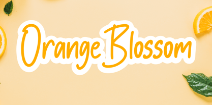 Orange Blossom is a beautiful display font perfect for crafting, branding, invitation, stationery, wedding designs, social media posts, advertisements, product packaging, product designs, label, photography, watermark, special events or anything. Orange Blossom comes with full set of uppercase and lowercase letters, ligatures,multilingual symbols, numerals and punctuation.
 - Belgravia by Scriptorium,
$24.00Belgravia is an Art Nouveau period design based on hand lettering from the 1890s. Like our popular Pantagruel font it has a lot of the elements which would influence later Psychedelic poster lettering in the 1960s. Very nice looking with a good weight for title designs. - Fashion Plate by ParaType,
$25.00 A set of model sketches was designed by Arevik Shmavonyan in 2007 for ParaType. The font includes pictures of woman fashion dresses designed for real manufacturing. Fashion-plate font may be interesting to modern fashion magazines. Also these pictures may use as illustrations and for advertising matter.
 - Kathaline by Fikryal,
$15.00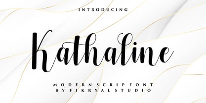 Kathaline is a natural script font perfect for crafting, branding, invitation, stationery, wedding designs, social media posts, advertisements, product packaging, product designs, label, photography, watermark, special events, or anything. Kathaline comes with full set of uppercase and lowercase letters, alternates, ligatures,multilingual symbols, numerals and punctuation.
 - Dormitory Decals JNL by Jeff Levine,
$29.00Dormitory Decals JNL is a set of Greek letters placed on the standard keyboard positions of A-X and a-x. The design (based on Jeff Levine's Juneway JNL) emulates the gold and black water-applied decals used by college kids in the 50s and 60s. - Procent by GRIN3 (Nowak),
$26.00 Procent is an all-caps, handwritten font with two variations for each letter. Procent can be used for scrapbooks, greeting cards, invitations, announcements, signs, menus, restaurant themes and more... Language support includes Western, Central and Eastern European character sets, as well as Baltic and Turkish languages.
 - Dearlove by Fikryal,
$16.00 Dearlove is a beautiful calligraphy font perfect for crafting, branding, invitation, stationery, wedding designs, social media posts, advertisements, product packaging, product designs, label, photography, watermark, special events or anything. Dearlove comes with full set of uppercase and lowercase letters, swash alternates, ligatures,multilingual symbols, numerals and punctuation.
 - Qualettee by Ingrimayne Type,
$9.95 Qualettee is a decorative sans face with a high x-height that works surprisingly well for text. The lightest weight is almost moonline but as the styles get bolder, the contrast increases, becoming very pronounced. The family has ten members: five weights with italics for each weight.
 - Planer by The Northern Block,
$- A modern rounded typeface combining humanist elements with a strong geometric grid. The result is a font that can produce striking visuals at large scale and clean line legibility at text size. Details include seven weights, a complete character set, manually edited kerning and Euro symbol.
 - The Overcook by Arendxstudio,
$22.00 The Overcook is a free style font that has the characteristics of street art that shows freedom and is filled with unique characters Features : • Character Set A-Z • Numerals & Punctuations (OpenType Standard) • Accents (Multilingual characters) • Ligature • Alternate There it is! I really hope you enjoy it
 - But by Nicole Fally,
$40.00 Bold, black and square. But was first drawn as a logotype for the magazine "BUT – Bilder und Texte" (pictures and texts) which was published by an experimentally-oriented non-commercial initiative. In consideration of the unusual dimensions of the magazine (6 x 14 cm / 2,4 x 5,5 inch), I decided to fill as much space as possible with the body of type. This formal idea refers to the meaning of the title by blurring the border between legible letters and abstract shapes. Because of its origin, But is ideal for short messages in headline point size. Despite its blocky shapes, But creates a friendly atmosphere. The details are as playful as the restrictions that are given by the concept allow them to be. Punctuation marks and other special characters contrast the boldness of the design since they are matching the thin parts of upper- and lowercase letters. This also avoids gaps when longer texts are set. But is available in open type format and has an extended character set (Latin extended A). Two sets of numerals, one matching the x-height and another one matching the cap-height, are provided.
 - Directors Cut Pro by Type Innovations,
$39.00 Directors Cut Pro is a compelling new font series designed by Alex Kaczun. It recently won the second place—a commendation in the Canberra Typeface Competition. This handsome Geometric Antique serif design is based on the early 19-century Moderns and Scotch styles, infused with the warm charm of traditional antique, added for interest. Capturing the best of both ages: it's warm, comforting and persuasive. Directors Cut Pro's graceful aspects naturally invite uses at large sizes, for which we have created a stunning and elegant lighter weight. But, this workhorse typeface series incorporates a solid regular weight, along with its italic—ideal for a multitude of text purposes, at varying point sizes. A robust Bold weight is available for headlines and emphasis. Director Cut Pro comes with proportional as well as tabular lining figures for quickly setting up charts and tables. It also contains an extended character set—including most Central European languages. Alex Kaczun is in the process of expanding this typeface series to include additional weights, styles and proportions. Stay tuned! The large Pro font character set supports most Central European and many Eastern European languages.
 - PF Bague Inline Pro by Parachute,
$79.00 Bague Inline Pro is the inline version of Bague Universal a contemporary geometric typeface family which blends distinct minimalist characteristics with mainstream details. Despite its inspiration from Herbert Bayer’s drawings of the 1920s, it diverts from the constructivist rigidity and display structure of early geometric typefaces by incorporating humanist characteristics as well as classic letterform shapes which balance out the extremity of the minimal shapes. Bague Inline is a typeface that stays true to its urban nature and heritage. A very interesting feature of Bague Inline is its vast array of uppercase alternates and ligatures which truly shine when set at display sizes. Make your selection from 4 groups of alternates as well as a rich set of discretionary ligatures and watch it transform into a flexible, charming and stylish typeface with strong modern aesthetics. This typeface offers enormous possibilities and variations for editorial design and branding. Bague Inline is the only commercially available inline typeface that comes in 4 weights for uppercase and lowercase letters. Each style consists of 775 glyphs with more that 128 alternates and ligatures and an extended set of characters which supports simultaneously Latin, Cyrillic and Greek. PDF Specimen Bague Inline on Behance
 - Smoothness by The Ocean Studio,
$15.00 Hello for our first debut on MyFont "Smoothness" is a modern script font. Smoothness is a gorgeous organic handwritten and that looks stunning in just about every works. With Full Multilingual support. well-suited for advertising, branding, logotypes, packaging, titles, headlines and editorial design. Enjoy with Smoothness font. Cheers! Note : this helps you to use all of our font functions To get Special Characters like Our Preview Image · Adobe Photoshop go to Window - glyphs · Adobe Illustrator go to Type - glyphs You can get special characters by access Character Map for Windows user, and Font Book for MAC user. Download tutorial below : How to Access special characters, You can Download the link for Support you : http://www.mediafire.com/file/o3sml68hxp6h6yd/Access_Spesial_Characters.pdf/file This is information and tutorial how to use ligatures in Adobe Illustrator, Adobe Photoshop, Microsoft Word (Windows and Mac). And Enable alternates characters in other apps. Download the guide here : http://www.mediafire.com/file/edm9sjjwx9g1vi2/How_to_Active_Ligature.pdf/file if you get a trouble on our font kerning : http://www.mediafire.com/file/9e0q5sjzx97e06m/how_to_slove_trouble_kerning.pdf/file Includes · OTF File · TTF File · Beginning and Ending Characters · Ligatures · Numbers + punctuation · International Languange
 - High Class by Redy Studio,
$19.00 High Class – Handwritten Font High Class is a handwritten font, with high-end style and embodies the most desirable elements of fashion, setting an impression of classiness. This font truly brings on the vibe of high society. While this font comes with over 122 hand-drawn ligatures, it has been carefully kerned to give results as if they were all handwritten. It comes with a clean base look and all over the place forms with imperfect letters, messy style ligatures, and ampersands that make it complete. Easy to use, you can create a great impact on your work. High Class font is perfect for branding projects, logos, wedding designs, social media posts, advertisements, product packaging, product designs, label, photography, watermark, invitation, stationery, and any projects that need handwriting taste. High Class features: A full set of upper & lowercase characters Numbers & punctuation 122 Gorgeous ligatures A full set of alternate upper & lowercase characters Multilingual symbols PUA Encoded Characters – Fully accessible without additional design software. Feel free to give me a message if you have a problem or question. Thank you so much for taking the time to look at one of our products.
 - Kereru by Daniel Reeve,
$20.00 Artist and calligrapher Daniel Reeve, well known for the lettering and maps in The Lord of the Rings films, is creating hand-crafted fonts of some of his writing styles - Kereru is the inaugural release, allowing users to emulate some of his much-admired calligraphy. Nominally a half-uncial style, clever arrangements of the stylistic sets allow Kereru to be set as full uncial or standard roman, as well as offering numerous alternates, ligatures, swashes and flourishes, ornaments, unlimited fractions, scientific inferiors and numeric superscript, all accessible via OpenType features. Cyrillic and Greek alphabets are included, in addition to the letters required for all the languages of Western, Central and Eastern Europe, Scandinavia and the Baltic. Kereru is very legible and easy on the eye, without sacrificing calligraphic flair. A pdf description of the Stylistic Sets and their usage is included with the font package, which comprises regular, bold and italic variations. Kereru Italic supercedes and improves upon its previous incarnation, Shire Regular. The name Kereru comes from New Zealand's Maori language - it is our native wood pigeon, a bird of generous and rounded form, like the font itself.
 - Kang Meatball by Midvel,
$15.00 Kang meatball inspired by brush pen calligraphy. Characters shape based on brush pen stroke. Start by making words with brush pen on paper. Some words that have suitable shape are selected to be the initial inspiration for the font design. We draw calligraphy for uppercase, lowercase and number character. After drew Calligraphy character, next process is design digital lettering. We design Uppercase, lowercase, and number character in digital. Add puctuation and ligature characte. There are some style set, endswash and underline swash character that make lettering design more unique. We encoded unique character in Private Use Area (PUA). Kang meatball has 305 characters including uppercase, lowercase, numbers, punctuation, set style, and underscore swash. Kang meatball is suitable for many design. This brush font is suitable for logos, posters, advertising, gift cards, name cards, and T-shirt design. The font is suitable for logos, name cards, and gift cards. Fonts can be combined with visual elements to create posters, advertising, t-shirt designs or book cover designs. Feature : · Uppercase · Lowercase · Number · Punctuation · Multilingual (Accented Letters) · Ligature · Swash · Style set (01-04) · PUA Encoded Characters If you have question or request for any languange glyph, please contact us.
 - Giraffenhals by TypoGraphicDesign,
$19.00 The kiddy and rough character and the huge capital height with the tiny x-height (plus the cute giraffe character dingbats), gives the typeface a high recognition value and uniqueness. Application Area The warm, child-like, bold and striking handmade font “Giraffenhals” would look good at logos, display size for poster, flyer, comics and graphic novel lettering, headlines in magazines or websites, packaging, music covers or webbanner etc. Technical Specifications ■ Font Name: Giraffenhals ■ Font Weights: Regular-Condensed + Bold-Condensed + DEMO (with reduced glyph-set) ■ Font Category: Display for headline size ■ Font Format:.otf (OpenType Font for Mac + Win) + .ttf (TrueType Font) ■ Glyph Set: 443 glyphs ■ Language Support: Afrikaans, Albanian, Catalan, Croatian, Czech, Danish, Dutch, English, Estonian, Finnish, French, German, Hungarian, Icelandic, Italian, Latvian, Lithuanian, Maltese, Norwegian, Polish, Portugese, Romanian, Slovak, Slovenian, Spanisch, Swedish, Turkish, Zulu ■ Specials: Alternative letters, stylistic sets, automatic contextual alternates via OpenType Feature. Euro, kerning pairs, standard & decorative ligatures, Versal Eszett (German Capital Sharp S), extras like Dingbats & Symbols, arrows, hearts, emojis/smileys, stars, further numbers, lines & shapes ■ Design Date: 2011–2017 ■ Type Designer: Manuel Viergutz ■ License: Desktop license, Web license, App license, eBook license, Server license
 - Future Tense by Borges Lettering,
$30.00 Future Tense is a modern type style that is perfect for logos, film, video games, packaging, signs, and more. Charles Borges de Oliveira & Vassil Kateliev's attention to letter forms insures extreme legibility without sacrificing this modern style. The 160 alternate letters will keep your designs looking fresh and different. A unique feature included in Future Tense is the small caps have their own set of small caps. This allows 3 different looks for each letter. What’s included in Future Tense: 160 alternate letters makes designing eye catching logos rewarding! The alternates are included in the small caps and second small caps as well. Future Tense is a titling face that contains small caps as well as a second set of small caps. Multilingual: support for over 200 languages. Over 2,500 glyphs make up Future Tense. PUA encoded. Take your designs to the next level with Future Tense. Please note: artwork is not included with font purchase. The images above show how Future Tense can be used in a design setting. Future Tense was designed and created by Charles Borges de Oliveira and Vassil Kateliev. This font is dedicated to Warrel Dane.
 - Ambicase Fatface by Teeline Fonts,
$48.00 Most fonts include uppercase and lowercase letters. Some experimentally-minded designers have proposed unicase typefaces as well: rather than having two different forms for a given letter, unicase fonts have one, chosen from the upper- or lowercase forms. Ambicase Fatface takes the next step, offering not "either/or", but rather "both/and". Each letter in Ambicase Fatface is a combination of its traditional upper- and lowercase forms, in an extra-bold style. Its inventive, hybrid forms are a bolder take on those of its 2010 sibling typeface, Ambicase Modern. Ambicase Fatface stands out as a carefully crafted experimental font: its eccentric forms do not hinder its readability. It is suitable for high-style display settings. Ambicase Fatface offers a large character set and extensive OpenType features. Most notably, in modern OpenType-aware applications, Ambicase Fatface can be set in swash mode, which features sophisticated decorative flourishes that differ depending on whether the letter is at the beginning, middle, or end of a word. Ambicase Fatface is available in two optical sizes: Regular and Poster. At very large sizes, the Poster cut, with its finer details, is recommended.
 - Kostic Serif by Kostic,
$50.00 Kostic Serif is a classic transitional typeface (like Baskerville, Bookman, Caslon, Times) with tall, clean characters and a large glyph set to support all European languages - Greek and Cyrillic script included. Excellent for setting multiple pages of text and packed with OpenType features (proportional lining and oldstyle numbers, tabular figures, superscript and subscript, numerator and denominator figures, fractions and 31 ligature in 659 characters), it should meet the demands of even the most demanding typographic works. Kostic Serif is made with fairly large x-height, so the text is legible in very small sizes. Zoran began the work on Kostic Serif around 2002 and after completing Regular, Bold and matching italics, he wasn’t too pleased with the design, so he dropped further work on it to make other fonts. In 2010 Nikola came upon unfinished files for Kostic Serif, and decided to redesign the letters, while retaining basic proportions and widths that Zoran established earlier. When they were both pleased with the new look of the font, they made Medium and decided to add CE and Greek script to the glyph set, to make it pan-european.
 - HorseFace by Typespec,
$32.00 Horseface is a chic geometric typeface with Didonian roots and a penchant for high fashion. Its mono-linear, formulaic structure is elongated with a generous x-height giving it an upmarket but approachable look, traditional forms remixed with a modern twist. Fundamentally a display typeface, Horseface is best set at large sizes. Because of it's thin line weight it is advised to expand paths after typing. It is available in six different styles and comes in OpenType (.otf) format for Mac and Windows. Features: Horseface Supports the following OpenType features: Standard ligatures, discretionary ligatures, ordinals, custom fractions, denominators, numerators, small caps, superscript, scientific inferiors, proportional and tabular oldstyle and lining figures, and a slashed zero. There are also three stylistic sets containing alternate glyphs. Supported Languages: Each weight has a 665 glyph character set for use in the following Latin languages: Albanian, Afrikaans, Basque, Bosnian, Breton, Catalan, Croatian, Czech, Danish, Dutch, English, Esperanto, Estonian, Faroese, Finnish, French, Gaelic, German, Greenlandic, Hungarian, Icelandic, Indonesian, Irish, Italian, Latvian, Lithuanian, Luxembourgish, Maltese, Norwegian, Occitan, Polish, Portuguese, Romanian, Sami, Serbian (Latin), Slovak, Slovene, Sorbian, Spanish, Swedish, Swahili, Turkish, Walloon and Welsh.
 - Formabbis by Picatype,
$10.00 Formabbis is a set of 2 handmade pen markers, designed to be combined perfectly and allows you to create amazing handwriting quickly and easily. Also includes a bonus swash set, ideal for giving your text the final touch of tactics! Formabbis comes with upper and lower case characters, large sets of glyph punctuation marks, numbers, and supports international languages. Alternative styles for some lowercase key characters are also available. To enable OpenType Stylistic alternates, you need a program that supports OpenType features such as Adobe Illustrator CS, Adobe Indesign & CorelDraw X6-X7, Microsoft Word 2010 or later. How to access all alternative characters, using Windows Character Map with Photoshop: https://www.youtube.com/watch?v=Go9vacoYmBw How to access all alternative characters using Adobe Illustrator: https://www.youtube.com/watch?v=XzwjMkbB-wQ Formabbis Script is encoded with Unicode PUA, which allows full access to all additional characters without having special design software. Mac users can use Font Book, and Windows users can use Character Map to view and copy one of the extra characters to paste into your favorite text editor / application. Thank you very much for searching and tell me if you have questions.
 - Cheltenham Pro by SoftMaker,
$15.99 Where most typefaces are designed by just one individual, quite a few people have been involved in perfecting Cheltenham over the times. In 1896, the architect Bertram Grosvenor Goodhue created the initial design for Ingalls Kimball at the Cheltenham Press. Just a few years later, Morris Fuller Benton devised a full family of Cheltenhams for ATF. This is the basis of the design we have today. In 1975, Tony Stan revived this classic typeface and did what was customary at the time: increase the x-height and make the Cheltenham family more regular. SoftMaker updated the design yet again in 2012. The result is Cheltenham Pro, a typeface that is exceptionally readable and holds up even in adverse printing conditions. SoftMaker’s Cheltenham Pro typeface family contains OpenType layout tables for sophisticated typography. It also comes with a huge character set that covers not only Western European languages, but also includes Central European, Baltic, Croatian, Slovene, Romanian, and Turkish characters. Case-sensitive punctuation signs for all-caps titles are included as well as many fractions, an extensive set of ligatures, and separate sets of tabular and proportional digits.
 - Ekamai by Eclectotype,
$40.00 This is Ekamai, named after the district of Bangkok I lived in. It is based on Quinella, and was supposed to be a quick and easy reworking of that font into a "tight-not-touching" (rather than overlapping) version. As is often the case with quick and easy things, it turned out to be neither, and the vast majority of glyphs needed to be completely overhauled to fit the new system. This face is deliciously plump face, with lovingly rendered curves and just the right amount of cuteness; perfect for food packaging (of the sweeter variety probably!), logos, magazine headlines and the like. It performs admirably in all caps settings. The numerals are expressive hybrid figures (somewhere between lining and oldstyle). The overall feel is friendly and soft, without being overtly saccharine. Ekamai is equipped with subtle contextual alternates (which I'd recommend leaving on) to help with the tight fit, a handful of discretionary ligatures if that's your thing, and a case feature for all caps settings. The stylistic alternates and stylistic set 1 features simply change the # glyph to an attractive numero. Automatic fractions are included along with wide-ranging language support.
 - Hollyhock by Angie Makes,
$32.00 Meet Hollyhock, a modern and messy calligraphy font with wild, tall letterforms that refuse to be tamed. Inspired by calligraphy the breaks the rules and hollyhocks that grow rebelliously where they please. This font includes two full sets of capital letters… a set that is tall, energetic, and wild as well as a set a bit more tame and subdued. Open type features in this font include contextual alternates, fractions, ordinals, discretionary ligatures, and swashes. Use contextual alternates to add subtle swashes to the beginnings and ends of your letters. Use your open type swashes panel to use the many and various doodles, swirls, and swashes to manually add flare and flavor to your text. Or, install the separate Hollyhock Ornaments font to access the swashes and doodles more easily. Most Diacritics included for various language support. Message me if there’s one you're not sure is included. This font works best in OpenType aware software (ie. Adobe Applications) so that you can take advantage of its many features. Comes as two .otf (OpenType font) files. See this tutorial for more on how to add the various swashes and doodles to this font! http://angiemakes.com/add-swashes-fonts-photoshop/
 - VLNL Beatbox by VetteLetters,
$30.00 VLNL Beatbox is a solid tech heavy straight stencil-face with a lot of character. It was originally designed as a logo for dj Markus Schultz back in 2004, who rejected it. His management couldn't read it, or thought people wouldn’t be able to read it. But Chef Donald DBXL found the concept interesting enough to finish it and has used it in many projects since. It was the identity font for the Battle of Amsterdam, a talent showcase in beat boxing and other skills. Beatboxing is a style of hiphop music (beats) made with the mouth and a microphone. A box is a handy container to store stuff. Like food, or fonts. We use a lot of boxes at the VetteLetters office. VLNL Beatbox is best deployed big, like in logos or headlines. Or flyers, album covers, posters and signage. As a display and headline typeface it’s got a lot of character. We could definitely see it painted on the side of a tank, or an airplane. It’s heavy, but not at all dangerous. Use it without risk. VLNL Beatbox comes in two variations; Regular and Small (smallcaps)
 - Speakeasy by Sudtipos,
$79.00 Speakeasy is a 5-font combo thematically built as a toolset for designing menus and liquor labels as well as coffees, restaurants and signs when the desire is to communicate with style. Originally put together to be used by the most famous speakeasy in Buenos Aires, this set contains a script, a minor (almost flat) wedge serif, a flare serif, a sans serif, and a bold Didone. The seed for the script was found in a German lettering book, and the other fonts reflect the familiar advertising and announcement styles of the early 20th century. The Speakeasy script comes with two different ways to connect the letterforms. Also included are many alternates, swashes, endings and flourishes — all accessible via OpenType features or glyph palettes. Speakeasy Modern and Speakeasy Flare are small cap fonts, and come with a few alternates. Speakeasy Sans and Speakeasy Gothic come with full sets of majuscules and minuscules, but contain small caps and a few alternates as well. A few rules and ornaments are also sprinkled throughout the set. This combination of fonts worked wonderfully for the project that called for it. Hopefully it will work just as well for your project.
 - Sienna by Monotype,
$40.00 Sienna is a soft serif typeface designed for both text and display purposes. Its soft and sharp structure creates an unusual, yet pleasing appearance. This leads to a comfortable reading experience with enough personality to create impactful titles and headlines, and Sienna will really shine in your branding projects. Variable versions of the fonts are available allowing you to fine tune the weight to your exact liking. Small Caps are included (along with their matching diacritics) – adding another layer of versatility to this typeface. Proportional Lining figures are an option if you prefer them to the default Old Style figures. A number of swash alternates enhance Sienna, giving you the opportunity to add more flair and personality to your title and branding designs. Simply activate Stylistic Sets to start adding flourishes to your typography. There are 14 fonts altogether, with 7 weights in roman and italic from Thin to Black styles. Sienna has an extensive character set (800+ glyphs) that covers every Latin European language. Key features: 7 weights in both roman and italic Variable fonts included with full family 59 Alternates 8 Ligatures Small Caps Full European character set (Latin only) 800+ glyphs per font.
 - Boring Sans by Zetafonts,
$39.00 Boring Sans, designed by Cosimo Lorenzo Pancini, is a typeface family designed along two variable axis: weight and weirdness. These two parameters allow designers to explore a full range of variations on sans serif design, starting from a neutral set of proportions and evolving to a strongly contrasted and dynamic treatment, ready to raise eyebrows on social media. The basic "A" subfamily, developed in in five weights plus italics, behaves like a traditional, solid workhorse sans serif, with finely tuned proportions for optimal readability and minimal emotional impact. The "B" subfamily, developed in the same ten weights, shows a more contemporary "brutal" approach, with slanted lines, deep inktraps and stronger contrast. All these features are brought to the extreme in the ten weights of the "C" subfamily, with each letter a bombastic show of exhuberant weirdness. Each of the style variant is developed in five weight with matching italics, with a glyph set covering extended latin languages and including many alternate forms and stylistc sets. For control freaks the family package includes two variable font versions that allow fine tuning and control of the design options.
 - Canilari by W Type Foundry,
$35.00 Canilari is a post-modern type family inspired by Diaguita pottery and contemporary serif typefaces. The Diaguita culture—developed from 10th century A.D. until 16th century A.D.—settled in the area of the present-day north Chile and northwest Argentina. Surviving cultural expressions of the Diaguita people are reduced to just a few pieces of beautifully decorated pottery of high technical quality. Canilari itself is a scream of identity with an incomparable tone that borrows elements from native America and proudly show them to the world. The intense and consistent personality of Canilari makes it a functional font for a wide range of uses: from continuous text in the most challenging environments to pithy, high-impact headlines. Canilari is well-suited for publishing: newspapers, magazines, books, etc. Its flashy look and angular shapes also make it an excellent choice for posters, logotypes, and advertising. The family consists of 2 sets: one standard and one pro, each in 4 weights plus italics. Canilari also includes a set of ornaments and illuminated caps. Together, the Std set (369 characters) and Pro (710 characters) support 219 different languages. This typeface was selected at the Bienal Tipos Latinos 2014.
 - Ambicase Modern by Teeline Fonts,
$48.00 Most fonts include uppercase and lowercase letters. Some experimentally-minded designers have proposed unicase typefaces as well: rather than having two different forms for a given letter, unicase fonts have one, chosen from the upper- or lowercase forms. Ambicase Modern takes the next step, offering not "either/or", but rather "both/and". Each letter in Ambicase Modern is a combination of its traditional upper- and lowercase forms, in a modern (didone) style. The inventive, hybrid forms that result are intriguing and handsome. Ambicase Modern stands out as a carefully crafted experimental font: its eccentric forms do not hinder its readability. It is suitable for high-style display settings. Ambicase Modern offers a large character set and extensive OpenType features. Most notably, in modern OpenType-aware applications, Ambicase Modern can be set in swash mode, which features sophisticated decorative flourishes that differ depending on whether the letter is at the beginning, middle, or end of a word. Ambicase Modern is available in two optical sizes: Regular and Poster. At very large sizes, the Poster cut, with its finer details, is recommended. For an extra bold variant, see its sibling typeface, Ambicase Fatface.
 - Colville by Canada Type,
$29.95 The Colville fonts began their existence in 2015 as a project-specific typeface, made to be used on a custom-made headstone commemorating Canadian artist Alex Colville (1920-2013) and his wife Rhoda Wright. For that purpose, some initial shapes were modelled after letters Colville himself had used on a Governor General gold medal he designed in the mid-1970s. From there started a year-long project that culminated in a set of four comprehensive fonts ranging in weight from Light to Bold, each containing over 750 glyphs to cover Pan European language support, stylistic alternates, five sets of figures, automatic fractions, and some ornaments rooted in Alex Colville’s art. These fonts exhibit a strong art deco aesthetic that has always been a favourite of architects, metal casters, and sign makers. This is a very humanist geometry alternating from the precisely calculated to the curvy and lithe, subtle contrast, flat stroke stops, and airy proportions that make for a counterspace built for accommodation and comfort. The breadth and timeless humanism of the Colville set makes fit in a variety of applications, from straightforward headlines, titles, and emphasis captions, to branding and packaging.
 - New Icon by Set Sail Studios,
$34.99 Introducing the New Icon Font Duo. This luxury script and timeless serif are perfectly designed for one another-not only are they strong standalone fonts, but will pair beautifully when placed side by side. Feeling creative? They can even be mixed together within the same word for a more eye-catching layout, giving you a versatile set of fonts which can be used & loved across a range of design projects. Included in this family; New Icon Serif • A classic, all caps serif font with nostalgic notes. Contains alternate large-width O,G,Q,C characters in the ‘uppercase’ set. New Icon Serif Condensed • A thinner version of the New Icon Serif. New Icon Script • A luxury, cursive script font containing upper & lowercase characters. A beautiful letter set inspired by traditional calligraphy, which can be used on it’s own or paired effortlessly with the serif font. Contains alternate lowercase y & g with elongated tails, accessible by turning on ‘Stylistic Alternates’ or via a Glyphs panel. Language Support • English, French, Italian, Spanish, Portuguese, German, Swedish, Norwegian, Danish, Dutch, Finnish, Indonesian, Malay, Hungarian, Polish, Croatian, Turkish, Romanian, Czech, Latvian, Lithuanian, Slovak, Slovenian.
 - Bowie by Latinotype,
$19.00 The name of this typeface comes from the surname of James (Jim) Bowie, American pioneer and inventor of the famous Bowie knife. This is exactly what inspired English rockstar David Jones to change his stage name to David Bowie. Bowie is thenew font by Bercz and Latinotype Team. The typeface is a type system that reflects a strong personality, an urban feel and an unprejudiced style. Bowieis well-suited for publishing projects, branding and packaging. This font family is composed of three sections: a group of sharp-shaped uppercase fonts (smallcaps and all caps) in 5 weights, each with matching regular/back slant italics,providing users with 15 different styles for multiple combinations; a set of script catchwords and eclectic sets of dingbats and flags that communicate the blue-sky thinking and feel of the project. Bowie —a collaborative project between Bercz and Latinotype Team—was developed by Leonidas Loyola, Valentina Vega, Rodrigo Fuenzalida, César Araya and Bruno Jara, under the supervision of Dany Berczeller, Daniel Hernández y Luciano Vergara.. Bowie consists of 5 weights, ranging from Thin toBlack, and comes with a 439-character set that supports 206 languages.