10,000 search results
(0.158 seconds)
- Subjective by Arendxstudio,
$15.00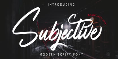 Introducing a Subjective Modern script fonts with sharp and beautiful letters that create fonts that are modern, tendy and elegant. Subjective came with opentype features such stylistic alternates, stylistic sets & ligatures good for logotype, poster, badge, book cover, tshirt design, packaging and any more. Features : • Character Set A-Z • Numerals & Punctuations (OpenType Standard) • Accents (Multilingual characters) • Ligature • Alternate
 - Display Haphazard by Gerald Gallo,
$20.00 Display Haphazard is a display font not intended for text use. It was designed specifically for display, headline, logotype, branding, and similar applications. Display Haphazard has an uppercase alphabet located under the character set keys and a full set of alternate uppercase characters located under the character + shift keys. It also has numbers with alternates, and punctuation.
 - Keith by Talbot Type,
$19.50 Keith is a striking and playful display font. Mix and match the different shadow styles, to create a variety of different looks and effects. There are four different shadow effects, along with a fill and an outline variation. Keith features a full upper and lower case character set and an extended set of accented characters for Central European languages.
 - Rahaely by Putracetol,
$19.00 Introducing Rahaely, a elegant script font with a lot of alternates character. This font is perfect for logotype creation, lettering compositions, wedding invitations, fashion projects, book design cover, magazines typography, cards, packagings, posters, branding and more. Come with Opentype feature with a lot of alternates, its help you to make great lettering. This font is also support multi language.
 - HWT Antique Tuscan 9 by Hamilton Wood Type Collection,
$24.95 A very condensed 19th century Tuscan style wood type design with a full character set with ligatures. This design was first shown by Wm H Page Co in 1859 and this is the first digital version of this font to include a lowercase and extended European character set. This is a font best used at large sizes.
 - Jackart by Arendxstudio,
$15.00 Introducing a Jackart Brush script fonts with sharp and beautiful letters that create fonts that are modern, tendy and elegant. Jackart came with opentype features such stylistic alternates, stylistic sets & ligatures good for logotype, poster, badge, book cover, tshirt design, packaging and any more. Features : • Character Set A-Z • Numerals & Punctuations (OpenType Standard) • Accents (Multilingual characters) • Ligature • Alternate
 - ATC Timberline by Avondale Type Co.,
$20.00 ATC Timberline, is an ultra wide-set sans-serif typeface. With its sharp points and extended curves, ATC Timberline feels just at home in mid-century modern as it does in forward-looking modern settings. Contains 370+ glyphs, full alphabet, ligatures, numberals, accents and punctuation. File type included in download is .otf. ATC Timberline was released in 2016.
 - ITC Farmhaus by ITC,
$29.99ITC Farmhaus is the work of British designer Tim Donaldson and is, in his own words, Neil Young meets Paul Renner." Donaldson borrowed the perfect circles and clean lines of Renner's drawings for Futura and gave them jagged edges and uneven, thick strokes. Farmhaus contains one set of capitals and two sets of lower case letters." - Turn Destiny by Deeezy,
$14.00 Trendy, bold & modern style sans font for your fancy projects. Elegant, funny and classic style on Amarillo font will be great for any branding project. Lot of alternates and ligatures will help you to create unique and original logo design or website header! Enjoy :) -Multilingual support -Lot of alternate characters & ligatures -Great for modern branding projects!
 - Rose Avenue by Set Sail Studios,
$26.00 Introducing Rose Avenue, an extra bold serif font with soft, charming rounded edges and curves. Rose Avenue brings chunky retro typography to the modern era, and includes 70 additional special characters with additional flair and flourishes - providing you with a variety of captivating custom text arrangements. Whether it's a fancy retro-inspired logo, or engaging bold header text - Rose Avenue is able to deliver. Accessing Alternate Characters • Many letters of this font have multiple alternate versions (see final image). In order to access each one, simply make sure 'Standard Ligatures' are enabled, and follow your letter with a number. For example, typing 'A1, A2, A3, A4, A5' will generate the 5 alternate versions shown for capital A. Accessing Ligatures • There are 10 lowercase ligatures (double letters) included. In order to access these, simply make sure 'Standard Ligatures' are enabled, and the ligatures will automatically generate as you type. All special characters can also be accessed via a Glyphs panel. Language Support • Rose Avenue supports the following languages; English, French, Italian, Spanish, Portuguese, German, Swedish, Norwegian, Danish, Dutch, Finnish, Indonesian, Malay, Hungarian, Polish, Croatian, Turkish, Romanian, Czech, Latvian, Lithuanian, Slovak, Slovenian
 - Galeiya by Craft Supply Co,
$20.00 Introducing Galeiya – Cute Script Font Adorable Playfulness Step into the enchanting world of Galeiya – Cute Script Font, where adorable playfulness takes center stage. This font is the embodiment of girly charm and fun. Joyful Whimsy Galeiya’s joyful whimsy adds a delightful and whimsical touch to your projects, making it the perfect choice for a wide range of creative endeavors. Versatile Delight Beyond its cute appearance, this font is exceptionally versatile. It effortlessly adapts to various design contexts, from invitations to branding, infusing each project with a joyful spirit. Expressive Typography Galeiya is more than just cute; it’s incredibly expressive. Its lovely script style injects character and a sense of fun into your content, ensuring it leaves a memorable impression. In Conclusion In summary, Galeiya – Cute Script Font is the font that seamlessly combines girly charm with a sense of playfulness. Its versatility and expressive nature ensure your content is not only cute but also highly engaging. Whether it’s invitations, branding, or an array of creative projects, Galeiya brings a unique, expressive touch that appeals to a broad audience, leaving behind a lasting and delightful impression.
 - Dream Goods by Create Big Supply,
$15.00 Introducing DreamGood, a captivating natural handwriting font that adds a touch of artistic charm to your creative projects. With its authentic style and versatile nature, this font is perfect for various craft endeavors. DreamGood's natural handwriting style brings a unique and personalized feel to your designs. Whether you're working on shirt designs, websites, SVG creations, home decor, branding materials, blogs, logos, or invitations, this font will elevate your projects with its organic appeal. With both uppercase and lowercase letters, DreamGood offers flexibility in crafting engaging compositions. It also includes numbers and punctuation, ensuring seamless integration within your text. The font's multilingual support enables you to communicate your message effectively across different languages, expanding your reach to a wider audience. DreamGood features ligatures that enhance the flow and aesthetics of your typography, allowing for captivating and cohesive designs. The font's PUA Encoding provides easy access to special characters and glyphs, opening up endless creative possibilities. Embrace the natural beauty of DreamGood in your craft projects and watch your creations come to life with an artistic flair. From handmade goods to digital designs, this font adds a touch of elegance and authenticity.
 - Giom Mod by Ardyanatypes,
$15.00 Giom Mod is a unique and elegant display font with a distinctive serif style. This font offers nine different thickness options, ranging from Thin to Black, providing a wide range of choices for various applications. Each thickness of Giom Mod has its own unique characteristics, allowing you to select the one that best suits your design aesthetics. For example, Thin may be suitable for light and elegant designs, while Black can be used for more dramatic and bold appearances. Furthermore, Giom Mod comes equipped with various OpenType features. These include features such as ligatures, which allow specific characters to combine beautifully, and alternative letterforms that provide more design options. With these features, you can create more engaging and unique text elements in your designs. Additionally, Giom Mod is designed to support multiple languages, making it suitable for use in many countries. This makes it highly versatile and appropriate for a wide range of multilingual design projects. So, if you are looking for a font that combines the beauty of serif with various thickness options, useful OpenType features, and multilingual support, Giom Mod is the perfect choice to meet your design needs.
 - SP Vincent by Studio Pulp,
$19.99 Discover the captivating charm of SP Vincent, a masterfully crafted display font developed in 2023 by Studio Pulp. Inspired by the iconic character Vincent Vega, the central figure in the film classic "Pulp Fiction" (1994), this typeface exudes a powerful and refined aesthetic, befitting a leading role. SP Vincent, with meticulous attention to detail and craftsmanship, showcases versatility that seamlessly complements a variety of design projects, especially excelling in the creation of impressive titles. The three well-balanced weights provide you with the flexibility to unleash your creativity, while the clear, open shapes optimize readability. Anchored in a sleek grid design, SP Vincent embodies modern minimalism and accessible elegance. Whether you are engaged in web design, graphic design, or print materials, this font adds a timeless class to your creations. Be inspired by the seamless blend of functionality and aesthetics in SP Vincent. Specifically designed to meet the demands of 2023, this font brings a contemporary flair to your projects while remaining faithful to Studio Pulp's commitment to quality and innovation. Transform your typographic landscape with SP Vincent and leave a lasting impression reminiscent of the unforgettable moments from "Pulp Fiction."
 - Times New Roman PS Cyrillic by Monotype,
$67.99In 1931, The Times of London commissioned a new text type design from Stanley Morison and the Monotype Corporation, after Morison had written an article criticizing The Times for being badly printed and typographically behind the times. The new design was supervised by Stanley Morison and drawn by Victor Lardent, an artist from the advertising department of The Times. Morison used an older typeface, Plantin, as the basis for his design, but made revisions for legibility and economy of space (always important concerns for newspapers). As the old type used by the newspaper had been called Times Old Roman," Morison's revision became "Times New Roman." The Times of London debuted the new typeface in October 1932, and after one year the design was released for commercial sale. The Linotype version, called simply "Times," was optimized for line-casting technology, though the differences in the basic design are subtle. The typeface was very successful for the Times of London, which used a higher grade of newsprint than most newspapers. The better, whiter paper enhanced the new typeface's high degree of contrast and sharp serifs, and created a sparkling, modern look. In 1972, Walter Tracy designed Times Europa for The Times of London. This was a sturdier version, and it was needed to hold up to the newest demands of newspaper printing: faster presses and cheaper paper. In the United States, the Times font family has enjoyed popularity as a magazine and book type since the 1940s. Times continues to be very popular around the world because of its versatility and readability. And because it is a standard font on most computers and digital printers, it has become universally familiar as the office workhorse. Times?, Times? Europa, and Times New Roman? are sure bets for proposals, annual reports, office correspondence, magazines, and newspapers. Linotype offers many versions of this font: Times? is the universal version of Times, used formerly as the matrices for the Linotype hot metal line-casting machines. The basic four weights of roman, italic, bold and bold italic are standard fonts on most printers. There are also small caps, Old style Figures, phonetic characters, and Central European characters. Times? Ten is the version specially designed for smaller text (12 point and below); its characters are wider and the hairlines are a little stronger. Times Ten has many weights for Latin typography, as well as several weights for Central European, Cyrillic, and Greek typesetting. Times? Eighteen is the headline version, ideal for point sizes of 18 and larger. The characters are subtly condensed and the hairlines are finer." - Times New Roman Seven by Monotype,
$67.99In 1931, The Times of London commissioned a new text type design from Stanley Morison and the Monotype Corporation, after Morison had written an article criticizing The Times for being badly printed and typographically behind the times. The new design was supervised by Stanley Morison and drawn by Victor Lardent, an artist from the advertising department of The Times. Morison used an older typeface, Plantin, as the basis for his design, but made revisions for legibility and economy of space (always important concerns for newspapers). As the old type used by the newspaper had been called Times Old Roman," Morison's revision became "Times New Roman." The Times of London debuted the new typeface in October 1932, and after one year the design was released for commercial sale. The Linotype version, called simply "Times," was optimized for line-casting technology, though the differences in the basic design are subtle. The typeface was very successful for the Times of London, which used a higher grade of newsprint than most newspapers. The better, whiter paper enhanced the new typeface's high degree of contrast and sharp serifs, and created a sparkling, modern look. In 1972, Walter Tracy designed Times Europa for The Times of London. This was a sturdier version, and it was needed to hold up to the newest demands of newspaper printing: faster presses and cheaper paper. In the United States, the Times font family has enjoyed popularity as a magazine and book type since the 1940s. Times continues to be very popular around the world because of its versatility and readability. And because it is a standard font on most computers and digital printers, it has become universally familiar as the office workhorse. Times?, Times? Europa, and Times New Roman? are sure bets for proposals, annual reports, office correspondence, magazines, and newspapers. Linotype offers many versions of this font: Times? is the universal version of Times, used formerly as the matrices for the Linotype hot metal line-casting machines. The basic four weights of roman, italic, bold and bold italic are standard fonts on most printers. There are also small caps, Old style Figures, phonetic characters, and Central European characters. Times? Ten is the version specially designed for smaller text (12 point and below); its characters are wider and the hairlines are a little stronger. Times Ten has many weights for Latin typography, as well as several weights for Central European, Cyrillic, and Greek typesetting. Times? Eighteen is the headline version, ideal for point sizes of 18 and larger. The characters are subtly condensed and the hairlines are finer." - Bodoni Z37 by Typodermic,
$9.95 Indulge in the timeless elegance of Bodoni Z37—a typeface that captures the essence of European sophistication. Designed with the mid-21st century in mind, this Didone font offers a dynamic range of weights and widths, allowing you to create captivating typography that is truly one-of-a-kind. Bodoni Z37’s Deco design with flat edges and geometric lines sets it apart from other fonts in its genre. It’s an exceptional choice for creating headlines, posters, and invitations. The razor-thin lines are enticing at larger sizes but can be challenging to handle when you need to go extremely small. Thankfully, the font is available in three optical sizes—large, medium, and small, making it versatile enough to use in any design scenario. The Bodoni Z37 family includes four weights, four widths, and italics, giving you a staggering 96 font options to choose from. The cute, curly italics are perfect for adding emphasis and flair to your text, while the lining numerals are kerned and proportionally spaced for effortless readability. With open-type fractions, numeric ordinals, and old-style numerals, Bodoni Z37 is a complete package that allows you to experiment with typography to your heart’s content. Whether you’re designing a book cover or a branding package, Bodoni Z37’s exceptional versatility and elegant design are sure to make your work stand out. Most Latin-based European, Vietnamese, Greek, and most Cyrillic-based writing systems are supported, including the following languages. Afaan Oromo, Afar, Afrikaans, Albanian, Alsatian, Aromanian, Aymara, Azerbaijani, Bashkir, Bashkir (Latin), Basque, Belarusian, Belarusian (Latin), Bemba, Bikol, Bosnian, Breton, Bulgarian, Buryat, Cape Verdean, Creole, Catalan, Cebuano, Chamorro, Chavacano, Chichewa, Crimean Tatar (Latin), Croatian, Czech, Danish, Dawan, Dholuo, Dungan, Dutch, English, Estonian, Faroese, Fijian, Filipino, Finnish, French, Frisian, Friulian, Gagauz (Latin), Galician, Ganda, Genoese, German, Gikuyu, Greenlandic, Guadeloupean Creole, Haitian Creole, Hawaiian, Hiligaynon, Hungarian, Icelandic, Igbo, Ilocano, Indonesian, Irish, Italian, Jamaican, Kaingang, Khalkha, Kalmyk, Kanuri, Kaqchikel, Karakalpak (Latin), Kashubian, Kazakh, Kikongo, Kinyarwanda, Kirundi, Komi-Permyak, Kurdish, Kurdish (Latin), Kyrgyz, Latvian, Lithuanian, Lombard, Low Saxon, Luxembourgish, Maasai, Macedonian, Makhuwa, Malay, Maltese, Māori, Moldovan, Montenegrin, Nahuatl, Ndebele, Neapolitan, Norwegian, Novial, Occitan, Ossetian, Ossetian (Latin), Papiamento, Piedmontese, Polish, Portuguese, Quechua, Rarotongan, Romanian, Romansh, Russian, Rusyn, Sami, Sango, Saramaccan, Sardinian, Scottish Gaelic, Serbian, Serbian (Latin), Shona, Sicilian, Silesian, Slovak, Slovenian, Somali, Sorbian, Sotho, Spanish, Swahili, Swazi, Swedish, Tagalog, Tahitian, Tajik, Tatar, Tetum, Tongan, Tshiluba, Tsonga, Tswana, Tumbuka, Turkish, Turkmen (Latin), Tuvaluan, Ukrainian, Uzbek, Uzbek (Latin), Venda, Venetian, Vepsian, Vietnamese, Võro, Walloon, Waray-Waray, Wayuu, Welsh, Wolof, Xavante, Xhosa, Yapese, Zapotec, Zarma, Zazaki, Zulu and Zuni.
 - Times New Roman WGL by Monotype,
$67.99 In 1931, The Times of London commissioned a new text type design from Stanley Morison and the Monotype Corporation, after Morison had written an article criticizing The Times for being badly printed and typographically behind the times. The new design was supervised by Stanley Morison and drawn by Victor Lardent, an artist from the advertising department of The Times. Morison used an older typeface, Plantin, as the basis for his design, but made revisions for legibility and economy of space (always important concerns for newspapers). As the old type used by the newspaper had been called Times Old Roman," Morison's revision became "Times New Roman." The Times of London debuted the new typeface in October 1932, and after one year the design was released for commercial sale. The Linotype version, called simply "Times," was optimized for line-casting technology, though the differences in the basic design are subtle. The typeface was very successful for the Times of London, which used a higher grade of newsprint than most newspapers. The better, whiter paper enhanced the new typeface's high degree of contrast and sharp serifs, and created a sparkling, modern look. In 1972, Walter Tracy designed Times Europa for The Times of London. This was a sturdier version, and it was needed to hold up to the newest demands of newspaper printing: faster presses and cheaper paper. In the United States, the Times font family has enjoyed popularity as a magazine and book type since the 1940s. Times continues to be very popular around the world because of its versatility and readability. And because it is a standard font on most computers and digital printers, it has become universally familiar as the office workhorse. Times?, Times? Europa, and Times New Roman? are sure bets for proposals, annual reports, office correspondence, magazines, and newspapers. Linotype offers many versions of this font: Times? is the universal version of Times, used formerly as the matrices for the Linotype hot metal line-casting machines. The basic four weights of roman, italic, bold and bold italic are standard fonts on most printers. There are also small caps, Old style Figures, phonetic characters, and Central European characters. Times? Ten is the version specially designed for smaller text (12 point and below); its characters are wider and the hairlines are a little stronger. Times Ten has many weights for Latin typography, as well as several weights for Central European, Cyrillic, and Greek typesetting. Times? Eighteen is the headline version, ideal for point sizes of 18 and larger. The characters are subtly condensed and the hairlines are finer."
 - Levato by Linotype,
$29.99 Levato, the first font designed by Felix Bonge, is an Antiqua that is full of character and is refined but by no means sterile. This typeface provides for a wide range of options for creating individual designs. It was not really Felix Bonge's intention to create a whole font family when, as a second year student, he began several exercises in contrast and proportion as part of the typeface design course of Professor Veljovi? at Hamburg University of Applied Sciences. However, these initial studies developed into a project that Bonge persisted with over the following years while working towards his degree. He continually had new insights and ideas that he was able to exploit for his font. Of particular importance, he claims, was a calligraphy seminar, which prompted him to completely rework his concept. It took him several years before his extensive font Levato™ was ready. Although the forms of Levato are ultimately derived from Renaissance Antiqua, Bonge has slightly increased the relative contrast in his version. This gives the font a graceful appearance that is further emphasized by the reduced x-height and the associated prominence of the ascenders. And, in addition, the relatively fine serifs, which are almost linear at their ends, infuse Levato with a hint of classical Antiqua á la Bodoni. At the same time, Bonge cleverly compensates for the sterilising tendency of this font form. Soft and rounded serif attachments and rounded line apexes offset the severe nature of the font and provide it with an aura of vivacity. This effect is promoted by the calligraphic-like foot of the lowercase h, n and m and the not quite horizontal bars of the uppercase E and F. Overall, Bonge has succeeded in creating a refined and yet very dynamic typeface. Levato is available in five weights; Light, Regular, Medium, Bold and Black, in each case with the corresponding italic versions. Bonge treats Levato Italic as a genuine cursive typeface. Its letters are thus slightly narrower than the analogous upright letters and their forms are considerably more curvilinear. All the versions of Levato boast an enormous range of characters to meet all possible requirements. In addition to four sets of minuscule and majuscule numerals for tabular and proportional typesetting, there are also small caps, numerous ligatures, ornamental characters and even swash variants of letters. With their generous, sweeping curves, the swash variants (available as OpenType versions) can be used for striking titling effects or as initials.
 - Times New Roman by Monotype,
$67.99 In 1931, The Times of London commissioned a new text type design from Stanley Morison and the Monotype Corporation, after Morison had written an article criticizing The Times for being badly printed and typographically behind the times. The new design was supervised by Stanley Morison and drawn by Victor Lardent, an artist from the advertising department of The Times. Morison used an older typeface, Plantin, as the basis for his design, but made revisions for legibility and economy of space (always important concerns for newspapers). As the old type used by the newspaper had been called Times Old Roman," Morison's revision became "Times New Roman." The Times of London debuted the new typeface in October 1932, and after one year the design was released for commercial sale. The Linotype version, called simply "Times," was optimized for line-casting technology, though the differences in the basic design are subtle. The typeface was very successful for the Times of London, which used a higher grade of newsprint than most newspapers. The better, whiter paper enhanced the new typeface's high degree of contrast and sharp serifs, and created a sparkling, modern look. In 1972, Walter Tracy designed Times Europa for The Times of London. This was a sturdier version, and it was needed to hold up to the newest demands of newspaper printing: faster presses and cheaper paper. In the United States, the Times font family has enjoyed popularity as a magazine and book type since the 1940s. Times continues to be very popular around the world because of its versatility and readability. And because it is a standard font on most computers and digital printers, it has become universally familiar as the office workhorse. Times?, Times? Europa, and Times New Roman? are sure bets for proposals, annual reports, office correspondence, magazines, and newspapers. Linotype offers many versions of this font: Times? is the universal version of Times, used formerly as the matrices for the Linotype hot metal line-casting machines. The basic four weights of roman, italic, bold and bold italic are standard fonts on most printers. There are also small caps, Old style Figures, phonetic characters, and Central European characters. Times? Ten is the version specially designed for smaller text (12 point and below); its characters are wider and the hairlines are a little stronger. Times Ten has many weights for Latin typography, as well as several weights for Central European, Cyrillic, and Greek typesetting. Times? Eighteen is the headline version, ideal for point sizes of 18 and larger. The characters are subtly condensed and the hairlines are finer."
 - Times New Roman Small Text by Monotype,
$67.99In 1931, The Times of London commissioned a new text type design from Stanley Morison and the Monotype Corporation, after Morison had written an article criticizing The Times for being badly printed and typographically behind the times. The new design was supervised by Stanley Morison and drawn by Victor Lardent, an artist from the advertising department of The Times. Morison used an older typeface, Plantin, as the basis for his design, but made revisions for legibility and economy of space (always important concerns for newspapers). As the old type used by the newspaper had been called Times Old Roman," Morison's revision became "Times New Roman." The Times of London debuted the new typeface in October 1932, and after one year the design was released for commercial sale. The Linotype version, called simply "Times," was optimized for line-casting technology, though the differences in the basic design are subtle. The typeface was very successful for the Times of London, which used a higher grade of newsprint than most newspapers. The better, whiter paper enhanced the new typeface's high degree of contrast and sharp serifs, and created a sparkling, modern look. In 1972, Walter Tracy designed Times Europa for The Times of London. This was a sturdier version, and it was needed to hold up to the newest demands of newspaper printing: faster presses and cheaper paper. In the United States, the Times font family has enjoyed popularity as a magazine and book type since the 1940s. Times continues to be very popular around the world because of its versatility and readability. And because it is a standard font on most computers and digital printers, it has become universally familiar as the office workhorse. Times?, Times? Europa, and Times New Roman? are sure bets for proposals, annual reports, office correspondence, magazines, and newspapers. Linotype offers many versions of this font: Times? is the universal version of Times, used formerly as the matrices for the Linotype hot metal line-casting machines. The basic four weights of roman, italic, bold and bold italic are standard fonts on most printers. There are also small caps, Old style Figures, phonetic characters, and Central European characters. Times? Ten is the version specially designed for smaller text (12 point and below); its characters are wider and the hairlines are a little stronger. Times Ten has many weights for Latin typography, as well as several weights for Central European, Cyrillic, and Greek typesetting. Times? Eighteen is the headline version, ideal for point sizes of 18 and larger. The characters are subtly condensed and the hairlines are finer." - Times New Roman PS Greek by Monotype,
$67.99In 1931, The Times of London commissioned a new text type design from Stanley Morison and the Monotype Corporation, after Morison had written an article criticizing The Times for being badly printed and typographically behind the times. The new design was supervised by Stanley Morison and drawn by Victor Lardent, an artist from the advertising department of The Times. Morison used an older typeface, Plantin, as the basis for his design, but made revisions for legibility and economy of space (always important concerns for newspapers). As the old type used by the newspaper had been called Times Old Roman," Morison's revision became "Times New Roman." The Times of London debuted the new typeface in October 1932, and after one year the design was released for commercial sale. The Linotype version, called simply "Times," was optimized for line-casting technology, though the differences in the basic design are subtle. The typeface was very successful for the Times of London, which used a higher grade of newsprint than most newspapers. The better, whiter paper enhanced the new typeface's high degree of contrast and sharp serifs, and created a sparkling, modern look. In 1972, Walter Tracy designed Times Europa for The Times of London. This was a sturdier version, and it was needed to hold up to the newest demands of newspaper printing: faster presses and cheaper paper. In the United States, the Times font family has enjoyed popularity as a magazine and book type since the 1940s. Times continues to be very popular around the world because of its versatility and readability. And because it is a standard font on most computers and digital printers, it has become universally familiar as the office workhorse. Times?, Times? Europa, and Times New Roman? are sure bets for proposals, annual reports, office correspondence, magazines, and newspapers. Linotype offers many versions of this font: Times? is the universal version of Times, used formerly as the matrices for the Linotype hot metal line-casting machines. The basic four weights of roman, italic, bold and bold italic are standard fonts on most printers. There are also small caps, Old style Figures, phonetic characters, and Central European characters. Times? Ten is the version specially designed for smaller text (12 point and below); its characters are wider and the hairlines are a little stronger. Times Ten has many weights for Latin typography, as well as several weights for Central European, Cyrillic, and Greek typesetting. Times? Eighteen is the headline version, ideal for point sizes of 18 and larger. The characters are subtly condensed and the hairlines are finer." - Times New Roman PS by Monotype,
$67.99In 1931, The Times of London commissioned a new text type design from Stanley Morison and the Monotype Corporation, after Morison had written an article criticizing The Times for being badly printed and typographically behind the times. The new design was supervised by Stanley Morison and drawn by Victor Lardent, an artist from the advertising department of The Times. Morison used an older typeface, Plantin, as the basis for his design, but made revisions for legibility and economy of space (always important concerns for newspapers). As the old type used by the newspaper had been called Times Old Roman," Morison's revision became "Times New Roman." The Times of London debuted the new typeface in October 1932, and after one year the design was released for commercial sale. The Linotype version, called simply "Times," was optimized for line-casting technology, though the differences in the basic design are subtle. The typeface was very successful for the Times of London, which used a higher grade of newsprint than most newspapers. The better, whiter paper enhanced the new typeface's high degree of contrast and sharp serifs, and created a sparkling, modern look. In 1972, Walter Tracy designed Times Europa for The Times of London. This was a sturdier version, and it was needed to hold up to the newest demands of newspaper printing: faster presses and cheaper paper. In the United States, the Times font family has enjoyed popularity as a magazine and book type since the 1940s. Times continues to be very popular around the world because of its versatility and readability. And because it is a standard font on most computers and digital printers, it has become universally familiar as the office workhorse. Times?, Times? Europa, and Times New Roman? are sure bets for proposals, annual reports, office correspondence, magazines, and newspapers. Linotype offers many versions of this font: Times? is the universal version of Times, used formerly as the matrices for the Linotype hot metal line-casting machines. The basic four weights of roman, italic, bold and bold italic are standard fonts on most printers. There are also small caps, Old style Figures, phonetic characters, and Central European characters. Times? Ten is the version specially designed for smaller text (12 point and below); its characters are wider and the hairlines are a little stronger. Times Ten has many weights for Latin typography, as well as several weights for Central European, Cyrillic, and Greek typesetting. Times? Eighteen is the headline version, ideal for point sizes of 18 and larger. The characters are subtly condensed and the hairlines are finer." - ITC Stone Sans II by ITC,
$45.99 The ITC Stone Sans II typeface family is new from the drawing board up. Sumner Stone, who designed the original faces in 1988, recently collaborated with Delve Withrington and Jim Wasco of Monotype Imaging to update the family of faces that bears his name. Sumner was the lead designer and project director for the full-blown reworking – and his own greatest critic. The collaborative design effort began as a relatively simple upgrade to the ITC Stone Sans family. As so often happens, however, the upgrade proved to be not so simple, and grew into a major design undertaking. “My initial intent,” recalls Sumner, “was to provide ITC Stone Sans with even greater versatility. I planned to add an additional weight, maybe two, and to give the family some condensed designs.” As Sumner began to look more closely at his twenty-year-old typeface, he decided that it would benefit from more extensive design improvements. “I found myself making numerous refinements to character shapes and proportions,” says Sumner. “The project scope expanded dramatically, and I’m pleased with the final result. The redesign has improved both the legibility and the overall appearance of the face.” The original ITC Stone Sans is part of the ITC Stone super family, along with ITC Stone Serif and ITC Stone Informal. In 2005 ITC Stone Humanist joined the family. All of these designs have always offered the same three weights: Medium, Semibold, and Bold – each with an italic counterpart. Over time, Stone Sans has emerged as the godfather of the family, a powerful design used for everything from fine books, annual reports and corporate identity programs, to restaurant menus, movie credits and advertising campaigns. ITC Stone Sans, however, lacked one attribute of many sans serif families: a large range of widths and weights. “These fonts had enjoyed great popularity for many years – during which graphic designers repeatedly asked for more weights and condensed designs in the family,” says Sumner. “Their comments were the impetus.” ITC Stone Sans II includes six weights ranging from an elegant Light to a commanding Extra Bold. An italic counterpart and suite of condensed designs complements every weight. In all, the new family encompasses 24 typefaces. The ITC Stone Sans II family is also available as a suite of OpenType Pro fonts, allowing graphic communicators to pair its versatile design with the capabilities of OpenType. These fonts offer automatic insertion of ligatures, small caps and use-sensitive figure designs; their extended character set also supports most Central European and many Eastern European languages. ITC Stone® Sans II font field guide including best practices, font pairings and alternatives.
 - Alistair Signature by Aktab Studio,
$17.00 Alistair Signature Font is a modern font with more featured and made with hand lettering. Alistair Signature Font have a complete glyphs, this font suitable for wedding invitation, greeting cards, T-Shirt, Logo or any design that you create. comes with a complete set of standard characters, Alternates, Punctuation & have extra ornament for your design and many more. The Features of this fonts is: - UPPERCASE and lowercase - Numeral and punctuation - Stylistic Sets - Stylistic Alternates and Contextual Alternates - International Glyphs support to All Stylistic Sets - Support PUA unicode (specially coded fonts) - Standart Ligatures and Discretionary Ligature - Fractions - Initial and Terminal Forms - Swash - Smallcaps Numeral
 - Pennyroyal by Stiggy & Sands,
$29.00 A Historic Revival with a Sophisticated Rustic Edge Pennyroyal began as a Barnhart Brothers & Spindler typeface called Plymouth Bold, first cut in 1900. What began as a straightforward rustic typestyle has been revived to include a more extensive character set. But this font wasn’t just revived, it has come alive with character and personality. Pennyroyal includes 564 characters. The expanded SmallCaps option for gives the typestyle a more sophisticated look, expanding on the original typeface inspiration. Opentype features include: A collection of ligatures. Smallcaps. Full set of Inferiors and Superiors. Proportional figures and Oldstyle figure sets
 - Gart Sans by Vitaliy Gotsanyuk,
$25.00 Gart Sans is a grotesque font that preserves the characteristics of early 20th-century grotesques, primarily used in advertising. The main features of this font include a pronounced contrast, narrow proportions, and light, smooth forms combined with modern design solutions. Compared to geometric or neo-grotesque fonts, Gart Sans distinguishes itself with its attention to detail. As the font weight increases, it acquires a more pronounced character, expanding its usability from headlines to extensive text settings. Gart Sans consists of 5 styles, 630 glyphs, encompassing an extended Latin character set, basic Cyrillic characters, ligatures, numeral sets, and much more.
 - Revolage by FallenGraphic,
$15.00 Revolage. Revolage is a vintage sans serif and script including Rough, & Clean versions as well as Oblique versions . Revolage is a versatile sans serif and script typeface that gives a vintage aesthetic. With it’s unique & distinct characteristics it sets itself apart, while also maintaining a strong timeless appeal overall. Textured versions allow Revolage to be a complete set without the need for 3rd party effects to create a printed look, eliminating a step in the process of finalizing your piece FEATURES : Character Set A-Z Numberal Accents (Multilingual characters) PUA encode Alternates Ligature MULTiLINGUAL ACCENT žŠŒšŸÀÁÂÃÄÅÆÇÈÉÊËÌÍÎÏÐÑÒÓÔÕÖØÙÚÛÜÝßàáâãäåæçèéêëìíîïðñòóôõöøùúûüýÿ
 - Motgan by FallenGraphic,
$14.00 Introducing Motgan – Vintage Fonts Motgan is a vintage sans serif family including Textured, & Clean versions as well as Oblique versions of each. Motgan is a versatile sans serif typeface that gives a vintage aesthetic. With it’s unique & distinct characteristics it sets itself apart, while also maintaining a strong timeless appeal overall. Textured versions allow Motgan to be a complete set without the need for 3rd party effects to create a printed look, eliminating a step in the process of finalizing your piece FEATURES : Character Set A-Z Numberal Accents (Multilingual characters) PUA encode Alternates Ligature MULTiLINGUAL ACCENT žŠŒšŸÀÁÂÃÄÅÆÇÈÉÊËÌÍÎÏÐÑÒÓÔÕÖØÙÚÛÜÝßàáâãäåæçèéêëìíîïðñòóôõöøùúûüýÿ
 - Anlinear by Linotype,
$29.99Anlinear is part of a series of constructed typographic experiments from the young Swiss designer Michael Parson. In the Anlinear family, which contains three separate weights, Parson has successfully created a fabulous display of alphabets out of the sole arrangement of lines at right angles to each other. The letters in this face virtually groove with the beat as you set them in text. Like a musical score, they provide a fantastic look just right for your next flyer. This family of fonts looks best when set in larger point sizes, in headlines or other display settings. - Country Western Script by FontMesa,
$30.00 Country Western Script is a new font based on the classic William Page font known as Clarendon Ornamented originally designed in 1859 and again in 1877 by Vanderburgh & Wells. This version includes Greek, Cyrillic, Central and Eastern European characters sets. Keeping with the original theme from 1859, Fill fonts are available for the Ornamented and Open faced versions of this font. Greek, Cyrillic, Central and Eastern European characters sets are supported in the Windows TrueType and OpenType formats. The Windows and Mac Type1 versions of this font do not support Greek, Cryillic, Central and Eastern European characters sets.
 - Zapatista by MADType,
$29.00 Zapatista is derived from a typeface that I designed in 1998 but never released. It is a playful slab serif with a texture that is sometimes subtle and reminiscent of the irregularities of letterpress printing. Like a fine wine, this face has been aged to perfection and is now ready for public consumption. It includes a full character set with accented characters as well as a second full set of alternate uppercase, lowercase, and numbers. OpenType makes it easy to mix and match the two sets of letters to create custom designs. It's like having 2 fonts in one!
 - Torus by Monotype,
$25.99 Torus is a simple, rounded monoline typeface that has been designed specifically for logo design, headlines and branding purposes. While the default character set is distinctive in its own right, graphic designers will love playing with the numerous alternate glyphs that will help them create unique wordmarks and logo designs. Torus’ simplistic forms and soft terminals make this a lovely, warm typeface perfect for a multitude of typographic applications. Please also consider: Torus Variations (2018) Torus Pro (2021) Key features: 6 weights 49 Alternates (via 2 Stylistic Sets) Full European character set (Latin) 550+ glyphs per font.
 - Special Elite Pro by Stiggy & Sands,
$29.00 Our Special Elite Pro brings the unique individuality of the Special Elite Type No. NR6 vintage typewriter keyset to the digital age. Antique typewriters would type with a warmth and appeal to them, primarily because of their unpredictable “grunge” results from force of keystrokes to ribbon and paper. The SmallCaps and extensive figure sets add a more serious note to the nature of the typeface. OpenType features include: - SmallCaps. - Full set of Inferiors and Superiors for limitless fractions. - Tabular, Proportional, and Oldstyle figure sets (along with SmallCaps versions of the figures). - Stylistic Alternates for Caps to SmallCaps conversion.
 - Dambera by Tour De Force,
$25.00 Dambera is a made up word I used as planet name in my first comic published in a kids magazine when I was 6 years old. Dambera font has pretty similar reference - it's a simple script font I initially designed for wedding invitations and restaurant menus, but it can have wide appliance in every design field, from posters, book covers, outdoor signes to labels and packages. It contains a set of stylistic ligatures and swash alternates, as well as a small set of floral dingbats. Also contains a set of characters with specific endings (in OpenType terminology, better known under FINA term).
 - Risque Pro by Stiggy & Sands,
$29.00 Our Risque Pro draws inspiration from the title screen of the 1962 Looney Toons cartoon, "Martian through Georgia". Originally an all Capitals reference, Risque includes Capitals, lowercase, and SmallCaps sets as festive and irregular in its bounce as the cartoon reference. This frolicking fun typeface has retro roots, but also an all around offbeat personality that opens it up to a wide gamut of uses. Opentype features include: - SmallCaps. - Full set of Inferiors and Superiors for limitless fractions. - Tabular, Proportional, and Oldstyle figure sets (along with SmallCaps versions of the figures). - Stylistic Alternates for Caps to SmallCaps conversion.
 - Morning Magpie by Ana's Fonts,
$15.00 Morning Magpie is a cute handmade brush font with matching illustrations and decorative elements. With an alternates character set, it is perfect for any design that needs a quirky handwritten feel, such as logotypes, postcards and tags, social media quotes. The illustrations will also look great in patterns, in wrapping paper and backgrounds. Morning Magpie includes: Morning Magpie, a brush font with ligatures for a more natural handwritten look Morning Magpie Alternate, a set of alternative characters for A-Z, a-z and 0-9 Morning Magpie Ornaments, a set of 52 drawings, swashed and underlines
 - Metronic Slab Pro by Mostardesign,
$26.00 Metronic Slab Pro is a slab serif typeface with a technological and minimalist look for text and headlines. It has six versatile weights from Air to Black with an alternative glyph set to improve its use in different graphic contexts. Metronic Pro has a wide range of OpenType features such as: old style and proportional figures, ligatures, case sensitive forms, fractions, stylistic alternates, arrows and an icons/ornaments set. This set of 60 icons, directly inspired from the typeface improves the OpenType features and can be quickly and easily use in your web design, GUI design, graphic design or any other graphic work.
 - Gart Serif by Vitaliy Gotsanyuk,
$25.00 Gart Serif is a serif font that combines traditional Antiques from the 18th century with modern solutions. Compared to other Antiques, Gart Serif stands out with its "display" metrics that enhance its character without compromising readability. With a variety of weights, Gart Serif can have an elegant demeanor seen in its thin weight or a more robust and sturdy presence in its bold rendition. It serves well for setting large amounts of text as well as for short headlines. Gart Serif comprises 5 weights, 642 glyphs, basic Cyrillic and extended Latin, several stylistic sets, ligatures, numeral sets, and a variable font.
 - Novaturient by DimitriAna,
$18.00 Novaturient is a modern, brush calligraphy font, designed to give an elegant hand-drawn style at your work. It is suitable for a variety of applications such as stationery design, invitations, logos, labels, packaging design, merchandise products, etc. It supports Central, Eastern, Western European, Baltic, Turkish and Greek languages. The font contains a variety of opentype features in Latin and Greek alphabet: Both, uppercase and lowercase character sets have their stylistic alternates. Standard ligatures, 2 sets of terminals (te01 & te02) and a set of initial letters (in01), will also give your text a custom personal look.