10,000 search results
(0.318 seconds)
- Delight Coffee by Sronstudio,
$15.00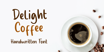 Delight Coffee is a fun Handwritten Font, this font Is perfect for product packaging, product designs, label, photography, watermark, special events, or anything. Delight Coffee comes with uppercase and lowercase letters, multilingual symbols, numerals, punctuation. Thank You, Sronstudio
 - Candy Night by FadeLine Studio,
$15.00 Introducing CANDY NIGHT! A Hand Drawn slab serif font! Made by hand to provide a natural, unique and modern style. This font is carefully designed to maintain the balance of each letter. Very easy and convenient to use.
 - Lecory by vuuuds,
$16.00 Introducing Lecory Font! Lecory is modern serif font, every single letters have been carefully crafted. This font including beautiful alternate glyph. You can access the alternate glyph via Font Book (Mac user) or Windows Character Map (Windows user).
 - Hebrew Stencil by Samtype,
$49.00 This is a modern Sans Serif font. There are 12 letters This font is for logos, covers and small texts and children books This font has the modern Hebrew punctuation: Shevana, Kamatz Katan, Dagesh Hazak, and Cholam Chaser.
 - Ready for More BB by Blambot,
$10.00 The long-awaited sentence-case version of Blambot's Ready for Anything comic book dialogue font has arrived! Are you...Ready for More? This typeface includes double-letter autoligatures, contextual alternate barred-I correction, and tons of diacritical glyphs.
 - Aloka Gikairo by Letterena Studios,
$17.00 Aloka Gikairo is a stylish and serif script font. It is PUA encoded which means you can access all of the amazing glyphs and ligatures with ease! Its distinct and well balanced letters make this font a masterpiece.
 - Hashira Mt by MotionTail,
$20.00 Give your designs an authentic handcrafted feel. "Hashira Mt" is perfectly suited to signature, stationery, logo, typography quotes, magazine or book cover, website header, clothing, branding, packaging design and more. Files included: - uppercase letters - multilingual symbols - numerals - punctuation
 - Godhong by Tama Putra,
$17.00 Godhong is a typeface inspired from gothic and rebel style. The Godhong typeface includes a full set of uppercase and lowercase letters as well as multi-lingual and currency support, numerals, punctuations, alternates, ligatures and some extra glyphs.
 - Plumcake by PintassilgoPrints,
$20.00 A bittersweet hand-drawn face, pleasing and assertive. Available in two weights, both all caps, with alternates for each letter. Comes with some ligatures and handy swash alternates to sweeten things up every now and again. Starting… Now!
 - Kallisto Lined by Device,
$39.00 A lined variant of Kallisto, suggestive of scan lines, speed and display screens. Kallisto weds a rational, machine-made aesthetic with a certain warmth that derives from more familiar letter shapes found on diestamped or embossed boilerplate signs.
 - Bullhead by Gassstype,
$28.00 Here comes a New font, Bullhead is a handwritten brush that is written casually and quickly. these strong Letters are made with brushes on Procreate. Bullhead is perfect for homeware designs, branding projects, Logo design, Quotes product packaging.
 - Crozzoe by Tama Putra,
$17.00 Crozzoe is a decorative blackletter typeface inspired by victorian style. The Crozzoe typeface includes a full set of uppercase and lowercase letters as well as multi-lingual and currency support, numerals, punctuations, alternates, ligatures and some extra glyphs.
 - Talloween by Ingrimayne Type,
$9.00 Talloween is a bizarre typeface in which the letters have a fraktur form, but look as if they had been made of wax that has partially melted. It comes in four styles, regular, oblique, shadow, and oblique shadow.
 - Brillia Calligraphy by AEN Creative Studio,
$12.00 Brillia is a sweet modern calligraphy, soft hand-lettered handwritten font. Fall in love with its authentic feel and use it to create gorgeous wedding invitations, beautiful stationary art, eye-catching social media posts, and cute greeting cards.
 - Qalisso by Letterena Studios,
$9.00 Qualisso is a modern and classic serif font with a unique style & modern look. This typeface is perfect for an elegant & luxury logo, book or movie title design, fashion brand, magazine, clothes, lettering, quotes, and so much more.
 - Olifant by Hipopotam Studio,
$25.00 Typeface originally designed as a monospace font (single standard width for all glyphs). We needed that for a project where letters stood directly above each other. Eventually it became proportional, and only the digits have a fixed width.
 - Flivver JNL by Jeff Levine,
$29.00Flivver JNL takes its name from the slang term applied to Model T's in the 1920s, and it's design is a first-cousin to Two Reeler JNL (inspired by lettering on titles from a Charlie Chaplin silent film). - Juicebash by Bogstav,
$17.00 It's tall, legible and handmade - and on top of that, charming as heck! Each letter has rounded corners, which leaves a pleasant and smooth look. Juicebash is legible, even at very small sizes and it has multilingual support
 - Sagha by YonTypeStudio Co,
$15.00 Sagha is a retro styled, thick lettered handwritten font, crafted to give your headlines and logotype projects a stylish touch. This font reads as strong, confident, and dynamic and can add tons of nostalgic character to your designs
 - Trelink by Letterena Studios,
$17.00 A serif modern and classic typeface that has its own unique style & modern look. This typeface is perfect for an elegant & luxury logo, book or movie title design, fashion brand, magazine, clothes, lettering, quotes, and so much more.
 - Pitlines by Mevstory Studio,
$20.00 Pitlines is a display fonts collection. Pitlineswill perfect for many project: fashion, magazines, logo, branding, photography, quotes, blog header, poster, advertisements, etc. Files Includes: Pitliness Regular.otf Pitlines Italic.otf What's Included? Uppercase & alternate uppercase letters, numbers, punctuation Multilingual support
 - Cabo Soft by Design A Lot,
$15.00 Cabo Soft is the 2.0 version of our original Cabo Rounded Typeface, created back in 2015. With this new version, Cabo Soft, we have brought multiple upgrades and updates compared with the original version. Some of those consist in the addition of more glyphs and accents, alternate designs for many of the glyphs (including an alternate for @, #, some of the numbers and more), and most importantly, we have done a slight update in the design of the letters, which we'll give more details in the following paragraphs. The main style and thought behind our Cabo fonts has always been the rounded corners and the soft and welcoming vibe that it gives. It's friendly and familiar, but also modern and slightly elegant, especially the Thin and Light styles. With Cabo Soft we have worked on adding an extra touch to the design of the letters by working on the termination edges of each letter. If Cabo Rounded had an exact round termination for each letter, with Cabo Soft we have developed a unique non-equally rounded shape that is applied to all types of terminations for each letter. This new design approach makes it have a more clean style, a more modern and unique look, but it also gives stylish, exclusivist and elegant vibes, while still being friendly and familiar. Thanks to it's variety in weights and styles, you can use Cabo Soft in almost any design project. It works well with headlines and paragraphs, it's a perfect match for logo design and branding, but can also do wonders in videos, signage and many other elements. The typeface covers most likely the entire Latin Alphabet, it comes with multiple design alternates for many of the letters, glyphs and numbers, with accents applied for all of the available alternates. As a finishing note, with the help of our Cabo Soft typeface you can create an friendly and welcoming designs, as well as stylish, elegant and exclusivist. It has all the necessary glyphs and accents for any Latin Alphabet projects, and you can play around with all of the alternates to create unique designs right from the start.
 - Lisbeth by TypeTogether,
$39.00 Louisa Fröhlich’s Lisbeth is the charming all-italic trailblazer that handles branding and text with internal vividness. With no roman style, it’s an italic-only family whose creation was guided by imagination instead of restrictive writing tools. Some type families aren’t sure what they want. Lisbeth proceeds with the utmost confidence on its own terms — it’s a feisty three-dimensional thespian amidst the cast of strait-laced characters you’re used to. With branding and magazine usage in mind, Lisbeth addresses the distinct challenges of text and display in a characterful way. The curves of the text weights show a soft angularity, emphasising the handwritten quality and the subtle twist inside the letters. The stroke’s carefully balanced contrast is more pronounced in the vibrant heavier weights but almost absent in the graceful structure of the thin weight. The angle of the letters is almost upright and the x-height is relatively large, so longer texts can be read comfortably and without effort. Lisbeth is slightly condensed and so uses a smaller area to efficiently impart much information. So if a type design can be thought of as the clothing letters wear, then Lisbeth is an energetic, freely flowing stroke wrapped around practical and efficient letter proportions. Another highlight of the family is the quirky high-contrast display style, easily catching every eye. The design concept of the twisted stroke shows at the extreme here and makes the letters dance a little on the page. Even though the shapes behave wildly, every letter is carefully balanced in itself so that the rhythmic repetition of the lettershapes results in an even and harmonic total picture. Lisbeth’s five text weights (from thin to bold) perform excellently in text settings, and its funky display style amps up the internal shimmer within each glyph. It supports numerous languages (Latin-A extended) and comes with ligatures and contextual alternates to produce beautiful typography. The character set contains proportional lining and oldstyle figures, tabular figures, subscripts, superscripts, and fractions. The complete Lisbeth family, along with our entire catalogue, has been optimised for today’s varied screen uses.
 - P22 Operina by IHOF,
$24.95 Operina is based on a 16th-century lettering model of the scribe Ludovico degli Arrighi (Vicentino Ludovico degli Arrighi) used in his 1522 instructional lettering book, "La Operina da Imparare di scrivere littera Cancellarescha." This book contains what is considered to be the earliest printed examples of Chancery Cursive. Rather than try to reproduce a perfect, smooth, type-like version of Ludovico's hand, which has been attempted in the past, the designer opted to leave in some rough edges and, thereby, create a look that mimics the endearing artifacts of quill and ink lettering on parchment. When reviving an old style, a designer is faced with many challenging decisions, such as whether to aim for ultimate authenticity or to modify the alphabet for modern use. The decision here was to create a font that resembles the 16th-century Italian hand-lettering master's, but is also useful to the contemporary user. Because the letters U u W w J j and our modern Arabic numerals were not in use during the advent of these original letterforms, these had to be interpolated. To make a complete and useable font set, we also had to fashion many of the extra and diacritical characters to match the look of the alphabet. There are three fonts in this set: Romano(simple), Corsivo(more complex), and Fiore(swash). Romano is the most subdued, it contains Roman looking caps and has lining figures. Corsivo is more elaborate, it has more decorative capital letters and an alternate version of the lowercase with longer ascenders and descenders, and old style figures. Fiore, the swash font, is the most elaborate with the longest ascenders and descenders. You may not wish to use the Fiore version on its own, especially as all caps; it is meant to enhance the other two alphabets because it contains the most elaborate capitals and has many extra ligatures. P22 Operina Pro is an OpenType version that contains over 1200 characters. It features Small Caps, Old Style Figures, full European, Cyrillic and Greek character sets and a new OpenType first with automatic Roman Numerals. Just type any number and with the feature, it will convert to Roman Numerals!
 - A10 STAR Black by Mogtahid,
$90.00 As a former typographer / lino and calligrapher, Abdallah NASRI had recourse to the nature of the idea of an "INTERCHANGEABLE" collection for types who in reality offer a police collar parallel to the complex typeface of the variable. Our fashion is outlined by a simple calculation defined by superimposed geometric circles where we used only its ¼ to fill the need for the angles of each of our letters. Always with the idea of having in the same allocated space, the same letter nested as many times as fat example from Hairline to Ultrabold. It was in this way that I was able to obtain a large number of styles, with a very interesting kerning which prompted me to extend the font to other languages with +1000 characters and +600 glyphs. I have always been treasured by the all in "1". I assure you that I sought to obtain the maximum of Visibility for a use S / Titling TV, WEB Pages and Typography Typo; once the difficult thing was done, I was rewarded by a font that has countless typographic openings for the world of graphics with 10 styles of weights in hand, and again I am happy to have personalized the charm of each letter by new details; I do not regret the time spent on thinking about it so that it is useful and at the same time pleasant as a working tool, finally profitable in all sectors and more multilingual, without forgetting that it is a family of inter change c ' is to say: All the types occupy the same height of the body and it is their fats which differs in the same space width of each of the letters, therefore no interference in spacing. Here, an additional alternative, a participation of a septuagenarian in the service of the love of modern digital typography. • TEST: At 50% screen in a body of 12 pixels, the A10 STAR Alphabet subjected to a test, has a clear Readability / Visibility. • P.S: A10 STAR integrates Diacriticism in all its forms. Texte d'origine : Abdallah NASRI a eu recours en étant ancien typographe/lino et calligraphe à la nature de l'idée d'une collection "INTERCHANGEABLE" pour les types qui en réalité offre un collier de police parallèle à la fonte complexe du variable. Notre mode est esquissé par un calcul simple défini par des ronds géométrique superposés où on a utilisé seulement son ¼ pour garnir le besoin des angles de chacune de nos lettres. Toujours dans l’idée à avoir dans le même espacement alloué, la même lettre imbriquée autant de fois de graisse exemple du Hairline à Ultrabold. C’est de cette manière que j’ai pu obtenir un grand nombre de styles, avec un crénage très intéressant ce qui m’a incité à étendre la police à d’autres langues avec +1000 caractères et +600 glyphes. J’ai toujours été prisé par le tout en « 1 ». Je vous assure que j’ai cherché à obtenir le maximum de Visibilité pour une utilisation S/Titrage TV, Pages WEB et Maquette typo ; une fois le difficile fait, j’ai été récompensé par une police qui possède d’innombrable ouverture typographique pour le monde du Graphisme avec comme atout en main 10 styles de graisses, et encore je suis content pour avoir personnalisé le charme de chaque lettre par des détails nouveaux ; je ne regrette pas le temps passé dessus à réfléchir pour qu’il soit utile et à la fois agréable comme outil de travail, enfin profitable tous secteurs confondus et en plus multilingue, sans oublié que c’est une famille d’inter change c’est-à-dire : Tous les types occupent la même hauteur du corps et c'est leurs graisses qui diffère dans un même espace largeur de chacune des lettres, donc aucune interférence dans l’espacement. Voilà, une alternative supplémentaire, une participation d’un septuagénaire au service de l’amour de la typographie numérique moderne. • TEST : A 50% d'écran dans un corps de 12 pixels, l'Alphabet A10 STAR soumise a un test, présente une nette Lisibilité / Visibilité. • P.S : A10 STAR intégre la Diacritique dans toutes ses formes.
 - Sterling Script by Canada Type,
$54.95 Sterling Script was initially meant to a be digitization/reinterpretation of a copperplate script widely used during what effectively became the last decade of metal type: Stephenson Blake's Youthline, from 1952. The years from 1945 to 1960 saw a heightened demand for copperplate faces, due to post-war market optimism, as well as the banking and insurance industries booming like never before, which triggered the need for design elements that express formal elegance and luxury. The name Sterling Script is a tip of our hat to England, the Stephenson Blake foundry's country of origin. It is also a historical hint about copperplate scripts having been used mainly for banking and bonds in the 19th century. Originally we just wanted to resurrect a gorgeous metal type from the ashes of forgotten history. But after the main font was done we saw that the original s really needed an alternate. We made one. But we felt sorry for the original s and didn't want to see it dropped from use altogether, so we saved it by building a set of ligatures that solve the minor connection problem with the s at large sizes. Before the completion of the ligatures, a few different alternates were also drawn, and we were faced by the fact that the single font we set out to do was now a much larger set than we anticipated. While thinking about how to split up our unexpected bundle of large characters, we drew a few more alternates and some swashes. This abundance "problem" reached a certain point where there was no looking back, so we just decided to go all the way with this font. We added many more alternates, swashes, ligatures, and two full sets of each beginning and ending lowercase letter. The result is over 750 characters of sheer elegance. Sterling Script has many features that set it above and beyond other copperplate scripts: - It has 2 beginning and 2 ending alternates for every single lowercase character. The beginning and ending variants on the vowels are also available in accented form in the appropriate cells of the character map. - Sterling Script is the ultimate elegant font choice for luxury design. Very elegant, but not too soft. Its strong and confident shapes convey a message that is real, comforting and assuring. - One of the eventual purposes of expanding Sterling Script this extensively was to create a script that finds the middle ground between formal and informal without compromising either trait, a script where the degree of formality can be gauged, tweaked, cranked up or toned down depending on the layout's needs. Aside from beginnings and endings, there are multiple variations for the majority of the basic characters. This is a formal script on steroids, where twirls and swashes can be set to come out unexpectedly from any place in the word, which is great for reducing the inherent rigidity of words set in copperplate scripts and "humanizing" them whenever needed. This is especially useful for wedding, postcard and invitation design, where not every viewer of the collateral material has something to do with banking or insurance. - With such an extensive character set, a designer can easily set a word or a sentence in 10 or more different ways, and choose the perfect one for the task at hand. This is particularly useful for work where details are of utmost importance, like logos, slogans, or elegant engravings that consist of one to three words. Let those swashes and twirls intertwine for maximum elegance. The Sterling Script complete package consists of 7 fonts: Sterling Script, Alternates, Beginnings, Endings, Swashes, Swash Alternates, and Ligatures. Sterling Script is available in five different purchase options and price ranges. But with such a massive offering of variation, the Sterling Script complete package is definitely the most value-laden set in its class. Once you use Sterling Script, you will never want to go back to other copperplates.
 - Sutray by Alit Design,
$12.00 Introducing Sutray Typeface Sutray Typeface has a script style with a retro theme that is unique and cool. This font when used for making poster designs, logotypes, text headers and magazine covers is very attractive because of its uniqueness. Sutray Typeface also have 7 families from Thin to Bold. So designers or non-designers if using the Sutray Typeface can be very easy to use and choose a family that is suitable for the design to be made. Apart from that this font is very easy to use in both design and non-design programs because all alternates and glyphs are supported by Unicode (PUA). In order to use the beautiful swashes, you need a program that supports OpenType features such as Adobe Illustrator CS, Adobe Photoshop CC, Adobe Indesign and Corel Draw. but if your software doesn't have Glyphs panel, you can install additional swashes font files.
 - Huntsville by Martype co,
$25.00 Introducing Huntsville Monoline Signature, a brand new font with monoline style and signature feels, also made from hanwriting skill to make it more useable and stylish. This font also suitable for Branding Design, Logotype, Wedding Invitation, Headline, Posters, Business Card and etc. Yes this font comes with more than 200+ alternates and ligatures to complete your design and make more attractive than other font. Support for 66 languages Afrikaans, Albanian, ,Basque, Bemba, Bena, Breton, Catalan, Chiga, Cornish, Danish, Dutch, English, Estonian, Faroese, Filipino, Finnish, French, Friulian, Galician, German, Gusii, Indonesian, Irish, Italian, Kabuverdianu, Kalenjin, Kinyarwanda, Luo, Luxembourgish, Luyia, Machame, Makhuwa, Meetto, Makonde, Malagasy, Manx, Morisyen, North, Ndebele, Norwegian, Bokmål, Norwegian, Nynorsk, Nyankole, Oromo, Portuguese, Quechua, Romansh, Rombo, Rundi, Rwa, Samburu, Sango, Sangu, Scottish, Gaelic, Sena, Shambala, Shona, Soga, Somali, Spanish, Swahili, Swedish, Swiss, ,German, Taita, Teso, Uzbek (Latin), Volapük, VunjoZulu, Thanks! Happy Desigining :) Umar
 - Bernard Script by Strong,
$19.00 Bernard Script Is a calligraphy Vintage script font that comes with beautiful alternate characters. copper plate mix calligraphy with handlettering style. Designed to convey stylish elegance. Pagoda attracts like a typeface that is smooth, clean, feminine, sensual, glamorous, simple and very easy to read. Bernard Script comes with a Clean and Aged version, beautiful upper and lower case, binding and loved by many finishes. It has Multilingual support (Western European characters) and works with the following languages: English, Danish, Dutch, Estonian, Finnish, French, German, Hungarian, Icelandic, Italian, Norwegian, Polish, Portuguese, Spanish, Swedish. In my example I show how this script can be used. It's perfect for logos, wedding invitations, alcohol labels, romantic cards, and more. Products include: Clean & Aged Script Versions Alternative Upper & Lowercase Styles fastener Recommended for use in Adobe Illustrator or Photoshop. Special features do not work in Microsoft Word. Font Glyphs
 - Manday by Alit Design,
$20.00 We want to create a different feel for the stencil font style. Usually stencil fonts are synonymous with military, retro and bold characters, but here we created the MANDAY font with an elegant and attractive stencil style for a modern design, combined with a subtle swash. In addition to swash in the MANDAY font, there are also many alternative character shapes and unique Discreationary ligatures. So the MANDAY font is very worthy of being a font collection on your computer for projects with a unique and charming elegant concept. Sans serif typefaces such as "MANDAY" are very easy to apply to any design, especially those with an elegant, modern and classic, besides that this font is very easy to use both in design and non-design programs because everything changes and glyphs are supported by Unicode (PUA). The "MANDAY"contains 800 glyphs with many unique and interesting alternative options.
 - Nourishe by Arterfak Project,
$12.00 Nourishe is our our brand new minimalist font, made with the combination of duo-line. A sans serif font which is suitable for branding and editorial design. As we know, sans-serif nowadays becomes a part of the new trending of graphic design in typography. Nourishe is a great choice to make your design more elegant with minimalist strokes and feminine curves. This font family has OpenType features like some alternates to gives you an option. Also complete with some swashes that you can apply to get more beautiful looks. Nourishe has 2 styles : - Inline: Suitable for headline in a poster, flyer or label. the empty space in every stroke give the attractive-typographic taste - Normal: Recommended for an editorial like sub-headline, quotes, and body text. Nourishe includes : - Uppercase - Lowercase - Symbols - Numerals - Punctuation - Multilingual accents - Stylistic Alternates - Swashes Well, thank you for visiting and hope you like it!
 - Artho by Twinletter,
$12.00 Our newest font named Artho has a strong and bold character but is relaxed and fun to look at. so it is appropriate if you use this font for your project that is friendly fun but has a strong impression and attracts attention. This font is also equipped with three choices of thin, regular, and bold. makes it easier and more flexible for you to combine them to suit your needs. This handwritten font is perfect for children’s magazines, drink banners, games, posters, beverage, outdoor events, thumbnails, food banners, cheerful writing, film titles, quotes, titles, logos, and various kinds of projects you need, of course, your various design projects will be perfect and extraordinary if you use this font because this font is equipped with a complimentary font family, both for titles and subtitles and sentence text. start using our fonts for your amazing projects.
 - 1742 Civilite by GLC,
$38.00 In the late medieval period appeared a "semi-cursive" writing, the French "écriture de civilité". Quickly, it is carved and melted down in lead for printing. It is a very elegant running font, with numerous variants, both final than initial characters, many of the accented small characters were present in the model I was inspired by, after “Fournier Le jeune ”, in his catalogue "Modèles des caractères de l'imprimerie et des autres choses nécessaires au dit art nouvellement gravés par Simon-Pierre Fournier le jeune" published in 1742 in Paris. A render sheet, included in the font file, makes all characters easy to identify on keyboard. This font, very attractive and decorative may be used for web-site titles, posters and flyer designs, editing ancient texts, labels, greeting cards... and anything you want! It supports as easily enlargement as small size, remaining elegant and pretty.
 - Basil by Karandash,
$- A mix between tradition and innovation, Basil is a unique humanist slab serif well suitable for broad range of design projects - editorial, logotype, poster, etc. With its tall x-height and generous internal spaces, the type family was especially designed with legibility in mind and is well suitable for body text at small sizes. In the same time Basil is equally able as titling and headline font due to numerous distinctive visual features that shape its attractive appearance. A true workhorse, packed with lots of OpenType features and full multilingual support, the type family consisting of six weights, with Regular available for free! Basil type family received Special Mention in Cyrillic text Typeface category at 7th International Type Design Competition for non-Latin typefaces - Granshan 2014. It also was exhibited at New Bulgarian Typography exhibition part of Sofia Design week 2013 and then took part in several travelling exhibitions.
 - Retro Morely by Typeskets,
$17.00 I want to introduce this cool font, namely (Retro Morely) which is a Bold script font with a charming touch of Retro style, this font also looks interesting because I added some alternative features that you can use, don't forget to add extrude style in it to make it look more Attractive for your designs, this font is suitable for those of you who want a design that displays an old-fashioned side but is still relevant for a charming modern look. there's nothing wrong if you feel all the experience of using this font in your designs, make this font as one of the font collections on your computer what will you get : Retro Morely Retro Morely Extrude Alternates Features PUA encoded We hope you enjoy this font! please feel free to comment if you have any thoughts or feedback. Thanks for purchasing and happy creating! :)
 - Capraia by CAST,
$45.00 Capraia is a book typeface, with a heavily quirky look when shown at big sizes, and with an irregular but attractive rhythm at text sizes. Capraia Book and Regular are designed specifically for continuous texts: Book meets a current preference of Italian publishers for lighter faces, while the slightly heavier Regular is intended for the wider international market. True to its vocation for publishing, Capraia has a big x-height, medium contrast and wide bracketed serifs. Furthermore, its slightly flattened curves, some unconventional roman letterforms (a, G, Q) and the 'slanted roman' italics, along with design details such as ball terminals, give to the whole family a very contemporary appeal. Originally the design was intended as a tribute to Caslon's Great Primer but at a certain point the designer was enthralled by Baskerville. Capraia is the unpredicted and original result of that intense experience.
 - Kashi by Naghi Naghachian,
$64.00 Kashi is the Persian word for tile. This font is inspired from building decorations of 16th and 17th centuries in Iran. It is extremely legible even in very small size. Kasha design fulfills the following needs: A Explicitly crafted for use in electronic media fulfills the demands of electronic communication. B Suitability for multiple applications. Gives the widest potential acceptability. C Extreme legibility not only in small sizes, but also when the type is filtered or skewed, e.g., in Photoshop or Illustrator. Nima’s simplified forms may be artificial obliqued in InDesign or Illustrator, without any loss in quality for the effected text. D An attractive typographic image. Kasha was developed for multiple languages and writing conventions. Kashi supports Arabic, Persian and Urdu. It also includes proportional and tabular numerals for the supported languages. E The highest degree of calligraphic grace and the clarity of geometric typography.
 - Anbenduk by Twinletter,
$17.00 The Anbenduk typeface is ideal for projects that require an elegant classic modernist serif feel. This font’s distinct and attractive design will make your writing stand out and appear professional. Anbenduk has wonderful features like ligatures and alternates that will provide a creative touch to your creations. Aside from that, this font supports a wide range of international languages, making it ideal for multilingual projects. Don’t make your design appear boring or corny. Use Anbenduk to add a creative and professional touch to your designs. Get Anbenduk immediately and transform your project! What’s Included : - File font - All glyphs Iso Latin 1 - Alternate, Ligature - Simple installations - We highly recommend using a program that supports OpenType features and Glyphs panels like many Adobe apps and Corel Draw so that you can see and access all Glyph variations. - PUA Encoded Characters – Fully accessible without additional design software. - Fonts include Multilingual support
 - Dual by North Type,
$- DUAL is a full width sans-serif typeface with an experimental side. Its straight lines and 90 degree angles give it a very geometric feel without hindering its legibility. It’s now available in 6 weights, ranging from 100 to 600. The idea behind DUAL has been brewing for quite some time, and though there has been many “experimental” released in the past, it does have its unique features. For starters, it is a fully usable and legible font in its original state. Also, its 251 alternate glyphs and 10 stylistic sets are, of course, its main attraction making DUAL a very versatile typeface for any user, from the casual designer to the hardcore artist. Finally, it has extensive additional language support for the Americas and parts of Europe. With its 563 glyphs, It’s actually two fonts in one, and thus the name DUAL. Enjoy!
 - Beauty Satine by Din Studio,
$29.00 Product Description Your branding missing something that makes people incredibly amaze? Looking for an elegant font to attract your audiences or customers? What if we told you, you only need to change one element to engage and convert your clients? Beauty Satine-A Signature Font Giving you a simple, yet the gorgeous solution to your branding. This font is not only just a signature font. It encapsulates the essence of elegance and modernity. With its clean script-type design and curved indentations, this font will take your projects to the next level! Use it for headings, logos, business cards, printed quotes, invitations of all sorts, cards, packaging, and your website or social media branding. Beauty Satine includes Multilingual Options to make your branding globally acceptable. Features: Ligatures Stylistic Sets Alternates Multilingual Support PUA Encoded Numerals and Punctuation Thank you for downloading premium fonts from Din Studio