10,000 search results
(0.032 seconds)
- Chong Modern by Monotype,
$29.99In the tradition of Goudy Old Style and Goudy Modern, Chong Wah drew Chong Old Style™ and Chong Modern™ as visually different – but complementary – designs. According to Chong Wah, “The extended family of typefaces started as a concept rather than a preconceived design. The concept is different sans serif type styles with a common underlying structure and a clear lineage to traditional serif designs. While there are similarities between the designs, each typeface was drawn as a separate entity.” Chong Old Style has the flavor of traditional old style designs without slavishly replicating the earlier design traits. It has the heft and color of an old style design but lacks the serifs and inclined stroke axis customarily seen in these typefaces. The result is a versatile suite of typefaces that deliver a straightforward message in large or small sizes. Chong Modern is a sans serif interpretation of the classic modern, or neoclassical, designs of Bodoni and Didot. More than a Bodoni without serifs, Chong Modern also has an elegant, Art Deco demeanor. This is a design that walks the line between traditional and contemporary with grace and aplomb. Chong Wah drew his Old Style and Modern designs in Light, Regular and Bold weights, adding an Extra Bold to the Old Style. All designs benefit from harmonizing italic counterparts. Both branches of the Chong family are also available as OpenType Pro fonts, allowing graphic communicators to take advantage of OpenType’s diverse capabilities. These fonts, in addition to providing for the automatic insertion of old style figures, ligatures and small caps, also offer an extended character set supporting most Central European and many Eastern European languages - Engel New by The Northern Block,
$30.36 EngelNewSans is sans serif family of 12 weights and an upgrade of the typeface Engel also published by Die Gestalten Verlag. The project began with an extension to the original Engel character set and freshening up the typeface to suit the OpenType format. EngelNewSerif came about as a sibling to EngelNewSans as a corresponding serif family also of 12 weights, matching those of EngelNewSans. Both families are designed for a wide usage in running text and headlines. EngelNewSans is an evolved version of the original Engel typeface, which undergone improvements to the individual letterforms and the overall look which resulted in this sans serif type family with a more mature confident character and with softer, rounder and more harmonious shapes. The characteristics between the two could perhaps, very fittingly, be compared to a person showing different sides to their personality at different stages in life. With EngelNewSans portraying the more mature role while the original Engel shows traits of a cool teenager with rough edges, not yet fully developed. To make the light weights function with serifs attached for EngelNewSerif, the same low stroke contrast as seen in EngelNewSans was applied. Further discovery found that the serifs and the stem width had to be optically similar for the light weights not to appear too fragile. In the heavy weights however, the stroke contrast was higher than in the Sans versions, this was done to open up the counters and make room for the serifs to breathe. The intention of the families is to motivate an element of play and give the designer a larger selection to work with.
 - Goneon by Ditatype,
$29.00 Goneon is a vibrant and eye-catching display font designed to bring the electrifying energy of neon lights to your designs. With its big, bold uppercase letterforms and mesmerizing neon style, this typeface captures the essence of a lively and dynamic atmosphere.. Each letter is meticulously crafted to emanate a radiant and electrifying glow, just like the vibrant neon signs that illuminate city streets at night. This neon style adds a touch of excitement and energy, instantly drawing the viewer's attention. Inspired by the pulsating rhythm of city nightlife, Goneon exudes a sense of modernity and vibrancy. The font captures the essence of an urban atmosphere, casting a dazzling neon glow that creates a lively and captivating visual impact. Each letter radiates with an unmistakable charm, bringing your designs to life with its electrifying vibes. Features: Alternates Multilingual Supports PUA Encoded Numerals and Punctuations Goneon perfect for headlines, banners, posters, and any design that requires a bold statement. The neon style adds an extra layer of excitement, making your text shine with a dynamic and eye-catching appeal. Whether you're working on advertising campaigns, event promotions, digital artwork, or any creative project that calls for a lively aesthetic, this font will instantly infuse your designs with an electrifying energy. It particularly shines in applications related to nightlife, entertainment, music, and urban-themed designs. Find out more ways to use this font by taking a look at the font preview. Thanks for purchasing our fonts. Hopefully, you have a great time using our font. Feel free to contact us anytime for further information or when you have trouble with the font. Thanks a lot and happy designing.
 - Space Armada by Wing's Art Studio,
$10.00 Space Armada - A Science-Fiction Font for Out of this World Designs! Space Armada is inspired by a 1980s interpretation of the future, referencing blockbuster sci-fi action movies of the period, along with the emerging video-game consoles and home computer technologies. It's nine unique fonts are designed to work together in a variety of ways, so you can layer it's different styles on top of each other to retro-futuristic effect!* Here's an example of how it works: Start by placing the Regular font on top of the Bold for a simple base outline. Add contrasting gradients to both fonts for an instant metallic or chrome effect. Take it a step further with one of the readymade Outlines for an embossed look. Overlay the Wireframe font for a glimpse inside the machine! This looks particularly good when you apply a glow effect and reduce it's opacity so the other layers show through. That's just one way to use it. Check out my visuals for more usage ideas! You can also follow my short tutorial! Space Armada is an all-caps font with unique uppercase and lowercase characters, along with a range of alternatives for experimentation with different looks. It also includes punctuation, numerals and language support, plus a selection of underlines and symbols. It's a highly customisable font, perfect for retro designs such as movie titles, posters, games, book covers and more! Every care has been taken to ensure that all fonts align perfectly when layering. Due to the variations in how different software handles text tracking, some minor tweaking may be required for pixel perfect alignment.
 - Charpentier Sans Pro by Ingo,
$41.00 A humanistic sans serif The first version of this font was created in 1994 within the framework of the bid placed by the city of Graz to become the location for the Winter Olympics in 2006. Appropriately, its original name was ”Olympia.“ The font is intended to embody classic ideals as well as to meet modern demands. The proportions of Charpentier Sans are directly derived from Roman capitals and the humanistic book-face. The contrast between strokes and thin strokes is based on medieval uncial script. And thus, a modern serif sans was created emphasizing thick and thin strokes together. Thanks to its traditional form language, Charpentier Sans is very legible, adapts to various forms of content and expresses a kind of calmness and certainty. Details resulting from writing with the quill guarantee that the font doesn’t appear too rough and unemotional. Even the tiny, pointed mini serifs contribute to the unmistakable appearance of the font. They create an exciting contrast to the soft flowing forms of the letters and are, to a great extent, conducive to the legibility. Consequently Charpentier Sans always appears with an extremely sharp and clear outline. Charpentier Sans Italique has an even more distinct ductus derived from writing. Especially the rounded forms from a, e, f, g and y reflect the handwritten humanistic cursive. Charpentier Sans is comprised of many ligatures, including discretional ones, plus proportional medieval and capital figures for the normal type as well as disproportional tabular figures with a consistent width. Above and beyond the ”normal“ Latin typeface system, small caps are available as an especially elegant form of distinction.
 - Diamond Braille by Echopraxium,
$5.00 Here is a "Decorative Braille font". The initial design was indeed drawn on a K.I.S.S digital sketchpad, the Windows default drawing tool (Microsoft Paint, classic version). A. Glyph Concept The Braille 2x3 dot matrix is weaved around a diamond-shape. a.1. Each "dot" is represented by a "right-angle isocel triangle". a.2. Braille dots in Diamond Braille a.2.I. "Dots" are outside the diamond for first Braille row (Braille dots 1, 4) and third Braille row (Braille dots 3, 6). a.2.II. "Dots" are inside the diamond for second Braillle row (Braille dots 2, 5). a.3. Diamond lattice Glyphs are connected horizontally (to/bottom diamond's corners) and vertically (left/right corners) to each other (see poster 5). a.4. Special Glyphs - Space: its is either empty ("Empty cell") or a "non Braille shape" { _, ° } depending on your display needs (as explained in b.3.II) - 6 dots: { £, =, û } - 6 empty dots: { ç, ¥ } B. Font user guide b.1. Lowercase glyphs { A..Z } In these glyphs the "dots" are represented as a white right-angle isocel triangle filled with a smaller black triangle. b.2. Uppercase glyphs { a..z } In these glyphs, the "dots" are represented as an empty triangle (this is an "empty dot"). b.3. 'Space' vs 'Empty Cell' b.3.I. 'Space' - 'Space' glyph is an empty shape - '¶' glyph (at the end of each line in Microsoft Word) is also an empty shape b.3.II. 'Empty cell' glyphs: _ (underscore), ° (degree). In these glyphs there are 2 "empty dots" at top and bottom corners of the diamond, which differentiates them from regular Braille glyphs (which dont have a "dot in the middle"). b.4. Diamond Lattice To display text as a 'diamond lattice', replace each 'Space' by an 'Empty cell' (as explained in b.3.II, see poster 5) b.5. Connectors The connector glyphs allow the creation of "circuit like" designs (see poster 1). Here are the connector glyphs: { µ, à, â, ä, ã, è, é, ê, ë, î, ï } b.6. Domino feature Some Glyphs represent numbers 1..6 in a way which is similar than on dominos (see poster 6) C. Posters Poster 1: the "Font Logo", it displays "Diamond Braille" text together with the Connectors feature. Poster 2: a pangram which is published on pangra.me ( "Adept quick jog over frozen blue whisky mix" ). Poster 3: an illustration of the Domino feature. Poster 4: a DiamondBraille version of the Periodic table. Poster 5: illustration of the Diamond lattice using only 6 dots ( û ) and 6 empty dots ( ç ) glyphs.
 - Friendly by Positype,
$29.00 Friendly is an homage to Morris Fuller Benton's adorable Announcement typeface. It is not a strict interpretation, digital revival or reverent reproduction of the original letterforms… but I would be remiss and shady to not acknowledge the letterforms that inspired this typeface. If you are looking for a more accurate 'scanned revival' I would recommend searching "Announcement" on MyFonts. As stated earlier, it is an homage to the original letterforms of the typeface but takes a great bit of freedom tightening the construction up in order to loosen up the movement of the variant letterforms to allow a great deal of usable personality. I enjoy stating this dichotomy… "loosen up to tighten up the forms" and vice versa. It seems counterintuitive or silly but by allowing the letterforms to normalize, I felt more comfortable going back and adding rather indulgent personality. Infused with stylistic alternates, swashes, titling, many many contextual alternates, 9 stylistic sets and 2 stylistic sets with wordmarks, the typeface became far more 'friendly' for me… how could it not? With so many loops, swashes and typographic indulgences, it was bound to be fun. The more elaborate and 'overdone' Friendly got, the more I wanted to slant it. Here's where my thinking differs from MFB's original. I like slanted romans… especially ones with long ascenders, but I do not like much of a slant. It has to be the lettering person in me. It's hard for me to do a completely upright serif and not pair it with an angle, but I did not feel Announcement's 'Italic' offered much and the actual slant needed to be far less. If it's not an italic, I prefer the letters to slant with an angle equivalent to the thickness of the vertical stroke. The Slanted version of Friendly is set at 3.6 degrees, is quite subtle, and very fitting for me. You will find that most characters have a contextual, stylistic, swash and titling alternate assigned to them and some have an echoed alternate to the swash and titling options if the stylistic alt has been selected in tandem. Additionally, all of these are accessible in the glyph palette directly from the base glyph typed or through selecting options through the Stylistic Sets 1–9. Stylistic Sets 10 & 11 are a little different. They are actually configured as complex majuscule ligatures… a result of me getting carried away. Other features like a default old style numeral set and coordinating glyphs have been produced along with case support, ordinals, and more have been added to make it more relevant for contemporary use.
 - Haunted House by HiH,
$8.00 Halloween lends itself to graphic images: witches, ghosts, bats, jack-o'lanterns and haunted houses. When we think of a haunted house, we generally think of a large, abandoned, derelict Victorian wood-frame house. The style is usually Second Empire or Queen Anne. There tends to be a lot of decoration. There is usually a porch or two with decorative spindle work. There is probably a tower, either square with a mansard roof such as one might see in Paris or round with a conical roof borrowed from a Loire Valley chateau. These houses were generally built in the United States between 1860 and 1900, products of the exuberance of a time before income tax. It took at least three servants to maintain such a house and was very expensive. Few can afford them today. That is why so many were converted to professional offices, multi-family dwellings or simply abandoned. HAUNTED HOUSE is our typographical contribution to Halloween. Based on our font PETRARKA ML, it features decorative capitol letters that utilize the silhouette of a Second Empire style house complete with a dead tree and a full moon. The font includes 8 ornaments suitable for flyers and party invitations. Revision 2.000 eliminates dual encoding, harmonizes metrics, adds new glyphs, and adds open type features. The zip package includes two versions of the font at no extra charge. There is an OTF version which is in Open PS (Post Script Type 1) format and a TTF version which is in Open TT (True Type)format. Use whichever works best for your applications.
 - Chocoball by Yumna Type,
$16.00 It is significant to have a unique font to create impressive, impactful designs because people often forget common things which may cause your work to be forgotten as well. You may have lost your candidate customers even before they know your brand and product. Let us introduce you to Chocoball, a font with firm impressions to protrude your designs. Chocoball is an uppercased display font designed in playful, modern concepts. It has firm, attractive impressions because of the inclined square letter shapes making it more unique than the others. Furthermore, it can show off your desired messages on your designs easily with the use of the uppercases. Besides, this font is able to build up a strong, recognizable brand identity. A playful display font is flexible and suitable for various design types as its advantage because it is applicable for either formal or informal designs producing interesting, consistent results. You can apply Chocoball, which gives you a clipart as a bonus, for big text sizes to be legible. You can enjoy the available features here as well. Features: Ligatures Multilingual Supports PUA Encoded Numerals and Punctuations Chocoball fits best for various design projects, such as brandings, posters, banners, headings, magazine covers, quotes, printed products, merchandise, social media, etc. Find out more ways to use this font by taking a look at the font preview. Thanks for purchasing our fonts. Hopefully, you have a great time using our font. Feel free to contact us anytime for further information or when you have trouble with the font. Thanks a lot and happy designing.
 - Vaudeville JNL by Jeff Levine,
$29.00 Vaudeville JNL started out as the re-drawing of an angular Art Deco font hand-lettered on some old publications for sale online. After completing the basic alphabet, it was realized that it just didn't look good -- so a more traditional letter form was adapted to represent the style and times.
 - Break Age Graffiti by Sipanji21,
$17.00 Break Age is an awesome display font with a graffiti style and break characters with bandages to make your design look awesome! It will elevate a wide range of design projects to the highest levels, be it branding, headings, wedding designs, invitations, signatures, logotypes, wall art illustrations, apparel, labels, and more!
 - Cavalier by Erik Bertell,
$19.95 Cavalier is a bold and extravagant headline typeface. Drawing inspiration from the iconic Lubalin classic, ITC Serif, Cavalier maintains in its design an approach more geometric and slightly cleaner. Equipped with plenty over 100 discretionary ligatures, Cavalier makes for a striking headline font, yet capable of legibility even in longer texts.
 - Trade Stencil by Jeff Levine,
$29.00 Spotted in an online auction was a set of brass stencils (possibly handmade) of which some of the characters were individually displayed. The interesting placement of where the letters were broken into stencil parts inspired the creation of Trade Stencil JNL, which is available in both regular and oblique versions.
 - Foxtale by Gabe Silverstein,
$29.00 Foxtale was inspired by an ancient Hebraic scriptural style, boasting flared seraphs, classic structures and dramatic shapes. Foxtale is perfectly suited for impactful word marks or subtext. A fully featured typeface with upper and lowercase, Latin characters, numbers, symbols, currency and alternatives - Foxtale will surely excite your next design adventure!
 - Shirah 25 by LightHouse,
$49.00Shirah 25 started as a freehand study, while experimenting with ink and new nibs. Later on, when David decided to have a digital version, he drew it merely with the tablet, trying to keep the spirit of the ink and the nib. Shirah 25 is an OpenType/TTF Unicode font. - Mang by MADType,
$21.00 Mang is an 11 point (or 22 pt or 44 pt etc.) bitmap font that was originally designed for a poetry piece in Born Magazine. It is slightly quirky but works well as a text face. You can use it for screen resolution or print designs as it includes outlines.
 - Lupa Sans Pro by Melli Diete,
$49.00 The Sans Serif is crafted for complex display typography with friendly extravagance and high readability. Each font has an extended character set and provides latin based languages. The typefaces include ligatures, alternate- & swash letters, various ampersands, smallcaps, fractions, lining-, tabular numbers, superior/inferior figures and other extras. Go with the flow!
 - Lillie by Fikryal,
$18.00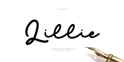 Lillie is an elegant signature font perfect for crafting, branding, invitation, stationery, wedding designs, social media posts, advertisements, product packaging, product designs, label, photography, watermark, special events, or anything. Included : Lillie multilingual support If you have any questions please don’t hesitate to contact me Thank you best regards, Fikryal Studio
 - Finition by Mans Greback,
$59.00 Finition is a calligraphic brush script. Created by Måns Grebäck, this typeface is perfect to create a youthful logo. With its hundreds of glyphs it supports a wide range of languages. Use underscore to make an underline. Example: Fin_ition With ligatures activated, write multiple underscores for a longer line. Example: Aut___omatic
 - Conigen by Yukita Creative,
$14.00 Conigen Modern is a modern typeface that looks both futuristic and contemporary. The lines are sharp and clean with an aerodynamic shape that exudes a modern and technologically advanced feel. Perfect for technology design and branding. There are 12 fonts from Regular to Black and italic fonts are also available
 - Kong Script by Talbot Type,
$19.50 Kong Script is a contemporary, geometric, script typeface, a modern interpretation of a traditional style. The upper and lower case character sets link seamlessly, in the manner of a traditional script, to create an easy, flowing look. It's full of character and works well as a stylish, memorable display font.
 - Quadrus by ITC,
$29.99Quadrus is the work of New York graphic designer Peter Fahrni, a condensed open slab serif typeface. Fahrni was inspired by the lettering styles typical of baseball, basketball and American football sportswear. Quadrus is an all caps alphabet ideal for a variety of applications, particularly for those related to sports. - Angela Cute by Sipanji21,
$16.00 Angela is a Cute and charm script font with a relaxed theme, featuring a lovely style. No matter the topic, but this font is awesome for every kids or child project, this font will be an incredibly asset to your fonts’ library, as it has the potential to elevate any creation.
 - Click Clack by Fonthead Design,
$15.00ClickClack is a family designed by Ethan Dunham that is made of hand-drawn typewriter letters. An actual sample of a typewriter alphabet was blown up and carefully traced into the two versions, regular and light. This family has a bouncy, informal feel and is a departure from other typewriter fonts. - Mister Bones NF by Nick's Fonts,
$10.00Alpha Midnight, reconstructed from an unnamed source by Dick Pape for Solotype, provided the pattern for this big, bold, unconventional stencil face, sure to grab your readers' attention. Both versions include the complete Latin 1252, Central European 1250 and Turkish 1254 character sets, as well as localization for Moldovan and Romanian. - Antibes by Barmoor Foundry,
$15.00 Antibes is a casual italic face with print caps and cursive lowercase letters. Antibes works well with colorful, freeform illustration and travel-related material like illustrated travel brochures and callouts for maps. All-caps paragraphs are an easy read and letter-spaced all-cap treatments can be used for titling.
 - Misologist by Sronstudio,
$23.00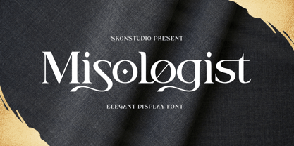 Misologist – Display Font comes with an elegant and modern touch this font is perfect for branding, invitation, stationery, wedding designs, social media posts, advertisements, product packaging, product designs, label, photography, watermark, special events, and more. Features: Uppercase and lowercase letters Lowercase Swashes Alternates Ligatures -Multilingual, numerals, and punctuation Thank You!
 - Halvert by Din Studio,
$22.00 Halvert is an amazing display font. The font is suitable for any project like branding , lettering , tshirt print and many others. Included Files : Halvert Solid (OTF) Halvert Shadow (OTF) Havert Layered (OTF) Features: Accents (Multilingual characters) PUA encoded Numerals and Punctuation (OpenType Standard) Thanks for visiting and purchasing my font!
 - Barbaros by MoodyType,
$49.00 An Art Deco condensed display sans font with 8 styles, +800 glyphs, +100 ligatures, +30 languages and many opentype features. It is perfect for poster designs, magazines, book covers, logotypes, headlines, newspapers and press. It's bold, daring, modern, geometric and covers a good range of weights from light to block.
 - Autopilot by Juncreative,
$19.00 Autopilot is an elegant and flowing handwritten font. It is PUA encoded which means you can access all of the glyphs and swashes with ease! It maintains its classy calligraphic influences while feeling contemporary and fresh. Fall in love with this font and bring your projects to the highest levels!
 - Easter Wishes by Stefani Letter,
$12.00 Easter Wishes is a cute and sweet handwritten font with an incredibly friendly feel. Get inspired by its playful feel! This font is PUA encoded which means you can access all of the cute glyphs with ease! It also features a wealth of special features including alternate glyphs and ligatures.
 - RMU Gong by RMU,
$30.00 Based upon an Arno Drescher design for Schriftguss, RMU Gong was freshly redrawn and redesigned and is intended for being a splendid font for headlines, subtitles, ads, posters etc. It comes with full sets of superior and inferior numbers, and even a long s can be accessed by typing [alt] + b.
 - Hasan Aya by Hiba Studio,
$59.00 Hasan Aya is an Arabic display typeface. It is useful for titles and graphic projects The font is based on the simple lines of Kufi calligraphy. This font was created based on the Latin font "Bedrock" which was designed by Corel Corporation in 1992. It supports Arabic, Persian and Urdu.
 - Kaboom by Picador,
$20.00Kaboom family contains 80 handmade glyphs depicting animals. It consists of two varieties: black as an outline and regular - with details. Inside you'll find monkeys, fish, birds, deer, pandas and other animals from the real world and fairy-tale. Illustrations can decorate invitations, t-shirts, children's texts, books, and posters. - Mister Slasher Halloween by Sipanji21,
$15.00 Hello, this is Mister Slasher, a Unique display font which is prepared to welcome Halloween. Mister Slasher comes with an awesome horror style, make it very perfect to use for quotes, logotypes, badges, labels, packaging, t-shirts, or simply use it in your next design project. Especially in Halloween celebrations.
 - Moon Walk by Mchcrafter,
$15.00 Moon-Walk is an unique and very elegant font for brand and logo design. It is a bold, detailed and assertive sans serif font. This font is imposing and features uniquely shaped alternatives, and as a result, it will easily match a wide range of creations that require a distinct touch.
 - Picaro NF by Nick's Fonts,
$10.00A rather quaint but charming typeface, originally named Harlequin, provide the inspiration for this typeface. Its mild eccentricities will add an inviting warmth to your next project. Both versions of this font contain the Unicode 1252 (Latin) and Unicode 1250 (Central European) character sets, with localization for Romanian and Moldovan. - Only You Sexy Icons by LeType,
$19.90 The Icons developed to the font Only You Sexy make reference to hipsters concept a recurring nostalgia and a recovery of an almost forgotten romanticism. Bring all that romance back. Bring the sensuality in your works and projects. The font has more than 300 icons. Also available Only You Sexy.
 - Santa Gravity by Illushvara,
$14.00 Santa Gravity is a fun display font, featuring an urban style. Fun and casual, this font is ideal for any design you wish to develop for Christmas Season! Features : Uppercase and lowercase Numbers Symbols Multilingual Accent If you have any question, don’t hesitate to contact me. Happy Designing !!! Thank You
 - Folty by Degarism Studio,
$15.00 Folty Typeface is a display based an a geometric sans serif with unique characters and has a sharp vertex. Folty was inspired by Modern graphic design and contemporary typeface. The family contains 6 weights from Thin to Bold good for advertising, packaging, editorial and publishing, logo, branding, music software, etc.