10,000 search results
(0.023 seconds)
- HT Arcadia Grotesk Expanded by Hype Type,
$34.00 The versatile neo-grotesk typefamily, inspired by the swiss academia with a contemporary mood. The shape of the letters are more pliable compered to classic grotesk typefaces. The Expanded series enlarges horizons... and type! -- Taking inspirations from classic grotesk letterforms, both from the European tradition (specifically the Swiss school) and the American tradition, HypeType's Arcadia Grotesk is modernized with its shorter ascenders and descenders to give more compact blocks of text and with more contemporary and dynamic forms. -- hype-type.com // kidstudio.it
 - Bixa by Novo Typo,
$26.00 Bixa is a chromatic typeface designed for display use. Bixa comes in 13 different layers containing 11 weights for beautiful color combinations. Bixa was originally designed for the Typewood project in 2015. Read more about this project here. In 2016 we launched the chromatic web version of Bixa. More information about Bixa Color here. Bixa was awarded by the Type Directors Club New York and the European Design Awards in 2016. Bixa is designed by Novo Typo in 2015. Youtube
 - Alphabet Soup Pro by Red Rooster Collection,
$60.00 Steve Jackaman. In the early 1980's, Steve worked at Typographic House in Boston, Massachusetts. At the time, 'Typo' House, as it was affectionately known, was the largest type house in New England. This font was designed and produced during his tenure. The design was so popular that it became available commercially through VGC, and was known as TH Alphabet Soup. Completely redrawn and remastered, Alphabet Soup Pro contains all the high-end features expected in a quality OpenType Pro font.
 - OC Revolt by OtherwhereCollective,
$99.00 -OC Revolt is a variable display font made for the protest graphics of the NYC based T*#@p Brexit era Non-Complicit project who initially made guerrilla type with masking tape applied directly in situ or to silk screens. An uppercase only font there are alternate versions of each character on the lowercase keyboard. Double letter ligatures are used to prevent direct mechanical repetition of letters in the static styles and the Shift axis can be used to make each letter variably unique.
 - Fandango by Solotype,
$19.95Curlicues galore on this modern version of a mid-victorian display type. We started with the caps from a type called Cellini, altered them considerably, and added a lowercase. - American Advertise 003 by Intellecta Design,
$11.90wood type heritage - Shuttle by Volcano Type,
$19.00Type 3D letterforms. - Odishi - Unknown license

- Just Girl by stiplinestudios,
$15.00 Lovely Present Just Girl ♥ Simple way to access is just type a number (1-10) after the letters (sample in pict no.1) Just Girl ♥ is perfect for wedding stationery, invitations, lovey cards, logos, business cards, branding and other projects that require a touch of love and luxury. This font was created with multilingual support and over 500+ glyph characters, allowing you to create a lovely look to your projects. What you get?? a full packed font which character has build in ligatures encoded. So you don't have to worry about accesing alternative character to use on any design project. Are you happy with this font? So let me know if you have any question at fittingline99.ac@gmail.com Thank you - Stipline Studios
 - Letterhack Serif by Comicraft,
$19.00 IT’S MAILBAG TIME! Dear Jolly JG Roshell and Rascally Richard Starkings, Comicraft Fonts are a thing of Beauty and a Joy Forever! You guys must be a Wild Bunch, and I roar with delight whenever a new comicbookfonts release appears in my emailbox. But I have to level with you daredevils...what about us Letterhacks? We need representation too! We haven’t spent years hammering away on our typewriters to be ignored! BRING BACK THE LETTER HACK! In fearless font form. You know it makes sense! Truly Yours, Forbush, Irving, senior. We give up! We can’t resist your appeals, threats and commands ANY LONGER!!! We may crack under the strain, but this month’s release IS two (count 'em) Letterhacks! That’s right, a pair of fantastic fonts that recreate the look and feel of your Marvelous Letters of the Sixties! It’s a Bullpen Bulletin! It’s an Iconoclastic Item!
 - Shield Classic 2 Letters by MonogramBros,
$12.00 Shield Classic 2 Letters Monogram Font is a perfect shaped monogram font consisting of 52 letters and 1 basic frame. With just a single font file you will be able to create beautiful monograms in just a matter of minutes after the purchase! Shield Classic 2 Letters Monogram Font comes with font file in OTF format.
 - Unconscious by Pavel Boog,
$18.00 When we fall asleep, we become free in our thoughts, in our judgments, in our choice, we decide on bold actions and words. This font will bring all this to life. UNCONSCIOUS-This font is for brave, free and liberated creators. For people with a good sense of humor and able to derive joy even from bad things.
 - Nevolastx by Glukfonts,
$18.00 Unique poster typeface with multilingual, contextual alternates. Perfect for loud message. With over 1000 alternate glyphs, this font has extensive Latin language support for Western, Central, and Eastern European and gives text a unique, elegant and modern feel. Technical info: To be able to use Nevolastx font you need to have installed program with OpenType features (Contextual Alternates) support.
 - Exotique by Akrtype Studio,
$15.00 The Exotique is unique, this display font and is equipped with multilingual to be able to handle most typographic applications ranging from branding to body copying with various weights and inherent readability. will be perfect and look luxurious for many projects such as fashion, magazines, logos, branding, photography, invitations, quotes, blog headings, posters, advertisements, postcards, etc.
 - Thigles by Abbasy Studio,
$15.00 Thigles, is a font inspired by Signs Painting, these pretty hand painted letters that you can see on buildings, billboards and signboards. Thigles font comes with some alternates and ligature as well to create your design more unique. With additional shadow font you will be able to create the beautiful combination and bring retro touch to your artworks!
 - Curious Monkey by Abo Daniel,
$17.00 introducing CURIOUS MONKEY - the quirky line font - This font is great for cutting, printing, logo, quotes, branding, packaging and any more craft project. What's included? Basic characters Numeral & punctuation a lot of Ligatures Multilingual Support PUA encoded This font is user friendly. Very easy to use even you use standard software. Hope you love it. Regards, Abo Daniel Studio
 - Radugo by Twinletter,
$10.00 Radugo is a san serif font family designed with light strokes that make up a vintage style with a rustic touch and a stamp with 2 fonts, as the ribs in your design work, and able to beautify and strengthen your work in the form of logotypes, typography, hand lettering, packaging, t-shirts, labels, and many more.
 - Snowember by Abo Daniel,
$18.00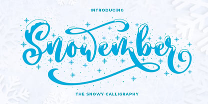 SNOWEMBER is a carefully stunning modern calligraphy with snowy effect. It is great for titling, headline, logo, t-shirt designs, mugs, tote bag designs, cards, banners, social media, and anything of craft projects. Features: - Uppercase - Lowercase - Numeral - Punctuation - Alternates - Multilingual - PUA encoded This font is very worthy to add to your collection regards, Abo Daniel Studio
 - Winter Pen by Abo Daniel,
$13.00 Introducing WINTER PEN - simple signature font - This font is great for branding, logo, signature, packaging, t-shirt design, social media and anything your project that need an elegant taste. It came with two styles : Regular and Italic. Features: Uppercase Lowercase Number & Punctuations Multilingual Support PUA Encoded Hope you love it Grab it fast... regards, Abo Daniel Studio
 - DXOldStandard Condensed No2 by DXTypefoundry,
$25.00 The font DXOldStandard Condensed No2 was revival on the basis of the Antiqua Condensed type, which was issued by type foundry of Russian from the beginning of the 20th century.
 - Echelon by Barnbrook Fonts,
$50.00 Echelon is based upon 1970s Eastern European ‘pipe-style’ typefaces. This style of Communist consumer typography came from what, at the time, seemed like a bizarre mirror universe: Existing alongside the West, similar-but-different, essentially unknowable. Even though the letterforms had the same historical origins as their Western equivalents, they also had their own bizarre fashionable/unfashionable aesthetic. The parallels between the surveillance practices of the Soviet Union and those of today’s Western governments informed the naming of this typeface. Echelon is the codename for a massive international surveillance system that collects and processes data from communications satellites. It can eavesdrop on telecoms and computer systems, it can track bank accounts. It can record and store information on millions of individuals.
 - VLNL Agitka by VetteLetters,
$30.00 As a font designer for films Henning Brehm delivers fonts with a whip-sharp eye for precision. His latest Vette Letters release, VLNL Agitka is a Cyrillic-inspired (and including) alphabet with both feet rooted in Soviet Union-era propaganda posters. Its design is constructivist (look Mom, no curves!) geometric and strong. Like Russian vodka. Aside from the Regular, Light, Bold and Black weights, Agitka comes in four Neon styles as well. For a dazzling design effect, layer those neons over a regular weight for a star struck embossed-letter effect. We would also like to point out the usage of VLNL Agitka in the Bourne Ultimatum movie, for which Brehm designed neon signage for a scene at a Russian supermarket. За здоровье – Za Zdarovje!
 - HT Neon by Dharma Type,
$19.99 HT Neon shines as if to invite us.This rounded and monoline font is very striking. But it is readable because the characters are arranged naturally when they are typed. HT Neon is great to use on your design projects such as Shop Sign,Packaging, Logotype and more.When you type the character “µ”, it becomes a electrical cord! Holiday Type Project offers retro hand drawing scripts. Inspired by retro script on shopfront lettering, wall paint advertisements in Italy around 1950s. Check out the script fonts from Holiday Type!
 - Minimela Tm by Mustafa Demirel,
$30.00 "It is hard to believe, but they won't be able to give up on us" The story of this font has started with a little suitcase actually. These characters were trying to do something for minimela kitchen which it named.After that, they looked that they was wanting to be that font beautiful writings written with it, belonging to it, special to it and reminding it to everybody. These cute monsters that have shaped themselves were a piece of a whole, of a little whole. They were totally believing to beautiful and long ways that have being waited them. They have given a sincere promise they will continue with little steps on that ways. "It is hard to believe, but they won't be able to give up on us" while telling this, we were totally talking about that
 - Baluno by Luxfont,
$22.00 Introducing is a fun and playful pouty Baluno font. Font has embodied the graphic trend of cartoon flat illustrations and will successfully complement modern designs. The font has 2 types of faces, which can be used both independently and together by alternating letters in one word to avoid repeating letters, creating a unique heading. Family is ideal for children's themes, because the font resembles inflated balloons. Creates a relaxed mood and has fun. Set comes in many different carefully selected colors and gradient color options. Check the quality before purchasing and try the FREE DEMO version of the font to make sure your software supports color fonts. P.s. Have suggestions for color combinations? Write me an email with the subject "Baluno Color" on: ld.luxfont@gmail.com Features: Free Demo font to check it works. 2 types of faces. Lots of ready-made matched colors. Gradient color variants. Kerning. IMPORTANT: - Multicolor OTF version of this font will show up only in apps that are compatible with color fonts, like Adobe Photoshop CC 2017.0.1 and above, Illustrator CC 2018. Learn more about color fonts & their support in third-party apps on www.colorfonts.wtf -Don't worry about what you can't see the preview of the font in the tab "Individual Styles" - all fonts are working and have passed technical inspection, but not displayed, they just because the website MyFonts is not yet able to show a preview of colored fonts. Then if you have software with support colored fonts - you can be sure that after installing fonts into the system you will be able to use them like every other classic font. Question/answer: How to install a font? The procedure for installing the font in the system has not changed. Install the font as you would install the other fonts. How can I change the font color to my color? · Adobe Illustrator: Convert text to outline and easily change color to your taste as if you were repainting a simple vector shape. · Adobe Photoshop: You can easily repaint text layer with Layer effects and color overlay. ld.luxfont@gmail.com
 - HWT Brylski by Hamilton Wood Type Collection,
$24.95 HWT Brylski is a typeface by Nick Sherman, named for retired wood type cutter Norb Brylski and designed to be cut as wood type at the Hamilton Wood Type & Printing Museum. This font is the digital counterpart to the wood type made as part of the Hamilton Legacy Project . It incorporates several themes that were common in 19th-century type design, including split tuscan serifs with angled mansard-style sides, heavy weight placement at the top and bottom of letters (traditionally referred to as French or Italian/Italienne, regardless of any actual relation to those countries), and an extended overall width. This digital version contains over 400 glyphs for full European language coverage.
 - Monkey Was Here by Intellecta Design,
$22.90 A collection of fonts by the type foundry Intellecta Design. Distressed and antique, use these fonts in display purposes for a stylized type design. Contains a limited amount of letter designs.
 - Cherrywood JNL by Jeff Levine,
$29.00 Based on the classic “Columbian” from the William H. Page Wood Type Company (circa 1870), Cherrywood JNL is a bold slab serif type design available in both regular and oblique versions.
 - Gothic Extended by Wooden Type Fonts,
$15.00Based on a revival of one of the popular wooden type fonts of the 19th century, suitable for display, lower case missing but not always designed for this type of face. - Monkey Messed Gutenberg Caps by Intellecta Design,
$22.90 A collection of fonts by the type foundry Intellecta Design. Distressed and antique, use these fonts in display purposes for a stylized type design. Contains a limited amount of letter designs.
 - Monkey In The Middle Ages by Intellecta Design,
$24.90 A collection of fonts by the type foundry Intellecta Design. Distressed and antique, use these fonts in display purposes for a stylized type design. Contains a limited amount of letter designs.
 - !Disc Inferno® BASIC - Unknown license

- !MISQOT - 100% free

- HWT Roman Extended Fatface by Hamilton Wood Type Collection,
$24.95 The design of the first "Fat Face" is credited to Robert Thorne just after 1800 in England. It is considered to be the first type style designed specifically for display or jobbing, rather than for book work. The first instance of Fat Face in wood type is found in the first wood type specimen book ever produced: Darius Wells, Letter Cutter 1828. This style was produced by all early wood type manufacturers. The style is derived from the high contrast, thick and thin Modern style of Bodoni and Didot developed only decades previously. The extended variation makes the face even more of a display type and not at all suitable for text. This type of display type was used to compete with the new Lithographic process which allowed for the development of the poster as an artform unto itself. This new digitization by Jim Lyles most closely follows the Wm Page cut. The crisp outlines hold up at the largest point sizes you can imagine. This font contains a full CE character set.
 - Madromit by Dharma Type,
$14.99 Madromit(ma-do-ro-mi) is a somewhat nostalgic display font. Do you remember computer advertisements in the 80s and 90s? Yes, it is the most excited period in the history of computer. We call the design in this period Primitive Digital Design. Madromit is, so to speak, the revival or reconstruction of the primitive digital type in the period. The structure and elements of this font are very simple and the key features are geometric shape and simple griddy design with rounded corners, oval bowls, and right‐angled joints which we used to see in the primitive period. In addition to this, Madromit has one more characteristic feature — classic engraving font —. It is called Open Style. Open style is one of the classic method to decorate and emphasize the font. Our aim is the synergy by the mixture of primitive digital design and classic engraving method. This mixture makes new impression we have never seen before. Madromit family consists of 5 styles for stacking color font. Please use Photoshop or Illustrator, or your favorite graphic design apps that can handle layers. Layers are the printing plates of wood type. You should be able to change text color for each layers. Madromit "Standard" style is the base of this font family. You can add open effect by stacking "Fill" layers over the Standard layer. Instruction 1. Type your text as you like. 2. Set font-name "Madromit" and font-style "Standard". 3. Set color of "Standard" layer. 4. Duplicate the "Standard" layer to make "Fill" layer. 5. Set font-style "Half Fill" or "Full Fill" and new color of upper layer. Madromit Standard, Half Open, and Full Open style can be used solely.
 - Moyenage by Storm Type Foundry,
$55.00Blackletter typefaces follow certain fixed rules, both in respect to their forms and to the orthography. Possibly, they were a reaction to the half-developed Carolingian minuscule which was soon to end in the Latin script. Narrow, ordered script was to replace the round, hesitant and shattered shapes of letters in order to simplify writing, to unify the meaning of individual letters, and to save some parchment, too. Opposed to the practice common in monasterial scriptoriums where Uncial, Irish and Carolingian inspiration flew freely and as a result, the styles of writing differed in each monastery, the blackletter type was to define one, common standard. It was to express spiritual verticality, in perfect tune with the architecture of the Gothic era. Typography became an integral part of the overall style of the period. The pointed arch and the blackletter type were the vanguard of the spectacular transformation from the Middle Ages towards the modern era, they were a celebration of a time when works of art were not signed by their makers yet. Some unfortunate souls keep linking blackletter solely with Germany and the Third Reich, while the truth is that its direct predecessor, the Gothic minuscule, evolved mostly in France. Even Hitler himself indicated blackletter type obsolete in the age of steel, iron and concrete – thus making a significant contribution to the spreading of the Latin script in Germany. Once we leave our prejudice aside, we find that the shapes of blackletter type have exceptional potential, unheard of in sans-serif letterforms. The lower case letters fit into an imaginary rectangle which is easily extended both upwards and sideways. In its scope and in the name itself, the Moyenage type family project is to celebrate the diversity of the Middle Ages. I begun realizing the urge to design my own blackletter when visiting the beer gardens of Munich and while walking through the villages of rural Austria. The letters from the notice boards of inns are scented with spring air, with the flowers of cudweed, with white sausage and weissbier. The crooked calligraphic hooks and beaks seem to imitate the hearty yodeling of local drinkers and the rustle of the giant skirts of girls who distribute the giant wreaths of beer jugs. Moyenage is, however, a modern replica of blackletter, so it contains some otherwise unacceptable Latin script elements in upper case. I chose these keeping the modern reader in mind, striving for better legibility. The font is drawn as if written with a flat pen or brush, and with the ambition to, perhaps, serve as a calligraphic model. In medium width, the face is surprisingly well legible; it is perfect for menus as well as posters and CD covers for some of the heavier kinds of music. It has five types of numerals and also a set of Cyrillic script, symbolising the lovelorn union of Germans and Russians in the 20th century. Thus, it is well suited for the setting of bilingual texts of the German classic literature, which, according to the ancient rules, must not be set in Latin script. - Private Eye JNL by Jeff Levine,
$29.00 From 1958 to 1964, one of ABC-TV’s popular shows was the detective series “77 Sunset Strip”. Based in Los Angeles, the fictional detective agency was located next door to Dino’s Lodge, (partly owned by Dean Martin and actually located at 8532 Sunset). It was originally known as the Alpine Lodge. The adjacent building where Stuart Bailey and Jeff Spencer’s private detective service was located in fact housed a popular modeling agency. The ‘77’ address did not exist outside of the realm of the series. However, a wonderful sign with Art Deco-influenced lettering graced the set (on the wall of the office foyer) saying “Bailey & Spencer Private Investigators Suites 101-102”. A screen capture of this sign served as the working model for Private Eye JNL, which is available in both regular and oblique versions.
 - Deco Geometric Stencil JNL by Jeff Levine,
$29.00 Deco Geometric Stencil JNL was inspired by an example of a vintage Art Deco stencil type design seen in the Steven Heller-Louise Fili book "Stencil Type" (published by Thames and Hudson).
 - DIVERSITY Font by TypoGraphicDesign,
$9.00 The typeface DIVERSiTY Font is designed from 2022 for the font foundry Typo Graphic Design by Manuel Viergutz as a political statement #diversity #♥︎ 1 font-styles (Mix) with 245 glyphs incl. decorative extras like icons, arrows, dingbats, emojis, symbols, geometric shapes (type the word #LOVE for ♥︎ or #SMILE for ☺ as OpenType-Feature dlig) and stylistic alternates (3 stylistic sets). For use in logos, magazines, posters, advertisement plus as webfont for decorative headlines. The font works best for display size. Have fun with this font & use the DEMO-FONT (with reduced glyph-set) FOR FREE! Font Specifications ■ Font Name: DIVERSiTY Font ■ Font Styles: 1 (Mix) + DEMO (with reduced glyph-set) ■ Font Category: Display for headline size ■ Glyph Set: 245 glyphs incl. extras like icons (decorative extras like dingbats, emojis, symbols) ■ Design Date: 2022 ■ Type Designer: Manuel Viergutz
 - GDR Traffic Symbols by TypoGraphicDesign,
$9.00 The typeface GDR Traffic Symbols is designed from 2021 for the font foundry Typo Graphic Design by Manuel Viergutz. The rough dingbat display typeface is inspired by the past and the future. 306 glyphs / decorative extras like icons, arrows, dingbats, emojis, symbols, geometric shapes, catchwords, decorative ligatures (type the word #LOVE for ❤ or #SMILE for ☺ as OpenType-Feature dlig) and stylistic alternates (5 stylistic sets). For use in logos, magazines, posters, advertisement plus as webfont for decorative headlines. The font works best for display size. Have fun with this font & use the DEMO-FONT (with reduced glyph-set) ■ Font Name: GDR Traffic Smybols ■ Font Styles: 1 Icons + DEMO (with reduced glyph-set) ■ Font Category: Display for headline size ■ Glyph Set: 306 glyphs / decorative extras like arrows, dingbats, emojis, symbols ■ Design Date: 2021 ■ Type Designer: Manuel Viergutz


