10,000 search results
(0.032 seconds)
- Nevolastx by Glukfonts,
$18.00 Unique poster typeface with multilingual, contextual alternates. Perfect for loud message. With over 1000 alternate glyphs, this font has extensive Latin language support for Western, Central, and Eastern European and gives text a unique, elegant and modern feel. Technical info: To be able to use Nevolastx font you need to have installed program with OpenType features (Contextual Alternates) support.
 - Exotique by Akrtype Studio,
$15.00 The Exotique is unique, this display font and is equipped with multilingual to be able to handle most typographic applications ranging from branding to body copying with various weights and inherent readability. will be perfect and look luxurious for many projects such as fashion, magazines, logos, branding, photography, invitations, quotes, blog headings, posters, advertisements, postcards, etc.
 - Thigles by Abbasy Studio,
$15.00 Thigles, is a font inspired by Signs Painting, these pretty hand painted letters that you can see on buildings, billboards and signboards. Thigles font comes with some alternates and ligature as well to create your design more unique. With additional shadow font you will be able to create the beautiful combination and bring retro touch to your artworks!
 - Curious Monkey by Abo Daniel,
$17.00 introducing CURIOUS MONKEY - the quirky line font - This font is great for cutting, printing, logo, quotes, branding, packaging and any more craft project. What's included? Basic characters Numeral & punctuation a lot of Ligatures Multilingual Support PUA encoded This font is user friendly. Very easy to use even you use standard software. Hope you love it. Regards, Abo Daniel Studio
 - Radugo by Twinletter,
$10.00 Radugo is a san serif font family designed with light strokes that make up a vintage style with a rustic touch and a stamp with 2 fonts, as the ribs in your design work, and able to beautify and strengthen your work in the form of logotypes, typography, hand lettering, packaging, t-shirts, labels, and many more.
 - Snowember by Abo Daniel,
$18.00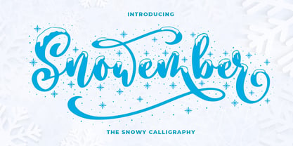 SNOWEMBER is a carefully stunning modern calligraphy with snowy effect. It is great for titling, headline, logo, t-shirt designs, mugs, tote bag designs, cards, banners, social media, and anything of craft projects. Features: - Uppercase - Lowercase - Numeral - Punctuation - Alternates - Multilingual - PUA encoded This font is very worthy to add to your collection regards, Abo Daniel Studio
 - Winter Pen by Abo Daniel,
$13.00 Introducing WINTER PEN - simple signature font - This font is great for branding, logo, signature, packaging, t-shirt design, social media and anything your project that need an elegant taste. It came with two styles : Regular and Italic. Features: Uppercase Lowercase Number & Punctuations Multilingual Support PUA Encoded Hope you love it Grab it fast... regards, Abo Daniel Studio
 - HT Neon by Dharma Type,
$19.99 HT Neon shines as if to invite us.This rounded and monoline font is very striking. But it is readable because the characters are arranged naturally when they are typed. HT Neon is great to use on your design projects such as Shop Sign,Packaging, Logotype and more.When you type the character “µ”, it becomes a electrical cord! Holiday Type Project offers retro hand drawing scripts. Inspired by retro script on shopfront lettering, wall paint advertisements in Italy around 1950s. Check out the script fonts from Holiday Type!
 - Echelon by Barnbrook Fonts,
$50.00 Echelon is based upon 1970s Eastern European ‘pipe-style’ typefaces. This style of Communist consumer typography came from what, at the time, seemed like a bizarre mirror universe: Existing alongside the West, similar-but-different, essentially unknowable. Even though the letterforms had the same historical origins as their Western equivalents, they also had their own bizarre fashionable/unfashionable aesthetic. The parallels between the surveillance practices of the Soviet Union and those of today’s Western governments informed the naming of this typeface. Echelon is the codename for a massive international surveillance system that collects and processes data from communications satellites. It can eavesdrop on telecoms and computer systems, it can track bank accounts. It can record and store information on millions of individuals.
 - VLNL Agitka by VetteLetters,
$30.00 As a font designer for films Henning Brehm delivers fonts with a whip-sharp eye for precision. His latest Vette Letters release, VLNL Agitka is a Cyrillic-inspired (and including) alphabet with both feet rooted in Soviet Union-era propaganda posters. Its design is constructivist (look Mom, no curves!) geometric and strong. Like Russian vodka. Aside from the Regular, Light, Bold and Black weights, Agitka comes in four Neon styles as well. For a dazzling design effect, layer those neons over a regular weight for a star struck embossed-letter effect. We would also like to point out the usage of VLNL Agitka in the Bourne Ultimatum movie, for which Brehm designed neon signage for a scene at a Russian supermarket. За здоровье – Za Zdarovje!
 - Caslon Antique by GroupType,
$19.00 Caslon Antique is a decorative American typeface that was designed in 1894 by Berne Nadall. It was originally called "Fifteenth Century", but was renamed "Caslon Antique" by Nadall's foundry, Barnhart Bros. & Spindler, in the mid-1920s. The design of the typeface is meant to evoke the Colonial era. Early printers would reuse metal type over and over again, and the faces would become chipped and damaged from use. Caslon Antique emulates this look. Despite the name, it is not a member of the Caslon family of typefaces. The renaming is believed to have been a marketing maneuver to boost the popularity of a previously unpopular typeface by associating it with the highly popular Caslon types. Caslon Antique is popular today when a "old-fashioned" or "gothic" look is desired. It is used by the musical group The Sisters of Mercy on their albums, for the logo of the musical Les Misérables, and for the covers of the books in A Series of Unfortunate Events. It is also frequently used on historical displays. It was used for the previous edition of the Warhammer Fantasy Role-Play. Most recently, it has been used on promotional material for the smash musical Monty Python's Spamalot on Broadway, the West End, and its tour of the United States. British 80's band The The also used the font in several of their music videos, usually displaying several lyrics from the song in the opening scenes. It used on the cover of Regina Spektor's album, Begin to Hope. This description was sourced (in part) from Wikipedia, the free encyclopedia.
 - HWT Brylski by Hamilton Wood Type Collection,
$24.95 HWT Brylski is a typeface by Nick Sherman, named for retired wood type cutter Norb Brylski and designed to be cut as wood type at the Hamilton Wood Type & Printing Museum. This font is the digital counterpart to the wood type made as part of the Hamilton Legacy Project . It incorporates several themes that were common in 19th-century type design, including split tuscan serifs with angled mansard-style sides, heavy weight placement at the top and bottom of letters (traditionally referred to as French or Italian/Italienne, regardless of any actual relation to those countries), and an extended overall width. This digital version contains over 400 glyphs for full European language coverage.
 - Monkey Was Here by Intellecta Design,
$22.90 A collection of fonts by the type foundry Intellecta Design. Distressed and antique, use these fonts in display purposes for a stylized type design. Contains a limited amount of letter designs.
 - Cherrywood JNL by Jeff Levine,
$29.00 Based on the classic “Columbian” from the William H. Page Wood Type Company (circa 1870), Cherrywood JNL is a bold slab serif type design available in both regular and oblique versions.
 - Gothic Extended by Wooden Type Fonts,
$15.00Based on a revival of one of the popular wooden type fonts of the 19th century, suitable for display, lower case missing but not always designed for this type of face. - Monkey Messed Gutenberg Caps by Intellecta Design,
$22.90 A collection of fonts by the type foundry Intellecta Design. Distressed and antique, use these fonts in display purposes for a stylized type design. Contains a limited amount of letter designs.
 - Monkey In The Middle Ages by Intellecta Design,
$24.90 A collection of fonts by the type foundry Intellecta Design. Distressed and antique, use these fonts in display purposes for a stylized type design. Contains a limited amount of letter designs.
 - Minimela Tm by Mustafa Demirel,
$30.00 "It is hard to believe, but they won't be able to give up on us" The story of this font has started with a little suitcase actually. These characters were trying to do something for minimela kitchen which it named.After that, they looked that they was wanting to be that font beautiful writings written with it, belonging to it, special to it and reminding it to everybody. These cute monsters that have shaped themselves were a piece of a whole, of a little whole. They were totally believing to beautiful and long ways that have being waited them. They have given a sincere promise they will continue with little steps on that ways. "It is hard to believe, but they won't be able to give up on us" while telling this, we were totally talking about that
 - !Disc Inferno® BASIC - Unknown license

- Baluno by Luxfont,
$22.00 Introducing is a fun and playful pouty Baluno font. Font has embodied the graphic trend of cartoon flat illustrations and will successfully complement modern designs. The font has 2 types of faces, which can be used both independently and together by alternating letters in one word to avoid repeating letters, creating a unique heading. Family is ideal for children's themes, because the font resembles inflated balloons. Creates a relaxed mood and has fun. Set comes in many different carefully selected colors and gradient color options. Check the quality before purchasing and try the FREE DEMO version of the font to make sure your software supports color fonts. P.s. Have suggestions for color combinations? Write me an email with the subject "Baluno Color" on: ld.luxfont@gmail.com Features: Free Demo font to check it works. 2 types of faces. Lots of ready-made matched colors. Gradient color variants. Kerning. IMPORTANT: - Multicolor OTF version of this font will show up only in apps that are compatible with color fonts, like Adobe Photoshop CC 2017.0.1 and above, Illustrator CC 2018. Learn more about color fonts & their support in third-party apps on www.colorfonts.wtf -Don't worry about what you can't see the preview of the font in the tab "Individual Styles" - all fonts are working and have passed technical inspection, but not displayed, they just because the website MyFonts is not yet able to show a preview of colored fonts. Then if you have software with support colored fonts - you can be sure that after installing fonts into the system you will be able to use them like every other classic font. Question/answer: How to install a font? The procedure for installing the font in the system has not changed. Install the font as you would install the other fonts. How can I change the font color to my color? · Adobe Illustrator: Convert text to outline and easily change color to your taste as if you were repainting a simple vector shape. · Adobe Photoshop: You can easily repaint text layer with Layer effects and color overlay. ld.luxfont@gmail.com
 - !MISQOT - 100% free

- HWT Roman Extended Fatface by Hamilton Wood Type Collection,
$24.95 The design of the first "Fat Face" is credited to Robert Thorne just after 1800 in England. It is considered to be the first type style designed specifically for display or jobbing, rather than for book work. The first instance of Fat Face in wood type is found in the first wood type specimen book ever produced: Darius Wells, Letter Cutter 1828. This style was produced by all early wood type manufacturers. The style is derived from the high contrast, thick and thin Modern style of Bodoni and Didot developed only decades previously. The extended variation makes the face even more of a display type and not at all suitable for text. This type of display type was used to compete with the new Lithographic process which allowed for the development of the poster as an artform unto itself. This new digitization by Jim Lyles most closely follows the Wm Page cut. The crisp outlines hold up at the largest point sizes you can imagine. This font contains a full CE character set.
 - Deco Geometric Stencil JNL by Jeff Levine,
$29.00 Deco Geometric Stencil JNL was inspired by an example of a vintage Art Deco stencil type design seen in the Steven Heller-Louise Fili book "Stencil Type" (published by Thames and Hudson).
 - Lemonado by Melvastype,
$29.00 Lemonado is a type family drawn with a dry brush pen. It includes upright and italic scripts and all caps fonts with brush texture or with smooth edges. Lemonado Script is playful and slightly bouncing connecting script. It includes two sets of lower cases to increase the hand writing effect. By enabling Contextual Alternates from OpenType panel you can cycle these two sets and achieve variation. Lemonado Script also includes set of lowercases without connecting stroke, you can use those in the middle of words or automatically add them at the end of words by enabling Stylistic Set 1 at the OpenType panel. There are also set of lower cases with end swashes, you can automatically add these swashes to end of words by enabling Stylistic Set 2 at the OpenType panel. Also other alternate characters and underlines are included to give you even more possibilities to play with. Lemonado Caps has two sets of upper case letters, high and low ones. You can achieve this fun looking bouncing effect by varying them. Just enable Contextual Alternates from OpenType panel and those two sets will cycle.
 - Malutzki Initials by Spirit & Bones,
$15.00 In 1980, Peter Malutzki, Heidi Hübner-Prochotta and Manfred Prochotta founded the FlugBlatt-Presse and began producing broadsheets, which they called FlugBlätter and which also gave their press its name. They were mostly woodcuts or linocuts, combined with hand-set typography. When they finished the series in 1984 there were 67 FlugBlätter. During a Frankfurt Book Fair in the 1980s the collector Rob Saunders acquired FlugBlatt No. 37 along with other prints. Later they became part Letterform Archive, a non-profit museum and special collection library in San Francisco, which Rob Saunders founded in 2014. In 2021, Letterform Archive posted the FlugBlatt No. 37 on social media, where type designer Lena Schmidt saw it, immediately fell in love with it, and developed the plan to bring it into the digital world. After contacting Peter Malutzki – who is still working as a book artist today – and in close consultation with him, Schmidt translated the letterforms into a font series, Malutzki Initials. The three fonts can be used for black (single-color) text using the Regular style, or for multicolor text by applying different colors to the Letter Layer and Figure Layer styles.
 - FHA Condensed French by Fontry West,
$25.00 FHA Condensed French One could speculate that FHA Condensed French probably started life as wood type for displays, headlines and posters. The exaggerated sharp serifs and condensed forms were not uncommon for that period. At some point, sign painters picked up Condensed French added their own character. At the end of the nineteenth century, Frank H. Atkinson included Condensed French in his samples of lettering for his book, ”Sign Painting, A Complete Manual.” This book became one of the definitive guides for signwriting and hand lettering. In 1999, Mike Adkins digitized Condensed to add to our Atkinson collection. For its re-release, Condensed French has been updated with more language support, ligatures, and OpenType alternates. It has true vintage character but still plays well in more modern designs. A font for all seasons, the condensed forms and sharp serifs fit in every layout from wildwest days posters and creepy film credits to Christmas ads and Mother’s Day cards. While I can’t really see FHA Condensed French as the font for phone aps or video game text, it will provide impact to logos, branding, and product labeling.
 - Guillotine by Canada Type,
$24.95 Guillotine is inspired by an uncredited early 1970s film face called Rhythm Bold. While the original film type had plenty of round forms that were uneven and somewhat badly drawn to fit within the overwhelming pop wave of the time, this digital incarnation disposes of all curves, relies on a much sharper grid, and adheres to specific parameters of stroke widths and angles. Guillotine is a thick poster classic, mechanically constructed yet clearly exhibiting the idiosyncratic traits of hand drawing. Its forms embody the amalgamation of a multitude of influences, such as woodcut letters, punch card forms, and the unique art nouveau concepts that were popular in the 1960s and 1970s. The totality of the font is a strong display aesthetic that plays very well anywhere the eye is meant to see a strong but casual, sharp but hand crafted message. This font comes in all popular formats for all common platforms, and includes expanded language support to cover Western, Eastern and Central European Latin languages, as well as Baltic, Celtic/Welsh, Esperanto, Maltese, and Turkish. A few alternate characters are sprinkled throughout the character map.
 - Weg by Huerta Tipográfica,
$18.00 WEG* font is an experimental type system where legibility isn’t the focus. This project studies how glyphs are constructed and how their ductus can be modified. I explored how far I can move the limits if I don’t worry about the legibility. In Weg, letters are built by a single line that connects them, along with words and paragraphs. When weight decreases, the legibility of the signs increases. This is the first stage. It’s a project in expansion. The set contains uppercase, lining figures and basic punctuation in three weights: Regular, Light and Thin. The current supported languages are Spanish, Guaraní and English. If you need any other language, please let me know. I would like to expand the character set. Second stage project WEG is an experimental in-expansion font family. Here I present to you the second stage. I’m planning the first upgrade for middle 2021. I’m preparing a pattern set for July 2021. Here you can see the first four patterns. If you buy the font before July 2021, you’ll get this upgrade! • Second stage April - July 2021: pattern set (first four ready). • This upgrade will be available on August 2021.
 - Edita by TypeTogether,
$49.00 Edita is a gentle typeface, humanistic in concept yet with a contemporary feel, where softness and fluidity play a very important role. This can be seen especially in its italics, which are loosely based on handwriting. This book typeface family is intended to be used in books where text is set together with photographs and other graphic elements. However, Edita is a general book typeface, versatile enough to be used in many other contexts, from novels to promotion material. Edita’s large character set, covering most languages which use Latin script, and styles give the designer the possibility to work with a big typographic palette, allowing complex typesetting with several levels of information. This is further enhanced by the two optically corrected weights Edita Small and Small Italic. They have been particularly designed for their use in very small type sizes, such as in captions and notes. They differ in having a slightly bigger x-height, heavier stems, reduced contrast, and carefully drawn ink-traps to ensure legibility at sizes as small as 5 pt. Additionally, their extenders are shorter to save space which allows text to be set with tighter leading.
 - Primot by Plau,
$49.00 Primot is an upright script heavily influenced by italian gelaterias . After releasing 3 sans serifs , we were looking for an opportunity to design a display type with less constraints for legibility and expression. We started playing with brush lettering and looking into vintage scripts from different eras. Some cool things that made it into Primot were some unusual vertical connections and the sweet brush flairs in the letter endings. From that point on, we set out to create a beautiful looking vertical script – something we don’t see that often – in which each word set could would make a nice piece of graphic design (think logos, video game titles, shop windows etc.). We also made it smart by including hand-lettering inspired features such as initial and final forms for letters, contextual alternates and swashes. The result is a versatile 900+ glyphs display typeface, suitable for a wide range of applications. We hope you have as much fun with it as we had designing it! And while we’re here, you may like that it also pairs beautifully with our sturdy sans-serif family Motiva Sans .
 - Moyenage by Storm Type Foundry,
$55.00Blackletter typefaces follow certain fixed rules, both in respect to their forms and to the orthography. Possibly, they were a reaction to the half-developed Carolingian minuscule which was soon to end in the Latin script. Narrow, ordered script was to replace the round, hesitant and shattered shapes of letters in order to simplify writing, to unify the meaning of individual letters, and to save some parchment, too. Opposed to the practice common in monasterial scriptoriums where Uncial, Irish and Carolingian inspiration flew freely and as a result, the styles of writing differed in each monastery, the blackletter type was to define one, common standard. It was to express spiritual verticality, in perfect tune with the architecture of the Gothic era. Typography became an integral part of the overall style of the period. The pointed arch and the blackletter type were the vanguard of the spectacular transformation from the Middle Ages towards the modern era, they were a celebration of a time when works of art were not signed by their makers yet. Some unfortunate souls keep linking blackletter solely with Germany and the Third Reich, while the truth is that its direct predecessor, the Gothic minuscule, evolved mostly in France. Even Hitler himself indicated blackletter type obsolete in the age of steel, iron and concrete – thus making a significant contribution to the spreading of the Latin script in Germany. Once we leave our prejudice aside, we find that the shapes of blackletter type have exceptional potential, unheard of in sans-serif letterforms. The lower case letters fit into an imaginary rectangle which is easily extended both upwards and sideways. In its scope and in the name itself, the Moyenage type family project is to celebrate the diversity of the Middle Ages. I begun realizing the urge to design my own blackletter when visiting the beer gardens of Munich and while walking through the villages of rural Austria. The letters from the notice boards of inns are scented with spring air, with the flowers of cudweed, with white sausage and weissbier. The crooked calligraphic hooks and beaks seem to imitate the hearty yodeling of local drinkers and the rustle of the giant skirts of girls who distribute the giant wreaths of beer jugs. Moyenage is, however, a modern replica of blackletter, so it contains some otherwise unacceptable Latin script elements in upper case. I chose these keeping the modern reader in mind, striving for better legibility. The font is drawn as if written with a flat pen or brush, and with the ambition to, perhaps, serve as a calligraphic model. In medium width, the face is surprisingly well legible; it is perfect for menus as well as posters and CD covers for some of the heavier kinds of music. It has five types of numerals and also a set of Cyrillic script, symbolising the lovelorn union of Germans and Russians in the 20th century. Thus, it is well suited for the setting of bilingual texts of the German classic literature, which, according to the ancient rules, must not be set in Latin script. - Madromit by Dharma Type,
$14.99 Madromit(ma-do-ro-mi) is a somewhat nostalgic display font. Do you remember computer advertisements in the 80s and 90s? Yes, it is the most excited period in the history of computer. We call the design in this period Primitive Digital Design. Madromit is, so to speak, the revival or reconstruction of the primitive digital type in the period. The structure and elements of this font are very simple and the key features are geometric shape and simple griddy design with rounded corners, oval bowls, and right‐angled joints which we used to see in the primitive period. In addition to this, Madromit has one more characteristic feature — classic engraving font —. It is called Open Style. Open style is one of the classic method to decorate and emphasize the font. Our aim is the synergy by the mixture of primitive digital design and classic engraving method. This mixture makes new impression we have never seen before. Madromit family consists of 5 styles for stacking color font. Please use Photoshop or Illustrator, or your favorite graphic design apps that can handle layers. Layers are the printing plates of wood type. You should be able to change text color for each layers. Madromit "Standard" style is the base of this font family. You can add open effect by stacking "Fill" layers over the Standard layer. Instruction 1. Type your text as you like. 2. Set font-name "Madromit" and font-style "Standard". 3. Set color of "Standard" layer. 4. Duplicate the "Standard" layer to make "Fill" layer. 5. Set font-style "Half Fill" or "Full Fill" and new color of upper layer. Madromit Standard, Half Open, and Full Open style can be used solely.
 - Linotype BlackWhite by Linotype,
$29.99BlackWhite is a titling typeface created by Ferdinay Duman in 1989 styled after the designs of the late 1980s. Like the name says, the figures emphasizes the play between dark and light. To this end, most inner spaces have been deleted. The constructed outlines of the robust figures draw the attention. In some weights, Duman split the figures horizontally, giving them a unique look. The technical and mechanical BlackWhite is perfect for generous headlines on fliers or in trendy magazines. - Pina Colada by Larin Type Co,
$12.00 Pina Colada this beautiful handwritten font duo is a smooth script and playing sans, they perfectly combine and complement each other, they will bring their unique style to any design project and make it unique. It is as sweet as Pina Colada, fall in Love with its incredibly versatile and simple style and use it to create gorgeous wedding invitations, beautiful stationery, greeting cards, attractive social media messages and more! This font is easy to use, has OpenType features, and supports PUA encoding.
 - Lina Serif by Caroline Herr,
$18.00 Lina Serif is an antiqua balanced between classic and modern. The design focused on the combination of flowing shapes and partially edged transitions, that give Lina her character. The font plays with a high line contrast in combination with dynamic shapes. This makes Lina a casually elegant display font. The terminals remind on floral shapes. Lina gives your design a human, natural touch. Lina Serif is available in 4 weights or as variable font with infinitely variable interpolation of weight.
 - Tecna Dark Down Triangle BNF by Descarflex,
$30.00 The Tecn@ Dark&Light Triangle Background Nomenclature Font family is differentiated by the direction of the triangle tip in the 4 cardinal points. The family were designed to head, enumerate, indicate or highlight writings or design plans, for this reason, the characters are available only in capital letters and some signs or symbols that can serve such purposes. A triangle or empty character is included so that the user can use it overlaying any character of his choice or to be used alone.
 - Kahlo Rounded by Latinotype,
$25.00 Kahlo Rounded is a new version that plays hipster style with a Latin flavor. It was inspired by the strong influence of Mexican decorative elements as you can see in the set of ornaments and patterns. Kahlo Rounded has four weights and italics, initial capital letters, some alternate characters and ending. It works well for magazine headlines, posters, logos, cosmetics packaging, advertising etc. Salud! Languages include: Basic Latin, Western European, Euro, Catalan, Baltic, Turkish, Central European, Romanian and Pan Africa Latin.
 - HMS Gilbert by Fenotype,
$35.00 HMS Gilbert is a hand drawn collection of fonts designed to play perfectly together. HMS Gilbert contains seven different fonts, five of which also have texturised versions of them. In addition to fonts there is also Catchwords and Ornaments -sets of nice extras that help you to complete your designs with a coherent look. Most of the fonts are equipped with OpenType features such as Swash, Stylistic Alternates and Automatic Ligatures to help you to achieve more custom and “hand made” look.
 - Cottonwood Market by Make Media Co,
$18.00 Cottonwood Market is a sweet, upright calligraphy font with loads of decorative alternates and a charming signature feel. This lovely little calligraphy font is packed with alternates, ligatures, and an authentically inked texture. It’s both romantic and delicate, with thin lines and signature glyphs. Just check out that swanky ‘k!’ Cottonwood Market has plenty of personality for branding, bridal, merchandise, signage, signatures, and more! With over 90 ligatures and alternates to play with, you can have some serious fun with this font.
 - Tecna Light Down Triangle BNF by Descarflex,
$30.00 The Tecn@ Dark&Light Triangle Background Nomenclature Font family is differentiated by the direction of the triangle tip in the 4 cardinal points. The family were designed to head, enumerate, indicate or highlight writings or design plans, for this reason, the characters are available only in capital letters and some signs or symbols that can serve such purposes. A triangle or empty character is included so that the user can use it overlaying any character of his choice or to be used alone.

