10,000 search results
(0.03 seconds)
- Epicgant by Viaction Type.Co,
$25.00 Epicgant is a sans serif font with elegant characters. Epicgant is perfect for your elegant-themed work, suitable also for elegant vintage. This font is available in two font style variants, making it easy to do work on various design themes. Epicgant is equipped with multilingual accents. Check out the latest Viaction Type.Co font products : Matrole : https://www.myfonts.com/fonts/viaction-type/matrole/ Baskar : https://www.myfonts.com/fonts/viaction-type/baskar-stc/ Get it now Epicgant Family fonts, to add to your collection and work solutions. Thanks.
 - Street Culture by Blankids,
$20.00 Hello, Are you looking for a rustic serif font? Do you want of creating Something that stand out and inspire creativity, imagination, and endless fun? Wait no more, we will give you the best choice. Street Culture a Rustic Serif Font Street Culture a Rustic Serif Font, Inspiring from college typography. This font is perfect for a design that makes it more attractive and playful. made with a very good level of aesthetics making this font suitable for book cover, poster, packging, merchandise, logotype and much more.
 - Tello Mallo by Greentrik6789,
$9.00 Just write, I just want to write, I took a pen, I write the words with punctuation, I write the numbers, symbols and some currencies. No matter about My writing is ugly or very ugly, but sharing this handwriting to the world is my best wish. Tello Mallo comes in regular and italic style for every word you type. Do you like it? Hope you enjoy this, if you have problems or questions, please don't hesitate to contact me. Thank you and have a nice day :) ;)
 - Peanut Jam by PizzaDude.dk,
$18.00 Peanuts are a good source of healthful fats, protein and fiber - and besides that, I looove peanuts! Every once in a while, I have to name a font peanut-something. But I only do that with fonts that have that organic and handmade look and feeling ... and in this case, this font looked perfect to have the honour! :) Peanut Jam is super handmade and has 4 different versions of each lowercase letter and besides that, the font has multilingual support! Go get that peanut butter feeling! :)
 - Garland Glamour by Pen Culture,
$17.00 Introducing the new Garland. It's modern brush font with beautiful and natural brush stroke that perfect for logo, poster, product, apparel, packaging and many more. Garland come with full all caps, number, punctuation. this font very easy to use, so what you waiting for. I really hope you enjoy it - please do let me know what you think, comments & likes are always hugely welcomed and appreciated. More importantly, please don't hesitate to drop me a message if you have any issues or queries. Thank you
 - BB Strata (Pro) by Bold Studio,
$49.00 BB Strata™ (Pro) is the first font with only octagon angles (±45°), polyspacing (same width in every weight), optical shape and monoline variants for any type of use. The ideographic system was created for an exhibition in 2015 to visualize the process and results of scientific investigations in a historical and contemporary context. ● 9 Variants (incl. SS19, SS20) ● 37 Opentype-Features/Style ● 60 Stylistic Sets (20/Variant) ● 90 Styles (incl. SS19, SS20) ● 40 OT-Features/Style ● 97 Languages Support ● 31,920 Glyphs (1064/Style)
 - Parisi by Eurotypo,
$34.00 The Parisii was a small Gallic people settled in the current Paris region, which gave its name to the city of Paris. According to Caesar (53 BC.), their main town (oppidum) was Lutetia (Paris). Parisii was born of inspiration to be leafing through some old magazines on the terrace of a cafe in the beautiful city that is Paris. Parisi is like the city: casual, youth, romantic, free spirited and, at the same time, sophisticated, elegant and classic. The Parisi family font is a lovely and casual handlettering script, which is based on gestual calligraphy. Parisi has a slight bounce and intentional irregularity giving your words a wonderful flow. Fat and thin stroke in this font impresses the harmony. Parisi consists of 3 subfamilies: Regular, Italic and Condensed. This font includes Parisi font has OpenType features such as Stylistics and Contextual alternates, swashes, Standard and Discretional Ligatures, stylistic sets and ornaments that allow you to mix and match pairs of letters to fit your design. This will help your creativity and make it easier to make the impressive and elegant typographic work. This OpenType features may only be accessible via OpenType-aware applications, a Central European language support. Parisi looks lovely on wedding invitations, greeting cards, logos, business-cards and is perfect for using in ink or watercolour based designs, fashion, magazines, food packaging and menus, book covers and more!
 - RePublic by Suitcase Type Foundry,
$75.00In 1955 the Czech State Department of Culture, which was then in charge of all the publishing houses, organised a competition amongst printing houses and generally all book businesses for the design of a newspaper typeface. The motivation for this contest was obvious: the situation in the printing presses was appalling, with very little quality fonts existing and financial resources being too scarce to permit the purchase of type abroad. The conditions to be met by the typeface were strictly defined, and far more constrained than the ones applied to regular typefaces designed for books. A number of parameters needed to be considered, including the pressure of the printing presses and the quality of the thin newspaper ink that would have smothered any delicate strokes. Rough drafts of type designs for the competition were submitted by Vratislav Hejzl, Stanislav Marso, Frantisek Novak, Frantisek Panek, Jiri Petr, Jindrich Posekany, and the team of Stanislav Duda, Karel Misek and Josef Tyfa. The committee published its comments and corrections of the designs, and asked the designers to draw the final drafts. The winner was unambiguous — the members of the committee unanimously agreed to award Stanislav Marso’s design the first prize. His typeface was cast by Grafotechna (a state-owned enterprise) for setting with line-composing machines and also in larger sizes for hand-setting. Regular, bold, and bold condensed cuts were produced, and the face was named Public. In 2003 we decided to digitise the typeface. Drawings of the regular and italic cuts at the size of approximatively 3,5 cicero (43 pt) were used as templates for scanning. Those originals covered the complete set of caps except for the U, the lowercase, numerals, and sloped ampersand. The bold and condensed bold cuts were found in an original specimen book of the Rude Pravo newspaper printing press. These specimens included a dot, acute, colon, semicolon, hyphens, exclamation and question marks, asterisk, parentheses, square brackets, cross, section sign, and ampersand. After the regular cut was drafted, we began to modify it. All the uppercase letters were fine-tuned, the crossbar of the A was raised, E, F, and H were narrowed, L and R were significantly broadened, and the angle of the leg and arm of the K were adjusted. The vertex of the M now rests on the baseline, making the glyph broader. The apex of the N is narrower, resulting in a more regular glyph. The tail of Q was made more decorative; the uppercase S lost its implied serifs. The lowercase ascenders and descenders were slightly extended. Corrections on the lower case a were more significant, its waist being lowered in order to improve its colour and light. The top of the f was redrawn, the loop of lowercase g now has a squarer character. The diagonals of the lowercase k were harmonised with the uppercase K. The t has a more open and longer terminal, and the tail of the y matches its overall construction. Numerals are generally better proportioned. Italics have been thoroughly redrawn, and in general their slope is lessened by approximatively 2–3 degrees. The italic upper case is more consistent with the regular cut. Unlike the original, the tail of the K is not curved, and the Z is not calligraphic. The italic lower case is even further removed from the original. This concerns specifically the bottom finials of the c and e, the top of the f, the descender of the j, the serif of the k, a heavier ear on the r, a more open t, a broader v and w, a different x, and, again, a non-calligraphic z. Originally the bold cut conformed even more to the superellipse shape than the regular one, since all the glyphs had to be fitted to the same width. We have redrawn the bold cut to provide a better match with the regular. This means its shapes have become generally broader, also noticeably darker. Medium and Semibold weights were also interpolated, with a colour similar to the original bold cut. The condensed variants’ width is 85 percent of the original. The design of the Bold Condensed weights was optimised for the setting of headlines, while the lighter ones are suited for normal condensed settings. All the OpenType fonts include small caps, numerals, fractions, ligatures, and expert glyphs, conforming to the Suitcase Standard set. Over half a century of consistent quality ensures perfect legibility even in adverse printing conditions and on poor quality paper. RePublic is an exquisite newspaper and magazine type, which is equally well suited as a contemporary book face. - ITC Johnston by ITC,
$29.00ITC Johnston is the result of the combined talents of Dave Farey and Richard Dawson, based on the work of Edward Johnston. In developing ITC Johnston, says London type designer Dave Farey, he did “lots of research on not only the face but the man.” Edward Johnston was something of an eccentric, “famous for sitting in a deck chair and carrying toast in his pockets.” (The deck chair was his preferred furniture in his own living room; the toast was so that he’d always have sustenance near at hand.) Johnston was also almost single-handedly responsible, early in this century, for the revival in Britain of the Renaissance calligraphic tradition of the chancery italic. His book Writing & Illuminating, & Lettering (with its peculiar extraneous comma in the title) is a classic on its subject, and his influence on his contemporaries was tremendous. He is perhaps best remembered, however, for the alphabet that he designed in 1916 for the London Underground Railway (now London Transport), which was based on his original “block letter” model. Johnston’s letters were constructed very carefully, based on his study of historical writing techniques at the British Museum. His capital letters took their form from the best classical Roman inscriptions. “He had serious rules for his sans serif style,” says Farey, “particularly the height-to-weight ratio of 1:7 for the construction of line weight, and therefore horizontals and verticals were to be the same thickness. Johnston’s O’s and C’s and G’s and even his S’s were constructions of perfect circles. This was a bit of a problem as far as text sizes were concerned, or in reality sizes smaller than half an inch. It also precluded any other weight but medium ‘ any weight lighter or heavier than his 1:7 relationship.” Johnston was famously slow at any project he undertook, says Farey. “He did eventually, under protest, create a bolder weight, in capitals only ‘ which took twenty years to complete.” Farey and his colleague Richard Dawson have based ITC Johnston on Edward Johnston’s original block letters, expanding them into a three-weight type family. Johnston himself never called his Underground lettering a typeface, according to Farey. It was an alphabet meant for signage and other display purposes, designed to be legible at a glance rather than readable in passages of text. Farey and Dawson’s adaptation retains the sparkling starkness of Johnston’s letters while combining comfortably into text. Johnston’s block letter bears an obvious resemblance to Gill Sans, the highly successful type family developed by Monotype in the 1920s. The young Eric Gill had studied under Johnston at the London College of Printing, worked on the Underground project with him, and followed many of the same principles in developing his own sans serif typeface. The Johnston letters gave a characteristic look to London’s transport system after the First World War, but it was Gill Sans that became the emblematic letter form of British graphic design for decades. (Johnston’s sans serif continued in use in the Underground until the early ‘80s, when a revised and modernized version, with a tighter fit and a larger x-height, was designed by the London design firm Banks and Miles.) Farey and Dawson, working from their studio in London’s Clerkenwell, wanted to create a type family that was neither a museum piece nor a bastardization, and that would “provide an alternative of the same school” to the omnipresent Gill Sans. “These alphabets,” says Farey, referring to the Johnston letters, “have never been developed as contemporary styles.” He and Dawson not only devised three weights of ITC Johnston but gave it a full set of small capitals in each weight ‘ something that neither the original Johnston face nor the Gill faces have ‘ as well as old-style figures and several alternate characters. - AwanZaman by TypeTogether,
$93.00 AwanZaman has a three-phase story, beginning with Dr Mamoun Sakkal’s two Arabic styles and culminating with Juliet Shen’s Latin extension. AwanZaman started as simply Awan, a commission for a modern, clean, monoline typeface for writing headlines and story titles in a forward-thinking Kuwaiti newspaper. Awan was based on the geometric forms of Kufic script, while in phase two, a second typeface (Zaman) was designed to add enough calligraphic Naskh details to make it easy to read in demanding newspaper settings. Together these two phases give the typeface a warm, familiar, and progressive look, as well as an explanatory two-part name — AwanZaman. Since most editorials use typical Naskh headline fonts with an exaggerated baseline, Awan’s rational forms immediately distinguish it as a modern and progressive voice in the crowded field of Arabic editorial typefaces. As the companion Arabic typeface, Zaman has the same basic proportions and forms as Awan, but with many cursive, energetic, and playful details. And since modern monoline fonts are increasingly being used to set extended texts, more features were borrowed from Naskh calligraphy to expand the typeface’s use from headlines into text setting. When using the AwanZaman Arabic family, Awan (geometric Kufic forms) is the starting point. To add the sweeping, energetic personality of Zaman (calligraphic Naskh forms), simply activate an alternate character through the option of 20 stylistic sets available in any OpenType-savvy software. The two typefaces function as one file — the AwanZaman Arabic family — allowing users to combine features from both designs to transform the appearance of text from geometric and formal to playful and informal. The third phase of AwanZaman’s development introduced a companion Latin typeface designed by Juliet Shen to fulfil the persistent need in the Arabic fonts market for modern and geometric bilingual type families. Due to the Arabic’s monolinear strokes, AwanZaman Latin was destined to be a sans serif with a tall x-height, larger counters, and corresponding stem thickness to harmonise with the Arabic’s overall text colour and page presence. But it needed much more. One of AwanZaman’s chief assets is making the two languages look on a par when typeset side by side. Arabic and English readers will have a different sense of what that entails, but this type family defers to the Arabic — graceful and artistic with a good mix of straight stems and curved forms. Latin in general doesn’t aesthetically flow the way Arabic does, yet the tone of the Latin needed to mirror both the Arabic’s more squarish curves and formal personality of Awan and the undulating and more playful shapes of Zaman without looking outlandish. That need was met by creating some novel Latin characters, which are accessed through four stylistic sets the same way as AwanZaman Arabic. The alternates are not just clever in the way they look and how they echo the Arabic aesthetic, but also in harmonising the disparate languages and serving designers well when needing a balanced, bilingual text face with a warm and lively voice. AwanZaman is a clever, seven-weight powerhouse that makes extensive use of OpenType’s stylistic sets (20 in the Arabic and four in the Latin) so writers and designers can make the most of everything from a single glyph in display sizes down to dense text in paragraphs. As AwanZaman Arabic has no italic, neither does the Latin; contextual distinction normally handled by italics is achieved by exploiting the family’s seven weights. AwanZaman’s intricate OpenType programming supports Persian and Urdu, with features such as the returning tail of Barri Yeh treated properly. From its inception in geometry to its melding of two worlds with novel forms, AwanZaman is a personal labor by designers Dr Mamoun Sakkal and Juliet Shen, and embodies the TypeTogether ideals of serving the global community with innovative and stylish typeface solutions. The complete AwanZaman Arabic and Latin families, along with our entire catalogue, have been optimised for today’s varied screen uses.
 - Monik by Sensatype Studio,
$15.00 MONIK is a A New Elegant Classy Serif Font A serif that we created special for elegant branding needs, with extra ligature and alternates in unique shape will be ready to add value of your brand. It so nice to leverage designer or product owner that need solutions to make their design look more classy and modern. MONIK serif font ready with: Ready 3 Weights (Light, Regular, and Bold) Preview as a inspirations that you can do with MONIK font Ready with Lowercase and Uppercase characters Wish you enjoy our font. :)
 - Rooster Squad by Alexander Sharkov,
$9.00 Let me introduce our new handwritten font - the Rooster Squad! Our dangerous font is designed for completely different missions. Suitable for logo and package design, user interface design, online and print use, comics and more! The font contains letters from a huge number of languages. Contains Latin and Cyrillic alphabets. We also designed various ligatures and alternate letters to add variety to our cool and dangerous typeface. The font will be constantly updated and developed! Don't know what to do with your cool new project? Call the Rooster Squad!
 - Ceria Style by Sensatype Studio,
$15.00 Ceria is a Modern Vintage Display Font A New Vintage font that we created special for Unique branding needs, with extra ligature in unique style that ready to add value of your brand. It's so nice to leverage designer or product owner that need solutions to make their design look more unique and vintage. Ceria Modern Vintage Display font ready with: Lowercase and Uppercase characters Numbers and Punctuations Preview as a inspirations that you can do with Ceria font Available for PC and Mac Wish you enjoy our font.
 - Black Scratch by Blankids,
$23.00 Hello, Are you looking for a strong bold font? Do you want of creating Something that stand out and inspire creativity, imagination, and endless fun? Wait no more, we will give you the best choice. Black Scratch a Strong Bold Font Black Scratch a Strong Bold Font, Inspiring from strong bold typography. This font is perfect for a design that makes it more attractive and playful. made with a very good level of aesthetics making this font suitable for book cover, poster, packging, merchandise, logotype and much more.
 - Yorso Square JNL by Jeff Levine,
$29.00By any stretch of the imagination, Yorso Square JNL is an imperfect font...by design! Taking a page from the elementary school projects of years past, this sans serif face is square and blocky... looking as if it was manually constructed in haste with a ruler and pencil - just as a student might do for a book report cover, science fair project or class poster. If you need a type face that shows the innocence of youth, or possibly a bit of urban audacity - Yorso Square JNL is your choice of lettering! - ITC Musclehead by ITC,
$29.99ITC Musclehead is the work of type designer Timothy Donaldson, a robust, densely packed handwriting typeface. It almost looks like brushwork but was in fact made with a ruling pen which Donaldson had bought from a company in Salem, Massachusetts. He says, The world's gone ruling-pen mad at the moment [late 1990s] and I was beginning to tire of all the skinny splashiness of the letters that most people were making with them. I wanted to do something heavy and robust with the tool, so that's what I did."" - InstaLove Smooth by Nicky Laatz,
$18.00 With smooth curves and a deliciously bold personality, InstaLove Smooth leaves good vibes wherever it goes. The InstaLove Smooth Brush font is loaded with opentype features including character alternates and a large selection of natural looking ligatures. Scroll through the previews to get a good feel for what it can do. Included in the glyphs are 8 super handy swashes , and a few extra doodles, to add some extra punch to your designs. Perfect for making a bold statement, and getting second glances - InstaLove won’t let you down.
 - Earth Encounters by Scrowleyfonts,
$24.00 When my Taiji teacher gave all of his students a handwritten card with their name on I noticed that he had an unusual and beautiful handwriting. I persuaded him to write out each of the standard glyphs for me in return for me doing some repairs to his trousers! Earth Encounters Family is the result. The regular font and the light version include OpenType coding to offer the option of different versions of the same letter in words, giving the effect of real handwriting. Earth Encounters also comes with a Shadow style.
 - Stelashild by Skinny Type,
$16.00 Stelashild Duo is a majestic, luxurious and impactful handwritten script font, serif font with clean ligatures and alternates making for a harmonious pair. Handwritten scripts come with a large number of ligatures giving you several options for your designs. Stelashild Duo supports western, southern, southern, and southeastern America. Stelashild Duo is perfect for branding, web titles, logos, quotes, movie titles and more... Promote your next project today with this powerful duo and differentiate your message from the rest. I'm so excited and excited to see what you can do with the Stelashild Duo!
 - Raguel by Sensatype Studio,
$15.00 Raguel is Classy Elegant Luxury Font with Sharp shape make your design look classy and elegant A new Serif Font that we created special for Headline, Title and more stand out typography needs, we crafted for unique style and modern feels so enjoy to create any project that will show your main idea out. Raguel is Classy Elegant Luxury Font ready with: Any options to get creative variations Preview as a inspirations that you can do with Raguel font Ready with All characters Wish you enjoy our font. :)
 - Shaq Attack NF by Nick's Fonts,
$10.00No: Jethro Bodine didn't design this typeface although, to look at it, you might be tempted to think so. Rather, the pattern was a product of the fertile imagination of famed lettering artist Alf Becker. The lowercase letters are the same as the uppercase, but angled differently so, if you want a randomized appearance, you can activate Contextual Alternates and the font will do the shift-key double-clutching needed. Both versions include the complete Unicode Latin 1252, Central European 1250 and Turkish 1254 character sets, with localization for Moldovan and Romanian. - Classic Clips JNL by Jeff Levine,
$29.00 During the years of physically doing camera-ready paste-up work before the advent of the digital age, clip art books dominated the way stock art was added to a print project. Clip art books were eventually replaced by clip art CDs, DVDs and online download sites, just as the books themselves had replaced the stock photo engravings of the letterpress era. With the kind permission of Graphic Products Corporation, Jeff Levine Fonts offers up a sampling of images found within the pages of Graphic Source clip art books; aptly entitled Classic Clips JNL.
 - Banda Neira by Redy Studio,
$16.00 Banda Neira Script is a luxury and modern script inspired by hand lettering. It is designed resulting in clean and wavy character, has pretty much alternatives glyphs choice in the pack. It provides beautiful letter essence for any design project including invitations, labels, logo, card, Quote, packaging, headline, poster, magazine and more design concepts. We do really hope you enjoy and get interested towards our offer. We'll be very happy to answer your questions. Alternatively, you can drop me a message and you can get your service started immediately nfajriredy@gmail.com. ~ Redy Studio
 - Clocks by Pen Culture,
$15.00 Introducing Clocks Typeface Clocks is modern and elegant serif font with lovely ligature. this font has authentic shape which is very suitable for various design projects such as branding, logo, fashion design and many others. What inside and what will you get: Uppercase letter Number and punctuation Lovely ligature PUA Encoded I really hope you enjoy it – please do let me know what you think, comments & likes are always hugely welcomed and appreciated. More importantly, please don’t hesitate to drop me a message if you have any issues or queries. Thank you
 - Rotten by Pen Culture,
$15.00 Rotten is modern and elegant serif font. This font bring modern minimalist and elegant concept, this font will be very suitable for branding needs, logo design, posters and much more. This font is equipped with ligatures and beautiful alternates, you can mix and match them very easily in your projects. I really hope you enjoy it – please do let me know what you think, comments & likes are always hugely welcomed and appreciated. More importantly, please don’t hesitate to drop me a message if you have any issues or queries. Thank you
 - Kon Tiki Aloha JF by Jukebox Collection,
$36.99 Kon Tiki Aloha is a font that celebrates the design style of mid 20th Century Hawaiian kitsch. This font was inspired by the ad poster of a popular 1960s Hawaiian themed attraction, and contains 120 alternate interlocking ligatures to give it a Polynesian feel. The ligatures can be found under the Discretionary Ligatures OT feature or added from the glyph palette. Jukebox fonts are available in OpenType .otf format and all fonts contain basic OpenType features as well as support for Latin-based and most Eastern European languages.
 - Rockner by Linotype,
$29.99Rockner is a family of fraktur typefaces designed by the calligrapher/designer Julius de Goede. Like all Blackletter styles, fraktur evolved out of Northern Europe's medieval manuscript tradition. Fraktur was the most used Blackletter variety between the sixteenth and twentieth centuries. Unlike many similar fraktur font families, Rockner is available in three weights: Regular, Medium, and Bold. This flexibility allows for richer design possibilities. The OT fonts contain the many alternate characters, such as the long s and historical ligatures, which are often necessary for the setting of historical documents. - Rainbow Style by Sensatype Studio,
$15.00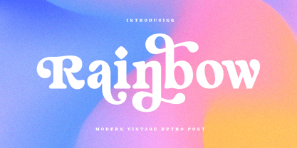 Rainbow is a Modern Vintage Display Font A New Vintage font that we created special for Unique branding needs, with extra ligature in unique style that ready to add value of your brand. It's so nice to leverage designer or product owner that need solutions to make their design look more unique and vintage. Rainbow Modern Vintage Display font ready with: Lowercase and Uppercase characters Numbers and Punctuations Preview as a inspirations that you can do with Rainbow font Available for PC and Mac Wish you enjoy our font.
 - Amster by PampaType,
$60.00 Amster is an energetic & refined type created by Francisco Gálvez, with a sharp idea on how elegance & legibility can meet harmoniously. Amster can build a text that is highly readable as well as friendly. It has five weights of roman & cursive both with smallcaps and fully-equipped with all OT sorts and even a wonderful set of illuminated initials. Amster is a very versatile typeface, allowing for a wide range of uses: screen to print, small text to display, science to poetry. Amster speaks more than 200 languages.
 - Kimbiso by Yukita Creative,
$14.00 Kimbiso is one of the most advanced fonts on the market. Its clean lines and ultra-modern style make it perfect for high fashion branding, cinematic videos, social media posts, and more. Best of all, it's easy to read and looks sophisticated and stylish. What do you get when you get this font? - Modern Sans is one font you need - Affordable and versatile - Multilingual support and complete characters set - Designed by a Typeface Designer - Get one font for any occasion - Multilingual support in this modern sans serif font - Well known for its exceptional readability
 - Satnight Script by Picatype,
$17.00 Introducing Satnight, a classy and contemporary modern script font. This versatile script typeface includes many different alternatives for each lowercase letter. It's fun to use because every word can be changed according to your wishes. Satnight offers beautiful typographic harmony for a variety of design projects, including logos & branding, wedding designs, social media posts, advertising & product design. That's it! I hope you enjoy this type!! Let me know what do you think!!! Feel free if you have a question, please contact me : picatypestudio@gmail.com Thank you and keep creative!
 - Bromwich by Greater Albion Typefounders,
$14.95 Bromwich is a piece of brand new Edwardian fun. In the spirit of railway travel posters and illustrated news journals, it's a wonderful font for poster design, or for book covers and other work with a period theme. Need something for a menu or placecards for a period themed function? Designing a book cover for a period novel? Bromwich is the face for you. It's offered in regular and alternate forms, with additional true small capital forms of both. Bring a bit of period flare to everything you do!
 - Kickback by Comicraft,
$39.00 Joe Canelli is a crooked cop working in a corrupt police force. Joe is haunted by nightmares of powerlessness. When his partner is brutally murdered and he's betrayed by his colleagues, it appears that Joe's nightmares are coming true. With his back against the wall there's only one thing he can do -- turn against the criminal network that he once embraced... KICKBACK is a fast-paced, action-filled, noir-style, crime thriller from the co-creator of V FOR VENDETTA, David Lloyd. KICKBACK is also a font. This one.
 - Smooth Brushings by Hanoded,
$20.00 When I was painting this font, I suddenly had the movie Cool Runnings (1993, directed by Jon Turteltaub) in my head. I had to name the font, so I came up with Smooth Brushings. Of course, this font has nothing to do with the movie. Smooth Brushings is an all caps brush font, which was made with a stiff brush and some China Ink. Upper and lower case glyphs can be mixed. It is a very legible and clear font, ideally suited for posters, product packaging and book covers.
 - RMU Gilgengart by RMU,
$30.00 RMU Gilgengart is a revival of Hermann Zapf’s beautiful calligraphic blackletter font which was cut and first released by Stempel in 1952. This font comes with fine ligatures and swash letters. Before working with this font it is recommended to activate both OT features Standard and Discretionary Ligatures in order to get access to all ligatures. RMU Gilgengart contains the following swash letters: D, L, h, f, g, k, round s, and t, whereby you should use the small letters at the end of a word or slogan only.
 - Kosumi by Thinkdust,
$10.00 Kosumi is an experimental display typeface. Its juxtaposition of thick and thin catches that gleam in your eye, and leads you by the hand out of your comfort zone with such ease that you'll never look back. Kosumi is comfortable in any of a thousand different places, looking brilliant on posters, and reigning supreme within magazine spreads. All you need to do is let is whisk you away. The eye-catching differences between thick and thin lines serve to capitalise your attention, ensuring your nicely laid out headline is truly the star of the show!
 - Sloop Script Pro by Lipton Letter Design,
$29.00 Richard Lipton originally released Sloop Script in 1994 through Font Bureau. Sloop Script Pro is the new, improved, rethought version, offering expanded language support and smart OpenType features. All of the new enhancements can be activated via human-readable stylistic sets whose names precisely describe what they do: “Entry Swashes,” “Exit Swashes,” “Smaller Caps,” and so on. Every weight of Sloop Script includes the available styles. Applying these features is straightforward and, thanks to automatic ligatures and contextual alternates, Sloop Script sets beautifully right out of the box.
 - Starwall by Blankids,
$18.00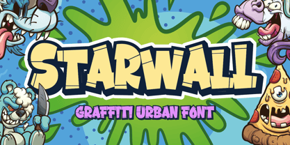 Hello, Are you looking for a graffiti urban font? Do you want of creating Something that stand out and inspire creativity, imagination, and endless fun? Wait no more, we will give you the best choice. Starwall a Graffiti Urban Font Starwall a Graffiti Urban Font, Inspiring from graffiti typography. This font is perfect for a design that makes it more attractive and playful. made with a very good level of aesthetics making this font suitable for book cover, poster, packging, merchandise, logotype and much more. FEATURES : Uppercase Lowercase Number Punctuation Multilingual PUA Encode Opentype
 - Qiomy Style by Sensatype Studio,
$15.00 Qiomy is A New Display font that perfect for unique Branding and any Design needs A New font that we created special for Unique branding needs, with unique style that ready to add value of your brand. It's so nice to leverage designer or product owner that need solutions to make their design look more unique, Stylish and elegant. Qiomy New Display font ready with: Lowercase and Uppercase characters with Ligatures Numbers and Punctuations Preview as a inspirations that you can do with Qiomy font Available for PC and Mac Wish you enjoy our font.
 - Faringa by Sensatype Studio,
$15.00 Faringa is a New Bold Vintage Font with Retro style inside. An extraordinary style with vintage and retro in serif font, to make your design more standout. As our focus that analyze any typeface that helps to leverage any logo design to look more modern and unique. We prepared this font with any vintage characters to help you create creative style. Faringa Bold Retro Vintage Font ready with: Better style of characters with creative style Preview as a inspirations that you can do with Faringa font All Uppercase characters Wish you enjoy our font. :)