10,000 search results
(0.02 seconds)
- ITC Lintball by ITC,
$29.99Eric Stevens's latest typeface, ITC Lintball, combines two unusual features: its letterforms are based on the serifless lettering inscribed in stone by the ancient Greeks, yet the wobbly edges of the strokes, and especially the slightly wider “lintballs” on the ends, suggest lettering done on paper with a modern felt-tip pen. The ball motif is carried through in the fat dot under the raised capital O, and in the similar dot used in place of a crossbar in the capital A. There's an angularity to many of the strokes, especially in the lowercase, that gives Lintball its distinctive character. - Donaire is my current interpretation of the classic Didonas , a modern Didona that pays homage to the elegant fat-face fonts that emerged in the late 18th century. Inspired by modernist and historic...
- Donaire Italic is my current interpretation of the classic Didonas, a modern Didona that pays homage to the elegant fat-face fonts that emerged in the late 18th century. Inspired by modernist and ...
- Paltime by Typodermic,
$11.95 Step right up, ladies and gentlemen, and feast your eyes on the most dazzling typeface in the land! Paltime is the star of the show, with its all-caps display font and dotted “marquee lights” style that will light up any design like a three-ring circus. But that’s not all, folks! Paltime is a font that knows how to have fun, with layers of dots, hearts, and stars that can be stacked on top of the solid layer to create a multicolored effect that will leave your audience in awe! It’s like a carnival in your design, and everyone is invited. And even if you prefer to keep it simple, Paltime has got you covered. The Marquee, Love, and Glam styles are all standouts on their own, perfect for when you need a monochrome setting or just can’t get enough layer stacking in your life. So come on down to the Paltime font party and join the fun! With its circus barker style, this typeface will be the talk of the town and the star of your design! Most Latin-based European writing systems are supported, including the following languages. Afaan Oromo, Afar, Afrikaans, Albanian, Alsatian, Aromanian, Aymara, Bashkir (Latin), Basque, Belarusian (Latin), Bemba, Bikol, Bosnian, Breton, Cape Verdean, Creole, Catalan, Cebuano, Chamorro, Chavacano, Chichewa, Crimean Tatar (Latin), Croatian, Czech, Danish, Dawan, Dholuo, Dutch, English, Estonian, Faroese, Fijian, Filipino, Finnish, French, Frisian, Friulian, Gagauz (Latin), Galician, Ganda, Genoese, German, Greenlandic, Guadeloupean Creole, Haitian Creole, Hawaiian, Hiligaynon, Hungarian, Icelandic, Ilocano, Indonesian, Irish, Italian, Jamaican, Kaqchikel, Karakalpak (Latin), Kashubian, Kikongo, Kinyarwanda, Kirundi, Kurdish (Latin), Latvian, Lithuanian, Lombard, Low Saxon, Luxembourgish, Maasai, Makhuwa, Malay, Maltese, Māori, Moldovan, Montenegrin, Ndebele, Neapolitan, Norwegian, Novial, Occitan, Ossetian (Latin), Papiamento, Piedmontese, Polish, Portuguese, Quechua, Rarotongan, Romanian, Romansh, Sami, Sango, Saramaccan, Sardinian, Scottish Gaelic, Serbian (Latin), Shona, Sicilian, Silesian, Slovak, Slovenian, Somali, Sorbian, Sotho, Spanish, Swahili, Swazi, Swedish, Tagalog, Tahitian, Tetum, Tongan, Tshiluba, Tsonga, Tswana, Tumbuka, Turkish, Turkmen (Latin), Tuvaluan, Uzbek (Latin), Venetian, Vepsian, Võro, Walloon, Waray-Waray, Wayuu, Welsh, Wolof, Xhosa, Yapese, Zapotec Zulu and Zuni.
 - Sancoale Slab by insigne,
$32.00 The contemporary feel of the Sancoale superfamily takes a bolder turn with this futuristic slab. Built from Sancoale's successfully simple geometry, Slab's serif elements and tall x-height give the face an energetic, yet clean figure that easily complements its cousins: Sancoale Softened--a sans with blunted terminals; Sancoale Narrow; and, of course, the original Sancoale itself. The weights of each member have been balanced carefully to ensure compatibility with the others, and when used together, the combination creates a powerful design that is easy to identify. With weights ranging from the classier Thin to the authoritative Black, Slab opens the door to a range of applications. Used in different text sizes, its tech image is legible and neutral enough for longer bodies of copy--both in print and on the web. Have a more prominent need? The web font also stands out well in a headline or even as a display face. Slabís great personality puts a strong foot forward without giving its reader a kick in the teeth. Whatever the task, this font's one to capture the Zeitgeist into your work. All Insigne fonts are fully loaded with OpenType features. Sancoale Slab is also equipped for complex professional typography, including alternates with stems, small caps and plenty of alts, including "normalized" capitals and lowercase letters. The face includes a number of numeral sets, including fractions, old-style and lining figures with superiors and inferiors. OpenType-capable applications such as Quark or the Adobe suite can take full advantage of automatically replacing ligatures and alternates. You can find these features demonstrated in the .pdf brochure. Included are small caps, fractions, old-style and lining numbers, scientific superior/inferior figures, complete ordinal and inferior alphabet, and a set of symbols and arrows. The Sancoale family also includes the glyphs to support a wide range of languages, including Central, Eastern and Western European languages. In all, Sancoale Slab supports over 40 languages that use the extended Latin script, making the new addition a great choice for multi-lingual publications and packaging.
 - Casttano by Beary,
$8.00 Casttano is modern feminine font, every single letters have been carefully crafted to make your text looks beautiful. With modern script style this font will perfect for many different project ex: photography, watermark, quotes, blog header, poster, wedding, branding, logo, fashion, apparel, letter, invitation, stationery, etc. This font including alternate glyph. You can access the alternate glyph via Font Book (Mac user) or Windows Character Map (Windows user). Ligature & alternate glyph: at att bt btt ct ctt dt dtt et ett ft ftt gt gtt ht htt it itt jt jtt kt ktt lt ltt mt mtt nt ntt ot ott pt ptt qt qtt rt rtt st stt ut utt vt vtt wt wtt xt xtt yt ytt zt ztt Foreign languages support: ÀÁÂÃÄÅÆÈÉÊËÌÍÎÏÐÑÒÓÔÕÖÙÚÛÜÝßàáâãäåæèéêëìíîïðñòóôõöùúûüýÿ Thanks for looking.
 - Muller by Fontfabric,
$47.00 Muller Specimen: http://bit.ly/mullers Muller Narrow Specimen: http://bit.ly/mullerns The very first sketches of Muller were made about four years ago. In the process they changed to the point where they had nothing in common with the original idea. As it is with most work we do, when we seek perfection, changes are inevitable. It was specifically designed with a wider structure for better appearance in small sizes and the extra attention to the detail was needed for the big sizes. We managed to find the right balance for the perfect universal font family. The family consists of 20 weights, ranging from Thin to Heavy with matching Italics. This font family is suited for everything, ranging from advertising, packaging, editorial and branding, to web and screen projects. Muller comes with a complete range of figure options, including proportional and old style figures, each in its tabular version. It also includes advanced typographic features such as ligatures, fractions, alternate characters, case-sensitive forms, superscripts and subscripts.
 - Shield Classic 2 Letters by MonogramBros,
$12.00 Shield Classic 2 Letters Monogram Font is a perfect shaped monogram font consisting of 52 letters and 1 basic frame. With just a single font file you will be able to create beautiful monograms in just a matter of minutes after the purchase! Shield Classic 2 Letters Monogram Font comes with font file in OTF format.
 - Unconscious by Pavel Boog,
$18.00 When we fall asleep, we become free in our thoughts, in our judgments, in our choice, we decide on bold actions and words. This font will bring all this to life. UNCONSCIOUS-This font is for brave, free and liberated creators. For people with a good sense of humor and able to derive joy even from bad things.
 - Nevolastx by Glukfonts,
$18.00 Unique poster typeface with multilingual, contextual alternates. Perfect for loud message. With over 1000 alternate glyphs, this font has extensive Latin language support for Western, Central, and Eastern European and gives text a unique, elegant and modern feel. Technical info: To be able to use Nevolastx font you need to have installed program with OpenType features (Contextual Alternates) support.
 - Exotique by Akrtype Studio,
$15.00 The Exotique is unique, this display font and is equipped with multilingual to be able to handle most typographic applications ranging from branding to body copying with various weights and inherent readability. will be perfect and look luxurious for many projects such as fashion, magazines, logos, branding, photography, invitations, quotes, blog headings, posters, advertisements, postcards, etc.
 - Thigles by Abbasy Studio,
$15.00 Thigles, is a font inspired by Signs Painting, these pretty hand painted letters that you can see on buildings, billboards and signboards. Thigles font comes with some alternates and ligature as well to create your design more unique. With additional shadow font you will be able to create the beautiful combination and bring retro touch to your artworks!
 - Radugo by Twinletter,
$10.00 Radugo is a san serif font family designed with light strokes that make up a vintage style with a rustic touch and a stamp with 2 fonts, as the ribs in your design work, and able to beautify and strengthen your work in the form of logotypes, typography, hand lettering, packaging, t-shirts, labels, and many more.
 - Snowember by Abo Daniel,
$18.00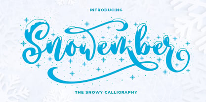 SNOWEMBER is a carefully stunning modern calligraphy with snowy effect. It is great for titling, headline, logo, t-shirt designs, mugs, tote bag designs, cards, banners, social media, and anything of craft projects. Features: - Uppercase - Lowercase - Numeral - Punctuation - Alternates - Multilingual - PUA encoded This font is very worthy to add to your collection regards, Abo Daniel Studio
 - Winter Pen by Abo Daniel,
$13.00 Introducing WINTER PEN - simple signature font - This font is great for branding, logo, signature, packaging, t-shirt design, social media and anything your project that need an elegant taste. It came with two styles : Regular and Italic. Features: Uppercase Lowercase Number & Punctuations Multilingual Support PUA Encoded Hope you love it Grab it fast... regards, Abo Daniel Studio
 - Beauchef by Latinotype,
$26.00 Beauchef is a sans serif typeface originally created to meet the needs of Centro de Modelamiento Matemático de la Universidad de Chile (University of Chile Center for Mathematical Modeling). Beauchef is a typeface with rough strokes that features subtle optical compensation and does not strictly follow the laws of perception. This typeface might not be too cheerful, but shows a very particular idiosyncrasy of form. Beauchef is as tough as advanced mathematics; however, it is as legible and exact as numbers themselves. This is an avant-garde typeface that resembles the development of mathematics, but at the same time it is as conservative, calm and respectful as clients who require its services. Beauchef is so astonishing as mathematical formulas that mathematicians work with, but at the same time it is as humble as resulting figures.
 - Bambola by EdyType,
$60.00 BAMBOLA, Script put out by EdyType. Almost formal script, that gained a little weight. but she is taking care of that. BAMBOLA, a real doll, wants to be loved, she is trying hard to be popular. Is very conscious of her beauty, but trying not to be a show off. She'll be at ease in any place where normal faces gather, unpretentious, yet with a touch of class. Born to be readable, it’s ideal for packaging headlines and editorial work. Not thick, nor thin, just the exact weight, makes a good pattern at large texts, and reduces with no problems, her voluptuous initials makes it stand out always. A real romantic face, it belongs to the fashion world, where she’s come from. A real hip chick, she’s got what it takes!
 - Tabela by aspect type,
$25.00 Tabela is a family of typefaces inspired by the aesthetics of monospaced fonts. Its design, based on the monospaced font, preserves its characteristic elements. Perfect for headlines, titles and logotypes, it also has an alternative, more neutral stylistic variant for projects that do not require such distinctive lettering. Its wide array of diacritics allows it to be used in most European languages.
 - Friday Jeans by PizzaDude.dk,
$19.00 Got a favourite pair of jeans? I do, and I wear them every Friday when it's time to PAAAARTYYYY! Well, that was 30-something years ago, but the memory of those jeans lives happily in my mind :) The font, Friday Jeans is a happy-go-lucky sans font with inky edges and lively lines. Playful as a Friday night out!
 - Tabela Soft by aspect type,
$25.00 Tabela is a family of typefaces inspired by the aesthetics of monospaced fonts. Its design, based on the monospaced font, preserves its characteristic elements. Perfect for headlines, titles and logotypes, it also has an alternative, more neutral stylistic variant for projects that do not require such distinctive lettering. Its wide array of diacritics allows it to be used in most European languages.
 - Bravissima Script by Sudtipos,
$59.00 Bravissima is the dynamic and spirited embodiment of the 1970s, when food was food and the wild brush ruled. It tells you to eat, and to do it right now. Another perfect blend of traditional Koziupa calligraphy and Paul tech, spiced up with OpenType features like the meal of your dreams. A personal favorite for food packaging design, especially hot stuff. Bon appetit.
 - Boottering by HafisHidayat,
$15.00 Boottering is a modern handmade script, organic, energetic and dynamic, can be used for various purposes. such as the title, correspondence, wedding invitations, letterheads, signage, labels, signature newsletters, logos, posters, badges, etc. Boottering features 222 Glyphs, 40 alternate all lowercase characters, including ligatures, International support for most Western Languages is included, And for Boottering Sans do not have International Language support.
 - HU Retroround by Heummdesign,
$50.00 'HU Retroround' is a font that captures the feel of the retro typefaces used on signboards during Korea's modernization era. This font has a variable function, allowing users to fine-tune the thickness they want. (Available only in Adobe programs.) Six basic weights are provided so that they can be used even in programs that do not apply the variable function.
 - Crobista by Gatype,
$14.00 Crobista is a versatile font with a clean, sleek shape. The overall typeface is strong to bring order and harmony between letters. Best used as Instagram, poster, web design, magazine, logo or product. Include files: Crobista. OT Crobista. TT -Letters, Numbers, Puntuations, Accens Ligatures, Swashes, Alternates If you've got any questions don't hesitate to drop me a message thank you
 - Crowd Pleaser by Hanoded,
$15.00 Crowd Pleaser is a pleasant, handmade font. I hoped its lively looks, slightly crooked glyphs and overall happy appearance would appeal to many people - so I named it Crowd Pleaser. Well… not entirely true, as I have a list of font names and Crowd Pleaser was the next one up… ;-) I do hope, however, that you will like this font!
 - Neue Aachen by ITC,
$40.99 Impressed by the quality of the Aachen typeface that was originally designed for Letraset in 1969 and extended to include Aachen Medium in 1977, Jim Wasco of Monotype Imaging has extended this robust display design to create an entire family. Derived from the serif-accented Egyptienne fonts dating to the early 20th century, Aachen has serifs that are very solid but considerably shorter than those of its precursor. The incorporated geometrical elements, such as right angles and straight lines, provide the slender letters of Aachen with a slightly technological, stencil-like quality. Despite this, the effect of Aachen is by no means static; its dynamism means that this typeface, originally designed for use in headlines, has come to be used with particular frequency in sport- and fitness-related contexts. Jim Wasco, for many years a type designer at Monotype Imaging, recognized the potential of Aachen and decided to extend the typeface to create an entire typeface family. He appropriated the existing Aachen Bold in unchanged form and first created the less heavy cuts, Thin and Regular. Wasco admits that he found designing the forms for Thin a particular challenge. It took him several attempts before he was able to achieve consistency within the glyphs for Thin and, at the same time, retain sufficient affinity with the original Aachen Bold. But he finally managed to adapt the short serifs and the condensed and slightly geometrical quality of the letters to the needs of Thin. The weights Light, Book, Medium and Semibold were generated by means of interpolation. Supplemented by Extralight and Extrabold, the new Neue Aachen can now boast a total of nine different weights. Wasco initially relied on his predilection for genuine cursives in his designs for the Italic cuts. But it became apparent with these first trial runs that the soft curves of cursives did not suit Aachen and led to the loss of too much of its original character. Wasco thus decided to compromise by using both inclined and cursive letters. Neue Aachen Italic is somewhat narrower than its upright counterparts; the lower case 'a' has a closed form while the 'f' has been given a descender, but the letters have otherwise not been given additional adornments. The range of glyphs available for Neue Aachen has been significantly extended, so that the typeface can now be used to set texts not only in Western but also Central European languages. Wasco has also added a double-counter lowercase 'g' while relying on the availability of alternative letters in the format sets for the enhancement of the legibility of Neue Aachen when used to set texts. The seven new weights and completely new Italic variants have enormously increased the potential applications of Aachen and the range of creative options for the designer. While the Bold weights have proved their worth as display fonts, the new Book and Regular cuts are ideal for setting text. And the subtlety of Ultra Light will provide your projects with a quite unique flair. The new possibilities and opportunities in terms of design and applications that Neue Aachen offers you are not restricted to print production; you can also create internet pages thanks to its availability as a web font.
 - News Gothic by ParaType,
$30.00A Bitstream version of News Gothic that was created by Morris Fuller Benton for American Typefounders and first appeared in 1908. There is the standard American sanserif of the first two thirds of the twentieth century with narrow proportions and a large x-height. Despite, or perhaps because of, the font’s unconventional relationships in proportion and form, News Gothic has long been a popular typeface for almost any use. Cyrillic version developed for ParaType in 2005 by Dmitry Kirsanov. Greek extension designed by Dmitry Kirsanov in 2009. - Amsi Grotesk by Stawix,
$40.00 In 2015, Amsi Pro was released with the intention of easy usage and headings. After more than 5 years, Amsi has developed itself into the direction of Grotesk, which can be use comfortably as Graphic, both text and headlines, keeping its friendliness trait with Semi-Rounded and Humanist approach looking pleasing to the eye, succeeding the DNA of Amsi. The font has been set to equipped with 3 widths (Normal / Narrow / Condensed) for flexibilities in various demands. We are truly proud to present Amsi Grotesk.
 - Octavian by Monotype,
$29.99Octavian font was designed by Will Carter and David Kindersley for the Monotype Corporation in 1961. Mr. Carter writes: While the ultimate authority is the ancient inscriptional pattern, the physical characteristics of the present rendering are manifest in the economic proportions of the shapes and the modified relations of the strokes. Thus, the letters are narrower than the classical forms and their weight heavier." Octavian is a fine book font and works well for other text settings that are less demanding, such as magazines and brochures." - Remus by RMU,
$25.00 Both fonts of the Remus family are complete redesigns of turn-of-the-century fonts. The regular style is based upon an inhouse design of Schelter & Giesecke in 1889, called Romanisch. This font was adopted by other German foundries and slightly modified and a bold version was added. Due to their proportions, these fonts fit perfectly into narrow columns, and still they are very legible. In January 2023, an Italic style was added. Here too it is recommended to use both ligature features Standard and Discretionary.
 - Ardina Title by DSType,
$50.00 Ardina was designed for the Portuguese newspaper Jornal de Notícias. Right after the exclusivity period, we decided it was a wonderful addition to our type library, therefore we redesigned it and included an extended set of characters. Ardina is a soft and warm news typeface, with five weights and matching italics, three grades (Display, Title, and Text), and slightly narrow proportions but with a very nice x-height. It’s the right typeface for a serious newspaper that intends to achieve a very contemporary feeling.
 - Fairweather by Dharma Type,
$19.99 Fairweather is a fresh air. Clear, transparent, and lucid as if it is the spring and autumn sky. By designed condensed, legible and perspicuous, Fairweather is perfect for titles and captions. But "Title and Captions" are the just examples. Very neutral and plain letter forms make the font versatile. The condensed forms can be very effective for body text in narrow space and the clean and clear letterform doesn't intrude your art works. Consists of nine weights and their matching italics. Supporting almost all latin languages.
 - Ardina Display by DSType,
$50.00 Ardina was designed for the Portuguese newspaper Jornal de Notícias. Right after the exclusivity period, we decided it was a wonderful addition to our type library, therefore we redesigned it and included an extended set of characters. Ardina is a soft and warm news typeface, with five weights and matching italics, three grades (Display, Title, and Text), and slightly narrow proportions but with a very nice x-height. It’s the right typeface for a serious newspaper that intends to achieve a very contemporary feeling.
 - ITC Serengetti by ITC,
$29.99ITC Serengeti is a font of narrow, high reaching capital letters designed by Bob Alonso in 1996. In the form of small caps, the letters combine to make words. This font is at the same time modern and nostalgic, with letters like N and M being reminiscent of those on posters in the 1920s. One can also interpret this small caps alphabet as one influenced by the Jugendstil. ITC Serengeti should be used only for headlines and display in point sizes of 18 or larger. - Airwings by Parker Creative,
$18.00 Airwings is a retro narrow typeface that includes Regular, Distressed, and Outline versions. Each version can be used on its own or combined and overlaid to create even more design options. Airwings is a versatile typeface that can be used in many ways for many different types of designs from album covers, to movie posters, clothing lines, restaurants, and more. Combine Regular and Outline versions to create a retro 3-D look. Use the Distressed version to add a grungy feel to your design.
 - Modified Gothic by Linotype,
$29.99Modified Gothic is an art deco titling face developed by the Linotype Design Studio. This typeface includes the following features: letterforms drawn with a monoweight line, a relatively narrow character base, proportionally altered small caps" in lieu of a lower case, and a distinctly round feeling. Use Modified Gothic anytime you need to evoke the spirit of the roaring 20s! Modified Gothic looks great in headlines, as well as in short lengths of large body text. Modified Gothic is part of the TakeType 4 Library." - DXEgyptian Fett by DXTypefoundry,
$45.00 Digital version of the font Egyptian Bold (Headset No. 8, Narrow fat Egyptian), Cyrillic version of the Egyptienne schmale font, around 1870. A squared antiquarian font with almost no contrast between the strokes. For the reconstruction font were used stamp from the catalog Typefoundry and the factory of copper lines B. Krebs Priemnik, St. Petersburg and Frankfurt am Main; Catalog of hand and machine fonts, Publishing House Book, 1966; Catalog of manual fonts of the Kharkov liner factory, Prapor, 1973; Catalog of fonts typography Volodarskogo, Lenizdat, 1985.
 - Inversi by Hanken Design Co.,
$30.00 Inversi is a reverse-stress typeface that may be used as a display or text-face font for a wide range of subjects. Compared to other reverse-stress/reverse-contrast typefaces, Inversi's linear contrast is much lower which, at lower sizes, makes it a good options for text or captions. It has good language support, unique design, fractions, and three different widths. Inversi pairs well with HK Requisite. Use the narrow or condensed style when mixing with HK Requisite to give more contrast to the composition.
 - Mediator by ParaType,
$30.00 Mediator is a balanced contemporary sans serif typeface that performs well both in display sizes and body text. The family contains 30 fonts in 3 widths: 8 romans with matching italics, of slightly extended proportions, from Thin to Black; 7 narrow and 7 condensed, from Thin to ExtraBold. The character set in normal upright faces was expanded to include small caps and all faces include old style figures. The typeface was designed by Manvel Shmavonyan with the participation of Alexander Lubovenko and released by ParaType in 2016.
 - Avaleigh by Asenbayu,
$15.00 Avaleigh is an elegant high-end serif fonts family in 3 styles. Avaleigh is a tall narrow serif font with an impressive appearance. Each letter is carefully crafted which will give the impression of an extraordinary visual experience. Avaleigh font can help you complete various projects such as brand logos, headlines, products, social media posts, web and much more. Avaleigh fonts feature opentype, kerning, ligature and alternate packed in 3 styles: Light, Regular and Bold. Avaleigh fonts include uppercase letters, lowercase letters, numeral, punctuation and multilingual support.