10,000 search results
(0.173 seconds)
- Bingbong by Letteralle,
$19.00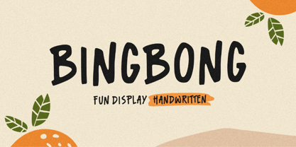 Introducing Bingbong Font! Bingbong is a fun and cheerful allcaps handwritten font display. This font is suitable for handwriting logos, T-shirts, merchandise, quotes, social media posts, advertising, and a lot more! Bingbong comes with an accent language. Thank You!
 - MBF Space Habitat by Moonbandit,
$18.00 Space habitat is a modern minimalist sans serif display font. Wide and wavy with a lot of rounded corner and sharp edge, emphasize the futuristic scifi theme. Perfect usage includes logo, poster, display, headline, t-shirt design and many more.
 - SpeedSwash by Greater Albion Typefounders,
$16.00 SpeedSwash is a stylised oblique script-fraktur hybrid. That description could should bizarre - lets face it, it does - but the result is actually rather splendid we think. Lovely for poster work where a sense of life and motion is required.
 - Gashouse Gang by Solotype,
$19.95This font was adapted from an old lettering book, circa 1900. The book got away from us many years ago, but we had made stats of all the potentially useful fonts. Original had no lowercase or numerals, so we designed them. - Sennit by AType,
$29.95It is not simple sennit. You know that such Russian lapti? It is footwear plaited of stripes a bark of a linden. My font too all is made from stripes. From the first up to last letter. Funny isn't it? - Metal Core by Vozzy,
$10.00 Metal Core is a set of strong and nervous fonts and perfect for lettering on vintage music (and not only for these) style labels, posters, t-shirts, logo etc. All available characters with sample designs you can see at the preview.
 - Roniq by Negara Studio,
$19.00 RONiQ is a display font. A type which should not be taken too seriously, a mixture in styles as per usual. this one is also quite juicy. Ready to be used in fun projects. Supports some languages, a lil bit multingual.
 - Picture Postcard NF by Nick's Fonts,
$10.00Lettering artist Alf Becker suggested that this typeface was suitable for postcard work, and we agree (although it's suitable for a great many other uses, as well). It packs a lot of information in a limited amount of horizontal space. - Jamish by Gleb Guralnyk,
$16.00 Hello! Introdusing a Jamish font that has a lot of characters including West European languages support and few ligatures. Also it has a useful additional font files for inner fill and outer base contour, that makes easier to recolor this elements.
 - Courant by Hanoded,
$20.00 Courant means "newspaper". Courant font was modeled on 17th century Dutch newspapers and most of the glyphs are authentic. The 'modern' glyphs, like @, $, €, * and several others have been designed by me, as they were not in use in the 1600's.
 - Grenadier by Alexey Timokhovsky,
$15.00 Grenadier font is based on historic blackletter forms, carefully reviewed and modernized. It got bright temper with harsh notes. Very good for packaging, branding and large sized typesetting. Grenadier has Latin and Cyrillic sets with an equal attention to details.
 - Vapor by The Hiscott Foundry,
$35.00This font was inspired by the swirling steam drawn on a chalkboard at a coffee shop. Not actually a script font though it has a similar feel. This font dances and twirls the way a wisp of smoke or steam would. - Sunbeat by PintassilgoPrints,
$26.00 Sunbeat is a quite groovy face, but that's not all: this upbeat family is packed with cool interlocking pairs for adding that twist when you need it. Available in three tones, suitable only for projects that sound great. Hell yes!
 - Heldustry by URW Type Foundry,
$35.99 Heldustry is a sans serif design with letterforms partway between Helvetica and Eurostile. The Heldustry font family has a large x-height and wide characters, making it ideal for situations where there is not much copy but pages must be filled.
 - Capsbats by Typephases,
$25.00 Everything your head should not be or would rather not do is here. A complete collection of 225 illustrations (plus bonus shadows) in three fonts. The illustrations collected in the Capsbats keep the free-flowing lines of the ink-on-paper sketches. As a dingbat, or pictorial typeface, the Capsbats are very versatile: you can use them immediately in any application. The vectorial format of the font file means they are scalable with no loss of quality. And you can customize them in no time in your favourite graphics program. They can be used out of the box, as accents or spot illustration, or enlarged, combined, coloured, textured... to achieve an infinite variety of results easily. With Capsbats you have an incredible resource for your concept illustration needs: enlarge them and you can create a high impact page layout, posters, magazine covers and book jackets, advertising... The Capsbats Shadows are bonus silhouettes that you can use in very different situations. Use these shadows to fill them with your own patterns, or use them as a mask or clipping path, to paste the images you want inside them. The possibilities are endless. We didn't limit our imagination in drawing them, so why would you when using them? The book 1000 Heads is a compendium of the drawings featured in the Capsbats and Entestats and it gives a glimpse of the limitless applications of this collection.
 - Golden Clouds by Anastasia Kuznetsova,
$22.00 Say hello to Golden Clouds :) A charming and cute font duo with handwritten letters and doodles!! Bring some irresistible fun to your design with Golden Clouds Font Duo! This playful font duo consists of a fast-flowing signature font and a charming font with small capital letters as the perfect companion. But that's not all - the set also includes a bonus Doodle font containing hand-drawn drawings designed to give your "Golden Clouds" fonts the appeal of handmade. Golden Clouds Script • A clean, smooth handwritten signature font containing uppercase and lowercase characters, numbers and a wide range of punctuation marks. Golden Clouds SmallCaps • Clean, charming handwritten font with capital letters. Golden Clouds Doodles • A set of hand-drawn drawings designed in combination with Script and Small Caps fonts. Just set it as your own font and enter any character to create each drawing. "Golden Clouds" is ideal for everyday use in greeting cards, illustrations, quotes, original branding, book covers, children's books, packaging and much more :) Font Features: A-Z; a-z character set; 1 language (English); numbers and punctuation marks, symbols. Fonts can be opened and used in any software that can read standard fonts, even in MS Word. No special software is required to get started. It is recommended to use it in Adobe Illustrator or Adobe Photoshop. Made with love and magic ♡ Thank you for reading it, and do not hesitate to send me a message if you have any questions! ~ Anastasia
 - Freigeist by René Bieder,
$29.00 The story of Freigeist is a journey into the past, back to the early grotesk fonts and long before Helvetica and Co were standard fonts in operating systems. For what we take for granted today is the result of innovation and pioneering spirit of type foundries such as Caslon or Stephenson Blake in the 19th century, whose expressive designs are mostly forgotten today. The Freigeist family captures this untamed spirit — hence the name (German for “free spirit”) — and puts it into a contemporary context, resulting in a multi-faceted family with a wide range of applications, font styles and features for modern typesetting. Design Details Unlike other modern grotesk typefaces like Helvetica or Univers, Freigeist is characterized by a warm and dynamic appearance. It draws inspiration from various historical models such as Caslon’s Doric or the Grotesque variants of Stephenson Blake. Particularly noticeable are the narrow terminals, the serpentine S or the dynamic g in combination with ascenders that reach to the cap-height only. Italics Many italic grotesk fonts are strongly oriented towards their upright counterparts. Unfortunately, this often means that they cannot do justice to their actual task, which is to highlight words or sections of a text. The italic cuts of Freigeist try to remedy this situation by using the greatest possible formal distance while reinforcing the untamed spirit. What adds to this, is a reminiscent of handwritten forms, which can be found in a, n, y or g, as well as the German sharp s or the ampersand. Alternate Characters Alternative letterforms are ideal for customizing the overall appearance of a text, for usage in logos or they can even work as custom fonts for companies. Freigeist comes with ten stylistic alternatives that are easy to insert via the Opentype window, such as the single-storey a, a tail-less version of the a for compact text, when uses in condensed widths or a dialed down version of the r. Languages Freigeist has a built-in support for Latin and Cyrillic based languages and covers more than 210 languages. Opentype Features and Symbols The family comes with many opentype features to support modern typesetting. This includes ligatures, different number sets or alternative shapes for texts set in all caps. Styles Freigeist is available in five widths (XCon, Con, Normal, Wide, XWide) and six weights (Thin, Light, Regular, Medium, Bold, Black). Including the accompanying italics, the family comes in 60 cuts that are suitable for any application. Testfonts If you like to test the fonts before buying the full version, please follow the link below: https://www.renebieder.com/test-fonts Update 1 A lot has changed in this first update. It is more than just a 1.01 or 1.02. It is actually the 2.0! I’ve gone through all! single glyphs of the 18 master files, making the family more sharp and even a bit more modern. I’ve added some new opentype features and redesigned the italics, because I wasn’t happy enough with the result. I’ve added new kerning pairs, new metrics, and even new glyphs. Please check my website for more details on the new design and overview about the opentype features and alternate shapes. If you purchased the Freigeist family already, thanks a lot!! It is the most advanced family that I published so far. I hope that you’re happy with this new version. Thanks!
 - ITC Ballerino by ITC,
$29.99Vienna designer Viktor Solt has a love affair with handwriting. “Usually” he says “when I start with a specific calligraphic style I take some historic specimens and try to integrate their main features into my own handwriting.” Although there are hints of various 18th-century calligraphic styles in Ballerino it was not based on any historical model. The swash ascenders and descenders on the lowercase are all slightly different; this and the rough texture of the edges gives Ballerino a distinctly hand-written feel. The swash caps are meant to be used only in conjunction with the lowercase not to be combined with each other. - Konstantin by Wiescher Design,
$39.50 My son Konstantin wants to become a cook. So I thought it would be a nice idea if I designed a script for his fabulous future menus as a gift for him. I think he will become a great cook. The three Konstantin cuts can be mixed. The A cut has the most straightforward letterforms, the B cut has more swashes in the capitals and swinging descenders and last but not least, the C cut gives you some fancy lowercase letters. All three cuts have different numerals. If you mix the fonts be careful not to overdo things, mostly - even with scripts - less is more. Your family designer Gert
 - New Yorker Type by Wiescher Design,
$55.00 NewYorkerType was one of the first typefaces I tried my hand at in 1985. I meant it as a revival of the typeface used by the New Yorker magazine. I did not scan it in, I just looked at the type and redrew it completely by hand. So it is not just a copy, but rather a redesign. Only much later did I come to know, that there is a bundle of similar typefaces of that period. Rea Irvin's design for New-Yorker magazine was just one of them, but the best. Yours, sincerely honoring Rea Irvin a great type- and magazine-designer Gert Wiescher
 - Command Blast by Invasi Studio,
$17.00 Command Blast is not your typical display font - it's bold, it's futuristic, and it packs a serious punch. What sets Command Blast apart is its unique glyph design with thunder alternates, which adds a level of dynamism and excitement to any design project. This font is perfect for anything related to robotics, such as gaming, sci-fi, or futuristic branding. Its edgy and high-tech vibe also makes it an excellent choice for sports cars, garages, and other speed-related themes. Command Blast is not just a font - it's a statement, and with its alternate characters, ligatures, and Latin Multilingual Support, it offers endless creative possibilities for your designs.
 - Tin Roof by Jukebox Collection,
$32.99 Tin Roof is a unique and original Jukebox font based on the 1958 hand lettered movie poster from "Cat on a Hot Tin Roof". The slightly modulated baseline and shaky letters give the font both a silly and sinister aspect. Perfect for any dramatic, spooky or sultry subject, Tin Roof has all the allure of a hot southern night! Jukebox fonts are available in OpenType format and downloadable packages contain both .otf and .ttf versions of the font. They are compatible on both Mac and Windows. All fonts contain basic OpenType features as well as support for Latin-based and most Eastern European languages.
 - Dudu by Borutta Group,
$10.00Dudu is a font which I made mainly for my own purposes. A lot of times in many projects I was looking for elegant vertical and modular typeface. There is a lot of fonts that overall look good but if You take a closer look, You can clearly see they have mistakes. That's why I made Dudu. Dudu is a font designed with a highest attention to the detail. Each Dudu glyph has the same modular construction. Dudu Font contains over 400 glyphs ready to use in various languages. I'm also working on a cyrillic version of a Dudu Font which soon is going to be published. - Bourget by Julien Fincker,
$24.00 Bourget is a Display-Sans, which is inspired by the Art Déco Typography of the 1920´s, 1930´s years. It has a very characteristic and unique style by its thin line through every letter. The upright and italic versions have each 750+ Glyphs with Open Type Features, playful Ligatures and a lot of Alternates as Stylistic Sets. So there is a lot to discover and to play around with. Bourget is good to use for Branding, Signage, Packaging, Invitations, Advertising, Headlines, Displays, Magazines, Book titles or everything you want to use it for. Bourget has an extended character set to support 219 latin based languages in 212 countries and Pinyin.
 - Sunday Fish by PizzaDude.dk,
$15.00 I am not sure if there is such a thing as a Sunday Fish. But anyway, now you have a font with that name! My idea of a Sunday Fish is a lazy, goofy and kinda laid back one. One you'd like to play around with, and a friend for life - not that kind of fish that ends up on your plate! :) Sunday Fish has massive language support and 4 different versions of each lowercase letter, and these automatically cycle as you type! It comes in 4 different layered versions, which works well together - just play around with the layers and your favourite colours!
 - Printout by Hanoded,
$15.00 Font naming is not all that difficult. Take Printout for example. I was busy working on this font, when my niece came over with a poem she needed to have printed. One of her classmates had the same request (they’re writing poems for our national Remembrance Day). As I was printing out these poems, I thought the name Printout would be perfect for the font I was working on. See? It’s not rocket science! Printout is a totally awesome, completely handmade font. I used an almost dried out Japanese brush pen to get the eroded effect. Maybe I should name my next font ‘Dried Out Brush Pen’? I’ll let you know.
 - Salsero by Plau,
$49.00 Cabrón, listen. Nosotros made a new fuente (only one file, cabrón, not super family – it can be variable, you just have to stretch it). Compra te, just buy it, or get it via Adobe Fonts. Go for it, amigo. Salsero hablas spanish en primero lugar, pero many other languages. German, english, french and most gringo languages tu cabeza can think of. Salsero has contraste invertido and all kinds of crazy curves, curvas locas, amigo. If you compreende this text, then you surely have compatibilidade, compatibility with Salsero, cabrón. No doubt you will like this fuente full of happy and not so happy mistakes, erritos.
 - Siah by Si47ash Fonts,
$19.00 Extra bold, extremely black! Siah font comes with 2 weights and provides a modern and clean sans serif Arabic/Persian type experience for headlines and headings! Siah means "Black" in Persian. This font also supports basic Latin. The complete font family is a great choice for all graphic designers, typographers and visual artists. Shahab Siavash, the designer has done more than 30 fonts and got featured on Behance, Microsoft, McGill University research website, Hackernoon, Fontself, FontsInUse,... Astaneh text and headline font which is one of his latest designs, already got professional typographers, lay-out and book designers' attention as well as some of the most recognizable publications in Arabic/Persian communities.
 - Waddle by Ben Sanders,
$18.99 Waddle is inspired by the playfulness of mid-century jazz albums, opening title sequences and movie posters. Friendly, rounded, slightly roughed, with a bouncy baseline, this unique typestyle boasts a generous number of glyphs and ligatures across all three weights. Waddle Thin is perfect for body copy and is both fun and elegant. Waddle Plump has been designed for bold headlines and titles. Waddle Regular is an ideal all-rounder. Combine the Waddle Family for maximum affect the next time you need to get a playful and positive message across to an audience of any age. Not too kiddy, not too serious ... just right.
 - Chelleh by Si47ash Fonts,
$23.00 Nostalgic, typographic, stencil and old-style! Chelleh is the Persian Northern Hemisphere's winter solstice festival celebrated on the "longest and darkest night of the year, and I also an Arabic/Persian typeface too! Well, of course supporting basic Latin as well. Due to its special design, Chelleh doesn't support Arabic diacritics. Shahab Siavash, the designer has done more than 30 fonts and got featured on Behance, Microsoft, McGill University research website, Hackernoon, Fontself, FontsInUse,... Chelleh heavy and headline font which is one of his latest designs, already got professional typographers, lay-out and book designers' attention as well as some of the most recognizable publications in Arabic/Persian communities.
 - Freehouse by Device,
$39.00 Freehouse is a reinterpretation of the well-remembered Watney’s logo, a brewery and pub chain infamous for its poor quality beer and brutalist decor. In Design Research Unit’s corporate guidelines from 1966 the font is described as Clarendon Bold Expanded — however, this is not the case. Clarendon has square serifs, whereas the Watney’s font is rounder and friendlier. A fixture of the British high street landscape for decades, this digitisation adds a full international character set, numbers, punctuation and many other characters that did not exist in the original. A distressed version that evokes rough print on a wet beermat has also been developed.
 - Hodgepodge by Outside the Line,
$19.00 Hodgepodge is a confused mixture of letters that somehow work together. While I know this has been done before I create fonts that I need. And I occasionally have found a need for this. And it was not there, so now it is. There is a mixture of light and dark, bold and regular, caps and lower case but not where you would expect them to be. Since this is a headline font you can set the headline and then easily go back and change a letter here or there to get the best-looking combination. Hodgepodge was in the 2011 Typodarium Page-A-Day Calendar on 7-17-2011.
 - Cristal Text by Johannes Krenner,
$5.00 »Cristal Text« has nice to read lower case letters. It contains 636 letters per font style and some Open Type features: Different stylistic alternates and different sets of numerals. It is not monospaced: Therefor it stays not true to an underlying grid like it’s bigger brother »Cristal True«. But this offers a better legibility. The basis of this font is a Union-Jack or sixteen-segment display (SISD). I have found myself in the need of a precise and well-made font, that simulates the look of such a LCD display. Also it should offer enough letters and language support for the whole European region as well as different font styles.
 - Aviano Gothic by insigne,
$22.00 The Aviano collection returns, refined into a new, mid-contrast sans-serif inspired by the design and style of early 1900ís American engravers. Engravers would meticulously carve lettering into copper plates for printing, and often these letters, for more impact, would be extended and only utilize capitals. While taking inspiration from the past, Aviano Gothic is distinctly one-of-a-kind, and is not a revival, but instead is based on the structure of pre-existing Aviano type families for interchangeability and interoperability. Aviano Gothic has been diligently honed to be sinuous and seductive, making it great for high-end work such as including jewelry, beauty, and other luxury products. The full Aviano Gothic family presents you with six distinct weights and is full of OpenType options. Available with the face are deco alternates for replicating inscriptions and signage of the í20s and í30s. Style sets are offered, together with four full sets of art deco-inspired alternates, swashes, and titling, in addition to an expansive range of other alternates to help ìunique-ifyî your layouts. Aviano Gothic also features forty discretionary ligatures for inventive typographic compositions. Begin planning your work with Aviano Gothic by looking at these options in the instructive .pdf brochure. OpenType-able applications, including Quark or the Adobe suite, allow for the comprehensive benefit of the ligatures and alternates. This typeface also features the glyphs to aid a broad number of languages. Several variants have been made to extend the usefulness of the typeface, and it makes for a fine substitute for Copperplate, ITC Blair or Engravers Gothic. Aviano Gothic also pairs perfectly with the other members of the Aviano collection, including the original Aviano, Aviano Serif, Aviano Sans, Aviano Didone, Aviano Flare, Aviano Future, Aviano Wedge, Aviano Contrast and Aviano Slab.
 - Mifelin by Nathatype,
$29.00 Mifelin is a well-defined serif font. Serifs are small ornaments that appear at the ends of the lines of letters, giving them a neater, more structured appearance. The well-defined serifs in this font create an elegant and professional impression. This serif font has a balanced and harmonious proportion of height and width. The proportions ensure that each letter looks proportional and easy to read. The line of letters in this font has a smoothness and clarity that distinguishes each character. Sharp, clear lines give off a professional and organized impression. This clarity also helps strengthen the legibility of the font in a variety of design settings. This serif font with an elegant look has a classic style that remains relevant in modern designs. Despite having strong roots in traditional typographic design, this font is able to adapt to more contemporary design contexts and give it a touch of elegance and class. Even though it has a touch of elegance, this serif font still prioritizes good readability. Each letter is carefully designed to ensure that the text remains easy to read and understand for the reader. Prominent readability is the hallmark of this font. Enjoy the various features available in this font. Features: Stylistic Sets Ligatures Multilingual Supports PUA Encoded Numerals and Punctuations Mifelin is suitable for any designs that require a formal and official impression. This font is can be used in the design of books, magazines, reports, formal invitations, brand identities, and other design projects that require elegance and professionalism. Find out more ways to use this font by taking a look at the font preview. Thanks for purchasing our fonts. Hopefully, you have a great time using our font. Feel free to contact us anytime for further information or when you have trouble with the font. Thanks a lot and happy designing.
 - Gold by FontMesa,
$29.00 Gold is all new for 2021, the complete family has been rebuilt using the multiple masters technique. In this new version we've removed any alternatives that could not be shared across all weights in the family and we've trimmed a few others that just were not practical in keeping a consistent look to the whole font. All the alternates now have matching accented glyphs across all weights. Case sensitive forms have also been added to all weights. With 14 weights the difference between weights are closer together which may give you the effect of a variable font where variable fonts are not supported. For technical reasons the original Gold family has now been split into two families with Gold having ten weights and the four heavier weights under the Gold Magnum family. The Gold and Gold Magnum font families support accented characters for western, central and eastern European countries. Gold comes with OpenType features to access the alternate glyphs however you will need an application such as Adobe Creative Suite to take advantage of alternate glyphs.
 - FS Renaissance by Monotype,
$52.99 FS Renaissance is a display stencil typeface by the Monotype Studio. A collaboration between lettering artist and designer Craig Back and Creative Type Director Pedro Arilla, the single style font explores the intersection between art and design. With artist and designer working hand in hand, each letter was crafted as a standalone piece of art, while working harmoniously together as a functioning typeface. The typeface is inspired by the Renaissance period symbolised by flourishing progress in the arts, sciences, learning, and philosophy. The typeface is not a traditional stencil design: the cuts are not rigid but interactions that are hand crafted between each element, emphasising the idea of a typeface as a piece of art or sculpture. Pedro Arilla’s aim was to take the core DNA of Craig's lettering and apply it to a typographic base with a solid internal consistency, balanced with an external elegance. Pedro and Craig worked closely together to make sure the original concept was not compromised and this is reflected in the finished design which strikes the perfect balance between functionality and art.
 - Cartier Book by Monotype,
$29.99 Cartier was Canada’s first roman text typeface, created in 1967 to celebrate Canada’s centennial. Its designer, Carl Dair, was one of the country’s most celebrated graphic design pioneers, and a fine designer indeed — but he was not a trained type designer. He had spent a year at the Enschedé type foundry and printing works in the Netherlands, but that probably wasn’t enough to fully grasp all that was required to make an effective text face. It is also possible that Dair simply compromised his own design by not allowing any of the much needed alterations to be made to his working drawings when they were handed over to Linotype for production. Cartier, though a strikingly original oldstyle, never became the influential allround text face it might have been. A display typeface derived from it, Raleigh, was more successful. Realizing that Dair’s design was sound in concept, if not in execution, Rod McDonald began working on a new digital version in 1997. The final family is convincing proof that Cartier could have been the functional text face that Dair originally wanted.
 - Apadana by Naghi Naghachian,
$100.00 Apadana is a new creation of Naghi Naghashian. Apadana design fulfills the following needs: A. Explicitly crafted for use in electronic media fulfills the demands of electronic communication. Apadana is not based on any pre-digital typefaces. It is not a revival. Rather, its forms were created with today's technology in mind. B. Suitability for multiple applications. Gives the widest potential acceptability. C. Extreme legibility not only in small sizes, but also when the type is filtered or skewed, e.g., in Photoshop or Illustrator. Apadana's simplified forms may be artificial obliqued in InDesign or Illustrator, without any loss in quality for the effected text. D. An attractive typographic image. Apadana was developed for multiple languages and writing conventions. Apadana supports Arabic, Persian, and Urdu. It also includes proportional and tabular numerals for the supported languages. E. The highest degree of geometric clarity and the necessary amount of calligraphic references. This typeface offers a fine balance between calligraphic tradition and the contemporary sans serif aesthetic now common in Latin typography.
 - Ekbatana by Naghi Naghachian,
$75.00 Ekbatana is a new creation of Naghi Naghashian. Ekbatan design fulfills the following needs: A. Explicitly crafted for use in electronic media fulfills the demands of electronic communication. Ekbatana is not based on any pre-digital typefaces. It is not a revival. Rather, its forms were created with today's technology in mind. B. Suitability for multiple applications. Gives the widest potential acceptability. C. Extreme legibility not only in small sizes, but also when the type is filtered or skewed, e.g., in Photoshop or Illustrator. Ekbatana's simplified forms may be artificial obliqued in InDesign or Illustrator, without any loss in quality for the effected text. D. An attractive typographic image. Ekbatana was developed for multiple languages and writing conventions. Ekbatana supports Arabic, Persian, and Urdu. It also includes proportional and tabular numerals for the supported languages. E. The highest degree of geometric clarity and the necessary amount of calligraphic references. This typeface offers a fine balance between calligraphic tradition and the contemporary sans serif aesthetic now common in Latin typography.