10,000 search results
(0.029 seconds)
- Gloss Drop by phospho,
$20.00 Gloss Drop is a wild hand lettered typeface, that passed the process of digitization without losing the spontaneous vibrancy of brush lettering. With the power of OpenType it gets real close to what you normally do with ink, brush and paper. Like in real handwriting, some, but not all, letters connect within a word. Automatic OpenType features handle the choice of inital and final forms neighbouring a gap and choose the adequate medial or isolated forms.
 - Lilla Letter Lover by Letterground Foundry,
$11.99 "Lilla Letter Lover" is a captivating font designed specifically for children's books. This delightful typeface brings an element of playfulness to reading, while also enhancing phonemic awareness. The font's remarkable strength lies in bridging the gap between handwritten and printed letters. For early readers, this transition can be challenging, but "Lilla Letter Lover" simplifies the process. It merges the familiar aspects of handwritten letterforms with the clarity of printed text, providing a seamless reading experience. This feature ensures that children can comfortably navigate both forms of writing, enhancing their overall literacy skills. The whimsical charm of "Lilla Letter Lover" instantly captures young readers' imaginations. Each letter is thoughtfully designed with basic shapes and simplicity in mind, for an experience where letters come to life, fostering a love for reading and storytelling. Additionally, "Lilla Letter Lover" offers a unique opportunity for sight-based spelling learning. The visually distinctive presentation of words helps young readers to develop a strong visual memory of spelling patterns. This visual association enables them to recognize and recall words with ease, strengthening their reading and writing proficiency. In summary, "Lilla Letter Lover" is not just a font; it is an enchanting gateway to make reading a joyous adventure for children of all ages.
 - Gentlemens Script by Piñata,
$15.00 Gentlemen’s Script is a dynamic hand-written script in which the sharpness and speed of writing harmoniously coexist with elegance and a serious attitude. The script allows you to simulate fast inscriptions made by hand while keeping them elegant and classy. Working on the project, we wanted to develop a script that would harmoniously complement serifs or traditional sans-serifs and perfectly match them. Gentlemen’s Script is like an accessory in a gentleman’s wardrobe. It dilutes font traditions and adds brightness and dynamics to them. Despite the fact that the script was designed to be used as a complementary font, it has all the prerequisites to become the main character of your design story. It does not matter how you use it—Gentlemen’s Script easily adapts to reality and always works at the maximum level of efficiency. To make the script more harmonious and natural, we have drawn more than 60 ligatures. In order for the ligatures to be substituted automatically, we recommend always keeping the standard ligatures OpenType feature turned on! In addition, there are several alternative characters in the font that are programmed on the OpenType feature contextual alternates and which are used when the letter meets the service characters. To use the script to its maximum power, we recommend that you always keep the standard ligatures and contextual alternates OpenType features turned on. If you do not have access to applications that support OpenType features, it does not matter—even without these features you can use and enjoy our font!
 - Lady Dodo by Sudtipos,
$49.00 And the day in which I introduce my second typographic family has arrived. In order to do this, I borrowed several passages from this beautiful book by Maurice Maeterlinck, “Life and Flowers”. His poetic observation of Nature made me reflect about the small discoveries behind the flow of my pen on paper. About that quick, spontaneous, overwhelmed stroke, with some awkwardness as well as certainty in it. About the writing that looms line after line. About the mischievous stains of ink flooding my writing tool. Lady Dodó was born as a product of these drawings, pieces of writing and reflections. Following the steps of its ancestor and friend, Lady René, it takes advantage of the goodness of the Open Type technology to propose a systematized as well as a personalized writing font. Both friendly and challenging. Due to the large number of alternate characters (both for lower and upper case as well as for numbers) and to its precise programming, it proposes to design diverse and rich typographical sets with multiple strokes in a simple way. However, Lady Dodó is not just made of typographical signs; it also proposes a set of modules to make patterns and another one to design frames. From the combination of these modular signs, an infinite universe of possibilities for decoration arises. Here is Lady Dodó, ready to get started and write its destiny. July 2015.
 - Geomanticus by 2D Typo,
$28.00 Simple geometric print with a clear modular design.
 - Novelty Script by HiH,
$10.00 Novelty Script is a bold dynamic script, sharply delineated, yet fluid. Most of the lower case letters and many of the upper case letters have joins. The typeface was designed by Nicholas J. Werner and Gustave F. Schroeder and patented in March 1893. The original release was by the Central Type Foundry of St. Louis, Missouri. Although a part of ATF from 1892, the Central Type Foundry continued to operate under its own name until 1895. Novelty Script uses our new encoding, as noted in the All_customer_readme.txt. The Euro symbol has been moved to position 128 and the Zcaron/zcaron have been added at positions 142/158 respectively. Otherwise, Novelty Script has our usual idiosyncratic glyph selection, with the German ch/ck instead of braces, Western European accented letters, lower case “o” and “u” with Hungarian umlaut and our usual Hand-in-Hand symbol. But that is not all. With the takeover of the Central Type Foundry by ATF, a group of special characters appeared. All are included in this font, except the “&Co” and the "'s", for a total of nine in all. The “Ch” and “nd” ligatures are especially interesting because of the impact they have on the color and overall appearance of the page. Download the PDF Type Specimen for locations. This is a fun font to use. Its strength is print, where it gives a page a refreshing look. The joins sometimes have difficulty on the screen, in spite of extensive hinting. Playing around with small changes on the point size can pay dividends. Not for the faint-of-heart. Are you up to the challenge?
 - ITC Johann Sparkling by ITC,
$29.99ITC Johann Sparkling is the work of Austrian designer Viktor Solt, a perfect imitation of the handwriting of an educated person of the 18th century. ITC Johann Sparkling is intended to close the gap between highly formal copperplate scripts and the scribbled look of 'true' handwriting," says Solt. "I am not very interested in highly formal and perfect calligraphy, but rather in quick, personal-looking scripts. Usually I start with some historical samples in mind, but I do not try to copy these sources. Instead, I incorporate them into my own handwriting. It takes up to two weeks, and many sheet of paper, before the respective script becomes my own. Of course, this would not be an economic approach for individual lettering jobs, but I can conserve the custom script for future use by digitizing it." ITC Johann Sparkling should be used in fairly large point sizes and its capitals only as initials. - Matthew's Text by Matthias Luh,
$16.00 A very scary font. Good to do graffiti-like labels or scary text...
 - Klex Plus by Ingo,
$42.00 A calligraphic alphabet in bold/light brushstrokes Actually, a typeface like this one should be written with a wide brush; this one was written with a thick, pointed brush. Thus were created the round or misshapen ends of the stems, and the sometimes excessively pointed ends of the hairlines. For each character of KLEX, the large brush was dipped in the ink anew. Using this method, the forms turned out very soft, in spite of their geometrical rigidity. The individual characters are heavy, simple, and monumental, so that they are also suitable as initials.
 - Bredston by Uncurve,
$30.00 Bredston is an aesthetic vintage typography font, inspired from the past, elegant signage, gold leaf , sign painting and old label product. Bredston comes with tons of alternates characters to make more eye cacthy . It is suitable for authentic logos, headings, sign painting, posters, letterhead, branding, magazines, album covers, book covers, movies, apparel design, flyers, greeting cards, product packaging, and more. You just combine with the another font like script , serif or san serif font and adding some effect finally BOOM..!! you get a great design for your project.
 - ITC Handel Gothic by ITC,
$40.99 The Handel Gothic? typeface has been a mainstay of graphic communication for over 40 years - all the while looking as current as tomorrow. Designed by Don Handel in the mid-1960s, and used in the 1973 United Airlines logo developed by Saul Bass, Handel Gothic was an instant success when released to the graphic design community. Its generous lowercase x-height, full-bodied counters and square proportions make the design highly readable at a wide range of sizes. Handel Gothic's slightly idiosyncratic character shapes gave the face a futuristic look 40 years ago that retains its power today. In addition, its Uncial-like lowercase is instantly identifiable - and unique among sans serif typestyles. Award-winning type designer Rod McDonald was attracted to the simple, decisive forms of the original, but he felt the design needed to be refined and updated. ?One of my goals was to bring a modern typographic discipline to what was really an old phototypesetting font.? To achieve his goal, McDonald re-proportioned every character and balanced the delicate relationship between the curves and the straight strokes. He also added a number of alternate characters to extend the range of the design. ?I wanted to give designers a large enough character set so they wouldn't feel constrained in what they could do. I want them to be able to play with the fonts, not just set words.? McDonald enlarged the family from the single-weight original to five weights, each with a full suite of alternate characters.In 2015 Nadine Chahine designed matching arabic weights to this family.
 - 1557 Italique by GLC,
$38.00 Italic type was invented by Aldus Manutius in 1499 or 1501, first, before to be a style name, it was a plain font familly name. This Italique style font was inspired from these who was used by Jean de Tournes in Lyon (France) to print La mÈtamorphose d'Ovide figurÈe, a splendid book with numerous gothic style wood carved pictures. The original font contains almost all modern usual characters except accented ones, no longer in use on that time. They have been added, with some others, with respect for the original design. . A render sheet, enclosed in file, help to identify various others unusual letters on keyboard. It is used as successfuly as web-site titles, posters and fliers design, editing ancien texts or greeting cards, invitations, gastronomic menus... and much more, as a very decorative and elegant font... It supports easily as enlargement as small size, remaining clear and easy to read from 8 or 9 points to 72 and more, particularly on prints.
 - Core Label by S-Core,
$59.00 Core Label is a condensed sans serif font. You will be able to manage a lot of information into limited spaces with Core Label. Its highly legible even in condensed forms and also clear at small sizes. Supported codepages are MS Windows 1252 Latin1 and MS Windows 949 Korean consisting of 11,172 Korean letters and Symbols, except Chinese. This Type-face is good for narrow spaces such as Labels, Books and so on.
 - Stamm by Tychographica,
$79.00 Based on Element by Max Bittrof, Stamm takes the next step in adaptation to modern environment. Using it's own construction logic it makes the design far more consistent and considerably expands the character set, supporting hundreds of languages, including Vietnamese and extended Cyrillic. Generous amount of OpenType features allows various localization options, automatic fractions, super- and subscripts, oldstyle and tabular figures, small caps and ligatures to suit almost every need. There are 15 Stylistic Sets available to customize the font (some of them duplicate locl-features in case they're not supported by applications): ss01 (Traditional glyphs): changes modern shapes used by default to old-style forms; ss02 (Alternate historical glyphs): changes the shape of several characters to a more obscure historical form; ss03 (Catalan middle dot): replaces middle dot between two l's by Catalan variant for better spacing; ss04 (German ligatures): activates historical ch, ck and tz ligatures used in German blackletter typesetting; ss05 (Dutch IJ-acute): replaces j after i-acute with j-acute; ss06 (Marshallese cedilla): replaces commas under certain letters with cedillas; ss07 (Romanian/Moldovan comma): changes cedilla-glyphs to comma-glyphs; ss08 (Turkish i): replaces regular i with dotted Turkish variant; ss09 (Cyrillic alternates): changes several Cyrillic glyphs to alternate variants; ss10 (Bulgarian Cyrillic): activates Bulgarian shapes; ss11 (Serbo-Macedonian Cyrillic): activates Serbo-Macedonian shapes; ss12 (Double-story a): replaces default glyph with it's double-story variant; ss13 (Alternate asterisk): replaces default asterisk with 5-pointed shape; ss14 (Enclosed figures): replaces standard figures with enclosed variants; ss15 (Slashed zero): replaces default zero with slashed variant.
 - Stuntman by Vozzy,
$10.00 Introducing a hand-crafted label font duo named Stuntman. All available characters you can see at the screenshots. This family have two fonts - Script and Stencil; and for each included two styles - Clean and Paint (dripping effect). This font will good viewed on any retro design like poster, t-shirt, label, logo etc.
 - Felbridge by Monotype,
$29.00 The impetus behind Felbridge was both ambitious and highly practical: to develop an ideal online" typeface for use in web pages and electronic media. Robin Nicholas, the family's designer, explains, "I wanted a straightforward sans serif with strong, clear letterforms which would not degrade when viewed in low resolution environments." Not surprisingly, the design also performs exceptionally well in traditional print applications. In 2001, to achieve his goal, Nicholas adjusted the interior strokes of complex characters like the M and W to prevent on-screen pixel build-up and improve legibility. Characters with round strokes were drawn with squared proportions to take full advantage of screen real estate. In addition, small serifs were added to characters like the I, j and l to improve both legibility and readability. "The result," according to Nicholas, "is a typeface with a slightly humanist feel, economical in use and outstanding legibility - even at relatively small point sizes. Most sans serif typefaces have italics based on the simple "sloped Roman" principle, but italic forms for Felbridge have been drawn in the tradition of being visually lighter than their related Roman fonts, providing a strong contrast when the italic is used for emphasis in Roman text. The italic letter shapes also have a slightly calligraphic flavor and distinctive "hooked" strokes that improve fluency. Felbridge is available in four weights of Roman - Light, Regular, Bold and Extra Bold - with complementary italics for the Regular and Bold designs. The result is a remarkably versatile typeface family, equally comfortable in magazine text copy or in display work for advertising and product branding. As a branding typeface, Felbridge works in all environments from traditional hardcopy materials to web design, and is even suitable for general office use. As part of a corporate identity, this no-nonsense typeface family will be a distinctive and effective communications tool." Felbridge™ font field guide including best practices, font pairings and alternatives.
 - La storia by Abo Daniel,
$15.00 Introducing La storia - a fine tip signature font. Beautiful monoline signature, looking so classy and natural. There are 2 version, - Regular - Bold La storia is perfect for branding, photography, invitations, quotes, watermarks, advertisements, product designs, labels, and more that needs a natural sign feel. Includes number-punctuations and multilingual support. I created 89 ligatures to keep this font looks natural. at ct dt et ft gt ht it jt kt lt mt nt ot qt rt st tt ut vt wt xt zt an in un en on ar ir ur er or aa ant int unt ent ont att itt utt ett ott ii ee oo uu ff rr ss xx zz ll adl idl udl edl odl ald ild uld eld old art irt urt ert ort fl fh fb jl Fr Gr Hr Ir Kr Mr Nr Or Pr Tr Ur Vr Wr Dr space-r Titling and Ending Swash - Quick Access Add underscore 2x before or after a lowercase (you can see this on the presentation posters). For example a_ _ or _ _a Swash Lines make this font complete. Add underscore 2x before numbers from 1 to 9, you'll get 9 variations of swash line (as shown in the posters). For example _ _1 Thank You so Much!
 - Breton by Latinotype,
$29.00 Breton is a geometric slab serif typeface inspired by Boston. Breton has a strong personality and it is an ideal face for headings and branding design. Its most noticeable characteristic is a great difference of proportions between rounded characters (like "o", "c" or "e") and non-rounded ones (like "n", "m" or "z"). By combining them, you will be able to give your compositions a very unique rhythm. Each font style comprises 417 characters, which support more than 200 Latin-based languages, as you would expect from Latinotype fonts. Breton comes in 10 styles, from Hair to Black, and includes matching italics. Breton was designed by Daniel Hernández and Rodrigo Fuenzalida.
 - Geometra by T4 Foundry,
$21.00 Geometra is a new font family from Swedish type designer Bo Berndal and the T4 font foundry. Somewhere between a slab serif and a sans it has a crisp, geometric feel and is both 20’s retro and modern. Its soft curves and openness makes it very readable in smaller print. The powerful serifs give the font lots of character in larger sizes. Geometra comes in three weights, regular, semibold and bold.
 - Nada Fraktur by Johan Elmehag,
$19.00 Nada Fraktur is a modern geometrical blackletter made to serve your hip intentions. Think hip-hop album sleeves, your local t-shirt print shop, and Tumblr-boy action. The goal with this typeface is to blend medieval aesthetic with sharp modern cuts. You could say that the font is sort of monospaced, but it is not. The typeface includes an extended character set to support Central and Eastern European as well as Western European Languages.
 - Booden by Lithographe,
$36.00 Booden is a name not to boo but to use in display type situations. but as texts funtion s to be read its functionality ges beyond a Cyber-tech font single weight single time use. it can be used for branding purposes or any type of editorial text because of its readability. Be it a logo, or a Title headliner, web or print booden typeface can certainly entertain your need for simple variation.
 - EFCO Overhold by Ephemera Fonts,
$19.00 EFCO Overhold, a family of 25 fonts, block allcaps with spur serif accent, created as a font pair with other font collections. available with height and width axes which make a lot of possible layouts. and also available in variable font format for unlimited possible layouts. EFCO Overhold is a great typeface for typography logo composition, branding, packaging, signage, print, headline, pair with your illustration, or pair with other ephemera fonts collections, etc.
 - Hawkins by Fenotype,
$25.00 Hawkins is a rounded serif combined with small hints of Art Nouveau influence and remarkably high x-height. Hawkins takes a lot of space and is a well suited display typeface for any use from print to online and from advertising to book cover or from product design to digital posters. Hawkins is packed with a few OpenType features -Standard Ligatures and plenty of Swash Alternates, as well as few Titling and Stylistic Alternates.
 - Beauty Shine by Java Pep,
$17.00 Introducing a pretty script font that comes with two styles regular and italic, As the name Beauty & Shine is a pretty calligraphy font that has a lot of alternate characters to switch it for more stunning and outstanding looks. Beauty & Shine aslo can switching into italic style based on you need or mix and match with regular style . This font is perfect for quotes, logo, branding, invitations, apparel, prints, wall decor, cricut projects, and etc.
 - Sentex by Harvester Type,
$20.00 Sentex is a font from the Cyberpunk universe, inspired by the logo and created by order of the corporation itself. The font conveys the spirit of cyberpunk and its atmosphere. The font has many alternative characters and contains a basic set of letters, punctuation and numbers. The font is perfect for prints on clothes. For logos, posters and titles. A lot of alternative symbols and language support gives great freedom to creativity!
 - Branch by Peliken,
$15.00 Branch font with Cyrillic support is perfect for branding, Slavic motives, Russian menu design and many more Font includes a full set of gorgeous uppercase and lowercase letters, numbers, a large selection of punctuation. You can use this font for design logos, quotes prints on t-shirts and other. Ethnic serif font. Authentic slavic stylized alphabet bold symbols. Creative minimal latin character set. Please NOTE - Mock ups and photo are NOT included.
 - Kelvingi Rodrige by Letterena Studios,
$10.00 Hi, Everyone! If you’re looking for a gorgeous font to attract your audiences or customers then we’ve got the font for you! Introducing Kelvingi Rodrige - A Serif Font This handmade font typeface with modern style looks very interesting for loads of different projects and promotions. It is perfect to be used on your website, for your social media branding, Pinterest banners, printed products, and more! Features: Multilingual Support Ligatures Alternates PUA Encoded Numerals and Punctuation
 - PlainPensle by Ingrimayne Type,
$14.95 As its name suggests, PlainPensle is a handwriting font that emulates printing and writing with a pencil or ballpoint pen. The plain and bold styles have hand printing that is ordinary and nondescript. The italics and bolditalics contain simple handwritten cursive.
 - Vandotta by Flawlessandco,
$9.00 Introducing Vandotta, a dynamic and powerful sport display font designed to make a bold statement. With its sleek lines and strong geometric shapes, Vendetta embodies the spirit of competition and athleticism. There's some connected letters and some alternates that suitable for any graphic designs such as branding materials, t-shirt, print, business cards, logo, poster, t-shirt, photography, quotes .etc This font support for some multilingual. Also contains uppercase A-Z and lowercase a-z, alternate character, numbers 0-9, and some punctuation. If you need help, just write me! Thanks so much for checking out my shop!
 - Camaro by Flawlessandco,
$9.00 Introducing "Camaro" - a dynamic and high-octane racing display font that embodies speed, excitement, and adrenaline. Camaro showcases a strong and sleek design that mimics the aerodynamic lines of racing cars. There's some connected letters and some alternates that suitable for any graphic designs such as branding materials, t-shirt, print, business cards, logo, poster, t-shirt, photography, quotes .etc This font support for some multilingual. Also contains uppercase A-Z and lowercase a-z, alternate character, numbers 0-9, and some punctuation. If you need help, just write me! Thanks so much for checking out my shop!
 - Sagira by Flawlessandco,
$9.00 Introducing "Sagira" - A Retro Display Font. Travel back in time with "Sagira," a nostalgic retro display font that pays homage to the past, complete with charming wavy line details that evoke a sense of vintage flair. There's some connected letters and some alternates that suitable for any graphic designs such as branding materials, t-shirt, print, business cards, logo, poster, t-shirt, photography, quotes .etc This font support for some multilingual. Also contains uppercase A-Z and lowercase a-z, alternate character, numbers 0-9, and some punctuation. If you need help, just write me! Thanks so much for checking out my shop!
 - SK Rohkea by Shriftovik,
$48.00 SK Rohkea is a modular display typeface that combines strict geometry and smoothness of lines. The main features of the typeface are the constant inclination of the oval and the elongation of forms. They give the typeface a unique character, especially when it is used in large inscriptions and headings. The SK Rohkea typeface has capital and lowercase letters that support the extended Latin and Cyrillic set and even icons! Thanks to the combination of modernity and refinement, the typeface is great for the widest range of design tasks, no matter whether it is printing or web design.
 - Gene Condensed JNL by Jeff Levine,
$29.00 Gene Gable is known to many graphic artists from his on-line column 'Scanning Around with Gene', which was on the Creative Pro website for a number of years, covering a variety of topics ranging from printing techniques to paper ephemera; water applied decals to lettering stencils. Gene has also been a great help in providing vintage source material to Jeff Levine, which resulted in many additional font designs. It seems only fitting that he should be bestowed with his own-named font as well. Gene Condensed JNL is offered in both regular and oblique versions.
 - Remixa by Narrow Type,
$35.00 Introducing Remixa, a cutting-edge modern sans-serif typeface that seamlessly incorporates elements from serif typefaces, resulting in a truly unique and captivating design. Remixa boasts a carefully crafted set of six weights, ranging from light to bold, allowing for versatile usage across a wide range of design projects. Each weight has been meticulously balanced to ensure optimal legibility and visual impact, empowering designers to create captivating and expressive compositions. Its clean lines and subtle serif-inspired details create a harmonious blend that stands out in both digital and print media. Experience the essence of modernity and timeless elegance with Remixa.
 - Chanley by Flawlessandco,
$9.00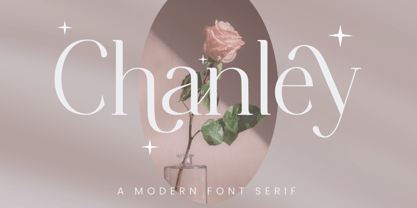 Chanley, a sleek and sophisticated modern serif font that is sure to make a statement. With its clean lines and contemporary design, Chanley strikes the perfect balance between elegance and versatility. An Original typeface that suitable for any graphic designs such as branding materials, t-shirt, print, business cards, logo, poster, t-shirt, photography, quotes .etc This font support for some multilingual. Modern Sweet Retro that contains uppercase A-Z and lowercase a-z, alternate character, numbers 0-9, and some punctuation. If you need help, just write me! Thanks so much for checking out my shop!
 - Nubian by G-Type,
$39.00 Nubian was one of the first typefaces ever designed by G-Type and is an elegantly proportioned, crisply modern sans serif family. Comprising five weights from Thin to Bold with true matching italics, each font also includes two sets of figures (lining and old-style numerals) and an extended European character set. Nubian has a noticeably open, semi extended appearance providing very even 'colour' and excellent legibility when set as text. The contemporary letterforms work well at all sizes in print and on screen making Nubian a great choice across all media. The family has been updated to OpenType with extended language coverage.
 - Salva by Flawlessandco,
$9.00 Introducing "Salva" - An Elegant Display Font. Prepare to be captivated by the distinctive allure of "Salva," an elegant display font that weaves waves into every line of its letters, redefining elegance with its truly unique design. There's some connected letters and some alternates that suitable for any graphic designs such as branding materials, t-shirt, print, business cards, logo, poster, t-shirt, photography, quotes .etc This font support for some multilingual. Also contains uppercase A-Z and lowercase a-z, alternate character, numbers 0-9, and some punctuation. If you need help, just write me! Thanks so much for checking out my shop!
 - Meguro Sans by GT&CANARY,
$27.00 Meguro Sans has a modern-styled boxy shape that achieves clean, industrial yet friendly style lends itself well to brand building. Its mono-line oriented and very high X-height ensure that it is extremely legible and creates a strong impression. Meguro Sans is Sans serif version of Meguro Serif. The Meguro sans font family is comprised of 10 styles with 5 different weights from light to black, along with matching italics offering possibilities for use in web, print, package and sign design, all with the goal of building an established look for brands in wide range of industries.
 - Strom by Lasse Strøm,
$35.00 STROM is а modern sans serif font with minimalistic and geometric characters. The rounded corners give the typeface a friendly look, yet it retains a professional quality. The attention to detail paid during its development means that this typeface offers a vast range of design possibilities – and helps users create eye-catching designs. The different font styles are built on the same foundation, so they can be mixed and matched while maintaining a harmonious look. The simple, clean lines make it noticeable and ideally suited in display settings, advertising, packaging, logo, branding, poster, billboards, film, television, web, screen and print design.
 - Pritchard by ITC,
$29.99Pritchard is the work of British designer Martin Wait, a capital, condensed sans serif font inspired by the geometric styles of the 1920s Soviet Constructivist movement. Despite unusual letterforms, Pritchard remains legible and effective in large display sizes. Two fonts make up the Pritchard family: Pritchard Regular and Pritchard Line Out. Pritchard Regular is a caps-only font, but Pritchard Line -- a bold, open font suitable for a wide variety of headline applications -- does include lowercase letters. A similar font from Linotype is Linotype Reducta. Unlike Pritchard Regular, Linotype Reducta's character set contains lowercase letters."