10,000 search results
(0.079 seconds)
- Lavaman by Chank,
$49.00Lavaman was created by Chank Diesel in 1995 as a custom font for the Cartoon Network's Space Ghost Coast to Coast web site. This font represents the printed voice of the talk show's surly backstage engineer, who is a man made of molten lava. - Evening Gown JNL by Jeff Levine,
$29.00 Evening Gown JNL comes from the lettering displayed on a printed ad for the fictional "Gowns by Roberta" in a scene in the 1935 film of the same name. "Roberta" starred Fred Astaire and Ginger Rogers and was based on the successful 1933 stage play.
 - Quelline by Maulana Creative,
$14.00 Introducing Quelline Font. Are you looking for a bold handlettering decorative font that has a medieval gothic feeling? We can help! Try to download our Quelline Font. Suitable to use for any occasion such as book, logo, print, game, event, music, invitation and others. Thanks!
 - Hold On by Seemly Fonts,
$12.00Hold on is a chunky and bold display font featuring subtle brush-strokes for a friendly feel. This gorgeous typeface is perfectly suited for stationery, logos, t-shirt, paper, print design, website header, photo frame, flyer, music cover, poster, image slider, and much more! - Find Peace by Seemly Fonts,
$12.00 Presenting Find Peace is a standout display font that's ideal for giving your designs a special touch. If you use this font, your design will seem appealing. Apply it for print design, photo frames, flyers, record covers, stationery, t-shirts, image sliders, paper, and more.
 - Lawson Vintage by Okaycat,
$29.00 Okaycat Font Foundry proudly presents “Lawson Vintage”! A retro classic style font, perhaps futuristic, with vintage textured edges. containing European accents. Beautifully connected cursive with high legibility and style for your design, great for web, print and publication. See original Lawson without texture. Salon
 - Andrea Handwriting by StuArt,
$9.00 Born out of an insatiable addiction to handwriting fonts, Andrea's Handwriting fonts are simple, readable and easy on the eyes. Each font is cool, casual and fun all at the same time. Perfect for printing your personal thoughts be they silly, pensive or absolutely nonsense!
 - Alterous Display by ZetDesign,
$15.00 Alterous is made for a bold impression on each of your works. This font can be used for title and text display so it is suitable for all types of designs, whether posters, flyers, banners, t-shirts, screen printing, magazines, newspapers, logos, and others.
 - Eskander Arabic by Protype,
$40.00 Eskander the first version designed at 2018, and re-designed at 2021. Eskander is Arabic typeface with rounded edges and friendly. For web, digital applications and prints, supported languages (Arabic, Persian and Urdu). Eskander is a trademark of Protype Foundry Ltd, Design by Ibrahim Hamdi.
 - Devil Story by Yoga Letter,
$14.00 "Devil Story" is a halloween themed font, decorated with "devil" letters. This font is perfect for Halloween party celebrations, party invitations, posters, prints, stickers, and more. This font is equipped with uppercase letters, lowercase letters, uppercase decorations, lowercase decorations, numerals, punctuations, and also multilingual support.
 - Seventy by Lucky Type,
$18.00 Seventy is the newest signature font that is perfect for branding, business cards, quotes, posters, stickers, blogs, logos, weddings, birth announcements, photo overlays, printed goods, bags, t-shirts and more. This font has several unique ligatures that will beautify your writing. Thank you very much.
 - Rockel by Din Studio,
$29.00 Rockel is a bold and authentic display font. It suitable for your any project that needs the outer space touch. And the font also suitable for branding project, t-shirt print and many more. Featured : Accents (Multilingual characters) PUA encoded Numerals and Punctuation (OpenType Standard)
 - Profumo by Device,
$29.00 Profumo evokes the rubber ‘top secret’ stamps found on files in government vaults and under the beds of double-agents’ mistresses. The font was produced by scanning in inky impressions from vintage rubber letters - dozens of prints were made, and the most interesting selected.
 - Simple Script by Etcsupply,
$13.00 Simple Script Font A handwritten script font with 278 characters and 7 swash character designed by Ilham Nashrul Huda, and published by Etcsupply. _________________________ Simple Script Font perfect for: logos, branding, wedding invitations, business cards, greeting cards, posters, magazines, social media, planner prints and others.
 - Culington by Nurf Designs,
$16.00 Culington is a bold script font. This font will look great in any creative project such as logos, printed quotes, invitations, cards, product packaging, headers, and more! This font is PUA encoded which means you can access all of the glyphs and swashes with ease!
 - Plz Script by Outside the Line,
$19.00 Plz Script is a warm and friendly script font that can be used as body copy or for headlines. Great with Architectural Lettering or Plz Print. It can also be found in the book "Indie Fonts 3, a Compendium of Digital Type from Independent Foundries".
 - Smaragd by Linotype,
$29.99Smaragd is a light and gracious font especially appropriate for titles and cards. It is Gudrun Zapf von Hesse’s interpretation of Baroque adornment engravings. Smaragd is clear and festive, well-suited to titles and headings, initials and private printed materials, such as cards and stationery. - Alexaniri by Gassstype,
$25.00 Alexaniri is a Handwritten Brush font with a natural Rough style and dramatic movement. Crafted manually with love and passion, This font is great for your next creative project such as logos, printed quotes, invitations, cards, product packaging, headers, Logotype, Letterhead, Poster, Label, and etc.
 - Sidra Sans by Blythe Green,
$10.00 Sidra Sans is an upper-case font with an authentic, handwritten feel. It's perfect for: logos, playful branding, greeting cards, shirts, quotes, textiles, posters, magazines, social media, planners, prints, and more. FEATURES: Consistent stroke widths for linear designs Multilingual characters for the global designer
 - Pecorino Script by Blythe Green,
$13.00 Pecorino Script is a lower-case script font with an authentic, handwritten feel. It's perfect for: logos, branding, wedding invitations, greeting cards, quotes, textiles, posters, magazines, social media, planners, prints, and more. FEATURES: Stylistic end swashes to add personality Initial characters Multilingual accents + support
 - Argento by Librito.de,
$10.00 The design for this typeface is based upon four sheets of an old latin book I purchased in Hanover (Germany) a couple of years ago. The letters preserve the rough edges of the original printing, I just added a few missing letters and some ligatures.
 - Sandcastle JNL by Jeff Levine,
$29.00 Based on a popular design of the 50s-60s, Sandcastle JNL has the retro-casual charm of many prints ads of that era. It lends itself well to headlines, price tags, announcements, name plates and just about anything that recreates the mid-century panache.
 - Speedwriter - Personal use only

- MUNIficent - Unknown license

- Sweet Upright Script by Sweet,
$39.00Sweet Upright Script is the first release for Sweet Fonts Collection, published by MVB Fonts. It is an interpreted revival of a vintage, social engraving lettering style that was popular during the 20th Century. It is probably the first digital version of the design. With the advent of the engraving machine (a pantograph device) around 1900, commercial engraving moved from the use of hand-cut plates to the use of masterplates (lettering patterns). Lettering was traced from the masterplate using the engraving machine, letter by letter, onto a coated steel plate, that would then be etched in a chemical bath. The resulting plate was used to print engraved stationery with the raised print distinctive to the process. Many of these lettering styles were used for decades for commercial and social applications (letterheads, wedding invitations, etc.), but as they were merely traced alphabets, were not "fonts". Many remain unavailable in digital form. Over time, a number of the most popular styles were adapted to phototype, which sped up the process of plating for engraving, avoiding the need to trace each letter by hand with the engraving machine. Later, when type went digital, these phototype fonts were revived as digital fonts. As a result, the styles offered by engravers narrowed over time, as has the range of engraving styles revived in digital form. - Veto Sans by Monotype,
$50.99 Veto® Sans is both highly legible and handsomely distinctive – a rare blend in a typeface. It’s a design that stands out and fits in. Veto Sans is equally competent on screen and in print. It’s four carefully determined weights in both normal and condensed proportions, each with an italic complement, give the family an exceptionally deep range of applications. All the designs in the family are valuable design tools. None are superfluous. Advertising, brand, corporate, editorial and interactive design are all in Veto Sans’ wheelhouse. It also shines in wayfinding and other signage projects. And to all these, it brings a warmth and personality. An ample x-height, open counters, vertical stroke endings and subtly condensed capital letters enable Veto Sans fonts to perform with grace in print and digital environments while being space efficient. An added benefit is that all-capital typography set in Veto Sans is not only space saving, it’s also easy to read. Drawn as a complete reimaging of his earlier Veto design, Swiss designer Marco Ganz worked to create character shapes distilled to their purest forms while maintaining a relaxed and natural demeanor. Ganz, who is also a three-dimensional artist, is acutely aware that the negative space between letters and the internal space within letters is as important as the positive shape of the letters themselves. This dynamic balance between the negative and positive aspects of character forms gives Veto Sans a sense of immediacy without looking hurried. Ganz also took great care to draw a suite of italic designs that not only complement the roman weights perfectly, but also give the family a dynamic verve. A large international character set also ensures ease of localization. “Veto Sans,” says Ganz, “is a typeface for designers that search for a new and different solution to age-old typographic challenges.”
 - Luis Serra by Homelessfonts,
$49.00 Homelessfonts is an initiative by the Arrels foundation to support, raise awareness and bring some dignity to the life of homeless people in Barcelona Spain. Each of the fonts was carefully digitized from the handwriting of different homeless people who agreed to participate in this initiative. Please Note: these fonts include only the latin alphabet; no accented characters, no numbers or punctuation. MyFonts is pleased to donate all revenue from the sales of Homelessfonts to the Arrels foundation in support of their mission to provide the homeless people in Barcelona with a path to independence with accommodations, food, social and health care. Luis Serra was born in Alicante. There he grew up and even started a family His life was there. But at the age of 35 he split up with his wife and decided to go to Barcelona in search of a new life. And it wasn’t easy for him. He had to turn his hand to all kinds of jobs and didn’t manage to find the stability he needed. Luis is a shy, retiring person who takes great pleasure in the little things in life such as walking in the mountains or celebrating the victories of his football team, Barça. After four years living in Barcelona, Luis found himself in a position he’d never imagined. “The street’s much worse now, there’s more trouble, there’s more tension,” says Luís. In the street he had to learn, as he always had, to move fast, to find a place to sleep and something to eat. Luís is one of those people who don’t let circumstances mould him, but adapts to them and always tries to do his best.
 - Oceanwide Pro by California Type Foundry,
$47.00 A font perfect for not just one, but many projects! Introducing Oceanwide Pro, a sans that loves to be used in just about any situation! Designed with ultra clean lines and versatility in mind, Oceanwide wants to be your new favorite sans! Oceanwide’s ultra clean letters work anywhere you want to communicate orderliness and competence, and designed to build trust and rapport with your audience. Its wide proportions make it ideal for display and logo use. Oceanwide especially shines for white/bright letters on black/dark backgrounds! That’s because the inside shapes are nearly perfect circles in many weights. Here's a quick video tour of Oceanwide Pro by Dave Lawrence, including all the great things Oceanwide can be used for! We've tested Oceanwide for these industries, with stunning results!: Tech Arts Fashion & Style Business & Branding Corporations Logistics Architecture Food and many more... Oceanwide can be used for: Headers Subheadlines Logos Even body text, if tracked. Print & Screen The styles it can take are also many. It's great for: Modern/minimalist design Flat design Cut out design User Interface (UI) Technical designs In combination with text effects, even for grunge and other situations. And many others... DESIGN FEATURES Simplicity Tall x-height Hand-sloped obliques (italics) Narrow spacing Semi-wide proportions Expert kerning Well proportioned, usable lights & extra lights Large caps Great ALL CAPS MODE Uppercase punctuation Uppercase spacing with California Type Foundry’s Smart Tracking™ Advanced fraction support Proportional lining figures Thick joins Smooth curves Sturdy—great for textures and effects Variable font available Latin Pro character set for Central European languages. That's the writing for over 782 languages and transliterations worldwide! DESIGN STORY—THE FORGOTTEN SANS by Dave Lawrence, Lead Designer, California Type Foundry Adrian Frutiger was the 20th century master of sans, but I didn't realize he had made—not one—but TWO geometric sans! It wasn't until I had purchased the book “Adrian Frutiger: Typefaces”. I had hoped to someday meet Adrian Frutiger, but he passed away that very same year. Here is the story of Frutiger's forgotten sans. Back in 1968, Frutiger was approached by Pentagram to make a design for British Petroleum. They wanted a "new version of Futura". However, they wanted him to make a couple adjustments. First, they felt that Futura was "too fiddly." By this, they meant that it narrowed too much at the joins. (Joins are for example where the round and straight parts of the 'd' meet.) This is something that is necessary for small print text (to prevent ink clogging), but is not necessary at large sizes. Second, they wanted it to be entirely geometric, using the circular shape with minimal optical corrections. Unfortunately this font was not even used very consistently in the BP brand. A haphazard mix of Futura and Frutiger's BP font ensued. It was then replaced by another font design very soon after. My design is different in several ways. First, the commas and quotes are a more modern style. I tried his original commas, but these just didn’t work to 21st century eyes. Second, in his drawings, Frutiger went for a more standard u with a downstroke on the right. However, Oceanwide has a simpler u. Third, I made more optical adjustments. At the direction of his employer, Frutiger reluctantly put no font optical corrections into the letters. So I think my optical adjustments are similar to what Frutiger would have wanted. Fourth, I extended the weight into the light and extra light ranges. Fifth, the rest of the font I created according to the principles of Adrian Frutiger, but with no sources for inspiration. Here is Frutiger’s design philosophy, in his own words: “If you remember the shape of your spoon at lunch, it has to be the wrong shape. The spoon and the letter are tools; one to take food from the bowl, the other to take information off the page... When it is a good design, the reader has to feel comfortable because the letter is both banal and beautiful.” The words about the spoon were the ones I kept in my mind as I tried to make the curves ultra smooth, and the shapes ultra simple. Hopefully this font is a worthy successor to the font that inspired it. Released on the 93rd birthday of Adrian Frutiger, to celebrate the life and achievements of this amazing designer. ——————— Simplicity. Versatility. Oceanwide.
 - Elegise by Nathatype,
$29.00 Elegise is a captivating script font that gracefully captures the essence of cursive handwriting with a touch of elegance. This typeface exudes an air of sophistication and refinement, making it perfect for projects that require a stylish and polished look. Each letter in this font is meticulously crafted with high contrast, adding a dynamic and eye-catching quality to the font. The combination of thick and thin strokes creates a sense of fluidity and movement, adding a touch of liveliness to your typography. The long swinging endings in some letters of Elegise bring a sense of graceful flair and drama to the font. These charming details add a touch of elegance and uniqueness, making the script come to life with a sense of poise and grace. For the best legibility you can use this font in the bigger text sizes. Enjoy the available features here. Features: Stylistic Sets Ligatures Multilingual Supports PUA Encoded Numerals and Punctuations Elegise fits in headlines, logos, movie posters, flyers, invitations, greeting cards, branding materials, print media, editorial layouts, headers, and many more. Find out more ways to use this font by taking a look at the font preview. Thanks for purchasing our fonts. Hopefully, you have a great time using our font. Feel free to contact us anytime for further information or when you have trouble with the font. Thanks a lot and happy designing.
 - Levigate by Nathatype,
$29.00 Levigate is a graceful script font that beautifully captures the essence of cursive handwriting with a touch of sophistication. This typeface exudes an air of elegance and refinement, making it perfect for projects that require a stylish and polished look. Each letter in this font is meticulously crafted with high contrast, adding a dynamic and eye-catching quality to the font. The combination of thick and thin strokes creates a sense of fluidity and movement, adding a sense of energy and vibrancy to your typography. The swinging endings in some letters of Levigate bring a touch of whimsy and personality to the font. These charming details add a flourish of creativity and uniqueness, making the script come to life with a sense of playfulness. For the best legibility you can use this font in the bigger text sizes. Enjoy the available features here. Features: Stylistic Sets Ligatures Multilingual Supports PUA Encoded Numerals and Punctuations Levigate fits in headlines, logos, movie posters, flyers, invitations, greeting cards, branding materials, print media, editorial layouts, headers, and many more. Find out more ways to use this font by taking a look at the font preview. Thanks for purchasing our fonts. Hopefully, you have a great time using our font. Feel free to contact us anytime for further information or when you have trouble with the font. Thanks a lot and happy designing.
 - Monthir by Ditatype,
$29.00 It may be a hard challenge to find an attractive, prominent font in a unique way amid the abundant font options available. Due to the significant reason to find the right font to deliver appropriate messages and emotions, we would like to introduce you to the Monthir, the perfect choice to express any of your project designs. Monthir is a capitalized brush font in brush details to produce authentic looking handwriting displays. The font’s bold, firm displays which are the advantages of such a font can create more interesting, prominent designs. Besides, people can feel closer to the brands or designs created through its personal, natural nuances. The letters’ proportions are relatively consistent, yet its dramatic, bold styles are suitably applied for bigger text sizes rather than the text body. Features: Multilingual Supports PUA Encoded Numerals and Punctuations Monthir fits best for various design projects, such as brandings, posters, banners, headings, magazine covers, quotes, invitations, name cards, printed products, merchandise, social media, etc. Find out more ways to use this font by taking a look at the font preview. Thanks for purchasing our fonts. Hopefully, you have a great time using our font. Feel free to contact us anytime for further information or when you have trouble with the font. Thanks a lot and happy designing.
 - Lumina by Scholtz Fonts,
$21.00Lumina combines a fluid, informal look with an upright, fairly formal character structure. The font is reminiscent of leaded or stained glass, suggesting a trying to-be-solid outline with flowing inner spaces. Characters are softened by the use of staggered heights and slightly irregular widths, creating the impression of hand-crafted, ink-drawn shapes. Lumina is unusual in that it gives a medieval treatment to a modern character outline. The outline has been given an irregular, slightly hand-crafted look that is at variance with its modern character and hints at both the informality of a grunge font and the carefully hand-drawn quality of medieval illuminated scripts (hence its name). It is one of the few informal, compressed fonts that retains a high degree of legibility. Use it when you want your text to be both relaxed and readable, and yet take up very little space on the page. Lumina Regular is not an outline font in the usual sense, since it contains one or more rounded hollows or lacunae within its outline. Use Lumina for: —Ecclesiastical book headings and illustrations —Church posters —Book covers —Greeting card design —Advertisements —The "fine print" The font contains a full 256 character set (upper and lower case, punctuation, diacritical characters, special symbols and numerals), in which all characters have been fully kerned and letter-spaced. - Antipol VF by phospho,
$75.00 With Antipol Variable, the reversed stress font was supplemented with Wide and Extended cuts in the Hairline weight. The ability to stretch single letters extremely wide is an exclusive goodie of the Variable version. Antipol is a Sans Serif design that reverses the conventions of a regular Latin Sans Serif. With a weight emphasis on the horizontals and its vertical terminals Antipol radiates a 1970s charisma known from the like of Antique Olive. Its modern and avantgardistic attributes are most pronounced in the Hairline weight, where ultra thin lines meet distinctive arrowhead-corners. This particular weight is meant for display settings, think full-page magazine titles or posters. Antipol Wide and Antipol Extended are a generous statement for graphic design with enough space to let the type breathe: art catalogs, lead texts, invitations, letterheads or brand identity. Any style comes with a wide range of OpenType features that goes beyond a standard display font: Small Caps, Proportional and Tabular Oldstyle Figures and Lining Figures, Fractions, and much more.
 - Stempel by Linotype,
$29.99The Stempel family consists of two fonts; each made to look like a set of block stamps. Each letter appears inside its own roughly drawn square. Stempel One's letters are very simple form/counterform objects. Stempel Two's forms are more ornate: each square stamp has a thin border inside of it, and then the individual letterforms have been knocked-out, so that the colored area depicts the counters around the letters rather than the letters themselves. As a line of text is typed, a box appears for each letter entered, and all of the boxes slightly nudge against each other to form the line. The Stempel fonts have the appearance of a hand-made quality to them. Their forms appear too random, too delicate, and too thought out to have been made on a machine. Using these fonts will add a nice warm, linoleum-cut touch to your work. Both Stempel One and Stempel Two were designed by German designer Martina Balke in 2002, and are part of the Take Type 5 collection from Linotype GmbH." - Albe Sans by Hackberry Font Foundry,
$24.95Albe Sans is a font family that began life when I was struck by a full-color back page ad in a 1935 copy of Better Homes & Gardens. I loved the readability and general cleanliness of the design. This font is drawn from memory after that experience. It is loosely based on Palton for proportion, but heaviily modified (not to mention, Palton is serif): Lower case numbers, Euro, ballot box in the section slot. - Bilibin by Scriptorium,
$12.00Ivan Bilibin was one of the best artists and designers of the Russian folk art movement of the early 1900s. His posters and his illustrative work are exceptional, and like many of the artists of the period he did a lot of hand lettering in various old-fashioned and modernistic interpretations of traditional Russian folk calligraphy. Our first Bilibin font is based on his lettering from an illustrated folk story by Alexander Pushkin. - Yuletide Doodles by Outside the Line,
$19.00 Yuletide Doodles is the perfect font for that quickie Christmas party flyer, menu, or invitation. Or make your own gift tags. The uses are endless. This font includes gifts, ornaments, snow globe, snow man, holly, olive branch, lots of trees and stars, a light bulb, deer, moose, wreaths, pine boughs, skate, stocking and crown. This font works well with Christmas Doodles and Christmas Doodles Too . Mix and match to your heart's desire.
 - Pisak by Cuda Wianki,
$20.00How many times have you been looking for a handwritten yet not childish font without result? We have a nice solution for you-our brand new PISAK! :) Thanks to extra thin condensed letters PISAK is easy readable and ideal for text writing. Its subtle irregularity makes it warm and friendly good for unoficial designs. If you like the shape of the letters but you need a more official and regular version see our Lalalo font. - Spaghetti Western by Comicraft,
$19.00 If you're a man with no name and you like your Westerns a little more continental, we've got a Fistful of Fonts for you! Load up your guns with our dynamite new offering, SpaghettiWestern. Lip synch the Good, the Bad AND the Ugly scripts you're presented with and we guarantee that Spaghetti Western will make Spanish lettering look a little bit more Mexican. Don't try to understand 'em, just rope and throw and grab 'em!
 - Lancenia by Digitype Studio,
$16.00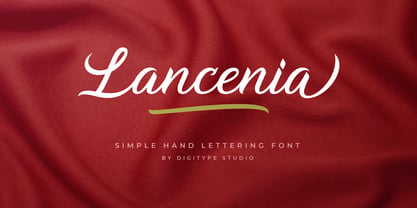 Lancenia - a stylish and simple handletter script typeface. This font will looks awesome and amazing in many ways on your latest design project. Lancenia is perfect for lots of different uses such as logos & branding, invitations, stationery, wedding designs, social media posts, advertisements, product packaging, product designs, labels, photography, watermarks, special events and more. This font has many OpenType features like ligatures, stylistic alternates, contextual alternates, swashes, and has multi-lingual support.

