10,000 search results
(0.07 seconds)
- Hand Writing of Janina by TypoGraphicDesign,
$19.00 The typeface Hand Writing of Janina is designed from 2021 for the font foundry Typo Graphic Design by Janina Fels & Manuel Viergutz. The character of the handwritten script typeface is rough, ruggend and raw. With state-of-the-art OpenType-Feature (like Contextual Alternates (calt) and Stylistic Alternates (salt)). Each uppercase and each lowercase letter has automatically alternated two variations to bring humanly-random characteristics of handwriting to life. 4 font-styles (Book, Bold, Dark & Icons) with 786 glyphs (Latin 3) incl. 100+ decorative extras like icons, arrows, catch words, dingbats, emojis, symbols, geometric shapes (type the word #LOVE for ♥︎ or #SMILE for ☺ as OpenType-Feature dlig) and stylistic alternates. For use in logos, magazines, posters, advertisement plus as webfont for decorative headlines. The font works best for display size. Have fun with this font & use the DEMO-FONT (with reduced glyph-set) FOR FREE! Font Specifications ■ Font Name: Hand Writing of Janina ■ Font Styles: 4 font-styles (Book, Bold, Dark, Icon) + DEMO (with reduced glyph-set) ■ Font Category: Display Script for headline size ■ Font Format:.otf (Mac + Win, for Print) + .woff (for Web) ■ Glyph Set: 786 glyphs (Latin 3 incl. decorative extras like icons) ■ Language Support: 93 languages: Afrikaans, Albanian, Asu, Basque, Bemba, Bena, Breton, Catalan, Chiga, Colognian, Cornish, Croatian, Czech, Danish, Dutch, Embu, English, Esperanto, Estonian, Faroese, Filipino, Finnish, French, Friulian, Galician, Ganda, German, Gusii, Hungarian, Inari Sami, Indonesian, Irish, Italian, Jola-Fonyi, Kabuverdianu, Kalenjin, Kamba, Kikuyu, Kinyarwanda, Latvian, Lithuanian, Lower Sorbian, Luo, Luxembourgish, Luyia, Machame, Makhuwa-Meetto, Makonde, Malagasy, Maltese, Manx, Meru, Morisyen, Northern Sami, North Ndebele, Norwegian Bokmål, NorwegianNynorsk, Nyankole, Oromo, Polish, Portuguese, Quechua, Romanian, Romansh, Rombo, Rundi, Rwa, Samburu, Sango, Sangu, Scottish Gaelic, Sena, Serbian, Shambala, Shona, Slovak, Soga, Somali, Spanish, Swahili, Swedish, Swiss German, Taita, Teso, Turkish, Upper Sorbian, Uzbek (Latin), Volapük, Vunjo, Walser, Welsh, Western Frisian, Zulu ■ Design Date: 2021 ■ Type Designer: Janina Fels, Manuel Viergutz
 - Ekamai by Eclectotype,
$40.00 This is Ekamai, named after the district of Bangkok I lived in. It is based on Quinella, and was supposed to be a quick and easy reworking of that font into a "tight-not-touching" (rather than overlapping) version. As is often the case with quick and easy things, it turned out to be neither, and the vast majority of glyphs needed to be completely overhauled to fit the new system. This face is deliciously plump face, with lovingly rendered curves and just the right amount of cuteness; perfect for food packaging (of the sweeter variety probably!), logos, magazine headlines and the like. It performs admirably in all caps settings. The numerals are expressive hybrid figures (somewhere between lining and oldstyle). The overall feel is friendly and soft, without being overtly saccharine. Ekamai is equipped with subtle contextual alternates (which I'd recommend leaving on) to help with the tight fit, a handful of discretionary ligatures if that's your thing, and a case feature for all caps settings. The stylistic alternates and stylistic set 1 features simply change the # glyph to an attractive numero. Automatic fractions are included along with wide-ranging language support.
 - Sienna by Monotype,
$40.00 Sienna is a soft serif typeface designed for both text and display purposes. Its soft and sharp structure creates an unusual, yet pleasing appearance. This leads to a comfortable reading experience with enough personality to create impactful titles and headlines, and Sienna will really shine in your branding projects. Variable versions of the fonts are available allowing you to fine tune the weight to your exact liking. Small Caps are included (along with their matching diacritics) – adding another layer of versatility to this typeface. Proportional Lining figures are an option if you prefer them to the default Old Style figures. A number of swash alternates enhance Sienna, giving you the opportunity to add more flair and personality to your title and branding designs. Simply activate Stylistic Sets to start adding flourishes to your typography. There are 14 fonts altogether, with 7 weights in roman and italic from Thin to Black styles. Sienna has an extensive character set (800+ glyphs) that covers every Latin European language. Key features: 7 weights in both roman and italic Variable fonts included with full family 59 Alternates 8 Ligatures Small Caps Full European character set (Latin only) 800+ glyphs per font.
 - Fer by ParaType,
$30.00 Fer is a sans-serif font for body text, not lacking in its own distinctive voice. The aftertaste of reading the text set in Fer is like reading the letters on old rusty plates somewhere in Southern Europe, hence the name (Fer means iron in French). Being a modern system that includes a variable font with weight and optical size axes, Fer combines the features of geometriс sans serifs and old sans serifs with closed apertures. The typeface contains three sets of styles: for captions, text and headings, — with the weight ranging from regular to black. Fer was created with the idea to unite nations. The Latin character set supports all European languages, most African languages and Vietnamese. Cyrillic has support for all living Cyrillic languages and some obsolete characters too. The font also supports the Greek language. Additionally, the character set includes currency signs of all supported languages’ countries, old style, lining, tabular and proportional figures as well as numbers in squares and circles. Lastly, the font has lots of localized letterforms and stylistic sets. Fer was designed by Dmitry Goloub for Paratype in 2020–2023.
 - Geometric Arrows by Gerald Gallo,
$20.00 Contains 42 arrow designs pointing up, right, down, and left totaling 168 arrows.
 - Ongunkan Lydian by Runic World Tamgacı,
$50.00 Lydia (Lydian: 𐤮𐤱𐤠𐤭𐤣𐤠, Śfarda; Aramaic: Lydia; Greek: Λυδία, Lȳdíā; Turkish: Lidya) was an Iron Age kingdom of western Asia Minor located generally east of ancient Ionia in the modern western Turkish provinces of Uşak, Manisa and inland Izmir. The ethnic group inhabiting this kingdom are known as the Lydians, and their language, known as Lydian, was a member of the Anatolian branch of the Indo-European language family. The capital of Lydia was Sardis. The Kingdom of Lydia existed from about 1200 BC to 546 BC. At its greatest extent, during the 7th century BC, it covered all of western Anatolia. In 546 BC, it became a province of the Achaemenid Persian Empire, known as the satrapy of Lydia or Sparda in Old Persian. In 133 BC, it became part of the Roman province of Asia. Lydian coins, made of silver, are among the oldest coins in existence, dated to around the 7th century BC.
 - Curiousness by Bogstav,
$17.00 Comic font with crunchy lines - with multi language support as well as contextual alternates!
 - Carnas by Hoftype,
$49.00 Carnas, a new monoline sans with a light, slender and informal appearance. It is however forceful and strong enough for headlines and signage. Despite the reduction in its shapes, it is pleasantly readable for both shorter and longer text applications. The Carnas family consists of 16 styles and is well suited for ambitious typography. It comes in OpenType format with extended language support. All weights contain ligatures, superior characters, proportional lining figures, tabular lining figures, proportional old style figures, lining old style figures, matching currency symbols, fraction- and scientific numerals and matching arrows.
 - Harbour Light by Cititype,
$19.00 Harbourligh is a monoline script font. designed for those of you who are needing a touch of clean monoline handwritten Font. Resembling the typical line of a casual rollerpen and equipped with a lot of stunning ligature make it more naturals, assertive and appear more stand out for modern brands. The swas line is a straight line at the beginning and end to emphasize a strong decision in the signature. this font is a great choice for digital signature, logo, book cover, web site, brand identity, wedding invitation, photography, movie title and other modern brand.
 - Saturknight by Echopraxium,
$13.50 Saturnight Regular is a proportional and kerned typeface. The name is a variation of Saturnight, which is itself the anagram of Unstraight. This is because vertical lines are Unstraight sticks. It's a consequence of the Design rule * Glyphs are built from segments on a triangular tessellation (cf. poster 1) Note 1: Unstraight lines depend from the chosen tesselation orientation (here the tesselation has horizontal lines and thus Unstraight verticals). Note 2: The encoding is Windows Latin 'ANSI', which includes Icelandic characters (as illustrated by poster 3).
 - Quant Text by Hoftype,
$49.00 Quant Text is the optimized text version of the Quant family. It comes with a slightly greater width, stronger hairlines and stronger serifs which make it very stable for small text, but also gives it a forceful appearance when used for headlines. Quant is well-equipped for ambitious typography. The Quant family consists of 8 styles, comes in OpenType format with extended language support for more than 40 languages. All weights contain small caps, proportional lining figures, tabular lining figures, proportional old style figures, lining old style figures, matching currency symbols, fraction- and scientific numerals.
 - Civita by Hoftype,
$49.00 Civita is a new 'Modern Type' with a high stroke contrast, distinct formal features, and a strong personality. It has a fluid ductus but nonetheless a solid structure. Civita is well equipped with many OpenType features which make it especially suitable for ambitious typography. The Civita family consists of 12 styles, comes in OpenType format with extended language support for more than 40 languages. All weights contain small caps, proportional lining figures, tabular lining figures, proportional old style figures, lining old style figures, matching currency symbols, fraction- and scientific numerals.
 - Candide Condensed by Hoftype,
$49.00 Candide Condensed is the complement for Candide and widens greatly the possible applications of the Candide family. Through Its moderately condensed proportions, it also works superbly as a discrete space saving text face. Candide Condensed comes with the same character layout and features as Candide. Candide Condensed consists of 16 styles. It comes in OpenType format and provides an extended language support. All weights contain standard and discretionary ligatures, proportional lining figures, tabular lining figures, proportional old style figures, lining old style figures, matching currency symbols, fraction- and scientific numerals, matching arrows and alternative characters.
 - Danton by Hoftype,
$49.00 Danton is a serif dominated face with a crisp and distinct graphical flavor. Designed especially for use in magazines and newspapers, It is superb in headlines and, because of its solid structure, it is also an excellent choice for text applications. The Danton family consists of 14 styles and is well suited for ambitious typography. It comes in OpenType format with extended language support. All weights contain small caps, ordinals, ligatures, proportional lining figures, tabular lining figures, proportional old style figures, lining old style figures, matching currency symbols, fraction- and scientific numerals, and arrows.
 - Guzzo by Monotype,
$50.99 A playful caricature of a midcentury grotesque, Guzzo is a fresh addition to the Monotype Library. Somewhat eccentric and full of surprises, its unmistakable quirk can be found on closer inspection, stemming from details proudly borrowed from brush lettering and calligraphy. The wide range of weights and style can take you through any design space, from the condensed weights squeezing in larger headlines or dense blocks of text with the condensed range, to experimenting with small point sizes, labels or packaging with the extended cut. However, Guzzo’s real charm is probably best expressed through its wonderfully playful shapes, its unusual 'laid-back italics' feature cursive forms and a backslant. The different stylistic sets allow you to decide what you make of Guzzo, with several sets of alternate glyphs steering it in any direction you want. Guzzo is a happy-go-lucky character, and has a warm, humble and painterly quality that - at a glance - may be unrecognizable as a typeface. It can almost pass for hand-lettering. Guzzo pairs exceptionally well with scripts and slab typefaces, and feels most at home in situ with toys, packaging, menus, broadcasting, cartoons and merchandising! Guzzo encourages you to turn up the silliness and is for designers who want to emulate hand-painted and casual motifs. Taking its name from American artist Jeremy Pinc, aka the painter Guzzo Pinc, the typeface channels the quirky, funny and poignant qualities of his paintings - with wacky characters, loosely painted geometric forms and bright colors. For this mid century, authentic, nostalgic typeface - the story is really what you make of it.
 - Plinc Beaux Arts Didot by House Industries,
$33.00 Firmin Didot is credited with establishing the Modern genre of serif typefaces, of which Beaux Arts Didots stands as an exemplary model. Like the French neoclassical architecture of its namesake, Beaux Arts has all the hallmarks of the early nineteenth-century style: a clear and confident construction consisting of simple yet strong lines. Use it for elegant and formal settings, or when a direct typographic tone is desired. Mix it with styles of similar sensibilities such as Plinc Hanover and Davison Spencerian. Digitized from the original Photo-Lettering film matrix in 2014 by Jean-Baptiste Levée. BEAUX ARTS DIDOT CREDITS: Typeface Design: Photo-Lettering Staff Typeface Digitization: Jean-Baptiste Levée Typeface Production: Ben Kiel Typeface Direction: Ken Barber Like all good subversives, House Industries hides in plain sight while amplifying the look, feel and style of the world’s most interesting brands, products and people. Based in Delaware, visually influencing the world.
 - Donovan Display by The Ampersand Forest,
$19.00 Meet Donovan Display! She's a lovely, high-contrast Didone with lots of options. Do you like sweeping flourishes at the end of your strokes? She's got 'em! Prefer juicy ball terminals? She's got 'em! Like a simpler, cleaner terminal? She's got those, too! She also has a set of grand swash capitals and a trunkful of ligatures that will add panache and elegance to any project that requires display-size type. Even better, she comes in two widths: Slim, for standard display use, and Skinny, a compressed version for spaces that require a bit of a squeeze and/or a more (traditionally) masculine feel! Donovan's lines are inspired by classic Didone faces — most notably the work of Firmin Didot (for architectural detail) and Giambattista Bodoni (for the look of the skinny version). She's sexy and stylish and she'll give you exactly the fashionable, elegant look you're after.
 - Chord Symbols by Tijs Krammer,
$24.00 Chord Symbols is a font for musicians. With this font, you can quickly write beautiful chords, using only simple keyboard characters as input. Musicians tend to write chords with regular characters. They use # instead of a genuine sharp, b instead of a genuine flat, dim instead of a small circle, etc. With Chord Symbols, your chords will be better looking, more easily readable and more efficiently notated. Chord Symbols helps you to write the chords the way you like it. Whether you prefer ‘maj7’ or ‘m7’ or a small triangle for a major seventh, whether you want ‘m’, ‘mi’, ‘min’ or a horizontal line for a minor chord, this font will suit you. Chord Symbols is originally created out of the need to write chords above pop song lyrics. It is designed to also work smoothly in music notation software, like Sibelius, Finale and Encore.
 - Carouge Pro by André Simard,
$14.00 Carouge Pro is a contemporary typeface with a classical twist. This duality gives Carouge an energetic and vivid sensibility. Its subtle shapes are highly suitable for all types of documents, including corporate collateral and publicity literature. The fineness of the types provides a pure and elegant style that is highly valued in the fashion and design industry. While extremely legible in small body sizes, its personality comes into full bloom when used in large type sizes. Carouge comprises a wide range of bold fonts, from Ultra Thin to Ultra. The italic companion of the roman type has a split-line allure with a rounded personality. Carouge Pro is available in eight weights from the UltraThin to an Ultra Black. Each weight is also supported by a strong personality cursive italic. “When I designed Carouge, I wanted to create a typeface with a sober appearance and a dash of audacity. Carouge provides a fine balance between two different worlds.” — André Simard Carouge Pro is a contemporary typeface with a classical twist. This duality gives Carouge an energetic and vivid sensibility. Its subtle shapes are highly suitable for all types of documents, including corporate collateral and publicity literature. The fineness of the types provides a pure and elegant style that is highly valued in the fashion and design industry. While extremely legible in small body sizes, its personality comes into full bloom when used in large type sizes. Carouge comprises a wide range of bold fonts, from Ultra Thin to Ultra. The italic companion of the roman type has a split-line allure with a rounded personality. Carouge Pro is available in eight weights from the UltraThin to an Ultra Black. Each weight is also supported by a strong personality cursive italic. “When I designed Carouge, I wanted to create a typeface with a sober appearance and a dash of audacity. Carouge provides a fine balance between two different worlds.” — André Simard
 - Colarino by Luxfont,
$18.00 Introducing the incredible, multicolored Colarino family. They are a unique family with perfect color transitions. Modern color combination was used. Letters do not just have a banal linear gradient, here the colors are randomly mixed in a different order, which resembles a watercolor paint or a complex vector mesh. Some variants resemble a sunset, others a sea wave and a cote d'azur. Color in the letters is complemented by transparency, which allows them to perfectly fit into both light and dark backgrounds - the letters take on the background color and do not look superfluous. Unique multi-colored design. Perfect for trending covers and headlines. Looks great in advertising and attracts attention. Very original and versatile family. This font family is based on the Regular font Pacardo - which means that if necessary you can combine these two families and they will be absolutely stylistically identical and complement each other. Check the quality before purchasing and try the FREE DEMO version of the font to make sure your software supports color fonts. P.s. Have suggestions for color combinations? Write me an email with the subject "Colarino Color" on: ld.luxfont@gmail.com Features: · Free Demo font to check it works. · Uppercase and lowercase the same size but different colors. · Transparency in letters. · Mega high-quality coloring of letters. · Kerning. IMPORTANT: - Multicolor version of this font will show up only in apps that are compatible with color fonts, like Adobe Photoshop CC 2017.0.1 and above, Illustrator CC 2018. Learn more about color fonts & their support in third-party apps on www.colorfonts.wtf -Don't worry about what you can't see the preview of the font in the tab "Individual Styles" - all fonts are working and have passed technical inspection, but not displayed, they just because the website MyFonts is not yet able to show a preview of colored fonts. Then if you have software with support colored fonts - you can be sure that after installing fonts into the system you will be able to use them like every other classic font. Question/answer: How to install a font? The procedure for installing the font in the system has not changed. Install the font as you would install the other classic fonts. How can I change the font color to my color? · Adobe Illustrator: Convert text to outline and easily change color to your taste as if you were repainting a simple vector shape. · Adobe Photoshop: You can easily repaint text layer with Layer effects and color overlay. ld.luxfont@gmail.com
 - Sugar Crakers by Atom,
$19.00 Sugar Crakers is a bold signature font with pointed corners and supported with over 45 ligatures. Use your imagination to make company logos, product labels, headlines, and other designs that will make your designs come alive and become more selling points. Use Sugar Crackers for the success of your next project.
 - HT Maison by Dharma Type,
$19.99 HT Mason is bold and hand painting font. This font is retrospective and decent, but it is also funny and cute. Holiday Type Project offers retro hand drawing scripts. Inspired by retro script on shopfront lettering, wall paint advertisements in Italy around 1950s. Check out the script fonts from Holiday Type!
 - TELETYPE 1945-1985 - Unknown license

- Maest by Omine Type,
$24.00Constructed only with straight lines, Maest is an unusual script typeface. The straight lines give the letters a striking visual effect, specially in small sizes. Maest also features four styles of figures, plus swash capitals, a few ending forms and the f-ligatures. It is available in three weights, from regular to black. - Diamond Braille by Echopraxium,
$5.00 Here is a "Decorative Braille font". The initial design was indeed drawn on a K.I.S.S digital sketchpad, the Windows default drawing tool (Microsoft Paint, classic version). A. Glyph Concept The Braille 2x3 dot matrix is weaved around a diamond-shape. a.1. Each "dot" is represented by a "right-angle isocel triangle". a.2. Braille dots in Diamond Braille a.2.I. "Dots" are outside the diamond for first Braille row (Braille dots 1, 4) and third Braille row (Braille dots 3, 6). a.2.II. "Dots" are inside the diamond for second Braillle row (Braille dots 2, 5). a.3. Diamond lattice Glyphs are connected horizontally (to/bottom diamond's corners) and vertically (left/right corners) to each other (see poster 5). a.4. Special Glyphs - Space: its is either empty ("Empty cell") or a "non Braille shape" { _, ° } depending on your display needs (as explained in b.3.II) - 6 dots: { £, =, û } - 6 empty dots: { ç, ¥ } B. Font user guide b.1. Lowercase glyphs { A..Z } In these glyphs the "dots" are represented as a white right-angle isocel triangle filled with a smaller black triangle. b.2. Uppercase glyphs { a..z } In these glyphs, the "dots" are represented as an empty triangle (this is an "empty dot"). b.3. 'Space' vs 'Empty Cell' b.3.I. 'Space' - 'Space' glyph is an empty shape - '¶' glyph (at the end of each line in Microsoft Word) is also an empty shape b.3.II. 'Empty cell' glyphs: _ (underscore), ° (degree). In these glyphs there are 2 "empty dots" at top and bottom corners of the diamond, which differentiates them from regular Braille glyphs (which dont have a "dot in the middle"). b.4. Diamond Lattice To display text as a 'diamond lattice', replace each 'Space' by an 'Empty cell' (as explained in b.3.II, see poster 5) b.5. Connectors The connector glyphs allow the creation of "circuit like" designs (see poster 1). Here are the connector glyphs: { µ, à, â, ä, ã, è, é, ê, ë, î, ï } b.6. Domino feature Some Glyphs represent numbers 1..6 in a way which is similar than on dominos (see poster 6) C. Posters Poster 1: the "Font Logo", it displays "Diamond Braille" text together with the Connectors feature. Poster 2: a pangram which is published on pangra.me ( "Adept quick jog over frozen blue whisky mix" ). Poster 3: an illustration of the Domino feature. Poster 4: a DiamondBraille version of the Periodic table. Poster 5: illustration of the Diamond lattice using only 6 dots ( û ) and 6 empty dots ( ç ) glyphs.
 - Ginthamy by Krakenbox Studio,
$16.00 Ginthamy is a cute and playful display font. Use this font to add that special cool touch to any design idea you can think of! It is perfect for any branding project such as logos, t-shirt printing, creative products, and more.
 - SF Droob Pro by Sultan Fonts,
$19.99 Droob Pro is a Latin Arabic typeface for print and web, an upgraded version of the Droob7 font, featuring clarity and high readability. The Droob Pro font family contains two weights: Regular and Bold. This font supports Arabic, Latin, Farsi, Urdu, and Kurdish.
 - Big Heroes by Typefactory,
$14.00 Big Heroes is playful font which puts a smile on your projects and will inspire you to create something fun and memorable. It is perfect for headings, flyer, greeting cards, product packaging, book cover, printed quotes, logotype, apparel design, album covers, etc
 - Lovely Dream by Yumna Type,
$16.00 Lovely Dream is a beautiful script font with a natural and unique design will make your project more beautiful. The font is suitable for your branding project, printing, logos dan wedding. Features: Multilingual Support PUA encoded Set Stylistics Many Swashes Beautiful Ligatures
 - Honey Sky by Yumna Type,
$16.00 Honey Sky is a handwritten font with a natural and unique design will make your project more beautiful. The font is suitable for your branding project, printing, logos dan wedding. Features: Standard Ligatures Alternates Multilingual Support PUA encoded Numeral and Punctuation by Yumnatype
 - Chamfer Serif JNL by Jeff Levine,
$29.00 A set of vintage wood type printing blocks yielded the alphabet which was to become Chamfer Serif JNL. With its heavy vertical serifs and interesting character shapes, the design is unique when compared to the more familiar wood type offerings of the past.
 - Chedros by Surotype,
$15.00 Chedros is a display typeface with playful taste. It comes in two different weight, regular and bold so you can use them to your heart's content. Chedros very suitable to use for headlines, wordmark, prints, logotype, young and playful design or anything else.
 - Renaissance Initial by Kaer,
$19.00 This is a new classic Renaissance Initial font. Renaissance Initial font is perfect for premium design labels, medieval print, antique posters, etc. The fonts are presented in usual and color versions. Only uppercase letters from A to Z and numbers set (36 characters)
 - American Sign Alphabet by Deniart Systems,
$10.00 This font can be used as a play'n learn tool to teach the meaning of these modern day communication symbols. Each alphabetical character can be printed with or without the corresponding roman symbols. NOTE: comes with an interpretation guide in pdf format.
 - RTCO Vorlich by Roams Type Co,
$14.00 Classy Serif condensed display typeface with & rounded corner. Inspired by vintage sign and logotype of advertising branding. This font is suitable for graphic designs such as logotypes, merchandise, printed stickers, and other branding needs. Include: Uppercase & Lowercase | Numerals & Punctuation | Ligatures | Multilanguage support
 - Rooling Candy by Yumna Type,
$16.00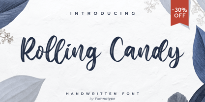 Rolling Candy is a beautiful handwritten font with a natural and unique design will make your project more beautiful. The font is suitable for your branding project, printing, logos dan wedding. Features: Beautiful Ligatures Multilingual Support PUA encoded Numeral and Punctuation by Yumnatype
 - Sundylle by Patria Ari,
$10.00 Sundylle is round typeface with clean characters and playful alternates to support your brand/project. Sundylle is perfect for projects such as logos & branding, headlines, posters, signage, advertisements, printed quotes, product packaging, product designs, label, photography, watermark, special events or anything. Thank You!
 - Pottery by Nurf Designs,
$16.00 Pottery is a beatiful script font. This font is great for your next creative project such as logos, printed quotes, invitations, cards, product packaging, headers, Logotype, Letterhead, Poster, Apparel Design, Label, and etc. Pottery comes with uppercase, lowercase, numerals, punctuations, multilingual support .
 - Personal Message JNL by Jeff Levine,
$29.00 Inspired by the calligraphic poster art of Santa Fe's Randall Hasson, Personal Message JNL is part calligraphic, part cartoon lettering. A light, casual and friendly design, Personal Message JNL can be applied to many different print or web projects with equally attractive results.
 - Nünooska by Okaycat,
$29.00 Nünooska is a sans serif type designed by Luke Turvey in 2014. The minimalist charm of Nünooska offers a soft unique style while remaining legible and clean. This rounded geometric sans serif is designed to look excellent for display or printed publication.
