10,000 search results
(0.049 seconds)
- Verismo by Martin Verstraaten,
$20.00 Verismo (Italian for ‘realism’, from vero, meaning ‘true’) is a genre of operas with scenarios based on contemporary everyday life. This font is inspired by old school sign painting techniques. In addition, the font has a contemporary look and can therefore be used in many different designs.
 - Verismo Inline by Martin Verstraaten,
$20.00 Verismo (Italian for ‘realism’, from vero, meaning ‘true’) is a genre of operas with scenarios based on contemporary everyday life. This font is inspired by old school sign painting techniques. In addition, the font has a contemporary look and can therefore be used in many different designs.
 - Larken by EllenLuff,
$42.00 Larken is a confident serif. Designed to reflect nature, it creates a sense of natural softness and expressiveness. We pushed the concept into a usability focused direction, to work as a bold tool and beautiful communicator. Larken variable allows fluid design across 7 weights, italics and major latin based languages. True italics advance the aesthetics, bringing energy and making it suitable for modern design. The type family melds organic curves and gentle repetition into powerful and harmonious type. At large point sizes you can appreciate the letter shapes, whilst the same restraint and focus creates an even texture for small point sizes and long reading. The font broadens its use by supplying weights all the way from thin to black. The natural curves, swells and sloping trunks, grow in character as the font gains weight. Whilst the thinner weights have lowered contrast and optical corrections to create a warm and gentle appearance. The Larken character set incorporates additional symbols, stylistic alternates, unique ligatures and case sensitive punctuation - producing a stable workhorse family ready to tackle projects of any size.Check out Jeko which is a great pair for Larken.
 - Newshawk JNL by Jeff Levine,
$29.00Jeff Levine's Newshawk JNL emulates the tall, condensed headline fonts often used years ago when an urgent story broke and a newspaper rushed an "Extra" edition to the streets. - Jessie by Turtle Arts,
$20.00Jessie's Letter is based on an old typed letter by Kerrie's great step grandmother. This letter was undated, but we think it must have been from the 1920s or so. Jessie wasn't much for punctuation, so there aren't any of those pesky question marks and exclamation points. But, she did make mistakes in her typing, so we've included cross outs and strange resulting characters to make up for the lack of everyday punctuation. Maybe Jessie wanted to visit Paris, or maybe she secretly made paintings in her back yard, or maybe she dreamed of painting her house bright pink. Well, maybe not, but it's fun to dream... - Basim Marah by Hiba Studio,
$59.00 Basim Marah is an Arabic display typeface and is useful for titles and graphic projects. The font is based on the simple lines of free style calligraphy. A collaborative effort, Basim Marah was designed and drawn by Basim Salem Al Mahdi from Iraq and then digitalized as a typeface by Hasan Abu Afash from Palestine. In November, 2008, Basim Marah was upgraded by working with Mirjam Somers an award-winning Arabic type designer to the DecoType font format for use in WinSoft Tasmeem which is now bundled with InDesign CS4.
 - Swirly by Trim Studio,
$12.00 Swirly is a cute handwritten font to share happy, loving, and cheerful vibes and moments in life like Easter, Valentine, Christmas, and for many other occasions.
 - Tusque by Eclectotype,
$40.00 Tusque is a layered chromatic type family with a Tuscan flavor. Regular, Circus and Tooled can stand alone, while Highlight and Deco are purely for layering up multicolored gorgeousness. Tusque lends itself to fairy tales, wine labels and boutique logos, and makes some particularly delectable drop caps. Although it’s all caps, the lower case slots are all different from the upper case so you can mix and match to your heart’s content. There are also a bevy of swash alternates and ligatures at your disposal. The contextual alternates feature cleverly substitutes alternate versions of more triangular glyphs like A and V to give a better fit. The ordinal feature changes ‘a’ and ‘o’ to the feminine and masculine ordinals for Spanish etc. but also changes ‘c’ and ‘ac’ to superscript lowercase versions for names like McBride and MacDonald.
 - Ridtype Pro by Ridtype,
$30.00 Ridtype Pro is a custom font for our brand, and later this font will work in all roles in the type of brand we use. both in units of typography, printing, and type texting. This font is equipped with a modern semi-classic category type, so this font can work in all lines of business, both for supporters of implementation in modern and classic business. This font has been designed as best as possible, both in terms of letter design and the type of weight that is made to be compatible in all roles.
 - Destructive Decisions by Chank,
$99.00 Destructive Decisions is a font based upon the inherent flaws of human nature—presented under the guise of complete legibility. At first impression this font is very readable, but upon closer examination you'll notice the edges are fuzzy and some of the lines are off-kilter. You can read it, but it is also a bit foggy. No matter how hard it strives for perfection. This font was originally designed for a cable tv show about substance abuse, but is now available for use in your web and print designs, too.
 - Boldstrom by Sharkshock,
$115.00 Boldstrom is a heavy-handed, all caps, display font available in 5 versions. Emphasis was put into strong line weight, minimal contrast, and tight curves. This family is defined by very broad stems with comparatively thinner cross strokes. Spacing was condensed to ensure the characters fit snug against one another. This was done in part to minimize negative space while also creating tension. The result is a powerful looking sans serif designed to command attention and make a statement. Boldstrom will be best used in large format print, titling, books, movie posters, or company logos.
 - Rodixu by Product Type,
$17.00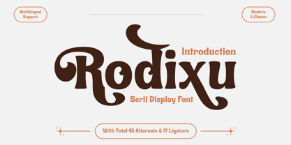 Rodixu is a classic serif font that exudes elegance and sophistication. Each character is carefully crafted with clean lines and balanced proportions, making it perfect for any project that requires a refined touch. Its timeless appeal makes it suitable for anything from editorial layouts to branding materials. With its stylistic alternates and ligatures, Rodixu offers a range of design possibilities and can elevate any project to the next level. Whether you’re creating a logo, website, or print materials, Rodixu is a font that will help you achieve a polished and professional look.
 - Artik by Nirmana Visual,
$24.00 Introducing Artik our stunning modern serif font, perfect for adding elegance and sophistication to any design project. With its clean lines and contemporary flair, this font is ideal for creating eye-catching headlines, logos, and branding materials. Crafted with care and attention to detail, our modern serif font features subtle curves and sharp edges that create a perfect balance between classic and modern design elements. The elegant serifs add an extra touch of sophistication and ensure readability in any size, making it a versatile font choice for both print and digital media.
 - Lasting Impression JNL by Jeff Levine,
$29.00Lasting Impression JNL was rendered from scans of a 1930s rubber stamp printing set. At small sizes it has the look of hand-stamped lettering. At larger sizes, the user will see jagged and angular lines giving the font a kind of retro-grunge look. This typeface was the model for the more cleanly-drawn Casual Friday JNL, also by Jeff Levine. There is a limited character set, and both the spacing and kerning have been intentionally omitted so that the results will more closely resemble the uneven letter spacing of rubber stamps on paper. - Ikhsani Grotesk by Makarsih Studio,
$9.00 Ikhsani Grotesk is a modern, contemporary font that offers an elegant and stylish look. It's perfect for any project that requires a bold yet sophisticated style. The font features strong lines and curves with sharp edges to create a unique visual effect. Its clean design makes it easy to read on both digital platforms as well as in print materials, making it ideal for logos, branding projects, websites or other graphic designs. With its versatile nature and timeless appeal, Ikhsani Grotesk is the perfect choice when you need something special yet classic!
 - Histadia by IbraCreative,
$17.00 Histadia is a strikingly modern chic serif typeface that seamlessly blends timeless elegance with contemporary aesthetics. Its graceful, high-contrast letterforms exude sophistication and versatility, making it an ideal choice for a wide range of design projects. The font’s crisp lines and refined serifs convey a sense of refined luxury, while its clean, minimalist detailing ensures legibility and impact in both print and digital applications. Histadia captures the essence of classic serifs while embracing a modern sensibility, making it a versatile choice for those seeking a harmonious balance between tradition and innovation in typography.
 - AT Bubley by Amera Type,
$20.00 Inspired by the archive of music flyers and skateboarding magazine created in the early 90s. Bubbley is made for the purposes of making posters, magazine headers, book titles, flyers and other print media. Bubbley is made for digital needs that are more modern but still have a vintage feel Every line and curve in letterform is made for the needs of the future industry, the latest version in the modern lettering industry. Bubbley is very suitable to be combined with the illustrations that we provide for free, to complete your needs
 - AggressIan by Hackberry Font Foundry,
$13.95 AggressIan is the release of the first font I ever drew. It was done by hand with triangle and parallel rule back in the mid-1980s. I originally called it Aggressor, but I never liked it. My local type designer friend, Ian Roberts, really likes this type of drawing and told me I had to release it. So I named it after him. The small caps should work well if you need a bolder version. It has oldstyle and lining figures, plus the small cap figures. I hope you like it.
 - Olbrich Display NF by Nick's Fonts,
$10.00Based on lettering on a poster for an 1907 art exhibition by Joseph Maria Olbrich. Use uppercase characters for headlines, and lowercase letters for text use. For “dotted” spaces, use the underscore, and brackets or braces for framing characters. Both versions of the font include 1252 Latin, 1250 CE (with localization for Romanian and Moldovan). - Ransom Clearcut NF by Nick's Fonts,
$10.00Will Ransom designed the uppercase letters in this typeface for Barnhart Brothers & Spindler in the 1920s, under the name Clearcut Shaded Caps. The lowercase letters come from another BB&S typeface named Clearcut Italic. An elegant headline face, best used sparingly, the font includes decorative flourishes in the brace, bracket and en dash positions. - Picturebook by Andy Peat,
$12.00 About this font family Picturebook was made for very young readers and is ideal for creating simple words and sentences in picture books. Produced in three weights with very clear, distinct character shapes to aid early reading and learning. Features 3 weights; Regular, Medium and Bold Multi language support To be able to access alternative fonts, make sure the software you use can support opentype features such as Microsoft Word, Paint, Adobe, Corel draw, Cricut and other applications. Designed and published by Andy Peat. www.andypeat.com Released December 2023
 - Sarlotte by Attract Studio,
$18.00 Sarlotte is a luxurious serif with an elegant style. It seduces your eyes with its curves yet still manages to maintain its classy serenity, it's perfect for branding, logos, invitations, long texts, and many more of your other needs. Sarlotte Features: Multilanguange PUA Encoded Alternates Ligatures. To be able to access alternative fonts, make sure the software you use can support opentype features such as Microsoft Word, Paint, Adobe, Corel draw, Cricut and other applications. If you need help, please contact me :) Check out Holen Vintage which is a great pair for Sarlotte.
 - Vergilia by Attract Studio,
$18.00 Vergilia - Modern Bold Serif Font is a stylish font It has a modern and retro look that is easy to read. Vergilia also comes with an outline style to help with your designs. Great for creating logos, quotes, posts, branding projects, magazine imagery, wedding invitations, even long text and much more. Vergilia Features: Multi language PUA Encoded Alternates Ligatures. To be able to access alternative fonts, make sure the software you use can support opentype features such as Microsoft Word, Paint, Adobe, Corel draw, Cricut and other applications.
 - Knock Type by sugargliderz,
$20.00 KnockType is based on the concept of braille notation in Japanese. It does not support braille notation in other languages. KnockType is not necessarily aimed at facilitating “braille transcription”. It is designed so that someone who understands the grammar of “braille transcription” can instantly transliterate into braille text that was previously transcribed to kana characters, etc. In addition, it allows ink characters to be converted to braille using OpenType features. It is recommended for use in applications that are compatible with OpenType features. If they are not compatible, KnockType is “simply a kana font”. To be a little more specific, it is assumed that KnockType will be used in Adobe’s InDesign and Illustrator applications. If you don't have them, you will not get satisfactory results. Four types of font are available. There are “hasBox&Line”, “hasnotBox&Line”, and the reversed font of each. When displayed on a convex surface, the assumption is that they will be used mainly for printing applications. When displayed on a concave surface, the assumption is that they will be used mainly for writing on braille boards, etc. By printing, you can get a rough idea of the dot positions. It is more effective to match them to the grid size of the braille board.
 - Biro Script Plus by Ingo,
$50.00 An authentic script from the tip of the ball point pen. This hasn’t been seen yet: A typeface which truly looks as if it were handwritten. Calligraphy is, actually, the art of fine writing. And actually, written scripts as typeface for the computer are 100% nonsense. And yet, an obvious thought: Create a typeface which truly derives from everyday handwriting. And since we, if we write at all, utilize practically only a ball point pen anymore, then a modern cursive writing form must look like just that. As a counterpart to the artistic ”handwritings“ which have long been available as typeface, the thought of digitalizing a truly ”ugly“ handwriting is appealing. After all, time and again there is the need for a text to look ”handwritten“. Biró Script is written freehand with a ball point pen. Finally a truly individual script! Biró Script includes more than 300 authentic ligatures in addition to the customary alphabet. By the way, the most convincing effect is obtained with a font size of about 18 to 22 points, at which the thickness of the stroke is now about the same as that of a real ball point pen. There's a difference between the anglo-american forms of some characters (esp. the numerals 1 and 7, but also capitals I and F) and how it's written in the rest of the world. For those of us who aren’t used to the world-wide usual forms, Biró Script includes a US version with the appropriate characters.
 - Klagia by Konstantine Studio,
$17.00 Klagia is a font inspired by the advertising media back in 1970. The glory of printing and handpainted signs and visuals. Emphasizing the bold, loud, yet poppin' and modern retro vibes that will be stylish in any era. It makes Klagia a font that you need to have in your design arsenal. Contains a bunch of Ligatures and Stylistic Alternates to give a distinctive vibe in every message conveyed using Klagia font. Perfectly fit for logo, branding, advertising, poster, food and beverages, restaurant, book cover, album artwork, decoration, sign painting, and many more.
 - NS Deckpress by Novi Souldado,
$30.00 Inspired from the letterpress achieve and printed media from the 19th century. We talk about headlines, labels, playing cards, postcards, book covers, signs, and many more. That's where the DECKPRESS has risen. An old vibes all-caps fonts, armored with the robust yet decorative ornamental slab-serif style. Double up the majestic, it comes with the layered style to give an amplification back to the vintage era. It is an inevitable partner for your classical heritage touch of visuals such as signage, logotype, sign painting, label, header, ornamental typographic design, you name it, old sports.
 - Revx Neue Rounded by OneSevenPointFive,
$9.00 Revx Neue Rounded is a modern rounded sans serif typeface. It contains 14 styles - 7 uprights and corresponding italics. The typeface supports the OpenType Latin Pro character set of 455 characters. It is packed with powerful OpenType features, alternative glyphs, kerning pairs, guided typing experience, and more which makes the typeface well featured. The typeface is suitable for all platforms (web, display, print, etc.). Revx Neue Rounded blends beautifully in your designs. Revx Neue (Non-Rounded corners): https://www.myfonts.com/fonts/one-seven-point-five/revx-neue/ Feedback: https://forms.gle/iY8Zswmsg689m95M8
 - AT Move Artu by André Toet Design,
$39.95 Artù ! Strano ma vero, strange but true. A beautiful, intelligent and lively Italian dog and a great friend, unfortunately no longer among us ... but his memory lingers. A typeface designed in Rosennano (Tuscany), its Italian, but executed in Amsterdam. This monospace typeface might prove to be extremely useful for household products like washing powder or any anything like that. Just use it in your designs, let it live! Concept/Art Direction/Design: André Toet © 2017
 - Monstrosity by Comicraft,
$19.00 It breathes fire and its leathery hide is impervious to rocket propelled grenades and drone warheads! It destroys everything in its path! Is it a terrifying sound effect font or does it just want to be loved? One thing's for sure – no one is safe!
 - Picz JNL by Jeff Levine,
$29.00Picz JNL is a rockin' font made up of guitar picks and is perfect for any projects representing good times. Use it moderately in short phrases or as initial caps, or combine it with Sock Hop JNL for a matching look. Limited character set. - Castle On The Hill by Hanoded,
$15.00 When I started working on this font, I had the radio on. Ed Sheeran was singing his song ‘Castle On The Hill’ and when I looked at this new font of mine, I couldn’t help but notice it had a bit of a medieval look. So I named it Castle On The Hill. COTH is a very lively, messy handpainted serif. It was made with a Japanese brush pen. I actually had a different look in mind, but this is what came out of the pen and I quite liked its looks. It is especially useful for children’s book covers, apps and posters, but be my guest and use it as you like. All it needs is a designers’ touch, a nice tune and a sunset.
 - Saffran by CAST,
$45.00 Saffran is a project of Erasmo Ciufo and Alessio D’Ellena. Saffran is a clear sans-serif with big x-height, short ascenders and descenders, that works well both for headlines and main bodies of text. The objective of the design is to improve readability of small size texts, by clearing the junctions and enlightening the structure of each letter as a consequence. The broken junctions, inspired from the hebrew alphabet, turn into spiky endings that connect to the flat sides only under 7pt.
 - Gin by Bykineks,
$12.00 Gin is a futuristic decorative font that combines calligraphy, graffiti and typography. This font is inspired by the street art called calligraffiti where it is abstract and elegant. This font is suitable for those who are anti mainstream and out of the zone, this is a new face in the world of fonts, for those who are against this font it will be considered broken but for those who are from the future, this font is an answer to futuristic design needs
 - HT Profumeria by Dharma Type,
$19.99 HT Profumeria is a monoline and connected font with a thin line and a unique tail. Its simple and retro look is the best script for branding and packaging, but it may also be useful for headlines, publishing and advertising. Holiday Type Project offers retro hand drawing scripts. Inspired by retro script on shopfront lettering, wall paint advertisements in Italy around 1950s. Check out the script fonts from Holiday Type!
 - HT Fiorista by Dharma Type,
$19.99 Fiorista is a pretty brush scrip with thin and curly line. Florists works best for greeting card, wedding ceremony invitation or shop card of fashion or apparel. It could also be used for film, magazines, advertising and websites. Holiday Type Project offers retro hand drawing scripts. Inspired by retro script on shopfront lettering, wall paint advertisements in Italy around 1950s. Check out the script fonts from Holiday Type!
 - Blippo by Linotype,
$40.99Blippo Black with its constructed style is a typical headline typeface. Its robust figures with their even strokes were composed using the basic forms of the circle and rectangle. Its curves are often not completely closed. The figures of Blippo Black form dark, heavy lines, making the typeface suitable only in middle and larger point sizes. Blippo Black will make an impression when used for flyers and correspondence. - Budinger Oldstyle by The Ampersand Forest,
$20.00 The Ampersand Forest has its first book family! Budinger Oldstyle is elegant and approachable at the same time, with five different weights, making it a perfect choice for text or display in situations that require a hint of scholarship, fine arts, craft, erudition, and clarity. Budinger Oldstyle has the legibility of a Garalde (like those of Garamond, Manutius, et al.), with a whiff of Venetian revival (after the fashion of Schneidler & Goudy). The letters are arbitrary, with conventions like cupped serifs and leftward stress. It also has a higher x-height than might be expected, to give it an upright posture and openness in the counters. The italic is more compact, with more clearly calligraphic letterforms and conventions like Swash Caps. Its many features include OpenType alternates (a one-story a and g, and a K, R, and Q with elongated descenders), full and true small caps, both standard and discretionary ligatures, oldstyle and lining numerals, and Swash letterforms in the Italic (all capitals and descenders, plus the ascender of the d). Plus, the most adorable pudge of an ampersand you've ever seen!
 - Cadmium by AVP,
$- Cadmium has a comprehensive latin character set and many Opentype features to enhance text, including small capitals, case-sensitive forms, superscript and subscript. Plenty of numeral variants include old-style figures, lining figures and fractions. Default numerals are proportionally spaced. Alternative styles for a handful of key characters provide some useful variations where stylistic sets can be implemented. The fonts are presented as four width-based sub-families: Expanded, Normal, Condensed and Compressed. Each width has a matching range of six weights and italics (obliques). Regular and Bold weights are style-linked, together with their respective oblique forms. Each width differs in its basic construction but all fonts share the same vertical metrics and may be used in combination with each other. Letter spacing is optimised for text sizes but is tolerant of significant tracking changes. Cadmium is good for signage, publicity and packaging, screen credits and titling, general print and publication, as well as web and screen applications.
 - Bodoni by Linotype,
$29.99 Giambattista Bodoni (1740–1813) was called the King of Printers and the Bodoni font owes its creation in 1767 to his masterful cutting techniques. Predecessors in a similar style were the typefaces of Pierre Simon Fournier (1712–1768) and the Didot family (1689-1836). The Bodoni font distinguishes itself through the strength of its characters and embodies the rational thinking of the Enlightenment. The new typefaces displaced the Old Face and Transitional styles and was the most popular typeface until the mid-19th century. Bodoni’s influence on typography was dominant until the end of the 19th century and, even today, inspires new creations. Working with this font requires care, as the strong emphasis of the vertical strokes and the marked contrast between the fine and thick lines lessens Bodoni’s legibility, and the font is therefore better in larger print with generous spacing. The Bodoni of Morris F. Benton appeared in 1911 with American Type Founders.